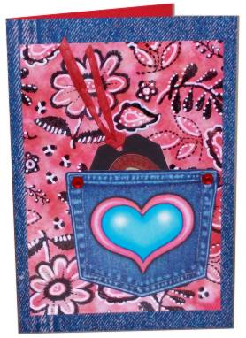
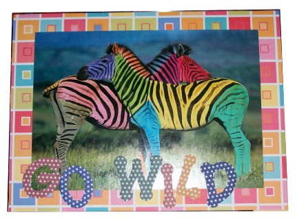
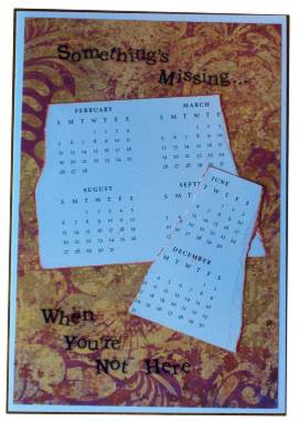
Topic: A to Z challenge round 3
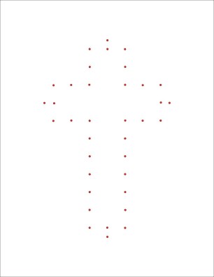
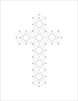
I designed this new cross for paper embroidery. First is the pricking layout for the holes:
Then the guide for stitching between the holes:
I'd love to see the results of your use of this pattern.
Posted by studio3d@ccgmail.net
at 6:00 AM PST