Topic: A - Z challenge 5
This type of quilt is made with paper by mounting strips behind a square aperture. It looks like a little quilt block.
Posted by studio3d@ccgmail.net
at 6:00 AM PDT
| « | April 2008 | » | ||||
| S | M | T | W | T | F | S |
| 1 | 2 | 3 | 4 | 5 | ||
| 6 | 7 | 8 | 9 | 10 | 11 | 12 |
| 13 | 14 | 15 | 16 | 17 | 18 | 19 |
| 20 | 21 | 22 | 23 | 24 | 25 | 26 |
| 27 | 28 | 29 | 30 | |||
This type of quilt is made with paper by mounting strips behind a square aperture. It looks like a little quilt block.
This piece of handmade paper was run through the Cuttlebug and the raised areas were rubbed with a distressing ink pad. The resulting colors went so well with this calendar illustration that I trimmed it up and simply added frames in complementary colors and a text sticker.
I've always thought of onyx as being a black stone but, when I researched it online, I found that it comes in many colors more commonly than black and they often are banded or resemble marble.
I followed the look of one illustration I found and duplicated the stone using alcohol inks and blending solution on a non-stick mat, smooshing glossy cardstock onto it and drying with a heat tool.
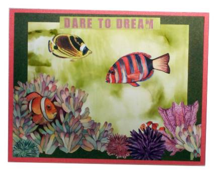
This piece of the finished background looked like water so I added stickers and mounted it to create this underwater scene.
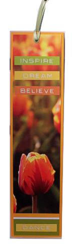
Though not as obvious from the photo the colors in the picture I used are really eye-popping, neon, bright orange and yellow. It was simple to trim the illustration, mount on cardstock, add some stickers and an eyelet with ribbon.
Hmmm, sometimes I think I should figure out how well something will photograph before I get all the way done with it! LOL!
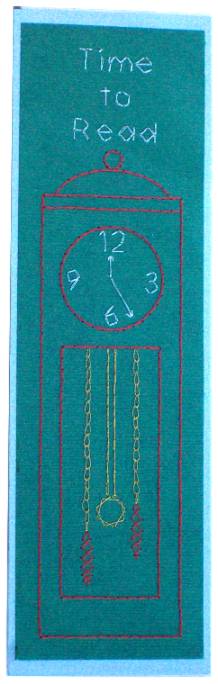
I designed this bookmark on the theme "Time to Read" and used a grandfather clock for the illustration.
Some themes are just easier than others! I started this with the text sticker, pulled out a calendar illustration and then seatched my stash for scrapbook papers to match.
Done in a flash.
The utinsils on this Swiss Army Knife are mounted to the backing with brads so they rotate. Then the knife body is set over them on foam tape to allow the swivel in and out. I used an actual photograph for the pattern, silver cardstock for the blades, red glossy card for the knife and white Sharpie paint pen for the markings.
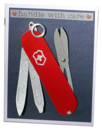
The text is a fabric sticker.
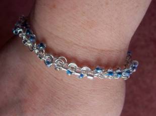
I used a package of jumprings and two different beads to create this bracelet for myself. I've never done anything remotely like this and I really like the result.
For this digital collage I chose three elements that are American icons: The flag, the eagle, and the constitution I used PhotoPaint for editing.
![]()
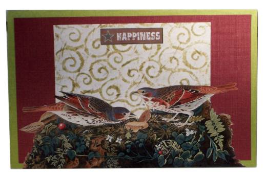
These will be used as cards for servicemen for Independence Day.
The hands of this ballerina are my theme focus. This is a 3D element where each framed area is another layer. The hands were the most difficult to cut out!
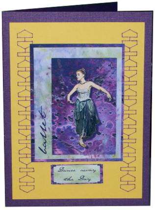
In actuallity, this card was orriginally designed around the stitched border as an assignment for a swap. I designed the border and stitched it in purple on yellow and then went looking for a center piece for it.
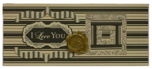
A kit I worked on recently had gold hot glue and rubber stamps to make faux wax seals. I did mine on a craft sheet , melting the glue with a heat gun. When melted I pressed the stamp into the puddle and allowed it to cool. Then I peeled the stamp off and hit the glue quickly with the heat gun to bring up the shine.
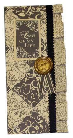
I used dryline adhesive around the edges of yellow cardstock and applied foiling to match the foil 3D unit in the center. The flowers are stitched on a pattern created with a Crealies template. I used thread colors to echo the 3D.

Aren't these the most adorable little baby shoes? The pattern is from Stampington Studio. They go together so easily and are shown here a little larger than life size.
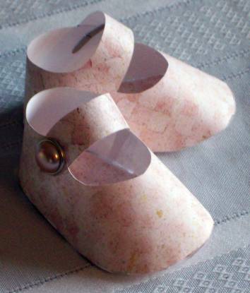
I used pearl headed brads to hold the straps.
This is another all-digital creation. The background photo was taken 'at sea' on our last cruise. The Christ figure was photographed in the courtyard of the cathedral in Mazatlan.
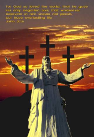
Hills and crosses were digitalized using masks in PhotoPaint. Text was added in CorelDraw.
I used these as Easter cards this year.
Not having a graphic that depicts caramel and not being incline dto cook up a batch as a project I decided to go with 'caramel' as the color theme. I then used Caramel alcohol ink to color some faux leather scraps, drew the boots on with Sharpie marker and cut out. Woodgrain scrapbook paper, a focal paper and some stickers finish this off.
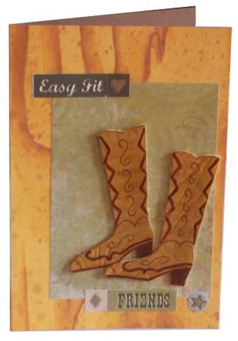
The boots are attached with silicone adhesive.
Gingham ribbon was used to tie these bows - three separate bows on a single long strip. A Cuttlebug embossing was sanded to expose the white core. The flower fairy was given three flower brads to hold, each with a rhinestone center.
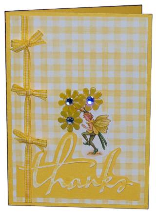
This was made for a challenge which allowed only yellow and white.
I played with alcohol inks in three ways while making projects for Easter.
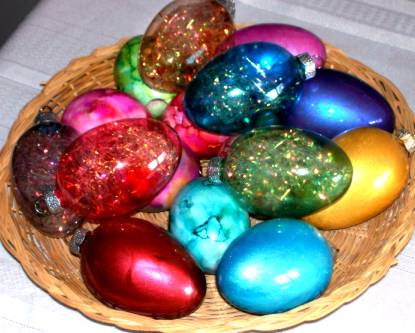
The first is using regular hard-boiled eggs. On these I used the polished stone technique. These will be used for hiding and hunting NOT for eating so the alcohol ink is OK.
Next I used glass egg ornaments and coated the inside with alcohol ink. These I turned upside down so the extra could drain out. When Dry I used tweezers to fill them with irridescent ultra-fine Easter grass.
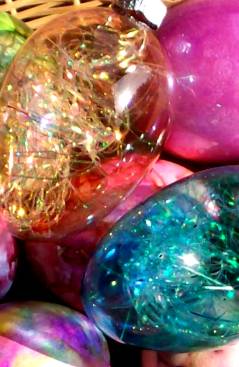
The last set I also used alcohol ink inside but when it was dry I put a coordinating color of Pearl-Ex powder inside and shook to coat it. This makes a really rich coloring of the glass egg.

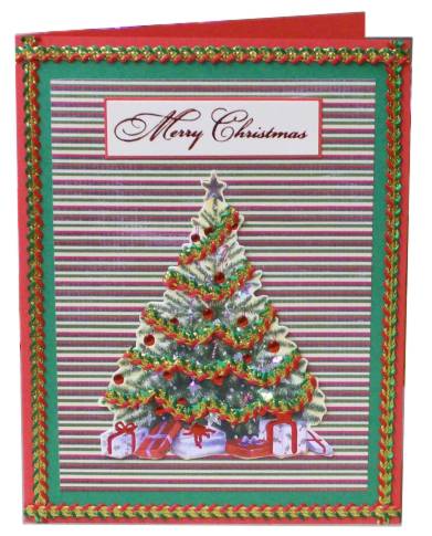
The sticky-backed rick-rack trim used on the tree and the border are the title element for this card. The tree was salvaged from an old card as well as the greeting. The striped background is scrapbook paper.
This little sweater is made from sticky-back yarn that I got at Big Lots some time back. I placed braids of it side by side and then cut around the sweater shape (separate cutting for the sleeves.) I used some button brads down the front and then the parts were then pieced together.
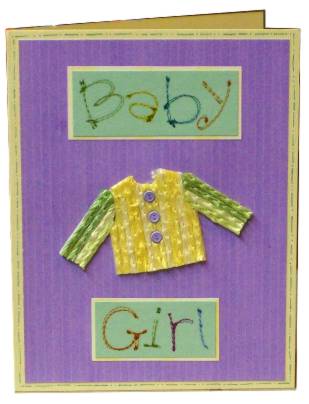
The text is rub-on letters that look like stitching. I applied them to green and cut out, then matted with yellow. The yellow cardstock was trimmed out with 'doodle' lines in green.
Photocopies of architectural elements were tinted with distressing inks and a bruch. I used a square punch to make all the squares the same size and mounted on black. This is double-matted on lavender and buff.

The lavendar text is a clear sticker.
