« May 2008 »
S M T W T F S
1 2 3
4 5 6 7 8 9 10
11 12 13 14 15 16 17
18 19 20 21 22 23 24
25 26 27 28 29 30 31
You are not logged in. Log in
Entries by Topic
All topics  «
3D paperwork
A - Z challenge 5
A - Z challenge 7
A - Z challenge round 4
A to Z challenge round 3
A to Z round 2
A to Z round 6
A-Z round 1
Around the House
Art Challenges
Artist Trading Cards
Backgrounds
Beads
Bible Journaling
Books
Boxes
Collage
Color Challenge
Coloring
cookbook
Die Cuts
Digital Projects
Digital Stamps
Drawing
Dry Embossing
Fabric Stuff
Fantastic Folds
Field Trip
Home Decor
How Does Your Garden Grow?
Hymnal Art
In The Kitchen
In the studio
Jewelry
Lettering
Links
Multi-Technique
Music to Work By
Musings
Nail Art
New Work
Online Class
Other Hobbies
Other Projects
Painting
Paper Embroidery
Paper Piecing
Photo
Pretty Paper
Quilting
Random
reading
Scrap Recovery
scrapbooking
Sewing
Sketch Challenge
Some Backlog
Stamping
Stencils
Stickers
Supplies
Teabag Folding
Techniques
Testing
tips and tricks
Tutorial
Web resources
Welcome to my Blog
Work By My Friends
workflow
Writing
Blog Tools
Edit your Blog
Build a Blog
RSS Feed
View Profile
Group One
In & Out of Studio 3D
Friday, 30 May 2008
U is for Upper
Topic: A to Z round 6

Of all the phrases associated with 'upper' I chose to use Upper Class. This antique photo of a classy young lady was printed with a white border, distressed with folding, tearing, and distressing inks (old paper.)

I distressed the background card with ink as well and layered printed tissue paper.

The flowers and greeting are stickers.

Ddd studio3d@ccwebster.net


Posted by studio3d@ccgmail.net at 6:00 AM PDT
Thursday, 29 May 2008
T is for Tags
Topic: A to Z round 6

Cream pearlized cardstock, blue canvas print scrapbook paper, red crackled print scrapbook paper make up the background. Two holes are punched for ball-chain to thread through.

Two tags punched from silver cardstock have been impressed with metal letter punches. They read PATRIOT and HERO. The last step was to apply Thank You stickers to the bottom. 


Ddd Studio3d@ccwebster.net


Posted by studio3d@ccgmail.net at 12:01 AM PDT
Updated: Thursday, 17 April 2008 9:31 PM PDT
Wednesday, 28 May 2008
S is for Shrink Plastic
Topic: A to Z round 6

The first shrink plastic I have ever done! I colored some white product with 'latte' alcohol ink and stamped the bear with Staz-on black ink. He was cut close to the lines and shrunk with a heat gun. 

Mr. Bear sits on a chipboard buckle with a brown ribbon. Stickers (postcards and greeting) over scrapbook paper finish it off.

Ddd studio3d@ccwebster.net


Posted by studio3d@ccgmail.net at 6:00 AM PDT
Tuesday, 27 May 2008
R is for Redline Tape
Topic: A to Z round 6

For those not 'in the know' redline tape is a super high-tack adhesive that comes in rolls and in sheets. For this card I used it as a sheet of adhesive under this cutting that a friend made with her Wishblade. Then I sprinkled with ultrafine glitter.

Here is a closeup

The test is a vellum sticker.

Ddd studio3d@ccwebster.net


Posted by studio3d@ccgmail.net at 6:00 AM PDT
Monday, 26 May 2008
Q is for Queen
Topic: A to Z round 6

This crown iris-folding starts with an iris-folding rubber stamp. I embossed the background with my Cuttlebug using a Fiskars texture plate before cutting out the aperture. I used folded strips of metallic tissue paper for the fill and embellished with sticky-back rhinestones.

Ddd studio3d@ccwebster.net


Posted by studio3d@ccgmail.net at 6:00 AM PDT
Sunday, 25 May 2008
P is for Pen and Ink
Topic: A to Z round 6

This church in Balderson, Ontario, Canada is so beautiful that we comment on it every time we pass by. We finally stopped and took a picture last time through. My husband loves it so much I did this pen and ink drawing for him. I used pigma pens on watercolor paper and tinted it with Ranger distress inks using bushy brushes.

Ddd studio3d@ccwebster.net


Posted by studio3d@ccgmail.net at 6:00 AM PDT
Saturday, 24 May 2008
O is for Opal
Topic: A to Z round 6

My first play with translucent polymer clay. Slightly tinted with 4 other colors in marbled effect and included with irridescent plastic chips and micro glitter. When baked it was sanded and then I used Future Floor Wax for shine. They have metal tape bezels.

These are shown about 1 1/2 times actual size. 

Ddd studio3d@ccwebster.net


Posted by studio3d@ccgmail.net at 6:00 AM PDT
Friday, 23 May 2008
N is for Notions
Topic: A to Z round 6

I made this kit for sewing notions from a pattern on Carol Duvall Episode CDS-1307. She calls it the Falling Down Sewing Kit because, when the lid is removed, the sides all fall down flat providing access to all the supplies.

I stocked mine with small scissors, three tones of thread, a white fabric pencil, straight pins, needles, white buttons, safety pins, a seam ripper, and a thimble.

I used two fabrics patterns, two ribbon patterns, posterboard, and tacky-glue.

Ddd studio3d@ccwebster.net


Posted by studio3d@ccgmail.net at 6:00 AM PDT
Thursday, 22 May 2008
M is for Mesh
Topic: A to Z round 6

I cut the dragonflies into their stencil shapes and backed just the wings with burgundy mesh. Behind all of them I placed a glittery silver mylar. The wings are outlined with gold leafing pen, the bodies with copper leafing pen and the flight paths and text drawn in with silver leafing pen.

I added a few silver peel-off flowers and mounted on a purple card.

Here is a closeup of one of the dragonflies.

Ddd studio3d@ccwebster.net


Posted by studio3d@ccgmail.net at 6:00 AM PDT
Wednesday, 21 May 2008
L is for Luscious
Topic: A to Z round 6

This reproduction fruit crate label was printed out four times and cut into a 3D illustration. I set it off on a woodgrain paper over blue cardstock and added three text stickers. 

Ddd studio3d@ccwebster.net


Posted by studio3d@ccgmail.net at 6:00 AM PDT
Tuesday, 20 May 2008
K is for Kismet
Topic: A to Z round 6

OK, I hate this card! But them, I hated the theme I was supposed to use, too.

I started doodling on the computer and made mirrored and rotated duplicates to form a tile pattern. The red lines are shadowed by thinner orange lines and set on a yellow background. I ended up with a Indian feel to the image. To this I added butterfly stickers in coordinating colors and a slear text sticker. 

So there! I did it - and I never have to do it again!

Ddd studio3d@ccwebster.net


Posted by studio3d@ccgmail.net at 6:00 AM PDT
Monday, 19 May 2008
J is for Joy
Topic: A to Z round 6

When I pulled together these definitions (printed scrapbook paper), a premade pocket, a tag, and a text sticker for the tag, I was delighted to discover they all coordinated so well. I pulled some scrapbook paper in the same color family for the background and found I had these drafonfly stickers that matched as well. Excellent!

Ddd studio3d@ccwebster.net


Posted by studio3d@ccgmail.net at 6:00 AM PDT
Sunday, 18 May 2008
I is for Illness
Topic: A to Z round 6

Most any card can be turned into a get well card with the addition of a peel-off greeting. I've added a 'thinking of you' dot as well to this collage of oriental elements. 

Ddd studio3d@ccwebster.net


Posted by studio3d@ccgmail.net at 6:00 AM PDT
Saturday, 17 May 2008
H is for Holy
Topic: A to Z round 6

I got this 3D picture from an online group friend and knew it was just for this theme. When I had finished putting it together I laid it down and it happened to land on something with this shape and color. WOW! I went right to the studio and cut the background shape and put this card together. The text is a clear sticker. 

Ddd studio3d@ccwebster.net


Posted by studio3d@ccgmail.net at 6:00 AM PDT
Friday, 16 May 2008
G is for Grunge
Topic: A to Z round 6

This was a tough one for me because I don't lean toward grunge, worn, rough-looking art. I did have these rusty metal garden pieces given to me some years ago. This was the perfect opportunity to use them and I elected to do a distress background on a collection of tags to showcase them. A crackle-paint printed scrapbook paper serves as the background. 

Of course, I had to try to pretty it up somehow so I used metal flower brads in each of the tags' holes and added a clear rhinestone to each of them. The text is a vellum sticker. I used a moss green Sharpie marker to outline each of the tags and the text.

Ddd studio3d@ccwebster.net


Posted by studio3d@ccgmail.net at 6:00 AM PDT
Thursday, 15 May 2008
F is for Fabric
Topic: A to Z round 6

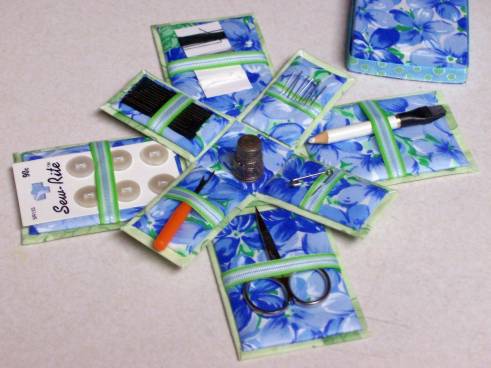
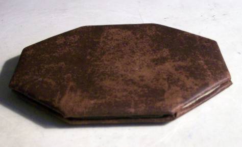
I have made octogon boxes for several years. I decided to make one for the 'Fabric' theme and show the process as well.

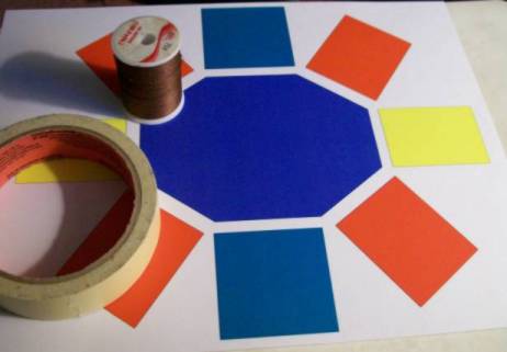
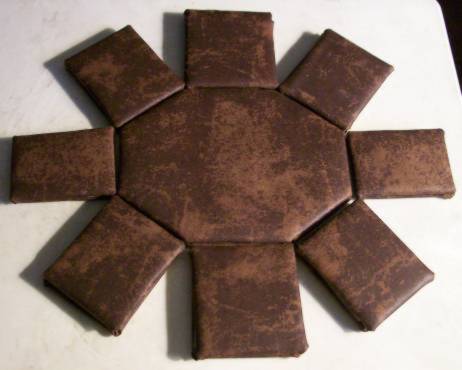
I began by creating a pattern on the computer. The key to this is that the side pieces must all be the same height and the width must match the corresponding side. Then you note on each block how many must be cut. You will cut twice as many as shown on your layout PLUS another double set of the center piece for your lid.

Other needs are thread, needle (curved would be great), and masking tape.

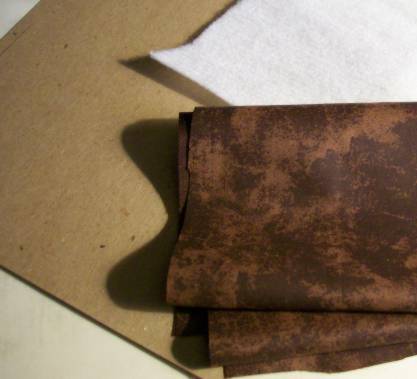
Choose your fabric (mine is a mock leather), very thin batting, and chipboard. The chipboard must be stiff enough to not bend easily but not too thick as it will make final construction difficult.

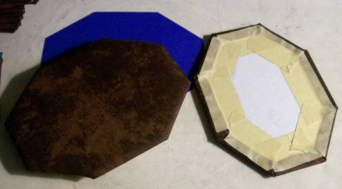
After cutting out all the pattern pieces of chipboard and batting you cut them of the fabric leaving a half inch of margin all around. You make a stack of 1) fabric face down 2) batting centered on fabric 3) chipboard on batting. Then you turn in first the corners then each side while holding down each turn with masking tape as you go. Do not pull fabric very tight as you will need it to have a bit of give for the stitching.


Lay a set of matching pieces with wrong sides together and blind-stitch all edges together.

The side pieces are stitched one by one around the perimeter using the blind stitch. Then they are folded up and the side seams are also stitched with blind-stitch.

Finally, blind-stitch one long side of the lid onto the box. Attach a bead, button or other desired fob on the front edge of the lid to allow you to open the box but not allow the lid to drop down into the box.

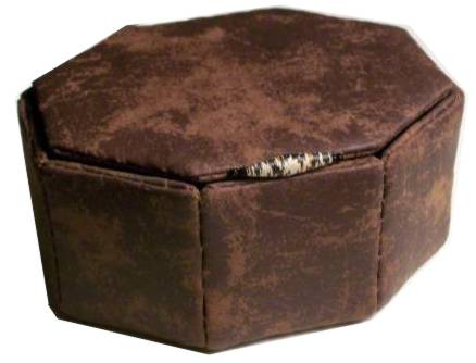
I have sometimes added buttons as feet on these boxes, but with the distressed leather look of this one decided to skip them this time.

Ddd studio3d@ccwebster.net


Posted by studio3d@ccgmail.net at 6:00 AM PDT
Wednesday, 14 May 2008
E is for Ephemera
Topic: A to Z round 6

Lots of reproduction antique text stained with Tea Dye distressing ink to unify it... torn and layered... text stickers... swirly scrapbook paper... 

...that's how to make a Father's Day card.

 Inside, another piece of antiqued paper with a 'definition' block about fathers.

Ddd studio3d@ccwebster.net


Posted by studio3d@ccgmail.net at 6:00 AM PDT
Tuesday, 13 May 2008
D is for Die Cuts
Topic: A to Z round 6

5 die cuts, actually (cardstock, background paper, scallop, purple circle, and purple square). Add in a paper doily, ribbon, a rub-on greeting and a flower brad.

Ddd studio3d@ccwebster.net


Posted by studio3d@ccgmail.net at 6:00 AM PDT
Monday, 12 May 2008
C is for Cornucopia
Topic: A to Z round 6

I made a miniature print (7 of them actually) of a coloring page and colored each with watercolor markers. A little more was cut out of the background of successive prints. These were curled at the edges and mounted together using silicone adhesive. 

In this close-up you can see the layers.

I mounted on burgundy cardstock and framed the corners with gold peel-offs.

Ddd studio3d@ccwebster.net


Posted by studio3d@ccgmail.net at 6:00 AM PDT
Sunday, 11 May 2008
B is for Beedz
Topic: A to Z round 6

Beedz are those itty-bitty glass beads without holes. I used a print of a Japanese woodcut, applied redline tape cut to the shape of the whitecaps, and then pressed the clear Beedz on. I sprinkeld ultra-fine glitter into the crevices.

Here is a closeup


Ddd studio3d@ccwebster.net


Posted by studio3d@ccgmail.net at 6:00 AM PDT

Newer | Latest | Older