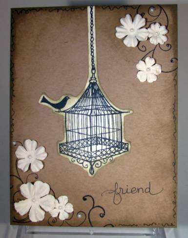
Topic: Photo
I love the view we get of Mt Hood from multiple vantage points as we drive about on our daily business. This shot was taken through the windshield of the car on the way home from shopping the other day.
Ain't she a beauty?
Ddd
« | August 2010 | » | ||||
S | M | T | W | T | F | S |
1 | 2 | 3 | 4 | 5 | 6 | 7 |
8 | 9 | 10 | 11 | 12 | 13 | 14 |
15 | 16 | 17 | 18 | 19 | 20 | 21 |
22 | 23 | 24 | 25 | 26 | 27 | 28 |
29 | 30 | 31 |
I love the view we get of Mt Hood from multiple vantage points as we drive about on our daily business. This shot was taken through the windshield of the car on the way home from shopping the other day.
Ain't she a beauty?
Ddd
The fish are back - with a new color scheme. I added the same splish-splash stickers to the background and the clear bubbles to the eyes. A different greeting for this one and a smaller base card.
I added the Stickles to the fins and tail and also to the blue parts of the body.Ddd
Stamped and colored these fish and then made them a watery background with colored pencils. I found these 'splash' stickers in my stash and added them for effect. Mounted on teal cardstock and stamped the greeting half on and half off the image panel.
Here you can see the glitter I added to the fins and tail and the 'bubble' stickers I added to the fish eyes.A little bit of summer on paper!
Ddd
An advertising brochure for travel yielded up this winsome face. How could I throw that in the trash? I had to use it in a card!
I trimmed it up with scraps from my cutting table, including the greeting strip.
While looking for embellishments I found a sticker sheet of clear 'bubbles' and used them on the eyes. Look at how this enhances the gaze from those beautiful brown eyes.
With the two previous images I used plain white cardstock for stamping but, for this one I used a scrap of actual watercolor paper that I had on hand. It makes all the difference in 'selling' the technique as watercolored art.
This was, again, stamped with Adriondack inks which were dabbed onto the stamp and misted with water.
For finishing, I just tied a sheer ribbon on the panel and layered with other colors of cardstock to carry the color scheme of the stamping.
The text at the bottom is a combination of two clear stickers.
Ddd
While I was in the mode of watercolor stamping I pulled out this image (one of my favorites) and inked it with Adriondack pads. Unfortunately, the 'sketch lines' are so close together that the misted water and ink pools into them and the whole thing stamps as blobs of color. I misted the stamp again and stamped...nope still too much. Then on the third misting I got very light color but still no definition.
Harrumph! I dried all of them with the heat gun and put them in the bin to use as backgrounds/tiles/whatever. Then it occured to me to try using them as BASE color and stamp the image in black over the top. So with the use of my stamp positioner, I aligned the image and stamped with Archival black ink. Impressions one and two still look lame but this one...
...looks heavenly!
What a perfectly colored image. I used a Nestabilities die to cut and emboss the image and selected papers to layer that picked up the image colors. The solid layer got some Cuttlebug embossing (branches) which were enhanced with distress ink. Then I used a distressing tool on the paper edges of both pink layers and inked the edges slightly.
Layered onto green cardstock, the pearl accents were added and then I hand-lettered the text.
Ddd
I picked up this stamp (on sale, of course) with the express intention of stamping it in this style. There are actually two stamps here, one is the 'sticks' at the bottom and the other is the flowers/weeds.
I tapped on ink from Adriondack stamp pads in multiple colors, sprayed with a 'mini-mister' and stamped, drying immediately with a heat gun. I re-misted and stamped twice more before re-inking and repeating. The branches were done the same way, using two tones of green ink. I made a smudge in the upper right so I covered it with a stamp of a bee and then repeated it in the lower left. The bees and the text were stamped with Archival black ink.
The bands that cross the image were made by scoring using the Scor-Pal. Then I inked them and all the edges of all the papers with "Old Paper" Distress Ink.
After adhering all the layers, I colored the bees with grey and gold watercolor markers and added Stickles to them (different color for the wings than the body).
Ddd
Remember, way back when, I shared my remodeling project (result of a broken dishwasher flood)? Well, we finally finished that up with the installation of the backsplashes in the kitchen and replacing the basement furniture with some from the living room (which in turn got replaced with Mom's gift of some she did not have room for any longer.
So here is the kitchen tile work:
A close-up of the tiles:Here is the family room with its furniture in place:
And the 'new to me' living room furniture:
We have only one more part to this remodel - installation of a 4-foot round window in the diningroom. It will replace a wall-mounted air conditioner.
Ddd
Did you really read the caption for today's entry?
When I glanced out the kitchen window the other day I thought this buck looked a little weird. It took the binoculars to realize what I was seeing was a very strange configuration of horns. His left horn appears to naturally come from just on the nside of his ear. But the right horn sticks right out from his forehead!
I got the camera and started taking picutres trying to get a good angle that would really show this well. This shot was not too bad:
This zoom is a little better:
You can see that even his regular horn has a strange crook in it. Makes you wonder if his mother dropped him on his head when he was born?
As he walked away into the brush I got a side view that really gives the unicorn effect.
Very strange!
Ddd
I suppose I could select designer papers first and then color my stamped images to match but, NO! Why start making sense now?
I stamped and colored the wheelbarrow image and cut right against the lines (called 'fussy-cutting'). Then I selected cardstocks for layering that enhanced the coloring and FINALLY went looking for a designer paper. Lucky for me, I had this blue/green print.
The corner brackets are from the scrap heap and the text is a rub-on.
Ddd
Same color disclaimer - the background is lemon yellow. SIGH!
Simple image stamped and colored with watercolor pencils. Then I used Stickles in 'ice' and 'diamond' over the image (one has yellow/gold glitters and one has purple/blue so they enhance different areas)
I used three sizes of nestabilities petite scallops on white, baby blue, and lavender cardstock. The lavender got a greeting stamp added and the embossed edge traced out with a marker. The white layer got the area below the flowers trimmed out and dots added to the scallops with a marker. The blue got the embossed scallops traced out with the marker.
I cut the right front edge of the folded card back 1/4 inch and added that width of blue band to the inside layer. The corners were rounded with a punch. Then I layered the whole thing as shown.
Ddd
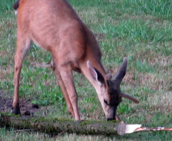
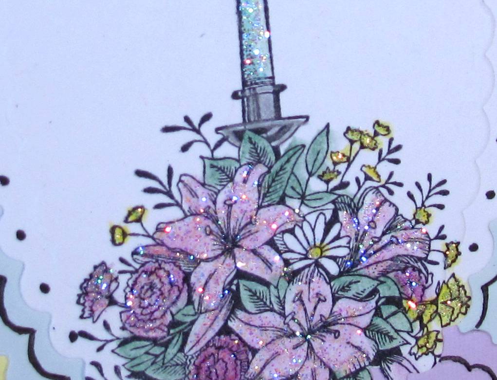
The caption refers to the CARD, not me!
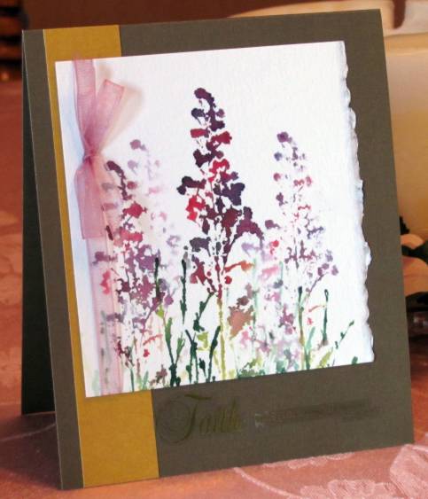
I've had this collage stamp for a L-o-o-o-n-g time (got it in a used stamp grab-bag) but it isreally not my style, so I hadn't used it before. I used watercolor pencils for the flowers and to edge the 'papers' in the image.
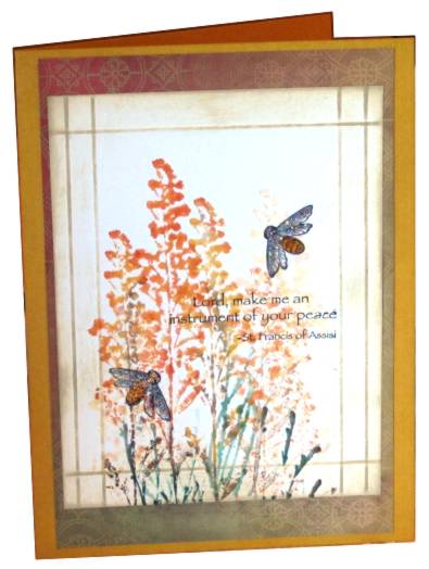
NOW WHAT? It sat in my pile of stuff for months waiting for inspiration to strike. When none did, I finally just grabbed it and started right in. I tore around the edges and then inked them in black. Then I focused on a 'postage stamp' in the upper right and suddenly had inspiration.
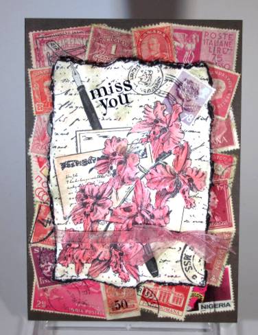
I pulled out my box of foreign postage stamps and sorted out ones with a similar color palette to the flowers. These I glued all over the brown base cardstock and then used 'old paper' distress ink to tone down all the white parts of them. I added the same to the stamped image. I cut around the upper right flower and inserted a real stamp over the image that was there (yes, the one that started the inspiration) and used a black pen to enhance the cancellation mark.
I used a rub-on to add the text and mounted the image over the postage stamp background with foam tape. The last step was to pull an organza ribbon around the front layer and tie a bow.
The colors and the distress ink give this a vintage look but, trust me, it's brand new!
Ddd
I
I'm going to categorize this one as stamping even though there is a dry embossed background. We're talking 'featured technique' here, folks.
This is another image from my marathon stamping/coloring session last month. I used watercolor pencils and an aquabrush for coloring it. A nestabilities label die provided the cutout and edge embossing which is then mounted on foam dots over a Cuttlebug embossed background. The brown is a white-core cardstock that cracked a little at the intersections so I inked over it with walnut distress ink.
The base cardstock is lemon yellow to match the flowers in the image. The other photo colors are fairly close though. I added some pre-made ribbon roses to match toe image colored ones and then a clear text sticker at the top.
Ddd
I hope you are patient with me while I try to figure out the color balance on my new camera. Outdoors it is fantastic but, with the indoor photo booth, not so much. I always end up doing a lot of 'tweaking' in the photo editor program on the computer and it is never 'exact'.
With that said...
I had two scraps laying around that just sort of fell together for this card. I had made the Cuttlebug star background a while back and then set it aside as I wanted to try an inking technique for a the project I was working on. So this one was in my 'pile' and I also ran across the gold bordered star that I had cut off of a Christmas card front a couple of years ago. The star fit perfectly on the background so I glued it right on there.
After I had assembled the card, including a vellum sticker that matched to colors and images to perfection, I though it needed a little 'punch' so I applied Stickles in 'ice' and 'diamond' to the two parts of the star. Perfect!
Ddd
Remember the field and trees images I used some time ago? Well, I had one left in my scrap pile so I pulled it out for this card. Three colors from the image are echoed in the backgrounds. I added a text strip and an oval 'memories' sticker.
Glittery raised dots enhance the layout.
NOTE: The color is washed out in this photo. They are much brighter in person.
Ddd
Ohhhh, I like this best! Of all the birdcage images I have used lately, this turned out the best.
I used two distress inks to tone the image more like the background and glued it on. To the opposing corners I stamped simple scrolls and adhered paper flowers. The flowers got self-stick pearls and the card got three more on the scrolls.
I used the distress inks to tone the edges of the kraft cardstock and then added a single line doodle around the edge. Lastly, I penned in the 'friend' text.
Ddd
Stitched on purple with irridescent lavender thread. I rounded the corners and added to yellow folded card base with rounded corners.
I added rose vine peel-offs to the cross, corners, borders and then trimmed up some punched butterflies and used peel-offs on those as well.
NOTE: The color on this image is WAY off. The actual card is Easter Egg purple rather than blue as it appears.
Ddd
This simple cross was stitched with purple metallic thread. I used a scallopped nestability to cut and impress the oval. Once I selected the background color of cardstock and chose the violets rub-ons, I realized I needed some green in the image. This I added using a distress ink pad.
I mounted the oval with foam tape and added a single green rhinestone to the center.
Ddd
Our little bird has moved house - smaller quarters!
This background is the reverse side of the printed cardstock from yesterday's card. I added a crocheted lace and a grosgrain ribbon on the left and added a sticker greeting at the top.
Again, I popped up the cage 3D on foam tape, but I did not curl this one.
Ddd
Trying some different designs to use these stamped birdcages. In this case, I cut close to the image and curled the edges slightly back to make it look three-dimensional. It is mounted to the background (printed cardstock) with foam tape.
I chose the folded cardstock to pull out the color from the background and added a round rub-on and two appropriately colored stickers.
The rub-on border at the top was added to give the birdcage something to hang on. The chain is glued flat to the background instead of raising it 3D like the cage itself.
Ddd