« August 2011 »
S M T W T F S
1 2 3 4 5 6
7 8 9 10 11 12 13
14 15 16 17 18 19 20
21 22 23 24 25 26 27
28 29 30 31
You are not logged in. Log in
Entries by Topic
All topics  «
3D paperwork
A - Z challenge 5
A - Z challenge 7
A - Z challenge round 4
A to Z challenge round 3
A to Z round 2
A to Z round 6
A-Z round 1
Around the House
Art Challenges
Artist Trading Cards
Backgrounds
Beads
Bible Journaling
Books
Boxes
Collage
Color Challenge
Coloring
cookbook
Die Cuts
Digital Projects
Digital Stamps
Drawing
Dry Embossing
Fabric Stuff
Fantastic Folds
Field Trip
Home Decor
How Does Your Garden Grow?
Hymnal Art
In The Kitchen
In the studio
Jewelry
Lettering
Links
Multi-Technique
Music to Work By
Musings
Nail Art
New Work
Online Class
Other Hobbies
Other Projects
Painting
Paper Embroidery
Paper Piecing
Photo
Pretty Paper
Quilting
Random
reading
Scrap Recovery
scrapbooking
Sewing
Sketch Challenge
Some Backlog
Stamping
Stencils
Stickers
Supplies
Teabag Folding
Techniques
Testing
tips and tricks
Tutorial
Web resources
Welcome to my Blog
Work By My Friends
workflow
Writing
Blog Tools
Edit your Blog
Build a Blog
RSS Feed
View Profile
Group One
In & Out of Studio 3D
Friday, 12 August 2011
Blurry Vision
Topic: Scrap Recovery

This started out with a vreat vision but the vision managed to get blurred along the way. I colored the image from the stamp catalog with watercolor markers (but the colors did not blend like I wanted and the green was too bright). I mounted it to the yellow background (but the imags seems to be too big for a card of this size). I decided to add some glittery Stickles to punch it up (but I started with the leaves and then the flowers looked too plain so I added to them and the centers, and then the grass and the weeds). I stood it upright to dry the Stickles (but with glue in so many places the paper started to warp).

Now I am stick with this card:

...and there is hardly anything I like about it.

So, what will I do? Into recycling with it. I am thinking I may use a square punch to punch out areas of the blooms, mount them to chipboard and then encase them in Glossy Accents to make thick embellishments. We'll see.

What will NOT happen is for it to go into the mail in its current form.

Ddd


Posted by studio3d@ccgmail.net at 6:00 AM PDT
Thursday, 11 August 2011
What I Love
Topic: Collage

I love it when a piece just falls together, everything works the first time, and it looks like it was meant to be.

And so we have this piece. I think the painting on the right was scavenged from a travel magazine, a catalog, or some junk mail - its been a while since I sent it to my parts and starts drawer. However, when I took it out to the table it fell in next to this silhouette stamped image on die ink background and the happy marriage began.

I boxed in areas with gold peel-off borders and then added a scrap of one to the awning. The whole piece was mounted to burgundy folded card as a base and, voila! Don't you just want to walk in and sit down there?

Ddd


Posted by studio3d@ccgmail.net at 6:00 AM PDT
Wednesday, 10 August 2011
Things I Don't Like
Topic: Collage

I don't like it when I have a grand idea for a card and it comes out looking like this! It looks like everything was tossed up in the air with glue already on it and stuck wherever it landed. Yuk!

This may end up in the 'recycle' bin. That is where I put things when I like elements of them but not how it came together. Occasionally I will pull elements off to use in another way or add something to unify it. You MAY see this or parts of it in another post someday.

Ddd


Posted by studio3d@ccgmail.net at 6:00 AM PDT
Tuesday, 9 August 2011
Are You My Mother?
Topic: Stamping

I was listening to a book on CD while I worked on cards and they kept mentioning a children's book with the title: "Are You My Mother?" I haven't read that one for many years but that is what I think of every time I see this card.

This is an image I received in a swap and I colored it with watercolor markers. It is hard to use color to make something look white, but I chose to go with a pale blue and color in where the shading marks appeared in the stamp.

Mouse is in standard mouse colors but I'm not sure the purple bowtie is 'regulation'! I used a purple plaid to echo that color and did a simple mounting on a card base to match the ground.

The text is a clear sticker.

Ddd


Posted by studio3d@ccgmail.net at 6:00 AM PDT
Monday, 8 August 2011
Striped Cake
Topic: Scrap Recovery

Some of the images from the stamp catalog are what I would call 'all-in-one' as they contain an image, a greeting, and a border together. If there are many more elements added to the card with them they look cluttered. I try to keep the layout very simple when using these.

I colored this with watercolor markers and then found the perfect striped paper with color to match the stamped image. The pink ribbon echoes the cake color and adds a festive note.

If I were to add anything to this it would be some yellow stars, but I don't think it needs them.

Ddd


Posted by studio3d@ccgmail.net at 6:00 AM PDT
Sunday, 7 August 2011
Earth Laughs
Topic: Stickers

Simply stickers (and ribbon and cardstock). I used the thin orange border to pull out the throat of the flower and then added the orange ribbon as a counterbalance to those. The image was slit on both sides of the stem so the ribbon could be threaded through and knotted.

The text along the side is actually a second sticker. I arranged it with only half of it extending into view so the little dotted line would border the floral image.

Ddd


Posted by studio3d@ccgmail.net at 6:00 AM PDT
Saturday, 6 August 2011
P is for Pram
Topic: Paper Embroidery

Yeah, I know it is out of order for the alphabet challenge but I already had this one pricked out when I decided to join. I used both pinks and blues for this so it can be used for either gender.

The background paper with the little diaper pins is from a page-a-day scrapbooking calendar. Does anyone USE diaper pins any more? For that matter, does anyone USE a pram any more?

I added text with whote rubons.

Ddd


Posted by studio3d@ccgmail.net at 6:00 AM PDT
Friday, 5 August 2011
Hot Dots
Topic: Scrap Recovery

I tried layering this string of chili peppers onall sorts of background but nothing worked till I came up with this stark black and white check. The peppers are from the stamp catalog and colored with watercolor markers. I added a clear text sticker to matching red cardstock and mounted it on foam dots.


It was still looking a little stark so I added black and gold dots to random squares. Oh,yeah! That's Hot!

Ddd


Posted by studio3d@ccgmail.net at 6:00 AM PDT
Thursday, 4 August 2011
Bunny Mom
Topic: Scrap Recovery

Oh, sure, there are probably rabbit out there with only two kids - but you don't see them often!

This lovely lady and her charges are dressed in their finery and ready for their photo op. I cut them from the stamp catalog and colored with watercolor markers. I gave them a printed cardstock background so they have a field of flowers to stand in and a golden sky.

The orange card base was selected to match the flowers in her dress and hair. A greeting was added in gold peel-off.

Ddd


Posted by studio3d@ccgmail.net at 6:00 AM PDT
Wednesday, 3 August 2011
Beach Scenes
Topic: Scrap Recovery

Here's a collection of cards made from calendar pages from a beach-themed page-a-day.

The first is an awesome sunset. I pulled the dark blues out with a denim print background and the gold is echoed in the simple knotted ribbon. I added gold peel-off borders and greeting. So restful.

Wouldn't you like to be on this bench? I trimmed close to rid it of some distracting elements and then extended the 'view' with the backing corcle. This uses the same denim print as the previous card. The text is a white rubon.


These flip-flops got fussy-cut and layered with some fun print and a diecut backing cardstock. Love how the scallops echo the shoes. I added raspberry backing cardstock for the color pop and then ran a clear sticker greeting across the bottom edge.This card is larger then the note-size I have been working with lately.

I think this photo is actually from a travel magazine. A simple trim and a fun background to match the chairs keeps the casual feel in this. The greeting is silver Peel-off.

Now why am I not enjoying one of these views for myself?

Ddd


Posted by studio3d@ccgmail.net at 6:00 AM PDT
Tuesday, 2 August 2011
For the Girls
Topic: Scrap Recovery

I colored up a couple of images from the stamp catalog with watercolor markers and trimmed close with a craft knife. Both got scrapbook papers as backing.

This little ballerina got a rose print to match the roses on her tutu. I gave her a band of pink floor to dance on and added white rubon text.

The ballet slippers hang on the wall on this card and sport Stickles glitter on the roses and leaves as well as shimmery pink satin Stickles on the ribbons. The test is a cardstock definition sticker with hand-drawn borders.

Gotta always be on your toes when looking for card ideas.

Ddd


Posted by studio3d@ccgmail.net at 6:00 AM PDT
Monday, 1 August 2011
Embossed Elegance
Topic: Stamping

The rose on this card was actually stamped by a friend and sent in a swap. It is embossed in a pearlized gold powder. I used markers to color in the image and do shading on it followed by coloring in the background.

After trimming the panel and rounding the corners I mounted to matching cardstock base and added a row of gold peel-off border.

The text is a large clear sticker.

Ddd


Posted by studio3d@ccgmail.net at 6:00 AM PDT
Sunday, 31 July 2011
Friendly Flowers
Topic: Paper Embroidery

These cards both started out with the stamping of the text/flowers on white cardstock. True to form, I colored them with different palettes. I had used the flower swag stitching on this stamp before ald liked it so I layered these and pricked them out together. Each was stitched in keeping with its coloring and then they were trimmed to rectangles and the corners rounded.


Then both were given complementary backing papers and mounted to a folded card base. The yellow was looking a little washed out so I trimmed the backing paper to let more of the card base show.

Since the floral is filled with text, no greeting is added to these cards.

Ddd


Posted by studio3d@ccgmail.net at 6:00 AM PDT
Saturday, 30 July 2011
Inedible Cupcakes
Topic: Paper Embroidery

When I have a paper embroidery pattern to prick out I usually layer several papers and poke through them all at once. Then I leave them taped to the pattern and pull off one at a time to stitch. Rarely to I ever stitch the same pattern twice in a row, though, but this time I just went for it.

However, I don't much enjoy repeat work so I change up the way I stitch or the color pallette. The colors are what got variety on these two cards.

First, I went traditional:

Then I went monochromatic:

Well, it started out monochromatic and then I added that blue backing!

I think the traditional one looks more feminine and more for a youhger crowd. The monochromatic looks more masculine and for an older audience.

They both use the same paper pattern for the backing (different colors obviously) and the same gold peel-off greeting.

Ddd


Posted by studio3d@ccgmail.net at 6:00 AM PDT
Friday, 29 July 2011
Just Ride
Topic: Die Cuts

Some time ago I made a skateboard element for a card using a diecut oval tag, some round punches, hole reinforcements and eyelets. I made several of these while I had the supplies out and set aside some for later use. It is now later.

For this first one I used a rubon border to decorate the center of the board and droppes it onto a plaid background. I also added a gold peel-off greeting at the top. This might be good for a younger boy.

For an older boy, I selected a more stark background and added a band of text about boys. This skateboard is popped up on foam squares and I added the silver peel-off text directly on the deck.

I like how the same element can span a wide age-difference.

Ddd


Posted by studio3d@ccgmail.net at 6:00 AM PDT
Thursday, 28 July 2011
Vellum Overlays
Topic: Stickers

So here I am with two little pads of printed vellum scriptures and sayings and also with a pile of large floral stickers. The stickers already have frames and have a watercolor look to them. I've had them for years. I decided to combine them and it turned out as a successful venture.

I cut the vellum down to 1/4 inch all around the sticker. Then I laid them face down and peeled ONE side of the sticker backing up and volded the vellum over it and creased. The backing was placed back down and on to the opposite side of the sticker. I trimmed the vellum corners and then folded in the two remaining sides. I lifted the backing once again and ran dry-adhesive over the vellum edges.

Next up was creating the card bases and selecting matching backing papers for each sticker. This is the resulting 5 cards.

The first uses a printed scrapbook paper background and a butterfly sticker accent.

Here I used an embossed background and a panel of alcohol-ink background.

The next two use a backgound I got in a swap. It is mulberry paper that has been stamped with Versamark and rubbed with Pearl-Ex to imprint the leaves. They are actually metallic-looking.


This last one is actually not a sticker, but a stamped silhouette over an inked background. But the vellum wrapping was done in the same way. I used skeleton leaves as a background element and added a band of sheer ribbon to the panel.

This is an easy technique to do and looks so elegant on the cards. I have many more of these stickers and vellum so you may see this again one fine day.

Ddd


Posted by studio3d@ccgmail.net at 6:00 AM PDT
Wednesday, 27 July 2011
Lumping
Topic: Stickers

OK, the title of this entry has nothing to do with either the theme of the cards or the supplies/techniques used to create them. WHAT?!?!?! No, it relates to a new plan for posting. I often create a multiple of cards in any one session and, posting them one per day, causes me to post up to three months in advance. I wanted to be able to show you all the work but not get too far ahead of myself. So I've decided that I will post cards together that have a similar theme, materials or techniques.

With that said, today I am posting 6 cards with an Independence Day theme. All of them use stickers and most of them use both printed scrapbook paper with a blue jeans print and a set of sticker sheets I got at the '75% off everything' store closeout.

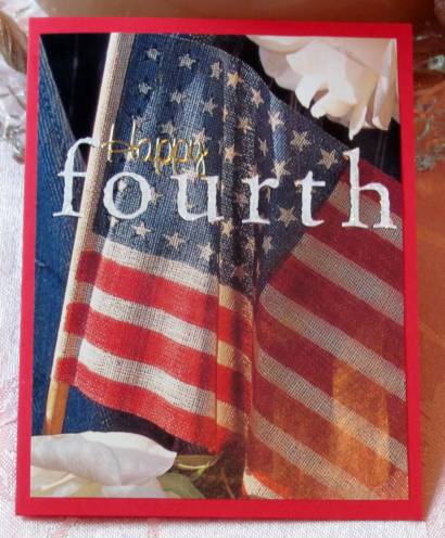
This first card is the odd one of the bunch. I used a magazine, advertisement or book illustration (can't remember for sure) that was in my parts & starts drawer. The 'fourth' text is part of the illustration but I added Stickles to it for a little shine. The 'Happy' text is a gold peel-off sticker. A simple mounting to a red folded cardstock base was all I needed to finish it.

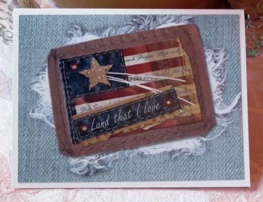
The sticker sheets I bought are cardstock stickers and the red, white, and blue are in the darker range. Since it makes them look antique I pulled out scrapbook papers with a vintage blue jeans print. Some of these had additional elements 'stitched' into the paper so I used those parts. These two used a portion with a leather patch over a frayed area. I layered labels over the patch.

To this one I also added three deep red rhinestones.

And on this one I colored in the star with Stickles.

Another of the papers has a frayed area without a patch. Some of the stickers had a stitching line around them so I placed them over the fraying to look like they were sewn on. I also added shinestones to this card.

There was no focal point on this print so I chose the area with wrinkles to give it some depth. Two layered stickers left a lot of 'white space' so I filled in with acrylic heart stickers.

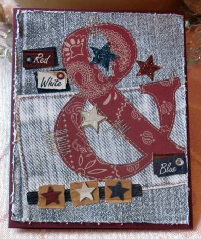
And finally, this background with the '&' patch over a denim patch. I added the 'red', 'white' and 'blue' stickers, the row of stars and the three single stars. I also added Stickles to the three central stars and used a distressing tool on the panel edges before mounting.

This is my favorite of the 6 cards.


This is also the only one that I used dark card base on. The rest are on white (OK, the first is on red, but Its a different style altogether).

Ddd


Posted by studio3d@ccgmail.net at 6:00 AM PDT
Tuesday, 26 July 2011
Log Cabin
Topic: Stamping

The 'sky' on this card is a background I made some time ago. I started with a cornflower blue and stamped first with bleach and then with darker blue. I had this piece left over and added a strip of printed scrapbook paper at the bottom as 'ground'

The log cabin is from the stamp catalog and has been colored with watercolor markers. I added the scripture stamp in the sky region, rounded the corners and added it all to pink folded card base.

Ddd


Posted by studio3d@ccgmail.net at 6:00 AM PDT
Monday, 25 July 2011
No Words to Say
Topic: 3D paperwork

Well, this is the final 3D of the diecuts I bought. I had no words to say goodbye so there is no greeting on this card.

The background is one of the Color Me papers that I blended with distress inks and stamped with a text pattern.

I chose a folded cardstock base to match the flowers and gave this a simple centered framing.

Ddd


Posted by studio3d@ccgmail.net at 6:00 AM PDT
Sunday, 24 July 2011
Blessed
Topic: 3D paperwork

This cream cardstock was run through the Cuttlebug to create an elegant background for the roses. I also rounded tow opposing corners to enhance the framing on the burgundy folded card base.

A clear sticker provides the black text word.

Ddd


Posted by studio3d@ccgmail.net at 6:00 AM PDT

Newer | Latest | Older