« October 2011 »
S M T W T F S
1
2 3 4 5 6 7 8
9 10 11 12 13 14 15
16 17 18 19 20 21 22
23 24 25 26 27 28 29
30 31
You are not logged in. Log in
Entries by Topic
All topics  «
3D paperwork
A - Z challenge 5
A - Z challenge 7
A - Z challenge round 4
A to Z challenge round 3
A to Z round 2
A to Z round 6
A-Z round 1
Around the House
Art Challenges
Artist Trading Cards
Backgrounds
Beads
Bible Journaling
Books
Boxes
Collage
Color Challenge
Coloring
cookbook
Die Cuts
Digital Projects
Digital Stamps
Drawing
Dry Embossing
Fabric Stuff
Fantastic Folds
Field Trip
Home Decor
How Does Your Garden Grow?
Hymnal Art
In The Kitchen
In the studio
Jewelry
Lettering
Links
Multi-Technique
Music to Work By
Musings
Nail Art
New Work
Online Class
Other Hobbies
Other Projects
Painting
Paper Embroidery
Paper Piecing
Photo
Pretty Paper
Quilting
Random
reading
Scrap Recovery
scrapbooking
Sewing
Sketch Challenge
Some Backlog
Stamping
Stencils
Stickers
Supplies
Teabag Folding
Techniques
Testing
tips and tricks
Tutorial
Web resources
Welcome to my Blog
Work By My Friends
workflow
Writing
Blog Tools
Edit your Blog
Build a Blog
RSS Feed
View Profile
Group One
In & Out of Studio 3D
Monday, 3 October 2011
From the Mail Bag
Topic: Scrap Recovery

Another place I like to get illustrations for using on cards is from my junk mail.

This is a portion of a full-page photo that I cut down. I layered a vellum dictionary entry over it with green flower brads and added vellum flower stickers. This is layered on a blue cardstock and a green card base:


This illustration is from a magazine and I added a string of wooden charms down the right side. I rounded the left corners of both the illustration and the card base. I punched a small hole at the upper left and threaded the string of a printed tag through it. The tag was then glued along the left edge of the photo:


This illustration is also from a magazine and I cut it to the same size as the vellum panel andlocked them together with red star brads. I made a background of wood panel print and denim print, layered the velum panel over and punched through all the layers with a star punch. The dark blue from the folded card base shows through:


From a magazine I got a large illustration of tree branches and got two panels from it. For this first one I added a square vellum panel with brass brads, layered it over a brown panel and orange folded card base. The green text is a sticker:


The other half of the picture I used a horizontal band of vellum and just turned it to the back to adhere it. I mounted over a green patterned cardstock and a yellow folded card base:


Ddd

Posted by studio3d@ccgmail.net at 6:00 AM PDT
Sunday, 2 October 2011
Off The Calendar
Topic: Scrap Recovery

I gathered up a bunch of illustrations from an old calendar to make cards for today.

I used the OWH sketch #74 for this first one. I used table scraps for the background strips and cut the illustration with a nestabilities die. The text is a clear sticker:


Most of the illustrations in this calendar are of birds. However, I did have one of squirrels that I thought was pretty cute. I cut it top and bottom with a new border punch and layered with some table scraps that had fancy cut edges. The text is a cardstock sticker:


I used a printed vellum panel over this illustration and attached it with brads right through the patterned background. The yellow text block is a cardstock sticker:


I treated this one with a velum panel as well - this one with a dictionary entry for 'happiness'. Patterned background cardstock and a cardstock text sticker finish it off:


It's a good thing I get a new calendar every year, as I really like the pictures they present.

Ddd


Posted by studio3d@ccgmail.net at 6:00 AM PDT
Saturday, 1 October 2011
Back to School
Topic: Stickers

Assignment: Make back to school cards

(Yes this is a belated posting)

I had some sets of stickers that fit the 'school' theme so that's what I started with.  This first one got a stamped background using my hand-carved crayon image. I placed two stickers on yellow cardstock and trimmed to leave a tiny border. These are popped up on foam dots. I added the word 'school' in rubon letters and cut out the word 'spirit' from a scrapbook paper. The pencil is a sticker and I turned it into an exclaimation point with the addition of a rhinestone. The yellow border all around is the folded card base:


I moved on to a set of stickers that depicts school notebooks. I framed each out in yellow cardstock. For the background I started with a navy blue card, layered a denim print paper, then ablue with script and swirls, then a strip of dictionary print card. Each of these was distressed with 'ole paper' ink before layering. I found someletter stickers with the notebook image and used these to write 'student' at the bottom. Round stickers spell out 'star' at the top and I added a star paperclip as well. This panel was mounted to a yellow card base and the three tags were popped up on foam dots:


Finally, I used OWH Sketch #75 to create this card on a blue card base with a light green panel over it. Strips of text and script papers run horizontally and a red accent strip makes the vertical. Three framed tags overlay the red strip with only the bottom one popped up on foam. The text at the upper left is from a sticker sheet:


These were sent to OWH.

Ddd


Posted by studio3d@ccgmail.net at 6:00 AM PDT
Friday, 30 September 2011
Sunburst of Scraps
Topic: Scrap Recovery

A tutorial on the OWH Stars and Stamps blog showed the layout for these sunburst cards. I made 18 of them using just table scraps, ribbons (mostly scraps) and some leftover elements from previous projects.

I first cut all the burst pieces and then divided them up into sets of papers that went together. These were glued down and then a bottom strip was selected and cut. These were glued to a base cardstock that matched or contrasted, ribbon was selected and attached with glue dots. Embellishments were added before the panel was attached to a folded card base.

The first three use silk flowers and brads over dircut circles for the embellishments:


Two use diecut 'love' over diecut circles:


Four of them use stamped hearts on foam dots:


And then there are a bunch of miscellaneous embellishments like stamped and colored images, stickers, printed images, die cuts, etc.:


And there you have it.

Ddd


Posted by studio3d@ccgmail.net at 6:00 AM PDT
Thursday, 29 September 2011
Sixty Plus Two
Topic: Books

For a ladies' retreat coming up I needed to make 60 little books for the ladies to take notes during the sessions. I've made these books before but they always used a cutout/insert of a triangle. We wanted a star on the cover because of our theme so I was going to use my new star punch (this is actually why I bought it).

I made a couple of models using different materials so I could see how the star would fit. It did NOT fit on the one made of denim print paper so I finished it up with a plain circle punch and glued a gold button in place. Then I did the front fold taller on the next sample so there would be room for the star and changed up the way the inside of the cover is finished to make it cleaner.


When I got the logistics sorted out I wrote out the steps and set up an assembly line for myself and completed the 60 books for the retreat. I cut up two large gold holographic bags from the dollar store for the inserts behind the star punch outs.


Each book has 6 sheets of paper which, when folded and stitched into the center, gives 24 writing surfaces.

Ddd


Posted by studio3d@ccgmail.net at 6:00 AM PDT
Wednesday, 28 September 2011
L is for Lamp
Topic: Paper Embroidery

On the road to creating a paper embroidery card for every letter of the alphabet, today's assignment is the letter L. For this I used a free pattern from Joke de Vette to create this beaded lamp.


The colors are SO far off on this photo, though. The background is actually orange, the upper beads and threads are gold and the lower beads and threads are silver.

If you can turn off your 'color filter' while you look at this card, I think you'll like it.

Ddd


Posted by studio3d@ccgmail.net at 6:00 AM PDT
Tuesday, 27 September 2011
Manipulating the Numbers
Topic: Supplies

In the clearance bin at my local craft store they had piles of this one stamp.


I have no number stamps so I'm thinking I can butcher this set and use the digits separately. I mean, look at the price!


When I got it home I realized why there were so many. This actually is designed to clip on to some sort of a wheel and be used as a self-inking background.


So I set to with a pair of sharp mini-scissors and cut out the individual numbers.


They were pretty close together so it took some finesse to keep from snipping a part of the border away. It helped to bend the sheet to make the numbers bulge out when cutting where they were close.

As I snipped out each number I placed them in their new storage, the inside of a CD case.


When the whole set was cut I placed a few digits at a time on an acrylic block and stamped on scratch paper. Then I circled the bits I missed cutting off with red pen.


I pulled these off the acrylic block and did some additional surgery on them to clean them up and stamped again.


Perfect! Here is the whole set which I will be able to use for birthday, anniversary and holiday cards. Ooooh, I just thought of another project for these. I've been planning to make a set of countdown blocks and these will be perfect!


I even salvaged a couple of bits of the background 'noise.


What a great lot of use I will get out of my $1.97 investment.

Ddd


Posted by studio3d@ccgmail.net at 6:00 AM PDT
Monday, 26 September 2011
Yellow, Yellow, Yellow, Red
Topic: Stamping

I acrually started this card as a scrap recovery but the focus ended up differently.

I began with a calendar picture of a field of yellow flowers and punched three times and rounded the corners. I chose a bright yellow background cardstock and lined up the punched blocks across the top. This was very bright and very stark so I pulled out a flower silhouette stamp and applied it four times across the left. I extended the stems to make them uneven.


I wanted to keep the casual feel this had so chose to stamp a greeting in a loose script.

Just to add a little interest in color I added red stickles dots to the centers of all the stamped flowers.

Ddd


Posted by studio3d@ccgmail.net at 6:00 AM PDT
Sunday, 25 September 2011
Line Up
Topic: Scrap Recovery

I pulled these little cupcakes off an old birthday card years ago and have been waiting for the right opportunity to use them. Today is the day!

On a cream folded card base I created stripes using 6 pieces of table scraps - most of which are dotted. I lined up the little cupcakes and then added a gold peeloff text greeting and butterfly.


Ddd


Posted by studio3d@ccgmail.net at 6:00 AM PDT
Saturday, 24 September 2011
In Great Shape
Topic: Die Cuts

As part of a swap of diecuts some time back I was given a butterfly cut from a folded base. It was the perfect size to make a card so that's what I did. I covered the entire surface with crumpled tissue with a rose imprint. Then I covered that with lots of scrolly gold peeloff stickers and some gold peeloff butterflies.


The back layer is slightly larger than the front leaving a border showing all around. You can't see it in the photo because of the way the card is standing, but the back layer has a gold border using a Krylon marker all around. This gives a gold border to the front when the card is closed.

Ddd


Posted by studio3d@ccgmail.net at 6:00 AM PDT
Friday, 23 September 2011
Delighted, I'm Sure
Topic: Sketch Challenge

A group I belong to challenged us with a card sketch. I made mine from table scraps and a bit of bling all in blues, purples and silver. The text is a printed vellum panel.


I used a Dazzles sticker under the butterfly.

Ddd


Posted by studio3d@ccgmail.net at 6:00 AM PDT
Thursday, 22 September 2011
OWH Sketch #72
Topic: Sketch Challenge

Time for another sketch challenge from Operation Write Home (actually completed in June). Here is the sketch we were to use:


Here are the nine cards I made from this sketch using table scraps:


Another batch ready to send to deployed soldiers.

Ddd

Posted by studio3d@ccgmail.net at 6:00 AM PDT
Wednesday, 21 September 2011
Purple and Green
Topic: Color Challenge

Challenge: Make cards using only Purple and Green

Well, I'm up for that. I pulled out a variety of supplies in the assigned colors and came up with three very different cards.

The first uses a square punch on printed medallions, background paper and two colors/widths of sheer ribbon. I used a clear sticker for the text in the center medallion.

Next up is a card made with a metallic printed vellum panel recovered from an old greeting card. I applied some floral stickers to the base paper and attached the vellum over the top, wrapping to the back to adhere. I gave it a green shimmer frame and mounted on violet cardstock. The finish was to adhere glittery floral acrylic stickers and dots to the flower centers.

Lastly, I used a large cardstock sticker and mounted it on a green frame of cardstock. I covered a green cardstock base with printed tissue paper and popped up the diamond piece on foam tape. The text panel is a cardstock sticker and two additional floral stickers were added as accents.

And that's the way you use Purple and Green.

Ddd


Posted by studio3d@ccgmail.net at 6:00 AM PDT
Tuesday, 20 September 2011
I is for Iris
Topic: Paper Embroidery

Having just made an Iris Folded iris I decided to take this in a different direction. I used a Stampin' Up image and stamped it three times on watercolor paper. I used an aquabrush on the lead of watercolor pencils to pick up the color to paint on the image, including a background for the flowers.


I stitched a border onto pebbled glittery cardstock using yellow thread, then used a scalloped Nestabilities die to punch out an oval in the center. The colored image was mounted behind this.

The framed image was adhered to a yellow folded card base.

Well, I liked this treatment so much that I repeated it three more times! The rest use shimmer paper instead of pebbled/glittery. Here is one using green paper, yellow thread, and a purple folded card base:


For this one I changed to Rust cardstock (because of the coloring of the iris) and golden yellow thread. I added an orange patterned cardstock border and mounted on a green cardstock base:


For this last one I had stamped the flowers in a different arrangement which was too wide for the oval aperture. So I gave it a different stitched border and a different cut-out shape. Layers of green and purple make up the framing.


None of these cards are getting greetings as they can then be sent for any occasion - including the 'stitch through the alphabet' swap.

Ddd


Posted by studio3d@ccgmail.net at 6:00 AM PDT
Updated: Tuesday, 20 September 2011 3:38 PM PDT
Monday, 19 September 2011
Play On Words
Topic: Paper Embroidery

Assignment: Make a card combining Paper Embroidery with Iris Folding

I made my own iris folding pattern for an iris several years ago and pulled it out for this card. I used a pebbled glittery cardstock for the main panel and completed the flower in folded tissue before pricking out the border. This border is actually bits and pieces from a template I got in a swap. I usedgreen threads on the top to echo the stem and leaves and used yellow on the bottom to echo the top of the iris.


I rounded the corners of the main panel as well as a dark purple shimmery paper as a backing. This is mounted onto a light purple folded card base. Both the purple layers match those in the flower.

Ddd


Posted by studio3d@ccgmail.net at 6:00 AM PDT
Sunday, 18 September 2011
Paper Pin
Topic: Fantastic Folds

Sometimes an idea just pops in my head and I have to go try it right away. Such is the case with today's project.

Question to myself: I see everyone making those cool pleated rosette flowers. I wonder if it would work to cut a strip of cardstock and punch it with edge trimmer, pleat on the bumps and valleys.

Answer: Yes it does work to some extent. The issue is really the 'spread' of the design in the border punch. The one I had at hand folded at just under 1/2 inch making for a very tall bloom.

Solution: Find another use for it instead of a card. So I added a rhinestone on a stem to the center, mounted the pleated flower on a big glue dot. To this was added three gold paper leaves (left over from cake decorating days), and two strips of ribbon. I backed this with another glue dot and backed it with a punched circle. Another punched circle got slots cut into it and a pin back fed through. Then glue dots hold whis circle to the rest of the pin.

Here is the result:

Cute, eh? But being paper it won't be durable. I wore it once and it looks nice, though. If I were to do another I might leave off the pin back and use it to decorate a gift box as a permanent 'bow'.

Ddd


Posted by studio3d@ccgmail.net at 6:00 AM PDT
Saturday, 17 September 2011
E is for Egg
Topic: Paper Embroidery

As we continue down the Alphabetical Stitching challenge, I chose to do E is for Egg. I colored the Color Me paper forst with distress ink and stamped the text background on it. Then I pricked out the design (I left off some other foreground flowers inside the egg. After stitching I used Copic markers to color inside (yellow) and outside (grey) the egg.

I had the plaid printed cardstock on hand and mounted it over yellow folded card for the base. Then the main image is raised up on foam squares over that.

I had set aside the recently stitched koi to serve as F is for Fish so the next one up in this challenge will be G.

Ddd


Posted by studio3d@ccgmail.net at 12:01 AM PDT
Updated: Monday, 30 May 2011 3:06 PM PDT
Friday, 16 September 2011
VBS Artwork
Topic: Other Projects

This is a wide-ranging group of projects. I spent some days making artwork for Vacation Bible School (back in June) and thought I'd gather all of them together to show today.

We had a 'Gold Rush' theme so I was asked to pain some animals for the sets. The project managers enlarged outlines with a projector and drew them out on butcher paper. Then I painted them with tempera paints.

Here is one of a pair of howling coyotes that stand about 6 feet tall:


Then I painted a huge grizzly bear:


This was followed by a horse (almost life size):


I did some shading of already painted rocks:


On a huge collapsible wall in one building they put up butcher paper for a mural. I was asked to add some miners around a campfire - these I had to draw as well as paint:


I also painted up a couple of fish and added them to their stream:


My next project was to letter some advertising banners to go in the lawn. These vinyl banners come with the picture graphics and the top caption. I did all the informational lettering and the signpost at the bottom with magic markers. I made two of these:


And finally, I made 11 posters for the Kickoff Festival games and for the daily registrations. These I did freehand with large magic markers and copic markers:


And that's it...

Ddd 


Posted by studio3d@ccgmail.net at 6:00 AM PDT
Thursday, 15 September 2011
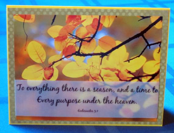
One Thing Leads to Another
Topic: Sketch Challenge

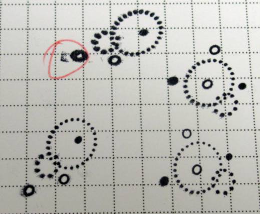
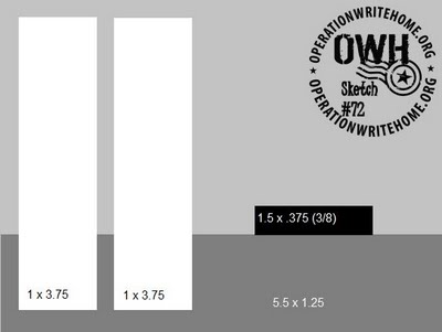
Very late in posting these cards for the Operation Write Home Stars and Stamps Sketch Challenge #70. Here is the sketch they provided:

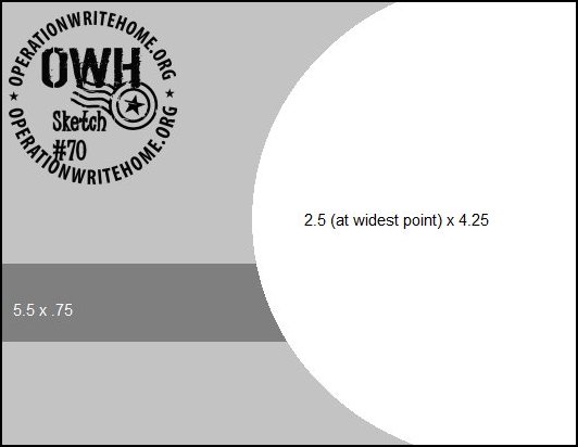
As soon as I saw this a bunch of ideas just popped into my head and when I woke up the next morning I had dreamed up even more. I hurried to write down all my ideas and off to the studio I went to implement a few. As it turned out I ended up making all of them and even made a couple of them twice. I finished 15 cards from this sketch in one session.

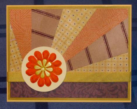
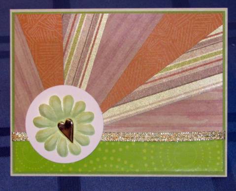
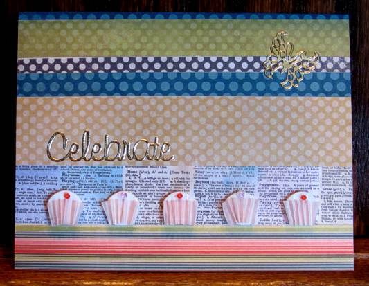
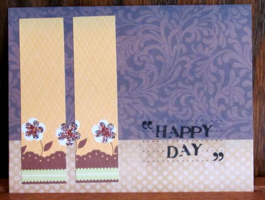
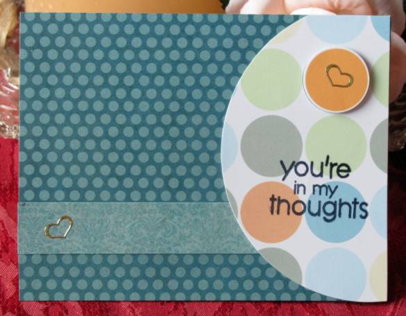
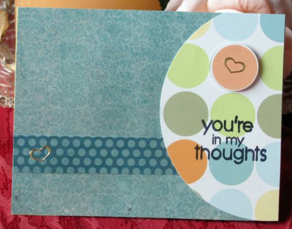
The first set is very standard interpretation using printed cardstock with big dots for the circle element. I used a punch and removed one of the dots and popped it up on foam tape for dimension. This got a couple of gold peel-off hearts, too. This is one that I liked so much I made another just like it except the main paper and accent strip are reversed.


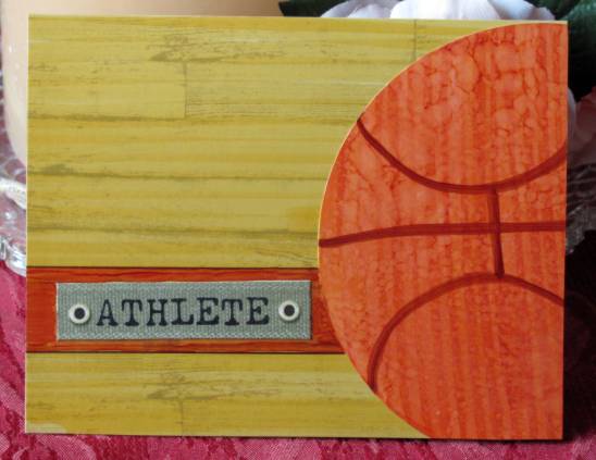
I then went on a sports kick. First I made a hand-drawn basketball and colored it with copic markers. The flooring in the background was grey wood-grain cardstock that I colored with copics and I hand-drew the accent stripe and added a sticker for the text.

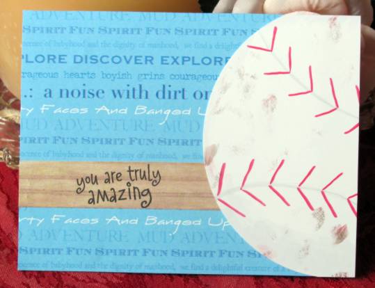
The baseball came next with details drawn with copics. I got some smudges on it with my fingers so I just added lots more smudges to make it a well-loved ball. I used printed scrapbook papers for the background and accent strip and stamped the greeting.

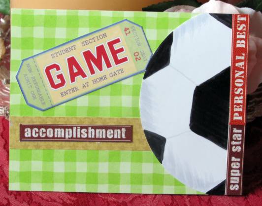
The third sports ball is for soccer. I didn't make it wide enough to fit the sketch exactly so I offset from the right edge and added some inspirational sports stickers. I used another one on the accent strip and then pulled a sticker 'ticket' from the same set as an additional focal.

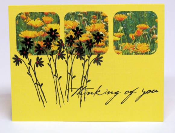
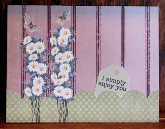
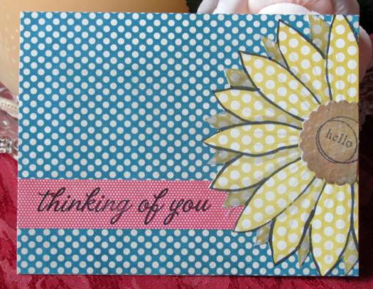
The first idea I had, but not the first executed, was this daisy. I sketched onto yellow dotted cardstock and used copics to add shading. The scalloped center piece was table scraps that I popped up on foam. I chose two other papers from the same set with different colors and different dot sized. The greeting on the accent strip is stamped.

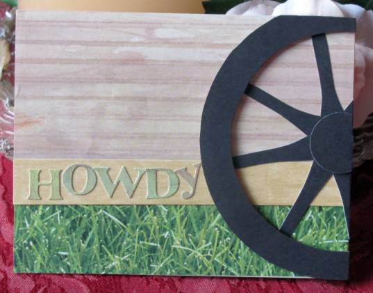
I love it when the vision becomes reality and looks exactly like what I had in my head. I was so glad to find these woodgrain papers in a new pack I had just bought. They made the perfect background to represent the covered wagon. The wheel is two layers - the hub and the rim are popped up on foam. The greeting is letter stickers. Loved finding the grass print in my scrap drawer!

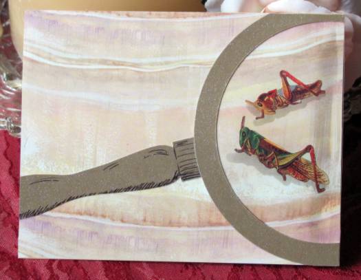
This background paper is from the same new paper pack and really looks like stone. I put the bug stickers on it and made shadows for them with copic markers. Then I cut an acetate circle and a metallic rim and handle. Details are drawn with Sharpie marker. When adhering the finished panel to the base cardstock I used foam under the magnifying glass and regular glue under the rest. This makes the lens bulge out.

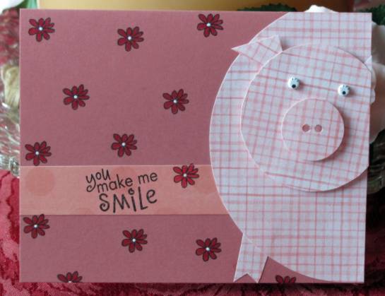
I cut circles in three sizes for these pig cards. The snout is punched with a 1/8 inch hand punch and the ears and feet are cut freehand. Eyes are white brads with Sharpie marker details. The snout and the head are popped up on foam. I stamped flowers all over the background and colored them with watercolor markers. The flower centers were dotted with a white gel pen. This was another design that I liked so much I made another the same - with different papers.


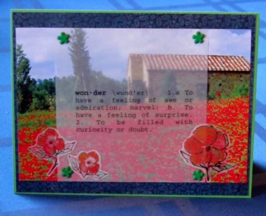
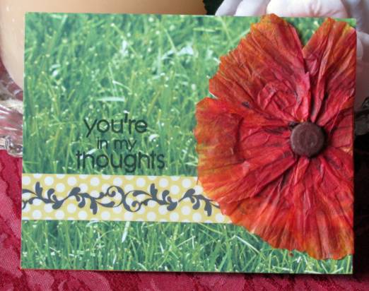
I had been wanting to try out making a poppy with coffee filters and then when this sketch was presented it seemed like the ideal time to do it. I placed a button in the center of the filter and wrapped tightly with thread and tied it off. Then I twisted the paper to give it the crinkly look and crinkle-cut the edges to fit the prescribed circle. I cut wedges toward the center and rounded the outside edges. Then I colored all the petals with three copic markers. I used a brown copic for the center and to add some veins in the petals. This was mounted on a backing circle and then onto the grassy paper. The accent strip has a rub-on scroll and the greeting is stamped.

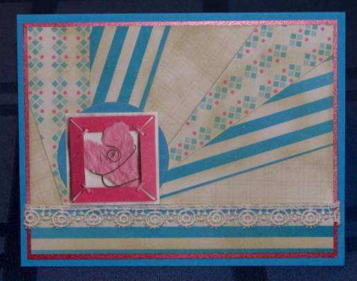
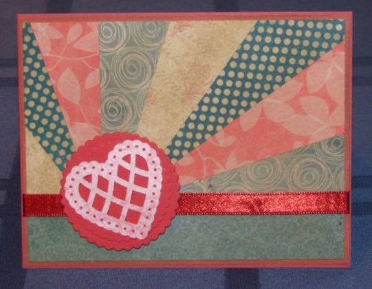
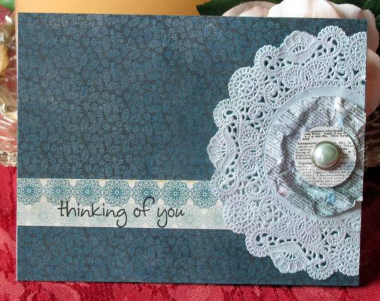
The idea for the paper doilies was to use them like a stencil to create a background. But it wasn't working for me so I set the project aside. When I went back later I realized the doily itself with the ink on it was looking pretty cool so I decided to use it on the card. The center is a couple of pieces of tex-printed scrapbook paper that I wrinkle-distressed and popped up on foam. I used a pearl-centered brad to hold all the layers together. The background paper and accent strip are printed cardstock. Text is stamped.

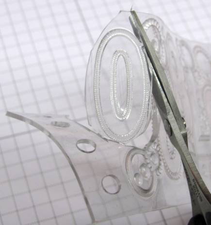
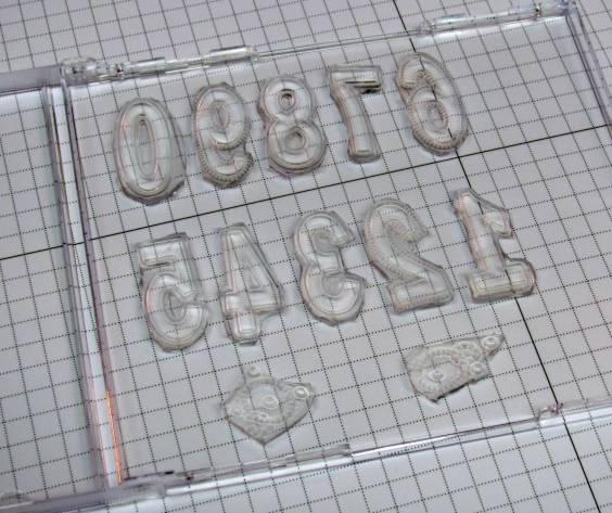
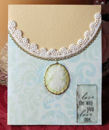
The rest of the samples turn the sketch on the side. For this one I rotated the circle element to the top and, instead of adding the circle I subtracted it. I used the circle cutter to cut out the top area and mounted the patterned paper over 'flesh' toned cardstock. Then I used lace to add trim to the neckline and used gold peel-off to create a chain. The cameo is a sticker which I burnished from the back to make it rounded in the center. Then I adhered it with foam tape, added a gold bezel and drew in a drop-shadow with copics. The text is a thick acrylic clear sticker.

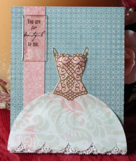
And this one is rotated 180 degrees from the last one. I used the circle element on patterned paper, scalloped the straight edge and adhered lace underneath with glue dots. the bottom of the skirt is attached to the card with foam tape but the top of the skirt is sliced so it will lay flat to the backing with regular glue. I drew in some pleating with copic markers. I had a gold peel-off sticker 'bodice' that I placed on printed pink matching the accent strip. Tehn I cut close around it and adhered over the top of the skirt. The text is a thick acrylic clear sticker.

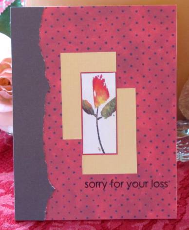
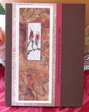
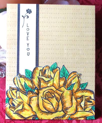
And, finally, I made a bouquet of roses by stamping my hand-carved blooms, using a lot of masking. The outer leaves are hand-drawn and the whole thing is colored with watercolor markers. I layered with simple strips for accent and stamped the text.

And that's it. 15 cards from one sketch.

Ddd


Posted by studio3d@ccgmail.net at 6:00 AM PDT
Wednesday, 14 September 2011
Sticker Shock
Topic: Stickers

I decided to try using up the last of the floral panel stickers I started with a while back. So I sat down and selected a main backing color for each, a card base, and sometimes another piece that 'goes with'. This is what I came up with, making additions to each one as it was created.

First, I went very simple, using a torn edge on the left over the dotted paper. Then I found two yellow scraps and layered them to frame out the sticker. The text was stamped after the sticker was adhered to the card front.

The next just uses a lot of varied layers to create a rather elegant card. I stamped along the edge of the red panel as a finishing touch because it was a little too plain.

Another one created with very simple layers. On this one I used a piercing tool to poke holes along the sides of the brown panel to add some interest. The sentiment was selected because it fit in the space!

When I got to this layering it needed a little 'zing' so I added a scallop on the left side. By shifting the panels to the right then the left it creates a balance but is not semetrical. This, also, was stamped with the text after the card was complete.

After laying out the layers for this one they looked too stark so I used a distressing tool to rough up the edges. Then they showed too much white so I inked the rough edges to tone them down. The vertical stamp was added at the last, after completion.

I chose to tear the edges of the mounting panel on this one to soften it up a bit. I cut slits around the stem and threaded sheer ribbon to tie in a bow. The violet panel was cut with the scallop punch and the torn panel is popped up over it on foam tape. I used glue dots to adhere a metal tag that reads 'dream'.

For this card I chose a background cardstock with tiny tone-on-tone stars then ran it through the Cuttlebug with the Stars embossing folder. A printed text panel frames out the floral sticker and these are raised up on foam.

Finally, I had a printed piece from a cheesy card 'kit' and used one panel as a backing. That panel includes only the violet on the left with the white 'happy birthday' greeting and the dotted side on the right. I adhered the butterfly sticker and then added the stem and leaves with green marker. The bloom is a silk flower, folded in half, and held in place with glue dots. I used glue dots to adhere it to the card as well as to attach the flower rhinestone to the fold. A sheer ribbon, tied in a knot, defines the line between the two sections of the cardstock. I rounded two opposing corners on the printed panel as well as the base cardstock.

How's that for variety? Now with all these floral sticker panels used up, I'll have to move on to something else for a while.

Ddd


Posted by studio3d@ccgmail.net at 6:00 AM PDT

Newer | Latest | Older