« November 2011 »
S M T W T F S
1 2 3 4 5
6 7 8 9 10 11 12
13 14 15 16 17 18 19
20 21 22 23 24 25 26
27 28 29 30
You are not logged in. Log in
Entries by Topic
All topics  «
3D paperwork
A - Z challenge 5
A - Z challenge 7
A - Z challenge round 4
A to Z challenge round 3
A to Z round 2
A to Z round 6
A-Z round 1
Around the House
Art Challenges
Artist Trading Cards
Backgrounds
Beads
Bible Journaling
Books
Boxes
Collage
Color Challenge
Coloring
cookbook
Die Cuts
Digital Projects
Digital Stamps
Drawing
Dry Embossing
Fabric Stuff
Fantastic Folds
Field Trip
Home Decor
How Does Your Garden Grow?
Hymnal Art
In The Kitchen
In the studio
Jewelry
Lettering
Links
Multi-Technique
Music to Work By
Musings
Nail Art
New Work
Online Class
Other Hobbies
Other Projects
Painting
Paper Embroidery
Paper Piecing
Photo
Pretty Paper
Quilting
Random
reading
Scrap Recovery
scrapbooking
Sewing
Sketch Challenge
Some Backlog
Stamping
Stencils
Stickers
Supplies
Teabag Folding
Techniques
Testing
tips and tricks
Tutorial
Web resources
Welcome to my Blog
Work By My Friends
workflow
Writing
Blog Tools
Edit your Blog
Build a Blog
RSS Feed
View Profile
Group One
In & Out of Studio 3D
Tuesday, 1 November 2011
Life is Just a Jar of Cherries
Topic: Stamping

Assignment: make cards using rubber stamping on the theme "Fairs and Carnivals"

My most memorable association with the fair was winning a blue ribbon for canned cherries over 30 years ago. So I decided to recreate the event. I used alcohol inks on acetate to tint it reddish-pink. I cur a jar-shaped aperture in white cardstock and mounted the tinted acetate on the back. I used pink cardstock ans stamped solid cherries in 5 shades all over it. Then I stamped in black some cherry outlines. This was mounted behind the acetate and, voila! - canned cherries!


I cut a strip of gold cardstock for the lid and used the scor-pal to create screw-top ridges. The label is stamped before adhering and I used fabric and a punched metallic blue cardstock to create a blue ribbon. The whole piece is mounted to a raspberry folded cardstock base.

Ddd


Posted by studio3d@ccgmail.net at 6:00 AM PDT
Monday, 31 October 2011
Sea Life in Stitches
Topic: Paper Embroidery

This was for a card swap with the assigned theme "sea life". This pattern was originally a 'string art' pattern that I found on the net and converted to paper embroidery. The stitching is just so simple and it looks elegant when done. I used verigated thread (pink, white, blue).


I brought in some coordinating scraps of paper and a couple of thick acrylic stickers.

Ddd


Posted by studio3d@ccgmail.net at 6:00 AM PDT
Sunday, 30 October 2011
L is for Love Birds
Topic: Paper Embroidery

HA! I snitched the L is for Lantern card to send in a swap that required beading so I had to make another L card. I decided NOT to do the same one again and actually combined one whole pattern and part of another pattern to create this:


The heart is created by the method of stitching a circle and it requires two full rounds of stitching to do it. Love the way it works up. I took the birds from another pattern and stitched them last so their white threads would be the top layer of the design.

Heart stickers trim up the four rounded corners.

Ddd


Posted by studio3d@ccgmail.net at 6:00 AM PDT
Saturday, 29 October 2011
S is for Sea and Sails Under the Starry Sky
Topic: Paper Embroidery

I chose a cheery two-toned blue stripe to stitch a sailboat because, to me, it 'read' sky and water. I chose to do all the stitching in white for a fresh look that would be a natural for the sails and the waves. This pattern does not include the outline stitching but it really needed it to define the stitching away from the background.


I wanted to retain a masculine feel on this card so selected a distressed woodgrain backing. Then, even though I used a scallop punch on the bottom to mimic the waves, I used a strip of distressed text as a border that keeps it from looking 'girly'.

I punched some stars using the wood grain and leftovers of the text strip to add some interest to the sky.

Ddd


Posted by studio3d@ccgmail.net at 6:00 AM PDT
Friday, 28 October 2011
Feeling Left Out
Topic: Scrap Recovery

I have one more Christmas card from my marathon that did not fit any of the other categories. So here it comes on its own.

I used a recycled card illustration, a gold background on whick I had tested out a corner punch, and a punched circle from when I needed an aperture in something else. The illustration and gold panel are popped up on foam dots over a printed paper from last year's 6x6 pad. I stamped the round greeting on the blue dot and then brushed with distress ink to tone down the brightness of the blue. I added tails of grosgrain ribbon and used glue dots to affix it to the card front.

The background on the illustration is really very yellow instead of the orange it appears to be.

Ddd


Posted by studio3d@ccgmail.net at 6:00 AM PDT
Thursday, 27 October 2011
OWH Sketch #79 with Stamps
Topic: Sketch Challenge

OK, I admit it. Only ONE of these cards really has a stamped image. The rest are from a book of 'clip art' designed to be used for folk art painted plaques. NOT my thing - so I appropriated the images I liked and colored them with Copic markers for these cards.

For this first one I used the sketch rotated 180 degrees. I selected all the papers first and colored the image to match them. After gluing the strips and image I had a bunch of open space on the left so I added two gold foil stars. I drew in strings and bows to mimic the image and added a greeting with the same style of lettering. Then I added pen 'stitching' around the border and cross-stitch pen work on the strips. This was done with a Sharpie. The image is muted with distress ink:

I cut the strips with banner ends and added pen stitching around them as well as the stars for a country feel on this card. The muted tones make this feel quite masculine:

With a rotated orientation and angle-cut strips, this card is more playful. I added stars, drew around them in a style to match the illustration and added strings and bows with a pen. I used distress ink on the image to mute the tone:

This snow family is colored in non-traditional colors to match the paper strips. I flipped the sketch 180 degrees and used a longer illustration than the formula calls for. The greeting is stamped:

The same illustration with a different color scheme creates a more masculine card. The brown and cream snowflake strips are certainly non-traditional. Because the base card is so dark, I placed the clear oval greeting sticker on a lighter printed paper and trimmed it out before gluing it to the card:

THIS card is actually stamped. But NOT by me! I got it in a stamped image swap. I did color it, though. I used a lot of blue in the snow, bits of green to bring out the color of the base card, and strips of pinecone printed paper for the strips. There was not a logical place to stamp a greeting so I layered a punched star and a clear sticker to create the text feature in the upper left:


Does this mean I am ready for Christmas? NO! It just means I have my box ready to mail to Operation Write Home. I have yet to start making my OWN cards.

Ddd


Posted by studio3d@ccgmail.net at 6:00 AM PDT
Wednesday, 26 October 2011
OWH Sketch #79 with Scraps
Topic: Scrap Recovery

Time for another Operation Write Home Stars and Stamps sketch (#79)

Since I also needed to fill 1/2 of my box of cards with holidays I made all of my sketch into Christmas cards. Today I will show those made with recovered materials. Tomorrow will be those made with stamps.

First up is an illustration from an old page-a-day scrapbooking calendar. This time the sketch was flipped 180 degrees to put the three stripes on the right. I used strips from an old paper pack and stamped the greeting on the illustration with its flourish falling on the base cardstock:

For this card I went a little funky and arranged the strips and the illustration off-kilter. The picture is recovered from a card received last year. I used the same stamped greeting:

This card is also illustrated by means of a recycled Christmas card. The 'merry' is a puffy acrylic sticker. 'Christmas' is a clear sticker:

I did a very tight trim on this recycled Christmas card image so it would fit the sketch. By mounting the image high I had room to stamp a larger greeting. I like the way the flourishes escape the edges of the card borders:

Another recycled card image - trimmed close to rid it of background. I cut the bottoms of the metallic strips to resemble a banner, for some added interest. A little dimension is achieved by popping the image up on foam tape. The same stamped greeting was used:

I rotated the sketch for the rest of my card set. The strips on this one are the last of piece of cardstock I stamped two years ago. It seems I get one or two of these same Santa images on Christmas cards every year. That's OK - I kinda like the folk art look of him. I stamped the greeting on the lower right:

This Santa face is from the page-a-day scrapbook calendar. I left the printed borders at the top and bottom for framing. The beard provided a handy spot for stamping the greeting:

The gold in this recycled card image looks so formal that I just continued down that path. I even chose black cardstock for the card base. The strips are gold on gold text and I created those banner ends again. The image is raised up on foam tape and the greeting is a puffy acrylic sticker:

This gold pinecone image from an old greeting card was paired with silver and white strips sor a fresh look. It looked so clean and simple that I did not want to mar it with stamping so I selected a clear sticker for the text:

More sketch cards tomorrow - using stamped images.

Ddd


Posted by studio3d@ccgmail.net at 6:00 AM PDT
Tuesday, 25 October 2011
Trim the Tree
Topic: Dry Embossing

In a swap of dry embossed papers I was sent 4 lovely Christmas trees. I decided it was time to use them and liked the first layout so much that I copied it for all the rest. I pulled out printed paper scraps from last year's 6 x 6 pads and used them to create a border on the left. Then I used the open scallop border punch doen the left edge of the tree, glued it on and trimmed the tree.

For this first one I used sticky-back clear rhinestones in a symetrical layout.

Theother green tree was decorated with sticky-back green pearls in various sized in an informal arrangement.

Two of the trees were on a bluish metallic finished cardstock with a linen texture. Very elegant. For the first, I trimmed the tree with red acrylic heart stickers.

Finally, I trimmed up the fourth tree with borders and sticker waste from gold peel-offs.

This is one of those embossing folders that I would like to have for myself. I've been relying on the generosity of others since it first came out!

Ddd


Posted by studio3d@ccgmail.net at 6:00 AM PDT
Monday, 24 October 2011
The End of Verve
Topic: Techniques

The last sketch is shown today:

I did the first one on end because this Santa image was so very tall. Since the wreath was colored green I added green Stickles on it and added red Stickles berries. Green marker was carried over to the dots in the b/w block. The text is a clear sticker:

Lots of vellum stickers of holly create a frame on this card. I added some fine doodle lines in red, green and black. A thick acrylic sticker provides text and I added red Stickles to all the berries:

The penguin is back! He, like his brothers, has Stickles snow underfoot and on the dots on the b/w block. The text is a rub-on phrase:

This one looks totally different through the use of overlapping kitchen stickers. The text is provided from the same sticker sheet. I ran the stickers off the side edges to intensify the scene-setting:

The red heart on this card is a stamped and colored image. I trimmed it close, added a black peel-off sticker with red Stickles inside. A clear text sticker graces the red block and a few additional black peel-offs finish it off:

And finally, I used a lot of gold peel-offs on this card. The two hearts have red thick heart stickers in the center, surrounded by gold Stickles. Thin red doodle lines frame the card:

And that's the end of the project.

Ddd


Posted by studio3d@ccgmail.net at 6:00 AM PDT
Sunday, 23 October 2011
Split Strip Verve
Topic: Techniques

Here we are with the third sketch from the Verve cut-up series:

For the ones with the red center block (3) I used up some of the adorable penguin stickers I got at the dollar store. They got lines of Stickles for snowy ground and I decorated with thick acrylic stickers:


I upended this one with the b/w center block and used another of the stamped elegant ladies. I, again, added the yellow bustle but this time only added Stickles to the yellow. I used a square clear acrylic sticker on the upper right and added two rhinestones to the b/w block:

Purple is the added color on this card - used for both the b/w block and the lady's scarf. I used red Stickles on her draped neckline and one red rhinestone on her corsage. A white glossy sticker provides the text:

Back to the original rotation we have a sharp red dress with red Stickles on the neck, straps, and hem popped up on foam tape. a thick acrylic sticker rests on the top edge of the left red block, gold peel-off borders frame on the left and right sides and two black flower stickers add the final touch with their red rhinestone centers:

The Christmas sticker on this card is so large it almost covers the center b/w block. I added a gold peel-off image of three candles and colored them in with various Stickles. Gold peel-off corners adorn top and bottom. I split some long clear text stickers to apply top and bottom:

Last set will be shown tomorrow.

Ddd


Posted by studio3d@ccgmail.net at 6:00 AM PDT
Saturday, 22 October 2011
Verve Twist
Topic: Techniques

Continuing the sketches started yesterday here is one I call 'with a twist'.

Starting with those that have the black/white block on point. For this I used another Santa image and made him walking into the card. A clear sticker for text and some yellow Stickles on the star he is holding are the finishing touches:

A gold peel-off rose sticker is the feature on this card. I filled in the blooms with red Stickles and the leaves with green. A long clear text sticker was cut in half to mount over and under the twisted panel:

A lovely lady image was colored up  on this card. I added yellow Stickles on her bustle and red Stickles on the draped neckline. A thick acrylic sticker is used for the text:

Not sure I like this one. I used a circle sticker element and added a thick acrylic round sticker on top. I added a black thick sticker to the red panel and trimmed all four edges of the card with gold peel-offs. Gold Stickles trim out the round sticker:

Then on to the red twisted blocks. I used more of the gold peel-off roses for this card. They also got red and green Stickles in the open areas. another gold peel-off was used for the text. I added some doodle lines in red around the black panel:

Next up is a few vellum heart stickers. I decorated the heart with red and crystal Stickles, added some red doodle lines and added gold peel-offs for text and as borders around the red block:

And finally, I turned this one on end, added some yellow to the black/white block to make it go with the lady's scarf. The scarf got some yellow Stickles and there is a rhinestone on her corsage. The image is bordered in black and the text is added with a white glossy sticker:

More tomorrow.

Ddd


Posted by studio3d@ccgmail.net at 6:00 AM PDT
Friday, 21 October 2011
Verve Oldies
Topic: Techniques

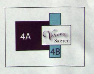
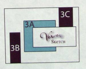
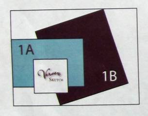
Back in September 2008 the people at www.vervestamp.com put up a challenge. They gave a cutting sketch along with four card layouts to make from the resulting paper snips. Here is the page they issued:


One does the same cuttings with two patterned papers, arranges the snips according to the sketches and adds (according to them) a stamped image block to finish it off. Working with two papers in the 6 x 6 papers they specify you would have 8 cards when done, as the blocks are reversed on the second card made from each sketch.

Well, at that time (yes, September 2008) I used 12 x 12 papers to make four 6 x 6 sheets of each color (I used red and black/white). Since I had four times the papers I ended up with supplies to make 32 cards. . . . I made 5 then got bored with it and put the rest of the supplies away. I just ran across them again and decided to do a marathon session to finish them all off.

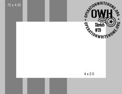
This is the first of the sketches I used:

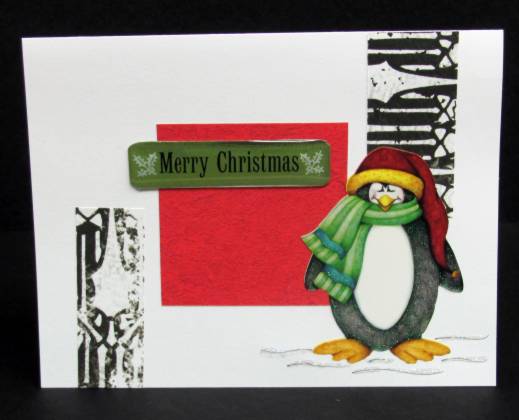
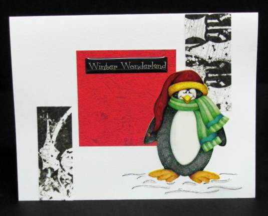
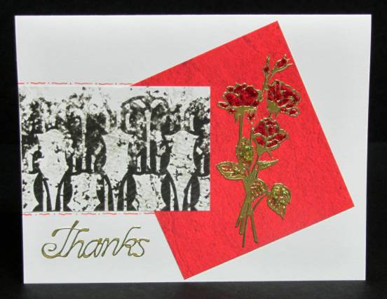
Throughout this whole project I used white folded card bases and attached all the red and the black/white pieces. Then I set about looking for stamped images and/or stickers that I could color red with watercolor markers to decorate the cards.

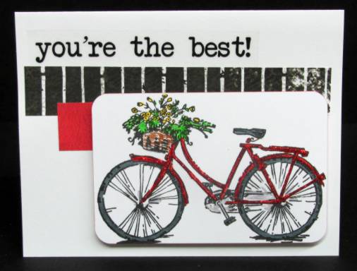
For this one I used a bicycle image on white cardstock. I colored the backet and flowers with green/brown/yellow to add another pop of color to the card. I rounded the corners and ran a red marker around the edge of the image and popped it up on foam tape. Then I added red Stickles to the bicycle. The text is a clear sticker:


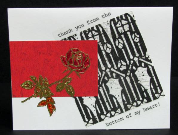
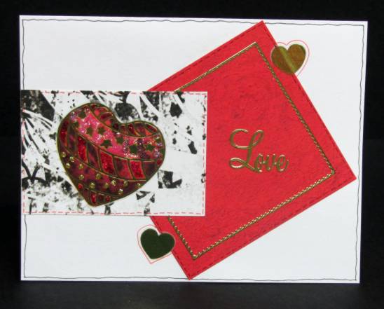
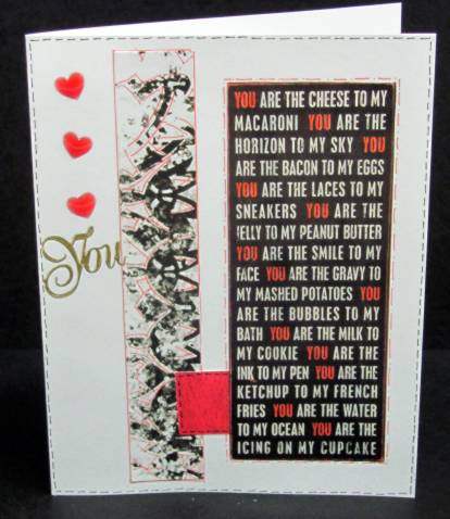
For this one I used a black/white text image from a catalog. I added red marker to the word 'you' throughout the text. Fine-line markers were used to doodle lines throughout the card and I placed three red acrylic heart stickers on the left border. A gold peel-off word 'you' sets the tone for the card:

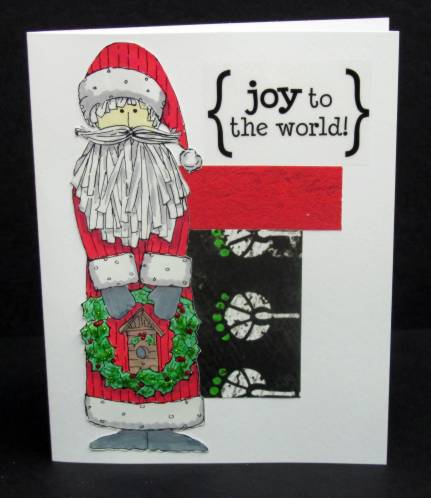
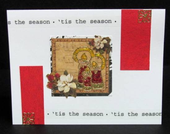
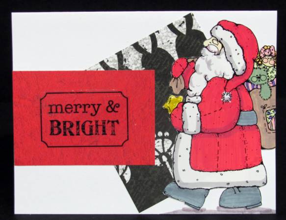
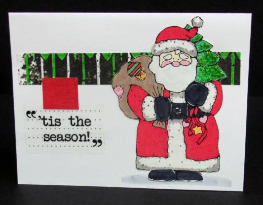
Next up is this Santa image. I colored some of the white areas of the b/w border with green to match the Christmas tree. I added green Stickles to the tree and a clear sticker for text:

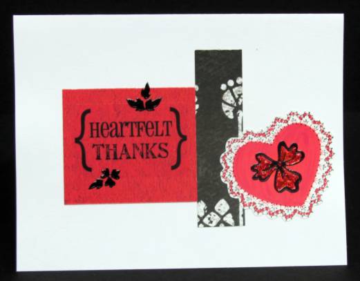
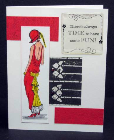
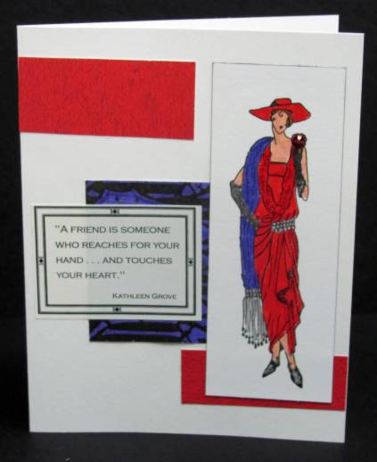
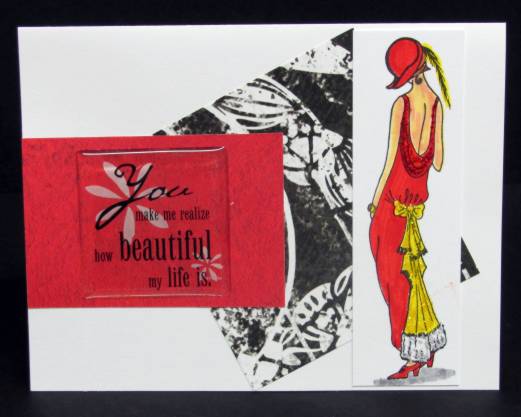
This stamped image was colored in red and grey and red Stickles line the stripes on her jacket. I colored the edge of the image with red marker to separate it from the background card. Two clear stickers were combined for the text and a rub-on heart plus a red rhinestone decorate the small red block:

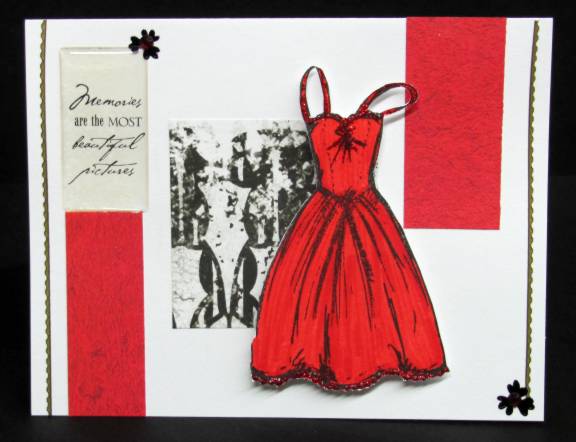
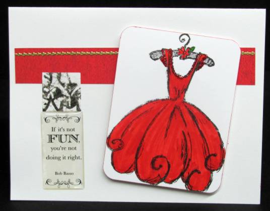
Then I started on the cards with the color blocks swapped. This flirty little dress was colored in red and Stickles were used to trim the neck and sleeves. I added a thick clear acrylic sticker for the text block:

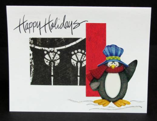
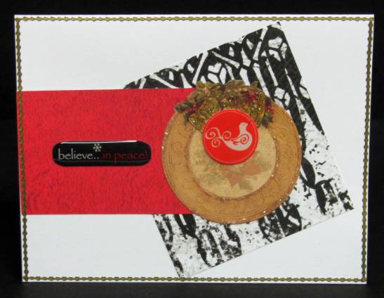
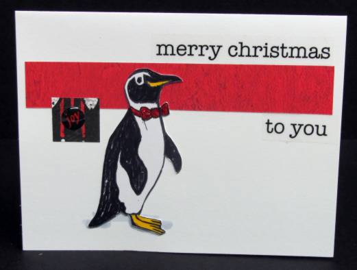
I pulled out this penguin I had stamped up a long time ago (handcarved by me) and drew in a red bow tie. This I glittered with red Stickles. I split a long text clear sticker to mount over and under the red bar. A bit of red marker and a round acrylic sticker were added to the little black block:

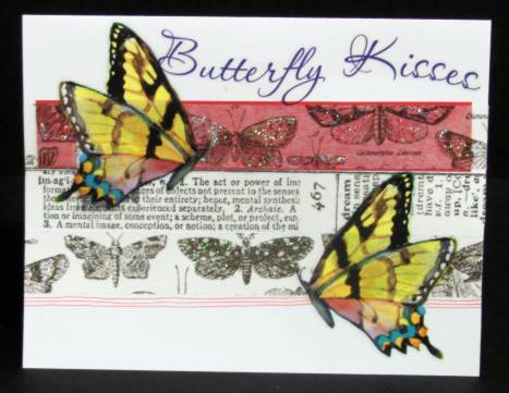
Finally, I placed strips of tissue tape over the color bar and then added vinyl butterfly stickers on top. I filled in the tissue tape butterfly wings with Stickles and added a clear script text sticker at the top:

So that's it for the first sketch - more tomorrow.

Ddd


Posted by studio3d@ccgmail.net at 6:00 AM PDT
Thursday, 20 October 2011
Double Pocket Front
Topic: Supplies

I've had this double pocket element with two tags hanging around for a long time. I pulled out some ledger print and roughed up the edges before coloring with 'old paper' distress ink. The background print is some of the Color Me papers with chalk inks. These are all layered on a tan folded card base.

The text is part of the original artwork - printed directly on the cardstock. The grossgrain ribbon is original to the piece as well, though the butterfly is part of the Color Me tags sheet.

I pulled the tags out to decorate them as well. They each got a chenille cord tied through the hole. The larger tag got another butterfly as well as two stamped ones. I colored in the stamped wings with Stickles and used an acrylic stamp across the middle by sticking it down to a block in a wavy curve. The round tag only got a stamped text.

Hard to tell from the photos - the larger tag is really pink and the round one is green. They have a text printed all over them very lightly.

Ddd


Posted by studio3d@ccgmail.net at 6:00 AM PDT
Wednesday, 19 October 2011
Line Up
Topic: Scrap Recovery

I just grabbed an assortment of table scraps and a couple of border punches and built up a block of interesting stripes. I added these to a block of finely dotted red cardstock and a tan folded card base. I used the trim-off to create a tag in the upper left and then echoed this with a tag to stamp the greeting.

Paper flowers were layered with copper brads and attached with glue dots.

This is the kind of card I would like to create on purpose instead of by accident!

Ddd


Posted by studio3d@ccgmail.net at 6:00 AM PDT
Tuesday, 18 October 2011
I Was Framed
Topic: Die Cuts

Left over from the 'dog days' project I had two of the beaded oval frames left over. Here are the two projects I made with these:

The first uses the same red splotchy cardstock as the base and the white frame placed the same as the dog cards. However, I had a clear scripture sticker which I added to the center. I found an awesome glittered foam bracket for the bottom and then added two tones of green rhinestones to the frame. A couple of irridescent green dragonfly stickers finish it off.


This one has the white frame added to white cardstock so you just get a subtle look. I used a clear scripture sticker for the center again and added some sunflower stickers at the corners.


So hard to photograph white on white - looks much better in person.

Ddd


Posted by studio3d@ccgmail.net at 6:00 AM PDT
Monday, 17 October 2011
Painter's Greens
Topic: Scrap Recovery

When selecting some paints for the house I picked up some paint sample folders that had great illustrations on the covers. Three of them were in awesome shades of green.

The first was this tasty pear which I framed with a couple of pieces of brown paper and a red background with textured graphics. This was added to a folded toast-colored card base. I stamped the text onto bright green glossy paper with Staz-on and trimmed to create a label.


This leaf was cut down to emphasize the veins and framed out with a light green paper. Yellow was placed underneath and then it was all added to a bright green card base. I used a weed stamp to add foliage around the edges and added a Thinking Of You tag.


The reamining leaf has a more woodsy look so I chose browns as the accents. The tag is from that little booklet of then from the other day but the 'ribbons' in it are actually cardstock. The celery card base supports the tag, the illustration backed by a colorblock of green and brown and a stamped text popped up on foam tape.

Ddd

Posted by studio3d@ccgmail.net at 6:00 AM PDT
Sunday, 16 October 2011
Color Me Labels
Topic: Supplies

I have showed the sheets from the sampler pack of Color Me papers I bought but have never showed anything using the page of labels . I cut them up into individual units before coloring them with Distress Inks, Shimmer Sprays, or Chalk Inks. Today I have a couple of cards I made using these labels.

This first one I colored with Distress Ink and trimmed close around. I colored a piece of the Color Me full sheet with some Shimmer Spray and mounted it on a Pink folded card base. The corners were rounded with a punch and I added a peice of clipart from a book. Then I stamped the text.


This one I colored with chalk ink and added to a piece of gray cardstock then stamped the text. For the bottom piece I wasdoing some experimenting with a border punch and a 1/8-inch punch. I threaded narrow pink ribbon through the holes and placed it on the card. I added two silver peel-off dragonflies.


I colored up the whole page of labels but these were the only ones I pulled out to use right away.

Ddd


Posted by studio3d@ccgmail.net at 6:00 AM PDT
Updated: Sunday, 16 October 2011 2:55 PM PDT
Saturday, 15 October 2011
Dog Days
Topic: Die Cuts

Challenge: Make cards on the theme 'dogs'

I started out wanting to stamp something but only have two dog stamps and they are both kind of 'cartoon-y'. Instead I decided to do a silhouette and went back to making my 'thumb puppies' to get them (that's where you trace around your crooked thumb and add your choice of ears to create a dog head)

I cut the dog heads from black cardstock, used two nestabilities dies to make white  frames and attached them to a red 'splotched' card base.


I had a stamp of 4 paw prints and used this to make corner elements using Staz-On ink.

Ddd


Posted by studio3d@ccgmail.net at 6:00 AM PDT
Friday, 14 October 2011
Many Thanks
Topic: Fantastic Folds

As the last project for the ladies' retreat I made 'thank you' cards for the speaker and worship team. These are made with the Shutter Card format that I got from the Scor-Pal website.

I started with a green printed cardstock as the base and did all the measuring, cutting and folding on that. I then added several papers in apple green and chocolate brown (theme colors). To the speaker's card I added tissue tape with text imprinted. The musicians got tissue tape with music imprinted.


I added pulled out a brown and a green silk flower, brown buttons and green 1/8-inch ribbon (to tie through the button holes). These were layered and attached with glue dots on the front cover and the back page. Large gold stars, gold peel-off stars, punched star holes, stamped star outlines and stamped starbursts are scattered throughout. I added green rhinestones to the upper right of the center section so they show when the card is closed.


I had a stamp with 'thank you' repeatedly on it so I stamped it twice on the inside panel and filled in around with the starburst stamp.  This leaves the last green panel for a personal note and signature.

Here is another one:


Ddd


Posted by studio3d@ccgmail.net at 6:00 AM PDT
Thursday, 13 October 2011
Stick-Ups
Topic: Other Projects

This was my last big project for the Ladies' Retreat.

I made 60 refrigerator magnets with the colors and theme of the retreat: "Shining Like a Star".

They were first printed on cardstock with my inkjet printer, then a star punched out in place of the letter A. I backed the cutout with glittery gold paper and ran the cardstock through the Xyron with laminate on both sides.

These were then cut out with the Nestabilities Labels 18 die.

A piece of sheet magnet was cut with a smaller Labels 18 die and affixed to the back.

Ddd


Posted by studio3d@ccgmail.net at 6:00 AM PDT

Newer | Latest | Older