« March 2012 »
S M T W T F S
1 2 3
4 5 6 7 8 9 10
11 12 13 14 15 16 17
18 19 20 21 22 23 24
25 26 27 28 29 30 31
You are not logged in. Log in
Entries by Topic
All topics  «
3D paperwork
A - Z challenge 5
A - Z challenge 7
A - Z challenge round 4
A to Z challenge round 3
A to Z round 2
A to Z round 6
A-Z round 1
Around the House
Art Challenges
Artist Trading Cards
Backgrounds
Beads
Bible Journaling
Books
Boxes
Collage
Color Challenge
Coloring
cookbook
Die Cuts
Digital Projects
Digital Stamps
Drawing
Dry Embossing
Fabric Stuff
Fantastic Folds
Field Trip
Home Decor
How Does Your Garden Grow?
Hymnal Art
In The Kitchen
In the studio
Jewelry
Lettering
Links
Multi-Technique
Music to Work By
Musings
Nail Art
New Work
Online Class
Other Hobbies
Other Projects
Painting
Paper Embroidery
Paper Piecing
Photo
Pretty Paper
Quilting
Random
reading
Scrap Recovery
scrapbooking
Sewing
Sketch Challenge
Some Backlog
Stamping
Stencils
Stickers
Supplies
Teabag Folding
Techniques
Testing
tips and tricks
Tutorial
Web resources
Welcome to my Blog
Work By My Friends
workflow
Writing
Blog Tools
Edit your Blog
Build a Blog
RSS Feed
View Profile
Group One
In & Out of Studio 3D
Sunday, 1 April 2012
All the Pretty Tags
Topic: Multi-Technique

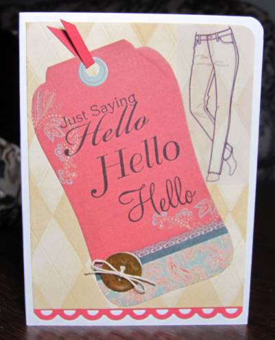
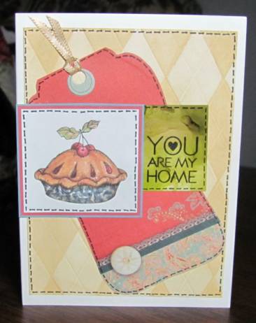
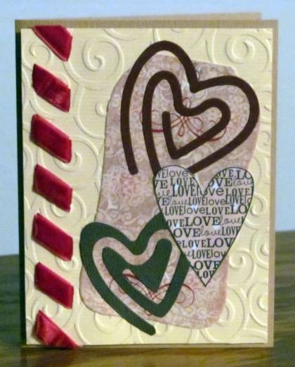
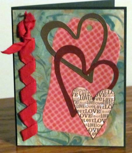
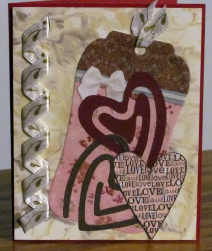
The commonality between all of this batch of cards is that they use printed decorative tags as their focal feature.

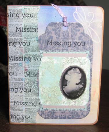
For the first I pulled out a background I've had for a long time - a glossy cardstock stmped with Versamark and brayered with multiple colors. I tore some printed scrapbook paper for the left edge and then added a matching tag to the right side. On top of this I layered a square 'sample' from the packaging of some scrapbook paper (save everything!). Then I placed a cameo from a jewelry catalog as a feature. Multiple stampings of text from one of the Hero Arts sets and a ribbon are the finishing touch.


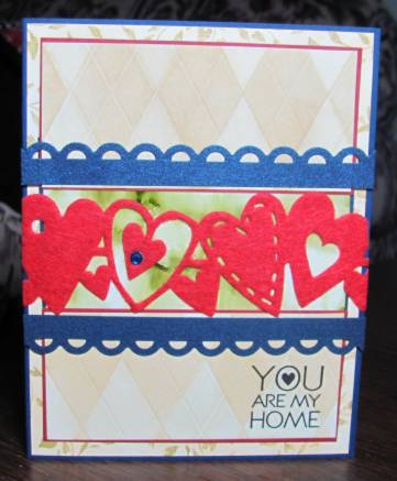
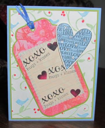
For this next one I started with an embossed white background and carefully colored in the raised elements with markers. I backed it with a green mat and added the same mat to the chosen tag. On the tag I stamped with oen of the Hero Arts stamps from the OWH sets and added the stamped solid hearts. When they did NOT stamp solidly I filled in with markers and it gives them a 3D look. Cool! I stamped the 'love text' heart on blue scrapbook paper and layered it over a white mat. This is popped up on foam tape.


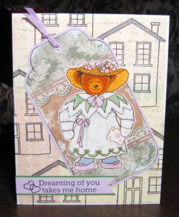
I love this little bear I cut from the clip-art section of an arts book. The only disappointing thing is the face is so dark and then they did not color the hands so the head really stands out a bit too much. Oh well, it is what it is. I chose a lacy tag to back it and then used a razor blade to scrape some of the edges to remove printing and give it a shabby-chic feel. For the background I pulled out a patchy pastel with overall text script. The Hero Arts stamp set had this cute house and I used it to stamp over the whole background. The text and hearts on the banner are from the set as well.


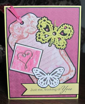
This one has a totally different look. Dark tones are the main difference and bandinge every element i black is a part of this. I chose a couple of butterflies in different materials (one tatted and one punched) and different colors. The yellow is then echoed in the text banner and base card. The white is echoed in the heart border. Then I echoed the pink heart with the tag ribbon and glitter inside the white butterfly. The stamp set used for this one is NOT the Hero Arts.
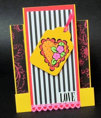
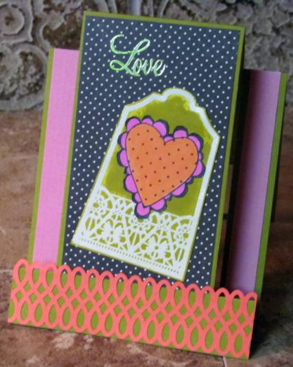

4 tags - 4 looks.

Ddd


Posted by studio3d@ccgmail.net at 12:01 AM PDT
Saturday, 31 March 2012
Background Check
Topic: Backgrounds

Challenge: Use a scoring tool to make a background with the scoring as the focus.

I started with a scrapbook paper with a large diamond tone on tome print. By scoring all the intersections as well as halfway between each of them I created a small diamond that now looks like argyle! I had enough to make three cards from this sheet.

First I added a scalloped border to the bottom and a tag to the center. The tag was stamped with a combination of stamps. I got the jeans illustration from a tag on the new pair I bought. The tag had a button printed on it so I took a cardstock one, tied twine through the holes and popped it up on foam tape. One rounded corner makes it even more casual.


For the second card I started with the same card base, background, and tag. I added an illustration from a page-a-day calendar and a scrap of polished stone background paper with a stamped text. This stamp is from one of the three new Hero Arts sets in cooperation with Operation Write Home. I just picked up all three sets. To create a more casual feel I added faux stitching lines around all the elements.


With two smaller pieces of the argyle paper left I used it to create bands at the top and bottom of this card. I started with a dark blue card base and added a greenish leafy print paper. Over this I added the bands of argyle and a center band of polished stone paper. Each of these was thinly banded. Two scalloped borders of dark blue frame a strip of felt diecut hearts. I added one rhinestone to the strip of hearts and on the lower right is another stampr from the Hero Arts set.


I am loving having all these challenges from the groups I belong to - it gives me a great starting point when I sit down to create.

Ddd


Posted by studio3d@ccgmail.net at 12:01 AM PDT
Friday, 30 March 2012
Get Out Your Sunglasses
Topic: Paper Embroidery

Color Challenge: Yellow and Orange

YIKES!

I used two tones of orange and one of yellow to stitch on yellow cardstock. This was layered on two tones of orange cardstock and added an orange punched dragonfly with orange Stickles on him.


The text is gold peel-off stickers.

Ddd


Posted by studio3d@ccgmail.net at 12:01 AM PDT
Thursday, 29 March 2012
Spread Your Wings Again
Topic: Paper Embroidery

I last did this butterfly in multi-colors as designed. This time I decided to just use two colors in keeping with the assigned theme - Spring.

I stitched onto pink printed cardstock and cut with a Nestability die. Under this is a yellow layer covered with printed tissue and the base card has a strip of tissue tape at the top and bottom. The butterflies on the tissue tape are tinted with Copic markers to match the pink, yellow, blue theme.


Ddd


Posted by studio3d@ccgmail.net at 12:01 AM PDT
Wednesday, 28 March 2012
A Little Birdie Told Me
Topic: Collage

With lots of those bird images left I did some matching up with various table scraps and die cuts then added a mix of embellishments to come up with several cards that are quite different from one another.

First is a selection with which the starting element was the frame left in white cardstock after having diecut scalloped oval. These had all been sprayed with a shimmer mist. This first card uses a couple of birds with a lot of purple in their coloring. I backed the aperture with a bit of floral printed tissue paper, tied the base with a ribbon, rounded the corners, and mounted the birds. A lavender card base and letter stickers finish this one.


Another simple treatment uses a single bird and lots of swirls. The swirl background paper is placed behind the aperture and diecut swirls mounted over it. I placed tissue tape across the bottom and used Copic marker to lightly tint it and the bit of card below it. Another diecut swirl was added for the bird to stand upon and dark blue marker stitches drawn around the aperture and the panel outline.


For the next card I cut the aperture cardstock down quite a bit so other papers could be seen around the outside. The yellow layer is the back of a printed index card, the pink layer is leftovers of a paste paper, and the center blue layer is leftovers of a cardstock sprayed with Glimmer Mists. More scraps (background from a cardstock used to clean the brayer) were cut into long triangle strips to serve as branches for the birds.


This next one also uses a cut down aperture, this time with rounded corners. I laid some music printed tissue on the folded card base. More paste paper scraps are used at the base of the aperture (the pink and the woodgrain). Then the pink is repeated in strips at the top and bottom of the card. The bottom strip serves as a backdrop to the text sticker. All this pink is to echo the bird colors and provide balance.


Finally, I used some of the music printed tissue to cover the aperture cardstock and cut the aperture back out of it. Behind this I placed some 'polished stone' cardstock. The bottom is banded with layered tissue tapes and I added two diecut swirl elements and a bit of tied twine. This bird has subtle coloring but the red background and blue base cardstock pick out elements of its palette.


Then I made three cards using a variety of branches for bird perches. The simplest branch is just a single long triangle. I used this for the card using a background of printed glossy cardstock with some torn music over one corner. A printed tag serves as a backdrop tying the birds together and I stamped the text.


By adding two more long triangles to each branch you get little twigs. I did this on a background created with wome of the paste paper scrap overlaid by a diecut scrapbook paper. I used a scrap of the diecut paper in the upper corner and stamped a greeting.


The last set of branches were free-hand cut and laid over a background of leafy scrapbook paper and a marbled paper. This is so simple that I added some gold peel-off corners and stamped partly onto one of the birds.


For the next card I went super-simple by using a plain white background embossed with birthday greetings. I tore a piece of green scrapbook paper for a grassy knoll and tied these onto a brown cardstock with a bit of twine. The coral base card echoes the color of the bird.


I had several diecuts on the table and layered them creatively on a blue card base to pick up the colors in the birds. The text is stamped. Simple and elegant.


And, last, is a mix of stuff I had pulled out when I started the series and hadn't used yet. All are table scraps and I just layered for the best effect.


Yep - all these cards in one sitting. And I'm all done with the birds!

Ddd


Posted by studio3d@ccgmail.net at 12:01 AM PDT
Tuesday, 27 March 2012
Four The Birds
Topic: Multi-Technique

A long time ago on a blog far-far away I collected some free pages of hand-painted birds and printed them out for later use. Later finally came.

I cut out the individual birds and matched them up based upon their coloring. First up were two that had a base rose coloring. I pulled out a background I had created by spraying doilies with Glimmer Mists. I had laid them on the same spot on cardstock to spray them with different colors. Rather than treat it as scrap I saved it to use. Glad I did. For the birds to stand upon I tore a piece of green patterned paper and created a branch of it. One strip of tissue tape and a few silver peel-off stickers bring it all together.


Next I used a little blue-colored bird. I echoed the black in the bird with black bordering on the other elements. The background for this one is from a commercial thank-you note I had received. Love the coloring of this. The center oval is from table scraps and I used a Nestability die to cut the scalloped backing for it. This is all raised up on foam tape and I added a black peel-off sentiment.


Finally, I had two of these golden birds. I treated them essentially the same with lavender card bases, embossed backgrounds, a printed tag, and diecut hearts. This first one only had a bit of ribbon and a rubon text.


The final one got a table scrap diecut popped up on foam with a rubon text. Then I added torn tissue tape borders to the top and bottom.

Ddd


Posted by studio3d@ccgmail.net at 12:01 AM PDT
Monday, 26 March 2012
Stand Up and Be Counted
Topic: Fantastic Folds

Now that I got a taste of the Funky Fold (center step) format I really like working with it. So I used some table scraps and feature elements to whip together a couple more.

First up is this adorable bunny from a scrapbook page-a-day calendar. I used an embossed background that is 'numbers' but by exposing only a bit of it it becomes an abstract design. The original borders of the page were cut and used as borders on the outer sections. Added to that on the lavender base are a bit of frilly diecut border and a cardstock text sticker.


Then I took a selection of super-bright elements and combined them for an eye-popping production. It started with the heart from the old stamp catalog colored up with watercolor markers. The black and white stripe came next followed by the pink border. Everything else just leaped on board! I'm not sure if I created this or it created itself.


Ddd


Posted by studio3d@ccgmail.net at 12:01 AM PDT
Sunday, 25 March 2012
Fancy Fingers 2
Topic: Other Projects

And then there are those fingernails again...

I ran across a website on different techniques for doing manicures and was fascinated by the 'sponging' way of blending different polishes to create an airbrushed effect.

I tried this using a solid dark pink base, a light pink and a candy-apple red blended toward the center, and a silver glitter and a gold glitter blended toward the center.


These have soo much more movement and depth of color in real life that is difficult to capture in a still photo.

I will definately use this technique again.


YES, IT IS STILL 'ART' EVEN IF ALL YOU ARE PAINTING IS YOUR FINGERNAILS!


Ddd


Posted by studio3d@ccgmail.net at 12:01 AM PDT
Saturday, 24 March 2012
Vintage Vision
Topic: Collage

The assignment was to make a card with a vintage look. This is something I am not too good at doing and it always comes off looking like the elements were tossed on the table and stuck wherever they landed.

For my vintage collage I used some printed papers, cardstock stickers, rubons, lace, paper flowers, rhinestones, and a clear text sticker.


So there you go. Assignment complete. Done. Fini!

Ddd


Posted by studio3d@ccgmail.net at 12:01 AM PDT
Friday, 23 March 2012
Funky Fold
Topic: Fantastic Folds

Some groups call this a center-step card but I have another style that I have refered to by that name. So when another group called it a Funky Fold I was good with that! I had never made one from this design.

I used table scraps to decorate the front panel with black dotted paper, a color-me tag and a colored heart from the stamp catalog. A diecut border piece I got in a swap fit the bottom perfectly and a couple of narrow strips finished off the sides.


Silver peel-off stickers are great! You can color them with alcohol markers while they are still on the sheet so they match your project. I made mine green.

Ddd


Posted by studio3d@ccgmail.net at 12:01 AM PDT
Thursday, 22 March 2012
Easter Egg Basket
Topic: Scrap Recovery

The central image on this card is from a scrapbooking page-a-day calendar. I trimmed it down, rounded the corners and added a doodle line around it. I had the dotted pink base card in the table scraps and pulled out several spring print papers to create a striped background.

After layering the background I used the marker to 'stitch' the papers down or together so they look like a pieced fabric panel.


The text is made up of stickers that are cut like little postage stamp shapes. The pastel colors of them suited perfectly. Due to the unevenness of the top wordI cut a single egg from one of the background papers for that space.

Ddd


Posted by studio3d@ccgmail.net at 12:01 AM PDT
Wednesday, 21 March 2012
Nautical Guy
Topic: Collage

For a challenge we were to create a masculine card with a nautical theme. I happened to have cut out this sailboat from a book of clip art and used that as the jumping-off point.

I selected some of the shaving cream background for the watery look and cut a wavy slit to tuck the boat hull down into. In my batch of printed tags I found this postcard printed one and used ink colors found in the boat image to stamp clocks, maps and a compass onto it. I also stamped the text greeting.


I punched a scalloped edge on the bottom and knotted some scappers floss around the base of the panel before attaching to a teal-blue card base.

Ddd


Posted by studio3d@ccgmail.net at 12:01 AM PDT
Tuesday, 20 March 2012
Use These Colors
Topic: Color Challenge

We were challenged to use Blue and Tan on a card. I found a beautiful blue cameo in a jewelry catalog and a printed tag using the same color range of blue.

Blues are hard to match up as they can go toward the gray, the red, the green, or the pastels. I was fortunate to find blues and tans in the table scraps that worked perfectly well and a folded card base that was great, too. These were layered in strips as a base for the tag, to which I applied blue distress ink  before mounting.


The tag also got a snippet of ribbon through the hole and two clear text stickers.

Ddd


Posted by studio3d@ccgmail.net at 12:01 AM PDT
Monday, 19 March 2012
Beachy Keen
Topic: Scrap Recovery

Assignment for this card was to make a 'thinking of you' card with a beachy theme.

Table scraps and parts & starts yeilded up: a silver shimmery 'color me' paper with swirls, a purple doily from the recent doily challenge, a purple cardstock strip with a diecut scalloped hole in one end, and a calendar page with a picture of a beachside setting. Not much work to round off the purple cut panel to the shape of the aperture, round the corners of the card and layer all these elements together.

I just added a round 'thinking of you' sticker to echo the silver background paper and a couple of blue wavy border stickers to reflect the blue in the photo and evoke the waves.

Wham! Done in record time.

Ddd


Posted by studio3d@ccgmail.net at 12:01 AM PDT
Sunday, 18 March 2012
In The Jungle
Topic: Collage

Our challenge was to use jungle animals to make a card for kids. Hmmm, I looked carefully several times and simply do not have a single stamp with a jungle animal! I have some 'wild' animals but they are of the 'woods' or 'desert' rather than the jungle.

However, in my clipart piles of stuff I found some frogs and chose the most 'jungle-y' of them to create with. I selected a green dotted background (from an old page-a-day scrapbooking calendar) and added a diecut 'vine' (a gift I got in a swap). I cut the frog close around with a craft knife and inked the edges black. He is mounted on foam tape all over the frog and with glue on the branch ends to make them flush with the card.


The text is made up of letter stickers. These were blue on the sheet and I colored over them with Copic markers to make them green. Creative shortening of the text greeting due to the large size of the letters.

I added a fine-line doodling around the perimeter.

Ddd


Posted by studio3d@ccgmail.net at 12:01 AM PDT
Saturday, 17 March 2012
Doilies, Diecuts and Punches - Oh My!
Topic: Die Cuts

On one group we were challenged to use doilies on a card and another group challenged us to use diecuts and punches. So I used all three on one card to meet both challenges.

I embossed the front panel of the base card with a Cuttlebug Hearts folder and built directly on it. The purple background circle and the red foreground circle are both doilies. The scalloped circle is a texturized cardstock that I diecut with a scalloped circke and used a 1/8-inch punch to create the holes. I glued the red doily to the front and added heart brads and rhinestones before mounting over the purple doily using foam tape.


The script is also a diecut whick I glittered with Stickles.

Ddd


Posted by studio3d@ccgmail.net at 12:01 AM PDT
Friday, 16 March 2012
Yummy Ribbons
Topic: Supplies

For Christmas I received three of the punches from We R Memory Keepers that allow you to punch anywhere on a page and weave ribbon through. They come with a 3-pack of ribbon that you can use to do the weaving. I did three cards with one of the punches, used thrie ribbon for two of them and a ribbon I had on hand for the third card.

This one uses their velvet ribbon. I felt it was too thick to do the second step of the ribbon weaving so just tucked the ends to the back. I mounted the front piece onto a folded card base using foam tape so the ribbon would not make it bulge up from the back. I used a Sizzix die to cut 'primative hearts' to layer with a printed tag and a text heart stamped on decorative paper.


The second card uses their twill ribbon which I wove in the prescribed manner. I also added a bit of knotted ribbon at the top end. This background is one made with the 'shaving cream' technique. I mounted it to the base card with foam tape again and continued with the primative heart die cuts, tag and stamped heart.


For this third card I used ribbon I had on hand. More of the shaving cream background, tag, diecut hearts and stamped text heart. I added a snippet of the ribbon to the top of the tag on this one.


I think this is my favorite of the three.

I have two more of these punches to try out along with more ribbons that came with them and more of them on hand. If I get bored with these, there are actually three more punches that I don't own. Oh the possibilities!

Ddd


Posted by studio3d@ccgmail.net at 12:01 AM PDT
Thursday, 15 March 2012
Eagle in Stitches
Topic: Paper Embroidery

I've been working on a new pattern for paper embroidery. I hope to have it available soon. In the meantime, here is the stitching I worked up from the draft version.


I wanted to do something patriotic and chose the bald eagle with a banner. I think I might do several text phrases that can be stitched into the banner as desired.

Ddd


Posted by studio3d@ccgmail.net at 12:01 AM PDT
Wednesday, 14 March 2012
Hot Tropics
Topic: Die Cuts

This challenge was to use hot troical versions of pink, green and yellow. I found an old card front image that had the right colors in it and used that for my background.

I diecut varying sizes of frames in multiple colors and shapes and layered until I had an arrangement I liked. This was glued to the card front and then the center oval was cut out of all the layers together.

The base card is neon yellow and I attached a butterfly sticker to the center. The constructed piece is mounted with foam tape around the opening and with glue (flat to the card) around the outside edges.


I stamped and diecut the text label out of neon orange and mounted with foam tape on the middle and glue on the ends. Three sticker hearts decorate the front and I added rhinestones to the flower centers on the butterfly.

Ddd


Posted by studio3d@ccgmail.net at 12:01 AM PDT
Tuesday, 13 March 2012
Birch Trees 2.0
Topic: Techniques

Back with another version of the birch trees card. This time I used distress inks to paint the background areas.

Here are the EASY steps:
  • Open a folded white card to lie flat (mine was 5.5 x 4.25 when folded)
  • Use sticky notes to mask off the folded edge on the back of the card so no ink will get on the back
  • Use two sticky notes to mask on the front, leaving a space between them (width of one desired tree trunk)
  • With the very edge of a light brown stamp pad stroke lightly from one sticky note edge toward the center of the open space. Turn card around and do from other sticky note edge. Do NOT aim for complete coverage. Spotty coverage is much better for the effect.
  • Move sticky notes over to expose another trunk area and repeat (vary the width of the trees and change the angles slightly). Repeat to make 5 wide tree trunks.
  • Move back to one edge and mask off a very skinny tree trunk. Mask off a space at the bottom so the tree will sit further back in the scene (wider trees will be closer so need less space masked off at the bottom). Swipe with ink pad. These trees will get a bit more coverage just because they are smaller to work with.
  • Repeat, moving the sticky notes to make several of these smaller trees.
  • Remove all sticky notes except for the one masking the card back.
  • Use fine-line black pen to sketch lines down the sides of the larger trees and make a few side-to-side marks in the trunks.
  • Draw in some defining curves at the bottoms of the smaller trees and draw in some upper branches on them (make sure the branches stay 'behind' your larger foreground trees)
  • Sketch in some hills and distant trees.
  • Paint the snowy foreground, purple in the mountains and green in the distant trees.For coloring the background, here is what I do. I use Distress Inks and press the pad onto an acrylic block. Then I use an aqua-brush to pick up the ink and paint it on like watercolors. The colors I used: Brushed Corduroy for the birch trees, Frayed Burlap for the snow then layered Tumbled Glass over it, Milled Lavender for the mountain, Bundled Sage for the background trees, Tumbled Glass for the sky
  • Attach a greeting.

Here is the newer verion of the card:


Ddd


Posted by studio3d@ccgmail.net at 12:01 AM PDT

Newer | Latest | Older