« May 2012 »
S M T W T F S
1 2 3 4 5
6 7 8 9 10 11 12
13 14 15 16 17 18 19
20 21 22 23 24 25 26
27 28 29 30 31
You are not logged in. Log in
Entries by Topic
All topics  «
3D paperwork
A - Z challenge 5
A - Z challenge 7
A - Z challenge round 4
A to Z challenge round 3
A to Z round 2
A to Z round 6
A-Z round 1
Around the House
Art Challenges
Artist Trading Cards
Backgrounds
Beads
Bible Journaling
Books
Boxes
Collage
Color Challenge
Coloring
cookbook
Die Cuts
Digital Projects
Digital Stamps
Drawing
Dry Embossing
Fabric Stuff
Fantastic Folds
Field Trip
Home Decor
How Does Your Garden Grow?
Hymnal Art
In The Kitchen
In the studio
Jewelry
Lettering
Links
Multi-Technique
Music to Work By
Musings
Nail Art
New Work
Online Class
Other Hobbies
Other Projects
Painting
Paper Embroidery
Paper Piecing
Photo
Pretty Paper
Quilting
Random
reading
Scrap Recovery
scrapbooking
Sewing
Sketch Challenge
Some Backlog
Stamping
Stencils
Stickers
Supplies
Teabag Folding
Techniques
Testing
tips and tricks
Tutorial
Web resources
Welcome to my Blog
Work By My Friends
workflow
Writing
Blog Tools
Edit your Blog
Build a Blog
RSS Feed
View Profile
Group One
In & Out of Studio 3D
Monday, 7 May 2012
I Got the Blues
Topic: Paper Embroidery

For a paper embroidery swap I had to make a blue and white card. As usual, this brought to mind blue delft china. So I got out this coffee set pattern and stitched it out on white cardstock with two tones of blue thread. I used a scallop border punch to create some layers for the bottom of a blue folded card base and popped the stitched panel up on foam tape.

I will most likely stitching this over and over - every time someone calls out a challenge for combining blue and white.

Ddd


Posted by studio3d@ccgmail.net at 12:01 AM PDT
Sunday, 6 May 2012
Puttin' On the Glitz
Topic: Jewelry

On the way from the fabric side of the craft store to the papercrafting side I walked right through the beads and jewelry area. Oh, BIG MISTAKE! They had a bunch of stuff on clearance. I got sucked right in.

I picked up several packages of coordinating styles and sorted them into two equal piles of beads. I had also picked up a beading design board on sale at the same time and I used it to lay out double rows of symetrical strands. Since they did not have two of the same 'charms' I got slightly different looks. I used the leftovers to create dangle earrings for them, each quite different.

Here is the first one I made:


And here it is laid out with the earrings


This is the second one


And with its earrings

I had fun making these jewelry sets. Now I have to decide which one to keep and which to put aside for a a gift.

Ddd


Posted by studio3d@ccgmail.net at 12:01 AM PDT
Saturday, 5 May 2012
Not Your Mother's Easter Basket
Topic: Photo

....because it is MY mother's Easter basket! It's been a while since I did any photography just for the artistic sake of it and this made such a great subject. I thought if I had some good photos from this session I could print them out for use on cards.

The basket contained fresh flowers and a butterfly on a pick. I added the little nest and bird that I had on the window sill.


I took these in the natural light of the garden window.

Ddd


Posted by studio3d@ccgmail.net at 12:01 AM PDT
Friday, 4 May 2012
Hey, What's In the Box?
Topic: Supplies

Since I do quite a bit of paper embroidery I wanted a set-up of supplies that would keep everything together and be portable. I take mine in the car, on the plane, to waiting rooms, and when I'm at home it is handy in a drawer by my favorite chair.

I got the box on sale at the craft store and here is how I have it set up:

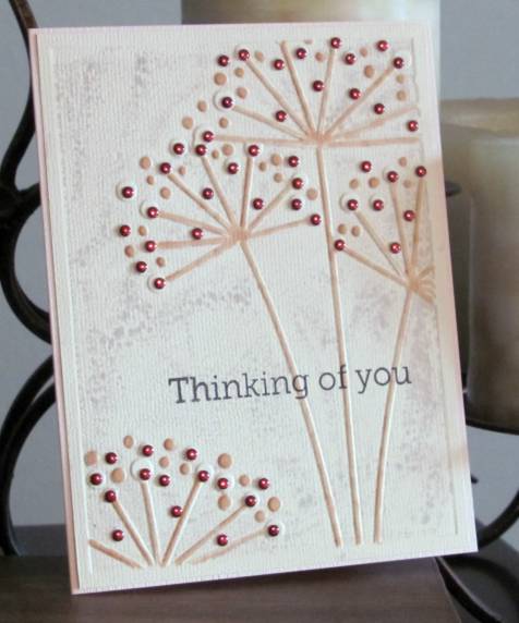
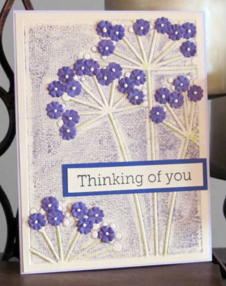
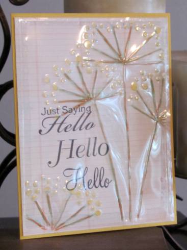
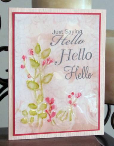
On top is a stack of already pricked papers, still taped to their patterns. If they are for a specific occasion they have a sticky note with a date and are arranged in order of stitching rotation. The lid is flexible and has a good latch so I can stack 4 to 5 projects in here. While I am working on a project the others get moved to the open lid, out of the way of thread selection. Completed pieces get moved to the bottom of the stack until I get home when they are moved to the studio for assembly into a card.


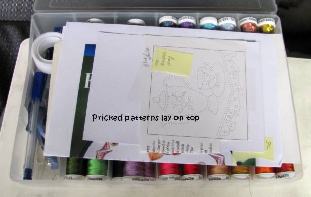
On the right side of the box I have all my threads. The brand I buy (Sulky) will fit 4 to a section. I group them by thread type (metallics, shimmers, verigated, and solids) The solids are grouped by colors so I can easily choose from 3 greens, 4 pinks, 3 browns, etc. I move the spool I am working from over to the left side tool section so I don't lose track of it.

So, what's in the tool section? First of all I used a sharp knife and cut out the divider in the left section so it would run the full width of the box, to fit longer tools inside. From upper left: roll of regular scotch tape. This is used to hold the loose thread ends to the back of the cardstock at the beginning and end of each length of thread. To the right is a tiny box of wax. This is used to condition threads that have a tendency to twist, knot and fray. Next row from the left: I use a Clover thread cutter. It has no sharp or pointed parts to I can take it on the plane without any problem. The thread is pulled into any one of the slots around the edge where there is a razor blade that slices through it. To the right is my needle case. This is actually the container that replacement leads for a mechanical pencil came in. Then there is a needle-threader. I seldom need this but it is a handy place to wind more tape and I use the rounded ends to burnish the back of the finished project to close up the holes around the threads. I keep a pen (and usually a mechanical pencil) in the box to make notations on patterns. I have two piercing tools. The one that looks like a pen is newer and, like a pen, comes with it's own cap. The older one on the bottom is just a 'needle on a stick' type so I devised this set-up to make it safe. The plastic tube is off of a fresh flower from the florist. It includes the rubber cap with a cross-cut opening to slide the stem through. I placed a sponge grip meant for a pencil inside. This way I just push the tool through the rubber cap and it slides into the foam sleeve. Keeps it from rattling around and protects the tip from breaking.


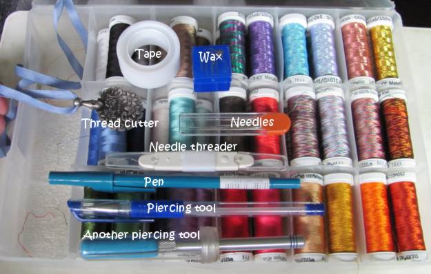
I put a little piece of packing material in the bottom of each well to keep everything from clacking around when I carry it.

....now back to stitching!

Ddd


Posted by studio3d@ccgmail.net at 12:01 AM PDT
Thursday, 3 May 2012
Color Spot Masking
Topic: Stamping

A blog called bits and pieces uses a lot of masking to create color spots to stamp in. I thought I would try this technique. I used a Nestabilities Labels 18 die to cut a shape in some masking paper. This was then applied to the front of a white card base. I used a foam blending tool to apply old olive distress ink to the opening. Then I used the same ink to stamp some grasses and stems in the opening. I then removed the mask and stamped more of the green followed by the grasses in black. The last step was to stamp a dragonfly in black and color it in with blue.


I put the same mask on another white card and this time inked with broken china ink. I used the same stamping sequence but colored the dragonfly with yellow. On top of the blue background the yellow made the dragonfly green.


I was having so much fun with this that I decided to combine the colors to create a sky and ground. Instead of stamping with branches I switched to the little grass stamp. I stamped inside the aperture and after removing the mask I stamped it all along the bottom edge. I used brown cardstock to cut a couple of poles and strung scrappers floss between them. I stamped a onesie on three pieces of printed cardstock and cut them out. They are then glued over the floss clothesline.tiny cardstock clothespins are glued to the shoulders.

Even though this uses a baby onesie stamp I didn't want it to be a baby card. So I gave it a 'summertime' greeting to make it a generic greeting card.

Ddd


Posted by studio3d@ccgmail.net at 12:01 AM PDT
Wednesday, 2 May 2012
It's In The Script
Topic: Stamping

The stamp I used today has such a vintage feel I wanted to use techniques that would enhance that.

I used distress ink pads pressed to acrylic blocks to create pools of color that I then used like watercolors. I used two purples, two pinks and one green. Then I used old paper distress ink to tone the edges.

These first two were stamped on regular white cardstock. Both of them are mounted over ColorMe papers misted with a color spray.


I stamped the other two on watercolor paper and treated them the same as thefirst ones. On one of them I tore and bent the edges for more distressing. These both got a black and cream brocade background.


All four of these are on lavender card bases.

Ddd


Posted by studio3d@ccgmail.net at 12:01 AM PDT
Tuesday, 1 May 2012
Roy G Biv
Topic: Stamping

Technique featured on another blog last week... make stripes of color with distress ink pads on a craft sheet. Press large stamp into it, move up a bit and ink again, and down to ink again, smooshing in the ink each time. This blends the colors. Mist with water and stamp onto cardstock. Result is a rainbow background (thus the Roy G Biv title - Red Orange Yellow Green Blue Indigo Violet) I only used the top half of the rainbow though.

First I used the technique on a brocade type stamp. I trimmed it down and stamped over the top with some flora, grass and a bird. Layering with black over a white base card and finished up with a stamped sentiment.


Then I switched to a dotted background stamp and stamped quite a few. Some are stamped directly onto a folded card base like these two. I stayed with the flora, grass and bird. I colored lightly in the flora and drew a doodle line around the top and sides.


Another one stamped directly on the card base got an arrangement of cupcakes. I added a hand-drawn cake plate and three strips of gold peel-off borders along the left.


I used an arrangement of sketchy flowers on the last of the direct-to-card backgrounds and again on a single piece that I cut down so it could get a black frame with one side punched with a scallop. These were colored with different selections of watercolor markers. Which to you like best?


I finished up stamping without reinking - just misting with water - and it created much softer dots. I turned one upside down to change the orientation of the colors. I stamped both of these with the bottle image and used very pastel watercolor markers on them. These were both backed with black panels.


I don't have a lot of background stamps and I'm pretty much done with these dots so I can't see using this technique again soon. It was a nice day of play though.

Ddd


Posted by studio3d@ccgmail.net at 12:01 AM PDT
Monday, 30 April 2012
Bird+House
Topic: Stamping

Fifteen of 'this', fifteen of 'that', fifteen of the 'other' and then mix them all together for fifteen finished cards. I started with a Hero Arts stamp set (a partnership stamps set with Operation Write Home) cheated a bit on the OWH sketch 119 to create this set. Here is the sketch


From the stamp set I selected the house, the cloud, the fence, and the kite. I stamped each of these (except the fence) on a variety of table scraps and cut them out. Then I Mixed and Matched pieces for a kind of patchwork look. Here's one 'close up'.

Each cloud was stamped twice on matching paper. Each house got the windows cut out and a contrasting piece was stamped and mounted behind. I used warm grey Copic markers to create shadows on them, too. The kites were cut into quarters and opposing pieces matched up to create whole kites. To create each card I stamped three fences on the lower portion of a white card, mounted a piece of green patterned paper over the lower edge with a torn edge. A bird was stamped on the fence and the kite stamped with the string in the bird beak. I used distress ink in 'stormy sky' around the top and sides of the sky and 'old paper' around the sides and bottom of the ground. I adhered the clouds in the sky with one overlapping the kite. Then the kite was assembled on top of the cloud, the house adhered on the grass and a shadow added at its base. Now ain't that cute? I just stamped them with a variety of text phrases to finish them off.

Here are all of them:


Cute, huh?

Ddd


Posted by studio3d@ccgmail.net at 12:01 AM PDT
Updated: Monday, 30 April 2012 7:53 AM PDT
Sunday, 29 April 2012
Bottle Bouquets
Topic: Stamping

Sometimes when I buy a new stamp it will sit for a long time before I get around to inking it up. This one, though, I had inked within 48 hours. I loved it that much - so much that I actually paid full price for it. Now THAT is noteworthy!

It is one of the designs that have a sketched look to them. I like every one of these designs that I have, and this is no exception. I stamped some of these fully inked and then stamped some as second generation so they would be a little lighter. This enhances the sketched look even more. I used a waterbrush and distress inks to paint the images in a watercolor style.

All of them were then bordered and mounted to colored cardstock with bordered paper scraps as backgrounds.

The card on the left uses three strips of patterned papers and I used distress ink (old paper) to tone the edges of the image. The sentiment is cut with a flag end and popped up on foam tape.

The one on the right turns the strips to the other orientation, I changed the text and left off the distress ink.

For the card on the left below I moved the sentiment and added tinted paper flowers over the top of the stamped blooms. I gave these rhinestone centers.

The one on the right below got the rhinestone centers applied directly to the blooms and I changed up the sentiment and applied it on an angle for a more casual look. I used pink Liquid Pearls in the center of the heart image.

These last two are the second generation images. Both of them use the same sentiment with blue Liquid Pearls in the heart. The image on the left is left 'natural' and the one on the right has the rhinestones in the flower centers.

Yep, I'll be stamping this image again.

Ddd


Posted by studio3d@ccgmail.net at 12:01 AM PDT
Saturday, 28 April 2012
Cover Shots
Topic: Scrap Recovery

So, I bought a new pad of 12x12 cardstock for a specific project. Yummy stuff! And when I took the pad apart it had a cover with a wavy-edge aperture cut out of it and some of the graphics from the contents were printed on the cover along with some little elements of possible enhancements - sort of like a 'serving suggestions' photo on a package of prepared food.

My response was to cut up the cover where it incorporated some of these elements as well as a section of the aperture. I mounted these onto colored card bases and then stamped with a birdhouse image. The image was colored in with watercolor markers.


I stamped them both with the same sentiment.

Ddd


Posted by studio3d@ccgmail.net at 12:01 AM PDT
Friday, 27 April 2012
Ocean View
Topic: Backgrounds

I started out this project by taking a photograph of one of my watercolor paintings from years ago. Then I printed it 4-up on photo paper and cut down to use as card fronts. I trimmed enough to expose an 1/8-inch border of the base card.

I chose three different sentiments and stamped directly on the photo front.

Here is one in close up.


Because of the glossy finish these appear much lighter than their true colors.

Ddd


Posted by studio3d@ccgmail.net at 12:01 AM PDT
Thursday, 26 April 2012
I've Learned My Lesson
Topic: Quilting

Every time I set out to make a quilt I try to learn a new technique or lesson from it. I learned FOUR things from making this quilt:

ONE: If a pattern is designed to be paper pieced, don't ssume you can short-cut it and make yards of stripes to set together. It is nearly impossible to make the strips piece accurately enough and you have to calculate in the 'takeup' of the bend of the fabric of every seam. The result of this experiment is a poorly pieced wall hanging from the center motif that I will finish up someday for my OWN wall.

TWO: I learned how to paper piece. Very time consuming but oh-so accurate and satisfying when all the seams match perfectly.

THREE: I tried out a new block construction for the wide border that is called a 10-minute block and goes together like magic. I can see myself making a whole quilt out of these blocks someday.

FOUR: I learned how to make and quilt a smaller quilt and then attach batting, backing, and borders to expand it to a larger size. This was necessary because the throat of my sewing machine is small and this way I could work on a smaller size for the quilting and then quilt the borders after they were attached.

I made this quilt for my son and daughter-in-law for their anniversary. They are lovers of all things Celtic.

So, here is the wide view of the queen-sized quilt I call Celtic Dreams:


Here is a closeup of the paper-pieced section:


And a closeup of the 10-minute block border:


I got the pattern for the feature part of the quilt from www.QuiltersCache.com. It is a pattern she calls Irish Plaid (http://www.quilterscache.com/I/IrishPlaidBlock.html). The 10-minute block is from Design Originals and I learned how to make it on youtube here: http://www.youtube.com/watch?NR=1&feature=endscreen&v=sgAZ3_xdkGw


I am SO pleased with this project... and glad it is done!

Ddd


Posted by studio3d@ccgmail.net at 12:01 AM PDT
Wednesday, 25 April 2012
A New Angle
Topic: Fantastic Folds

One group challenged a 'star card' and another challenged a 'triangle' card. I decided that a star card has so many triangles in it that I would use it for both challenges.

I've never done this structure before and now I can say I have done it many times. However, this is the only card that resulted as I had so many problems with the measurements that the rest of the papers were creased every-which-way and ended up in recycling. I STILL didn't get them quite right on this as you can see at the edges underneath the blue triangles. Those should be perfect 60-degree corners not open holes. 

One other result was that this made the card too large to fit in a 6 x 6 envelope for mailing. I'll have to make my own envelope if I want to send this to someone.

Over all, I kinda like it. I'll have to dig out some truly ugly papers to fuss with until I can get those measurements right. THEN I can make one that doesn't need patchwork on the front to cover up the mistakes and it will fit in the envelope.

Here is a view of the card when it is opened. I did not do any decorating here.

Yes, you can see inside where I double-creased, trying to fix those measurements. Sigh. Back to the drawing board.

Ddd


Posted by studio3d@ccgmail.net at 12:01 AM PDT
Tuesday, 24 April 2012
The Spotlight's On You
Topic: Stamping

Challenge: Make a card with the 'reverse spotlight' technique. I had to go look this one up as I had never heard of that technique. Turns out that it means you stamp the frontpiece of your card and then punch out portions of it that overlap the stamped images. Then you stamp the same images on contrasting paper and mount them underneath to align with the frontpiece.

OK, I'm game. I stamped with several individual images from a new set I picked up, to create a little scene. Just the birds and nest were stamped on this step. Then I punched and mounted those images underneath. It still didn't look quite complete so I pulled the cloud stamp from another set and added three of those.

It was pretty large so I trimmed it to a more standard size and chose some printed papers for framing.

The paper colors were a little too different so I used 'old paper' distress ink on the edges of all, including the frontpiece. I even used a bit of it inside the punched areas. Unfortunately, now they were all too similar in tone so I dragged the edges across a black ink pad to add definition.

This is pretty busy so I may not add any text. Blank cards are very useful to have on hand.

Ddd


Posted by studio3d@ccgmail.net at 12:01 AM PDT
Monday, 23 April 2012
Pockets Inside and Out
Topic: Fantastic Folds

Need a card with two pockets? Neither did I, but I saw a neat tutorial for one and I had to go try it out. 

I can't figure out how to make a link to a video 'clickable' so I'll just put the URL here and you can cut and paste if you want to go watch the tutorial for yourself. Patty is using the scoring board from Stampin' Up but it was easy to follow the same measurements and make the card on my Martha Stewart scoring board as well as my ScorPal. If you have none of these, you could easily score with a ruler and stylus. Here's the video link: http://www.youtube.com/watch?feature=player_embedded&v=b6WlQbBXUKY 

And here's the card I made:

If you don't go to watch the video I'll summarize - this is made from a single sheet of 8 1/2 x 11 reversible cardstock. It requires 4 folds, no cuts, and a bit of glue. I filled my two pockets with pre-made tags mounted back to back so they are also reversible. The front decoration is made with some table scraps and I glued a bit of picot-edge trim to the pocket edge.

Ddd


Posted by studio3d@ccgmail.net at 12:01 AM PDT
Sunday, 22 April 2012
Embossed and Embellished
Topic: Dry Embossing

I love the graphic effect of dry embossing folders and sometimes just want them to be the center of attention. Especially this folder from a Cuttlebug set which included the folder as well as a diecut set of several phrases.  The 'front' of the folder is marked but if used that way it makes the image indented. I really like it with the image raised so I always use the folder backwards. That's just how I roll.

For this first one I used a tan linen-texture paper. After embossing I used Copic markers to color the raised parts a light green. Then I attached sticky-back garnet colored rhinestones to some of the dots at the end of the 'branches'. I stamped the greeting directly onto the face and cut the panel to mounto on a light green card base.


I embossed again on the tan cardstock but this time I used light brown Copic for the coloring. The decorative dots here are gold 'nail head' stickers. I stamped the sentiment the same as before and used a medium brown card base.


Then I wanted to create the color in the background and leave the image light so I applied milled lavender distress ink direct to the inside of the folder before making the embossing on cream cardstock. This was too pastel for what I had in mind. So I used the brown Copic on the stems and dots again. I used ruby colored nail head stickers this time, stamped the greeting and adhered to a pinkish card base.


Still trying to get that background color I went with a darker purple distress ink on the folder before embossing. Much better. I used the light green Copic for the stems and left the dots uncolored. Digging into the stash of supplies I found these bitty purple flowers someone sent in a swap (thank you, whoever you were). I cut off their stems and glued in clusters to the stems to make real flowers out of the image. Oh, yes! I cut some of the cream cardstock to stamp the greeting and layered it over purple to match the flowers. The whole piece is attached to a light purple card base.


Now THAT is one yummy card!

Ddd


Posted by studio3d@ccgmail.net at 12:01 AM PDT
Saturday, 21 April 2012
Drunken Acetate
Topic: Dry Embossing

So, this was a challenge on one of my groups: Dry emboss acetate and use Sakura Lacquers to color in the image. Ummm, I don't have any of those. So I'll try out other products and see what works.

First, I tried using Copic markers. They look sketchy as they don't spread like the liquids would do. I ended up using two colors for the stems (green and brown) and two in the buds (yellow and blue). I stamped the text on a ledger paper and used a dry adhesive around the edges to mount.


Then I decided to try out alcohol inks. I put a drop out on an acrylic block and picked up with a water-brush filled with blending soluton. This was painted into the indentations of the embossing. On this one I used the inks to wet and they ran up the sides of the indentations. I let them dry and then used a sanding block to clean up the edges a bit. This scratched up the acetate so I just went with it and sanded it to a satin finish.

I stamped text on a printed cardstock and mounted the acetate over that. a red border sets it off from the very similar colored card base.


I kind of got the hang of it with this one. This technique does not lend itself to neat, clean edges but gives more of a watercolor effect. I used only green ink and mounted over a blue paper. This was such a nice pattern I didn't want to cover it up so I just added a single strip of cardstock with a rhinestone border and three satin bows.


I can't see myself spending a LOT of time with this technique. I do have a couple more made up that I have to turn into cards someday, though.

Ddd


Posted by studio3d@ccgmail.net at 12:01 AM PDT
Friday, 20 April 2012
Patriotic Trio
Topic: Digital Projects

I sat down to work with three patriotic digital images and had a lot of fun with them.

First up is the stitched star. I used markers in a sketchy style and added a variety of Stickles and Liquid Pearls to enhance the stripes and the stars. This panel was rounded and backed with matching blue. I created a card base from blue star cardstock and layered with a red stripe and a strip of gold tissue tape.

I like how simple it is.

Next was this little guy hugging his bunny. I got a new set of markers that are all flesh tones. There are two shades in several color ranges that allow for selection in how pink/peach/gold the skin will be. For the baby I decided to go very pink. 

I used a Nestability die to cut the image, allowing it to cut off the edges of the picture. Layering with the same colors, each banded in black, makes for a very graphic presentation. I trimmed the end of the text stamp (also a digital stamp) into a flag shape and popped it up on foam tape.


Finally, I colored up this little soldier and flag. It is such a large image that it fills up a good deal of the card. I rounded two colors to pull it back in a bit. By backing with red and banding in the bright blue it left me wanting to see some of the gold from the pole and the uniform blue so I punched some stars, added some faux stitching with a pen and attached them in a scatter.I also tied some neutral scrapper's floss around the end of the greeting banner.

The buttons, belt buckle, hat band, and environmental stars have gold Stickles. The stars on the flag have silver Stickles.

Ddd 


Posted by studio3d@ccgmail.net at 12:01 AM PDT
Thursday, 19 April 2012
Tin Man's Flower Can
Topic: Digital Projects

The challenge on coloring up this digital image was to make the watering can look like metal. To do this I used three shades of cool grey markers and really worked on rendering the curve of the shape. I think it turned out really well. I used more cool grey to create a shadow pool for it to rest in. Three flowers were colored up in purples in two shades for each bloom. They got yellow centers.


When I stamped the text it disappeared into the image so I traced over those areas with white gel pen to make them pop out.

All the layers are banded with black and there is a dark green card base.

Ddd


Posted by studio3d@ccgmail.net at 12:01 AM PDT
Wednesday, 18 April 2012
Huuummmmmm-er
Topic: Stamping

A stamping buddy and I traded impressions of out favorite images from out stamp collections. One of my favorites of those she sent was this hummingbird. I like the way it includes double framing.

I colored using Copic markers and then covered the bird with Glossy Accents. This really intensified the color. I used color blocking with tones pulled from the image and framed up each piece with black borders.


MUCH bolder colors in real life.

Ddd


Posted by studio3d@ccgmail.net at 12:01 AM PDT

Newer | Latest | Older