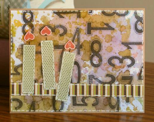
Stretch Your Stamps - Day 1
Topic: Online Class
I took an online class recently called Stretch Your Stamps. Popular stamp artists focus on multiple ways to use the stamps you already have to get more mileage from them. Day 1 the lessons were ways to use background stamps. I don't have a lot of these and didn't have the one they used for the lessons, so I just pulled out the 3 I did have: A field of dots, a distressed plaid, and swirls with butterflies.
Our first lesson was using Cut 'n Dry felt pad and reinkers to make a custom rainbow stamp pad. I've had the material for years and have not used it yet, so 'yay for me'. I used Adriondack reinkers to create an ink pad that is color bands on a diagonal.
This first card uses the dot background on the ink pad. I used the background to feature a foil illustration and tied everything together with rounded corners. The bow is fabric and I added a sticky rhinestone to the center.
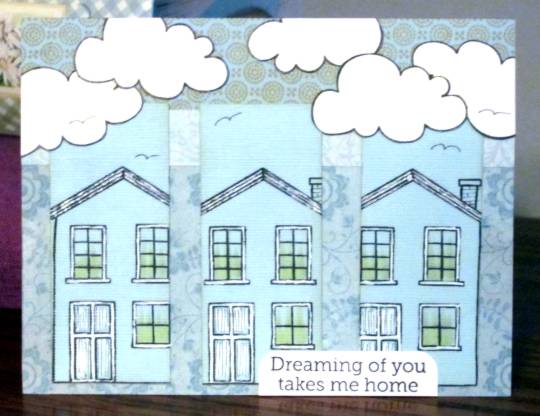
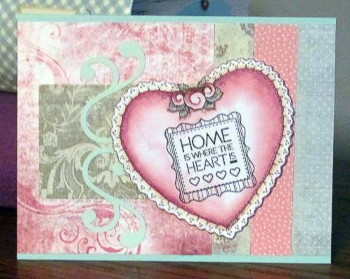
Then I made a whole bunch of these backgrounds with the distressed plaid stamp. On this card I stamped the Hero Arts / OWH house and hearts directly on the background. I used a water brush to blend the background colors in these areas. Then I drew stems for the hearts and stamped grass. The greeting is from my pre-stamped file and I rounded two corners and placed stamped and cut out clouds on top.

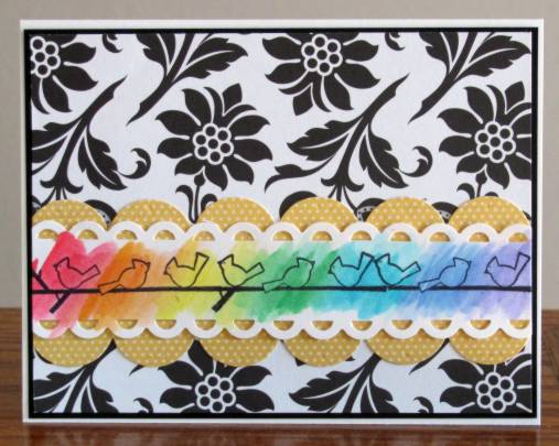
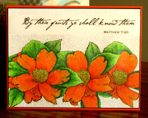
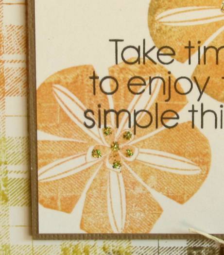
I used another of the rainbow backgrounds for the next lesson which was using a background stamp to 'kiss off' some of the ink on a solid stamp. I used the same plaid to kiss the flower stamp, added a sentiment and mounted with a scrappers floss winding accent. Here is a full view:
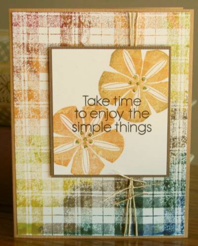
And on the close-up you can see the kissed plaid better. Also note that I added green Stickles to the flower centers.
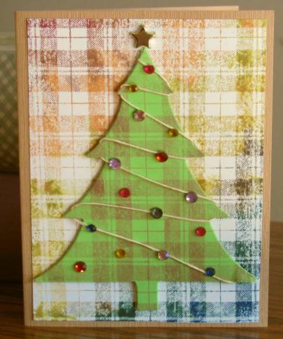
I also used the rainbow plaid for the background on this next card. The lesson for this one was using the background stamp on a shaped element. I used mine on the die-cut tree creating what I call a 'scotch pine'. LOL! I popped it up on foam tape aligned with the plaid in the background and then added a winding of scrappers floss and sticky rhinestones. I also added a star brad to the tree top. (A very 'country' Christmas)
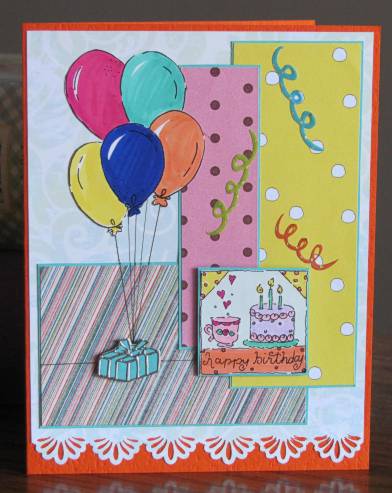
Next lesson was using a background stamp on patterned paper. I inked the plaid in three shades blue chalk ink and stamped on dotted green paper. I stamped the fence from the Hero Arts / OWH set and cut out the image from the scrapbooking page-a-day calendar. The paper for the text has a subtle white/blue dot pattern and I gave it a twist of scrappers floss. The grass is a stamp of several impressions.
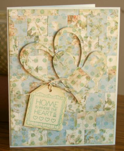
The next lesson was stamping on TWO patterned papers with different ink colors, cutting the papers into shapes and reassembling them. I had two papers that were the same print but one had a cream background and one blue. I stamped both with the dots background and cut 3/4 inch squares. These were reassembled over a xyron background. There was enough for the card front plus so I used the plus to die-cut the hearts. These were then popped up on foam tape. I stamped the tag and tied it to the heart with scrappers floss.
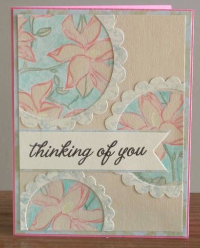
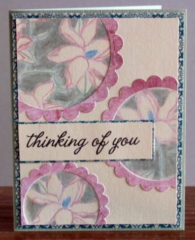
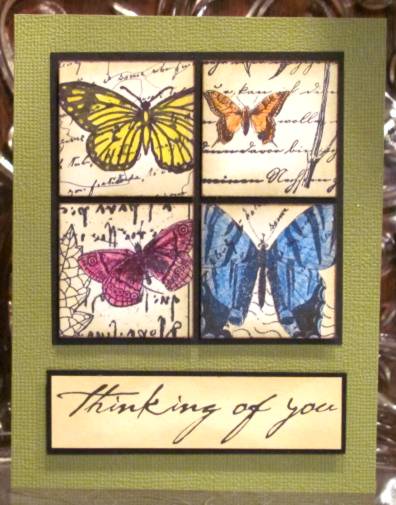
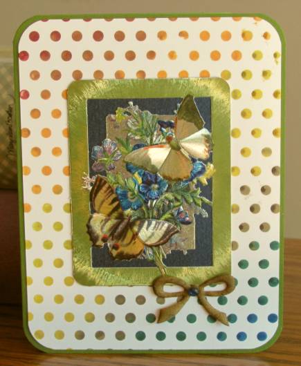
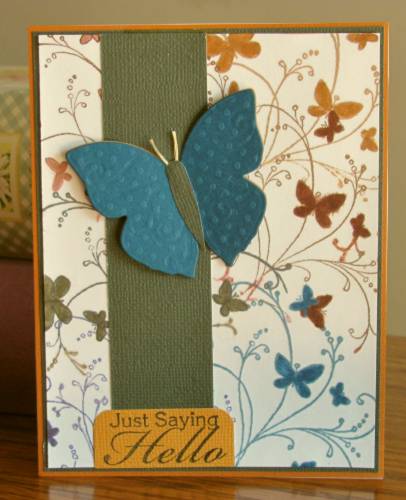
And, finally, I used a smaller background stamp with swirls and butterflies. I inked with one color of chalk ink and stamped and then repeated with 5 other ink colors. I used Distress Markers to color in the butterflies. I placed a strip of dark green to tone down some of the purple that was too bright at the bottom. Then I die-cut two butterflies in colors to match the background and layered them so the top one has its wings raised. The greeting is from the pre-stamped bin.
And so ends Day 1 of the class. If the rest of the class is this informative, I will be VERY happy.
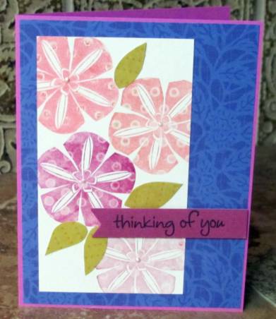
I made extras of the backgrounds while I had the materials out and put together a few more cards. This one is from the 'kissing' technique. I used the dotted background stamp on the solid flower. By adding some cut out leaves and some liquid pearl flower centers I had a great feature panel for a card. I added it to a blue background from the scrapbooking page-a-day calendar and popped up a sentiment on foam tape.
This one with the dots background just got a printed tag cut down for it, a twist of twine and a button. I mounted on colored cardstock base.
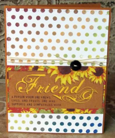
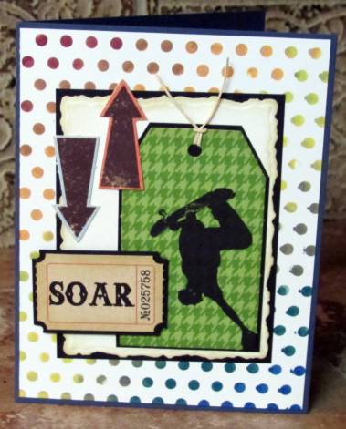
Anotherdotted background got a printed tag, an addage ticket, a deckle die-cut panel all backed with black plus two die-cut arrows and a bit of twine for the tag. This one got a denim blue cardstock base.
For this one I used a different background - one I had inked up but set aside from class as I wasn't really pleased with it. Then I found this printed tag and it suddenly had more appeal. I backed both with a thin black border and tied some sheer moss-green ribbon on the diagonals. As a final touch I added some red 'nail head' sticker dots.
A total of 11 cards from day one.
Ddd
Posted by studio3d@ccgmail.net
at 12:01 AM PDT
Updated: Tuesday, 31 July 2012 5:32 PM PDT