« August 2012 »
S M T W T F S
1 2 3 4
5 6 7 8 9 10 11
12 13 14 15 16 17 18
19 20 21 22 23 24 25
26 27 28 29 30 31
You are not logged in. Log in
Entries by Topic
All topics  «
3D paperwork
A - Z challenge 5
A - Z challenge 7
A - Z challenge round 4
A to Z challenge round 3
A to Z round 2
A to Z round 6
A-Z round 1
Around the House
Art Challenges
Artist Trading Cards
Backgrounds
Beads
Bible Journaling
Books
Boxes
Collage
Color Challenge
Coloring
cookbook
Die Cuts
Digital Projects
Digital Stamps
Drawing
Dry Embossing
Fabric Stuff
Fantastic Folds
Field Trip
Home Decor
How Does Your Garden Grow?
Hymnal Art
In The Kitchen
In the studio
Jewelry
Lettering
Links
Multi-Technique
Music to Work By
Musings
Nail Art
New Work
Online Class
Other Hobbies
Other Projects
Painting
Paper Embroidery
Paper Piecing
Photo
Pretty Paper
Quilting
Random
reading
Scrap Recovery
scrapbooking
Sewing
Sketch Challenge
Some Backlog
Stamping
Stencils
Stickers
Supplies
Teabag Folding
Techniques
Testing
tips and tricks
Tutorial
Web resources
Welcome to my Blog
Work By My Friends
workflow
Writing
Blog Tools
Edit your Blog
Build a Blog
RSS Feed
View Profile
Group One
In & Out of Studio 3D
Tuesday, 28 August 2012
Stripes and Dots
Topic: Scrap Recovery

More pieces from the table scraps bin.

The floral was white and black so I tinted it to make the flowers tan. Then I cut this as well as the black dotted paper into stripes and alternated them on a tan card base. I had the scalloped diecut left over from another project and layered that with a reverse dotted banner. On top of that is a stamping of my phoenix bird that I cut out with a round punch.

I ditressed the edges with a tool and distress ink then mounted it on foam tape.


Ddd


Posted by studio3d@ccgmail.net at 12:01 AM PDT
Monday, 27 August 2012
Dancin' On Dots
Topic: Scrap Recovery

I grabbed a whole bunch of little pieces from the table scraps bin using colors from the butterfly panel on the right. I cut them into bands and used a loose arrangement to allow the background cardstock to show through. The trimmings are a simple stamped greeting, pieces of white peel-off sticker lace at the top and bottom and a butterfly diecut with my Cuttlebug and a Spellbinders die. I used Old Paper distress ink to bring the butterfly color closer to the other blues. Then I gave it gold nailhead dots for a body and drew in some antennae.


Ddd


Posted by studio3d@ccgmail.net at 12:01 AM PDT
Sunday, 26 August 2012
Let It Snow - Later
Topic: Stamping

So how do you make it snow in August? With stamping!

I started with a white cardstock and masked off the bottom. I stamped the weeds with Versamark and then with black right below that. I embossed with clear powder. Then I tore a paper for the back hill and sponged blue distress ink onto the sky. I removed that mask and added another for the lower hill and sponged it from the bottom up. That mask was removed and the foreground was sponged from the bottom mask which was then removed. The sentiment was stamped last.

I trimmed the panel, bordered with black and placed on a white card base.

I made two of these - using different blues:


What a neat effect and so easy to do.

Ddd


Posted by studio3d@ccgmail.net at 12:01 AM PDT
Saturday, 25 August 2012
One, Two, Three - Let's Color Trees
Topic: Stamping

I saw some Spring trees created this way and thought I'd use the same method to make Fall trees.

I used a circle punch to create a round mask. Then I held it over tan cardstock and sponged three orange circles using different inks from Whispers. Over these I stamped a tree image with black ink. For one of them I used a tree with leaves but I prefered the leafless version so I used that on the other 5 cards.

I cut down the panel and tied a piece of scrappers floss around the panel. This was glued onto a orang-y brown folded card base and I stamped a sentiment on the bottom band of color.

Here is a full view of one:


And here is a look at the whole set of 6 cards:


That was so easy I may make some for the other seasons.

Ddd


Posted by studio3d@ccgmail.net at 12:01 AM PDT
Friday, 24 August 2012
A Band of Orange
Topic: Stamping

This may be as close to a one-layer card as I can make myself do! I decided to do some seasonal cards and started with fall. I started with a white cardstock and masked off the top and bottom. Then I used four different orange distress inks to blend a band of color. I stamped three leaf stamps a couple of times using a light brown distress ink and then removed the masks. I stamped the leaves again in black across the whole surface of the card. I stamped in some filler branches as well. I trimmed the panel, banded it in a golden brown and added three brads along the color line and a stamped sentiment. Then the panel was placed on a white folded card base.

I made two of these:


Ddd


Posted by studio3d@ccgmail.net at 12:01 AM PDT
Thursday, 23 August 2012
Rose Window Stained Glass Quilt
Topic: Quilting

I tried a new (to me) technique in quiltmaking to create a stained glass quilt. Each of the pieces is cut out, laid on a backing block and tacked in place with Steam-a-Seam2. Then the leading lines were added with single-fold bias tape and 1/2 inch wide Steam-a-Seam2. I did a mini-zigzag along both edges of the leading and then pieced all these blocks together. After I sandwiched the batting and backing with it I laid in the leading across all the seams joining the blocks and zigzaged along those for the quilting. This was for the patterned part. Then I added all the wide borders along with their batting and backing. The quilting for the wide borders is large roses at each corner and the centers of the sides. These are connected by leaves and vines. The whole quilt is bound in black.

Here is the queen-sized quilt:


Here is a closeup of the border quilting:


Ddd


Posted by studio3d@ccgmail.net at 12:01 AM PDT
Wednesday, 22 August 2012
A Takeover
Topic: In the studio

As quilting has taken over more and more of my time it has also taken up more and more of my studio space. It also started spreading to other parts of the house so I was doing cutting in the studio, pressing at the ironing board in the family room, piecing at a desk in the studio, sandwiching the quilt on a bed in a guest room, and quilting on the dining room table with all the leaves in it. Now that's just silly!

So we decided to cut back to having only one guest bedroom and use the other as a new quilt studio. We got rid of the bedroom set and I moved into the room with the sewing cabinet, ironing board, and fabric stash. I purchased four bookcases, a sheet of plywood (cut to 4 x 7 feet) and a piece of flannel-backed tablecloth plastic. From this I built a large table that is of a height for cutting fabric, sandwiching quilts and also quilting where the whole quilt has a place to rest without dragging.

Here's a view as you come in the door:


At the far side you can see the desk where the sewing machine sits most of the time and where I will do piecing. If you turn to the left wall there is a desk (which will eventually go elsewhere) with a bulletin board (that will stay) and the ironing board for pressing fabric.


From the pressing area, looking to the right you see the corner of the sewing table and you can see the open area in the table that allows for sitting here for sewing - just move the sewing machine over. Over on the far right you see the closet which has nothing quilt related at all. I bought a tension rod and some fabric to make curtains for this opening. The window will also get a matching valance.


The bookcases supporting the table will be used for my few quilting books as well as supplies. There is an open bay area for stacking bins with my fabric stash. I also installed a floor lamp for better lighting on the table.

Here's a view of the first quilt being finished off in the new quilt studio. Notice that I also installed a holder for my rulers under the window.


Now when the topic tag says 'in the studio' I might have to be more specific!

Ddd


Posted by studio3d@ccgmail.net at 12:01 AM PDT
Tuesday, 21 August 2012
Over Spray
Topic: Stencils

The stencil I used the other day with birds in the branches is actually a 6 x 6 piece that also includes some birdcages hanging from the branches. For those cards I blocked out all the birdcages. Today, however, I left one of the cages exposed. I also used three color sprays instead of the sponging like before and I used watercolor paper to control the bleeding and buckling of the paper.

I used a bit of a red, a blue and a green - trying to control where the color sprayed to give it a painterly look. I then pierced at the top and bottom of the hanging chain and threaded scrappers floss through to tape on the back. I added a bow of the same at the top of the cage.


I made a color blocked background to represent the sky and the ground and cut a pre-stamped sentiment. The center of the strip is popped up on foam but the ends are flat to the paper.

I added a clear sticker to the bottom edge.

Ddd


Posted by studio3d@ccgmail.net at 12:01 AM PDT
Updated: Thursday, 9 August 2012 9:56 AM PDT
Monday, 20 August 2012
Buzzin' In the Cattails
Topic: Paper Embroidery

I've always been fond of cattails so when one group allowed us to do our 'pattern of choice' for a swap I selected this from the book I own.

I stitched the heads in a brownish green and the stalks and leaves in a mossy green. Little moths from a sticker sheet seemed to fit right in with them.


The color is horrible in the photo. The pattern is actually stitched onkraft cardstock and the base card is really a deep forest green! However, the corners really are rounded just like the photo indicates.

Ddd


Posted by studio3d@ccgmail.net at 12:01 AM PDT
Sunday, 19 August 2012
Out On a Limb
Topic: Stencils

NEW CATEGORY! A while back I bought a couple of stencils to use on cards and just got around to trying one out. This is one of the mini stencils from The Crafters Store called Birds of a Feather.

I gathered a bunch of wide printed paper strips from the table scraps bin and selected Distress Inks to coordinate with each one. Then, using washi tape, I blocked off a portion of the stencil (hanging birdhouses) that I did not want to transfer to the paper. I used foam daubers to pick up ink from the pad and sponged it through the stencil onto the patterned paper.

When these were done I selected more table scraps for each one and then chose a card base. Each one then got a sentiment from the pre-stamped bin plus some paper flowers with either pearl or rhinestone centers. In some cases, where the contrast was not high between  a couple of papers, I used a colored or black fine line marker to draw in some faux stitching.

I made 7 of these cards with three being vertical and four on the horizontal.


Many more techniques to try using the stencil (including using the birdhouses portion of them). So, expect to see this again.


Ddd


Posted by studio3d@ccgmail.net at 12:01 AM PDT
Saturday, 18 August 2012
She Did It Again
Topic: Nail Art

It was time for a new manicure so I played with my stencil set again. This time I started with a base of a sheer purple (2 coats) and an over layer of a color shifting lighter purple in one coat. The end result looks more pink than purple but has wonderful depth.

I wanted to do the 'stamping' with the stencils again and chose an image with multiple flowers in the design. It also has a couple of leaves and some dots. I had to use it twice for each of the thumbs. I decided that I would do it in white since the base polish was so light.

I've noticed that, although they are the same brand of polish and MADE for nail art, the white is much more apt to smear with the application of topcoat. This is true no matter how long I let it dry. Kind of annoying as I had a couple of nails that it smeared so badly I had to take the polish off to the nail and start completely over with all the layers.

In the end, I like the result. It is much more low-key than the last few manicures I have been sporting but totally appropriate for a breezy summer look.

Ddd


Posted by studio3d@ccgmail.net at 12:01 AM PDT
Updated: Monday, 30 July 2012 2:24 PM PDT
Friday, 17 August 2012
Icing on the Cake
Topic: Paper Embroidery

Challenge: Make a wedding card with paper embroidery.

I have only stitched up this pattern one time since I designed it years ago. So I decided to have another go at it. I started with a pink shimmer cardstock and pricked ut the pattern. I used irridescent white thread to stitch the cake icing, an irridescent lavender for the plate and silver for the ring cake topper. I then spritzed the card lightly with a purple shimmer spray. This also darkened portions of the plate.

This pattern has slits for ribbon to thread through to form the tier separator pillars. It also has a series of 5-spoke thread wheels so that one can needle-weave ribbon around them which creates roses. I created these ribbon roses in dark purple for the bottom layer, lavender for the middle layer and white for the top layer.


I placed silver text stickers between the cake layers and mounted it on a bordered cardstock over two lavender layers.

I love how this came out and will add it to my stash for just the right couple.

Ddd


Posted by studio3d@ccgmail.net at 12:01 AM PDT
Updated: Tuesday, 31 July 2012 5:08 PM PDT
Thursday, 16 August 2012
Drunken Marbles
Topic: Backgrounds

I bet this is NOT what you expect... I wanted to see if I could do marbling with alcohol inks!

I put an inch of water in a shallow dish then I got out three colors of alcohol ink and dropped three drops of each color on top of the water. Then I swirled a bit with a toothpick and dropped a piece of white cardstock on the surface of the water. It has to be pulled and dried immediately with a heat gun to keep the paper from buckling too much.

I started with a yellow-green, a blue and a red. After drying I cut it down, mounted it over a patterned paper and card base. I stamped two cupcakes at the top and a greeting on the lower half. I stamped a sentiment border across a striped strip and mounted that to support the cupcakes. I colored in the cupcake flowers to match the marbled paper.


For the second one I used a blue, a turquoise and a green. I did not swirl this one much so the color blocks are larger. I cut this one down and mounted on patterned paper and cut a text-print with a flag bottom to mount over it. Before mounting, I stamped a tag-shaped greeting , punched a hole and tied it around the banner with scrappers floss. I stamped a greeting at the bottom of the marbled paper and then mounted three butterflies punched from a paint sample strip. Each of these got a purple rhinestone center.


So, 'yes' you can do marbling with alcohol inks. And now you know!When I do this again I will use watercolor paper to help with some of the buckling. I wonder if it will take the color differently... That is an experiment for another day.

Ddd 


Posted by studio3d@ccgmail.net at 12:01 AM PDT
Updated: Tuesday, 31 July 2012 5:10 PM PDT
Wednesday, 15 August 2012
Stretch Your Stamps - Day 11
Topic: Stamping

The stamp style for day 11 was 'reverse stamps'. These are blocks that the design is carved away and the background stamps solid. I only have three of these and one was so small (about 1 x 2.5) that I lost it on my tabletop for the entire day and only found it when I was cleaning up from the day of playing. So I used TWO stamps today in four different ways.

The first set was done by masking a piece of kraft cardstock with circle openings and stamping the background stamp with white pigment ink. I heat set the ink and then used colored pencils to color over the white inked portions. I also traced the outlines of the open areas in colors appropriate for each area of the design. I Used a Prismacolor blender pencil to smooth out the coloring. I used a plain and scalloped spellbinders die to make decorative frames from patterned paper, trimmed out the panel and backed it with another patterned paper and a colored card base. The sentiment was stamped on kraft paper, trimmed, and backed with patterned paper. The first one is done in pastels.


This one in the same style was colored with metallic colored pencils.


I next used the other reverse stamp with white Staz-On ink on transparency. I did two of these as well. I cut a scalloped oval in patterned paper and mounted the transparency to the back. On a folded card base I mounted a contrasting color and then placed the aperture panel on it with foam tape. I placed a silver sentiment sticker in the middle of the transparency and added three paper flowers with silver nail head centers along the bottom of the opening.

The first is a birthday card.


And the next is a generic 'hello' card.


Back to the first stamp. I stamped this on text print designer paper with light-toned chalk ink. The first was trimmed out and placed on a Cuttlebug embossed white background along with two designer paper strips. I tied a sheer ribbon at the bottom and added a green card base and silver sentiment sticker.

 Then I used a single strip behind the next one and tied the ribbon vertically. Both the designer paper and the stamped panel were backed with brown to match the card base.


The next one got a horizontal treatment to show more of the embossed background. I backed it with two designer paper strips and let the stamped panel, with rounded corners, runn off the left edge. The ribbon goes over the top this time and I used a gold sentiment sticker. I picked up one of the colors in the designer paper by using a dark blue card base.


Now, get out your sunglasses because it's going to get BRIGHT in here.

This time I stamped on white cardstock with Versamark ink and embossed in black. Then I colored in the image with blended watercolor markers. I trimmed the panel and cut an orange backing with a nestabilities die. This is cut on the two ends separately and the sides trimmed to meet. Then I stamped and embossed in black a border element at the top and bottom. The feature panel is mounted to the orange backer and both are adhered to a striped designer paper over a yellow card base. I stamped the sentiment on yellow and trimmed it out before mounting on foam tape.


And, that's it... class dismissed.

Ddd 


Posted by studio3d@ccgmail.net at 12:01 AM PDT
Updated: Thursday, 9 August 2012 10:04 AM PDT
Tuesday, 14 August 2012
Stretch Your Stamps - Day 10
Topic: Stamping

Here we are with day 10 already. Just one more day to go of class.

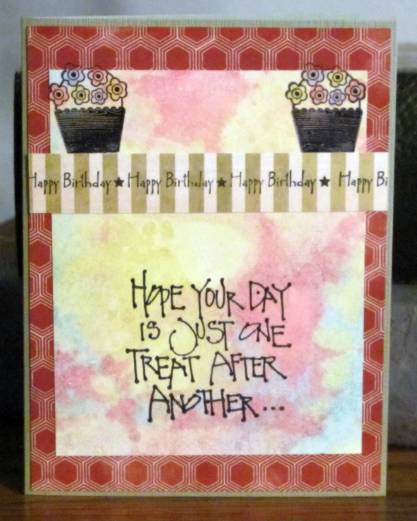
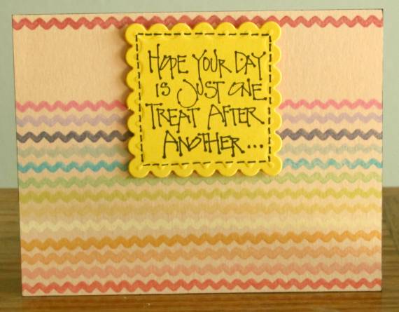
For day 10 we made use of border stamps. For the first card I used a zig-zag border and inked it up with a series of chalk inks and stamped myself a little rainbow. I did this directly on a colored card front and added one border at the top as well. I stamped a sentiment on a bright yellow square and diecut it with a scalloped nestability. I popped it up on foam tape and then added a dashed black line around it.


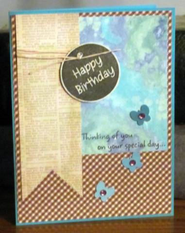
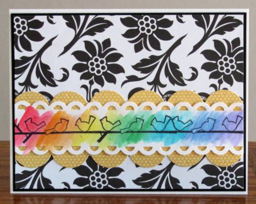
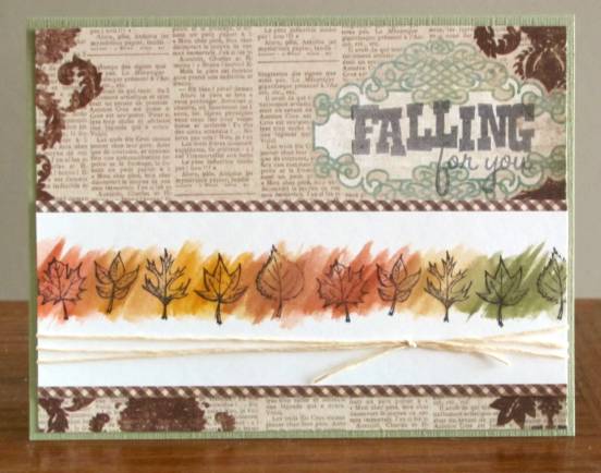
Another lesson was on stamping a border with an open image and doing a loose watercolor wash over it. I stamped a short border three times to stretch across a white card. I used marker inks for the 'paint' in the watercolor. When it was dry I trimmed it down and used a scalloped border punch on each edge. I used a larger scallop border punch on some yellow dotted paper and layered them. I placed them on a black and white designer paper and trimmed the whole thing. Then I bordered it with black and mounted on a white card base.


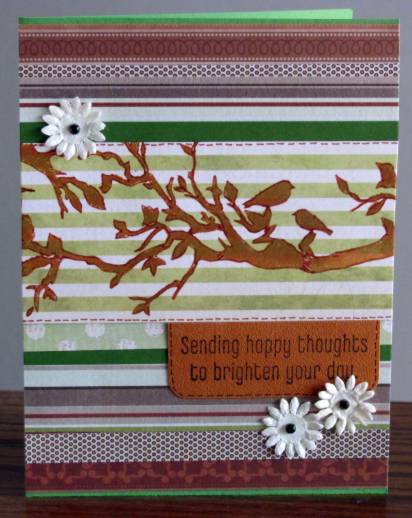
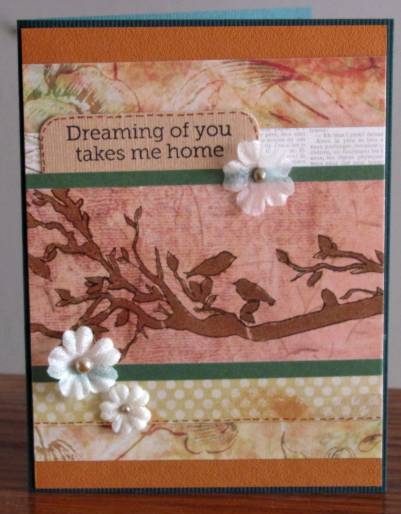
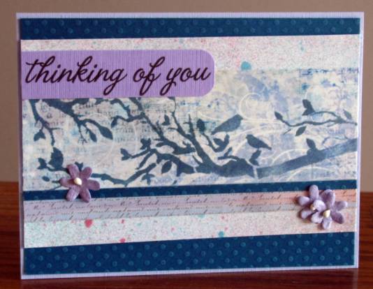
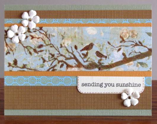
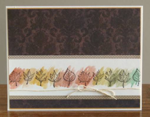
I did this a couple of times again with a leaf border stamp. In both cases I bordered the piece and placed on a printed paper background. I also tied scrappers floss around both. On the first one I also stamped a sentiment on an open area of the background paper.


Then I did one with a solid background paper and no sentiment.


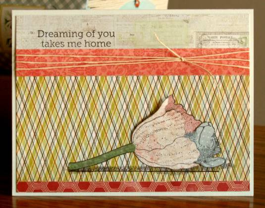
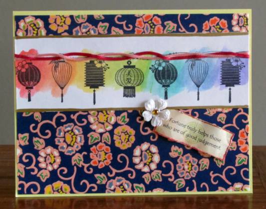
Finally, I stamped a border of Japanese lanterns. I twisted two satin cords and attached then along the top of the lanterns. I used Krylon gold paint pen to border the top and bottom and added it to a background of origami paper. I added a faux cookie fortune and a white paper flower with a rhinestone center before placing on a yellow folded card base.


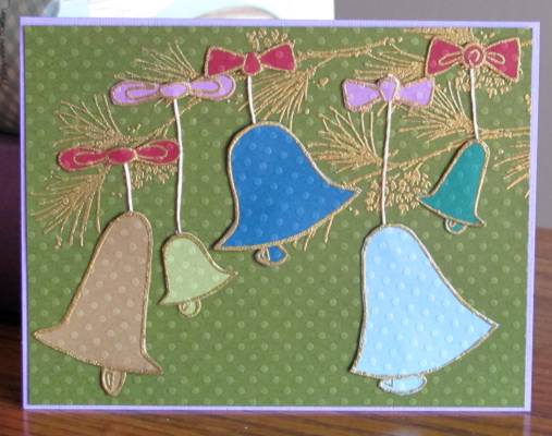
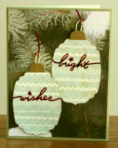
The next idea for us to try was using several borders together and embossing them with white on patterned papers. These are die cut into shapes for card embellishments. For this first one I cut two embossed pieces into ornaments. I used a Krylon gold paint pen to border both of them as well as the background paper. I cut caps out of gold paper and attached them. Then I created loops from scrappers floss and attached them. The upper ornament is glued directly to the background and the lower one is popped up on foam tape. I added sticker sentiments to both ornaments and sticker waste as hangers. This is mounted to a green card base.


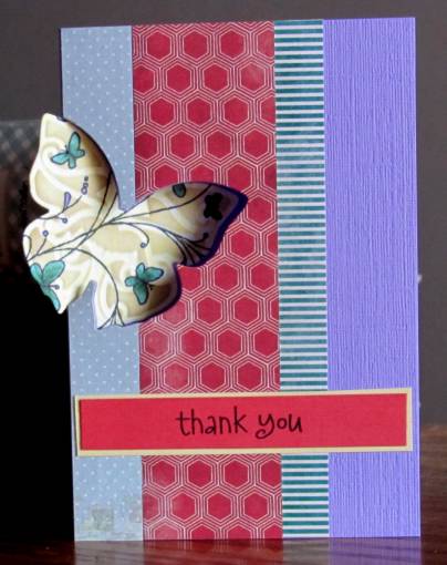
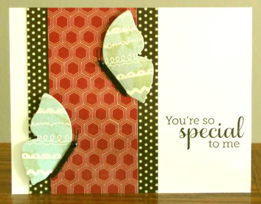
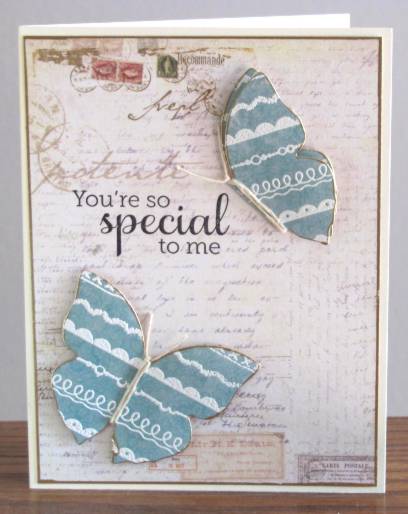
Then I turned the rest of the embossed border peices into butterflies and butterfly halves. This one is different from the rest of them in that I used only a partial covering of designer papers over a white card base. I gave both of the butterfly halves black bodies of card scrap, drew in antenna and feet and added black rhinestones for heads. I stamped the sentiment directly on the card base.


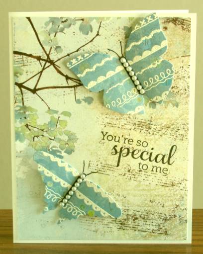
I have two butterfly diecuts and I used both for this card. On top of the black bodies I added pearl strips. Love this background paper.


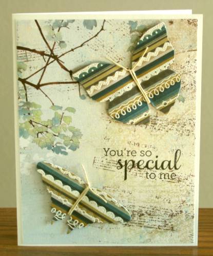
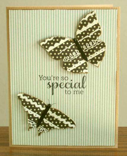
I used striped paper for these butterflies and really like how they came out! For these bodies I wrapped scrappers floss around twice and tied at the head for antenna.

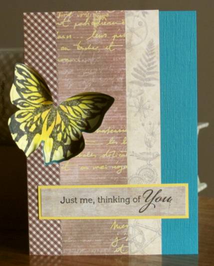
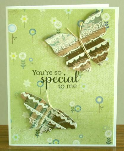
These butterflies, also striped, are treated in the same way as the last. I also forgot to say that all the butterflies are glued to the background at the body and the wings are popped up on foam dots.

More bodies tied with string. The upper butterfly is actually two layers. All of these butterfly parts are banded with gold Krylon paint marker as is the border of the background paper.


Love the background paper on this one, love the dotted butterflies, love the gold paint borders.

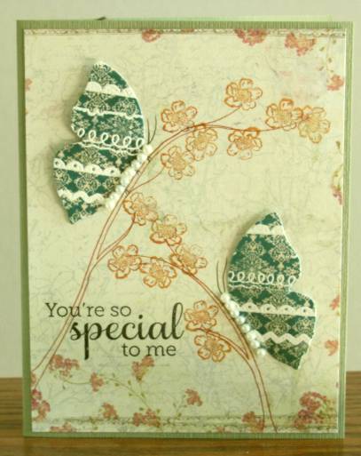
For this one I used two half butterflies and gave them pearl bodies.They looked too random hanging out there so I drew in branches for them to sit on. Those were too stark so I stamped blossoms on them. This one got a green card base to go with the butterflies.


I picked the sentiment when I started the series and saw no reason to skip to something else.

Ready for day 11? I am!

Ddd


Posted by studio3d@ccgmail.net at 12:01 AM PDT
Updated: Thursday, 9 August 2012 9:54 AM PDT
Monday, 13 August 2012
Stretch Your Stamps - Day 9
Topic: Stamping

No need to write an outline - today we were stamping them. I actually had a number of stamps that qualified and made 9 cards with the techniques we learned in class.

First, I created two color blocked cards using the same images. I used the Xyron to apply adhesive to the whole 1/4 card panel. Then I attached 4 strips of colored cardstock. Over these I stamped the images with Versamark and embossed in white. The panel was then trimmed and mounted to a white card front. The last step was applying various Stickles to the cupcake icings (which you cannot see at all in the photos).


The next technique is to make the image look like it was hand drawn. I used watercolor paper and stamped the poppy five times with a very light chalk ink. Then I traced over the lines with a distress marker. I also drew in the stems with distress marker. When this was all dry I used distress inks (markers and ink pads) as watercolor paint and colored the image. This is about 5 layers of color. After trimming the panel I bordered it with green and placed on a colored card base. I stamped the sentiment on coral card and trimmed, bordered and mounted on foam tape. I tied emboidery floss through buttons and trimmed and frayed the ends. These are attached to the flower centers with glue dots.


The next card is stamped on kraft cardstock with Versamark ink and embossed in white. I colored all the images with watercolor markers and buffed the ink off the white embossing. I drew stems with green marker and bordered them with white gel pen. The panel was trimmed, bordered with white and mounted to an orange card base. I stamped a sentiment on a white strip,trimmed, bordered and mounted to the card front. (This one was a featured student card selected by the instructors from the gallery)


I'm not too fond of the next one. It is stamped on kraft cardstock and colored with colored pencils. The panel was trimmed and bordered in black. I mounted to orange cardstock and added a stamped sentiment strip. I glued on tiny side borders and added tiny buttons to the flower centers (my favorite part).


More simple is this spotlight card. I stamped the image multiple times on white cardstock. I also stamped the parts of the image on printed cardstock and trimmed them out. These are mounted on foam tape. I stamped a sentiment on colored cardstock and tied it to the panel. I bordered the panel with printed cardstock and added to a folded card base.


For the next card I stamped all the images on pieces of dot textured cardstock with Versamark and embossed in gold. I also used the same technique to add the pine bough to the background. Each of the bells, clappers and bows were trimmed out and mounted using glue dots while trapping the ends of scrappers floss under the ends. After trimming the panel I added to a purple card base.


For this card I stamped the cups and mugs on various patterned papers using Versamark ink and embossed in white. All were trimmed out and I used a craft knife to cut a slit at the rim. I stacked them together and mounted to a patterned paper. This panel was trimmed out and layered on a brown card. The sentiment was emossed in white on patterned paper, trimmed, bordered and mounted on foam tape. I added three white paper flowers and placed brown rhinestones in their centers.


The last card was so much fun to make. I first stamped every image on masking paper and trimmed them out to create masks. Then, on watercolor paper, I started stamping with the foreground elements. The bicycle was stamped then masked, next was the left house which was masked and the tree stamped. I stamped the second house and moved the mask to it before stamping the picket fence. The fence was masked and I stamped the tree andright cloud. Then the kite was stamped, masked and the left cloud was added. The third house was added last. I drew in the two pieces of wire fences. All of the masks were then removed and I set to painting. This was done by using the ink of distress markers colored on an acrylic block for the base coats and drawing with the distress markers for details. When it was all dry I trimmed it only slightly so it makes a larger card. I bordered it in black and placed on a pastel card base. The sentiment was stamped on printed cardstock, trimmed and adhered to the road.


LOVE, LOVE, LOVE this card!

Ddd


Posted by studio3d@ccgmail.net at 12:01 AM PDT
Updated: Thursday, 9 August 2012 9:39 AM PDT
Sunday, 12 August 2012
Stretch Your Stamps - Day 8
Topic: Stamping

Day 8 was all about labels. I didn't think I had any of these but found a couple on sheets of other stamps. So I pulled out two that I liked and used each of them twice.

Our first lesson was using a smallish label as a supporting element for a larger sentiment. I used the label in a pretty straitforward way by stamping on white cardstock with black ink. I used distress ink to tone it darker in the center. I trimmed this panel down and rounded the corners. then I used a black Spica glitter pen to darken the thickest lines and give them some shine. I layered the panel over the green stripes and added a gold and a dot strip to each side while mounting to the card base. I bordered a long sentiment strip with gold and added it to the card front by gluing at the ends and popping the middle on foam tape. I added three dragonflies punched from a paint strip and made dots of Liquid Pearl at the ends of the sentiment strip.


The next suggestion was to make the label seem larger by stamping the top and bottom separately. I did this on white cardstock and tinted the edges with distress ink. Then I cut it out with a nestabilities die by cutting the top and the bottom separately. I attached this panel to the green dotted cardstock and used corner scissors to trim it. This was placed on a white card base and those corners were rounded. On coral cardstock I stamped a sentiment with versamark and embossed it in white. I cut a gold frame using two nestabilities dies and mounted it on the coral piece. These were popped up on foam tape. I added gold nail head stickers to the scrolls on the stamped label.


I switched to the other label for these next two. I stamped a floral spray with versamark on a tan cardstock and embossed in clear just to give a tone on tone background. I trimmed and bordered this panel and mounted to a white card base. I stamped the label on white cardstock with black ink, trimmed and tinted the edges with distress ink. I stamped the sentiment on the label with chalk ink and mounted to the card front with foam tape. Three pearls added to each side of the spray are the finishing touch.


For this card I used the label to create a background by stamping repeatedly on white cardstock with red chalk ink. Then I colored with a red marker on an acrylic block and used that ink to watercolor the labels. When it was dry I stamped the script image with light brown chalk ink, trimmed the panel, bordered it with black and mounted it to a white card base. The layers were then all tinted with distress ink. I stamped the label on white cardstock with black ink and watercolored it as well. Then I stamped the sentiment in black and trimmed the label. I backed it in black and popped it up on foam tape. I used a Cuttlebug die to cut black scroll elements and glued them in place. Three black rhinestones are set in the scroll ends and two pink rhinestones grace the top and bottom of the label.


I think I am definitely learning in this class.

Ddd 


Posted by studio3d@ccgmail.net at 12:01 AM PDT
Updated: Thursday, 9 August 2012 9:26 AM PDT
Saturday, 11 August 2012
Stretch Your Stamps - Day 7
Topic: Stamping

Floral images are probably my favorite to stamp and to color just because they are so versitile and the coloring can be organic rather than precise. So day 7 was really made for me. I had no problem coming up with projects to go with the techniques and had plenty of images in my stamp collection to select from

Our first demonstration was stamping on burnished glitter. Well, I don't use glitter since I started making cards for Operation Write Home becuase the glitter gets on the soldiers' clothing and makes them visible to night scopes. BAD THING! In order to keep from contaminating OWH cards I just don't use glitter at all. So I had to think of a way to make the concept work for me. I had some white cardstock that I had sprayed with a shimmer mist a long time ago. I used a piece of that and stamped a floral on it with Archival ink, masking so I could get three blooms and extras of the leaves. I used watercolor markers - three of each color group - to color up the image and blend the colors. I was liking it pretty well at this point but the coloring took away some of the shine. I decided to spritz over the top with Perfect Pearl mist. This caused the colors to start running together and I FELL IN LOVE! I used a heat gun to dry the image so the running would't go too far. I cut a strip of printed vellum for the text and wrapped it to the back to adhere it. I also tucked a couple of mini glue dots under the text and they don't show. Then I mounted with a very fine black border and an orange card base.


Next I used a different floral image and stamped all over a white card with Archival Ink. I colored in only one of the images with watercolor markers, using three of each color group. I spritzed over the top with a mist spray and, after drying, used old paper distress ink to tone the panel while leaving a white area around the feature bloom. I mounted on colored cardstock and added a bordered pre-stamped sentiment. Three small purple rhinestones under the sentiment help balance the design.


Another floral image was chosen and stamped repeatedly in a corner treatment using pale chalk ink. I used distress inks like watercolors to paint the blooms. It was a little sparse so I stamped some fillers from another set and painted them as well. For the sentiment panel I punched two 1/8 inch holes on each end and removed the cardstock between them to make slots. This I used to thread sheer ribbon. I used foam tape to pop up the sentiment and then pulled the ribbon ends to the back to attach before adding to a colored card base.


I repeated the technique in a monochrome look by stamping with a darker chalk ink and painting only with brown tones. I did not paint the fillers on this one either. The sentiment is tied on with scrappers floss through single holes instead of ribbon and slots.


One of the techniques suggested was paper piecing in a 3D manner. I pulled out my little sleeping mouse and stamped once on a patterned paper base and then on 4 other patterned papers for the parts of the picture. The elements were cut out, leaving parts underneath so you can see 'into' the image. I mounted the back of the flower flat to the background, then added the mouse with his head popped up on foam tape but the body not popped. The flower front is on foam at the open edge and stuck to the background at the base. The whole stem is glued directly on the backbround. I added a shadow underneath with a marker. Three strips were selected to band the top and bottom and scrappers floss was tied around one of the top strips. Then I mounted it to colored cardstock. On this first one I stamped the sentiment directly on the background.


The next one is the same concept with different papers for all of it. I also used a pre-stamped sentiment and trimmed it, rounded the corners and added dashed lines. Then I stuck it on, aligned with a paper seam. (How different that diamond plaid looks when it is on it's side!)


The final card is the most simple one. We used a more graphic floral stamp in black to create a silhouette. I used three stamps from two different sets and then grabbed a leaf from a third set as a filler. I spritzed the whole thing with black mist and stamped a sentiment with Momento black ink. The only color is the card base.


Another successful day of stretching my stamps!

Ddd 


Posted by studio3d@ccgmail.net at 12:01 AM PDT
Updated: Thursday, 9 August 2012 9:09 AM PDT
Friday, 10 August 2012
Stretch Your Stamps - Day 6
Topic: Stamping

Yes, you are right (if you were paying attention) there was not an entry for Day 5. That day was on making use of sentiment stamps. I actually had a day too busy to make samples and had already created some using most of the techniques they demonstrated. So I shared those previously made cards in the class gallery.

Day 6 was a 'bonus day' and featured ideas for using the stamps that come with cutting dies. I have none of these. I do have cutting dies in a few shapes but none have stamps that go with them. So for two of them I used other stamps to create a background and then used one of my butterfly dies for the technique. 

What this involves is using the die to cut only a portion on the front only of a card base, along the fold. Then the stamped item is cut out with the same die and glued to the inside of the card so it shows through the aperture. Cool!

For the first one I used a butterfly background stamp and colored it with a combination of Copics and Bic MarkIt pens. I decorated the card front with three strips of printed paper and cut down the width of the card so it is 4.25 inches from the outside edge of the wing. This allows it to use a standard envelope. I bordered and attached a pre-stamped sentiment.


For the next one I used a butterfly stamp (that does not match the die) and colored it with a combination of Copics and Bic MarkIt pens in yellows. I also decorated this card front with three strips of printed paper and cut down the width of the card so it is 4.25 inches from the outside edge of the wing. I bordered and attached a pre-stamped sentiment. The print on the center strip was white and there was none anywhere else on the card. So I used yellow marker to tint it all.


This one is done with the same style except I used one of my own carved stamps and did all the cutting with a craft knife instead of a die. For this I also decorated the front with three strips of paper and then I free-hand cut some leaves and stems from decorator paper. I reinforced the edges with some green marker and then added the bordered pre-stamped sentiment. I like the rose but wished I had done something else on the front of the card (like more roses that would overlap the inside one).


Finally, I thought my hand-carved hummingbird would look good with this technique. I trimmed this one out with three wooden diecuts and dropped red-orange rhinestones in the centers of them. One black rhinestone stands in for the eye on the hummingbird. The pre-stamped and bordered sentiment is popped up on foam tape so it is the same depth as the wooden flowers. (It is difficult to photograph this one because the images don't line up well when the card is propped slightly open so it will stand up)


This isn't a technique I will use often (if ever again) since my lack of matching dies and stamps makes it more cumbersome than the finished product warrants.

Ddd


Posted by studio3d@ccgmail.net at 12:01 AM PDT
Updated: Thursday, 9 August 2012 9:19 AM PDT

Newer | Latest | Older