« July 2013 »
S M T W T F S
1 2 3 4 5 6
7 8 9 10 11 12 13
14 15 16 17 18 19 20
21 22 23 24 25 26 27
28 29 30 31
You are not logged in. Log in
Entries by Topic
All topics  «
3D paperwork
A - Z challenge 5
A - Z challenge 7
A - Z challenge round 4
A to Z challenge round 3
A to Z round 2
A to Z round 6
A-Z round 1
Around the House
Art Challenges
Artist Trading Cards
Backgrounds
Beads
Bible Journaling
Books
Boxes
Collage
Color Challenge
Coloring
cookbook
Die Cuts
Digital Projects
Digital Stamps
Drawing
Dry Embossing
Fabric Stuff
Fantastic Folds
Field Trip
Home Decor
How Does Your Garden Grow?
Hymnal Art
In The Kitchen
In the studio
Jewelry
Lettering
Links
Multi-Technique
Music to Work By
Musings
Nail Art
New Work
Online Class
Other Hobbies
Other Projects
Painting
Paper Embroidery
Paper Piecing
Photo
Pretty Paper
Quilting
Random
reading
Scrap Recovery
scrapbooking
Sewing
Sketch Challenge
Some Backlog
Stamping
Stencils
Stickers
Supplies
Teabag Folding
Techniques
Testing
tips and tricks
Tutorial
Web resources
Welcome to my Blog
Work By My Friends
workflow
Writing
Blog Tools
Edit your Blog
Build a Blog
RSS Feed
View Profile
Group One
In & Out of Studio 3D
Sunday, 28 July 2013
Raggedy Angel Doll
Topic: Coloring

I colored up this doll a while back and decided to have another go at it. I used alcohol inks on plain cardstock again.

I decided to whack off her topknot which I think makes her cuter. The coloring covered so many hues that it was difficult to put together a card that didn't look too busy. I accomplished this by using some colors only in bordering and letting the red become the focus.


By stamping the sentiment directly on the background I was able to eliminate one layer of detail.

Ddd


Posted by studio3d@ccgmail.net at 12:01 AM PDT
Saturday, 27 July 2013
Jazz In The Garden
Topic: Coloring

Here is another of my hand carved stamps that I found in the drawer. Simple coloring with alcohol markers gives them real impact.

I didn't want to detract from that so I played it up with graphic papers for the background. The grey lace and grey dots allow the eye to rest shile the black and white chevron and the red dot echo the colors in the image.


I decided to use the green of the leaves in the bordering for the other elements.

Ddd


Posted by studio3d@ccgmail.net at 12:01 AM PDT
Friday, 26 July 2013
On The Lookout
Topic: Coloring

Some time ago I stamped up every one of my hand carved images for a display. Then I just threw them in a drawer. When I pulled out this lighthouse I decided to use alcohol markers in very pastel colors to not overwhelm the blue ink of the impression.

I went with a taupe card base and bordering. Color blocking with squares of patterned paper provide a base for the image which is popped up on foam tape.


I stamped the sentiment ona piece of the backing color and then bordered it with the same color as the stamping in the image.

Ddd


Posted by studio3d@ccgmail.net at 12:01 AM PDT
Thursday, 25 July 2013
Boston Tea Party
Topic: Coloring

These tea elements are from different sets so the only way to make them look like they were the right scale was to set the cup way out in front. I used the bands of bordering as anchor points for the china and used backing papers to echo the colors in them.


So, what's with the title of the blog entry today? Look at the backing paper. At the top edge is the word 'Boston'. Planned? Not at all! In fact I didn't notice it until I was editing the photo. LOL!

Ddd


Posted by studio3d@ccgmail.net at 12:01 AM PDT
Wednesday, 24 July 2013
Let Them Eat Cupcakes
Topic: Coloring

Cupcakes make me happy. Not necessarily REAL cupcakes, either. Just cupcakes in general. I have several images of them and this is my favorite.

For a single image I pulled green borders and card base from the cupcake paper. Combining these with pastel patterned papers keeps them the focus. I added a gold peel-off sticker and three gold brads for accents.


I used the three remaining cupcakes like they are sitting on the table with a wallpaper background.The blue version is popped up on foam tape. I mounted a birthday peel-off sticker onto cardstock to match the card base and trimmed it out. This is up on foam tape, too.


All the cherries on both cards have Glossy Accents for a little shine.

Ddd


Posted by studio3d@ccgmail.net at 12:01 AM PDT
Tuesday, 23 July 2013
Another Great Mystery
Topic: Coloring

This is another flower that I am at a loss to identify. But it looks tropical to me so I gave it vibrant colors.

I cut the flower with a narrow white border and echoed that  with deep purple. The purple was carried on to the borders on the patterned papers and as the card base.


I stamped the sentiment repeatedly in a staggered pattern on the largest strip to create a text background.

Ddd


Posted by studio3d@ccgmail.net at 12:01 AM PDT
Monday, 22 July 2013
That's For The Birds
Topic: Coloring

I am really so-so on this image. Trying to remind myself why I even bought it. It can technically be colored up as a Stellar Jay as well as a Cardinal. In fact, I tried the jay but it turned out horribly so I trashed it.

So, here is the cardinal. I backed it with many layers of patterned papers and color borders. The black scalloped papers are a perpared journaling block that I cut apart to fit this space.


This image was colored with alcohol markers on plain white cardstock.

Ddd


Posted by studio3d@ccgmail.net at 12:01 AM PDT
Sunday, 21 July 2013
Sun In The Garden
Topic: Coloring

I watercolored two sunflower images using Distress Marker inks and fussy cut them for mounting on two very different cards.

I combined papers from a 'denim' 6x6 pad for the first treatment. I used some denim blue for the card base and some buttery yellow to back three accent strips. the image is popped up on foam tape and the sentiment is stamped directly on the background.


From girly to masculine with a change in papers. I used three papers from Tim Holtz and bordered them with chocolate brown. The image is adhered directly to the background. I stamped the sentiment on green paper to match the stem and cut the top into 'grass' as an anchor for the flower.

Now THAT is a difference in treatment.

Ddd


Posted by studio3d@ccgmail.net at 12:01 AM PDT
Saturday, 20 July 2013
You Can Send Me Flowers
Topic: Coloring

This is an image that I've had around forever and never used. It came in a large set and just never seemed to speak to me. I colored it up three times in Distress Marker ink treated as watercolors.

With the first image I cut it out with an oval die and backed it with a large scalloped die. Three strips of patterned paper are laid out in a formal arrangement and I have tied a bow on three strands of purple twine.


With the second image I went with a bold yellow card base and added four squares of patterned paper as a backing for the scalloped focal piece. a little faux stitching on the blocks and a black tracing on the image help the pieces stand out. Then I found some awesome border stickers and applied those to either end before rounding the corners.


Finally, I used a fancy die to cut out the colored image and backed it with a deep purple paper. A green patterned paper underlies this with a base background of a diamond stripe. Borders of the dark purple at every layer ties it all together.


You certainly can't say they all look the same!

Ddd


Posted by studio3d@ccgmail.net at 12:01 AM PDT
Friday, 19 July 2013
Chicka, Chicka
Topic: Coloring

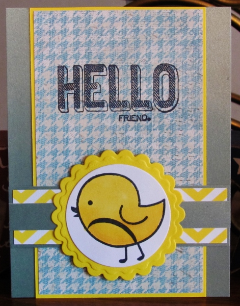
Sometimes you just have to break out a stamp you've had forever that has never been inked. Such is the case with this chubby chick. I stamped and colored it identically four times using Copic markers. Each image got it's own treatment, though.

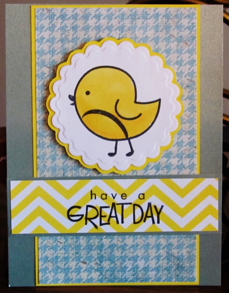
First is a cheery little Hello backed with greens and bordered in yellows. I used die cuts for the image and the scalloped circle. I combined patterns in the papers with the yellow chevron and the green houndstooth. The style of the sentiment is casual enough to suit this layout.


Using the same colors I made the chevron paper more of a focus on this card by stamping a sentiment directly on it. I cut the chick and the backing with scalloped dies.


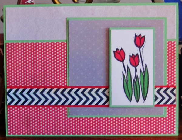
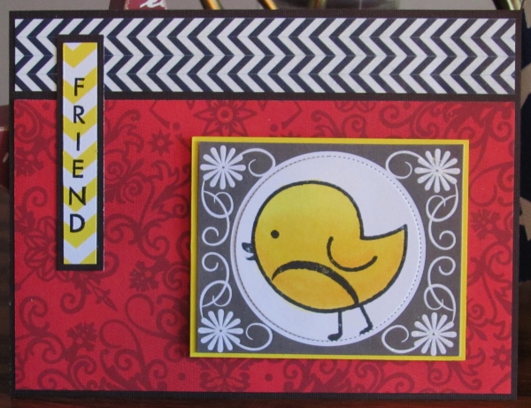
The next two are very similar to one another. I used some bold red to set the stage and added a strip of black and white chevron to jazz it up. A little snip of yellow chevron contains the sentiment nicely and ties in with the color of the chick. 

For this one I used a prepared journaling card and cut the chick in a rectangle to fit the open area.


With the same materials and layout I used a round die to cut the chick for the journaling tag.


What a cute chick!

Ddd


Posted by studio3d@ccgmail.net at 12:01 AM PDT
Thursday, 18 July 2013
Mystery Flowers
Topic: Coloring

Anyone know what kind of flowers these are, or what color they occur in naturally? I sure don't.

I thought they looked good in blue with a yellow center so in MY world that's the color they come in. I colored them in Copics.

For the first I bordered everything with yellow and used backing papers in blues and greens that are greyed versions of the flower. I popped the image up on foam tape. When I tried to stamp the sentiment directly on the panel I smeared it. Drat! So I stamped it again on the yellow chevron paper and cut a little heart from it. With the addition of the faux stitching to define the edges it really came together.

For this version I selected a background with beige tone-on-tone text. I added a scalloped edge to the yellow bordering piece to draw attention to it. This time I stamped the sentiment on a prepared journaling tag and popped it up on foam the same level as the image.


The color in this looks a little pink that is not there in real life.

Ddd


Posted by studio3d@ccgmail.net at 12:01 AM PDT
Wednesday, 17 July 2013
Double Up
Topic: Coloring

Many, many more days of colored images to show you! For today's cards I colored up an image of a bouguet of flowers in a vase with a large ribbon woven in.

I used a soft blue for the ribbon and a bit in the glass vase. Then I went bold in the colors of the flowers. In choosing papers for the background I brought out the softer colors of blue and green. As a final touch I used a toned-down version of the reds to create three little flags.


I hope it's not seen as a lack of imagination that I made these two cards identical.

Believe me, despite the little tricks the camera plays, these cards are made of exactly the same materials.

Ddd


Posted by studio3d@ccgmail.net at 12:01 AM PDT
Tuesday, 16 July 2013
Bright Wings
Topic: Coloring

You probably expected butterflies with that entry title, but I'm actually presenting three cards with hummingbirds. They must be different kinds because the colors on the belly and wings are reversed on one bird. In all cases, after the throat was colored in red I added pink pearl pen over it. All of the birds are fussy cut with a split between the wings so the closer wing can be popped up on foam tape.

First, I placed the bird on a red scrap printed with text. This andboth  the background papers were bordered with a green to complement the wings.


The next bird got some distressed papers and coral borders.

And on this one I started with shimmer paper in a red and several strips of printed paper from a 6x6 pad. Love all these green prints. A very light printed paper backs the bird.


No sentiments on any of these so they can be used for any occastion notecards.

Ddd


Posted by studio3d@ccgmail.net at 12:01 AM PDT
Monday, 15 July 2013
Purple Posies
Topic: Coloring

I pulled out my very favorite stamp for the caards today. The hydrangea is stamped on watercolor paper and used Distress Marker ink as paint for watercoloring. Each of the florettes got a small dot of yellow pearl paint.

First I used a dark dusty purple for bordering everything. The striped paper is a bit of stability in the sea of green matrix.


A brighter purple really livens up this card. The diagonal line between the two patterned papers creates a great dynamic.


When I diecut these two images I also embossed the edges. On one I sponged the distress ink around all the edges and on the other I left the die in place when sponging to create a white border.

Ddd


Posted by studio3d@ccgmail.net at 12:01 AM PDT
Sunday, 14 July 2013
Duplicated Delicates
Topic: Coloring

Imagine that, I actually made two cards that are exactly alike. As every time I have ever done this, I did them at the same time step-by-step rather than making one all the way through and then the other all the way through.

The image was stamped on watercolor paper and watercolored using Distress Marker inks. When I pulled out a 6x6 pad it had the exact colors I needed to play with the colored images.

I cut out the image with a Spellbinders die and cut a larger scalloped oval from the backing paper. Then I popped up the image on foam tape and that was it.

The only difference in these two cards is where the colors appear on the patterned paper.


I guess one flower tilts more than the other, too.

Ddd 


Posted by studio3d@ccgmail.net at 12:01 AM PDT
Saturday, 13 July 2013
Tropical Punch
Topic: Coloring

I love hibiscus! This is one of my favorite images in my stamp collection. It has great shading within the drawing which makes it easy to get the color shading in the right places. I stamped on plain cardstock and did the coloring with alcohol markers.

As soon as I trimmed out the fuschia bloom I knew I wanted a very graphic setting for it. I pulled out the black and white chevron paper and then my eye was pulled to the larger chevron in the pink paper. WOW! I broke it up with a darker band at the bottom and added a border to the flower. As a finish, I brought the green back in with the label sentiment at the top.


With an orange blossom I toned down the colors by using little of the color in the background - only around the edges and in a darker tone as well as three simple stripes of ribbon. I let the white border of the flower make it stand out from the background of greens.


I stamped the sentiment directly onto this background paper.

Ddd 


Posted by studio3d@ccgmail.net at 12:01 AM PDT
Friday, 12 July 2013
Pop-Pop-Poppies
Topic: Coloring

With three groupings of poppies stamped on watercolor paper I was able to create totally different looks on today's cards. All are watercolored with Distress Marker inks and cut with the same Spellbinders die.

For a yellow grouping I used the 'out of the box' technique to allow the blooms to escape out of the diecut shape. I chose borders of yellow and a brown background to pull colors from the flowers. The patterned papers use these same colors but in a more playful manner.


For a pink set of poppies I chose a rosy text background and some soft greens. The green stripes in the patterned paper echo the stems and the lightly printed paper serves as a calm place to stamp the script greeting.


The last set of poppies got a more casual treatment. The text background is lighter and more open so I was able to use a bolder bordering color and darker accent strips. I tied with a bit of green twine and made the flags a little whimsical.


The 'love' text in the background takes the place of any sentiment.

Ddd


Posted by studio3d@ccgmail.net at 12:01 AM PDT
Updated: Friday, 12 July 2013 7:23 AM PDT
Thursday, 11 July 2013
Like a Sunny Day
Topic: Coloring

I love the color combination I ended up with on today's cards. I stamped the butterfly on white cardstock and colored with alcohol markers in soft blue and bright yellow. I chose these same colors for the backgrounds while adding a soft grey to the mix.

For this first one I fussy cut the butterfly with a thin border then tinted the edges with 'old paper' distress ink and a foam pad. I glued the body and antennae to the background and popped the wings up on foam.


For the second one I fussy cut the butterfly without a border and mounted it on foam tape over a matching blue triangle.


In both cases I stamped the sentiment directly on the background.

Ddd


Posted by studio3d@ccgmail.net at 12:01 AM PDT
Wednesday, 10 July 2013
Leafy Greens
Topic: Coloring

Here is another image that I got in a swap. This time I used inks from Distress markers to watercolor in 4 different greens. I LOVE how this came out!

I gathered patterned papers and a base cardstock in a variety of greens with just one pop of brown for a break while keeping the theme of vegetation.


This has no sentiment so it can be used as a notecard for any occasion.

Ddd


Posted by studio3d@ccgmail.net at 12:01 AM PDT
Tuesday, 9 July 2013
Golf Birdie
Topic: Coloring

Here is an example of why I created the 'coloring' topic - I didn't stamp this image. I got it in a swap of images. Thereby hangs some risk... I didn't know what kind of ink was used for the stamping so I wasn''t sure what medium was safe to use that would not smear the ink.

I took a chance and worked with alcohol markers. I tried not to spend too much time going over stamped lines to reduce the risk of ruining them. For this reason I went with straightforward colors without any shading/blending.

I pulled all the colors from the image for the backing papers and built a little flag for the hole to reinforce the theme.

The sentiment was cut into a shape to support the flag.

Ddd


Posted by studio3d@ccgmail.net at 12:01 AM PDT

Newer | Latest | Older