« November 2013 »
S M T W T F S
1 2
3 4 5 6 7 8 9
10 11 12 13 14 15 16
17 18 19 20 21 22 23
24 25 26 27 28 29 30
You are not logged in. Log in
Entries by Topic
All topics  «
3D paperwork
A - Z challenge 5
A - Z challenge 7
A - Z challenge round 4
A to Z challenge round 3
A to Z round 2
A to Z round 6
A-Z round 1
Around the House
Art Challenges
Artist Trading Cards
Backgrounds
Beads
Bible Journaling
Books
Boxes
Collage
Color Challenge
Coloring
cookbook
Die Cuts
Digital Projects
Digital Stamps
Drawing
Dry Embossing
Fabric Stuff
Fantastic Folds
Field Trip
Home Decor
How Does Your Garden Grow?
Hymnal Art
In The Kitchen
In the studio
Jewelry
Lettering
Links
Multi-Technique
Music to Work By
Musings
Nail Art
New Work
Online Class
Other Hobbies
Other Projects
Painting
Paper Embroidery
Paper Piecing
Photo
Pretty Paper
Quilting
Random
reading
Scrap Recovery
scrapbooking
Sewing
Sketch Challenge
Some Backlog
Stamping
Stencils
Stickers
Supplies
Teabag Folding
Techniques
Testing
tips and tricks
Tutorial
Web resources
Welcome to my Blog
Work By My Friends
workflow
Writing
Blog Tools
Edit your Blog
Build a Blog
RSS Feed
View Profile
Group One
In & Out of Studio 3D
Sunday, 3 November 2013
Neon Flowers
Topic: Coloring

I needed more colored pieces to use with the 6x6 Tea For Two pad so I went back to stamping small illustrations inside fancy diecuts. The cuts were all stark white so they were toned with Distress Ink to go with the papers.

The card today turned out very LOUD! I used pretty bright colors on the flowers and their background so found that continuing in that vein with the papers and bordering actually worked well.


If anything, the photo is duller than the original. They yellow and green are actually neon colors.

The sentiment speaks to the brightness factor, too.

Ddd


Posted by studio3d@ccgmail.net at 12:01 AM PDT
Butterfly Boxes
Topic: Coloring

I have a long vertical stamp with butterflies and dragonflies in three boxes. I have only used it in its original for once. More often, I stamp it and then separate the boxes to use the images individually. That is what I did for the card today.

I colored the first one with light and medium yellows and blues from the custom palette. I selected a blue for bordering and two papers from the Tea For Two 6x6 pad. The sentiment is made up of a stamped word and four little letter stickers from the Tea For Two sticker sheet.


The second one was colored with medium and dark yellows and the same light and medium blues. I used papers that picked up more of the yellow tones and used a stamped sentiment panel as well.


Three amber rhinestones were added to enhance the color scheme.

Ddd 


Posted by studio3d@ccgmail.net at 12:01 AM PDT
Friday, 1 November 2013
Sailor Boy
Topic: Coloring

The illustration used today is a digital one but I don't remember where I got it - many many months ago. I used the custom palette and gave him a fairly standard coloring. Such a cute little guy.

I pulled papers from the Tea For Two 6x6 pad to maintain the Red, White and Blue theme and added a bit of brown twine to go with his shoes and maintain the masculine feel.


I rounded corners for a more casual feel and used Distress Ink to tone down the stark white.

Ddd


Posted by studio3d@ccgmail.net at 12:01 AM PDT
Thursday, 31 October 2013
Hula Girl
Topic: Coloring

This is the very last swapped image I have on hand. I colored it up fairly simply with a little more attention to the hair and the grass skirt. Two papers from the Tea For Two 6x6 pad are combined with bright yellow bordering. The lacy circles in the brown paper echo the coconut bra and the bursts in the lighter paper echo the shape of the flowers in her headband.


I rounded the corners for softness and added tiny green rhinestones to the flower centers and to dot the 'i' in the sentiment.

Ddd


Posted by studio3d@ccgmail.net at 12:01 AM PDT
Wednesday, 30 October 2013
A Colored Cross
Topic: Coloring

I am nearly to the end of the stamped panels received in image swaps over the years. The one used for today's card is extremely simple and actually reminded me of a coloring book image. I worked a lot on the shading to bring it to a more artistic level.

Part of that was making the lilies into daylilies by making the throats spotted. Then I gave a lot of dimension to the ribbon and, finally, I drew in corner lines to make the outer border of the cross appear to be beveled. Altogether, these treatments enhanced the character of the illustration.


I found matching pink and green patterned papers in the 6x6 pad of the Tea For Two kit and used them to echo the blooms and leaves. The blue bordering paper echoes the ribbon.

Ddd


Posted by studio3d@ccgmail.net at 12:01 AM PDT
Tuesday, 29 October 2013
Spread Your Wings
Topic: Coloring

This image was sent to me in a swap of stamped panels and I took a log time to color it up because I thought it was too dull. I had a sudden idea of how to make it more charming and set about to do it for this card.

I colored the image with the custom palette and then carkened the edges with Distress Ink to take away the whiteness. I used a craft knife to carefully slice around the ponytail. Then I stamped and colored a butterfly image and cut it out. This was mounted on foam tape UNDER the ponytail and completely changed the nature of the image.


Two papers from the Tea For Two 6x6 pad and a yellow sentiment block all got light blue borders.

Ddd


Posted by studio3d@ccgmail.net at 12:01 AM PDT
Updated: Monday, 14 October 2013 4:16 PM PDT
Monday, 28 October 2013
All Is Calm
Topic: Paper Embroidery

For an alphabet swap requiring a 'Z' card I stitched up a set of zigzag trees. I pricked it out on a pale woodgrain paper and stitched with forest green thread.

I mounted this on a forest green base card and added some tiny green rhinestones.


After a bit of practice on scratch paper I hand lettered the text on the background.

Ddd


Posted by studio3d@ccgmail.net at 12:01 AM PDT
Sunday, 27 October 2013
Little Angel
Topic: Coloring

From the box of stamped images sent to me over time I selected another of the Magnolia kids. This 'angel' standing in a wheat field got a drawn on mouth (cause we all know how I feel about THAT) and I colored it up with the custom palette.

Three choices from the Tea For Two 6x6 pad reflect these color choices as does the stamped sentiment.


I rounded the corners of the image for a softer look and popped the sentiment up on foam tape.

Ddd


Posted by studio3d@ccgmail.net at 12:01 AM PDT
Saturday, 26 October 2013
A Little Build-Up
Topic: Coloring

The patterned paper on the card today reminds me of the face of a sliderule. At least, when it is cut at this size. It also reminded me of construction so I decided to use it as backing for the three little birdhouses.

I repeated the house colors in the bordering color, the sentiment block and with three dragonfly brads.


Why dragonflies? 1) because I like them and 2) I didn't have any 'bird' brads.

Ddd


Posted by studio3d@ccgmail.net at 12:01 AM PDT
Friday, 25 October 2013
These Hands
Topic: Coloring

I was searching through my stamps for one to fit inside this diecut oval and re-discovered these praying hands. I stamped both diecuts with the same image and then liked the first coloring so much I did the second exactly the same.  These involved a medium blue dot background colored over with a light blue solid.

For the first card I selected a green patterned background and a golden yellow for bordering. A single narrow strip of a coordinating patterned paper forms an L with the stamped sentiment.


For the second one I Used borders to focus on the blue and lots of soft tan and beige for a restful feel. I used one of my scripture stamps made in the Theresa Collins Stampmaker.


The landscape orientation of this card contributes to the serenity.

Ddd 


Posted by studio3d@ccgmail.net at 12:01 AM PDT
Thursday, 24 October 2013
Meet The Greens
Topic: Coloring

This card did NOT go where I was steering it but I enjoyed the ride, anyway.

I started with one of the fancy diecuts, blocked out the filigree and stamped a little bird cottage in the center circle. I colored it with the custom palette in alcohol markers and toned the white filigree with Distress Ink. 

Then I chose the striped paper and... nothing. I kept trying different arrangements of papers - both solids and patterns - to back the image but either the diecut was just floating out there or the mest of the filigree was covered somehow.

Then I looked at the sticker sheets in the kit and found this border sticker. By weaving it creatively throught the filigree and sticking it to the backing paper it held the diecut in place and featured it beautifully.


I cut the sentiment block to fit perfectly between the sticker strips. Foam tape is used under the diecut but only at the tips and the stamped center.

Ddd


Posted by studio3d@ccgmail.net at 12:01 AM PDT
Wednesday, 23 October 2013
Hearts And Flowers
Topic: Coloring

On another of the fancy diecuts I blocked out the filigree and stamped a single flower stamp three times. This was colored with the custom palette and the filigree tinted with Old Paper Distress Ink.

Two papers from the Tea for Two 6x6 pad would have competed for attention but I used a dark green border on the colored piece and the pink sentiment. This brings the attention to these foreground elements and the background papers play nicely together.


To tie in the sentiment and backing paper with the illustration I added three pink heart brads as centers to the flowers.

Ddd


Posted by studio3d@ccgmail.net at 12:01 AM PDT
Tuesday, 22 October 2013
Party Girl
Topic: Coloring

In a swap of stamped images some time ago I got several Magnolia kids. These are the ones that have no mouths and that creeps me out so I always draw in one. This image also had wings on it but I've never been big on angels - especially kids - so after doing the coloring with alcohol markers I clipped her wings.


these papers are from the Tea for Two 6x6 pad and I colored her with y custom palette. Even so, the purple of her vest didn't appear anywhere in the papers I chose. I just selected a sentiment stamped on purple and it all came together.

The end of the sentiment banner as well as the fussy-cut girl are popped up on foam tape. I added a block of plain cream paper behind her to separate her from the busy background. A broken line of doodling frames out the backing block.

Ddd


Posted by studio3d@ccgmail.net at 12:01 AM PDT
Monday, 21 October 2013
Repeat Image
Topic: Coloring

Here is evidence that one can use the exact same image and come up with a completely different card.

This time I stamped the flowering branch on the center circle of a square fancy diecut. I colored it with pastels from the custom palette. Yesterday's bordering pieces were a pale sage freen so today I chose a dark forest green. What a contrast this makes with the filigreed border!

The colors in the papers from the 6x6 Cosmo Cricket kit are brighter today, too and setting the feature panel on point really gives it some zing!


I added some tiny yellow brads as centers to three of the flowers. Too much?

Ddd


Posted by studio3d@ccgmail.net at 12:01 AM PDT
Sunday, 20 October 2013
Diecut Slider
Topic: Coloring

This card kind of came together in fits and starts but I do like the end result very much! The starting point was the branch I stamped on one of the fancy diecuts and colored with the custom palette. I had selected the paper strip and the background paper as well as the bordering color. Then I got stuck.

It just looked too blah when the diecut feature was plopped on top of the strip so I decided to open up the ends of the unit and weave the strip through it like a slider. Better, still not great.

Then I went looking for a sentiment in the bin of pre-stamps and this one looked so good with the sky color. I added enough of the same blue to go under the top part of the illustration and knew that I was on the right track.


I cut some of the green bordering material to back the oval part of the die cut so the blue would not show through the open dots. Then I raised only the center of the diecut up on foam and attached the ends of the strip with blue brads to continue the color theme.

YES! Exactly right!

Ddd


Posted by studio3d@ccgmail.net at 12:01 AM PDT
Saturday, 19 October 2013
Take Note of Color
Topic: Coloring

For the card today I went back to the Cosmo Cricket 6x6 pad to feature a diecut medallion I had stamped and colored with the custom palette.

After blocking the scrollwork I stamped the iris with a Stampin' Up stamp. I did the background in a new technique - dotting in close around the flower with a medium blue then coloring over this with the lightest blue. I like the result and will definately use this technique again.


I used green bordering to pull out the leaf color and a yellow sentiment, cut to a flag shape, to echo the flower. Three tiny blue brads echo the blue sky.

Ddd


Posted by studio3d@ccgmail.net at 12:01 AM PDT
Friday, 18 October 2013
Thanks For the Birds
Topic: Coloring

I still had a bin of the diecut medallions and used black ink to stamp the centers. They were on white cardstock and since the Cosmo Cricket line does not have any white in it I used Old Paper Distress Ink to tone the edges to a cream color.

I blocked off the fancy borders with removable tape before stamping three birds on a branch. These were colored with the custom palette. When I went looking for backing papers I found that a couple from one of the other recent lines I was playing with actually went better with this illustration.


The yellow stripes echo the right bird, the sentiment echoes the center bird and the bordering papers echo the left bird.

The illustration block is popped up on foam tape.

Ddd


Posted by studio3d@ccgmail.net at 12:01 AM PDT
Thursday, 17 October 2013
Stickers From Cosmo
Topic: Coloring

I had this hand carved lighthouse in my bin to color and decided to do it up pretty brightly. None of the papers from the Tea Time for Two kit really went with it so I pulled a woodgrain from the scraps bin and added a strip from one of the other recent pads to mimic streaks of light.


After I chose the blue sentiment strip I went looking for a way to tie the elements together. To the rescue was the sticker sheet in the Cosmo Cricket kit! There are three sheets of stickers and each had a scalloped rectangle. I used one under the sentiment and two for opposing corners on the illustration.

The sentiment led me to use three more stickers from the sheet - the hearts. I also added a yellow brad to serve as the light in the tower.

Ddd


Posted by studio3d@ccgmail.net at 12:01 AM PDT
Wednesday, 16 October 2013
Paper Kit and Fishing Digi
Topic: Coloring

I have one more new paper kit to play with and I approached this one completely differently. The kit is one I got for my birthday and it includes a pack of 12x12 papers, scaled down patterns for 6x6 papers, tags, chipboard diecuts and stickers. This set is by Cosmo Cricket and is titled Tea Time for Two.


My approach was to use one of the 6x6 papers that featured stripes of several of the designs to view the entire color palette of the line. Then I got out my alcohol marker color reference cards to find all the matches for the papers. I created a special color chart using only these colors and pulled the markers from the bins to restrict myself to using only these.


You can see on the chart I placed them in color range groups and labeled them with the color code (number or name) as well as the brand, for ease in finding the one I wanted to use.

I started by pulling a digital image from my bin and coloring it using the custom palette. Then I selected a couple of papers from the line to mount it on. Look how nicely the colors coordinate! I added a sentiment stamped on a piece that matched the color of the dock.


The sentiment is popped up on foam tape and I used forest green as a bordering color to go with the evergreen trees in the illustration.

I will be coloring lots more images with this palette to use on cuts from the 6x6 pad.

Ddd


Posted by studio3d@ccgmail.net at 12:01 AM PDT
Tuesday, 15 October 2013
And Then There Were Three
Topic: Pretty Paper

I needed just three more cards to round out a box of 40 to go to Operation Write Home so I decided to break out the third of the 6x6 pad I picked up at the Tuesday Morning store.

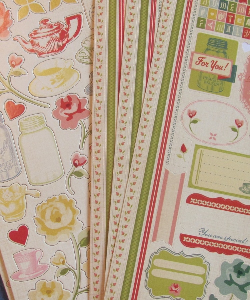
This one is a Crate Paper set called DIY Shop. It has rulers, wood grains, typewriter, vintage florals, music, ledger and sewing patterns.


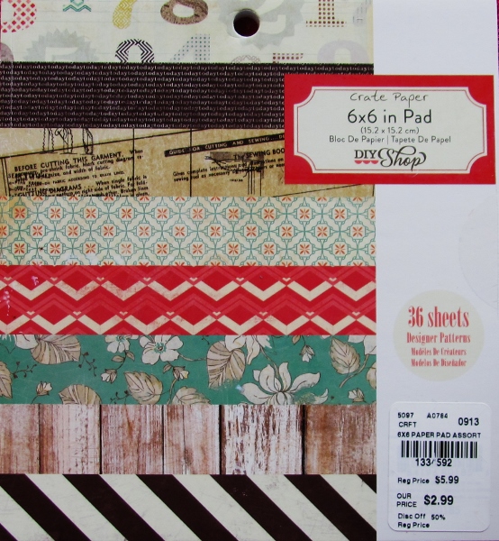
For two of the cards I started with a number background and the third uses a burst. I selected a ruler paper and a couple of small patterns to mix and match with these. All of the cards got brown bordering papers, although each is a different shade.

When I got this far I went looking for a diecut of Happy Birthday and discovered that I don't even have one! WHAT? So I went with Celebrate instead. There was going to be a lot of open space and all of the cards has a bit of muted red so I pulled some cardstock of that tone and hand cut two balloons for each card. I attached twine to the back of them and tied a knot near the bottom. the tails were then tucked and adhered on the back.


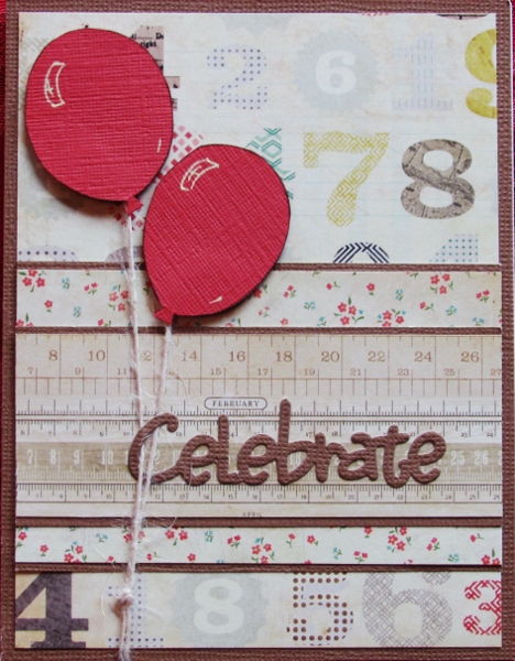
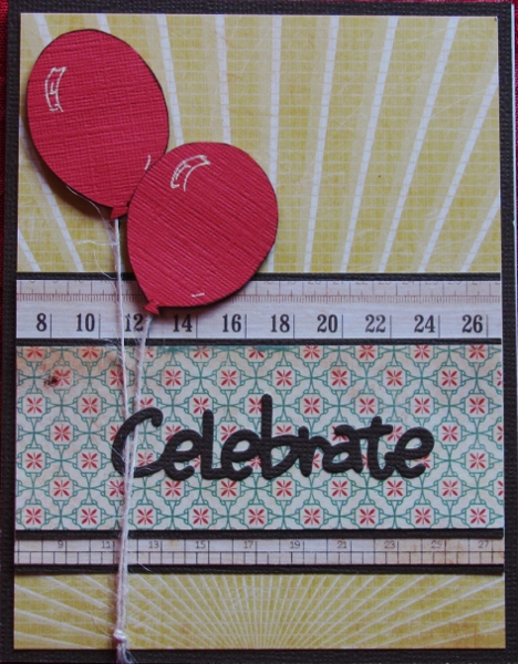
Finishing details included catching the C of the diecut word in the balloon strings before gluing it down, popping the balloons up on foam tape and adding some balloon highlights with gel pen.

With the generic text these can be used for birthday, anniversary, gradulation, or any other achievement.

Ddd 


Posted by studio3d@ccgmail.net at 12:01 AM PDT

Newer | Latest | Older