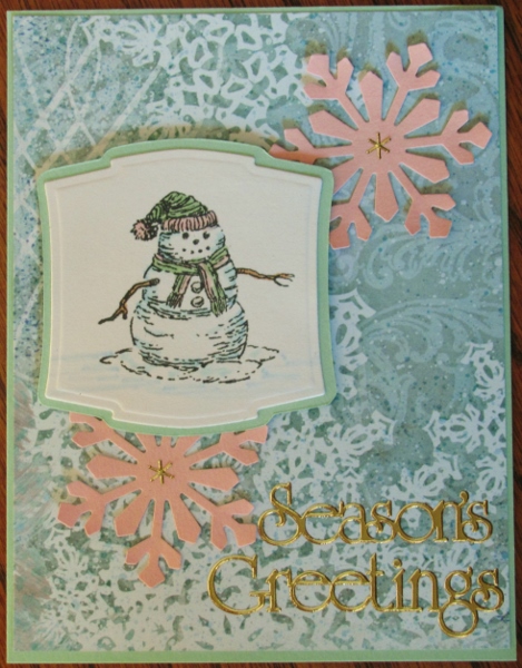
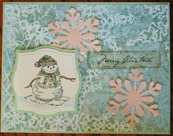
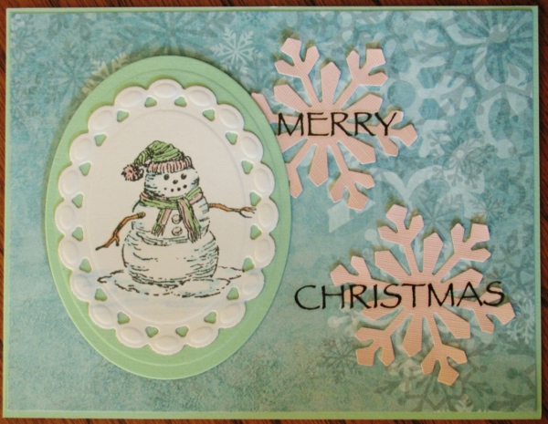
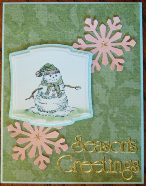
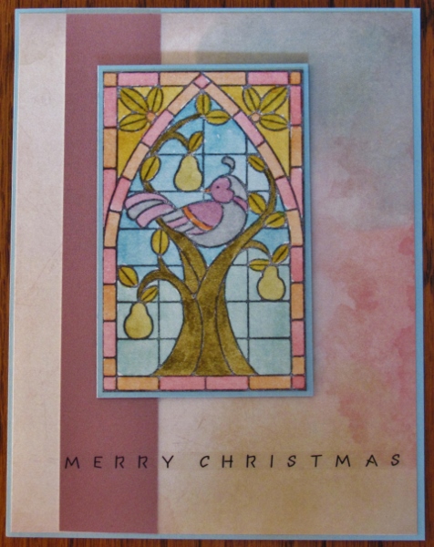
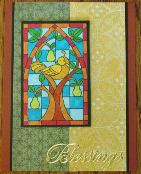
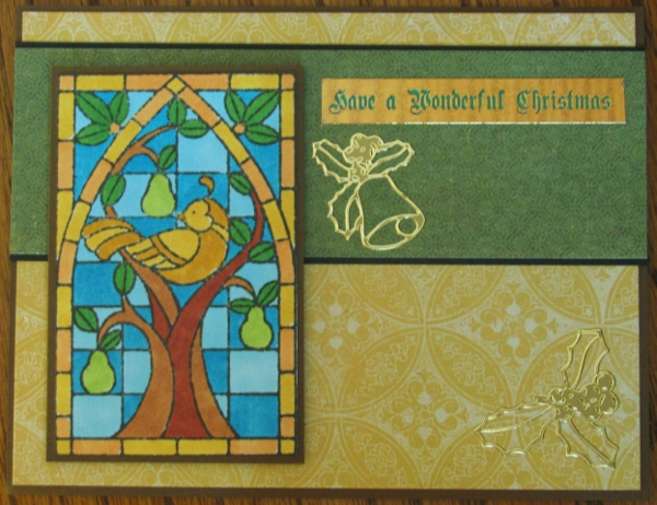
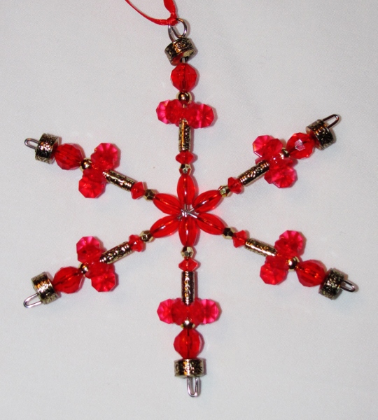
Topic: Beads
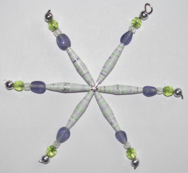
I had so much fun making those beaded snowflake ornaments (except when I poked my thumb with the wire) that I decided to do more and use them on packages for Christmas. I still had the bead bins all over my work surface so it was easy to come up with sets of beads to use. Other than pinching my palm with the pliers, this session was injury-free.
Here are the 6 new flakes I made:
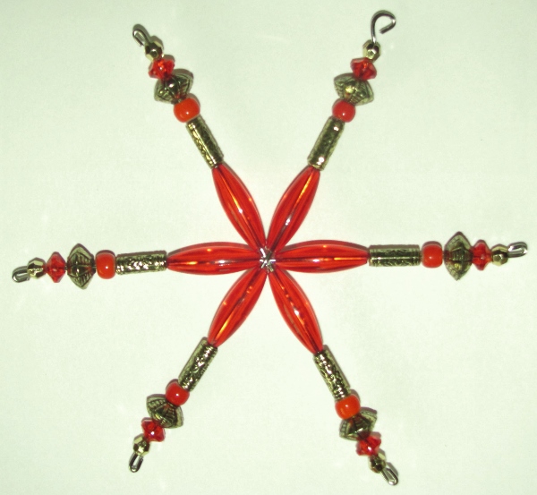
Red and gold:
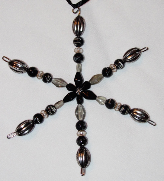
Black and Gray:
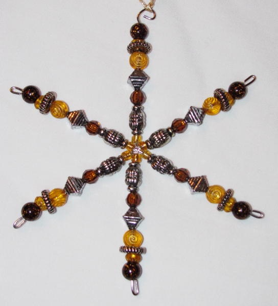
Amber and Silver:
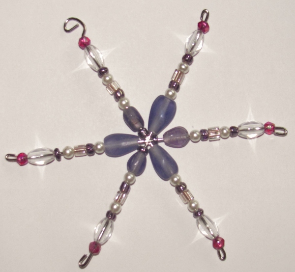
Blue and Clear:
![]()
Pink and Clear:
![]()
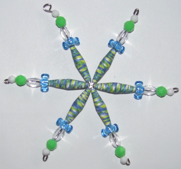
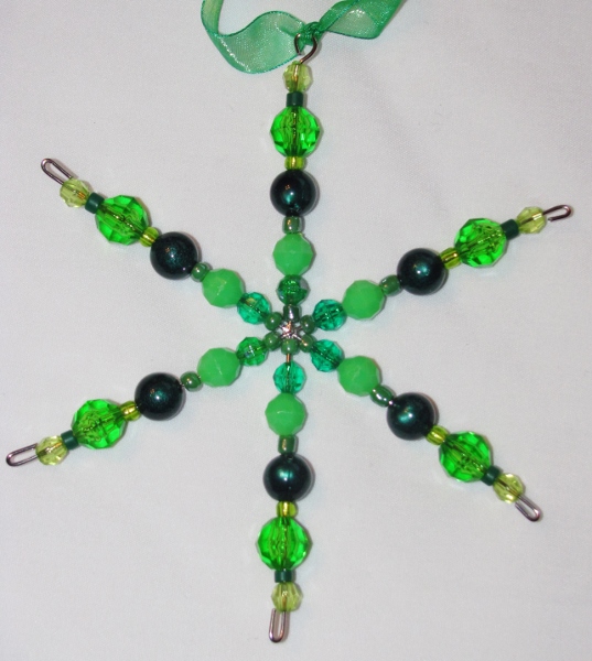
Green and More Green:
I may need to get a new set of wirecutters for jewelry since this wire is SO hard it nicks the edge.
I still have about 10 of these wire frames to use next year. Hmmm, maybe for a necklace?
Ddd
Posted by studio3d@ccgmail.net
at 12:01 AM PST