« April 2014 »
S M T W T F S
1 2 3 4 5
6 7 8 9 10 11 12
13 14 15 16 17 18 19
20 21 22 23 24 25 26
27 28 29 30
You are not logged in. Log in
Entries by Topic
All topics  «
3D paperwork
A - Z challenge 5
A - Z challenge 7
A - Z challenge round 4
A to Z challenge round 3
A to Z round 2
A to Z round 6
A-Z round 1
Around the House
Art Challenges
Artist Trading Cards
Backgrounds
Beads
Bible Journaling
Books
Boxes
Collage
Color Challenge
Coloring
cookbook
Die Cuts
Digital Projects
Digital Stamps
Drawing
Dry Embossing
Fabric Stuff
Fantastic Folds
Field Trip
Home Decor
How Does Your Garden Grow?
Hymnal Art
In The Kitchen
In the studio
Jewelry
Lettering
Links
Multi-Technique
Music to Work By
Musings
Nail Art
New Work
Online Class
Other Hobbies
Other Projects
Painting
Paper Embroidery
Paper Piecing
Photo
Pretty Paper
Quilting
Random
reading
Scrap Recovery
scrapbooking
Sewing
Sketch Challenge
Some Backlog
Stamping
Stencils
Stickers
Supplies
Teabag Folding
Techniques
Testing
tips and tricks
Tutorial
Web resources
Welcome to my Blog
Work By My Friends
workflow
Writing
Blog Tools
Edit your Blog
Build a Blog
RSS Feed
View Profile
Group One
In & Out of Studio 3D
Wednesday, 2 April 2014
Scrap Silver
Topic: Jewelry

When I went looking for things to embed in the resin I found a lot of pieced of broken jewelry that I have found in parking lots over time. One I liked a lot was a filigree piece with set stones.

I cut scrapbook paper for a background and pressed it into the resin in the mold. Then the scrap piece was added and resin poured in to cover it. Doming was done after the piece was cured and removed from the mold.

I have no idea why these gems look right when the self-adhesive rhinestones do not.

Ddd


Posted by studio3d@ccgmail.net at 12:01 AM PDT
Tuesday, 1 April 2014
Rhinestone Dragonfly
Topic: Jewelry

Just as the round rhinestones looked flattened in yesterday's project, so the rhinestone dragonfly does today. Very shiny - very flat. NOT cool!

This was also cast in a mold and domed after it had cured. E6000 used to attach a bail.

Ddd


Posted by studio3d@ccgmail.net at 12:01 AM PDT
Monday, 31 March 2014
Flattened Rhinestones
Topic: Jewelry

In experiment with the Little Windows product I wanted to try out embedding rhinestones as I thought that would give a lot of sparkle. Um... not so much. For some reason the view through the resin interferes with the refraction of light and the result looks like little shiny disks instead of sparkling rhinestones. What a disappointment!

I used a mold and embedded a set of adhesive rhinestone set into a heart pattern.


I used a scrapbook paper with faint text as a background for this pendant.

Ddd


Posted by studio3d@ccgmail.net at 12:01 AM PDT
Sunday, 30 March 2014
Little Windows Resin
Topic: Jewelry

When I was at the Sewing and Stitchery Expo at the end of February I visited a vendor I had seen the year before. I watched their schtick and decided I needed to try out the product for myself.

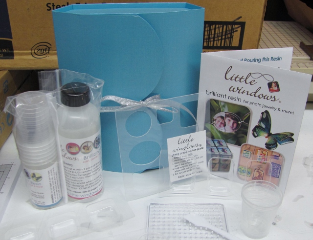
I have been seeing a lot of chatter about Ice Resin and had contemplated trying that out. However, here at my fingertips was a product called Little Windows so I went with that. This is the beginning kit plus two sets of molds and extra resin compound:

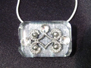
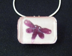
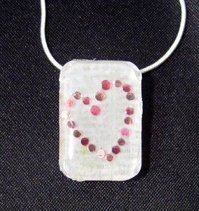
There are two ways of using the product - casting in molds and doming flat surfaces.  I selected some seed beads, broken jewelry parts, letter beads, scrapbook papers and rhinestones to use in my first attempts.

The resin is mixed in a 2:1 ratio for 2.5 minutes before using. It is poured and then allowed to cure for 24 hours or more.

I started with some letter beads set into one of the small square molds. I was going for a rif on the LOVE block but didn't have all the letters. So I switched up to HOPE instead. The beads unfortunately drifted apart during the curing time so it wasn't as neat as I envisioned.

After it was removed from the mold I used the doming technique to finish off the front surface.

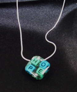
I used E6000 glue to attach a bail on the back corner. The resin is completely clear so the block will allow whatever garment it is worn against to show through the center and edges.

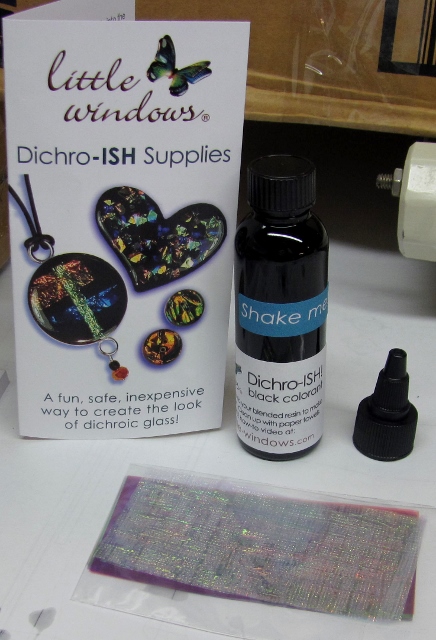
I also bought the materials to make faux dichroic glass but have not tried it out yet:

You can see their website at http://www.little-windows.com/

Ddd


Posted by studio3d@ccgmail.net at 12:01 AM PDT
Saturday, 29 March 2014
Tipsy Penguin
Topic: Paper Embroidery

Challenge: stitch a penguin. I only have one penguin pattern and I don't even like it. YIKES! What to do?

I say, "Change the pattern" and that's just what I did. The original was seriously fat at the bottom and the feet were huge. I redrew the parts I didn't like and then pricked it out on blue paper with white dots - so he would be in the snow.

After I had stitched it all I decided he blended too much with the background so I used distress markers for all the colored areas and a Krylon paint pen for the white areas.

He kind of leans to one side so I can either pretend he is waddling along or tipsy or in a high wind storm! LOL!


Pink and white chevron paper made a great border and I picked up the green with the base card.

Ddd


Posted by studio3d@ccgmail.net at 12:01 AM PDT
Friday, 28 March 2014
Operation White Home sketch 44 - C
Topic: Sketch Challenge

Oh look, another card from OWH sketch 44:


Yes, I turned this one to the side, too (all three of them).

When I chose the scraps for this card they were seriously off the measurements of the sketch. Will I let that deter me? No, I will not!

I used a blue card base as a lot of it would show around my too-small scraps. I mounted thin strips of a tiny floral on the top and bottom edges and a paper printed with larger floral motifs down the center. Then I didn't want to cover up all that lovely paper so I cut the center panel WAY down. I used a pink woodgrain and stamped a sentiment on it before inking the edges with a dark rose Distress Ink.


No doubt - I like this the best of the three.

Ddd


Posted by studio3d@ccgmail.net at 12:01 AM PDT
Thursday, 27 March 2014
Operation White Home sketch 44 - B
Topic: Sketch Challenge

As promised, another card from OWH sketch 44:

Again, I turned the sketch on its side and used scraps for the background that were fairly close to those designated. However, I wanted to use a tag for the centerpiece and it was smaller than required. Oh well...

I stamped it with a combination of two clear stamps and mounted it a little lower on the card. This places the sentiment in the center of the card and also calls attention to the curved edges of the tag.

The sentiment did not stamp clearly all over so I traced it with a fine line marker.

Ddd


Posted by studio3d@ccgmail.net at 12:01 AM PDT
Wednesday, 26 March 2014
Operation White Home sketch 44 - A
Topic: Sketch Challenge

With a very straightforward sketch like OWH 44 it is easy to change one little thing and have it appear very different. I chose to change several little things and came up with three very different looks.

Here's the sketch:

My main focus on today's card was using what I had already in the scrap envelope. The background strips were pretty close to the measurements given but I had no feature panel 'as shown'. So I went to the stamped sentiments bin for a selection. It was smaller than needed but I liked the view of the background so I kept it that way. I did add a bordering dark on top and bottom for some definition.


Oh, yeah! I also turned the sketch on its side!

Tomorrow, another card from this samee sketch.

Ddd


Posted by studio3d@ccgmail.net at 12:01 AM PDT
Tuesday, 25 March 2014
Operation Write Home sketch 43
Topic: Sketch Challenge

"I must fight the urge to straighten that panel". You've heard that from me before. Such is the case with OWH sketch 43.

Not only that, but I didn't have two scraps that would fill that background space so I added a third. HA, take that!

I used dark rose Distress Ink to tone the edges of the card after mounting the three background strips. The wonky rectangle was too plain so I used a border punch to give it a lacy edge Then I added a stamped sentiment block on which I had used the edge-inking technique.

One of my punched corners went awry so I used a floral sticker there.

Ddd


Posted by studio3d@ccgmail.net at 12:01 AM PDT
Monday, 24 March 2014
Operation Write Home sketch 42
Topic: Sketch Challenge

For OWH sketch 42 I had to decide whether to go by the picture or by the measurements given. 


You can see that the center block is shown shorter than the noted 4 inches. Since the piece I wanted to use for that part was longer, I chose to use the measurement instead of the picture.

I selected different papers for the two background panel, one lace and one embossed swiss dots, and used a dark rose Distress Ink on the edges to bring them together. I used the ink on the raised dots as well.The feature panel is a printed tag from which I trimed the punched end. I inked the edges of this and stamped a decorative sentiment in the lined portion. Then I used marker to color in the border of hearts and alternating stripes on the edges.


This is all set on a brown card base. I added two burgundy punched hearts, one on foam tape, and defined their edges with fine line black marker.

Ddd 


Posted by studio3d@ccgmail.net at 12:01 AM PDT
Sunday, 23 March 2014
Operation Write Home sketch 41
Topic: Sketch Challenge

Yeah, we're back to these sketches for awhile. Today we are focusing on sketch 41:


I am still working out of those envelopes of coordinated papers I sorted scraps into and I came up with this set of cream and brown patterns. I added a backing in brown and used the same for some bordering. Then I went to the pre-stamped sentiments bin and pulled this text block that coordinates.

The sentiment block was also bordered in brown and then popped up on foam tape.

Ddd


Posted by studio3d@ccgmail.net at 12:01 AM PDT
Saturday, 22 March 2014
You're Such a Pansy
Topic: Paper Embroidery

When we got the assignment to do a paper embroidery pansy card I immediately thought of my own stitching pattern. I decided I wanted to use a different color combination, though and did a Google image search for ideas. I really liked the dark red with purple centers and that bright yellow beard.

The full pattern was a little overwhelming so I cut it down to one bloom, two buds and a few leaves. I also changed up the stitching to include outlines and to stitch only half the veins in the leaves.

I pricked it out on a pink woodgrain paper and did the bordering in burgundy and purple over a pink card base.

Love it!

Ddd


Posted by studio3d@ccgmail.net at 12:01 AM PDT
Friday, 21 March 2014
That's Not What I Wanted
Topic: Paper Embroidery

Challenge Make a black and white paper embroidery card.

Chose paper, chose pattern, pricked out, chose thread, stitched half of it, got better lighting.... WHAT'S THIS? My paper is BROWN and white? Oh, brother. 

I finished stitching it and after I photographed it I ran a software filter to convert the picture to black and white. So I actually got a pic of what I thought I was stitching all along.

Here is the converted photo:

And here is what the actual card looks like in all its 'brown-ness'.


It's not that I don't like it, cause I do. It just isn't what the challenge asked for.

Ddd


Posted by studio3d@ccgmail.net at 12:01 AM PDT
Thursday, 20 March 2014
It's NOT a Pox
Topic: Nail Art

Inspired by the new spring pastel nail colors in a Cover Girl ad and sucked in by a coupon offer, I bought two small bottles of polish. Unfortunately, the new pastels did not come in the little bottles so I ended up with slightly brighter shades than I anticipated. Oh Well...

I wanted to use both of my new shades and found the easiest way to do that was to immediately dot on color two as soon as color one's second coat was laid on - nail by nail. This allowed the dots to self-level and spread rather than sitting on top and being slightly raised.

Overall, I like the effect even though it is a smidge bright for me.

Not only that, but look how coordinated and hip I look when dialing my new iPhone! LOL!

Ddd


Posted by studio3d@ccgmail.net at 12:01 AM PDT
Wednesday, 19 March 2014
Cotton Fabric Lanterns
Topic: Quilting

Title translated to Rantan Men'orimono. I thought it sounded more exotic than 'Cotton Fabric Lanterns'.

This is the quilt I cut out at the same time as Logan's Lanterns but it got borders of two of the other fabrics contained in the feature.

All of the lanterns were quilted with meandering in black thread:

The  fishscale bands were all stitched in the ditch:

The borders were also quilted in meandering:

The black blocks got the same strings of free-motion lanterns as Logan's Lanterns.

I also used the same technique to make an inset at the border.

This quilt will go to the Passages program at the hospital.

Ddd


Posted by studio3d@ccgmail.net at 12:01 AM PDT
Tuesday, 18 March 2014
On The Down Bead
Topic: Paper Embroidery

Can you name that tune? I'm not even sure anyone can PLAY that tune!

An assignment to use beads on paper embroidery led me to choose a pattern with musical notes on it. However, the original pattern had SIX lines on the staff. That's not right! So I eliminated one line. Then, all the plain old notes were boring so I added flags to some to change the timing and tied some of them together. More interesting to view, but not musically sound, I'm sure.

I pricked this pattern out on a musically printed cardstock complete with gold foiling on some elements. I double-stitched the beads onto the notes to make them more secure for mailing.


I added a little treble clef sticker as a finishing touch.

Ddd


Posted by studio3d@ccgmail.net at 12:01 AM PDT
Monday, 17 March 2014
Kitten Claws
Topic: Nail Art

Quite a while back I shared some nail art of tiger stripes - yellowish base coat with black tiger stripes. I wanted to use the same paint method but with different colors for a more feminine look.

I used some Barbie pink polish as a base and added the stripes with silver glitter.


Here's a couple of the nails close-up


Sorta like tiger stripe but probably more like kittens.

Ddd


Posted by studio3d@ccgmail.net at 12:01 AM PDT
Sunday, 16 March 2014
Some of This, Some of That
Topic: Color Challenge

This challenge used four unusual colors together: Burgundy, Red Violet, Dark Blue and Pine Green. When the swatches were laid out together I had a hard time envisioning something harmonious coming out of that, but we were only required to use two of the colors.

In sorting through scraps of designer paper I acrually found a floral with three of the colors in it! It was a corner treatment so I trimmed away the background with a craft knife and backed it with a solid burgundy piece.

I added a red violet border to this and let all the green come from the illustration.

By bordering the sentiment with the dark blue I actually managed to use all four colors.

The sentiment is popped up on foam tape.

Ddd


Posted by studio3d@ccgmail.net at 12:01 AM PDT
Saturday, 15 March 2014
A Layered Birdhouse
Topic: Stencils

For a February swap we were to make a card using birds or birdhouses. I immediately thought of the stencil I have of birdcages hanging in a tree.

I only wanted one birdcage so I blocked out all the others with removeable tape. I used daubers and Distress Ink to color the open areas of the stencil: green for the leaves, brown for the branches, teal for the birds and grey for the birdcage.

Then I removed this stencil and replaced it with a chevron stencil. This time I used glimmer sprays in blue and pink to spritz the card. This required a heat gun drying step.

I followed this by running the piece through the Cuttlebug with the script folder. Then I used a foam pad to sponge on some Distress Ink in old paper to the raised portions except inside the birdcage.

Then I trimmed down the panel and mounted it on teal and brown cardstock.

I added a string of rhinestones across the base of the birdhouse and some matching individual ones at the base of some of the leaves.

This came out precisely as I envisioned it. How often does THAT happen?

Ddd


Posted by studio3d@ccgmail.net at 12:01 AM PDT
Friday, 14 March 2014
Jazzy Cupcake
Topic: Paper Embroidery

Have you been keeping count? This is paper embroidery number 11 from the vacation series.

On assignment to make a birthday card for our stash, I chose the cupcake by Darsie Burno. I pricked it out on red swirly paper and stitched in bright threads.


Backing with red chevrons adds to the jazzy feel of this card. Hard NOT to get excited by this.

Ddd


Posted by studio3d@ccgmail.net at 12:01 AM PDT

Newer | Latest | Older