« December 2014 »
S M T W T F S
1 2 3 4 5 6
7 8 9 10 11 12 13
14 15 16 17 18 19 20
21 22 23 24 25 26 27
28 29 30 31
You are not logged in. Log in
Entries by Topic
All topics  «
3D paperwork
A - Z challenge 5
A - Z challenge 7
A - Z challenge round 4
A to Z challenge round 3
A to Z round 2
A to Z round 6
A-Z round 1
Around the House
Art Challenges
Artist Trading Cards
Backgrounds
Beads
Bible Journaling
Books
Boxes
Collage
Color Challenge
Coloring
cookbook
Die Cuts
Digital Projects
Digital Stamps
Drawing
Dry Embossing
Fabric Stuff
Fantastic Folds
Field Trip
Home Decor
How Does Your Garden Grow?
Hymnal Art
In The Kitchen
In the studio
Jewelry
Lettering
Links
Multi-Technique
Music to Work By
Musings
Nail Art
New Work
Online Class
Other Hobbies
Other Projects
Painting
Paper Embroidery
Paper Piecing
Photo
Pretty Paper
Quilting
Random
reading
Scrap Recovery
scrapbooking
Sewing
Sketch Challenge
Some Backlog
Stamping
Stencils
Stickers
Supplies
Teabag Folding
Techniques
Testing
tips and tricks
Tutorial
Web resources
Welcome to my Blog
Work By My Friends
workflow
Writing
Blog Tools
Edit your Blog
Build a Blog
RSS Feed
View Profile
Group One
In & Out of Studio 3D
Wednesday, 17 December 2014
A 12 x 12 Christmas
Topic: Pretty Paper

I haven't been making Christmas cards hand over fist all year as I usually do so found myself short when it was time to mail cards to family and friends. I only had half of what I needed for the demand.

I went looking through my bin of Christmas supplies for some inspiration. This bin includes stickers, embellishments, some 3D images, 6x6 printed cardstock and 12x12 scrapbook cardstocks. 

Many of the 12x12 papers had corner or border designs that could be trimmed down to fit on a card front. Then I had only to embellish them and add a sentiment to come up with finished cards. I had 2 to 3 of each design so the stock of cards grew quickly.

I started with a 12x12 with a very large corner pattern of toys under the Christmas tree. This was big enough to trim down to three card fronts. Here is the original layout.


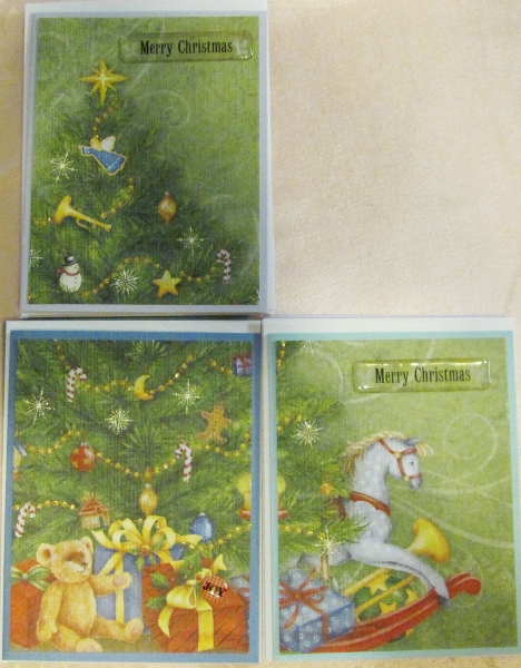
I started in the lower left corner. I cut the scene to 4x5.25 so I would have a 1/8 inch border of the base card showing. Aaaak! I ran out of white cardstock so I chose a variety of colored solids for my cards.

I decorated these cards with gold Stickles on the yellow parts of the garland and Diamond Stickles on the sparkly lights.


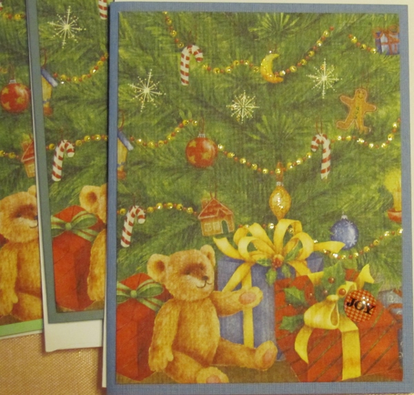
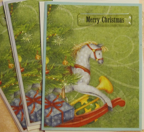
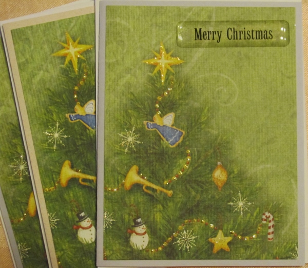
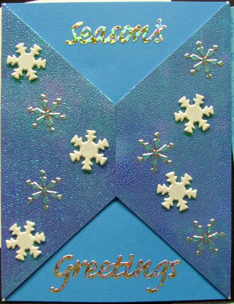
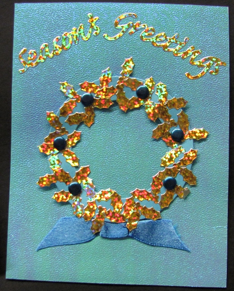
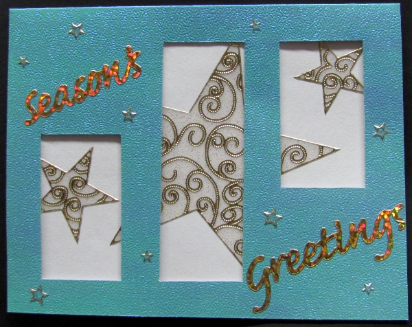
I used a variety of dimensional acrylic stickers as greetings.

With three sheets of 12x12 cardstock I have 9 cards done, just like that. BOOM!

Ddd


Posted by studio3d@ccgmail.net at 12:01 AM PST
Tuesday, 16 December 2014
Butterfly Hunter's Star
Topic: Quilting

I had seen one of my friends at quilting group making two different Hunter's Star quilts and found the process fascinating. The star is not actually in the block but appears when four blocks are placed together.

I had some scraps of bright prints that I wanted to work with and was persuaded to use some unbleached muslin as the background instead of the gray I had initially intended. I am glad for this change as the result was perfect.

I made the blocks oversized - at 12 inches - which makes for a very dynamic layout. I wasn't sure why this pattern was called 'hunter's' star until it was pointed out that the pattern includes large arrowheads.

Overall, this quilt is 66 x 78 inches.


The quilting was done first on the diagonal through the center of the stars. Then I designed a spiral with a paisley center and placed them with their terminus meeting.


The recipient is a lover of butterflies so a colorful background fabric that featured them was selected. You can just see a hint of the glittery finish in this photo.


At the top edge of the backing you can see that a soft teal tone-on-tone was selected for the binding.

Ddd


Posted by studio3d@ccgmail.net at 12:01 AM PST
Monday, 15 December 2014
3D Flower Thank You
Topic: Coloring

I had a stack of images left over from that day with no power a couple of months back. I decided to use them up by combining them with table scraps left from the crafting sessions with my granddaughters.

Since I had several of this image of a flower in a frame I cut three of them into layers (background, leaves and flower, flower only, and flower center. These were shaped with a ball tool over foam and them mounted in layers using foam tape.

I used this image over a dotted background enhanced with two similar colored strips of table scraps.


I added a Thank You sticker in gold.

Ddd


Posted by studio3d@ccgmail.net at 12:01 AM PST
Updated: Monday, 27 October 2014 7:56 PM PDT
Sunday, 14 December 2014
Winner Of the Ugly Baby Contest
Topic: Around the House

We are NOT running a wildlife park, despite the increasing number of animal sightings. We've lately seen the nutria come out of hiding a lot more and then suddenly, here she is with the ugliest baby on the planet.

It, unfortunately, looks exactly like the adult - which is one of the nastiest looking things on the planet. At about the same size as a beaver, this rodent has a giant rat-like tail and gnarly huge orange teeth.


Because of their dark coloring and the bright sunlight it was difficult to get a shot with any detail.


The question I have is - why doesn't the bobcat eat these nasty things instead of snacking on the cute little bunnies?


The only entertaining thing was when the baby did not see mom come up from behind him. She touched his backside with her nose and he levitated several feet and jettisoned into the brush - much like a cat that has been startled.

You wouldn't know by their lumbering gait that they were that quick and agile.

Ddd


Posted by studio3d@ccgmail.net at 12:01 AM PST
Updated: Friday, 24 October 2014 10:26 PM PDT
Saturday, 13 December 2014
Oven Roasted Salsa
Topic: In The Kitchen

This year I was given three tomato plants and three pepper plants by a neighbor. It was a guessing game to see what varieties they were!

When it all shook out I had regular, heirloom and roma tomatoes as well as two bell and one hot pepper. I have no idea still what variety the peppers were but they got a nice bright red color to them.

When I had collected enough ripe fruits from each of the roma and hot pepper plants I added a couple of green peppers from the same plant. To this I added the remains of the white onions from the garden and made some oven roasted salsa.

I cut the tomatoes and the peppers in half lengthwise and placed cut side down on a baking sheet:


On top of these I spread out the sliced onions:


These were placed in a 450 degree oven for 20 minutes.

While this was roasting I added to the bowl of the food processor some Mexican oregano (1 tsp), cumin (1 1/2 tsp), plus salt and pepper (2 tsp each).


I measured out 1/4 cup each of lime juice and apple cider vinegar:

After 20 minutes of roasting I sprinkled on chopped garlic and cooked another 5 minutes. This was followed by covering the pan with foil to sweat the skins off.

When pulled from the oven after a total of 30 minutes I had this:


I used a couple of forks to remove the seeds from the peppers and the skins from everything. Then all the 'good stuff' was placed in the food processor:

This was pulsed and the liquids added before more chopping. Oh My!


The recipe said it will keep in the fridge for 2 weeks and it can be frozen. So I measured out little containers of 1/4 cup for the freezer and a little more to put in the fridge for immediate use.


This may be the most ambitious I've gotten with my own garden produce. However, I am planning on trying some quickbread that uses acorn squash.

Ddd


Posted by studio3d@ccgmail.net at 12:01 AM PST
Updated: Friday, 24 October 2014 10:24 PM PDT
Friday, 12 December 2014
I'm So Blue
Topic: Stamping

I had so much fun wandering around the SplitCoastStampers tutorials. I ran across a technique I haven't done for a long time - blue delft tile.

I decided to use 1-inch increments for the tiles, scored them on my ScorPal and stamped with dark blue Distress Ink. After the ink was dry I used an aqua-brush to blend the ink. I used a heat gun to dry it and then used a lighter blue Distress Ink and a sponge to tint the edges of the 'tiles' for dimension.

I went over the lines with a white gel pen (not effective) and then a white Distress Marker (much better).

I ended up with two panels to use and treated them only slightly differently.

First was by adding a sentiment stamped onwhite. I used some of the blue ink to tint the edges and popped it up on foam tape.


For the second card I added a blue stamped sentiment which I banded in white. This was also popped up on foam tape.

I'm going to have to go do more cruising around the SplitCoastStampers site for techniques and tutorials. These experiments have been a blast.

Ddd


Posted by studio3d@ccgmail.net at 12:01 AM PST
Updated: Friday, 24 October 2014 10:22 PM PDT
Thursday, 11 December 2014
Changing Your Stripes
Topic: Coloring

Also on SplitCoastStampers I found a suggestion to do the stamp etching with color. I actually did the illustration in black and then added the color in stripes over it. I used two colors for the flower and two for the leaves.

I pulled colors from the illustration to make up the background, including a black stripe.

When I ran across the stamped sentiment I knew it would be perfect for this card. I then added black dots along the edges of the green background to echo that on the sentiment.

I added a faux stitching line to the illustration and popped the sentiment up on foam tape.

Ddd


Posted by studio3d@ccgmail.net at 12:01 AM PST
Updated: Thursday, 23 October 2014 4:55 PM PDT
Wednesday, 10 December 2014
What's My Point
Topic: Coloring

I was trolling through SplitCoastStampers for techniques and came across one on coloring with 'pointillism'. This uses dots of color - applied with alcohol markers - instead of the traditional blending.

I chose one of the new stamps from a Hot Off The Press set and used three greens, four pinks/reds and one gold for the flower and leaves. I used three blues for the background.

I selected many papers for the background, matching them to various parts of the illustration.

The sentiment was stamped on golden to go with the flower centers and bordered with maroon. The sentiment and illustration are popped up on foam tape.

I used a fine marker to add a double line border on the illustration.

Ddd


Posted by studio3d@ccgmail.net at 12:01 AM PST
Updated: Thursday, 23 October 2014 4:54 PM PDT
Tuesday, 9 December 2014
Operation Write Home - Sketch 157
Topic: Sketch Challenge

OWH 157 was such a complicated sketch that I had to simplify it to make sense of it.

I ended up going for the 'essence' of the sketch - a large bordered square center backed with a wide band bordered at least twice. I think I accomplished this.

I also included the leaves in the stamp etching and added black petal tips.

I went with a wider color palette by including teal, red and yellow as well as the black and white. By using all graphic papers they look like they belong together.

I added a double red pen border to the illustration and popped it up on foam tape.

Ddd


Posted by studio3d@ccgmail.net at 12:01 AM PST
Updated: Thursday, 23 October 2014 4:54 PM PDT
Monday, 8 December 2014
Operation Write Home - Sketch 156
Topic: Sketch Challenge

Sometimes a sketch just needs to be turned on its head. Such is the case with OWH sketch 156.


Notice that I did not 'rotate' the sketch to get it upsidedown but just 'flipped' it top to bottom. This is what keeps the illustration on the left side.

I went with a bold purple and white combo, using a chevron for the main background. Three purple brads are the enhancement to the black-bordered stamped sentiment.


On this illustration I carried the 'etching' into the leaves and added some black detailing to the petal tips.

Ddd


Posted by studio3d@ccgmail.net at 12:01 AM PST
Updated: Thursday, 23 October 2014 4:53 PM PDT
Sunday, 7 December 2014
Operation Write Home - Sketch 155
Topic: Sketch Challenge

Sketch 155 from OWH was more natural for the etched stamp illustration.

I went back to red / white / black for this card and moved the horizontal band behind the illustration. I'm not sure how effective this is though as you only see that little stub on the left.


I used a rub-on for the red dot feature.

Ddd


Posted by studio3d@ccgmail.net at 12:01 AM PST
Updated: Thursday, 23 October 2014 4:52 PM PDT
Saturday, 6 December 2014
Operation Write Home - Sketch 154
Topic: Sketch Challenge

OWH sketch 154 presented a challenge to using one of my etched stamp images.


I decided to go right ahead and cut it into 4 quadrants but NOT to put the circle element in the center as it covered too much of the flower. Instead, I used a heart sticker and moved it off-center.

I wanted a romantic feel to this one so I went with pink instead of the red used yesterday. Ooooh, I LIKE!

The large dot is playful.


I used white rub-on to create the sentiment on the band prescribed in the sketch.

Ddd


Posted by studio3d@ccgmail.net at 12:01 AM PST
Updated: Thursday, 23 October 2014 4:51 PM PDT
Friday, 5 December 2014
Operation Write Home - Sketch 153
Topic: Sketch Challenge

I did the next few sketches in a series, using a technique I found on Splitcoaststampers called Stamp Etching. There is a tutorial at http://www.splitcoaststampers.com/resources/tutorials/stampetching/

Basically, you start with an outline floral, stamped in black on white paper. Then a marker or fine pen is used to flick in parallel lines from the inside and the outside of the petals to make them look like a woodcut or etching.

OWH sketch 153 was the first one up to use one of these drawings on.


My first inclination with these graphics was to add red to the stark black and white. I selected a bold stripe, a solid red, and red and white lettered strips.

I had to work with the size of the die that I had so the panel is not exactly that prescribed, nor is the red border around it.


I wanted another touch of red so used a marker to color in some of the petal curls and stamens. I also used a black fine marker to add a little border around the illustration, but under the leaves.

Ddd


Posted by studio3d@ccgmail.net at 12:01 AM PST
Updated: Thursday, 23 October 2014 4:49 PM PDT
Thursday, 4 December 2014
Oeration Write Home - Sketch 152 (repeat)
Topic: Sketch Challenge

I first posted OWH sketch 152 on January 11, 2013.

I turned the sketch 90 degrees and used some bright, fun papers. I pulled a sticker to decorate the center of the circle element.

Since the little girl was painting I used a set of metal punches to hammer letters into scraps of cardstock, creating a suitable phrase. By coloring in the depressed letters with white gel pen I enhanced the sentiment.

I rounded two opposing corners for interest.

Ddd


Posted by studio3d@ccgmail.net at 12:01 AM PST
Updated: Thursday, 23 October 2014 4:49 PM PDT
Wednesday, 3 December 2014
Operation Write Home - sketch 151
Topic: Sketch Challenge

Wow! It's been a long time since I posted a sketch challenge. Here we have OWH sketch 151 which is very simple:


I rotated it 90 degrees counter-clockwise and adjusted the circle size just a smidge to use the size of diecut round that I had on hand.

I used a tone-on-tone dot for the smaller top area and a muted coral for the lower. I had vellum rose stickers that I wanted to use but they were a bit too pink. I solved that by mounting them on cream cardstock. That bit of yellowness showing through the pink makes them look more coral and they go very well with the paper.

I rounded the top corners and used a white gel pen for faux stitching around the coral paper.


I used several words from a sheet of white rub-ons to create a sentiment block.

Ddd


Posted by studio3d@ccgmail.net at 12:01 AM PST
Updated: Thursday, 23 October 2014 4:47 PM PDT
Tuesday, 2 December 2014
Teabag Fold Published
Topic: Some Backlog

Waaaaaay back in 2003 I was contacted by someone at the Origami Societeit Nederland to see if I would allow one of my original teabag folding designs to be published in their journal "Minori". Of course, I said 'yes' and they promised to credit me with the design and to send a copy of the issue.

Here is the cover of that issue:


And here is the two page spread, pages 20 and 21. You can read my by-line on the left page.

I have looked on a translator to see what a 'sterbloem' is but it does not translate it for me.

Ddd


Posted by studio3d@ccgmail.net at 12:01 AM PST
Monday, 1 December 2014
Kit Design Work - 7
Topic: Some Backlog

The theme of this last kit I worked on was 'thank you' and the technique was decorating envelope cards. The kit included the envelope cards in white and dove grey, decorative papers, diecuts, brads, ribbons, metal flower charms, fabric flowers, sticky-back pearls, and rubber stamps.  


I did not get the published booklet for this kit either.

The envelope cards are decorated only on the outside.


This may be my least favorite of the kits I worked on. This is also the last kit that I was contracted to design for CardMaker Kit-Of-the-Month.

Ddd


Posted by studio3d@ccgmail.net at 12:01 AM PST
Updated: Friday, 17 October 2014 7:20 PM PDT
Sunday, 30 November 2014
Kit Design Work - 6
Topic: Some Backlog

This was one of the last two kits I worked on. The theme for this was Thank You and featured the technique of outline stickers with foil. The kit contained charms, ribbon, stamps, outline stickers, and diecuts.

I did not get the booklet from this kit after production.


I also did not get two of my sample cards returned but I still had the original scans that I had submitted so I will show those here:


The stickers came in a variety of sizes.


Love the pewter charms.


I used 'corners' to make some medallions for these decorations.


I love the dragonfly stamps included in this kit.


This was an entirely new technique for me so I had to learn to use the product before I could design with it and write directions.

Ddd


Posted by studio3d@ccgmail.net at 12:01 AM PST
Saturday, 29 November 2014
Kit Design Work - 5
Topic: Some Backlog

It's been a long time since I looked through these kits that I did design work for so it is fun to revisit them and reminisce.

This kit had a theme of "friendship" and featured the technique of "teabag folding". It included papers with designs in chocolate brown, light blue and a bright yellow-green. Stickers and diecuts along with chocolate brown rhinestones and some fancy ribbon rounded out the selection. I remember that I did the design work for this while on a cruise vacation!


The first card is the one featured on the booklet. It uses a teabag fold with one corner cut along the outline of the motif.


This card features a standard fold.


Some of the teabag papers were round instead of square. This card uses one of them.


This one also uses a edge motif trim:


This card uses a standard fold.


This one is a standard fold as well.


Another standard fold.


A standard with a rhinestone center.


This one uses the round teabag paper.


This is a more fancy fold for the round teabag paper.


Another standard fold.

The kit I was working from for the samples contained VERY stiff papers making it difficult to get sharp creases, but they turned out OK in spite of this.

Ddd


Posted by studio3d@ccgmail.net at 12:01 AM PST
Friday, 28 November 2014
Kit Design Work - 4
Topic: Some Backlog

Time for a little Christmas Magic! That's the theme of the fourth kit I did design work on. The kit contained glitzy blue papers in two tones and lots of neat stickers in white, clear, and gold. Rubber stamps, ribbon, and brads were also included.


Here is the booklet that was published for the subscribers:


There's not a lot to say about the individual cards:


Beautiful in real life but very hard to photograph because of the ultra-shiny coating on the cardstock.

Ddd


Posted by studio3d@ccgmail.net at 12:01 AM PST

Newer | Latest | Older