« July 2015 »
S M T W T F S
1 2 3 4
5 6 7 8 9 10 11
12 13 14 15 16 17 18
19 20 21 22 23 24 25
26 27 28 29 30 31
You are not logged in. Log in
Entries by Topic
All topics  «
3D paperwork
A - Z challenge 5
A - Z challenge 7
A - Z challenge round 4
A to Z challenge round 3
A to Z round 2
A to Z round 6
A-Z round 1
Around the House
Art Challenges
Artist Trading Cards
Backgrounds
Beads
Bible Journaling
Books
Boxes
Collage
Color Challenge
Coloring
cookbook
Die Cuts
Digital Projects
Digital Stamps
Drawing
Dry Embossing
Fabric Stuff
Fantastic Folds
Field Trip
Home Decor
How Does Your Garden Grow?
Hymnal Art
In The Kitchen
In the studio
Jewelry
Lettering
Links
Multi-Technique
Music to Work By
Musings
Nail Art
New Work
Online Class
Other Hobbies
Other Projects
Painting
Paper Embroidery
Paper Piecing
Photo
Pretty Paper
Quilting
Random
reading
Scrap Recovery
scrapbooking
Sewing
Sketch Challenge
Some Backlog
Stamping
Stencils
Stickers
Supplies
Teabag Folding
Techniques
Testing
tips and tricks
Tutorial
Web resources
Welcome to my Blog
Work By My Friends
workflow
Writing
Blog Tools
Edit your Blog
Build a Blog
RSS Feed
View Profile
Group One
In & Out of Studio 3D
Saturday, 18 July 2015
Operation Write Home - sketch B15
Topic: Sketch Challenge

And now for something completely different! Oh how I love what they did when designing OWH bonus sketch B15:


You see, the black area is the actual folded card base, measuring 4.25 x 4.25 inches. Then the large circle is mounted extending above the fold so the finished card still reaches 5.5 inches.

I had some rose stickers (three the same in different sizes) that I wanted to use in a curve on the circle. this led to the selection of the outline rose paper which set the color pallete for the background to grey and white. I chose a grey dot for the large circle.

The circle was cut and mounted to the folded card base with the proper amount of extention. Then I layered the rose stickers around the lower curve.


In searching for just the right color of paper for the horizontal piece, I ran across a printed vintage paper with text printed in English and French. The text reads "My Beautiful Vintage Garden - Mon Beau Jardin"

Ddd


Posted by studio3d@ccgmail.net at 12:01 AM PDT
Friday, 17 July 2015
Operation Write Home - sketch B14
Topic: Sketch Challenge

When I used OWH bonus sketch B14 it spiralled off in a whole different direction than I had envisiioned - but in a good way!


See, the sketch is such a quiet, unassuming thing- don't you think?

As soon as I chose the illustration I knew I was going to have some bold colors that would stand up to it. So I chose the blue 'pearls' paper to surround it and bring it up to the prescribed size.

The best red I had was the one covered in white hearts so that wash chosen next.

I had a hard time deciding what to use for the horizontal band as most things I tried looked just stuck on. I liked the red scallop but it was too close to the background so I cut the white scallop to surround it.

A gold heart sticker with a cutout area for the red to show through fit well with the sketch but the sentiment contained in an oval did not. I finally used a pre-stamped sentiment on a matching blue background and cut it as a continuation of the center block instead of offsetting it like the sketch.


The reds and the blues really do match in real life but you know how these cameras mess with the color.

Ddd


Posted by studio3d@ccgmail.net at 12:01 AM PDT
Thursday, 16 July 2015
Operation Write Home - sketch B13
Topic: Sketch Challenge

Another balanced design that calls for elegance is found in OWH bonus sketch B13:


As usual, I started by selecting an illustration to use. In this case it was a rub-on floral which I applied to a dotted background.

I wanted a background to pull colors from the floral and came to select a blue lattice. This led to the choice of some blue and white twine.

For the yellow I used a mottled paper in the deep background and a light script paper for a mid-ground layer.


I think this has a romantic feel to it - maybe because of the script that looks like it could be from a love letter.

Ddd


Posted by studio3d@ccgmail.net at 12:01 AM PDT
Wednesday, 15 July 2015
Operation Write Home - sketch B12
Topic: Sketch Challenge

I decided to go with a little copper and silver for OWH bonus sketch B12:


The 'copper' is in color only as there is no metallic shine to it. I used a dot and a solid for background and feature and a lighter solid for the banner.

The feature is a silver peel-off sticker and I used a 1/2" corner chomper to round the top edges of the panel to mimic the sticker shape.

Before adhering the background to a white card base I applied a decorative silver peel-off border to the base. When the background is adhered over it a very fine scallop peeks out from behind.


I used a silver peel-off greeting sticker where specified in the sketch.

Ddd


Posted by studio3d@ccgmail.net at 12:01 AM PDT
Tuesday, 14 July 2015
Operation Write Home - sketch B11
Topic: Sketch Challenge

A balanced layout in a horizontal format is so serene:


In rifling through my stock of papers I came upon a floral that I don't remember ever using! WHAT?!?!?

I cut blocks of it for the two side pieces and found that one of my favorite dotted papers matched beautifully. YAY! I found a scrap for the center that was more subdued and left me a place to stamp.

I first stamped the little greeting and masked it with a post-it so the too-long stems of the floral would not overlap it.


This is all mounted on a white card base with a border exposed all around.

Ddd


Posted by studio3d@ccgmail.net at 12:01 AM PDT
Monday, 13 July 2015
Operation Write Home - sketch B10
Topic: Sketch Challenge

Color me happy! OWH bonus sketch B10 let me use some great color blocking:


I first chose a sticker with apples and trimmed it down to the size shown on the sketch. This was considerably smaller than the original sticker but I like how it frames out the illustration. This got bordered in black.

Then I selected 5 colors of solid papers from the picture and cut them to the specified size. I arranged them in a balanced sequence and adhered them to a black base card with even spacing.


I stamped the sentiment directly on one of the background papers using black ink.

Ddd


Posted by studio3d@ccgmail.net at 12:01 AM PDT
Sunday, 12 July 2015
Operation Write Home - sketch B9
Topic: Sketch Challenge

I'm taking liberties with OWH bonus sketch B9. This is the sketch:


Now why cut all those vertical strips when I have a perfectly suitable striped paper? I let the paper become the focus of this caaard because the prints were so interesting.

I pulled colors from the stripes for the horizontal bands and selected a pre-stamped sentiment on a similar color.

There was no prescribed place for a sentiment so I just polaced it where it looked good to me.


The border for the sentiment is the same as te base card.

Ddd


Posted by studio3d@ccgmail.net at 12:01 AM PDT
Saturday, 11 July 2015
12 Tags of 2015 - July
Topic: Multi-Technique

Go big or go home! that was my dilemma when starting to replicate the July tag from Tim Holtz. Here is his creation:


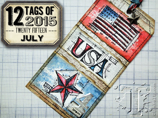
Tim made HIS tag with the mini versions of the patriotic blueprint stamps which I do not have - I have the standard size of them.

The solution was to up-size the whole project into a 6 x 10 hanging wall piece.

Here are the steps and supplies I used to complete this project:

- adhered text-printed scrapbook paper to the surface of a chipboard cut to size.

- use sandpaper block to scuff all 4 edges.

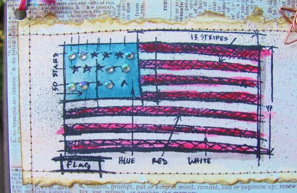
- stamp patriotic blueprint stamps onto heavy watercolor paper using black Archival ink.

- use deckle-edge ruler to tear against at the top and the bottom of each image.

- use Distress marker ink as watercolors to color the images. include drop-shadows painted with Pumice Stone ink.

- smear Versamark across images to create a resist. (this didn't seem to have any effect so this step could easily be skipped)

- use a very wet brush to add Pumice Stone Distress Ink over the images. blot off excess ink to keep smearing of colored images to a minimum. dry with heat tool.

- trim sides off images to fit them on text background.

- distress the edges with Frayed Burlap Distress Ink. Wet with aquabrush. dry with heat tool.

- adhere centers only of the images to the text background.

- stitch around all 4 sides of all 3 images. (this is the reason the glue was only in the center in the last step - so the machine needle would not have to go through it)

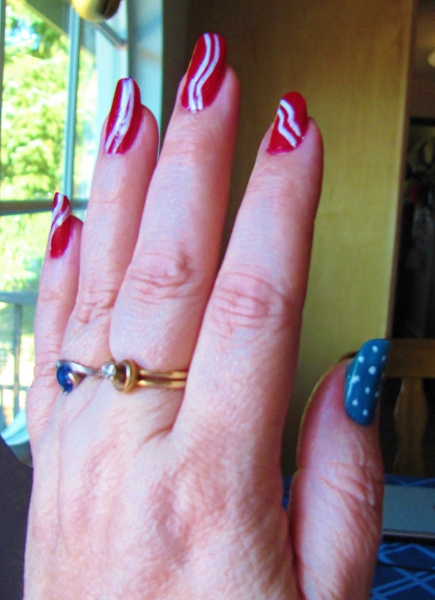
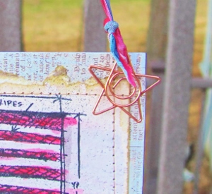
- decorate flag panel with rhinestone 'stars'.


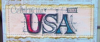
- add silver Dazzles 'celebrate' peel-off sticker at the top of the USA panel.


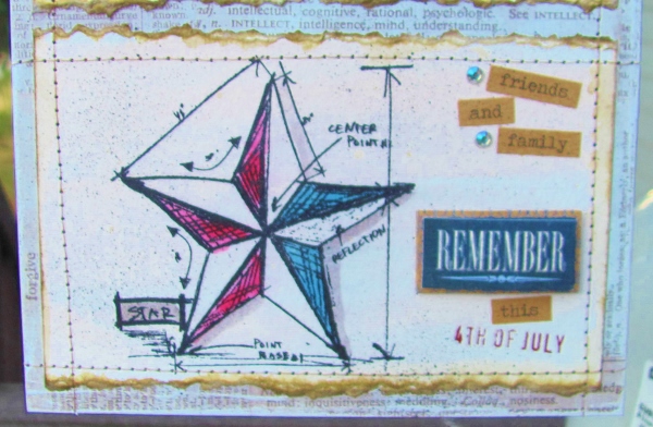
- add stickers, rub-ons, rhinestones to star panel.

- use spritzer to spray black soot Distress Marker ink on panels.


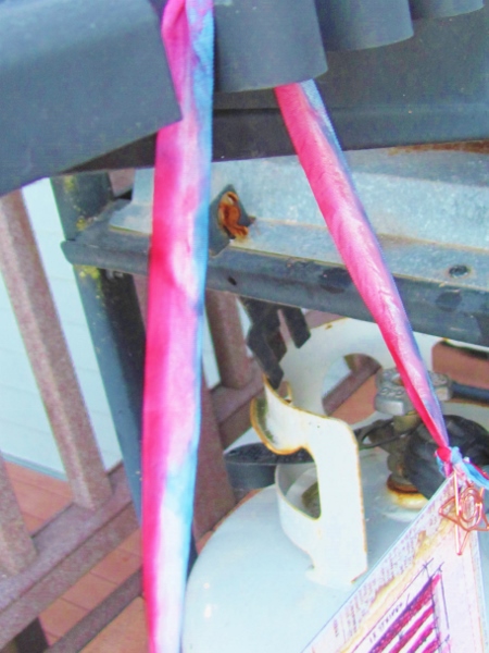
- punch holes on upper two corners of panel.

- color opposite edges of cream colored seam binding using a blue Distress Marker and a red one.

- spritz ribbon with mini-mister to start colors running. blot before colors run together in the middle.


- dry with heat tool, scrunching to wrinkle as it dries.

- tie ribbon to holes, attaching star charm by stringing through one end of the ribbon.


So, here is my completed hanging decorator piece which I used as a hostess gift for the neighbors who hosted our Independence Day get-together.


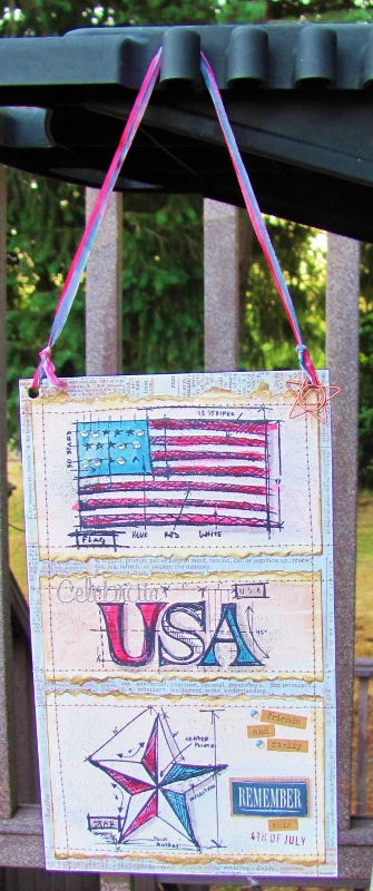
It's on a different scale than Tim's original but the general effect is the same.

I also covered the back of the chipboard piece with scrapbook paper to create an attractive finish.

Ddd


Posted by studio3d@ccgmail.net at 12:01 AM PDT
Friday, 10 July 2015
Operation Write Home - sketch 256 version 7
Topic: Sketch Challenge

And finally...

Version 7 of OWH sketch 256 is the biggest departure from the sketch while still having all the elements in place.


This all started with a pansy rubon and a snipped of floral paper. I wanted to use yellow as the background because of the yellow centers in the flowers and also found a snip of yellow and white to use as the horizontal piece.

I added another rubon bloom to be the round element and then more where the three dots were supposed to be. I filled in three tiny purple flowers for those dots.

Lots more rubon leaves were used as fillers to unify the parts of the design.


I found some yellow rhinestones to place as the flower centers on the pansies and a tiny green one for theyellow bloom at the top.

A white card base keeps this looking fresh.

Ddd


Posted by studio3d@ccgmail.net at 12:01 AM PDT
Thursday, 9 July 2015
Operation Write Home - sketch 256 version 6
Topic: Sketch Challenge

Today's version of OWH sketch 256 is designed to blend in. Here's the sketch:


I chose a rather busy text background and then a more calming dotted feature panel. I used vellum floral stickers on both, one for the feature and one to play as the round element.

The horizontal piece was subtle so I used it as a place to stamp a sentiment, which carries over to the feautre panel.

Three tiny purple rhinestones became the dot elements at the top.


I used a cream base card as white was too high contrast for the papers.

Ddd


Posted by studio3d@ccgmail.net at 12:01 AM PDT
Wednesday, 8 July 2015
Operation Write Home - sketch 256 version 5
Topic: Sketch Challenge

SWOOSH! That's the interpretation on OWH sketch 256 that I did for today. Here's the sketch again:


Because the heart sticker I chose to use was ls big, I kept the feaature panel the same as the sketch but let the sticker hang off the side.

I chose the background with the radiating lines and concentric circles to give some movement around the heart.

The strip I had for the horizontal was not wide enough so I doubled up on part of it for better impact.

In place of the round element I used two gold hearts (from the same vellum sheet as the red heart) in different sizes.


The three dots got changed to red heart brads and moved to complete the swoosh started by the heart stickers.

Ddd


Posted by studio3d@ccgmail.net at 12:01 AM PDT
Tuesday, 7 July 2015
Operation Write Home - sketch 256 version 4
Topic: Sketch Challenge

Yesterday's treatment of OWH sketch 256 was all oversized. Today I scaled way back to little pieces. Heres a reminder of the sketch:


I selected the little bird sticker with the text from a sheet I have had on hand for years. I thought it would be perfect to let them sit on some banner paper so cut a piece to size.

Papers bor elements and backgrounds were color coordinated to give this a very low key treatment.


I gave the horizontal piece a banner end and replaced the round element with two stickers of whimsical dragonflies.

The feature panel was popped up on foam tape.

Ddd


Posted by studio3d@ccgmail.net at 12:01 AM PDT
Monday, 6 July 2015
Operation Write Home - sketch 256 version 3
Topic: Sketch Challenge

This time it will be harder to see the sketch in the card. Here's another look at OWH sketch 256:


I combined this creation with another shallenge to make a card with only the color green.

I started with a sticker of a bindle of green beans and added a 'mesh' background block behind. It is a little wider than the sketch.

I added a green horizontal paper and then found some green adhesive letter stickers. These replace the round element and, in fact, take over the whole left side. But that's a good thing in this case, cause the text suits exactly.


Because of the oversize letters I needed to give the dots some heft as well. So I selected some very large green brads to use.

Ddd


Posted by studio3d@ccgmail.net at 12:01 AM PDT
Sunday, 5 July 2015
Operation Write Home - sketch 256 version 2
Topic: Sketch Challenge

Ready for a little deja vu? Here again is OWH sketch 256


For version 2 of this sketch I leaned heavily on the 'circle' theme. The sticker I started with had a big round center surrounded by round petals. I carried this over into the background covered with big dots and then used a punch to create the purple round element and added a floral to it. This got popped up on foam tape.

The main panel needed to be wider to accomodate the sticker and I also bordered it with lavender to separate it from the background.

I used low profile lavender pearls for the upper right dots in the sketch.


I turned the horizontal strip into two (one of which only shows at the right) and used a floral that kind of mimics the rim of the bowl in the illustration.

The white base card creates a border on the card.

Ddd


Posted by studio3d@ccgmail.net at 12:10 AM PDT
Saturday, 4 July 2015
Operation Write Home - sketch 256 version 1
Topic: Sketch Challenge

A new sketch was posted by Operation Write Home and then a challenge came out to use it in several ways. I took up the challenge and created seven cards with OWH 256:


I'm not thrilled with the first card I made, even though it meets all the design guidelines on the sketch.

I had a sheet of cardstock stickers and pulled the tall tabbed panel and the round text circle to start with. I gave the panel a dotted background and cut it larger than the sketch so it would show around the edges. The dots pull color from the round element.

Some of the other cardstock stickers were text as well, so I used those and then added outline stickers to illustrate them. This is where I got disappointed. I wish I had used something else on the tall panel.


Fortunately, this was only version one and I had lots more opportunities to improve on the style.

Ddd


Posted by studio3d@ccgmail.net at 12:01 AM PDT
Friday, 3 July 2015
Operation Write Home - a bonus sketch
Topic: Sketch Challenge

A few of the bonus sketches from OWH are not numbered and I have no idea when they were first produced. So they get generic names like 'a bonus sketch'. You'll probably also see 'another bonus sketch' and unnumbered bonus sketch'.

This is one of those:


I went searching first for a great round element and found this gold filigree medallion peel-off sticker in my stash. It exactly fit in the prescribed circle which I diecut from a coral-red.

In the paper stash I found this great coral and aqua with simple flowers. They look so good with the gold medallion!

I selected other papers that complemented it - the zig-zag mimics the layout of the flowers, the dots both pick up colors from the floral as well as having the same look as the scallops on the flower edges.

Sometimes you just 'know' when papers look good together and then have to do some analysis on the back end to figure out what it is that 'works'. In the case of this collection, they also all share the muted background (cream instead of white). The aqua dot is brighter so it is used as the background to the medallion to draw the attention there.


The medallion element is popped up on foam tape for emphasis.

Ddd


Posted by studio3d@ccgmail.net at 12:01 AM PDT
Thursday, 2 July 2015
Operation Write Home - sketch 255
Topic: Sketch Challenge

With this sketch I have officially 'caught up' with the regular series of sketches produced by Operation Write Home on their blog. After this, I will be working on the 30-some bonus sketches in their collection while sorting in the new sketches as they are released.

So now it is time for OWH sketch 255:


Somewhere along the line OWH changed from somebody 'creating' a sketch every week to selecting a donated card that they particularly liked and 'reverse engineering' a sketch from it. This way we know that somebody already made a great card using that design.

I have resisted the temptation to look at the work others have produced with the sketches and/or the work the sketches are derived from. I want my work to be 'mine' and not copied from someone else.

I first decided that I wanted to use some rub-on flowers and selected a lavender to diecut an oval from. I already had the sentiment stamped on the right color but it was too small. So I chose a block for it to sit upon what has two greens and a design that complements the leaves in the floral.

I kept the backing very neutral so it would not compete with the focal piece but I used a tone-on-tone dot so it would have some movement. It also echoes the little dots that are the flower centers.


For the round element I punched adot of green and then built a layered paper flower which I had colored with alcohol markers. I assembled these with a little flower brad.

The round did not suit where the sketch placed it so mine was moved to a new location.

Ddd


Posted by studio3d@ccgmail.net at 12:01 AM PDT
Wednesday, 1 July 2015
Operation Write Home - sketch 254
Topic: Sketch Challenge

Somebody must have hit the 'EASY' button! It sure came in handy with OWH sketch 254:


What's so easy about it? I already had the white circle cut, I already had the green circle cut, they matched the colors in the vellum sticker I wanted to use, I already had the sentiment stamped on the right size and color for the sketch!

The 'hard' parts were cutting the card front and the large rectangle.


I also had to change the alignment a little as my circles were larger and I wanted more of the floral sticker to show.

Ddd


Posted by studio3d@ccgmail.net at 12:01 AM PDT
Tuesday, 30 June 2015
Nailed It!
Topic: Nail Art

It's been quite a while since I did any art on my nails. Having my nails grown out to an attractive length is my preference for nail art and in the growing-out time span I just paint them without any art on them.

My nails have reached a great length for designing AND there's a holiday coming that makes me want to have a little celebration at the end of my fingers.


I went with a stars and stripes theme. The thumbs got blue with tiny white dots and the fingers got red with double white stripes.


This is before the cleanup of color from the cuticles. Actually, there is very little to clean up AND the stripes are remarkably neat.

Remarkable in that they were done start to finish while a three-year-old was continually trying to convince me to change my color scheme to purple, silver glitter and gold glitter, asking a lot of questions about the purpose of the supplies, and bounced against my knees as he tried to get a closer look.


Hooray for LEGOs that I managed to get out of a cupboard to entertain my little friend WITHOUT smearing any of my manicure!

Bring on the holiday, I'm ready!

Ddd


Posted by studio3d@ccgmail.net at 8:35 AM PDT
Operation Write Home - sketch 253
Topic: Sketch Challenge

I think I'm in LOVE! Yeah, with OWH sketch 253:


I shifted, simplified and shined up this sketch for use!

I decided that more of the layers would be the same so I would have more unity in the pattern. Then I decided to not have the center panels with all that space around them. This was the simplify part of the changes.

I had another of those vellum heart stickers with gold on it. I decided to cut a backing circle of shiny gold cardstock to meet the design of the sketch.

The color of the heart was used to select the papers for the card front, keeping the heart motif for the main piece. For more unity in design I kept two of the strips on the right the same.

When the front was assembled, I wanted to bring back some gold and needed to mimic the layering around the edges. So I selected some very fine gold line peel-off stickers and added them snug up against the colored papers of the front panel.


The gold circle with the heart is popped up on foam tape to separate it from the background.

Ddd


Posted by studio3d@ccgmail.net at 12:01 AM PDT

Newer | Latest | Older