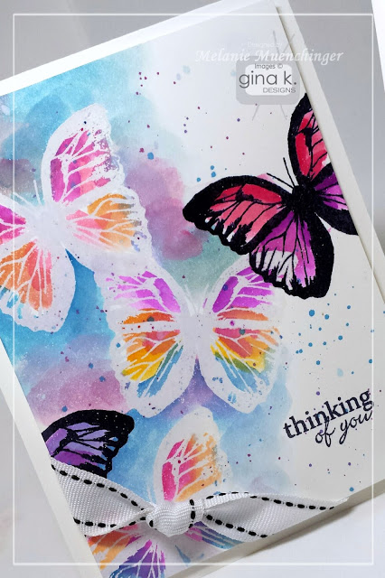
Topic: Techniques
This is the third in a series of cards that use the same tutorial as inspiration. You can go back to the first one for links to that tutorial.
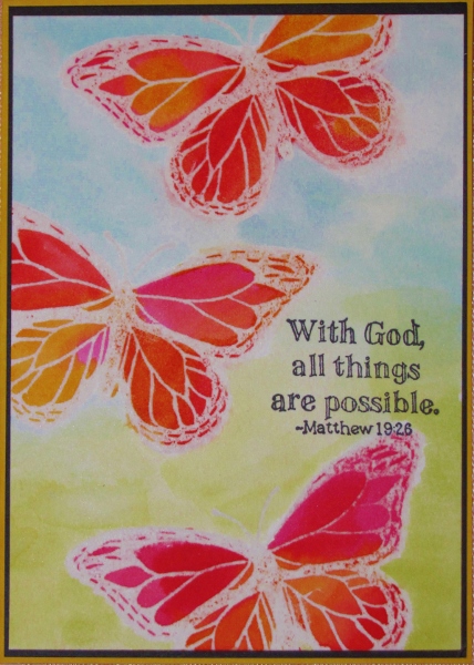
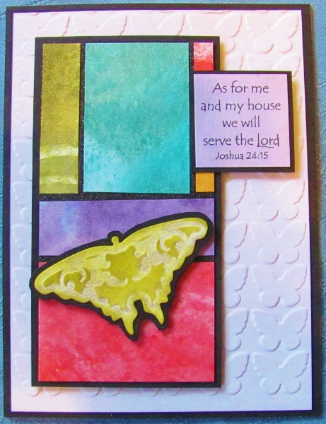
Here, again, are the steps I used:
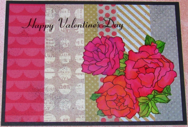
I stamped on watercolor paper with Versamark and embossed with clear powder.
Then I used the ink from Distress pads to watercolor and blend inside the butterflies. When those were dry I made a watercolor wash on the background combining blue and green.
I then took the card to the ironing board and pressed with a hot iron through a plain piece of white paper. This melts the embossing powder which is then absorbed into the paper.
The last step was stamping with a scripture stamp in black ink, trimming and bordering in black.
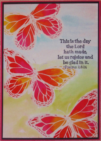
The pinks were the prominent color in these butterflies so I used a bright pink for the base card.
Ddd