« March 2016 »
S M T W T F S
1 2 3 4 5
6 7 8 9 10 11 12
13 14 15 16 17 18 19
20 21 22 23 24 25 26
27 28 29 30 31
You are not logged in. Log in
Entries by Topic
All topics  «
3D paperwork
A - Z challenge 5
A - Z challenge 7
A - Z challenge round 4
A to Z challenge round 3
A to Z round 2
A to Z round 6
A-Z round 1
Around the House
Art Challenges
Artist Trading Cards
Backgrounds
Beads
Bible Journaling
Books
Boxes
Collage
Color Challenge
Coloring
cookbook
Die Cuts
Digital Projects
Digital Stamps
Drawing
Dry Embossing
Fabric Stuff
Fantastic Folds
Field Trip
Home Decor
How Does Your Garden Grow?
Hymnal Art
In The Kitchen
In the studio
Jewelry
Lettering
Links
Multi-Technique
Music to Work By
Musings
Nail Art
New Work
Online Class
Other Hobbies
Other Projects
Painting
Paper Embroidery
Paper Piecing
Photo
Pretty Paper
Quilting
Random
reading
Scrap Recovery
scrapbooking
Sewing
Sketch Challenge
Some Backlog
Stamping
Stencils
Stickers
Supplies
Teabag Folding
Techniques
Testing
tips and tricks
Tutorial
Web resources
Welcome to my Blog
Work By My Friends
workflow
Writing
Blog Tools
Edit your Blog
Build a Blog
RSS Feed
View Profile
Group One
In & Out of Studio 3D
Wednesday, 2 March 2016
A Little Bit Off the Top
Topic: Backgrounds

Remember those shaving cream backgrounds? I made some cards using them for backgrounds.

Today's uses some vellum pansy stickers over a paper set in landscape. A bit of white peel-off sticker trim and a silver peelloff sentiment sticker make it look very feminine.


The purple base card reflects the vellum pansies.

Ddd


Posted by studio3d@ccgmail.net at 12:01 AM PST
Tuesday, 1 March 2016
Color From a Tube
Topic: Painting

If you know art supplies you've probaably heard of Gelatos which are water soluble pigment in a stick form. They come in a holder that looks like a lipstick tube so you can hold it and smear/scribble it on the paper.

However, the ones I have are NOT name brand. They are some cheap version that I bought in a tourist gift shop at the coast. I used them one time, years ago, and then put them in a drawer for 'some other time'.

I couldn't remember what type of base I had used them on before but I figured, "water soluble = watercolor paper".

I made a pencil sketch using the magnolia stamp I used yesterday as a guide. Then I scribbled the crayons onto the various areas where I needed the color.

I used a flat watercolor brush to add plain water to one color area at a time and blended out the pigment. With the rough texture of the watercolor paper the wash areas (sky and ground) did not blend out smoothly.

After the whole piece was dry I went back with a permanent marker and drew in to define the outlines and sketch details. I used a bit of cross-hatching to create shadows.


I cut the image down and used colors from it to build borders and added a black peel-off sentiment sticker.

Ddd


Posted by studio3d@ccgmail.net at 12:01 AM PST
Monday, 29 February 2016
Look Ma! No Lines!
Topic: Painting

I had another image on watercolor paper stamped with scattered straw ink. This was done with masking as the actual stamp only has one flower on it.

I continued on with the no-line watercolor technique, mixing my own greens and adding a blue wash for the sky.

I added a bit of pink to the petals and used paynes gray for shadows.

I trimmed into the blossoms to create more impact as it makes them appear larger when they won't fit in the frame.

I bordered the painting with gray and pink thenlayered it on green - picking up colors from the image.


I added a silver script sticker for text.

Ddd


Posted by studio3d@ccgmail.net at 12:01 AM PST
Sunday, 28 February 2016
All Drawn Out
Topic: Drawing

I have been doodling for as long as I can remember. It got me in trouble when I was in grade school as I used to use up my tablets with doodles instead of with my practice of printing and arithmetic.

In class lectures in high school and college I had just as many doodles in the margins as I had notes. Fortunately, I could look at what I had drawn and remember what the teacher had been talking about.

Later, sermon notes included many little designs that later became cards or scrapbook page sketches. 

I am not one to carry a sketchbook along with me (just one more thing for an already heavy purse) so I don't sketch much 'on the fly'.

I do have a sketch pad that I can use when I intentially sit down to do some doodles, though.

I use an eversharp number 2 pencil because I can't stand the way regular pencils get dull so fast. I use a Mars eraser as it is easy on the paper surface. 


When I have a doodle or sketch I like I use permanent marker to ink it and then erase the pencil lines.

These get clipped out and filed for future reference.

After refining further, they might be turned into a sketch for a card, a rubber stamp to carve, or a watercolor design.

Ddd


Posted by studio3d@ccgmail.net at 12:01 AM PST
Saturday, 27 February 2016
A Close Shave
Topic: Backgrounds

One of the groups I am on issued a challenge to use the shaving cream technique to create backgrounds and use them to make a card.

This is what is needed to do the shaving cream background:


Besides the tray, reinkers, shaving cream and a skewer you also need some cut pieces of white cardstock to 'print' on and some paper towels for cleanup.

To begin, you spray the shavig cream into the tray and flatten it out with the skewer. Then you drip reinkers onto the cream and use the skewer to swirl it around. The cardstock is pressed onto the surface, lifted away and wiped off with the paper towel.

What is left behind is a marbled-look pattern on the cardstock surface.

It works best to use harmonious colors of reinker so you don't get 'mud'.

The first few 'pulls' may have ink that is too dark - mine did - but the more it is stirred and printed the more muted the ink will become.

Here are mine:


When the patterns were too subtle, I added another color of ink:


I ended up with 10 sheets of cardstock off of one shaving cream tray. LOTS more cream in the can so there is hope for more to come.

Ddd


Posted by studio3d@ccgmail.net at 12:01 AM PST
Oh, The Possibilities
Topic: Quilting

OK, this is not technically quilting YET. What I have been doing is playing in Electric Quilt (EQ7) to design some quilt tops that I MAY turn into real quilts someday. They may look just like these or they may (more likely) be refined and edited when the fabrics are chosen.

I design quilts in several ways:

1) Find a pattern I like (free in a magazine or on the internet) and choose fabrics from my stash or purchase to make that quilt

2) Start with a pattern I like and change up the size of the blocks or the number of blocks (or both) before choosing fabrics

3) Choose a block I like and design a quilt layout around it

4) Design a block in EQ7 and then build a quilt using it

5) Grab some graph paper and start sketching patches until they form a block I like and then build a quilt around that

Here is one I started as a block on graph paper and later recreated in EQ7 so I could see what multiples would look like:


On this Pastel Plaid I recreated a single block I found in a magazine and used EQ7 to duplicate it so I could see what multiples would look like.


Once I went back to EQ7 AFTER I had made all the blocks to try out different layouts without having to keep moving them around on the design wall. I saved this layout to use some other time and did something else with the blocks I had on hand:


I had bought some fabrics that went together well and then started drawing and combining blocks in EQ7 to try for a layout I liked. As it turned out I used these fabrics for my last mystery quilt but I still have this nice design to use in the future:


This is one where I chose blocks I liked and then added fabrics and then worked on a layout that looked good to me:


I chose several paper-pieced blocks built in to EQ7 to create a possible garden layout:


And finally, I wanted to see what a paper-pieced sampler might look like if I changed them all to the same fabrics:


Oooh, I liked those corner block so much I created a layout using only them:


When I get ready to stitch one of these, EQ7 will tell me how much of each fabric I need, Give me instructions on paper-piecing, template patters and/or rotary cutting and finished sizes for the blocks and the quilt.

Can you tell I like EQ7?

Ddd


Posted by studio3d@ccgmail.net at 12:01 AM PST
Thursday, 25 February 2016
Super Bowl Winner? Me!
Topic: Quilting

I can't remember where I read that the quilting site on 'about.com' was going to have a mystery quilt sewing day on Super Bowl Sunday. I zipped right over to investigate and found that the designer has done this before and also does a New Years Day mystery quilt every year.

Well, I immediately selected some fabrics that I had purchased without a project in mind and cut up the pieces specified. The cutting instructions were issued over several days leading up to SBS.

We needed 5 fabrics: a dark, another dark or bright, two mediums and a light. All needed to contrast with each other. I chose a beautiful floral for my bright, and to match the colors in the print; a dark green from the color of the leaves, purple and coral from the flowers for the mediums and butter yellow for the light - also matching one of the flowers.

On Super Bowl Sunday the instructions started being posted early in the morning. I had to go to church and then prep food for guests so I didn't get to start my sewing until kickoff time (3:00 local time).

As I proceeded there were places where I wanted to use a different one of my fabrics for a border and these pieces had not been pre-cut so I was able to do so. I changed the inner border to the purple fabric and I changed the flying geese border to feature the floral.

Unfortunately, I misread the instructions and installed a set of corner blocks backwards but I liked the result so I left it that way.

Here is the wide view of this 48-inch quilt:


Can you say "Spring?"

I thought the solid green blocks were too bold so I did free-motion quilting over them in the style of the flowers in the print:


The rest of the quilt has free-motion meandering.

With a Christmas quilt and a Fall quilt now in my personal collection, I decided to keep this Spring one for the house.

In season, it will display in the living room, across a cedar chest in front of the window.


I guess I need to make Summer and Winter quilts so I have a full set for seasonal decor.

Ddd


Posted by studio3d@ccgmail.net at 12:01 AM PST
Wednesday, 24 February 2016
It's an Open Book
Topic: Other Projects

I was fortunate enough to get another coupon from Shutterfly - this time for a 20-page hardbound full-color book. All I had to pay was a small shipping fee.

The website allows you to choose a 'theme' for the page backgrounds. I selected solid black pages with white text.

As you go through the process you get to specify how manu photos you want on each page. You are then presented with sample layouts that have that number of spaces as well as a text block on many of them.

Whenever I had a layout without a text block I made sure the facing page had one that I could use to reference across the gutter.

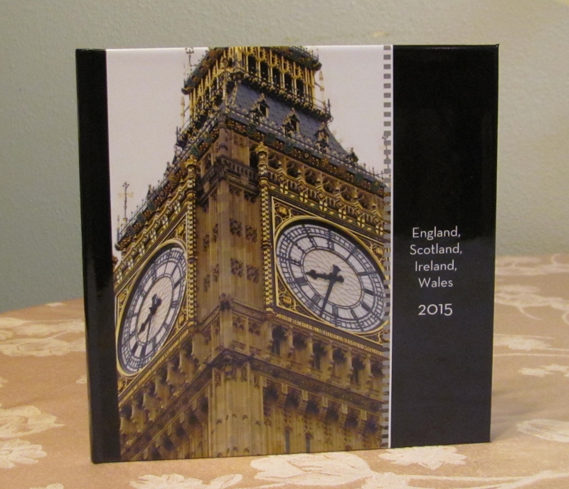
I had SO many photos from out trip to the UK last spring that I decided to use them to create a book documenting it.

You even get to put your own photos and text on the front cover:


My first page was all about our day in London. This was an excellent layout to include a dozen photos. You can see where I and typed out some placeholders ("XXXX") where I needed to look up the official name of a landmark. Unfortunately, by the time I got to the end of the book layout I forgot to go back and fix those placeholders. So when I got the book, I used white dots to cover up the Xs with a number and added a label next to the photo with the name written in.


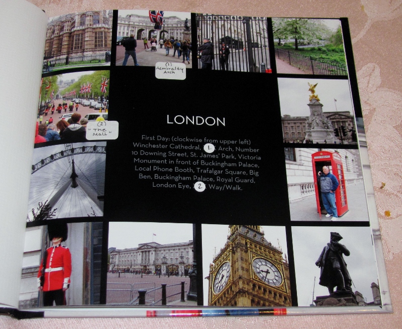
Since the facing page is blank I may add a map that shows the locale of each of the sites.

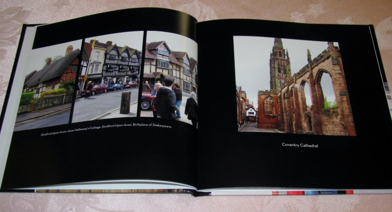
The rest of the book follows in order of the places visited. This spread includes Stratford-upon-Avon and Coventry Cathedral.


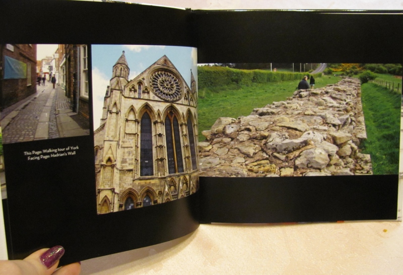
Thi spread documents our walking tour of York and visiting Hadrian's Wall:


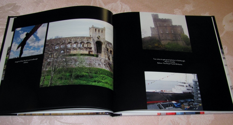
Moving up into Scotland, this spread shows 'The Angel of the North', Jedburough Castle, Edinburgh and the Royal Yacht Brittania:


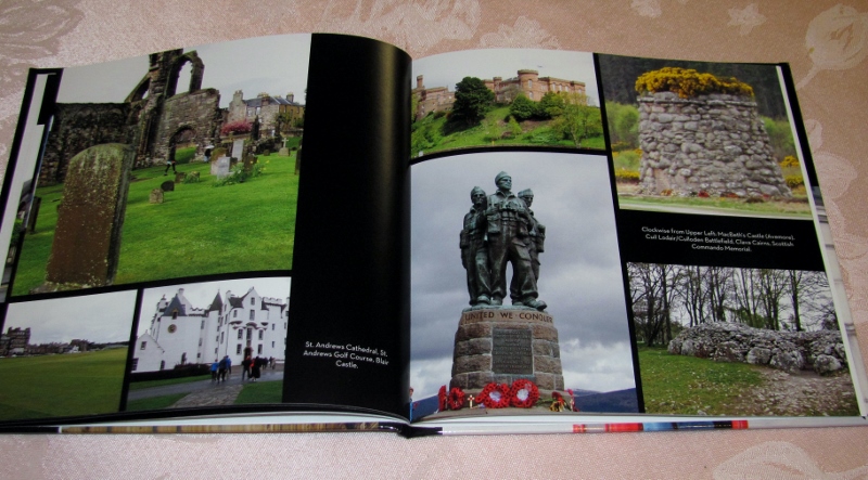
On the left are St Andrews and Blair Castle and on the right are MacBeth's Castle and some battlefields and memorials we visited.


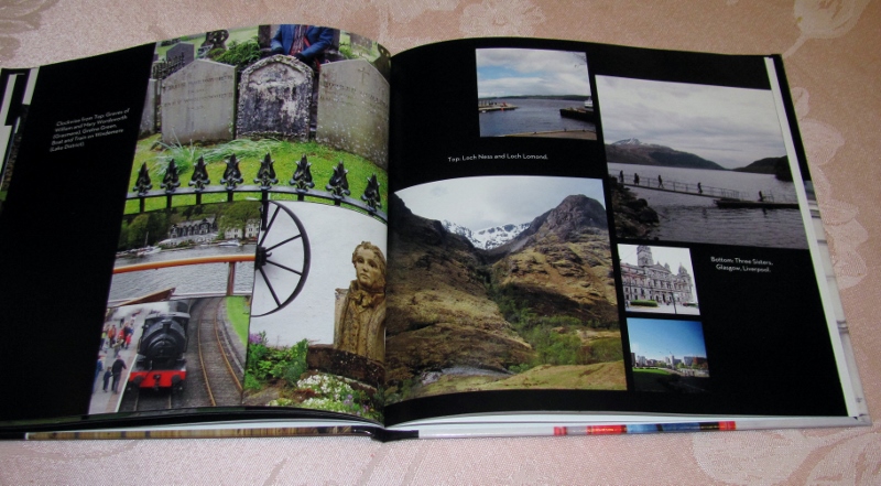
This spread is all about the Lake District and the Scottish Highlands:


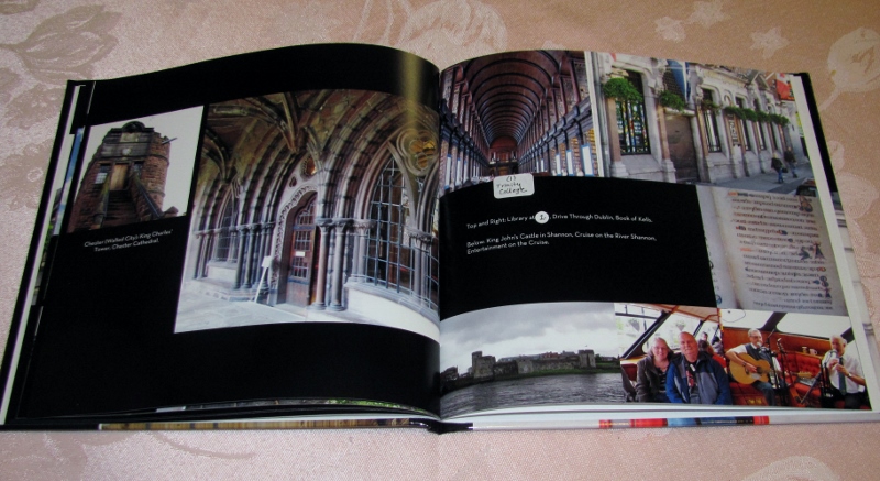
On the left side is the walled city of Chester and the right takes us to Ireland - Dublin, the Book of Kells, the River Shannon, the city of Limerick and a local pub. You can see another of those placeholder boo-boos:


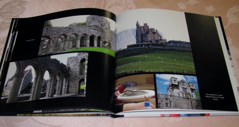
On the left is Boyle Abbey and on the right is Mountbatten's Castle, the Beleek Pottery Factory and Donegal Castle:


Some sights around the southwest of Ireland. You can see one of the pages (right side) that does not have a text block:


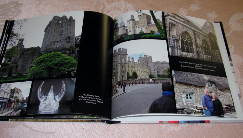
Blarney Castle, Killarney and Waterford on the left. Cardiff, Windsor and Wales on the right:


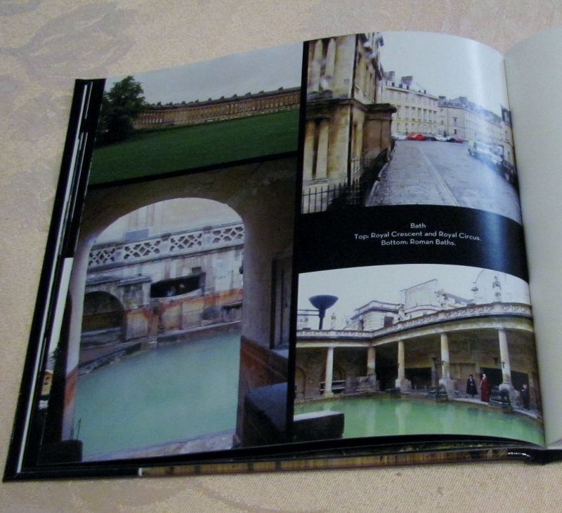
Four photos from Bath, England:


And there is another opportunity to feature a photo on the back cover:


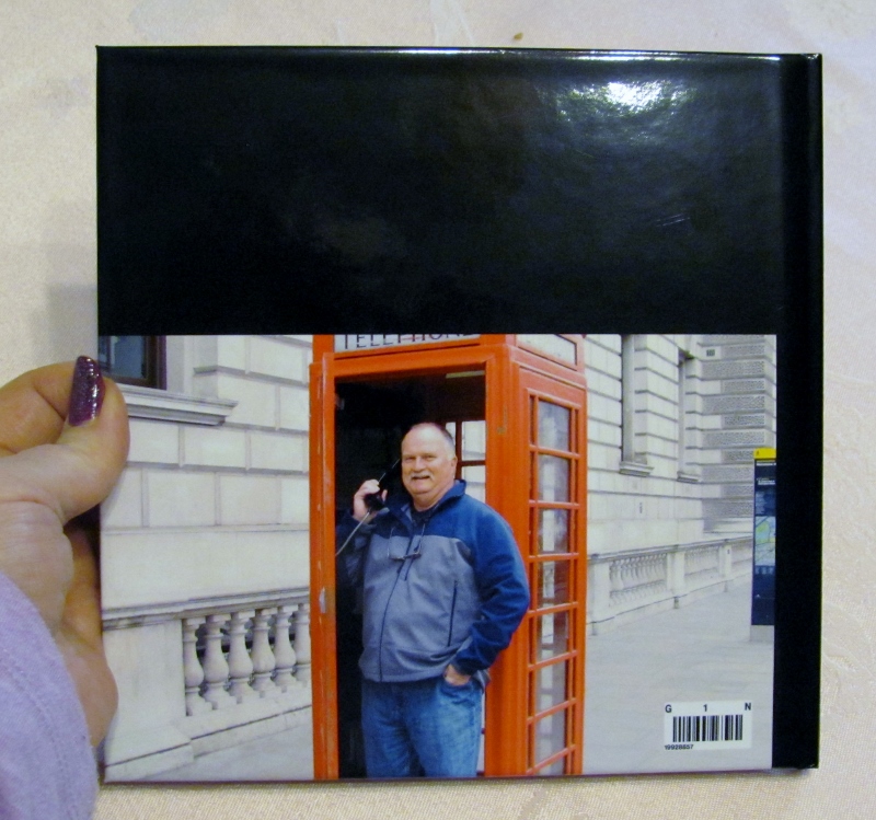
You can see by the hand in the photo above the size of the book - the pages are 8x8.

I have no association with Shutterfly - I'm just a satisfied customer. They have lots of products to choose from - larger books, mugs, postcards, greeting cards, and more - all featuring your own photos.

If I have another opportunity to use them for Books or Calendars like I already have, I will definitely do it.

Ddd


Posted by studio3d@ccgmail.net at 12:01 AM PST
Tuesday, 23 February 2016
Who Is Snacking On the Trees?
Topic: Around the House

I've shared before the plethora of animals that live around our house. Some new ones of late are the chickens that belong to neighbors up the road that tag along on our walks, like little dogs. There they follow down the road behind us... cluck, cluck, cluck. Last week a rooster joined the three ladies. We're still not sure if:

1) he was there all along but didn't like to go walking

2) he is new to the flock OR

3) he belongs to another neighbor and has just now discovered the new girls

Since the lady of the house has started back to work, the four of them now have started roaming the neighborhood all day rather than just coming out of their own yard to walk along. You never know which of 4 to 5 yards you'll see them in.

They do go home to sleep and to lay their eggs, though.


ANOTHER new guest to these here parts has been living in the pond on the property just upstream from ours.

This neighbor has always had a small pond, but this winter we noticed we could see it more clearly than ever before. We assumed that a few trees may have come down to open up the view or maybe it was attributable to the record rains we've had.


Then, the Mister was looking through the binoculars for an odd colored duck we've been seeing out there. WHAT?!?!? look at that freshly downed tree!


That is on OUR side of the pond which is the downstream side. You can tell by the pointy top on the stump that some beaver has obviously been felling trees and building up the blockage at the outlet of the pond.

This would explain why the pond is larger AND why the creek seems to flow through our pasture instead of flowing to the culvert like it used to.

Makes a mess out of our pasture, reducing the use of it to stick-dry summer. But, the wildlife in these parts have the 'right-of-way' so there's probably nothing we can do about this (also, the pond is not on our property so the beavers are under the jurisdiction of the neighbor anyway).

Mostly, we like the wildlife. But, gnawing beavers and gross-ugly nutria are NOT welcome here.

Ddd


Posted by studio3d@ccgmail.net at 12:01 AM PST
Monday, 22 February 2016
Hummmmmm
Topic: Painting

Watercolor painting again...

I used a quarter sheet of watercolor paper from a pad and stamped a hummingbird/floral image using 'scattered straw' Distress Ink.

I have no green watercolor pains so have to mix these using my two blues and two yellows.

The bird has browns mixed from ochre and umberwith blue shadows.

I painted the flowers in washes of three reds as well as a purple that I mixed for shading.


I forgot how much the colors become muted when they dry. It is difficult to get vibrant tones in watercolor.

I need much more practice.

Ddd


Posted by studio3d@ccgmail.net at 12:01 AM PST
Sunday, 21 February 2016
Watercolor For Real
Topic: Painting

I have been wanting to get back to watercolor paintig for some time now but have been limiting myself to painting card fronts and using stamp pad inks or markers for the 'paint'.

I decided to break out of this one step at a time so I started by switching back to true watercolors and standard brushes.

I started with watercolor paper that comes in a pad and cut a sheet into quarters. Rather than taking time to sketch something to paint I got out rubber stamps and stamped the image with 'scattered straw' Distress Ink.

For this one I used my hand carved stamps of roses.

I used the guidelines on the stamped image to decide where to do shading and worked with reds and yellows to create oranges with a bit of blue shadow. The greens were mixed as well as I have no green watercolor paints.


The background is NOT purple as this shows but if I dial that back the roses do not look as orange as they really are.

Although this ended up being sized properly for a card front, I'm not sure if will end up being used that way.

Ddd


Posted by studio3d@ccgmail.net at 12:01 AM PST
Saturday, 20 February 2016
And Then There Were Two
Topic: Techniques

This is the last of four resist butterfly cards that I made. The link to the inspiration tutorial is back on day 1 of the series (Feb 17).

These are the steps I used:

I stamped on watercolor paper with Versamark and embossed with clear powder.

Then I used the ink from Distress pads to watercolor and blend inside the butterflies. When those were dry I made a watercolor wash on the background combining blue and green.

I then took the card to the ironing board and pressed with a hot iron through a plain piece of white paper. This melts the embossing powder which is then absorbed into the paper.

The last step was stamping with a scripture stamp in black ink.

On this layout the bottom butterfly got a smeared wing so I cut it off and trimmed the watercolor paper to a square. This was bordered with a black striped paper over a red patterned paper.

In keeping with the red patterned paper I gave this a red base card.

Ddd


Posted by studio3d@ccgmail.net at 12:01 AM PST
Friday, 19 February 2016
In the Pinks
Topic: Techniques

This is the third in a series of cards that use the same tutorial as inspiration. You can go back to the first one for links to that tutorial.

Here, again, are the steps I used:

I stamped on watercolor paper with Versamark and embossed with clear powder.

Then I used the ink from Distress pads to watercolor and blend inside the butterflies. When those were dry I made a watercolor wash on the background combining blue and green.

I then took the card to the ironing board and pressed with a hot iron through a plain piece of white paper. This melts the embossing powder which is then absorbed into the paper.

The last step was stamping with a scripture stamp in black ink, trimming and bordering in black.

The pinks were the prominent color in these butterflies so I used a bright pink for the base card.

Ddd


Posted by studio3d@ccgmail.net at 12:01 AM PST
Thursday, 18 February 2016
Orange You Glad There's Butterblies
Topic: Techniques

You can see yesterday's post for the inspiration piece and tutorial for the cards in this series. Here again are the steps I used in creating them:

I stamped on watercolor paper with Versamark and embossed with clear powder.

Then I used the ink from Distress pads to watercolor and blend inside the butterflies. When those were dry I made a watercolor wash on the background combining blue and green.

I then took the card to the ironing board and pressed with a hot iron through a plain piece of white paper. This melts the embossing powder which is then absorbed into the paper.

The last step was stamping with a scripture stamp in black ink, trimming and bordering in black.

There was more orange in this set of butterflies so I used an orange base card.

Ddd


Posted by studio3d@ccgmail.net at 12:01 AM PST
Wednesday, 17 February 2016
Resisting the Arising
Topic: Techniques

On the blogs that I follow regularly I saw a tutorial by Melanie Muenchinger on making a butterfly card using a resist technique. This is the link to the tutorial: http://melaniemuenchinger.blogspot.com/2016/02/video-white-watercolor-splatter-with.html

and this is the project she created:


I used that as inspiration to create a selection of cards using my hand-carved butterfly stamp.

I stamped on watercolor paper with Versamark and embossed with clear powder.

Then I used the ink from Distress pads to watercolor and blend inside the butterflies. When those were dry I made a watercolor wash on the background combining blue and green.

I then took the card to the ironing board and pressed with a hot iron through a plain piece of white paper. This melts the embossing powder which is then absorbed into the paper.

The last step was stamping with a scripture stamp in black ink, trimming and bordering in black.


The card for today has more yellow tones than the others so I gave it a yellow base card.

Ddd


Posted by studio3d@ccgmail.net at 12:01 AM PST
Tuesday, 16 February 2016
Berry Best Wishes
Topic: Scrap Recovery

It is fun to gather these groups of strips out of the scrap bin and immediately flash on a project originally made with some of those papers. This set of papers did NOT make me feel that way. I certainly remember seeing them in the paper bins but I really don't recall how any one of them made it to the scrap bin. Obviously I used enough of them to end up with a strip but...who knows what it was.

All of the strips have a burgundy element except for the linen look one in the center.

I had several matching sheets of sticker that allowed me to come up with four of the berry clusters. These were arranged in alternating facings up the wide linen strip.

A burgundy base card was used with a border exposed.

For a sentiment I mounted a gold peel-off sticker on burgundy and tucked one end under a berry.

Ddd


Posted by studio3d@ccgmail.net at 12:01 AM PST
Monday, 15 February 2016
Thanks For a Hint of Yellow
Topic: Scrap Recovery

The inspiration for this scrap grouping was the two outer pieces featuring graphical black, white, grey and a hint of yellow. The pieces I chose to go with them are all shades of grey and focus on textures.

By putting the two lighter pieces at the ends I created a frame for the block of greys.

In decorating this background I chose a silver peel-off picture of tulips. I used alcohol marker in yellow to color only the lines forming the flowers.

The base card is also grey so it really fades into the background.


I used a silver peel-off sticker for the sentiment.

Ddd


Posted by studio3d@ccgmail.net at 12:01 AM PST
Sunday, 14 February 2016
Let's Picket!
Topic: Scrap Recovery

This scrappy background is all about the relative values in the cream to brown strips. I arranged them alternating in lights and darks without any idea what would eventually decorate them.

A search through my sticker bin yielded this picket fence framing a line of golden sunflowers. And I added some golden daisies on each end.

I think the brown and blue floral paper in the center is representing the sky.


For text I created a phrase out of kraft word stickers from a Tim Holrz line.

Ddd


Posted by studio3d@ccgmail.net at 12:01 AM PST
Saturday, 13 February 2016
My Love Is a Red, Red Rose
Topic: Scrap Recovery

The feature scrap strip on this piece is a golden brown with banners of white doilies. None of the other strips in the scrap bin really matched it so I just went with darker browns and told myself I was working with milk chocolate and dark chocolate.

That led me to add a rose sticker that incorporates some script and whose color blends well with the milk chocolate.

That rose brought me to color some white peel-off sticker borders with three colors of red alcohol markers to get the same range of light and dark.

Once these elements were added (chocolate, roses, lace) what else could the sentiment be but a Valentine quote? This is a combnination of two rub-ons.


I gave this a white base card to refer back to the white doily section.

Ddd


Posted by studio3d@ccgmail.net at 12:01 AM PST
Friday, 12 February 2016
Basket Case
Topic: Scrap Recovery

Oh I love all the spring-y greens that came together for this scrap background!

I placed the darker ones on the outer edges to create a frame effect. The spring ones frame out the focal piece which includes some unreadable script.

I found a rub-on basket of flowers and added a bow to the handle from the same sheet. That sheet also had some sets of golden dots and I added those in groups of four just inside the dark green bordering strips.

Word stickers from two different sets were combined on the left side.

Ddd


Posted by studio3d@ccgmail.net at 12:01 AM PST

Newer | Latest | Older