« May 2016 »
S M T W T F S
1 2 3 4 5 6 7
8 9 10 11 12 13 14
15 16 17 18 19 20 21
22 23 24 25 26 27 28
29 30 31
You are not logged in. Log in
Entries by Topic
All topics  «
3D paperwork
A - Z challenge 5
A - Z challenge 7
A - Z challenge round 4
A to Z challenge round 3
A to Z round 2
A to Z round 6
A-Z round 1
Around the House
Art Challenges
Artist Trading Cards
Backgrounds
Beads
Bible Journaling
Books
Boxes
Collage
Color Challenge
Coloring
cookbook
Die Cuts
Digital Projects
Digital Stamps
Drawing
Dry Embossing
Fabric Stuff
Fantastic Folds
Field Trip
Home Decor
How Does Your Garden Grow?
Hymnal Art
In The Kitchen
In the studio
Jewelry
Lettering
Links
Multi-Technique
Music to Work By
Musings
Nail Art
New Work
Online Class
Other Hobbies
Other Projects
Painting
Paper Embroidery
Paper Piecing
Photo
Pretty Paper
Quilting
Random
reading
Scrap Recovery
scrapbooking
Sewing
Sketch Challenge
Some Backlog
Stamping
Stencils
Stickers
Supplies
Teabag Folding
Techniques
Testing
tips and tricks
Tutorial
Web resources
Welcome to my Blog
Work By My Friends
workflow
Writing
Blog Tools
Edit your Blog
Build a Blog
RSS Feed
View Profile
Group One
In & Out of Studio 3D
Tuesday, 24 May 2016
Diecut Scrap
Topic: Die Cuts

That nativity card I made almost two weeks ago used a diecut from corrugated cardstock. I kept the cutout piece of the barn for later use and, guess what, its later!

I also had some red checked paper which just screamed 'country' to me so that had to be included.

I backed the barn with some woodgrain and cut the base for dimensionality. Then I drew in some lines to represent the back wall.

I used some Distress Ink (sponged) on the surface of the barn piece and then glued the whole thing onto the red paper.

I added a couple of animal stickers from my stash to 'make sense' of the barn.

A pre-stamped sentiment was cut into separate words to adhere on the card.


OK - it's not high class or fancy but it will make a suitable card for a young child someday.

Ddd


Posted by studio3d@ccgmail.net at 12:01 AM PDT
Monday, 23 May 2016
Scrappy Strips - Brown
Topic: Scrap Recovery

Here we are at the end of the card fronts made from my scrap bin full of strips of design papers.

Seven cards have passed by the screen and we have only the brown one left.

This time there were fewer strips in the color range and they were a lot longer. This allowed me to use a vertical format for the card.

By chance, a scripture printed on vellum fit perfectly as an overlay to the lace paper. I ran it through the Xyron for a full coverage of adhesive, which does not show through the vellum.


I had some very fine silver corner stickers which I used sparingly - just on the left side.

Ddd


Posted by studio3d@ccgmail.net at 12:01 AM PDT
Sunday, 22 May 2016
Scrappy Strips - Teal
Topic: Scrap Recovery

On the downhill stretch with my little scrap bin full of strips of design papers. I did a little sorting and combining to make card fronts from them.

Having seen the pink, orange, red + teal, green, tan + blue, and yellow + gray, we've just got a teal one and a brown one to go.

Today we'll look at the teal card.

I actually started with a square doily print on tan. I built out from this with two strips of teal on each the left and the right. Then I split a couple of long strip lengthwise and stacked them at the top and bottom.

This left one shorter strip which I cut in half to make some crossbars upper left and lower right.

I had some colored peel-off border stickers that made a nice framing element on the top and bottom.

A pre-stamped sentiment on teal green suited perfectly.

Ddd


Posted by studio3d@ccgmail.net at 12:01 AM PDT
Saturday, 21 May 2016
Scrappy Strips - Yellow With Grey
Topic: Scrap Recovery

Very close to done with the card fronts made with my little scrap bin full of strips of design papers.

This blog has displayed ones in pink, orange, red + teal, green, and tan + blue. Just the yellow + gray, teal, and browns are left.

The sliced and arranged strips were glued down on card fronts and decorated with text blocks, stickers and rubons.

Today we'll look at the yellow and grey card.

There isn't a lot of yellow in the mix on this card but I did get some from the floral piece. I added a short strip of yellow crosswise at the botto and bordered a stamped scripture in yellow before popping it up on foam tape.


A rummage in the sticker bin revealed the scrolls in colors found in the floral paper.

Awesome!

Ddd


Posted by studio3d@ccgmail.net at 12:01 AM PDT
Friday, 20 May 2016
Scrappy Strips - Tan With Blue
Topic: Scrap Recovery

Yay - more card fronts from the scrap bin of strips.

We've viewed those in pink, orange, red + teal, and green. There's just the tan + blue, yellow + gray, teal, and browns left.

Strips were sorted and glued down on the card fronts and decorated with text blocks, stickers and rubons.

Today we'll look at the tan and blue card.

I had several tan strips (including one of corrugated card) but only one with some blue in it. I wanted to use it and needed to find ways to bring that blue into the rest of the card.

I decided to use a blue card base as a starting point. Then I added that same border color to the stamped scripture block which was popped up on foam tape.


In my sticker file I found these sweet floral corners - a perfect finish.

Ddd


Posted by studio3d@ccgmail.net at 12:01 AM PDT
Thursday, 19 May 2016
Scrappy Strips - Green
Topic: Scrap Recovery

Still churning out card fronts from my scrap bin.

I've already shown those made in pink, orange, and red + teal.

Today's green will be followed up with tan + blue, yellow + gray, teal, and browns.

Strips arranged in an attractive fashion were glued down on the card fronts and decorated with text blocks, stickers and rubons.

Today we'll look at the green card.

This was pretty straightforward to the point of looking very boring. So I added a scalloped border to the bottom of the stamped text block.


I selected gold peel-off stickers for corners around the text block and borders up the left and right edges.

Ddd


Posted by studio3d@ccgmail.net at 12:01 AM PDT
Wednesday, 18 May 2016
Scrappy Strips - Red and Teal
Topic: Scrap Recovery

More sorting and combining to make card fronts with my little scrap bin full of strips of design papers.

I ended up making ones in pink, orange (both already shown), red + teal, green, tan + blue, yellow + gray, teal, and browns.

The card fronts with the sliced and arranged strips glued down were  decorated with text blocks, stickers and rubons.

Today we'll look at the red and teal card.

The strip that combines both colors was the starting place for the selection of other papers. I had that one tiny strip that wasn't long enough to fit on the card vertically so I swung it around to the bottom right.

This made a great place for a prestamped sentiment, in white to match the base card.


Yep, I had even more of the 'stitching' rubons to use.

Ddd


Posted by studio3d@ccgmail.net at 12:01 AM PDT
Tuesday, 17 May 2016
Scrappy Stripes - Orange
Topic: Scrap Recovery

With my little scrap bin full of strips of design papers I did a little sorting and combining to make card fronts.

I ended up making ones in pink (shown yesterday), orange, red + teal, green, tan + blue, yellow + gray, teal, and browns.

I sliced and arranged the strips in an attractive fashion and them glued down on the card fronts and decorated them with text blocks, stickers and rubons.

Today we'll look at the orange card.

Two of the papers had leaves printed on them and I kept them together on the arrangement. 

Then I had one paper that was a rectangle instead of a strip so that made a perfect place to drop a pre-stamped - a perfect choice.


More of those 'stitching' rubons in the 'perfect colors' make their appearance here.

Ddd


Posted by studio3d@ccgmail.net at 12:01 AM PDT
Monday, 16 May 2016
Scrappy Stripes - Pink
Topic: Scrap Recovery

My little scrap bin was full of strips of design papers after recent projects so I decided to do a little sorting and combining to make card fronts.

I ended up making ones in pink, orange, red + teal, green, tan + blue, yellow + gray, teal, and browns.

After slicing and arranging the strips in an attractive fashion they were glued down on the card front and decorated with text blocks, stickers and rubons.

Today we'll look at the pink card.

I started arranging the strips vertically to create a horizontal card and then saw that one of them had text running lengthwise so I placed it at the top.

I bordered a pre-stamped scripture with some raspberry cardstock to go with the sketchy ferns in the largest paper.


When I went looking for border stickers I came across some forgotten 'stitching' rubons. These flower sprigs were the perfect color and came out looking great.

Ddd


Posted by studio3d@ccgmail.net at 12:01 AM PDT
Sunday, 15 May 2016
12 Tags of 2016 - May (card 2)
Topic: Multi-Technique

Round 2 of the May 12 Tags of 2016 is up today. As a reminder, here are the tags Tim Holtzgot his techniques from:


And here is the tag he challenged us with using those techniques:


I didn't use all of the techniques Tim did as my stamps really didn't lend themselves to florals. But these are the steps I used on my project

- Select multiple stamps to use

- Apply tissue tape to selected areas where featured stamps will be used

- Stamp featured stamps over tissue tape using Archival black ink (I used fish)

- Stamp other images to cardstock as background (I used coral and seaweed)

- Use a palette knife to apply clear texture paste through a stencil in selected areas (I used medium dots)

- Let dry completely

- Colorize surface wiith Distress stains (go lightly)

- Mist with water to blend

- Dry completely

- Blend on Distress inks to highlight

- Buff to remove excess ink from tissue tape and stenciled areas

- Mask off tissue tape areas

- Spritz with gold metallic paint

- Trim to card size

- Border with black cardstock

- Mount on colored base card

Here is the bottom half of the finished piece that I used for the second card:

Now that I'm caught up with these challenges, we won't see another '12 Tags' project until June.

Ddd


Posted by studio3d@ccgmail.net at 12:01 AM PDT
Saturday, 14 May 2016
12 Tags of 2016 - May
Topic: Multi-Technique

Yep, back with another in the 12 tags series. In this case I actually made a single piece and then cut it in two to make separate cards.

Here are the tags that Tim combined this month:


And here is the project he created with that combination:


These are the steps I used on my project

- Select multiple stamps to use

- Apply tissue tape to selected areas where featured stamps will be used

- Stamp featured stamps over tissue tape using Archival black ink (I used fish)

- Stamp other images to cardstock as background (I used coral and seaweed)

- Use a palette knife to apply clear texture paste through a stencil in selected areas (I used medium dots)

- Let dry completely

- Colorize surface wiith Distress stains (go lightly)

- Mist with water to blend

- Dry completely

- Blend on Distress inks to highlight

- Buff to remove excess ink from tissue tape and stenciled areas

- Mask off tissue tape areas

- Spritz with gold metallic paint

- Trim to card size

- Border with black cardstock

- Mount on colored base card

Here is the top of the finished piece that I used for the first card:


Tomorrow, I'll show the bottom half - also made into a card.

Ddd


Posted by studio3d@ccgmail.net at 12:01 AM PDT
Friday, 13 May 2016
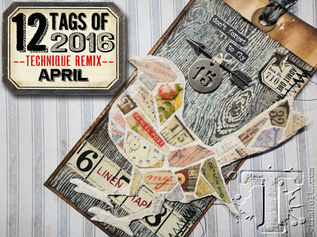
12 Tags of 2016 - April
Topic: Multi-Technique

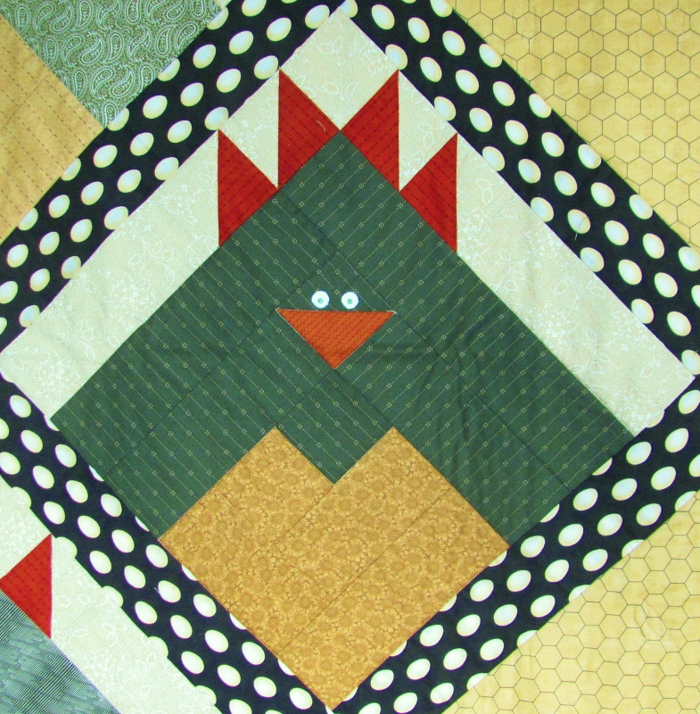
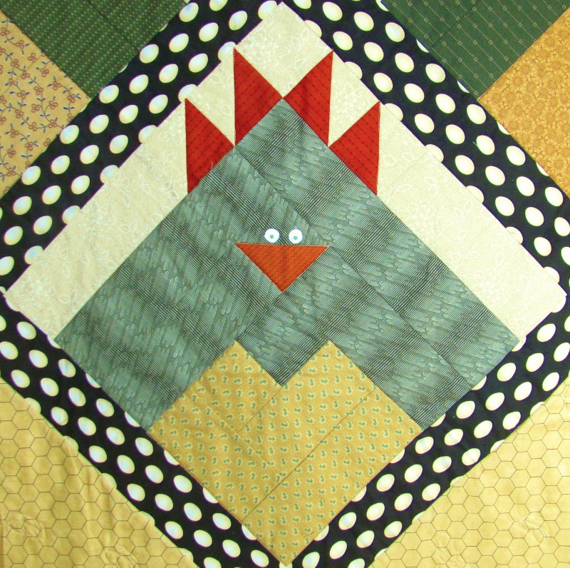
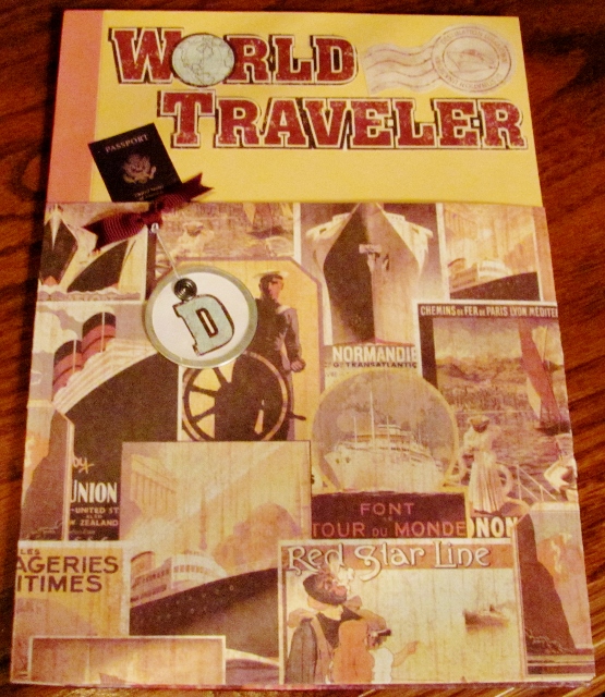
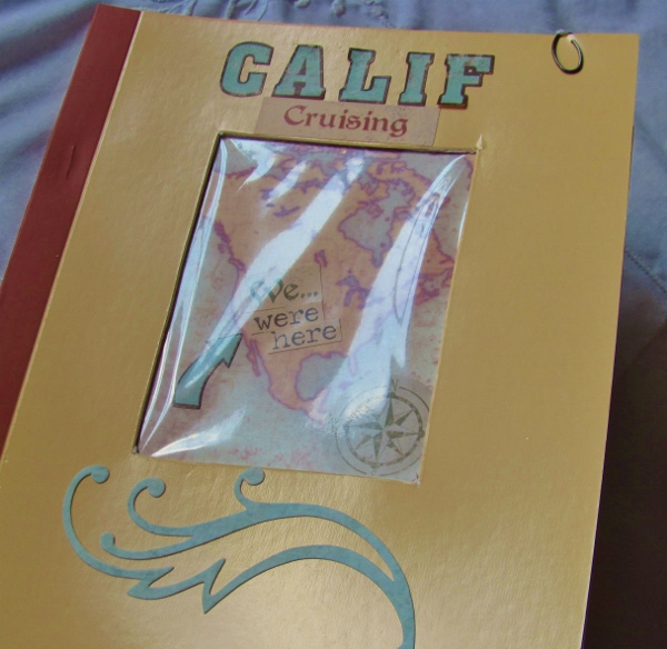
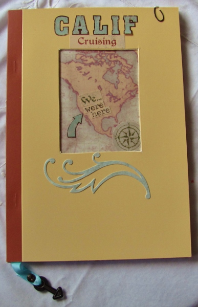
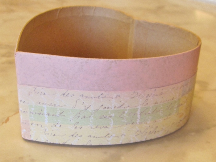
This is SO not a tag!

Tim Holtz works on tags to demonstrate his techniques but I rarely do. I mean, what do you do with a tag you've decorated? Tim recognizes that not everyone wants to work on tags but he is really just teaching technique ans encourages people to make the project their own.

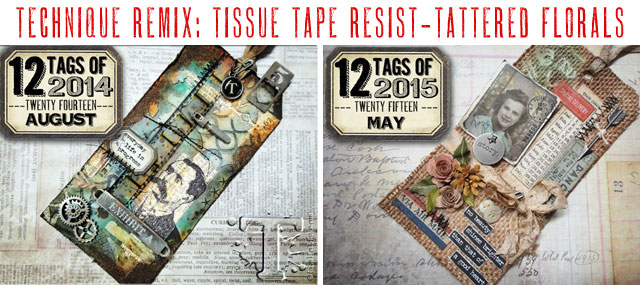
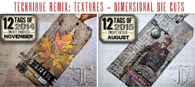
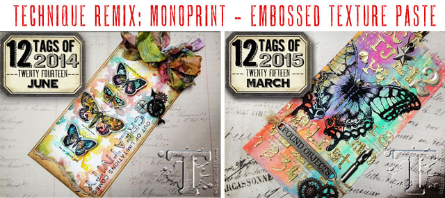
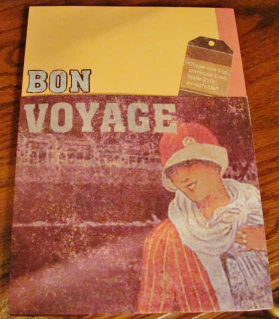
Here are the two tags he selected to combine in April:


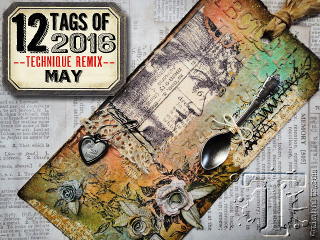
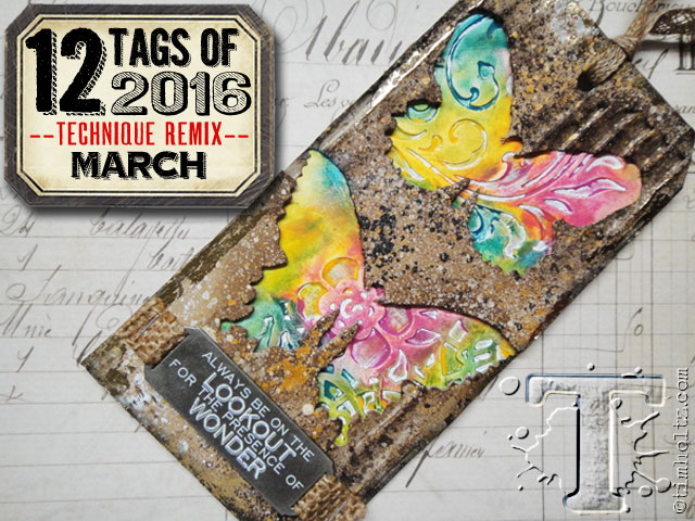
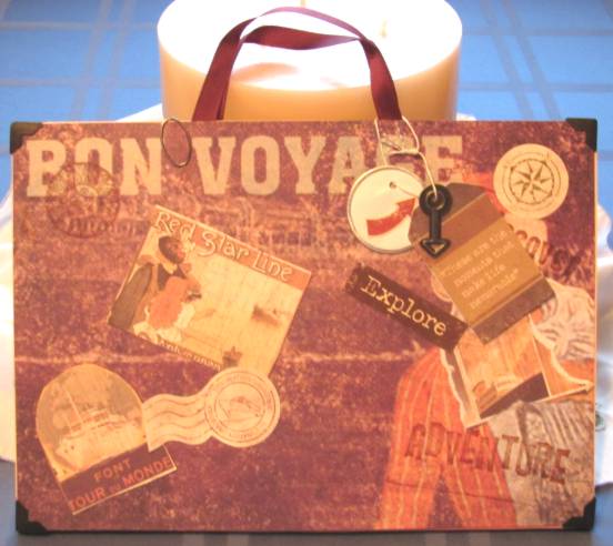
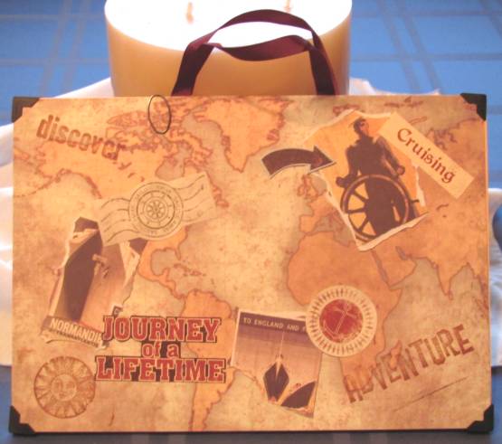
And the tag he made with these techniques:


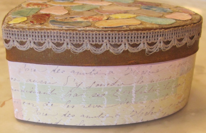
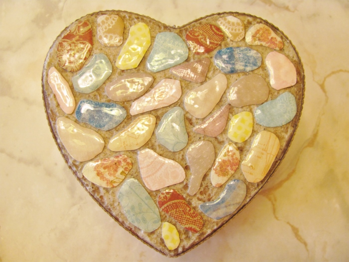
Here are the steps I used to create my project:

- Selected a shaped container with a removable metal lid

- Stir some sand into a little modeling paste.

- Apply a layer to the top surface of the box with a palette knife. Smooth out

- Allow to dry completely

- Cut decorative papers into mosaic shapes with rounded corners

- Glue shapes to box top using matte medium, leaving a small space between shapes

- Top coat with matte medium

- Allow to dry completely

- Top each shape with Glossy Accents

- Allow to dry completely

- Sponge Distress ink to tint the 'grout'

- Buff the tiles to remove ink

- Use matte medium as glue to attach trim to sides of lid

- Coat trim with matte medium

- Allow to dry completely

- Sponge Distress ink on trim to tint

- Place lid back on the container and mark where the lid stops

- Remove lid

- Use Distress Paint on upper part of the box base (above the marked line)

- When dry, add printed cardstock to the area below the line using Xyron ahesive for good adhesion

- Allow to dry completely

- Use finger to cover paint and paper with Microglaze (to protect the box from grime)

- Buff off extra Microglaze with a paper towel

- Place lid on box and admire your work!

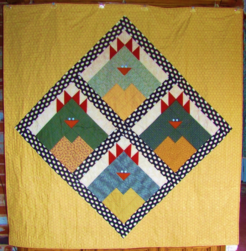
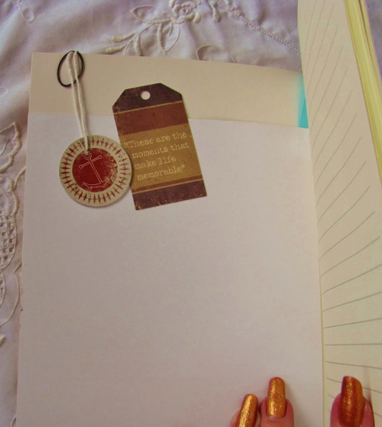
Ready for the big reveal?


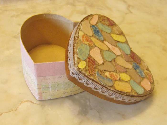
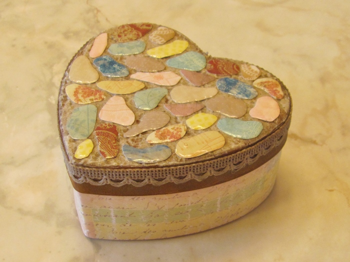
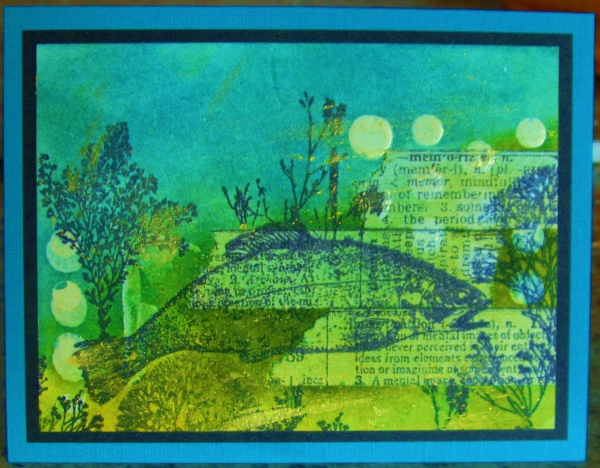
See? REALLY not a tag!

Ddd


Posted by studio3d@ccgmail.net at 12:01 AM PDT
Thursday, 12 May 2016
12 Tags of 2016 - March
Topic: Multi-Technique

I'm kind of in 'catch-up' mode on these Tim Holtz-inspired projects. So, right on the heels of the February one, we're on to March.

Here are the two techniques that Tim mixed:


And this is the new tag he created with the techniques:


Here are the steps I used to create my card:

- Use a shaped die to cut a void in corrugated cardstock (I used a nativity on buff)

- Add white distress stain to surface. dry

- Add distress inks to shade

- Set aside

- On non-stick craft sheet, sponge three Distress paints

- Mist with water

- Swipe cardstock through it

- Dry with heat tool

- Tap into leftover paint on the craft sheet

- Dry again

- Use glue stick or tape runner to apply random glue (not much)

- Lay foil sheet over glue and burnish. Peel up to leave foiling

- Mount diecut corrugated piece over top

- Use alcohol marker to draw in drop shadows

- Trim bottom edge at 3/4 inch

- Use letter diecuts to cut phrase from scrap of background cardstock

- Back cutout letters with cardstock to match drop shadows

- Trim to width of corrugated piece

- Lay three pieces together and tape/tack together

- Use strong adhesive to mount combined pieces to folded card base.

And here is my finished card:


Thiis is a larger card as the size was dictated by the original diecut.

Ddd


Posted by studio3d@ccgmail.net at 12:01 AM PDT
Wednesday, 11 May 2016
12 Tags of 2016 - February
Topic: Multi-Technique

I am WAY behind on creating tags from Tim Holtz's 12 Tags of 2016. I finally created the project for February - in MAY! 

This year he reprises two old tag techniques he has done in past years and combines them into one tag.

Here are the two tags Tim combined for February:

And the tag he made combining techniques from these:


I will warn you that my project looks nothing like his!

Here are the steps I used to create my version:

- Cut down a piece of watercolor paper to card-front size

- Apply Distress Stains over entire surface (I used a teal, a green and a brown)

- Spritz with water

- Dry with heat tool

- Ink BACK of a stencil with three Distress Ink Pads (I used a stencil of birch trees)

- Spritz stencil with water

- Place on the stained watercolor paper

- Cover with paper towel and press to soak up extra moisture.

- Lift stencil

- Dry waterolor paper with heat tool

- Ink edges with walnut stain Distress Ink

- DRY with heat tool (I forgot this step and had some problems later down the line)

- Place another stencil on the surface and squeegee modeling paste through selected areas (I used a stencil of birdcages hanging from branches)

- Remove (and clean) stencil

- Sprinkle with gold embossing powder

- Let dry completely

- Heat emboss powder

- Add stamping to embellish (I used one large and many tiny birds)

- Add word stickers (I used some of Tim's Kraft stickers)

- Use Distress marker to create drop shadows on all elements

- Apply a metal charm using Glossy Accents as adhesive

- Add green Stickles to charm

- Trim if desired and add to a folded card base.

Here is the card I created:


I really like my version a LOT!

Ddd


Posted by studio3d@ccgmail.net at 12:01 AM PDT
Tuesday, 10 May 2016
Working a Little Harder
Topic: Pretty Paper

This is the last project I make using this tic-tac-toe board


Felt                    Stamp                Butterfly


Twine                 Summer              Buttons


Stickers            Design Paper          Stripes


I used the center column for Stamp, Summer and Design Paper.

when I thought about the theme of 'summer' my mind immediately went to the beach. I decided to use the design paper to create a scene. There are 4 papers used: lace for the beach, swirls which I cut to resemble waves on which I added paint for whitecaps, a teal dot for the sky and doily print from which I punches two sizes of circles and arranged them to create clouds.

The stamps I used are that of the text, which has some added fill-in on the letters using black pen, and the grouping of seashells. I used Distress markers to color the shells and add a shadow underneath them.


A tan base card matches the front seashell.

Ddd


Posted by studio3d@ccgmail.net at 12:01 AM PDT
Monday, 9 May 2016
Tic-Tac-Two
Topic: Pretty Paper

I had another go at using this papercrafting tic-tac-toe game:


Felt                    Stamp                Butterfly


Twine                 Summer              Buttons


Stickers            Design Paper          Stripes


This time I chose the diagonal starting at the lower left for Stickers, Summer and Butterfly. (It could also be the bottom row but I used that for tomorrow's card).

I liked this design paper from a 6x6 pad that combines several patterns from the pack.

Then, among my miriad butterfly stickers I ran across these Dazzles brand stickers that come in three colors and have diecut parts. This allows you to place the outline in one color and internal features in two other colors. Fortunately, the colors of pink, teal and yellow/gold matched the paper I had chosen.

I constructed three butterflies with varying color combinations.


I added a sentiment in a gold peel-off sticker.

Nothing specifically says 'summer' on this card but the flowers and butterflies always come out then so I think it qualifies.

Ddd


Posted by studio3d@ccgmail.net at 12:01 AM PDT
Sunday, 8 May 2016
One Two Three In a row
Topic: Pretty Paper

The challenge on a papercrafting board was to select a line from this tic-tac-toe board and make a card:


Felt                    Stamp                Butterfly


Twine                 Summer              Buttons


Stickers            Design Paper          Stripes


I chose to use the far right column and create with Butterflies, Buttons and Stripes.

Fortunately, the striped paper I wanted to use actually had butterflies on it already! I was using the cover of a 6x6 pad showing the variety of papers that it contained.

I had two different styles of button stickers: one-inch cardstock and 1/2-inch acrylic so I layered them together for the left side.

I added a strand of twine for more texture.


I added a banner-cut strip of design paper for a silver peel-off greeting to hang out on.

Ddd


Posted by studio3d@ccgmail.net at 12:01 AM PDT
Saturday, 7 May 2016
Star Struck
Topic: Quilting

 I've seen several quilts with the wonky stars pattern but I was ezpecially drawn to those that interlock. I used the layout to draw up my own version based on a 5-inch block and pulled out all my scraps with shimmery, shiny, glittery and metallic finishes.

I chose a patterned black for the background fabric.


I did the quilting in loops and stars using glow-in-the-dark thread. There is a star in the center of each colored block and where each four black 'windmills' come together.


This 'shot-in-the-dark' from my camera just barely captures the light from the glowing thread.


This quilt will go to Passages - the 45th one I have donated to them.

Ddd


Posted by studio3d@ccgmail.net at 12:01 AM PDT
Friday, 6 May 2016
Home To Roost
Topic: Quilting

I found a cute pattern for a chicken block on Pintrest and used EQ7 to draw it up in a larger size (I used 3-inch strips). I made some other modifications, like removing the upper background strip and then made four blocks using greens for the backs, tans for the chests and rusts for the combs and beaks. The eyes are painted on using acrylics.


I set these together using sashing and borders of egg print fabric and then used a chicken wire print for the four setting triangles.


I quilted the chickens using stitch-in-the-ditch and then for the outer triangles I quilted from the back by outlining some of the chicken feathers on the backing print.

This quilt finished up at 60 inches.

This will go to our neighbors whose free-range chickens wander the neighborhood. When we go for a walk the chickens fall in line and join us for exercise.

They DO go "Home To Roost".

Ddd


Posted by studio3d@ccgmail.net at 12:01 AM PDT
Thursday, 5 May 2016
Book Me For That
Topic: Field Trip

On previous cruises I have played with the blank book craft that they make available.

The kit includes a blank book, a sheet of stickers, a sheet of die cuts, two ribbons, a crocheted lace, a bottlecap, some paper clips, photo corners, brads and three sheets of printed cardstock.

Let's see if I can find pictures of the previous books I made:

For this one I used the printed cardstock to create pockets for the front and back covers before decorating with stickers and a tag. FRONT:

BACK:


For the next one I used the photo corners and the ribbon (to make handles) so I could make it look like a suitcase. Both sides are covered with the printed cardstock. FRONT:

BACK:

So, I wanted to do something a little different this time, with the same supplies.

I cut an aperture in the front cover, backed it with clear cellophane from the original packaging and added a piece of map paper with stickers behind that.

The rest of the front got other decorations to further the theme:


I used one of the ribbons to create a permanent bookmark and added an arrow charm to it. Then on the inside of the front cover I backed the aperture decor with blank paper and added a couple of tags and a clip:


The back cover got a couple of printed cardstock attached to create a pocket:

The envelope is just there to show the pocket layers.


SO, that is the end of the Field Trip review. Something different coming tomorrow.

Ddd


Posted by studio3d@ccgmail.net at 12:01 AM PDT

Newer | Latest | Older