« May 2018 »
S M T W T F S
1 2 3 4 5
6 7 8 9 10 11 12
13 14 15 16 17 18 19
20 21 22 23 24 25 26
27 28 29 30 31
You are not logged in. Log in
Entries by Topic
All topics  «
3D paperwork
A - Z challenge 5
A - Z challenge 7
A - Z challenge round 4
A to Z challenge round 3
A to Z round 2
A to Z round 6
A-Z round 1
Around the House
Art Challenges
Artist Trading Cards
Backgrounds
Beads
Bible Journaling
Books
Boxes
Collage
Color Challenge
Coloring
cookbook
Die Cuts
Digital Projects
Digital Stamps
Drawing
Dry Embossing
Fabric Stuff
Fantastic Folds
Field Trip
Home Decor
How Does Your Garden Grow?
Hymnal Art
In The Kitchen
In the studio
Jewelry
Lettering
Links
Multi-Technique
Music to Work By
Musings
Nail Art
New Work
Online Class
Other Hobbies
Other Projects
Painting
Paper Embroidery
Paper Piecing
Photo
Pretty Paper
Quilting
Random
reading
Scrap Recovery
scrapbooking
Sewing
Sketch Challenge
Some Backlog
Stamping
Stencils
Stickers
Supplies
Teabag Folding
Techniques
Testing
tips and tricks
Tutorial
Web resources
Welcome to my Blog
Work By My Friends
workflow
Writing
Blog Tools
Edit your Blog
Build a Blog
RSS Feed
View Profile
Group One
In & Out of Studio 3D
Tuesday, 22 May 2018
Mustard Tree
Topic: Bible Journaling

I think with this posting I will be up to date with the backlog that accumulated with my vacation combined with the problems with my web/blog host!

This was another page I did on vacation. I wanted to feature some funky little birds I designed so I needed a tree for them to perch in.

I found the scripture reference for the mustard tree in Luke 13:18-19 and drew the tree with leaves similar to the burning bush. More branch, less leaves though.

Again, with a lot of text to add, I used a basic print style.


Crazy, colorful birds.

Ddd


Posted by studio3d@ccgmail.net at 12:35 PM PDT
Monday, 21 May 2018
Parable of the Weeds
Topic: Bible Journaling

The illustration for this scripture in Matthew 13:40-42 was from a 'how-to-draw-it' book. The photo I took of the page on my phone was extremely light and after the sketching, tracing and re-sketching there is a LOT of change from the original.

I couldn't isolate a particular part of the text that summed it up so I wrote out a lot more than I usually do. When doing this it is advisable to use a very basic print style to maintain readability.


The color is all 'me' as the original lesson was only black and white. This combination of green and purple reminded me of the thistles at home (which at this writing are taller than me in the garden plot).

Ddd


Posted by studio3d@ccgmail.net at 12:27 PM PDT
Sunday, 20 May 2018
Knit Me Together
Topic: Bible Journaling

I found a lovely illustration of Psalm 139:13 on Pinterest. Although I borrowed the concept in whole I did draw it myself and colored it without referencing the original.

It has been re-pinned so many times that I cannot find the original poster so I hope they will forgive my borrowing it. IF THIS IS YOURS, PLEASE LET ME KNOW SO I CAN EXTEND CREDIT TO YOU.


I used it on the page AFTER the actual appearance of the scripture as I had already journaled the full spread on the page before this.

Ddd


Posted by studio3d@ccgmail.net at 12:17 PM PDT
Saturday, 19 May 2018
The Narrow Gate
Topic: Bible Journaling

In a 'how-to-draw it' book I found how to make a stone stairway inside an arch. This was similar to many that we saw in Italy and Greece so I used it while on vacation there to illustrate the Narrow Gate in Matthew 7:13-14.

It was unfortunate that the lettering on the page behind it was so dark as it makes this lighter print hard to read. I think I am going to go back and add color to the letters on this page to make them more readable.


I had fun selecting colors and doing shading on the stones, using a range of five values in three sets of gray pencils (cool gray, warm gray and French gray).

Ddd


Posted by studio3d@ccgmail.net at 12:02 PM PDT
Friday, 18 May 2018
The Good Seed
Topic: Bible Journaling

When I want to have a record of something in a book or online that I want to draw later I often take a photo of the page or the screen with my phone. The only problem is that I haven't found a way to change the file name so I can search for them. I do save them in albums so all the lettering is together and all the sketch designs are together, etc.

So, in spinning past lots of pictures I came to a sketch of wheat that I liked for the kernels and one that I liked for the leaves and one for the bend of the heads.

I combined all of these to create three stalks of wheat swaying in the wind that I used to illustrate Jesus' explaination of the meaning of the Good Seed.


Matthew 18:23 is the reference.

Ddd


Posted by studio3d@ccgmail.net at 11:48 AM PDT
Thursday, 17 May 2018
The Wise Owl
Topic: Bible Journaling

During my vacation the Drawing Room lesson was posted for my Owl.

You can get the free PDF for that here: http://creative-bible-journaling.com/drawing-room-213-wise-owl/

I used the owl in my Bible to illustrate Ephesians 1:17


Yeah, strange lettering. It looked better in in my head and on the scratch paper draft. But after using it in this piece I just threw that alphabet away!

Ddd


Posted by studio3d@ccgmail.net at 11:44 AM PDT
Sunday, 13 May 2018
The Non-burning Bush
Topic: Bible Journaling

Our church is working through Exodus which was the perfect time for the Creative Bible Journaling Tip-In Corner to come up with a burning bush. I really liked how one person colored it and printed it out to reference.

Then, on vacation, I realized that I had left the paper at home so I tried to recreate it without.

I actually like my version better in the end!

Our pastor had quipped that it schould actually be called the non-burning bush since there was fire but it was not consumed. That's what this blog entry title is all about.

I had an alphabet on file of letters that resemble Hebrew characters so I used that for the ' I AM ' at the top. 

I did a lot of color blending on the elements and some tracing of the outlines in gold gel pen.


Exodus 3:14 is referenced.

Ddd


Posted by studio3d@ccgmail.net at 11:31 AM PDT
Friday, 11 May 2018
Thank You For Your Kindness
Topic: Bible Journaling

Ann was the Lettering Lodge teacher again the week I left on vacation. I was home for the first two days of lessons which were the focus word:

...and the full alphabet:

While I was away I skipped the day 3 and 4 lessons and went right to using it in my Bible.


The poppies are a creation out of my head.

Ddd


Posted by studio3d@ccgmail.net at 11:24 AM PDT
Sunday, 6 May 2018
Drawing a Prayer Garden
Topic: Bible Journaling

In the Creative-Bible-Journaling.com Drawing Room I created a lesson on how to use one’s own handwriting to make flower stems with the names of people you’re praying for.

This was a style I developed back in high school and it seemed perfect to use the week that the Lettering Lodge was focusing on Generations.

You can download the free PDF of the drawing lesson here http://creative-bible-journaling.com/drawing-room-211-prayer-garden/ and use it to create a prayer garden like I did in my Bible.


Only by turning the page 1/4 turn to the right can you decipher the names written into the stems.

Ddd


Posted by studio3d@ccgmail.net at 11:15 AM PDT
Saturday, 5 May 2018
A New Generation of Lettering
Topic: Bible Journaling

First of all, my appoligies for the delay in posting. Occasionally my web/blog host just goes off the rails and all access to my blog is blocked. I can't get in to post anything and nobody (including me) can see anything. SUPER annoying! Then, before they resolved it I went on vacation so I couldn't even post when it WAS fixed. I had to wait to get home.

In the meantime, I just kept creating and keeping track of when things would have been posted if I had been able to do so. So I am back-dating many posts to keep them in order of appearance.

Here we go:

My co-teacher in the Creative Bible Journaling Lettering Lodge was the instructor of the week and chose the word Generations as the focus for her lessons.

Day 1 was learning a few of the letters needed to write the focus word.


This is a very graceful print, standing tall and having lovely curves.

Day 2 - Learning the entire alphabet


I got some free markers with a purchase so I used them on these pages. I knew I wouldn't be able to use them in my Bible because they bleed through the paper.

Day 3 we were encouraged to create a genealogy tree with the letters. My tree has so many duplicate names and has been researched a long way back so I just used the names in no particular order and focused on decorating the page with dangles and lots of color. I included the descendents as well as the ancestors.


Day 4 we always move on to writing a focus word scripture in our notebook. I used Psalm 78:4 and decorated with some easy roses to fill white space at the bottom.


Day 5 is the day we always take the new lettering style to our Bibles. Psalm 79:13 now showstwo generations praising together with arms raised.
 

Which closes out another week of lettering.
 
Ddd

Posted by studio3d@ccgmail.net at 10:46 AM PDT
Saturday, 28 April 2018
Get Happy - Or, At Least, Get Joyful
Topic: Bible Journaling

The lettering that was taught this week on Creative Bible Journaling was another faux brush script with awesome big loops and swooshes. Ann did a good job by naming this style 'joyful'.

[I think you'll find the pictures will be clearer on artwork posted now as I finally figured out how to to scanning on my new printer instead of having to take photos and editing them]

As usual, we started on Monday with practice writing the focus word in the new lettering style.


On Tuesday we got the whole alphabet. In the faux brush style, you draw the base letter and then add a second line beside the downstrokes. Once these are inked, you fill in the gap with ink to create a thick line.


For the Wednesday activity, Ann had us create an anagram with the word 'joyful'. When I do these, I like to have mine create a phrase or a sentence rather than just listing random words.

I filled the gaps between the double lines on the letters using different colors from a new set of markers. I also decorated my page with the flowers I taught in the Drawing Room tutorial this week. These were very popular.


When I first started writing with this lettering I thought it would make a great style to use for bounce lettering because of the big swoops. It would just take some exagerating of those as well as curving the baselines and varying the letter bases along those lines. Each letter is finessed so the parts and pieces of the words nest into one another.

So, for Thursday's activity of lettering a scripture on paper, I did a rough sketch in a generic script for spacing, and then worked on incorporating all that flair.

After inking my piece I found I had some areas with open white space that were a little distracting. I sketched some butterflies and colored them with orange marker.

That step made them take the forefront so I used the yellow brush marker to add a highlight along the left side of all the thickened ink strokes on the letters.

On Friday, as usual, the activity was to use the new lettering style in our Bbile with a scripture that has the word 'joyful' in it.

I liked the way the bounce lettering looked on the previous piece so I had another run at that for the Bible page.

I added a sketch of a tambourine to illustrate the scripture and to fill in the white space on the page.


I will be saving this alphabet to use for bounce lettering in the future. I love the way it looks!

Ddd


Posted by studio3d@ccgmail.net at 3:10 PM PDT
Friday, 20 April 2018
That Looks Mighty Good
Topic: Bible Journaling

Another week of lettering lessons is up for posting today! Let's just jump right into it:

MONDAY

The font this week is a cross between a standard serif print and a novelty print. It has clean upright letters. There are notations on the sample sheet to give you some additional guidance.

Start with four horizontal guide lines, evenly spaced. From top to bottom these will be ascender, x-height, base and descender lines.

All the capitals have a crossbar at the x-height line (The H is an exception as it has that beautiful wing shape that matches the top of the M)

Letters with a fully rounded bowl (like the o, g) have a small internal curl.

The serifs on everything echo the crossbars. Watch to see which serifs are full-width and which are only half-width (extending only to the right or the left).

I’m not really fond of the mixed upper and lower case like in the last sample. But I know some who like that sort of thing, so I included it.


TUESDAY

I first drew out this alphabet and then I asked my hubby what it reminded him of and he said ‘Samson’s hands on the pillars he was going to crumble’. So, after discussion we decided to go with ‘Mighty’ as the theme!

Common elements to watch for: WING SHAPES on A, H, M, m. INTERNAL CURLS on g, O, o, Q, q. Make note of which serifs are full (go to both sides of the letter) and which are half-width (just extend either left or right).

Make sure your letters stand nice and tall.

Remember to Pencil-Ink-Erase (PIE) as you write out your Mighty Alphabet.

WEDNESDAY

This is a great font to use for some Mighty hymn or chorus lyrics.

I find that I like ‘display’ pieces best when every word is capitalized. I also did some in all-caps as feature words.

I drew some poppies with a very thin-point pen and colored with pencils. When doing art in this style, I stop just short of crossing over the letters with the drawing lines and I leave a slight space around the color so it does not touch the letters. This maintains the readability of the text.

THURSDAY

On Thursdays we write out a scripture using the font of the week This is also done in a notebook or journal or on plain paper.

Although one could use the index inside their Bible, mine does not have one. So, I use www.biblegateway.com/ to find scriptures. There you can type in the focus word of the week and it will show you every verse it appears in! You can even select the Bible version you want to search. The scriptures will be listed AND written out for you. How handy is that? (You can also type in a reference and get the full scripture or you can click ‘in context’ and get the surrounding scriptures as well)

For the Mighty font I chose Psalm 150:1. Once again, all the first letters have been done in upper-case.

Look at the bottom of my page and you will note that I took very simple numbers and added enough of the serifs and crossbars to make them look like the lettering!

I drew over top of my letters using colored pencils, with a different color (blue, green, yellow, pink) for each phrase.

FRIDAY

Today you’ll choose a scripture reference in your Bible that uses the word ‘Mighty’. On this page you will journal that verse using the font of the week.

I had to scale back the size of my letters quite a bit for this and you’ll see that I have condensed the vertical spacing so the descender line on one row also serves as the ascender line on the next row.

As you are penciling your letters in you may want to move the words/letters left or right a smidge so no serifs sit directly on top of one another. I only had to do this in two places with descenders. You’ll see that I stayed with my use of upper-case on the first letter of every word and that I used all-caps to feature selected words.

I did a hand-drawn image with colored pencils added for my page. You can choose to decorate your page any way you wish (or not at all).


This week we were having a 'guided tour' for new members to the CBJ facebook group. Beacuse this was such an easy font to draw we had more participation than we usually do. There were a total of 16 who shared their work with us!


Ddd


Posted by studio3d@ccgmail.net at 8:55 PM PDT
Saturday, 14 April 2018
No Habla Applique!
Topic: Quilting

It is a good thing the fabric I was given had applique elements PRINTED on it because I don't DO applique! This was another of those printed 'cheater' fabrics. The blue blocks were all part of a printed fabric and all I had to do was cut blocks with an added 1/4 inch around them, piece them together using a sashing and add a border of cute houses from the same donation source.

The applique elements on the blocks as well as the mitered-corner frames on them are all part of the printing.

I did NOT want to do free-motion outlining of the frames or elements so I did an all over free-motion medium meander. It is backed with the same medium-blue showing in the binding.

This will go to the hospital's Passages program - my 72nd quilt for them.

Ddd


Posted by studio3d@ccgmail.net at 9:43 PM PDT
The Promise Of Fine Lettering
Topic: Bible Journaling

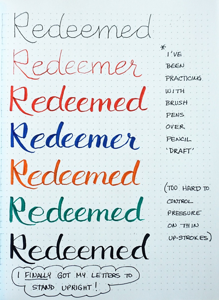
Last week I tutored another class on lettering in a style I called 'Promise'. Thi was a combination of two different lettering alphabets that I tweaked to use together - one for the upper-case and wone for the lower-case.

As we go through the daily lessons you'll note some issues I had with some letters and how I solved them.

MONDAY

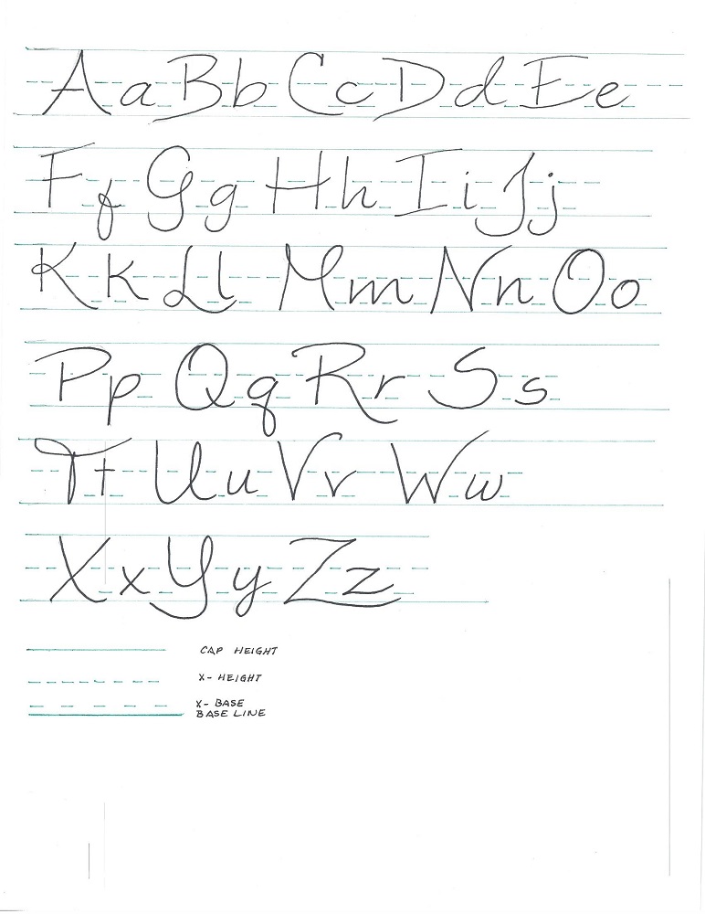
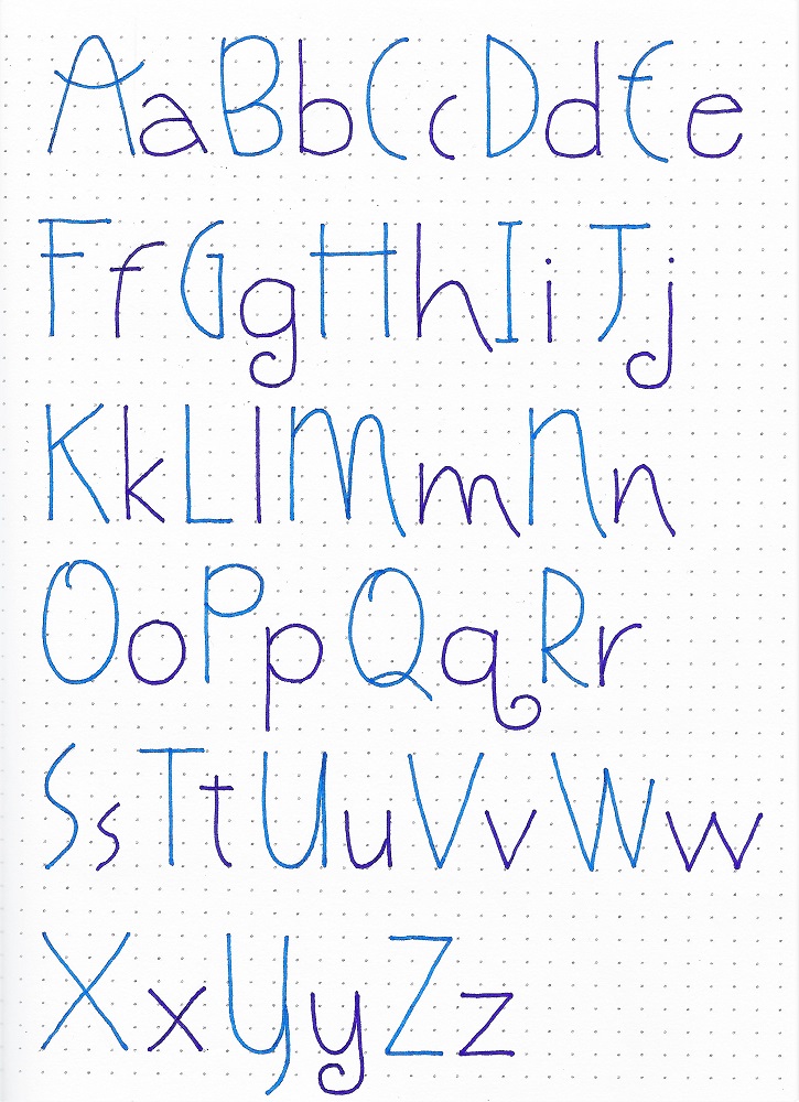
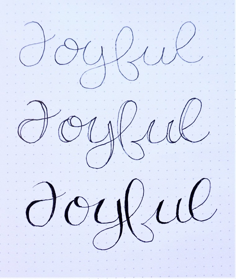
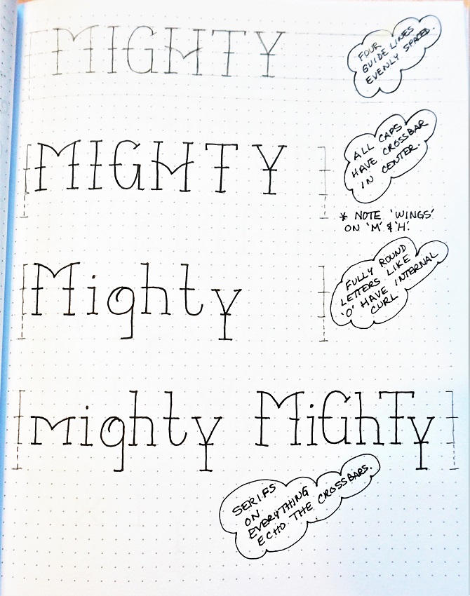
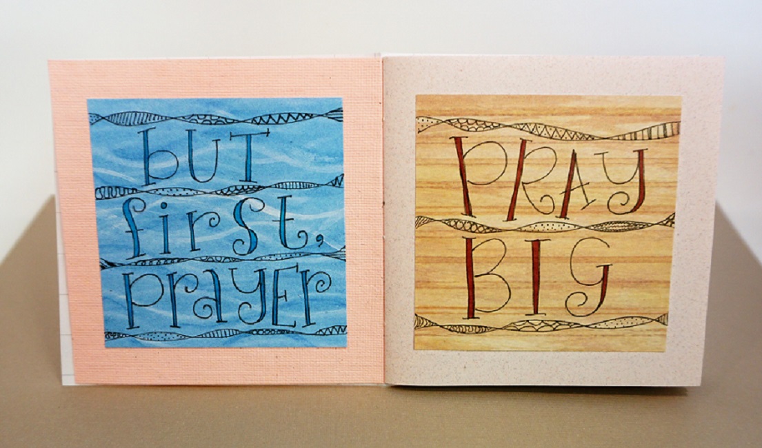
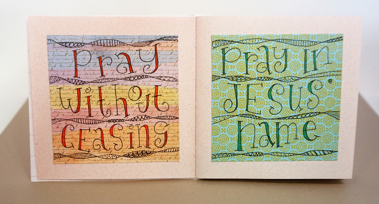
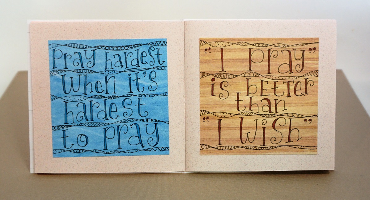
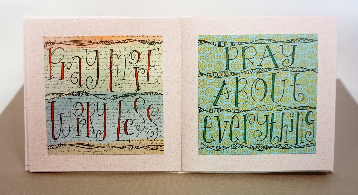
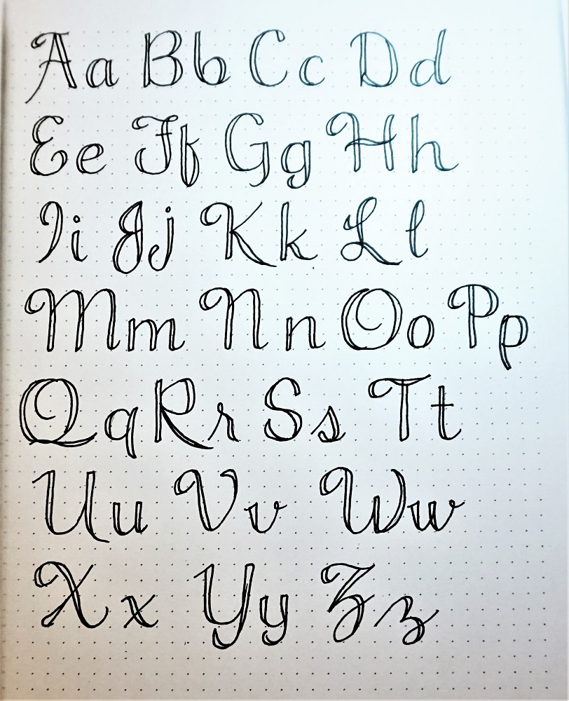
Welcome to another week of lessons in the Lettering Lodge! We are going be learning a semi-script that I call ‘Promise’.

I say semi-script because there are scrolls on both the upper- and lower-case letters (like a script) but there is no connection between individual letters (like a print). These letters are very upright, leaning neither to the left or right.

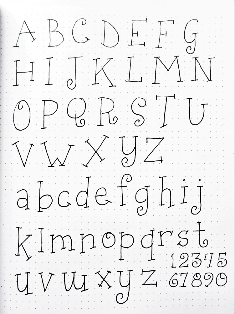
The height of the lower-case letters is slightly LESS than half of the uppers.

Work on getting those swoops right, you’re going to be using them a lot!

You’ll note that words written in all caps are not very readable. The word you’ll write out is just for practice.

So, have a go at this – remembering to draw in pencil until you have good forms, then ink, then erase your pencil.


TUESDAY

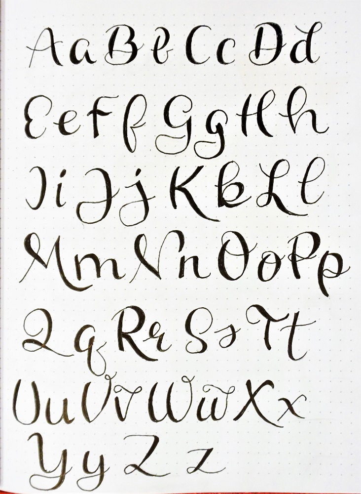
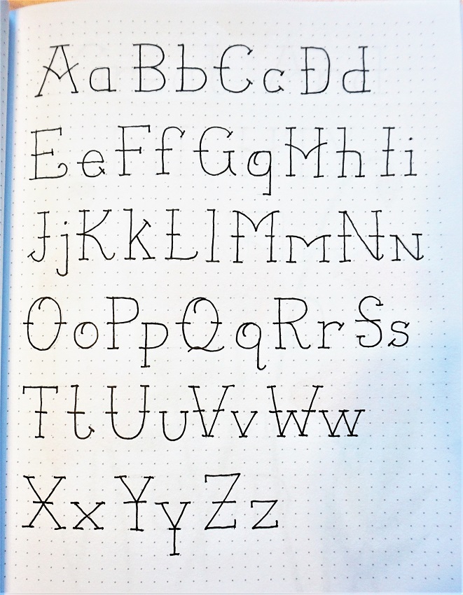
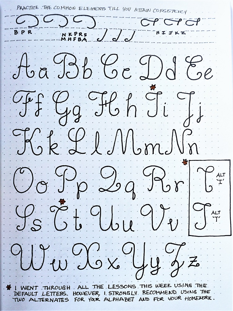
Since there are several loops, swoops and scrolls that are common between letters, practice some of these along the upper edge of your page. It will make it easier to write consistent letters if you get these forms into muscle memory first.

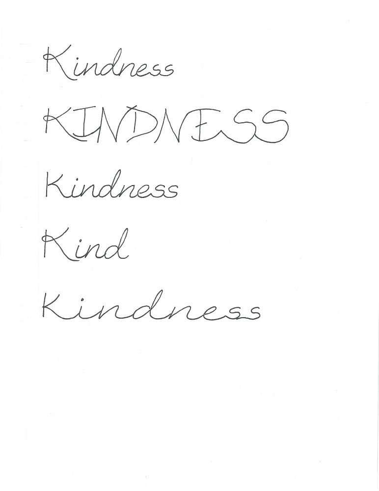
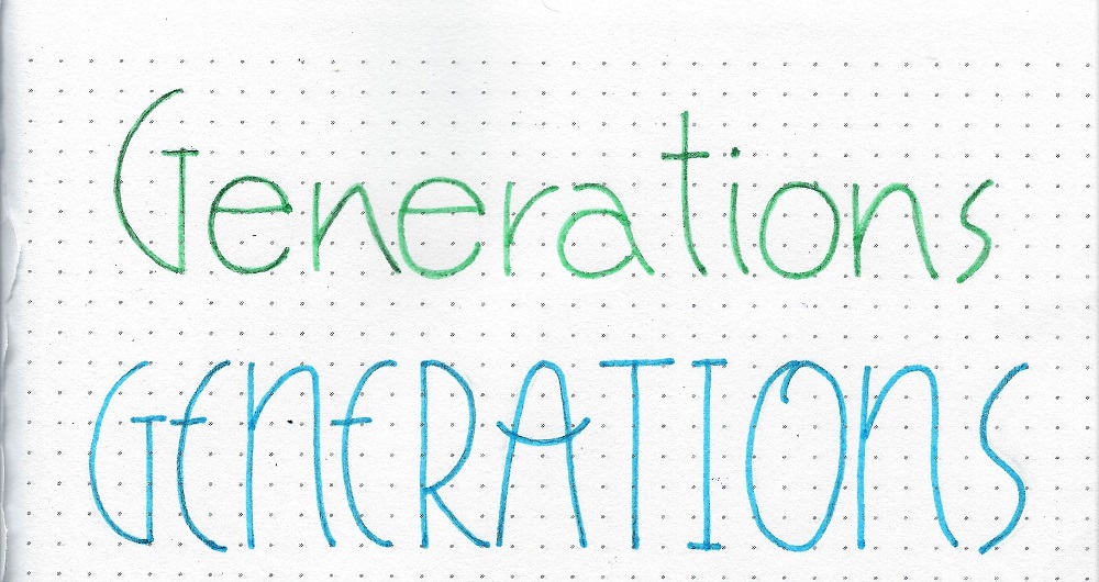
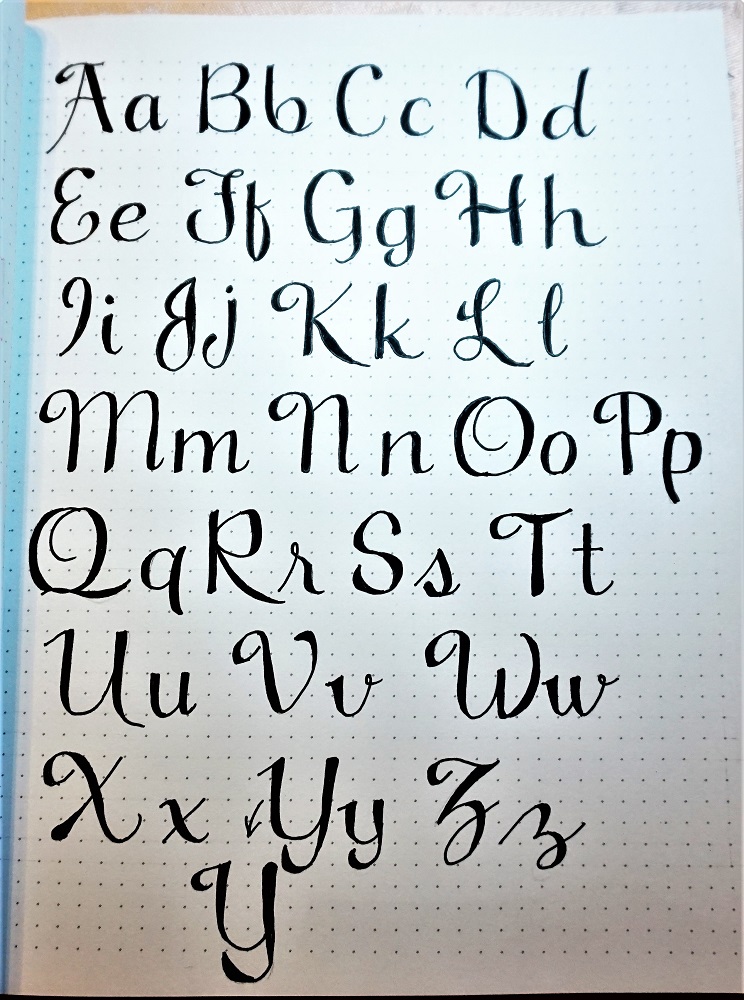
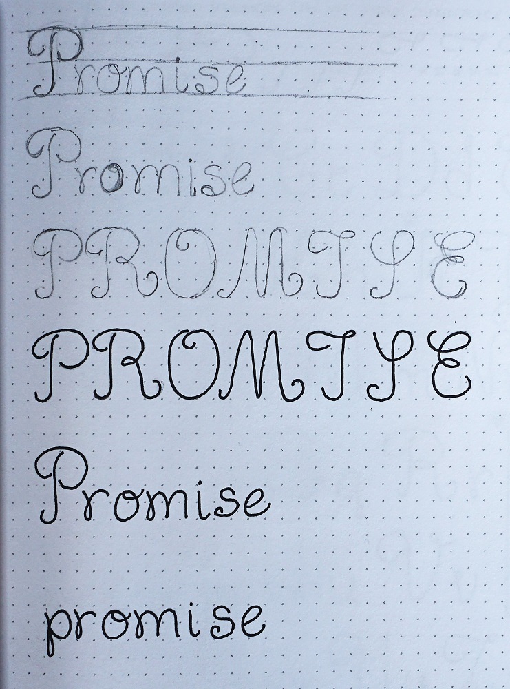
As you look over the alphabet page below, please note the two alternate forms for the letters ‘I’ and ‘T’. I actually did all the homework lessons this week with the original forms and found I did not like them. The original ‘T’ looks like a ‘C’ and the original ‘I’ looks like a ‘T’. So, I gave the ‘I’ to the ‘T’ and made a new form for ‘I’. IT IS PERFECTLY ACCEPTABLE TO DO THIS YOURSELF IF THERE IS A LETTER THAT YOU DON’T LIKE! Just create a new letter form that uses elements common to the style. In fact, I noted yesterday that a couple of people have already switched out the upper-case S for a form they liked better.

So, as you write out your alphabet, substitute in the letter forms as YOU like them and this will become your personal reference sheet as you complete more assignments this week (and in the future).


WEDNESDAY

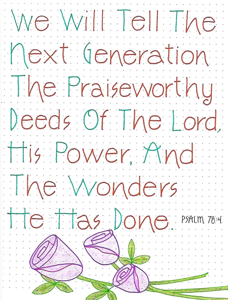
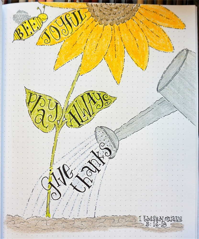
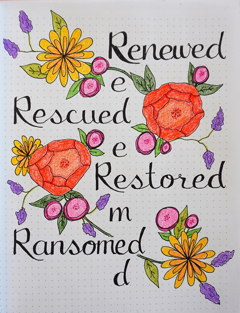
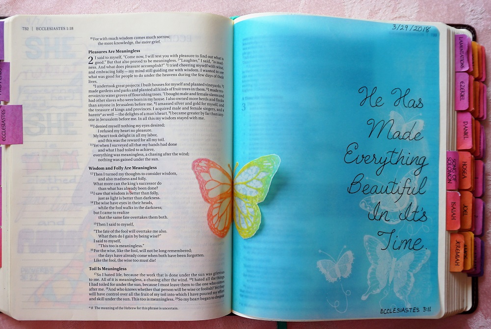
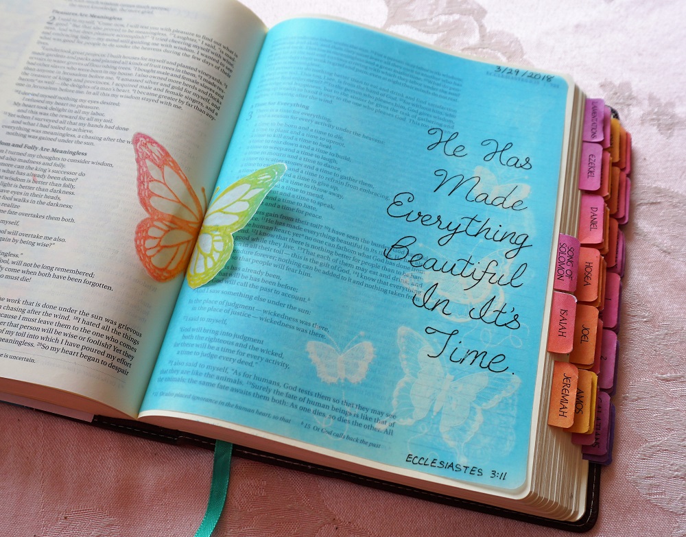
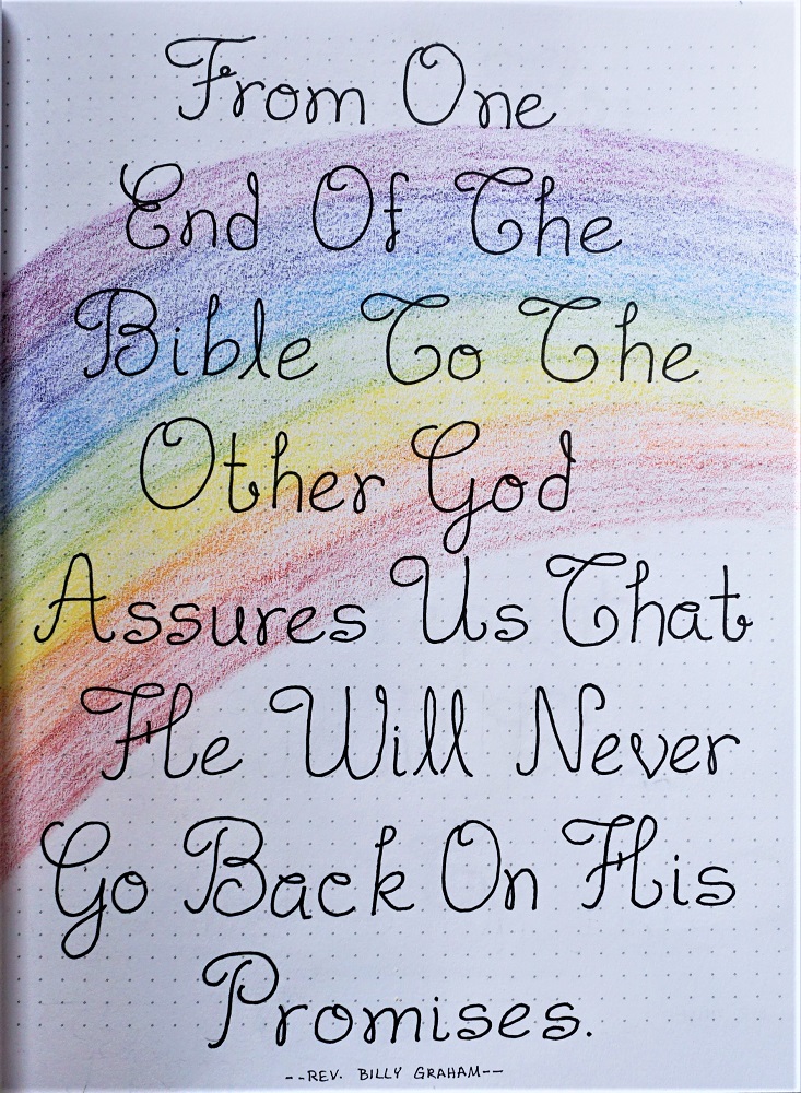
Find a song or quote about God’s promises and write it up as a reminder of His faithfulness. I used a quote from Rev. Billy Graham.

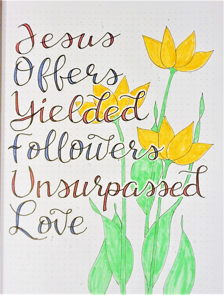
NOTE ON USE OF CAPITALS: I find that I like to capitalize every word (even the articles) when working on a full page like this. It looks nice and gives lots of practice on the large letter forms.

Unfortunately, all of those upper-case ‘T’s look too much like ‘C’s or ‘G’s so it is easy to read: “Go, Che and Chat”. This is why I gave those alternate forms yesterday!

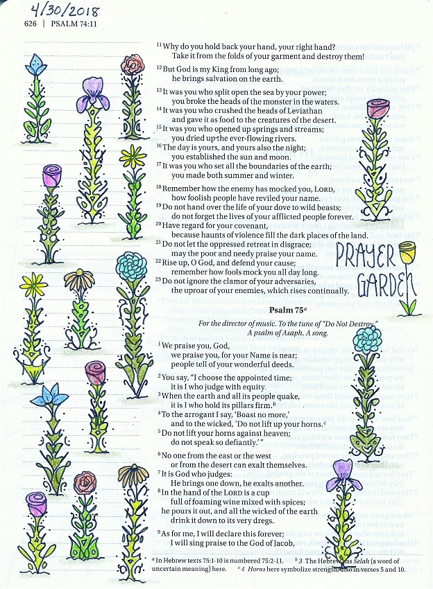
Remember P-I-E (pencil, ink, erase) and decorate the page if you wish. I used the rainbow as a reminder of God’s promise.


THURSDAY

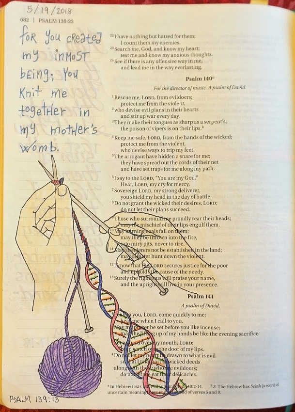
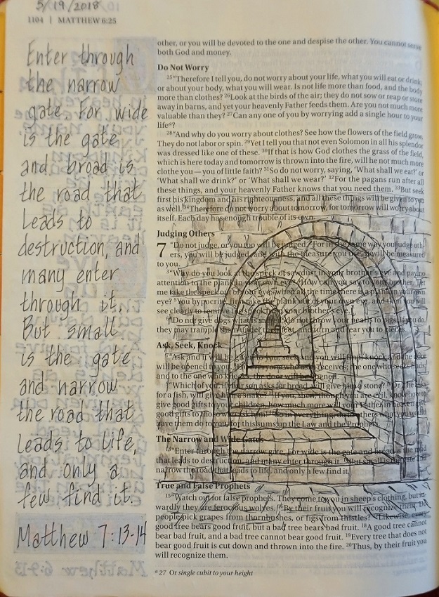
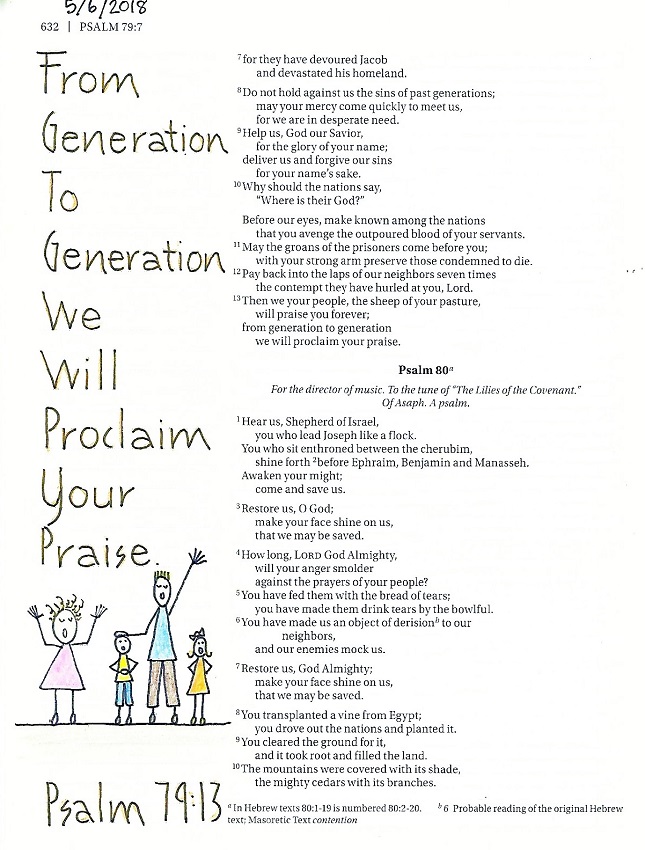
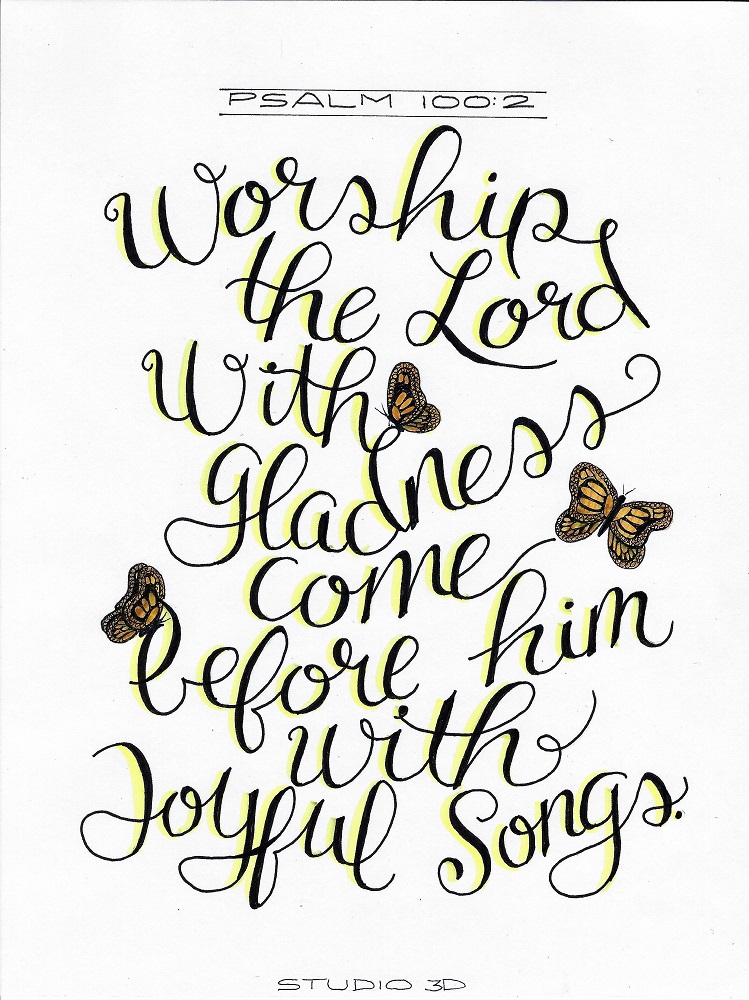
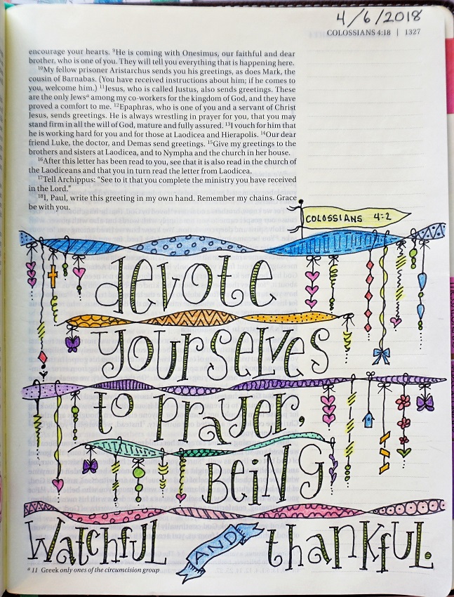
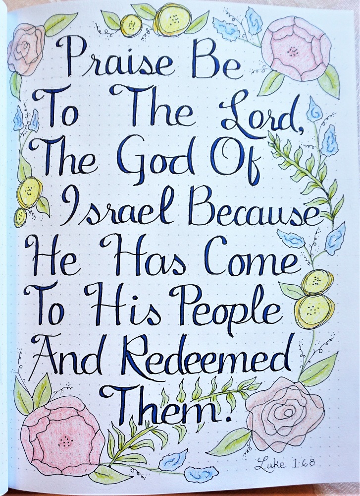
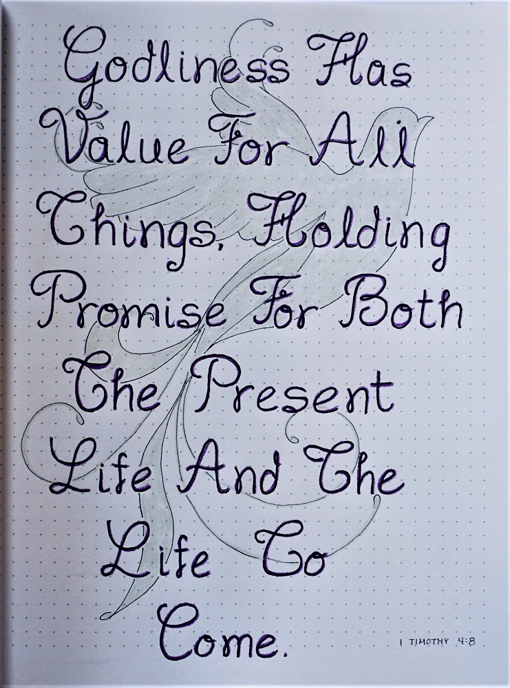
Today, use the ‘promise’ font to write out a ‘promise’ scripture in your journal, practice notebook or on plain paper.

NOTE ON CENTERING: If you want to center the words on your page, write and ink them on a practice sheet first. Then I usually pencil in a center mark on EACH LINE separately and pencil in a center line on the final page, top to bottom. This gives me a target. Then place the ‘final’ page over top of the practice piece and use a light box or a window to trace the words. You can slide the original sideways in whichever direction you need to center the lines on the page.

Another way to center them is to fold the practice paper right above the line of text and align its center line with the one on the final page. Then copy the letters on the final page just above the corresponding letter on the practice page. Repeat these steps as you move down the page.

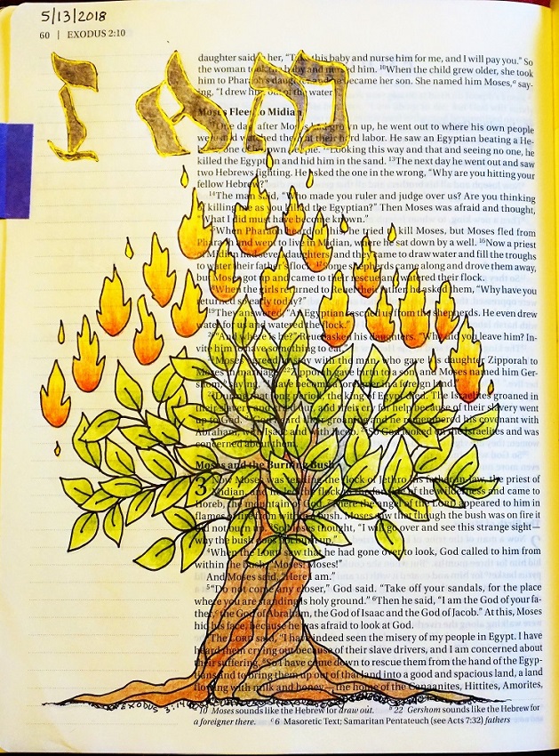
If you want to decorate your page, do all the inking of the letters first using a heavier weight line and erase their pencil guides. Sketch your artwork in pencil and ink it in very thin line pen. Erase those pencil lines before coloring. I used a dove representing the Spirit of God. This is a fancier version of the Drawing Room dove, with swoops and swirls added to the wings and tail.


FRIDAY

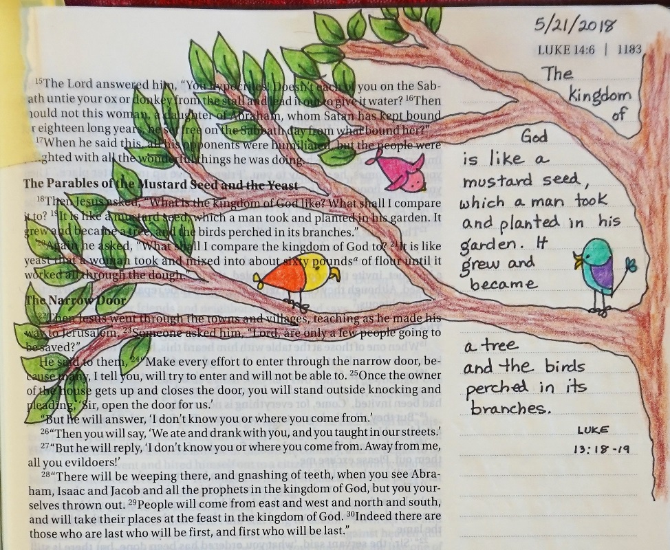
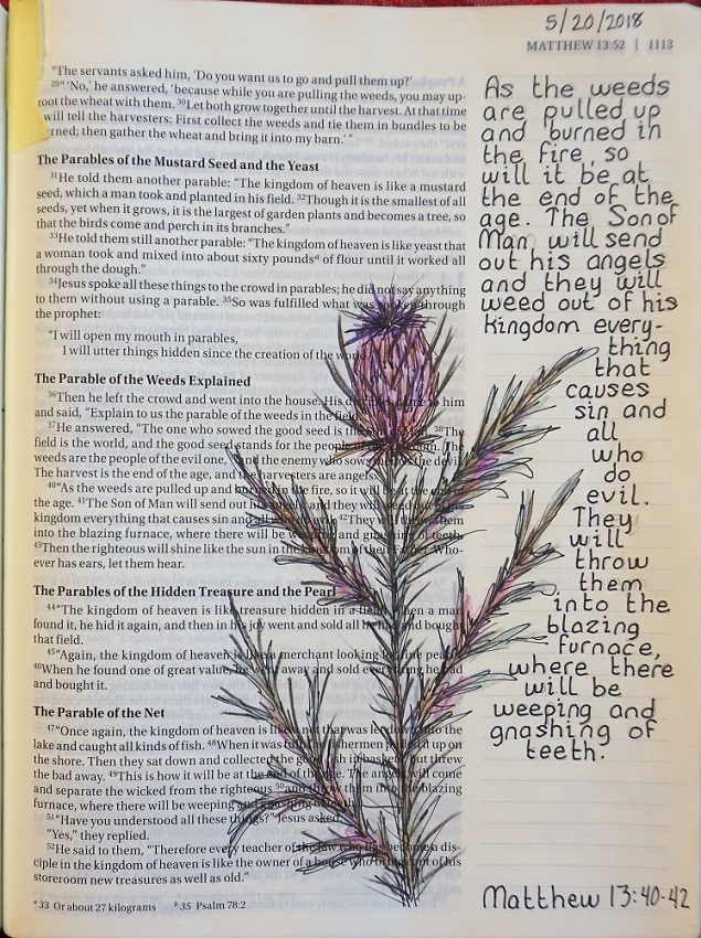
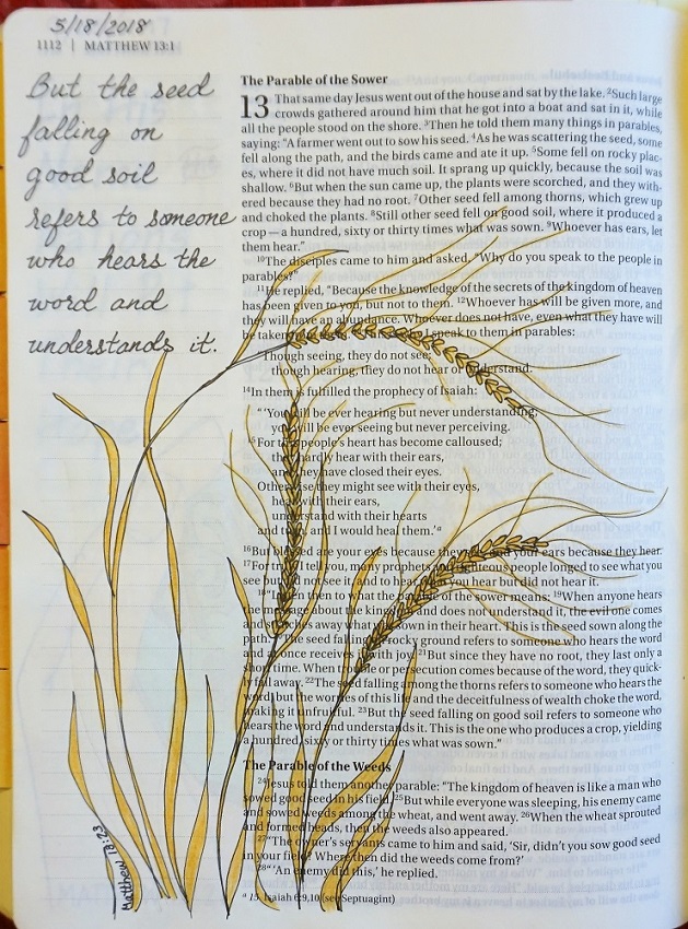
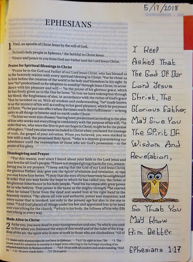
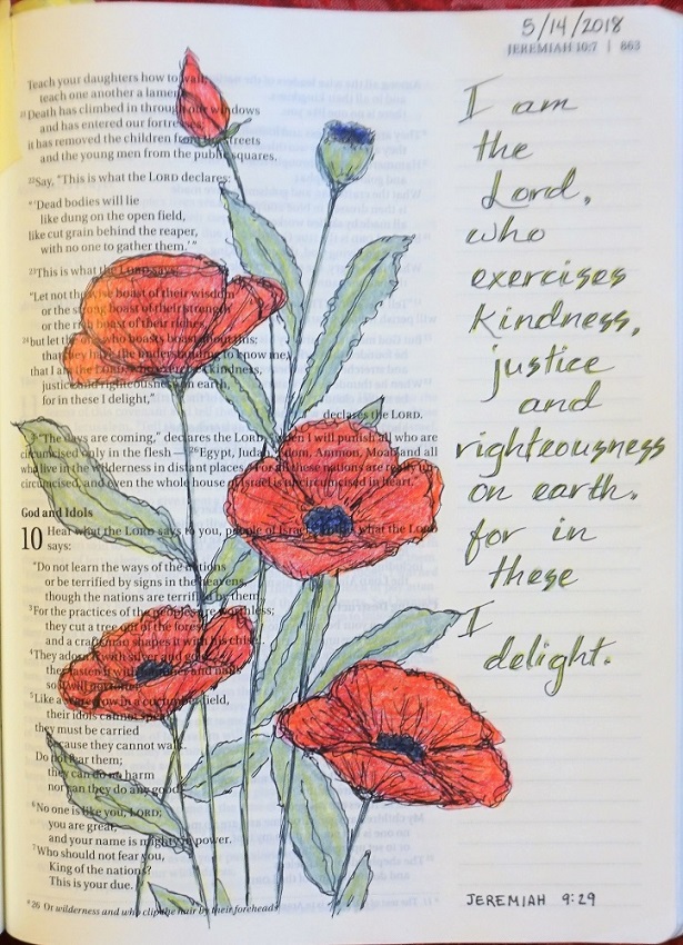
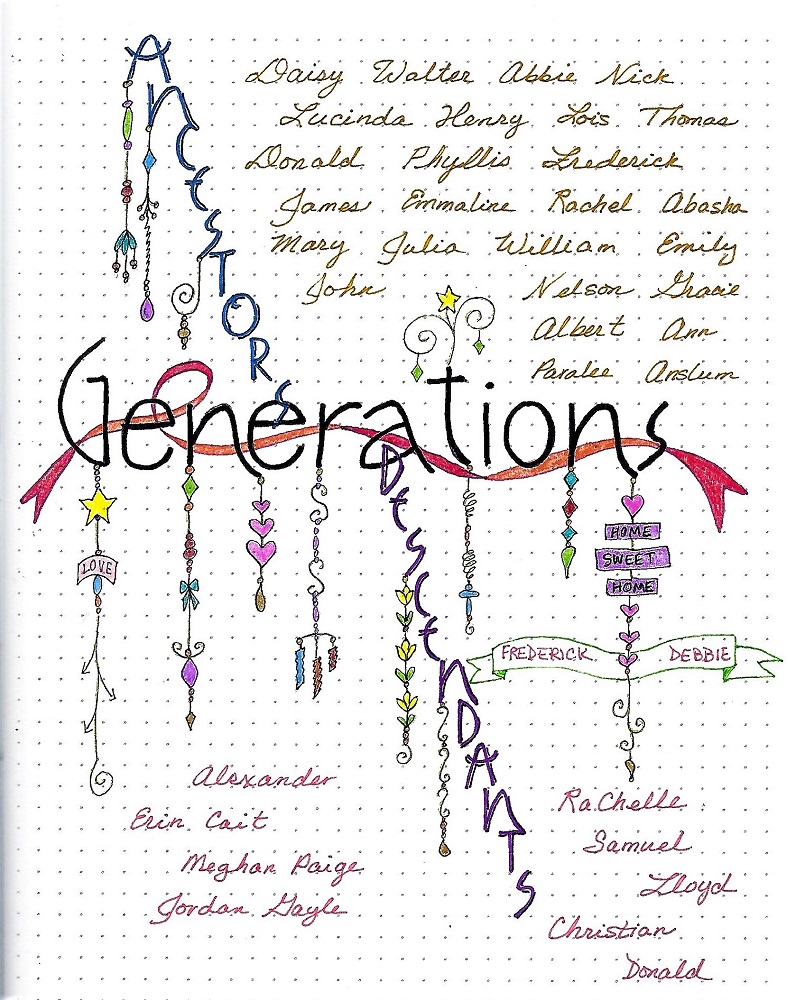
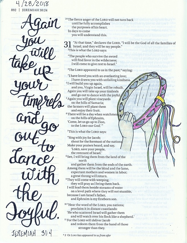
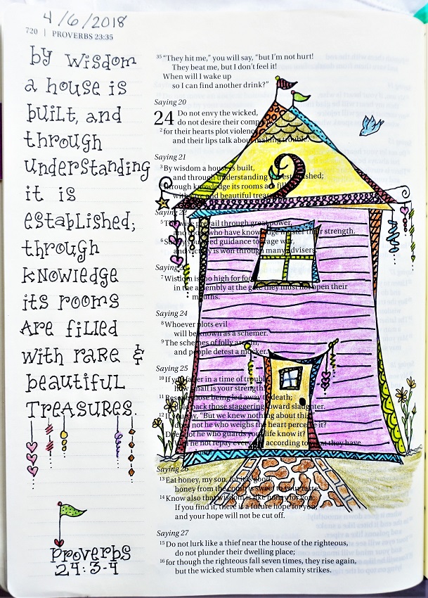
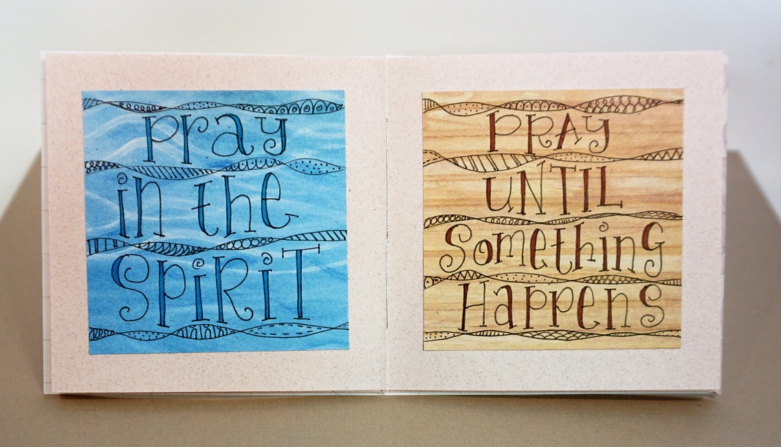
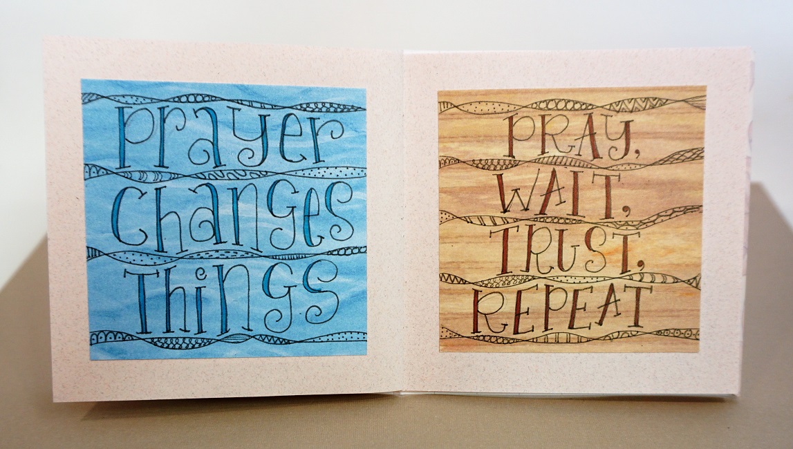
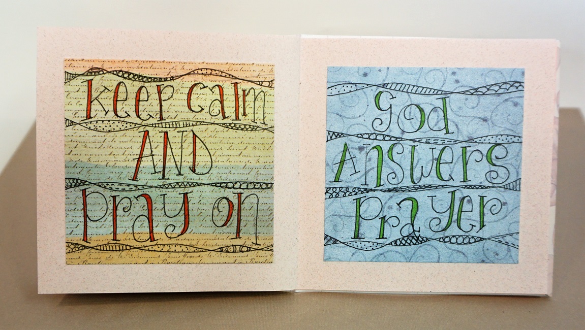
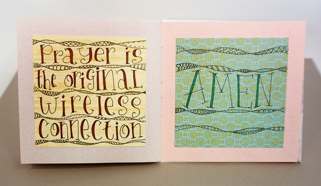
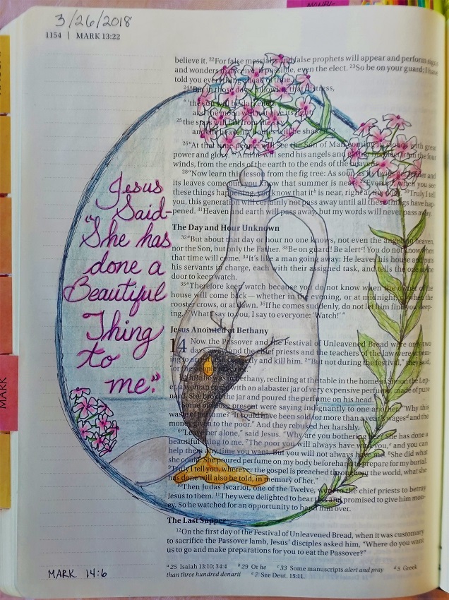
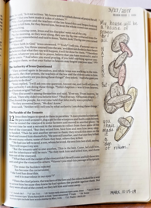
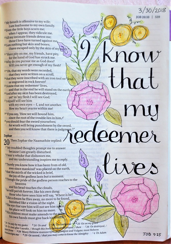
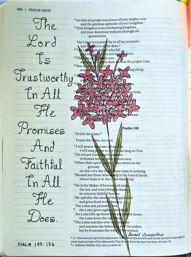
Now we will bring the ‘promise’ font to our Bibles.

This is the point at which I swapped out the alternate ‘T’ and ‘I’ letterforms. Isn’t that so much more readable?

Don’t forget that all our work is done with the P-I-E (pencil, ink, erase) process.


So that wraps up another week of lettering lessons - I'm on the schedule to teach lettering in the coming week, too, so there'll be another wrap-up next weekend.

Ddd


Posted by studio3d@ccgmail.net at 9:24 PM PDT
Saturday, 7 April 2018
Cheater Pants
Topic: Quilting

This quilt started out as a piece or yardage printed with a pattern of patchwork. I cut out 9 portions of the pattern, eliminating sections that I didn't want. What I ended up with was stars with 4-patch corners.

I pieced these together using sashings from a striped fabric (you've seen this fabric a lot lately on recent projects) and cornerstones I cut from scraps of other parts of the yardage.

I quilted this around the stars and the 4-patches.

The binding is made from scraps of the original yardage.

Ddd


Posted by studio3d@ccgmail.net at 8:42 PM PDT
Friday, 6 April 2018
Wonky Houses In the Drawing Room
Topic: Bible Journaling

The Drawing Room lesson this week garnered 12 shares of drawings in the group in 2 1/2 days! Everybody was having fun with this one.

The original idea was inspired by Joanne Fink.

You can find the lesson here  http://creative-bible-journaling.com/drawing-room-210-wonky-house/

Here is the Bible page I created from the lesson and I included the scripture text using the Lettering Lodge lesson from the week.


Oh, look! Those dangles were in the Drawing Room this week as well as Lettering Lodge. Total coincidence.

Ddd


Posted by studio3d@ccgmail.net at 5:39 PM PDT
Another Round of Lettering
Topic: Bible Journaling

I really like trading off with Ann when teaching lettering lessons. We always choose such different alphabets to bring to the students and fun spedial projects to include.

This was Ann's week to teach a lesson she called 'Pray'.

MONDAY was the introduction to the style with the focus word. This letter style is very casual print that features serifs and curls as well as randomly thickened letter parts.


As you can see, I did some of the fill with highlighter.

TUESDAY we got to see the whole alphabet. I focused on the structure and kept my letter sizes pretty consistent. In actual usage the letters will be more randomly sized.


WEDNESDAY our special project was to write on 3x5 card a quote about prayer, decorate it with decorated twisty ribbons and mount it on a larger piece of scrapbook paper. Did I do that? No I did not!

I had a small blank book made up in my studio and decided to write many quotes directly on scrapbook paper and mount them on the book pages.


THURSDAY we were supposed to write a verse on plain paper with the Pray font, include some decorated twisty ribbons AND add dangles. My design did not support the ribbons and dangles so I just left them off.

My scripture is also a paraphrase.


FRIDAY I did use the dangles and the twisty ribbons in my Bible.


I was fortunate enough to have a large chunk of blank paper at the end of the chapter where my scripture was located.

Ddd


Posted by studio3d@ccgmail.net at 5:16 PM PDT
Saturday, 31 March 2018
The Last Days of Lenten Bible Journaling
Topic: Bible Journaling

As promised yesterday, I have the last 6 days of Lenten Bible Journaling - 40 days of journaling every day from Genesis through the Resurrection.

Here are my final pages:

Monday we were inspired by Mark 14:3-9 - the story of the woman who broke her jar of perfume to anoint Jesus.


Tuesday we used Mark 11:15-19 where Jesus chased the moneychangers out of the temple.


Wednesday was for Judas' preparation to betray Jesus as told in Matthew 26:14-25


Thursday we dealt with John 13:1-15 where Jesus washed the feet of his disciples.


Good Friday we had a very long selection: John 19:1-37 on the trial and crucifiction of Jesus. I have other artwork on the crucifiction so I gave a sneak peek of the good news to come.


And the final piece was to be on Matthew 27:57-66 regarding the burial of Jesus and the guards at the tomb. But that's not the Good News of the gospel, so I changed my selection to Matthew 28 and documented the empty tomb.


Now THAT's the good news of Easter.

Ddd


Posted by studio3d@ccgmail.net at 10:07 PM PDT
Friday, 30 March 2018
Lettering For the Redeemed
Topic: Bible Journaling

The lettering lessons taught this week, by co-leader Ann, were titled 'Redeem' though we could use any form of the word (redeem, redeemed, redeemer, redemption). It is a beautiful faux brush script with very a upright stance and a few low-key curls.

I found myself singing and humming old hymns as I worked all week long. Songs like: "I Will Sing of My Redeemer", "There Is a Redeemer", "I Know My Redeemer Lives", "Redeemed, How I Love To Proclaim It" and "I'm Redeemed By Love Divine".

Monday we had our introduction to the word - I tried doing my practice in real brush marker and had only moderate success. I'm not very good with those yet.


Tuesday we got the whole alphabet. I made a copy of my sheet before filling in the spaces to aid me in drawing the letters when I started using them for real.

And after the filling in:


Wednesday we were supposed to write the word down the left side of the page and fill in with words that started with those letters. We also got instructions on creating different kinds of flowers for decoration.

I wasn't feeling the anagram activity so I made a crossword from mine. I reveled in using bright colors for my florals.


On Thursday we used this lettering style for a scripture verse. Mine was kinda long but it gave me lots of practice. This time I went for a pastel color scheme and added in a flower that I had taught as well as a palm branch disguising itself as a fern!


And Friday, as usual, was for using this style in our Bible. Much shorter verse!


Back tomorrow with the wrap-up of journaling for Lent.

Ddd


Posted by studio3d@ccgmail.net at 3:16 PM PDT
Thursday, 29 March 2018
Beautiful In Its Time
Topic: Bible Journaling

I had a bit of play today with an idea that's been floating around in my head for several weeks.

I've wanted to make some sort of insert in my Bible with vellum but had no idea how that would work. So here are the things I did (not necessarily in order)

-- The blue page is plain vellum with pre-printed white butterfly images on the corner.

-- I toned the vellum page on the back by smearing on 'Salty Ocean' Distress Ink and hitting it with a heat gun to dry it

-- I used a corner-rounder punch on the vellum

-- It is glued in only at the spine using 'multi-medium' glue

-- I lettered on the vellum using a Pigma Micron pen and tracing what I had drafted out on scratch paper (I see now that I used an apostrophe in a word where it does not belong. I will go back and add a butterfly sticker over it)

-- The butterfly is a stamp I hand-carved myself some time ago

-- The butterfly was stamped on vellum printed with tiny white flowers using a rainbow pigment pad

-- I embossed the butterfly with clear powder before cutting it out

-- The butterfly was folded and glued at the spine with the multi-medium


I love how the text can still be read through the blue vellum.

Ddd


Posted by studio3d@ccgmail.net at 2:34 PM PDT

Newer | Latest | Older