« June 2018 »
S M T W T F S
1 2
3 4 5 6 7 8 9
10 11 12 13 14 15 16
17 18 19 20 21 22 23
24 25 26 27 28 29 30
You are not logged in. Log in
Entries by Topic
All topics  «
3D paperwork
A - Z challenge 5
A - Z challenge 7
A - Z challenge round 4
A to Z challenge round 3
A to Z round 2
A to Z round 6
A-Z round 1
Around the House
Art Challenges
Artist Trading Cards
Backgrounds
Beads
Bible Journaling
Books
Boxes
Collage
Color Challenge
Coloring
cookbook
Die Cuts
Digital Projects
Digital Stamps
Drawing
Dry Embossing
Fabric Stuff
Fantastic Folds
Field Trip
Home Decor
How Does Your Garden Grow?
Hymnal Art
In The Kitchen
In the studio
Jewelry
Lettering
Links
Multi-Technique
Music to Work By
Musings
Nail Art
New Work
Online Class
Other Hobbies
Other Projects
Painting
Paper Embroidery
Paper Piecing
Photo
Pretty Paper
Quilting
Random
reading
Scrap Recovery
scrapbooking
Sewing
Sketch Challenge
Some Backlog
Stamping
Stencils
Stickers
Supplies
Teabag Folding
Techniques
Testing
tips and tricks
Tutorial
Web resources
Welcome to my Blog
Work By My Friends
workflow
Writing
Blog Tools
Edit your Blog
Build a Blog
RSS Feed
View Profile
Group One
In & Out of Studio 3D
Sunday, 17 June 2018
A New Lettering Style 'Coming' Up
Topic: Bible Journaling

Last week I was on duty for teaching another lettering lesson. The Facebook group was also running a guided tour of the whole layout and activities of the site so there were a lot of new letterers following the lessons.

All together there were 29 people who came through and at least commented on the lessons or the work of others. Twenty of them completed at least one lesson and posted their work. Here is the lesson plan:

MONDAY LESSON

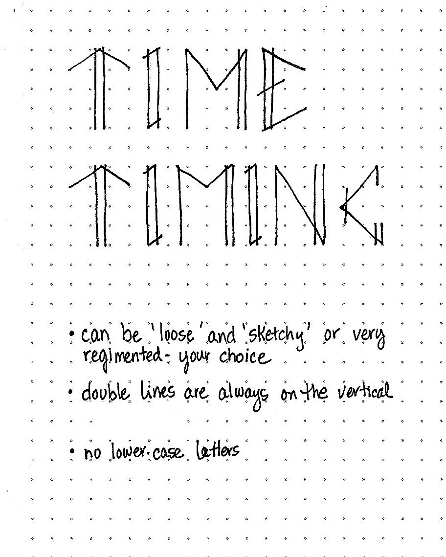
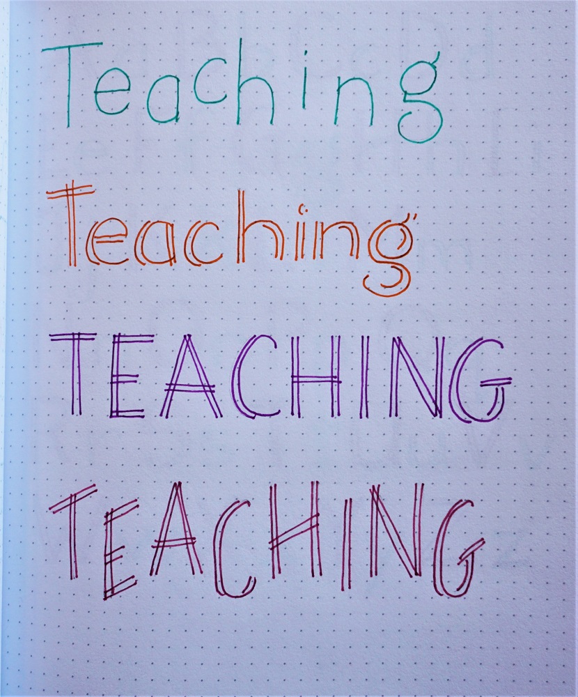
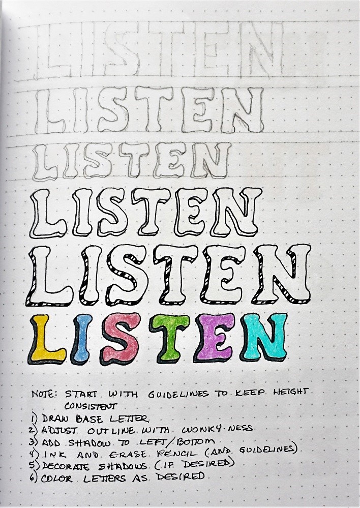
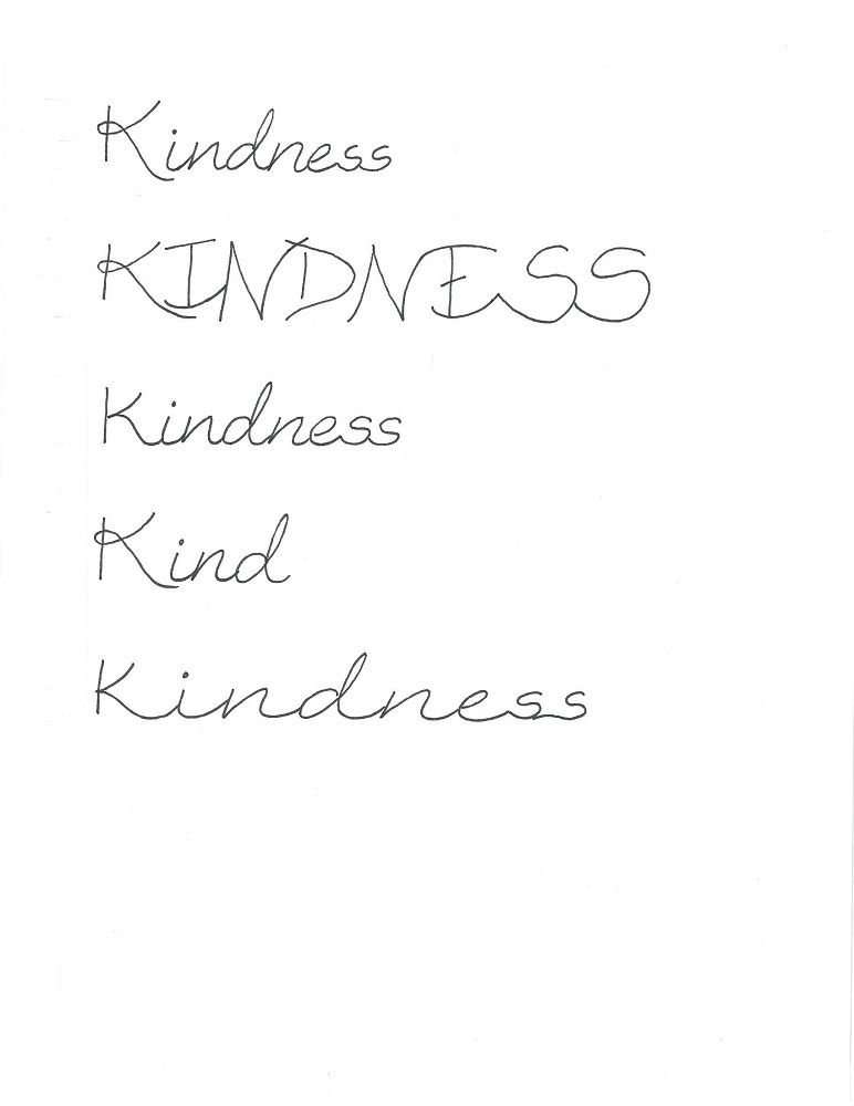
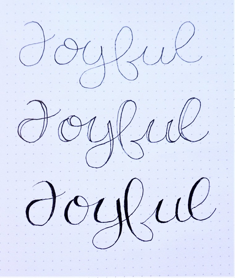
Many people on the tour may be new to hand lettering so I thought it might be time to go for something more relaxed. This style only looks complicated because of the curls everywhere but it is based on a simple print.

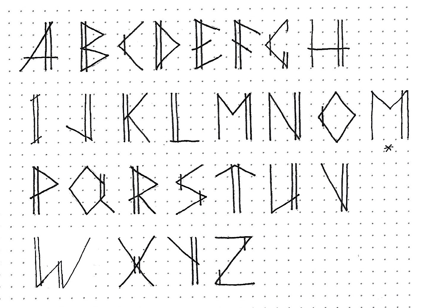
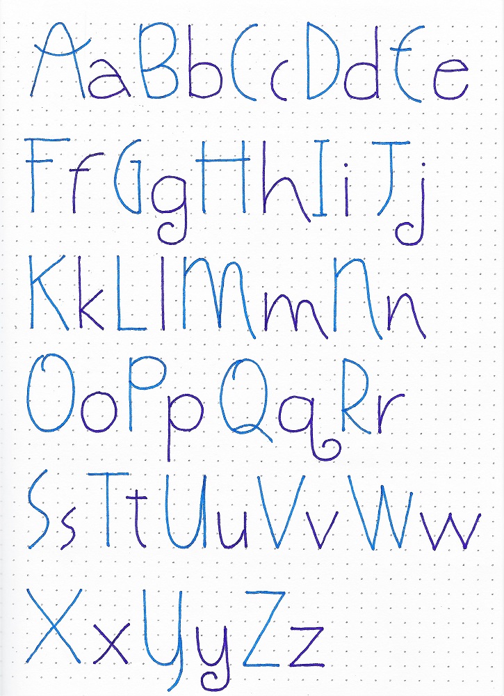
There are only 4 letters to practice with today – 8 if you count the upper- and lower-cases separately.

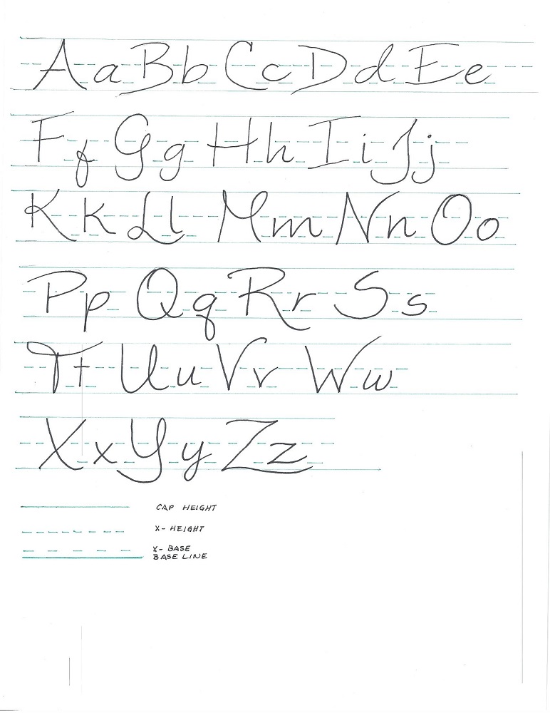
In the top two examples we are working from a 5 unit height (units would be lines on your paper or grid lines on graph paper or dots on a dot-grid paper), the x-height is 3 units. Look how the upper-case E takes up 3 units for the top half and 3 units for the bottom half. For samples 3 and 4, I worked on a 4 unit grid height and made the x-height half (2 units). Either scale works as long as you are consistent. The third set is half-scale of the second set.

Draw the basic shape of the letter first (in pencil of course) and then come back to add the unique stylings and finally, the curls. Ink only after you have the letters fully drawn out and, after the ink is dry, erase the pencil.
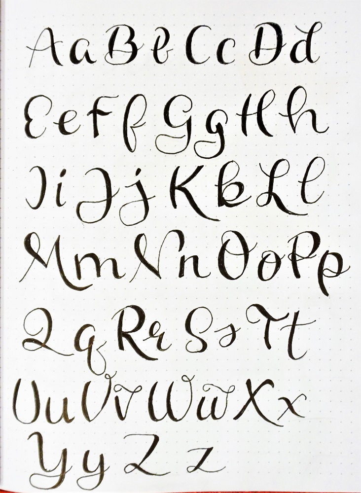
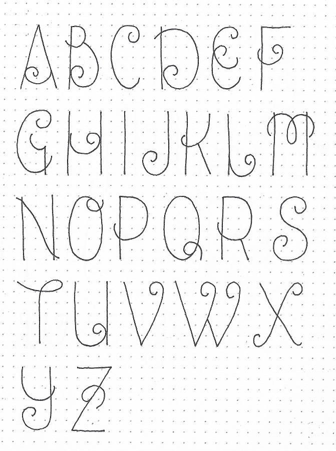
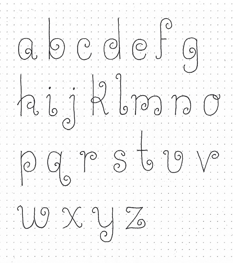


TUESDAY LESSON

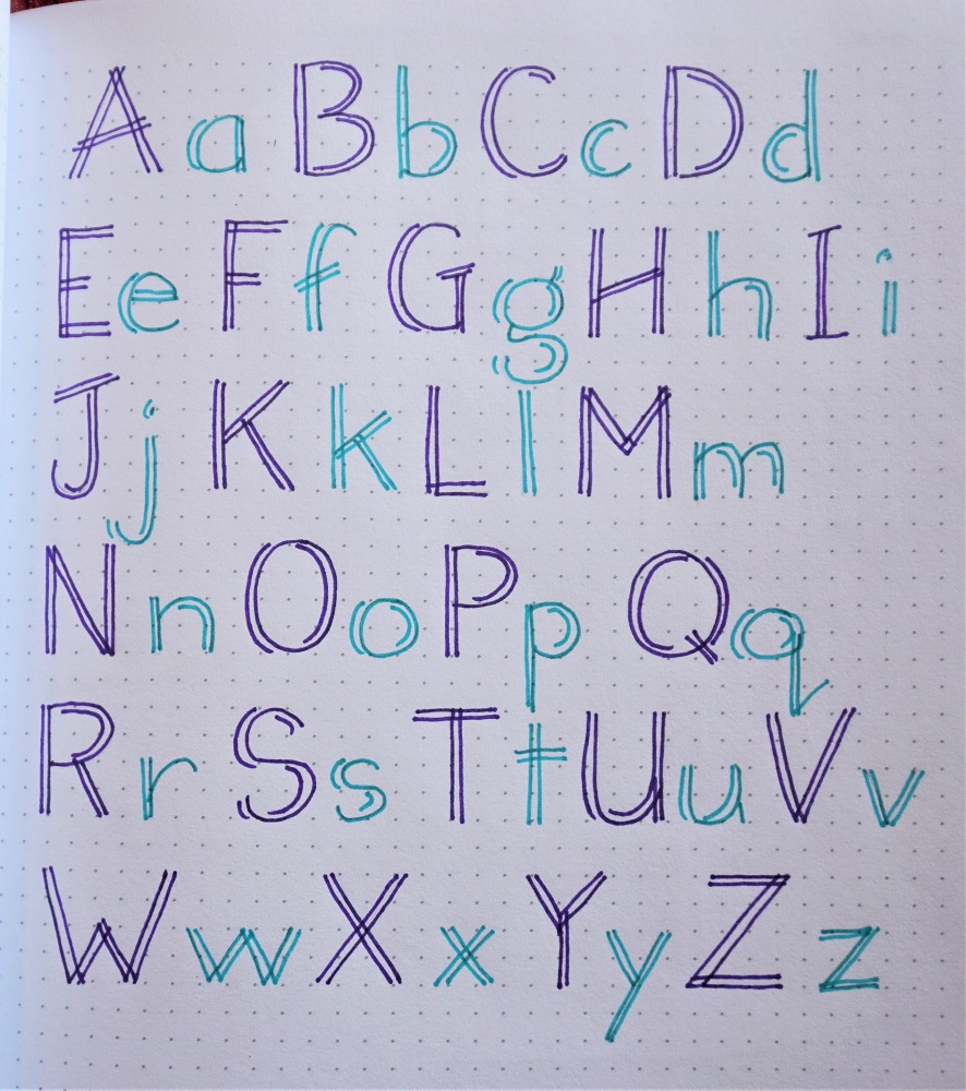
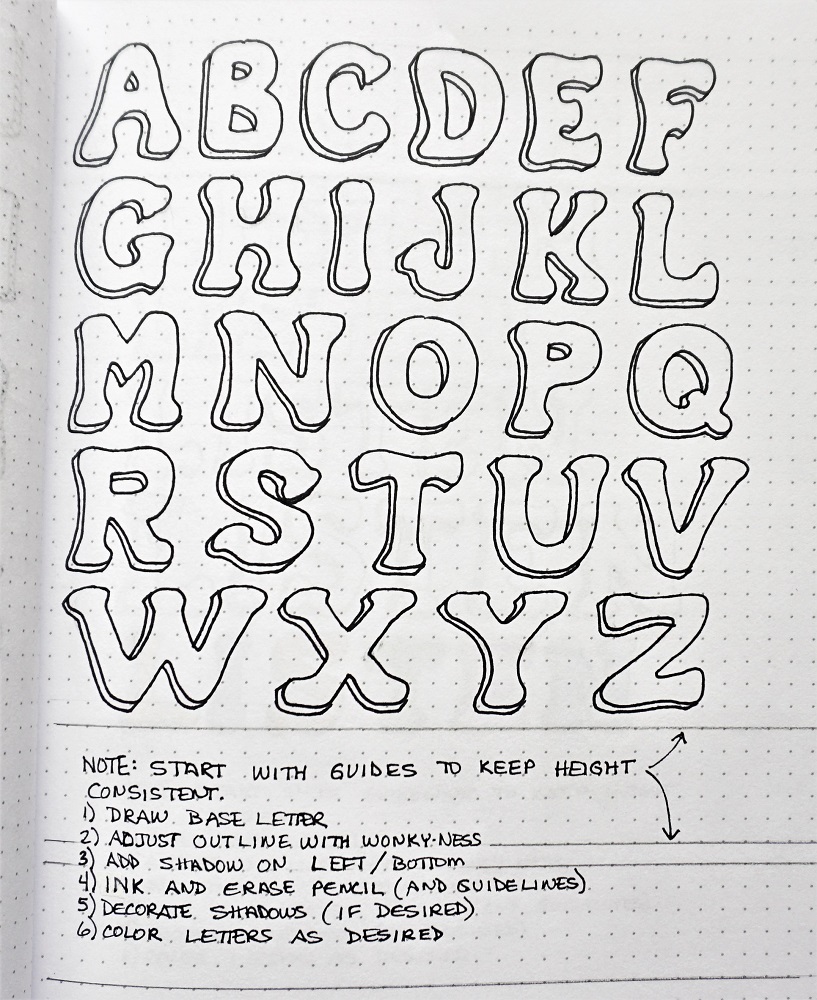
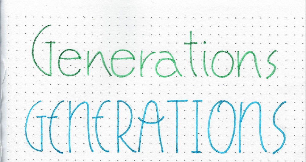
Today the upper- and lower-case alphabets are on different sheets.

Start by working large when learning a new alphabet style. It easier to scale down after you learn it than it is to learn small and scale up.

As we did yesterday, pencil the basic shape of the letters (all of them) then come back through and add the unique stylings (like the double curls on the E, the loopy top on the M) and then go through all adding curls. This will help to get the size and shape consistent and will help you make the curls a consistent size.

Then, go through and ink each letter in its intirety in order. This will set the letter style in your mind as a whole unit. Erase the pencil after the ink is dry.

NOTE: The alphabets may not appear in the same visual size scale. Use the grids for proper size ratios.


WEDNESDAY LESSON

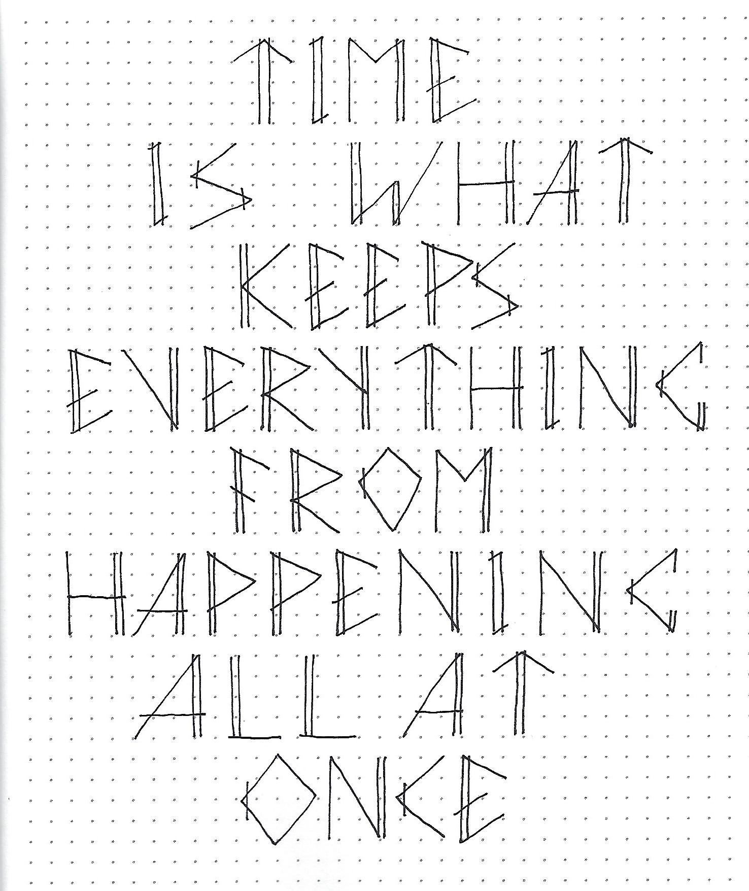
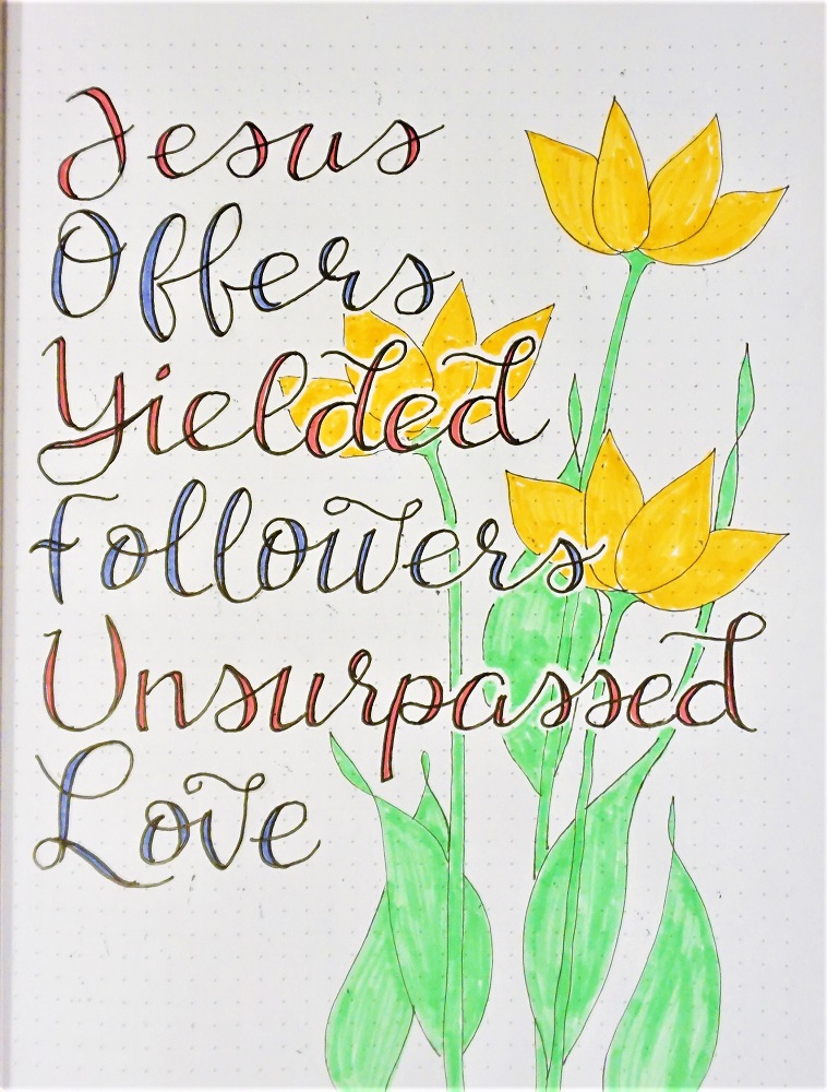
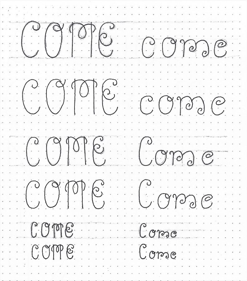
When our pastor related a quote from Billy Graham recently, I was struck by it and had to come home and look it up. For reasons of space, I modified it slightly, but the message is the same.

Use the ‘come’ lettering style to write your choice of a quote or song lyrics containing the word.

I like to see quotations centered on a page. I often write out the basic form in left-hand alignment and then mark the center of each line separately. Then on my ‘finish paper’ I mark the center line of the page. I use a lightbox, light pad or window to align the various centers line-by-line and trace over the basic forms in pencil. Then I go back and add the styling elements and curls.

Rather than a black pen, I used colored markers to make the finished letters. After erasing my pencil, I used a second color of marker to add shadows under and to the left of my two key words.

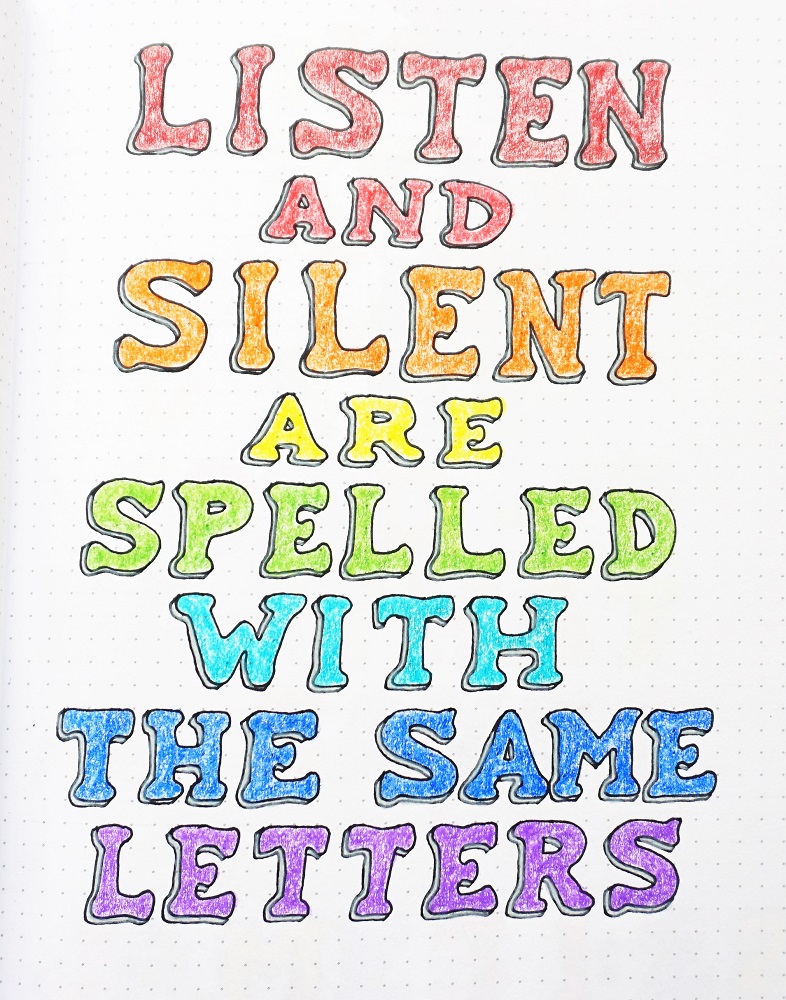
What will your practice page say?


THURSDAY LESSON

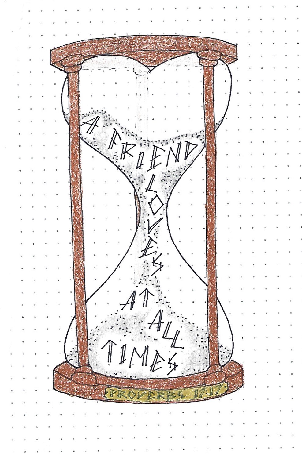
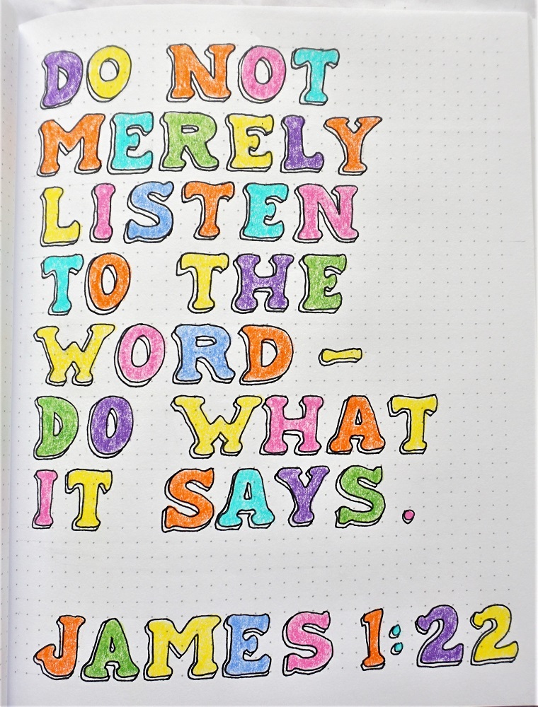
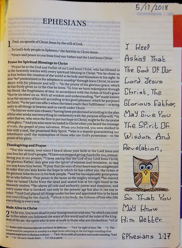
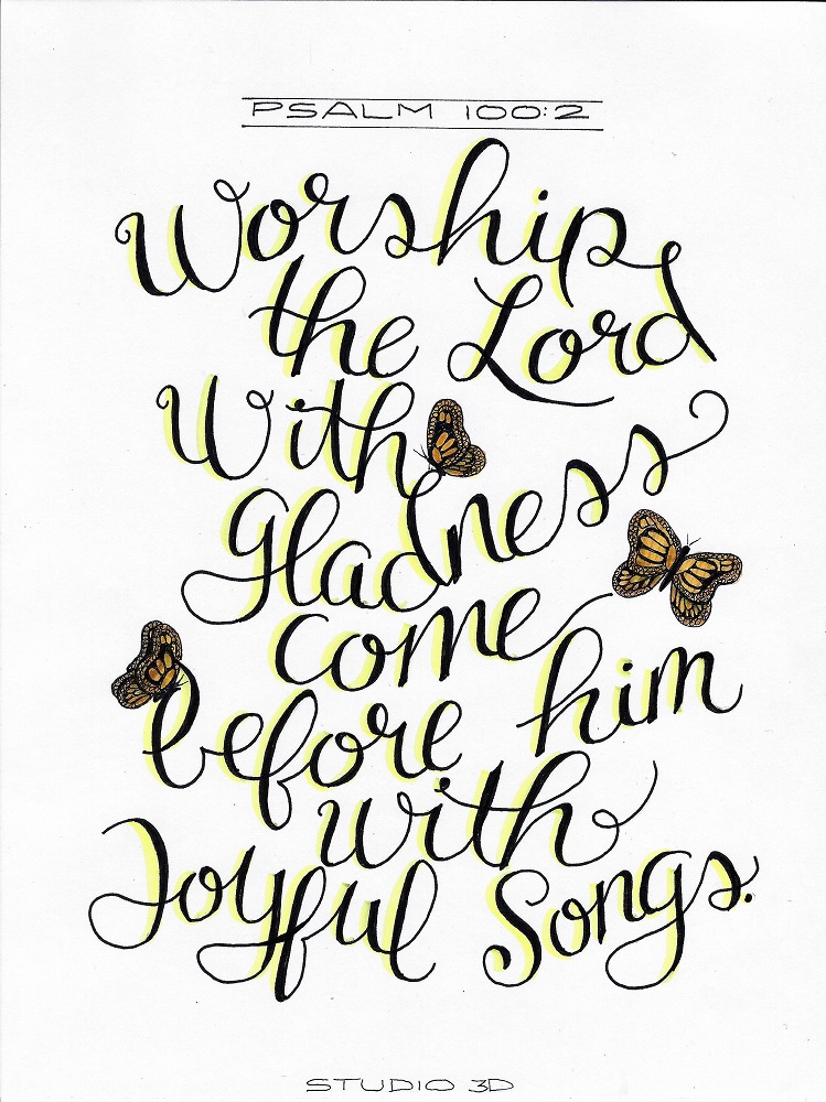
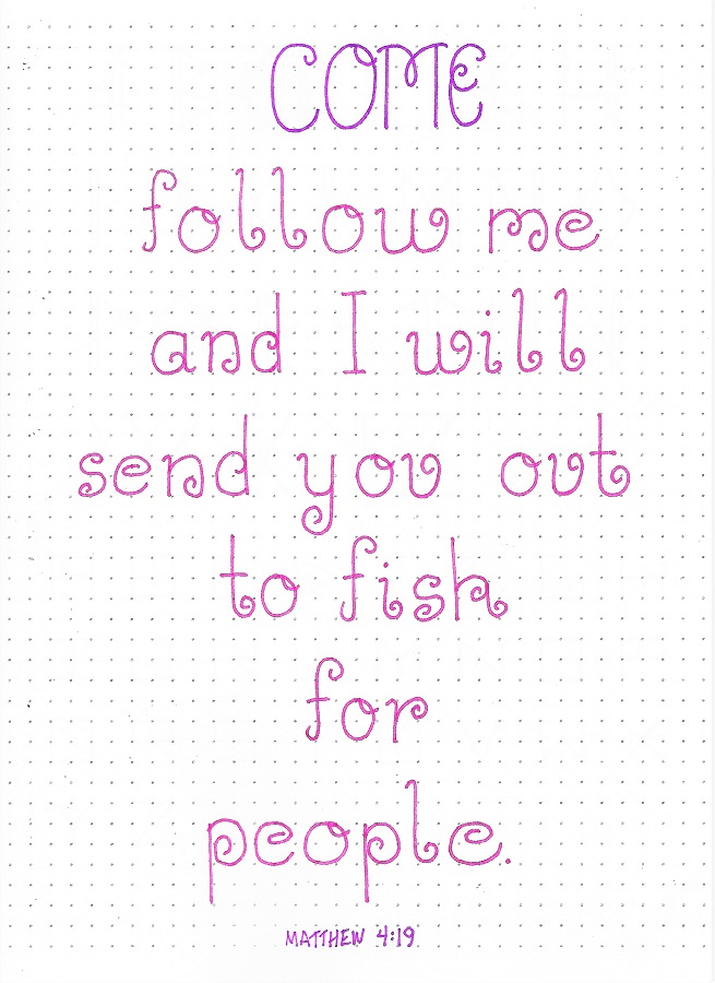
Today we’ll find a scripture with the focus word ‘come’ and write it up in our workbook, journal or just on plain paper.

The more you write with a new style the more it becomes fixed in your memory. With enough use, those letter forms will just flow off the pencil.

I used the same centering techniques as shared yesterday and even used the same set of markers.

FRIDAY LESSON

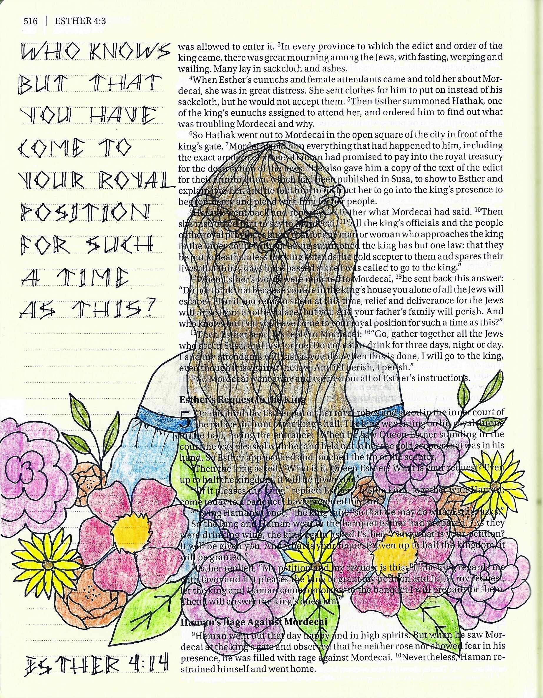
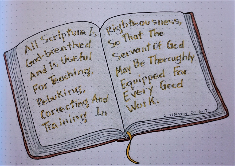
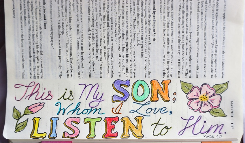
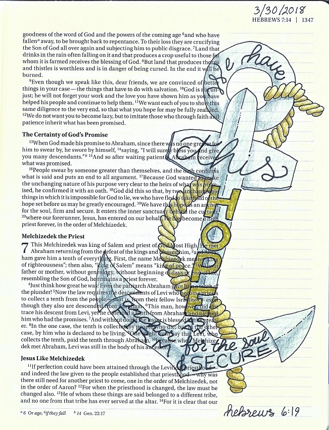
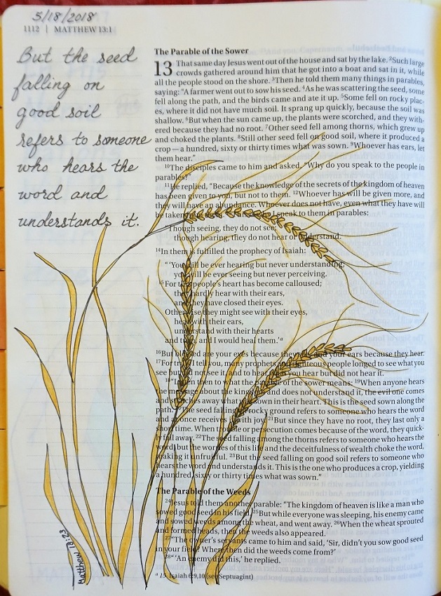
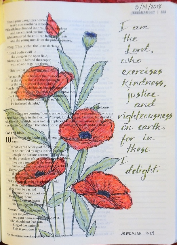
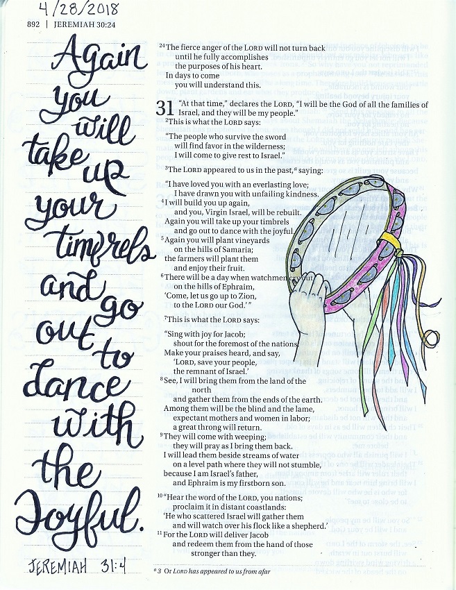
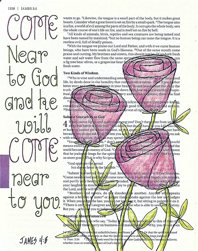
This is the day we take the ‘come’ lettering style into our Bibles. Don’t neglect this step in the learning process. It is, after all, the ultimate point of teaching all these awesome designer letters.

The process is the same for preparing to letter in your Bible, pencil first with basic forms to establish layout and spacing, enhance the letters with their embellishments and curls, then ink and erase the pencil.

If this is scary for you, add another step – do the designing and layout and lettering on scratch paper (grid or dot-grid) until you are happy with it and then trace it into your Bible. Do the tracing lightly in pencil and then do the inking and erasing.

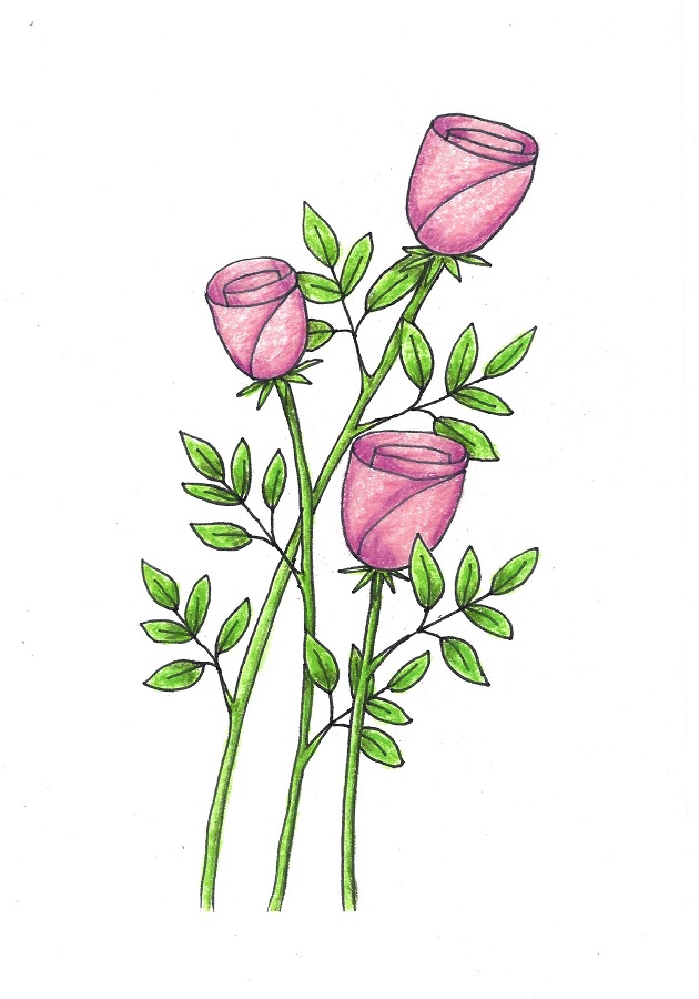
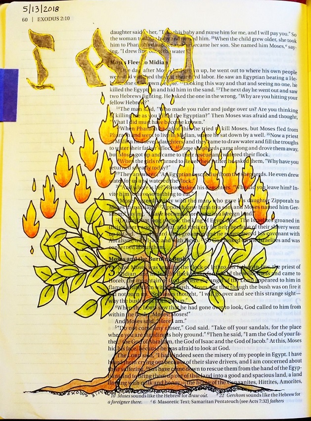
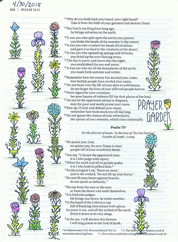
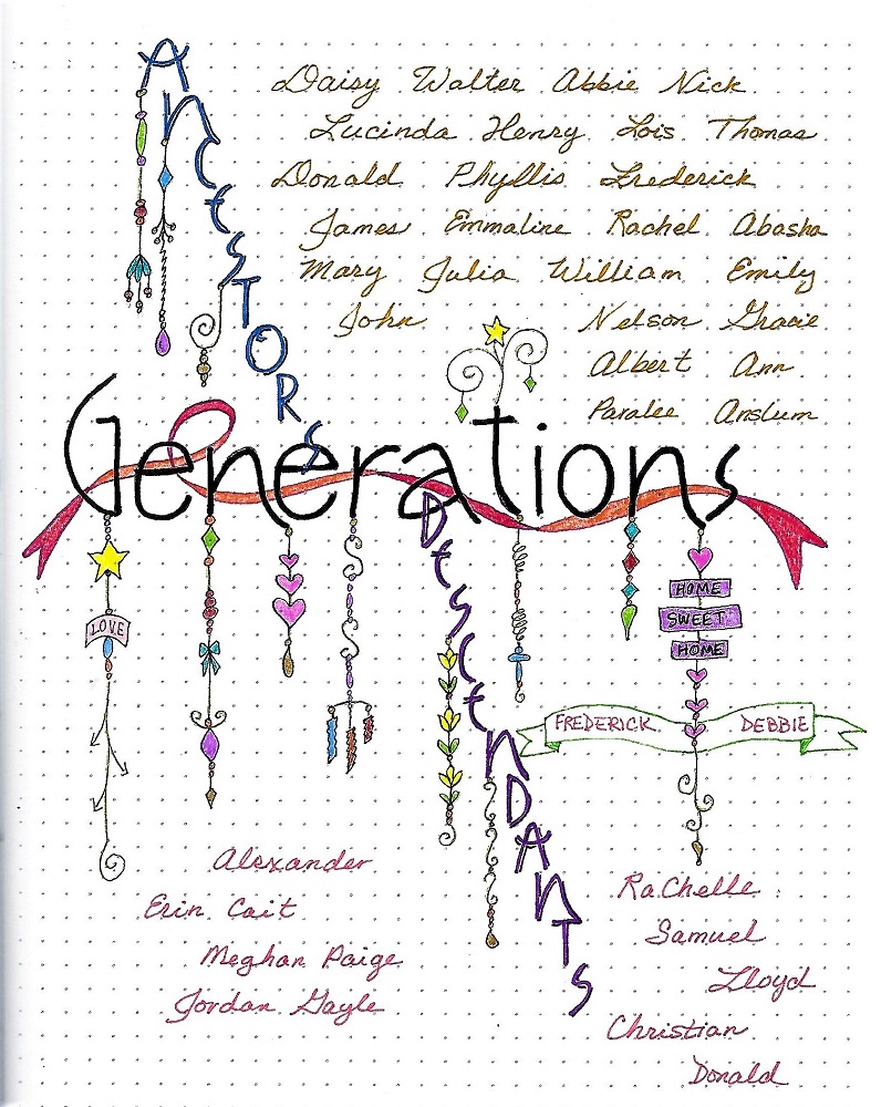
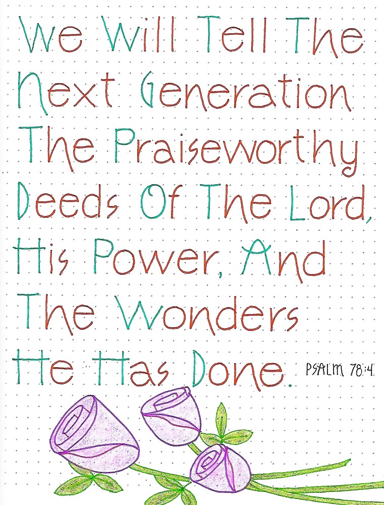
For those who wish to use flowers like these, they are from the Drawing Room lesson on Wednesday of this week. But, just because I’ve done artwork on my page does not mean you have to do so. These letters are beautiful enough to stand on their own. And it really IS all about the words.

So another week of lessons is in the books!

Ddd


Posted by studio3d@ccgmail.net at 10:03 PM PDT
Wednesday, 13 June 2018
Sketchy Business
Topic: Drawing

I guess I missed posting links to a couple of the Drawing Room lessons that I illustrated for Creative Bible Journaling.

We'll start with the one posted today.

Click here:  http://creative-bible-journaling.com/drawing-room-dr216-spiral-rose/  for a lesson on making this spiral rose.


The week prior I taught this hourglass.

You can get those instructions here: http://creative-bible-journaling.com/drawing-room-dr215-hourglass/

Now I can't remember if I posted the lesson for this waterfall! 

If I already posted it you can ignore this. If not... here is the link:

http://creative-bible-journaling.com/drawing-room-212-water-fall/

Hope you enjoy following these lessons.

Ddd


Posted by studio3d@ccgmail.net at 9:39 PM PDT
Tuesday, 12 June 2018
Long Time Coming
Topic: Backgrounds

I realized I hadn't made any cards for just ages. I had need of a card with a theme: 'M' is for...

I decided to use the M for Marbleing. I had several pieces left from a day when I had done a lot of shaving cream backgrounds. then in the same bits and pieces box I found two green diecut cardstocks and two metallic scallop diecut pieces.

These all layered up nicely and I put both on a seafoam blue-green card base.

I used black sentiment strips from a quote sticker book and added floral stickers from my large file of them.


On both cards I glued in a small strip of the marbled paper along with a small bit of coordinating sticker.

Ddd


Posted by studio3d@ccgmail.net at 11:25 PM PDT
Sunday, 10 June 2018
Double Done Double Lettering
Topic: Bible Journaling

A few weeks back someone suggested we develop a lettering style that used double lines. So I did an upper-case only and prepared the 5 days of lessons for it.

At the end of last month my co-leader was having some family health issues and needed some time off. I offered to pick up this last week for her. But when I got ready for the first post, she had forgotten about that offer and had prepped the 'teaching' font we just completed.

I had to laugh because we had both planned on the double-line fonts for the same week. Don't you love God's sense of humor?

So I did mine as a 5-hour class instead of a 5-day class and posted it in the lobby of our site instead of the Lettering Lodge thread. I posted one lesson each hour on Friday night and got lots of attention from people who don't seem to dig down into the threads for lessons.

So, here is the font I developed. Again, I did only an upper case. Mine is all straight lines where Ann's has lots of curves because it is based on a standard print.

LESSON ONE

Hello everyone it is TIME for new lettering! (The first lesson is always an introduction of the style using a focus word - the same focus word will be used for the whole lesson plan)

I had such fun developing this print style. This print style has no lower-case.

All those angles and double lines can be treated very loosely or very structured and precise. It’s your choice.

All of the double lines are on the vertical – never on an angle or horizontal. This gives a tall linear vibe. Every letter gets just one double.


LESSON TWO

Our second lesson is always the introduction of the full alphabet in the new lettering style.

We always use the same process for lettering, whether for this initial introduction or the projects we design later. We call that process P-I-E. This stands for PENCIL (use pencil to draw your letters rather than writing them which helps you break out of your natural handwriting) INK (go over the new letter forms in pencil as many times as you need to get them just how you like. Then trace over them in ink) ERASE (when the ink is dry, erase your pencil)

Note how there are no curves at all in this style. Those angular lines remind me of the hands on a clock which is what led to the focus word ‘time’. 

There is an alternate letter M as I wasn’t sure if I wanted a deep or a shallow V on the top of it, use whichever one you like best. 

My favorite letters are the G and Q.


LESSON THREE 

For our third less we give an assignment to do something creative with the new lettering style. Sometimes it is writing lyrics from a hymn or chorus, sometimes we do an anagram or crossword, other times it will be a quote. These will all use the focus word or be related to it.


The intention is to give ample opportunity for practicing using the letters in words and phrases to get familiar with spacing, joining letters and just seeing how the style looks when it is in common use. Some people choose to decorate their pages. This is optional.

I’ve always found this quote about time to be quite humorous. It has been attributed in various iterations to Einstein but most believe it not to have come from him at all. 

Choose your own quote about TIME to write up for lettering practice. You know why we do all these activities throughout the week, don’t you? It is to train our minds and hands in the proper formation of the letters for the style. It also gives more opportunity for you to develop the stylistic elements that will make it your own. So, it is to your OWN benefit to write longer blocks of text rather than trying to get by with as little as possible.


LESSON FOUR 

This lesson is always the day we use the new style to write a scripture with the focus word in our notebook, on plain paper or in a journal. These can also be decorated or combined with artwork if you wish

When using this letter style in a looser manner it takes on a casual feel. I used mine to write out a scripture inside an hourglass. This is a variation on the one presented in the Drawing Room this week. The scripture reference is on the brass plaque. 

Have you discovered whether you like to use this as a casual style or more regimented? It helps on the casual usage to toss and turn the letters a bit to dial down the formality.


LESSON FIVE


The fifth lesson is when we get to use the lettering in our Bibles.

I found a coloring book illustration that I liked for inspiration. I used the same hair style and sleeves but all the flowers are mine. 

For this scripture I went back to a more regimented usage of the lettering style as it references royalty so needed that formal touch.

Don’t forget, we are still using the P-I-E method – Pencil-Ink-Erase. 

Let us see what scripture you choose to use with the TIME font.


So, that's how you teach 5 days of lessons in 5 hours!

Ddd


Posted by studio3d@ccgmail.net at 10:42 PM PDT
Thursday, 7 June 2018
A Teaching Moment
Topic: Bible Journaling

This week my co-leader Ann had the lettering lesson. In response to a mention from one of the group members, Ann developed a double-line print and taught it with the focus word 'teaching'.

MONDAY

The introduction of the font/word. The straight lines get full double lines. Curves get partial double lines.


TUESDAY

Here's the alphabet. I changed some of my letter forms and where some of the double lines appear.


WEDNESDAY

The assignment was to write out words of things that teachers use to teach. I did mine on black cardstock with a Sharpie fine paint marker in white to look like a chalkboard. The marker was absorbed into the cardstock on the first pass so I had to trace all the lines a second time.


THURSDAY

This is scripture writing day in our notebooks. Once I selected my verse I knew it needed to be written out in a Bible drawing.


FRIDAY

I know from experience that we always use the font in our Bible on Friday. I was so excited about my idea that I did it back on Wednesday!

This turned out exactly like I envisioned it, too. I looked up a few references here and there on how to draw elements but the drawing itself is all mine.


What do you think?

Ddd


Posted by studio3d@ccgmail.net at 11:34 PM PDT
On Angel Wings
Topic: Bible Journaling

Back when I did the vellum butterfly pop-up insert in my Bible I thought how neat it would be to do one with angel wings.

I found a wing I liked and printed it out as a set with one a reverse image. Then I set it aside to do later.

Later got here! 

I used to do a lot of parchment craft on cards and still had all the supplies to do this craft.

I used Tinta pearlescent ink and a dip pen to trace the wings onto parchment. Then I used a medium ball tool to burnish from the back - heavier at the wing tips and more streaked as they went toward the base. I used a 4-needle tool to pierce around the perimeter and tore away the background, leaving a bridge between the two wings.

I folded the wings together and used dry-line adhesive to glue them into the gutter of my bible.

I wrote out Psalm 34:7 in an art deco font.


I am so pleased with how this turned out - exactly how I had hoped.


I don't expect I will use many pop-ups in my Bible but this was a 'must have'.

Ddd


Posted by studio3d@ccgmail.net at 9:29 AM PDT
Tuesday, 5 June 2018
Listening Device
Topic: Bible Journaling

Well, I had a big surprise while teaching this lettering lesson.

Several people said it was the hardest they had tried to learn! Really??? I chose this style because I thought I'd give them a break from all the difficult ones we had been doing.

Boy, was I surprised at how hard they found it to be.

Here is the lesson - as well as some tips I shared with them to help solve their dilemma.

MONDAY

Today we’re going to learn a lettering style that is graphic – kind of cartoon-like in all caps. It is one that would be good used in sign making. But our word is still thought provoking.  We’re going to ‘LISTEN’.

I’ve shown the samples in a variety of sizes so you don’t have to feel locked into making giant letters. It is easily scalable.

Follow the steps, line by line, and you’ll be writing ‘in style’ in no time at all. I wrote the steps directly on the design page so you can print it and have them right at hand. I’ll also detail those for you here:

·          -   Even if you’re using grid dot paper, start with guidelines to keep your height consistent.

·         -   In pencil, draw base letters in a block style (elements of the letters are the same width throughout whether horizontal, vertical or diagonal, straight or curved.)

·           - Adjust the letter outline with wonkiness. The tops, bottoms, ends of letters will ‘bulge’ a little (like a dog bone)

·           -   Add a shadow line to left and bottom, using a diagonal to connect to the letter.

·          -   Ink your letters and erase the pencil (including guidelines).

·           -   Decorate the shadows if desired.

·           -   Color letters as desired.


TUESDAY

We’re going to use the same steps as yesterday to create our entire alphabet.

Since you won’t need to write all those instructions at the bottom of your page, you’ll have room to create a set of numbers, as well.

I didn’t decorate my shadows or color my letters as this page will be a reference sheet on letter construction in my lettering notebook.


DEBBIE'S NOTES

I encourage you all to remember that this lettering style is very casual, imprecise and totally personizable. Do not distress if your letters are skinnier or fatter than the example. No need to worry if the bulges are not consistent.

Think of these as some regular block letters that got left out in the sun and have started to melt a little. They wouldn't do that in a precise manner!

The thing that will pull them all together in your project is to have the shadow depth consistent. So, make that shadow line an even amount from the letter edge and I think you'll be happier with your results.


WEDNESDAY

Use your new lettering style to create a ‘sign’ with a quote on listening. I found this one to be thought provoking.

I varied the sizes of the guidelines to emphasize some words and deemphasize others.

I did not decorate the shadows on the letters and I used a rainbow order for coloring my words.

Lots of options – what will YOU do?


THURSDAY

You may choose to use a shorter verse with the word ‘listen’ when you write on your practice paper. But doing a long verse provides the practice needed to really get those letter forms into muscle memory.

Again, I did not draw or color in the shadows. But I did get to use those numbers we talked about on day two.

Look how you can use the same style for punctuation, just bulge the ends of lines and add a shadow.

Crazy coloring today!


DEBBIE’S NOTES

Since this lettering has a distinct shadow, look how much dimensionality you can get by using a white gel pen to add some highlights!

Highlight sparingly INSIDE the letter on the UPPER RIGHT with a single curved line. This makes the letters appear to have a rounded surface instead of lying flat.


FRIDAY

Today we are going to use the ‘listen’ font in our Bibles.

Because this is a font that takes up a lot of horizontal room, I chose to turn my Bible and work on an edge-strip. I also saved space by mixing in a script font so the emphasis is on just two key words. You could also use a simple single-line block print with either all-caps or a mixed case font. I wouldn’t use a faux-brush style with thickened letters as it would then compete visually with the featured lettering.

I DID color my shadows for this final piece – with gold gel pen!

The addition of the flowers was to fill in some white space and balance the piece visually.


Another lettering lesson in the books.

Ddd


Posted by studio3d@ccgmail.net at 3:05 PM PDT
Thursday, 31 May 2018
Back So Soon?
Topic: Bible Journaling

While I was on vacation I spent a lot of time drawing and lettering and doing Bible journaling. You’ve been seeing the results of all this for several days now.

However, I had three sketches that were unfinished in my notebook when I came home. So, yesterday I worked on transferring those into my Bible and making finished pages out of them.

The first of these is Hebrews 6:19. I had found this scripture written in the shape of an anchor at https://www.pinterest.com/pin/858358010201145418/ (see photo)

But I wanted to have an actual anchor on my page. So I found a ‘how-to-draw-an-anchor’ page at http://www.supercoloring.com/drawing-tutorials/how-to-draw-an-anchor-with-rope (see photo)

Perfect! I combined the two of them in my sketch and then traced them into my Bible. After coloring, here is my result.


Also, on my iPhone I had a screenshot of a ‘zentangle’ feather that I wanted to use with Psalm 91:4. You can see the original at https://www.pinterest.com/pin/274930752227263469/ or see photo below.

I used the sample as a general guide to the shapes and then did all my own designs and coloring for the spaces.


The third page I did was inspired by this page https://www.pinterest.com/pin/7036943146432236/ (see photo)


You can see that I took it in a whole new direction by using a different scripture, writing the entire verse and reference in layers of script, and using a gradation of blues to color the water.

I did Isaiah 43:2

I am all caught up with the work I started on vacation so will have to compile a new list of things I want to work on now.

Ddd


Posted by studio3d@ccgmail.net at 11:44 AM PDT
Wednesday, 30 May 2018
Praying Hands
Topic: Bible Journaling

Today the Drawing Room lesson was posted for Praying Hands. You can get the free PDF for it here: http://creative-bible-journaling.com/drawing-room-214-praying-hands/

I drew this in my Bible to illustrate James 5:13 but I did it while on vacation and didn’t have the ‘notes’ that went with the lesson. That is why the fingers are longer than needed and too straight. It makes them look very wooden and flat.


The hands in the lesson are more natural-looking so don't judge the lesson by my lame results.

Ddd


Posted by studio3d@ccgmail.net at 12:49 PM PDT
Tuesday, 22 May 2018
Mustard Tree
Topic: Bible Journaling

I think with this posting I will be up to date with the backlog that accumulated with my vacation combined with the problems with my web/blog host!

This was another page I did on vacation. I wanted to feature some funky little birds I designed so I needed a tree for them to perch in.

I found the scripture reference for the mustard tree in Luke 13:18-19 and drew the tree with leaves similar to the burning bush. More branch, less leaves though.

Again, with a lot of text to add, I used a basic print style.


Crazy, colorful birds.

Ddd


Posted by studio3d@ccgmail.net at 12:35 PM PDT
Monday, 21 May 2018
Parable of the Weeds
Topic: Bible Journaling

The illustration for this scripture in Matthew 13:40-42 was from a 'how-to-draw-it' book. The photo I took of the page on my phone was extremely light and after the sketching, tracing and re-sketching there is a LOT of change from the original.

I couldn't isolate a particular part of the text that summed it up so I wrote out a lot more than I usually do. When doing this it is advisable to use a very basic print style to maintain readability.


The color is all 'me' as the original lesson was only black and white. This combination of green and purple reminded me of the thistles at home (which at this writing are taller than me in the garden plot).

Ddd


Posted by studio3d@ccgmail.net at 12:27 PM PDT
Sunday, 20 May 2018
Knit Me Together
Topic: Bible Journaling

I found a lovely illustration of Psalm 139:13 on Pinterest. Although I borrowed the concept in whole I did draw it myself and colored it without referencing the original.

It has been re-pinned so many times that I cannot find the original poster so I hope they will forgive my borrowing it. IF THIS IS YOURS, PLEASE LET ME KNOW SO I CAN EXTEND CREDIT TO YOU.


I used it on the page AFTER the actual appearance of the scripture as I had already journaled the full spread on the page before this.

Ddd


Posted by studio3d@ccgmail.net at 12:17 PM PDT
Saturday, 19 May 2018
The Narrow Gate
Topic: Bible Journaling

In a 'how-to-draw it' book I found how to make a stone stairway inside an arch. This was similar to many that we saw in Italy and Greece so I used it while on vacation there to illustrate the Narrow Gate in Matthew 7:13-14.

It was unfortunate that the lettering on the page behind it was so dark as it makes this lighter print hard to read. I think I am going to go back and add color to the letters on this page to make them more readable.


I had fun selecting colors and doing shading on the stones, using a range of five values in three sets of gray pencils (cool gray, warm gray and French gray).

Ddd


Posted by studio3d@ccgmail.net at 12:02 PM PDT
Friday, 18 May 2018
The Good Seed
Topic: Bible Journaling

When I want to have a record of something in a book or online that I want to draw later I often take a photo of the page or the screen with my phone. The only problem is that I haven't found a way to change the file name so I can search for them. I do save them in albums so all the lettering is together and all the sketch designs are together, etc.

So, in spinning past lots of pictures I came to a sketch of wheat that I liked for the kernels and one that I liked for the leaves and one for the bend of the heads.

I combined all of these to create three stalks of wheat swaying in the wind that I used to illustrate Jesus' explaination of the meaning of the Good Seed.


Matthew 18:23 is the reference.

Ddd


Posted by studio3d@ccgmail.net at 11:48 AM PDT
Thursday, 17 May 2018
The Wise Owl
Topic: Bible Journaling

During my vacation the Drawing Room lesson was posted for my Owl.

You can get the free PDF for that here: http://creative-bible-journaling.com/drawing-room-213-wise-owl/

I used the owl in my Bible to illustrate Ephesians 1:17


Yeah, strange lettering. It looked better in in my head and on the scratch paper draft. But after using it in this piece I just threw that alphabet away!

Ddd


Posted by studio3d@ccgmail.net at 11:44 AM PDT
Sunday, 13 May 2018
The Non-burning Bush
Topic: Bible Journaling

Our church is working through Exodus which was the perfect time for the Creative Bible Journaling Tip-In Corner to come up with a burning bush. I really liked how one person colored it and printed it out to reference.

Then, on vacation, I realized that I had left the paper at home so I tried to recreate it without.

I actually like my version better in the end!

Our pastor had quipped that it schould actually be called the non-burning bush since there was fire but it was not consumed. That's what this blog entry title is all about.

I had an alphabet on file of letters that resemble Hebrew characters so I used that for the ' I AM ' at the top. 

I did a lot of color blending on the elements and some tracing of the outlines in gold gel pen.


Exodus 3:14 is referenced.

Ddd


Posted by studio3d@ccgmail.net at 11:31 AM PDT
Friday, 11 May 2018
Thank You For Your Kindness
Topic: Bible Journaling

Ann was the Lettering Lodge teacher again the week I left on vacation. I was home for the first two days of lessons which were the focus word:

...and the full alphabet:

While I was away I skipped the day 3 and 4 lessons and went right to using it in my Bible.


The poppies are a creation out of my head.

Ddd


Posted by studio3d@ccgmail.net at 11:24 AM PDT
Sunday, 6 May 2018
Drawing a Prayer Garden
Topic: Bible Journaling

In the Creative-Bible-Journaling.com Drawing Room I created a lesson on how to use one’s own handwriting to make flower stems with the names of people you’re praying for.

This was a style I developed back in high school and it seemed perfect to use the week that the Lettering Lodge was focusing on Generations.

You can download the free PDF of the drawing lesson here http://creative-bible-journaling.com/drawing-room-211-prayer-garden/ and use it to create a prayer garden like I did in my Bible.


Only by turning the page 1/4 turn to the right can you decipher the names written into the stems.

Ddd


Posted by studio3d@ccgmail.net at 11:15 AM PDT
Saturday, 5 May 2018
A New Generation of Lettering
Topic: Bible Journaling

First of all, my appoligies for the delay in posting. Occasionally my web/blog host just goes off the rails and all access to my blog is blocked. I can't get in to post anything and nobody (including me) can see anything. SUPER annoying! Then, before they resolved it I went on vacation so I couldn't even post when it WAS fixed. I had to wait to get home.

In the meantime, I just kept creating and keeping track of when things would have been posted if I had been able to do so. So I am back-dating many posts to keep them in order of appearance.

Here we go:

My co-teacher in the Creative Bible Journaling Lettering Lodge was the instructor of the week and chose the word Generations as the focus for her lessons.

Day 1 was learning a few of the letters needed to write the focus word.


This is a very graceful print, standing tall and having lovely curves.

Day 2 - Learning the entire alphabet


I got some free markers with a purchase so I used them on these pages. I knew I wouldn't be able to use them in my Bible because they bleed through the paper.

Day 3 we were encouraged to create a genealogy tree with the letters. My tree has so many duplicate names and has been researched a long way back so I just used the names in no particular order and focused on decorating the page with dangles and lots of color. I included the descendents as well as the ancestors.


Day 4 we always move on to writing a focus word scripture in our notebook. I used Psalm 78:4 and decorated with some easy roses to fill white space at the bottom.


Day 5 is the day we always take the new lettering style to our Bibles. Psalm 79:13 now showstwo generations praising together with arms raised.
 

Which closes out another week of lettering.
 
Ddd

Posted by studio3d@ccgmail.net at 10:46 AM PDT
Saturday, 28 April 2018
Get Happy - Or, At Least, Get Joyful
Topic: Bible Journaling

The lettering that was taught this week on Creative Bible Journaling was another faux brush script with awesome big loops and swooshes. Ann did a good job by naming this style 'joyful'.

[I think you'll find the pictures will be clearer on artwork posted now as I finally figured out how to to scanning on my new printer instead of having to take photos and editing them]

As usual, we started on Monday with practice writing the focus word in the new lettering style.


On Tuesday we got the whole alphabet. In the faux brush style, you draw the base letter and then add a second line beside the downstrokes. Once these are inked, you fill in the gap with ink to create a thick line.


For the Wednesday activity, Ann had us create an anagram with the word 'joyful'. When I do these, I like to have mine create a phrase or a sentence rather than just listing random words.

I filled the gaps between the double lines on the letters using different colors from a new set of markers. I also decorated my page with the flowers I taught in the Drawing Room tutorial this week. These were very popular.


When I first started writing with this lettering I thought it would make a great style to use for bounce lettering because of the big swoops. It would just take some exagerating of those as well as curving the baselines and varying the letter bases along those lines. Each letter is finessed so the parts and pieces of the words nest into one another.

So, for Thursday's activity of lettering a scripture on paper, I did a rough sketch in a generic script for spacing, and then worked on incorporating all that flair.

After inking my piece I found I had some areas with open white space that were a little distracting. I sketched some butterflies and colored them with orange marker.

That step made them take the forefront so I used the yellow brush marker to add a highlight along the left side of all the thickened ink strokes on the letters.

On Friday, as usual, the activity was to use the new lettering style in our Bbile with a scripture that has the word 'joyful' in it.

I liked the way the bounce lettering looked on the previous piece so I had another run at that for the Bible page.

I added a sketch of a tambourine to illustrate the scripture and to fill in the white space on the page.


I will be saving this alphabet to use for bounce lettering in the future. I love the way it looks!

Ddd


Posted by studio3d@ccgmail.net at 3:10 PM PDT

Newer | Latest | Older