« September 2018 »
S M T W T F S
1
2 3 4 5 6 7 8
9 10 11 12 13 14 15
16 17 18 19 20 21 22
23 24 25 26 27 28 29
30
You are not logged in. Log in
Entries by Topic
All topics  «
3D paperwork
A - Z challenge 5
A - Z challenge 7
A - Z challenge round 4
A to Z challenge round 3
A to Z round 2
A to Z round 6
A-Z round 1
Around the House
Art Challenges
Artist Trading Cards
Backgrounds
Beads
Bible Journaling
Books
Boxes
Collage
Color Challenge
Coloring
cookbook
Die Cuts
Digital Projects
Digital Stamps
Drawing
Dry Embossing
Fabric Stuff
Fantastic Folds
Field Trip
Home Decor
How Does Your Garden Grow?
Hymnal Art
In The Kitchen
In the studio
Jewelry
Lettering
Links
Multi-Technique
Music to Work By
Musings
Nail Art
New Work
Online Class
Other Hobbies
Other Projects
Painting
Paper Embroidery
Paper Piecing
Photo
Pretty Paper
Quilting
Random
reading
Scrap Recovery
scrapbooking
Sewing
Sketch Challenge
Some Backlog
Stamping
Stencils
Stickers
Supplies
Teabag Folding
Techniques
Testing
tips and tricks
Tutorial
Web resources
Welcome to my Blog
Work By My Friends
workflow
Writing
Blog Tools
Edit your Blog
Build a Blog
RSS Feed
View Profile
Group One
In & Out of Studio 3D
Thursday, 20 September 2018
Chosen One
Topic: Bible Journaling

Wait till you see the style that I've 'chosen' to teach this week!

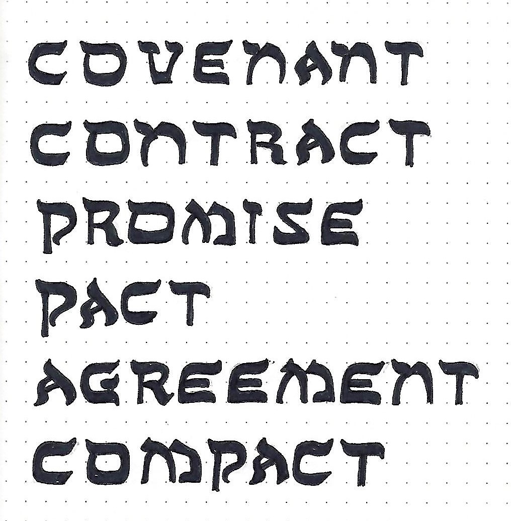
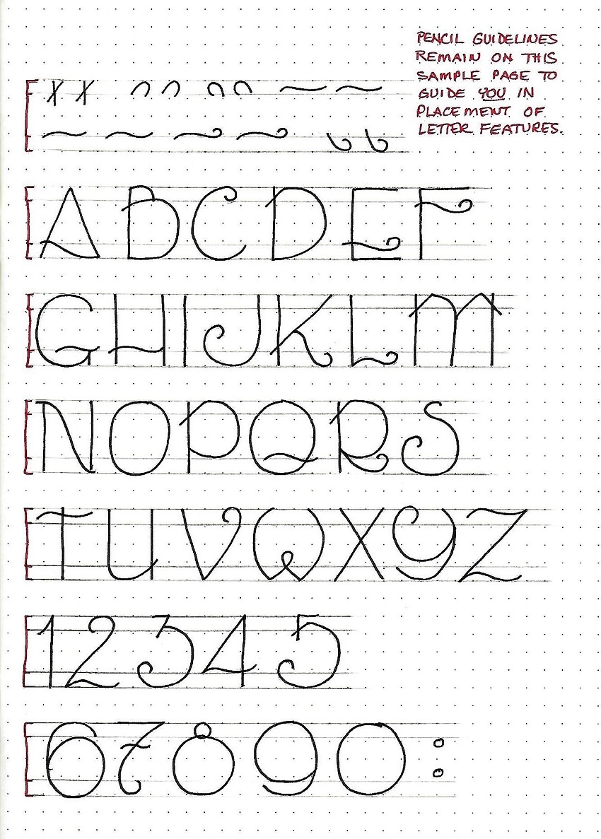
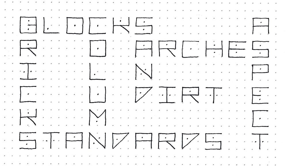
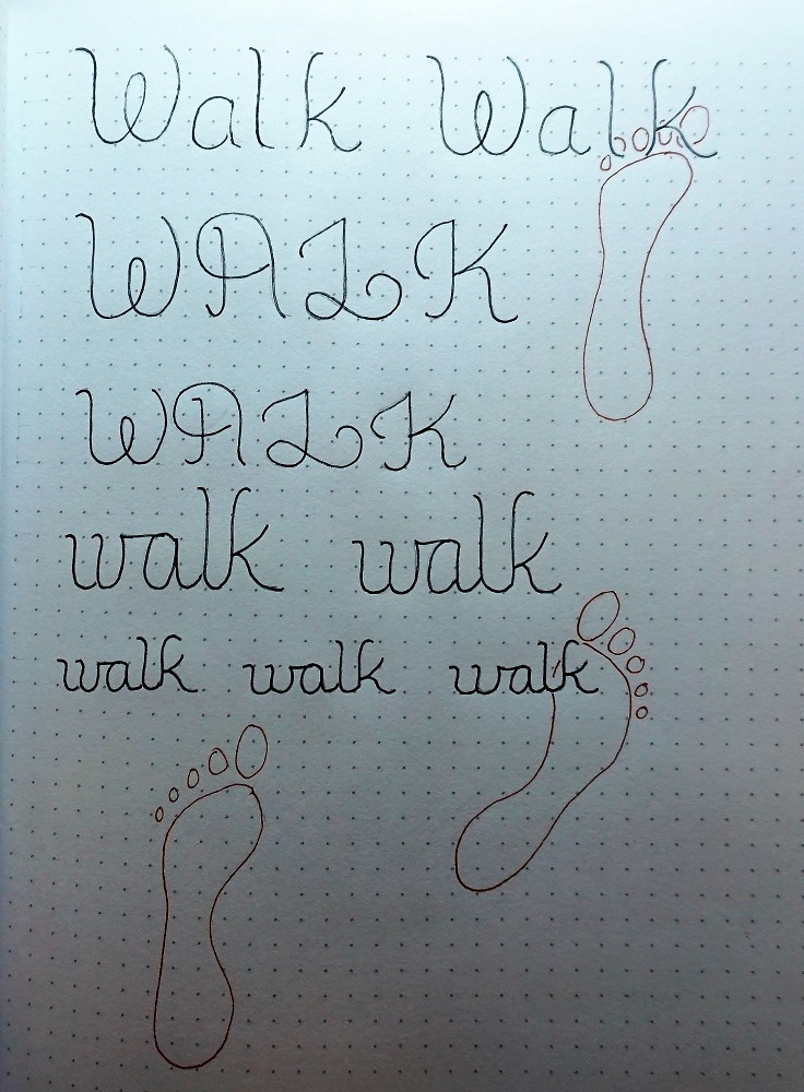
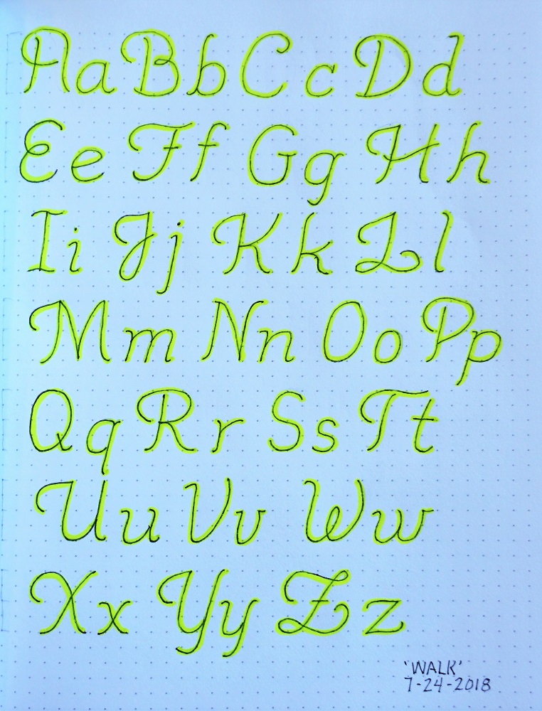
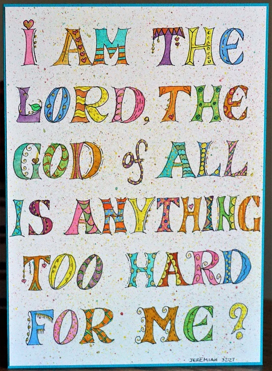
CHOSEN FONT – DAY 1 – INTRODUCTION

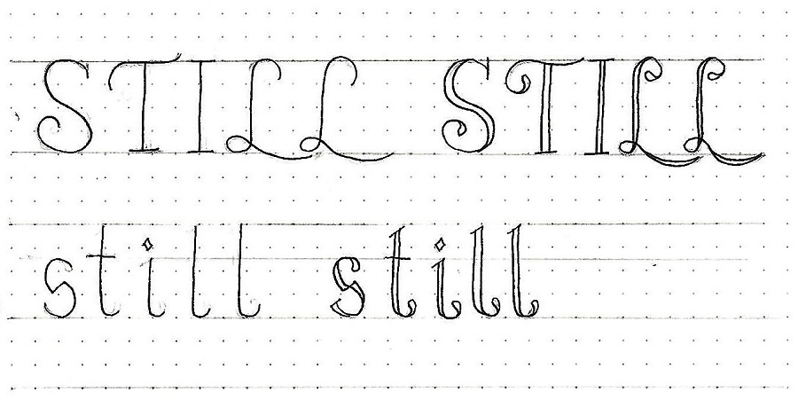
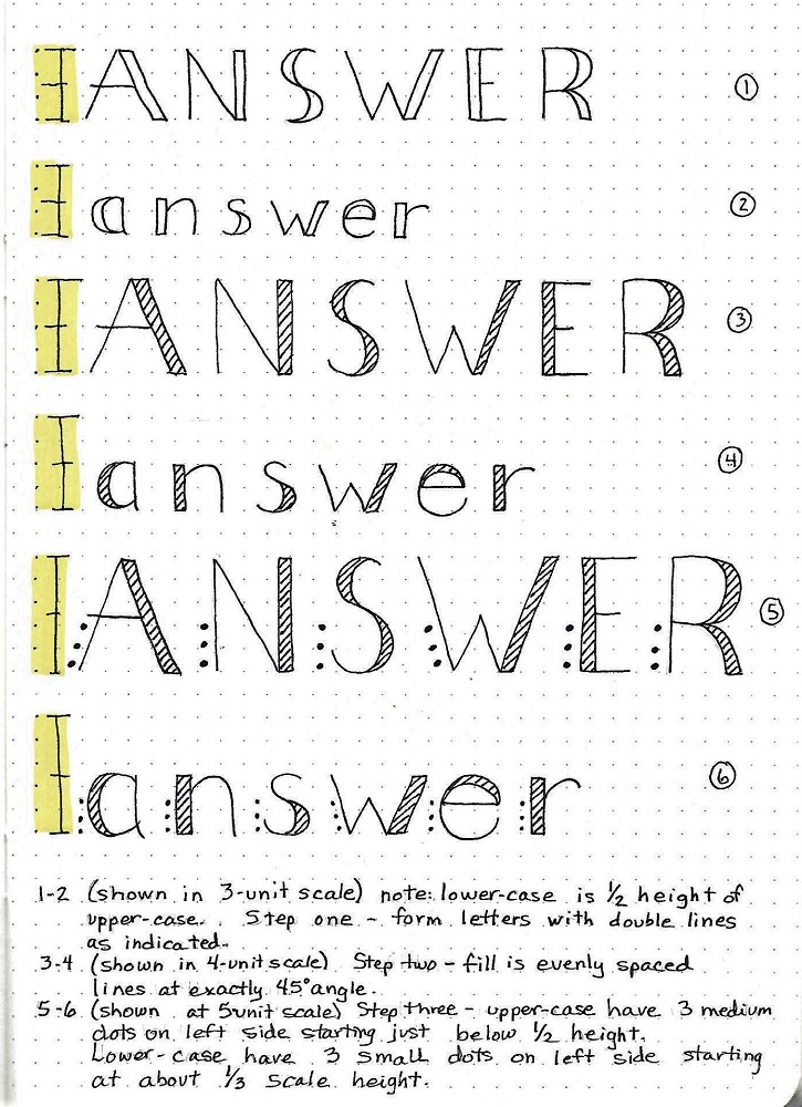
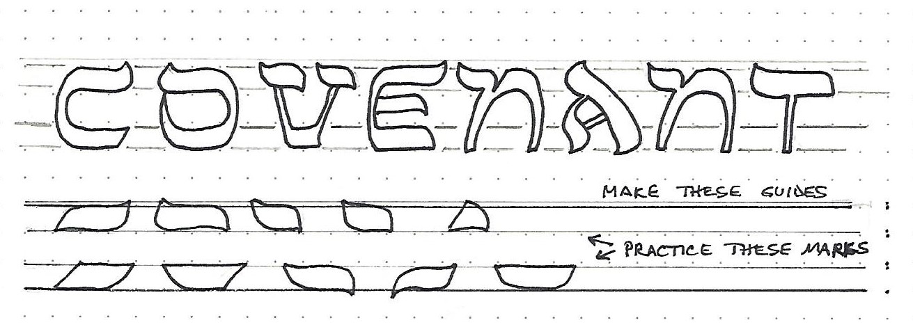
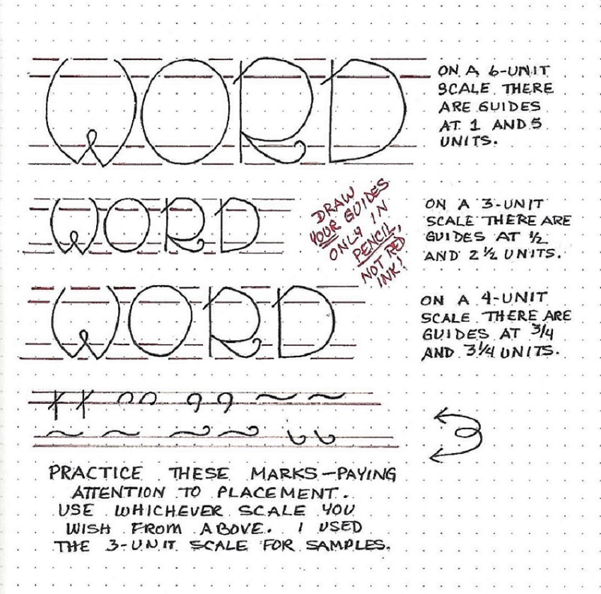
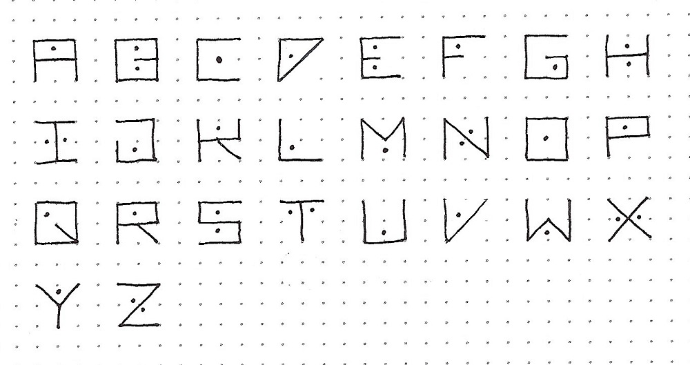
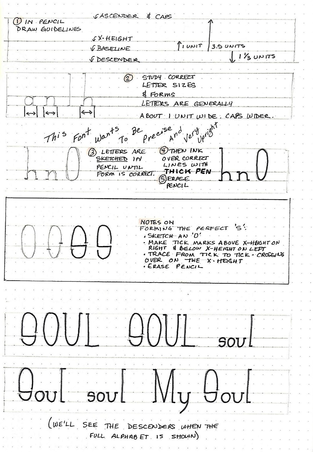
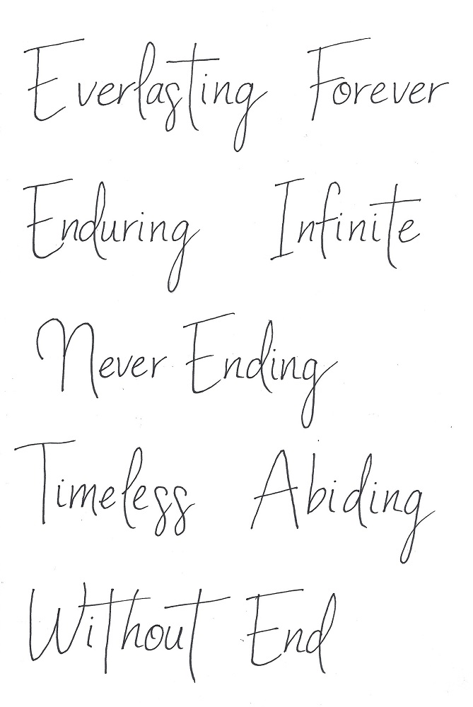
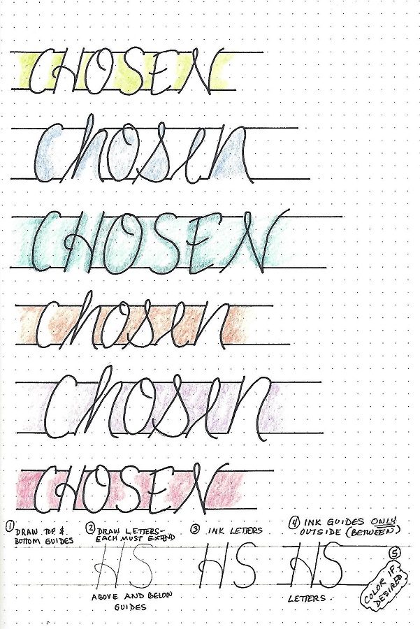
Not long ago we saw a font ‘introduction’ with lines showing on the top and bottom. In that case, they were guidelines only and were erased for the final product. In this case, however, those lines are added on at the END and they are a permanent part of the font style.

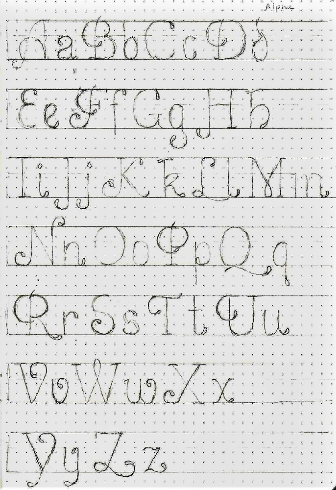
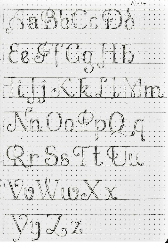
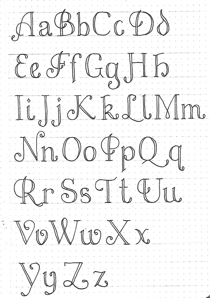
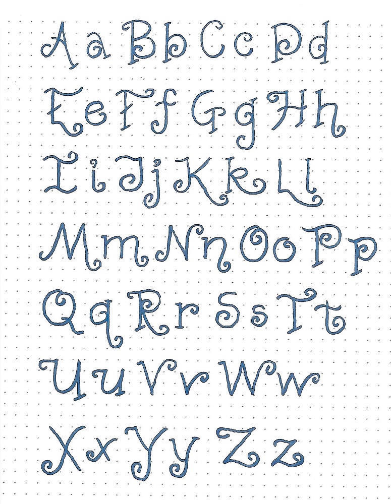
There are both a lower- and an upper-case but they are THE SAME SIZE. It is the style that distinguishes them.

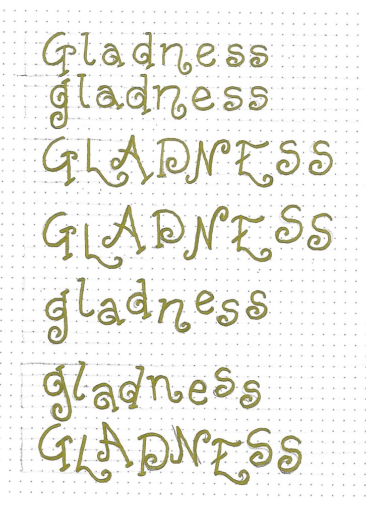
Follow along with the steps at the bottom of the page: 1) Start by establishing the height of your letters with a penciled guide at the top and the bottom. 2) Draw your letters. Note that every one of them will extend slightly below AND above the guidelines. 3) Ink your letters 4) Use a ruler and draw on the top and bottom guidelines ONLY between the letters. Do not draw inside the letters at all.

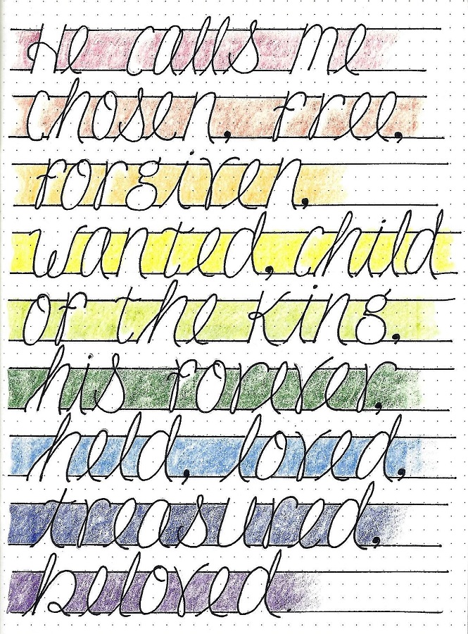
When coloring (which is recommended) do so between the letters OR inside the letters. My favorite is shown in samples 1, 4, 5, and 6. When the side of a letter form is open, fade the color out without going all the way inside.

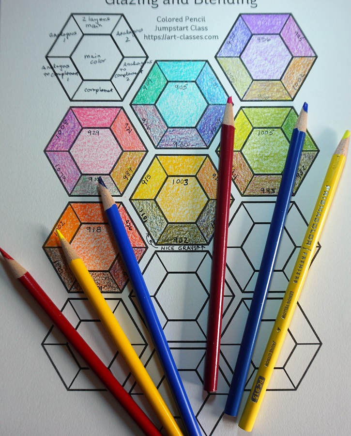
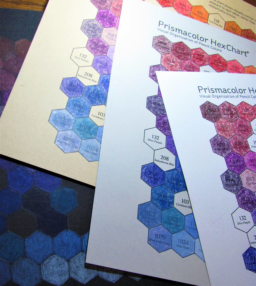
Keep your colors light to medium. If you use too dark of a color (dark green, navy blue, chocolate brown) you won't be able to distinguish the lines for the letters.

CHOSEN FONT – DAY 2 - ALPHABET

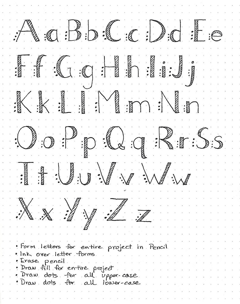
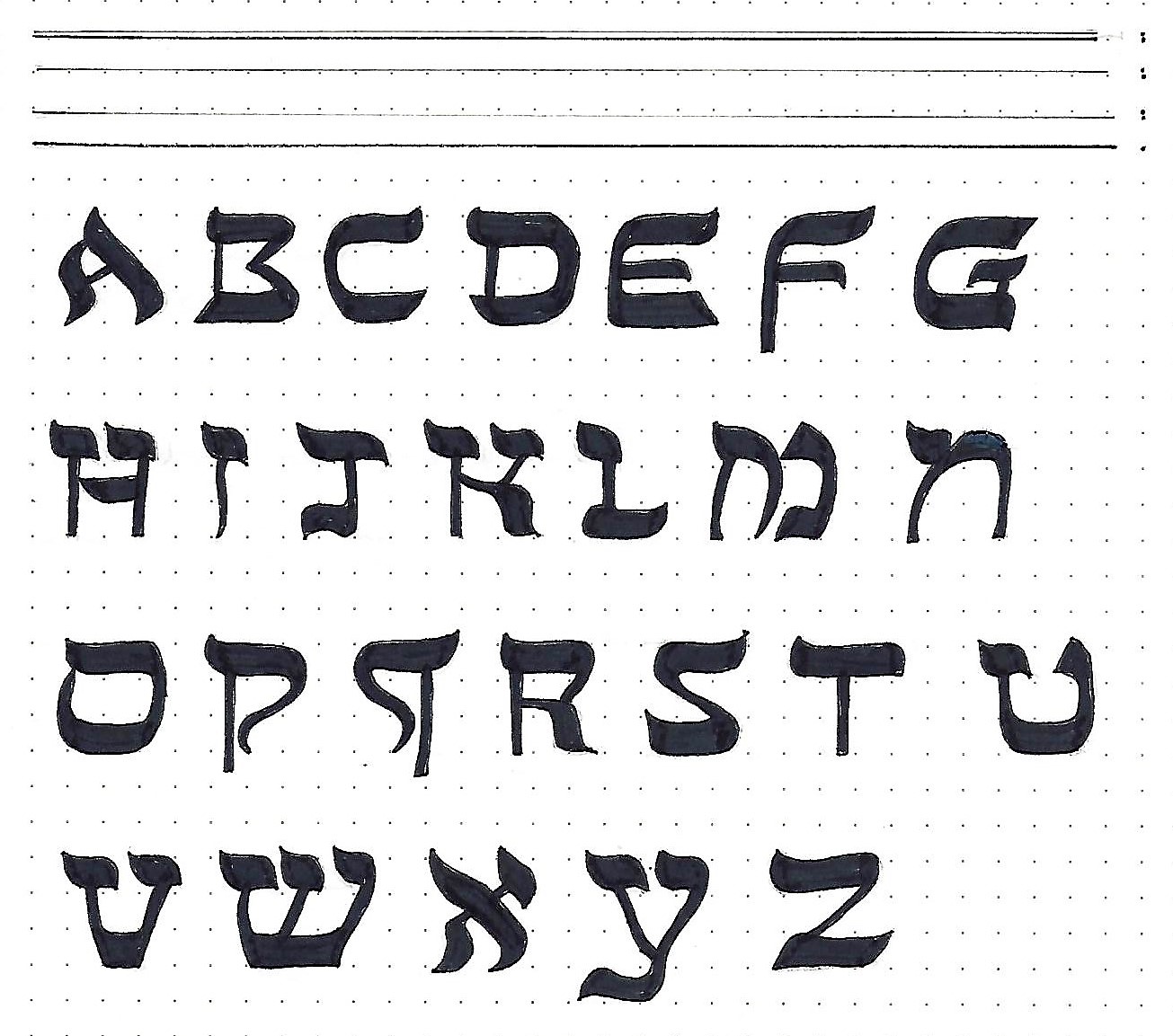
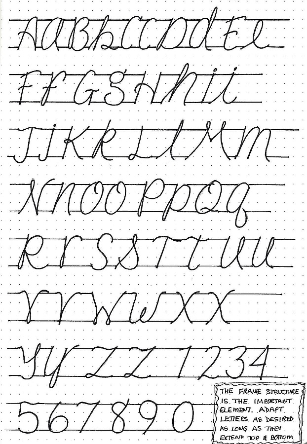
You’ll note that the letter forms for upper- and lower-case letters are sometimes the same in this alphabet. And here’s the good news… you can use your OWN form for a letter as long as it is a semi-script that fits with the general styling.

You may prefer to write an all-caps alphabet and then al all lower-case alphabet since that is how you will use them in projects.

I’ve included numbers for this style as well.

Since today you are making your own reference sheet for the alphabet construction you can leave it uncolored. If you DO wish to color it, use some of the ideas shown yesterday.


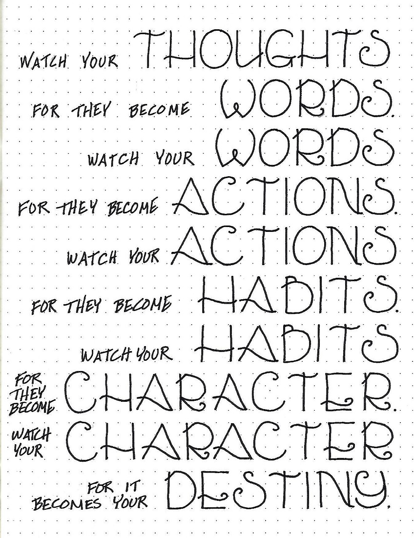
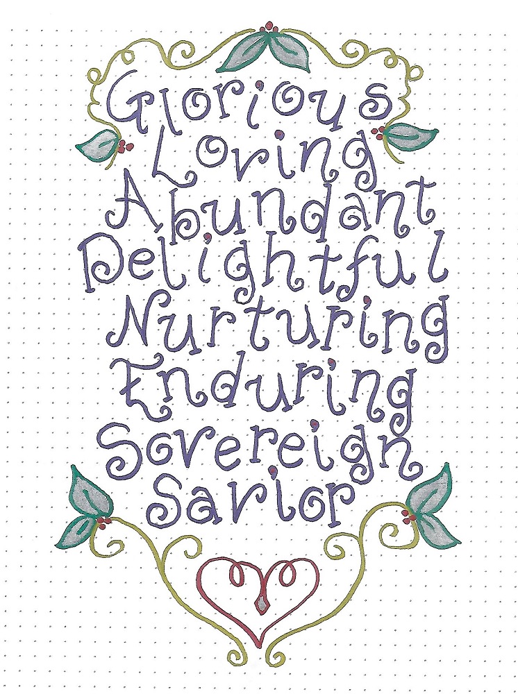
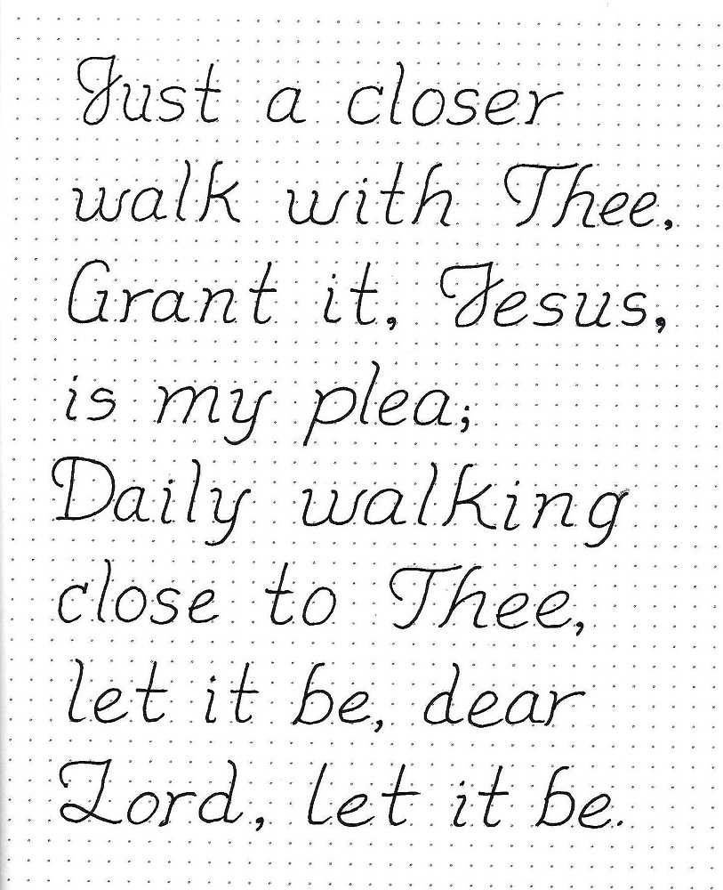
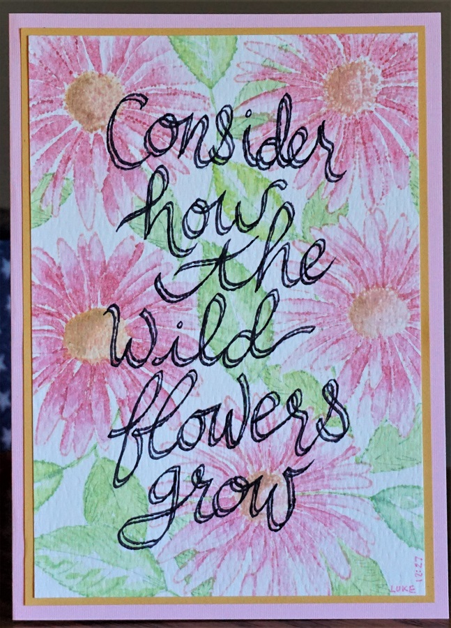
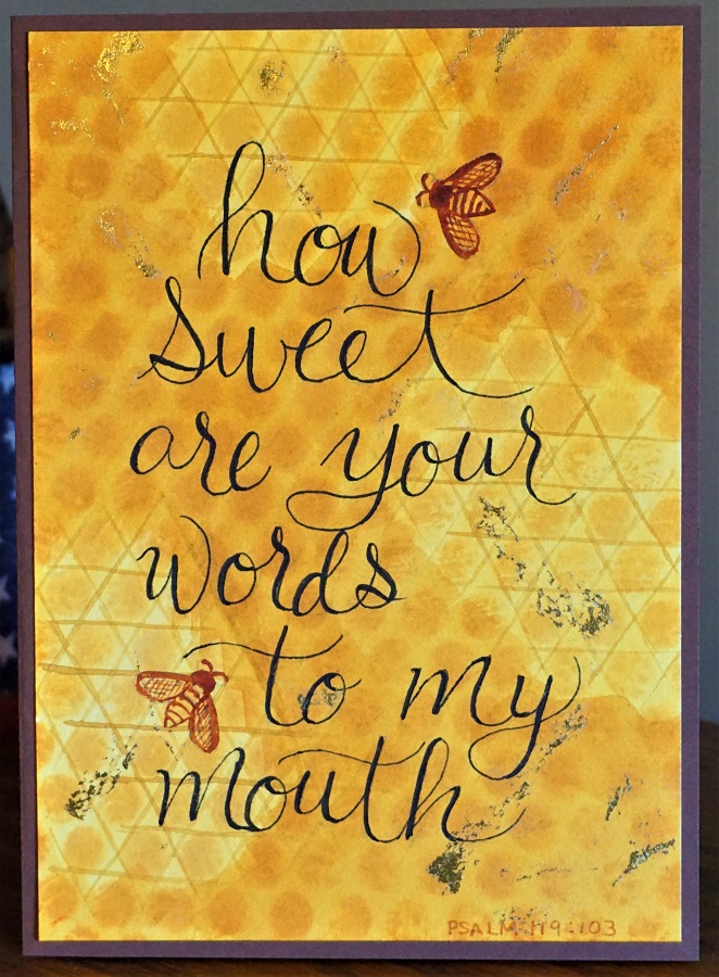
CHOSEN FONT – DAY 3 – QUOTE DAY

Today, use the CHOSEN font to write a quote or lyrics that contain the word.

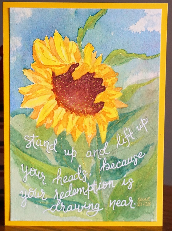
When we use this font for projects we DO want to color them as it reinforces the look of the structure (with the top and bottom bands). I colored my quote with a rainbow of hues.

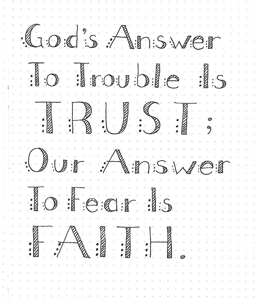
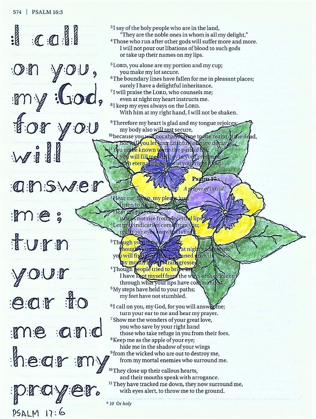
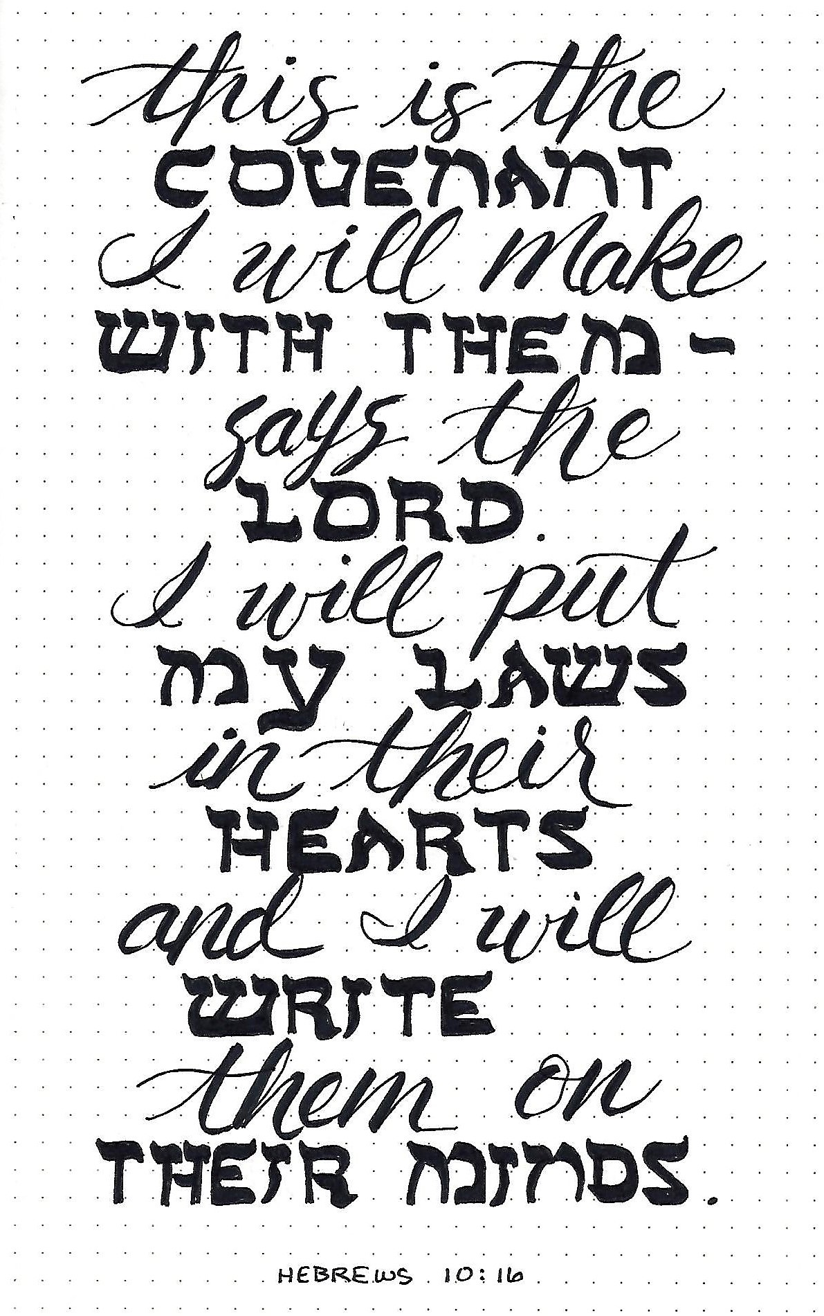
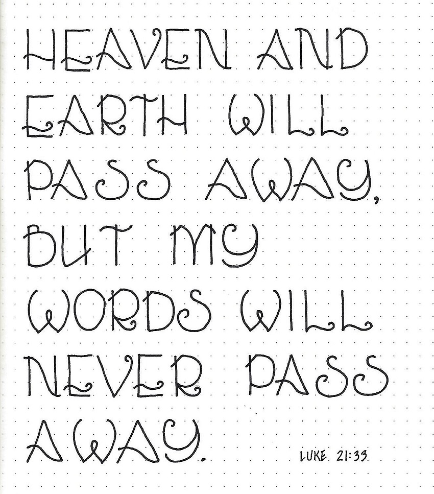
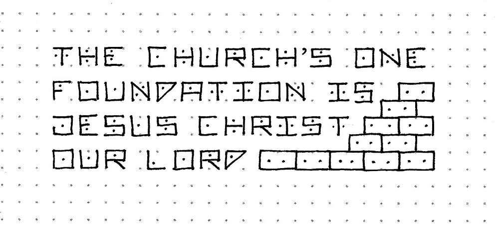
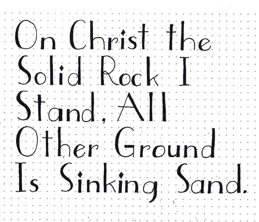
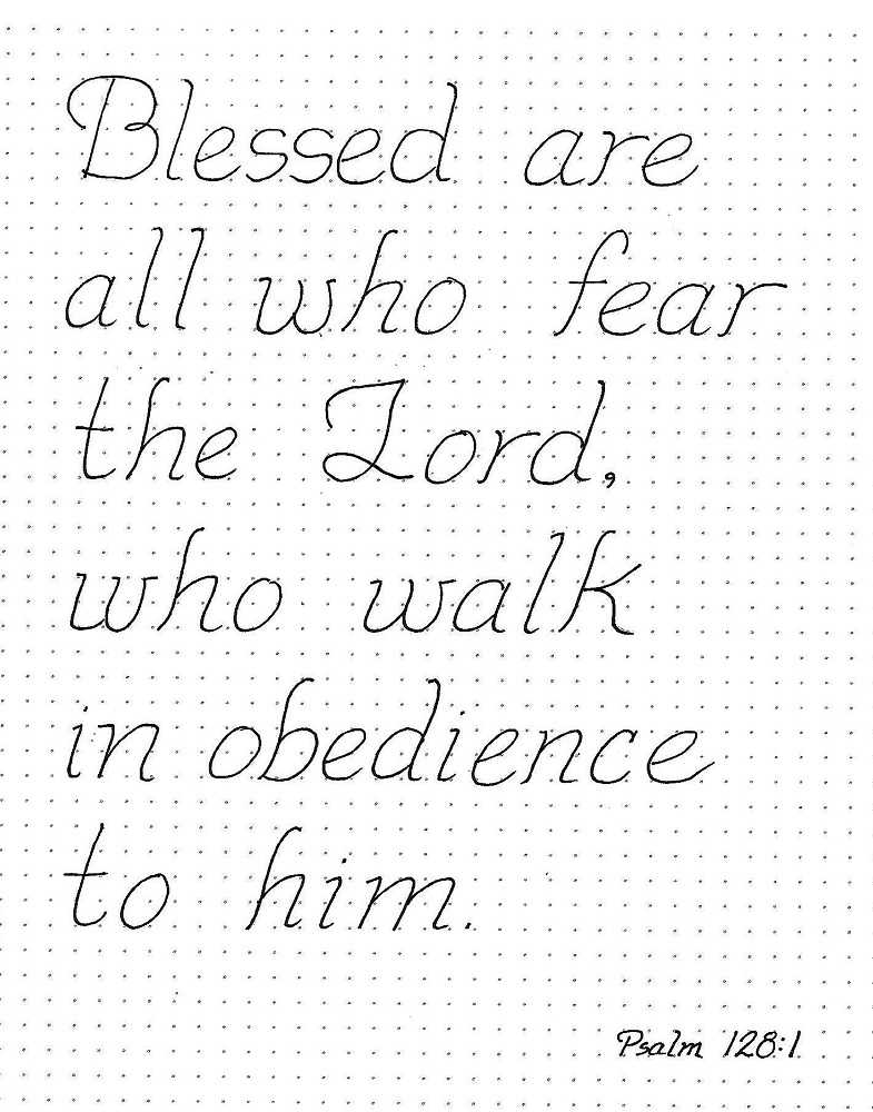
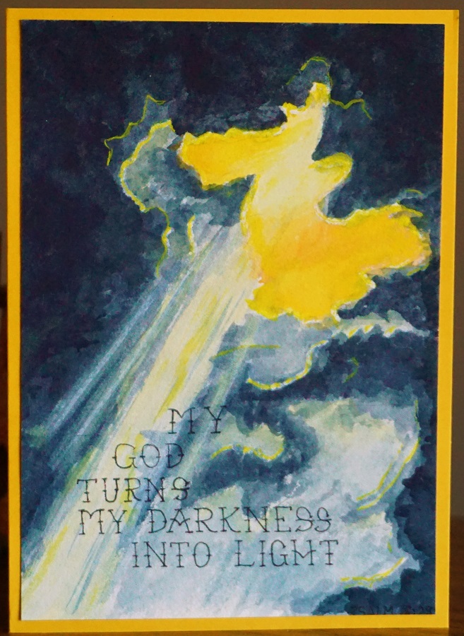
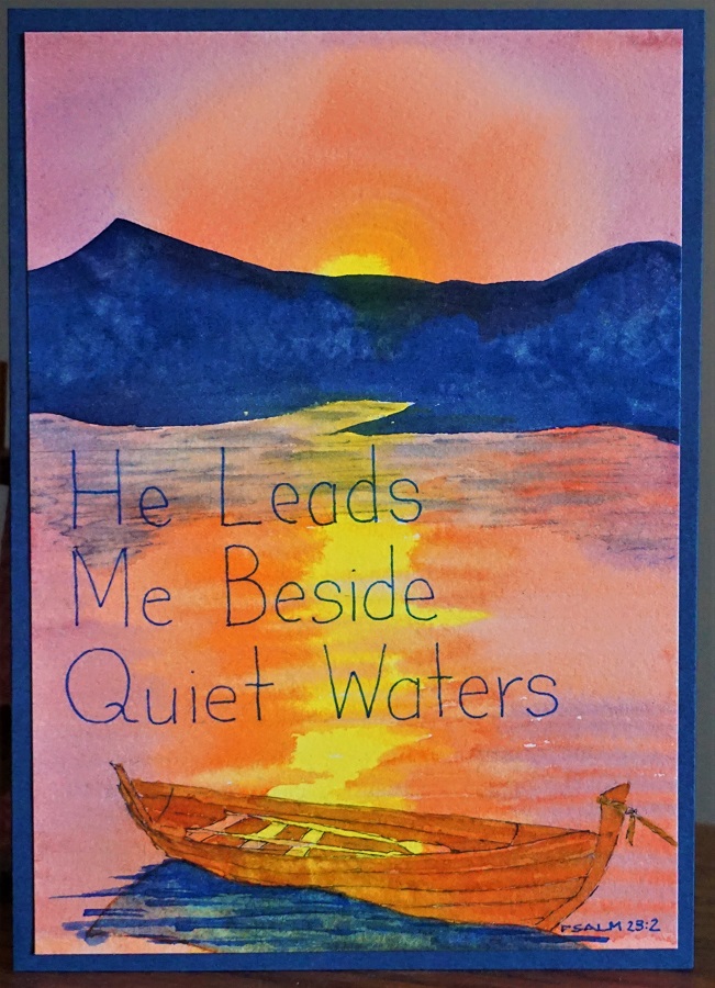
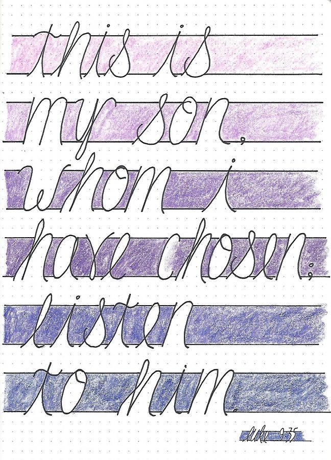
CHOSEN FONT – DAY 4 – SCRIPTURE WRITING

Use the new font style to write a scripture with the word CHOSEN. Use your journal, notebook or plain paper and color as desired.

Note that because my scripture was shorter than yesterday’s quote I was able to use a larger scale for it. I used a range of purples for an ombre effect in the coloring.

Here is another option that I did not do on any of my samples. Consider using TWO very close together lines at the top and the bottom to make it a little more decorative. Or, leave those bordering lines the same and use a heavier marker for the letters themselves to help the words stand out from the coloring.

What other ways can you think of to customize this font?

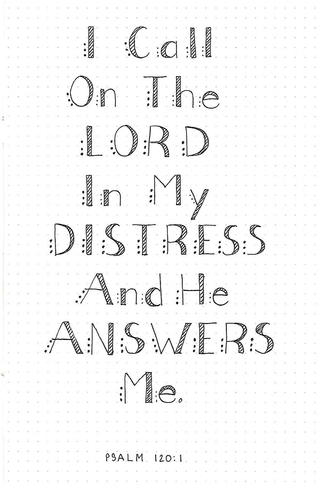
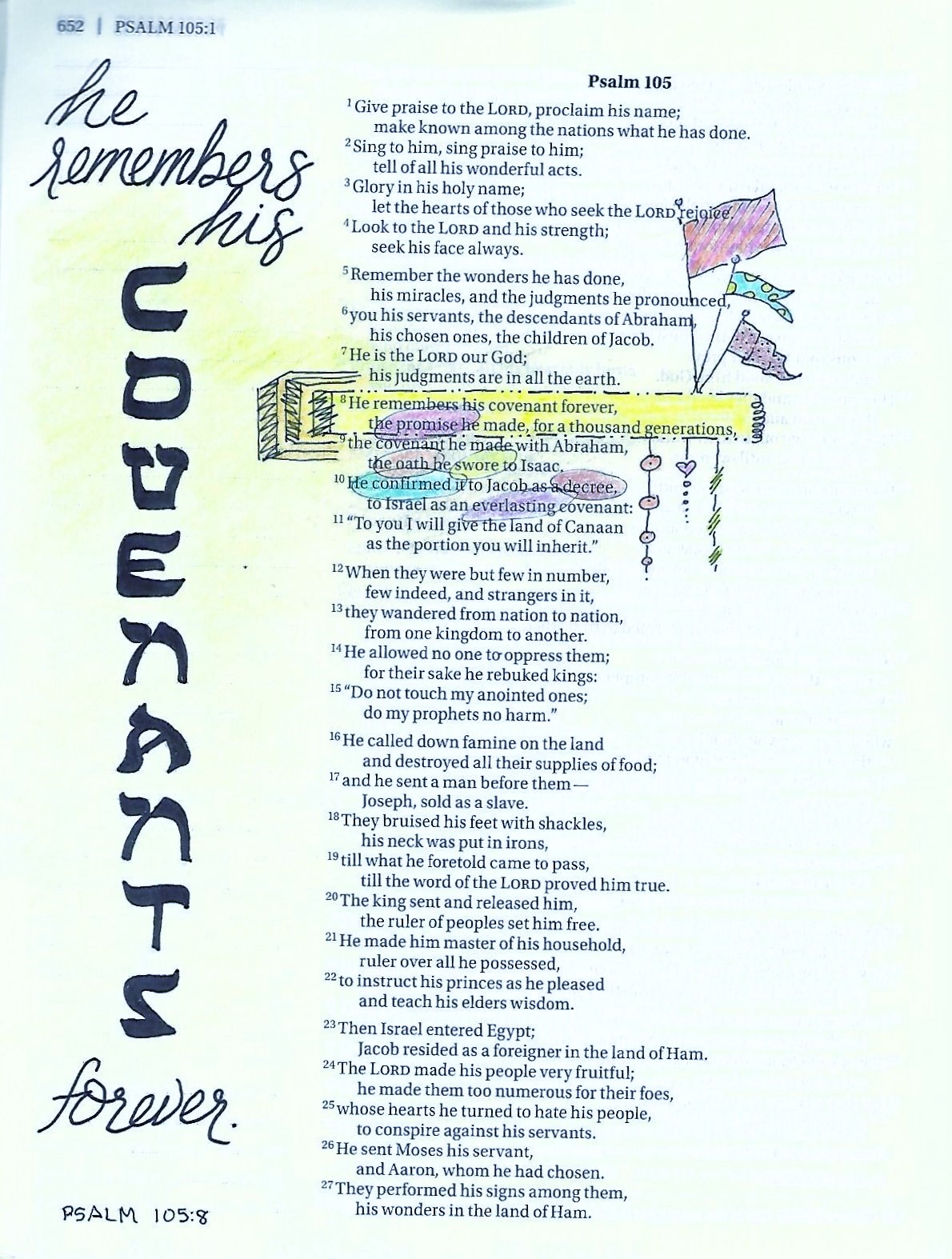
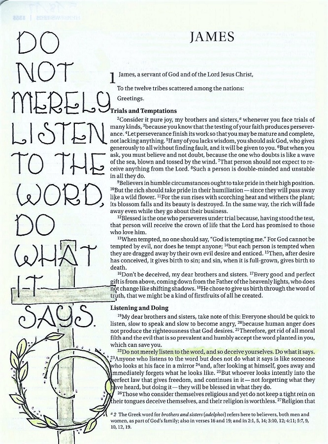
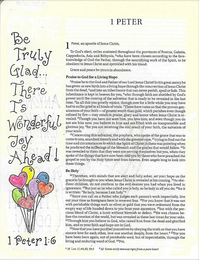
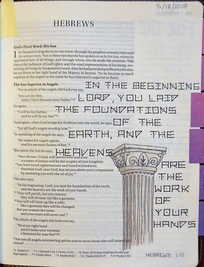
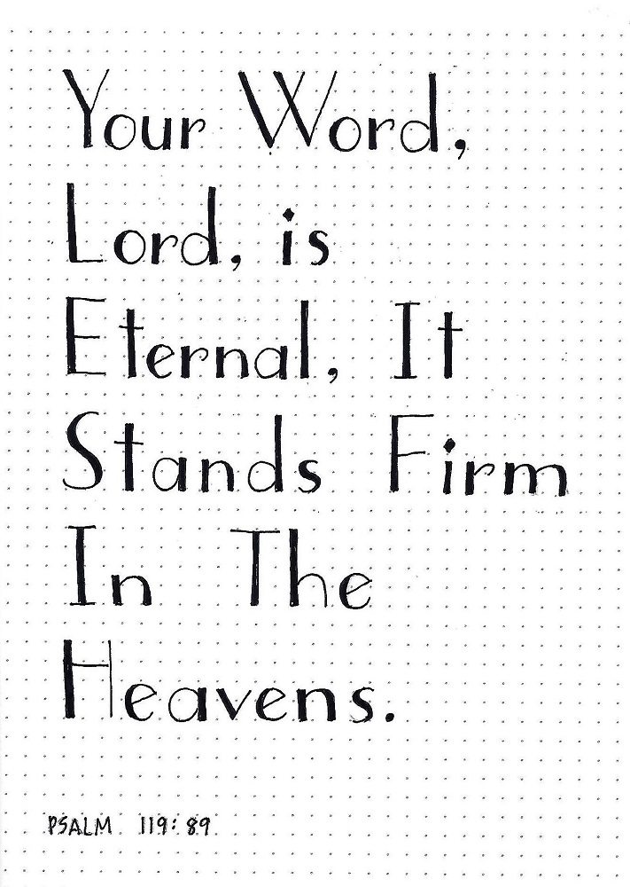
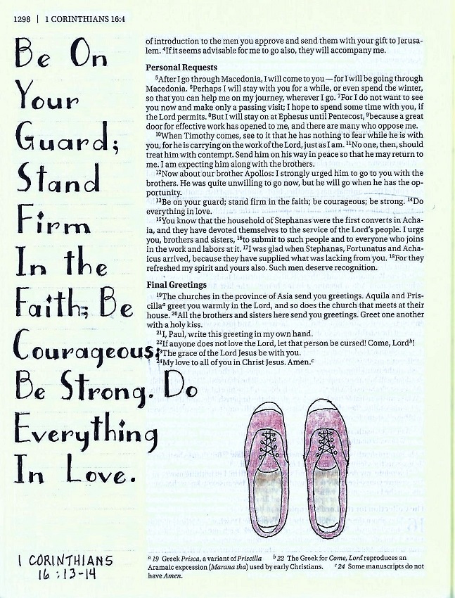
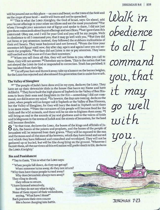
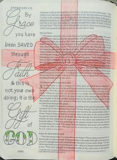
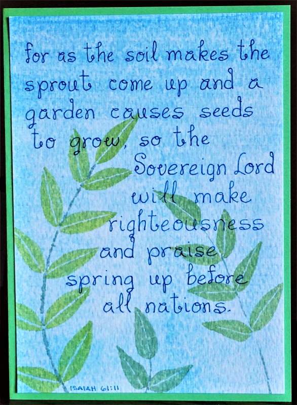
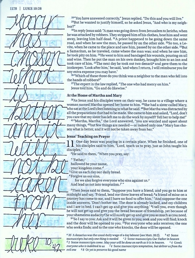
CHOSEN FONT – DAY 5 – TAKE IT TO YOUR BIBLE

This is the day we use the newly learned font in our Bible.

I was able to fit one word per line in my margin and colored it with a consistent blue all the way down.

If you have a longer scripture, simply reduce the scale of the guidelines, even if you have to go to 1 ½ spaces. A single space is probably too small though.

Because of all the color used and the decorative nature of the font, I decided not to add any artwork.


I hope many people will try out this unique and beautiful font and get it into their Bibles.

Ddd


Posted by studio3d@ccgmail.net at 11:34 PM PDT
Tuesday, 18 September 2018
I'm Still Here
Topic: Bible Journaling

Time for another lettering lesson to use in Bible journaling. This is the series I taught last week at Creative Bible Journaling Facebook group.

STILL FONT – DAY 1 – INTRODUCTION

Welcome to another week of Lettering Lessons. This time we will focus on the word ‘Still’ and use an upright formal print style.

This font features double lines, teardrop ends and big sweeping curves. Watch the tops of letters that are plain as they may either have a chisel top or a serif. Some letters have bottom serifs and some end in teardrops. NOTE: If you think something is totally out of character, it is OK to change it to suit yourself.

All of my samples are drawn on a 4-unit scale. The x-height for lower-case is at about the 2/3 mark.

To begin, you will pencil in your basic letters while concentrating on form and spacing (column 1 in the sample). Then, still working in pencil, refine the forms and add the second lines and teardrops (column 2). When the letters are just as you wish, ink them.

After the ink is dry, erase the pencil.

In the sample I have left the guidelines in place so you can see the relationships in letter size.

STILL FONT – DAY 2 – ALPHABET

Part 1 - Letter Formation

The lesson today is in THREE PARTS to better demonstrate the steps in recreating this letter form.

FIRST STEP: Draw guidelines. Then use pencil to sketch in your basic letter forms while focusing on form and spacing.

Now go on to step two.


STILL FONT – DAY 2 – ALPHABET

Part 2 - Letter Definition & Details

The lesson today is in THREE PARTS to better demonstrate the steps in recreating this letter form.

SECOND STEP:  On the same paper, still using pencil, refine the forms and add the second lines and teardrops.

Now go on to step three.

STILL FONT – DAY 2 – ALPHABET

Part 3 - Letter Inking Final Product

The lesson today is in THREE PARTS to better demonstrate the steps in recreating this letter form.

THIRD STEP: When the letters are just as you wish, ink them. After the ink is dry, erase the pencil. I leave the guidelines in place as it will refresh my mind when using the lettering on future projects.

STILL FONT – DAY 3 – FUN DAY

Let’s all select some song lyrics to write up using the ‘Still’ font. This way you get to practice writing the letters some more but you are also going to get to see how beautiful this font is when used on words instead of just writing out the alphabet.

You may wish to use a larger or smaller size guidelines to practice letter formation in a different scale.

Although this font is designed to remain ‘open’ you might wish to experiment with adding color between the double lines. I wouldn’t fill in the area entirely in black, however, as you lose so much of the elegant character that way.

STILL FONT – DAY 4 – SCRIPTURE WRITING

As always, on day 4 of Lettering Lodge we are going to use the new font to write a scripture with the focus word ‘still’.

As I usually do, I used upper-case for the initial letter on every word as I think it looks more like a display piece this way and I get more practice in on the beautiful capitals.

STILL FONT – DAY 5 – TAKE IT TO YOUR BIBLE

From the day I chose the word ‘still’ as my focus, I have been planning to use cattails as an illustration. Aren’t we fortunate they showed up in the Drawing Room this week? <grin>

There was an obvious need to reduce the scale of the font when used in my Bible. I used just two units height and remembered to set the lower-case height at 2/3 of that space.

Since I mentioned the Drawing Room in the lesson above I'll show what I did for that lesson, too. It actually goes step by step on how to draw the cattails and how to use them as an outline (like above) or colored or in silhouette (both shown beow)


If you want to see this, or any other of my drawing tutorials, they can be downloaded (PDF) at Creative-Bible-Journaling.com

That's it for another week.

Ddd


Posted by studio3d@ccgmail.net at 10:48 AM PDT
Thursday, 13 September 2018
Color Me Happy
Topic: Coloring

I finally got around to doing the homework for lesson 2 of the Colored Pencil Jumpstart class by Sandy Allnock at Art-Classes.com

This lesson entailed making color wheels in warm and cool tones. We selected all the colors from our sets of color for the first (top) ones and then we used only the Yellow, read and blue from the top wheel and blended them to create the bottom wheels.


For the second project we used the full sets we had used in the first exercise but overlapped them to create another color where they intersected. I labeled these with the color they most matched in the set as I might like to go directly to that pencil instead of blending it from scratch.


The third exercise had us select a color (center hex) and then do blends around the outside using analagous, complementary and complements of the analagous colors. I didn't finish this as I was kinda 'colored out' by this time.


By now, I hope your realize that the camera 'lies' about the color of things. This makes photographing artwork a challenge and sometimes you just have to 'let it go' and know that the original work is what is true and most important.

Ddd


Posted by studio3d@ccgmail.net at 3:57 PM PDT
Friday, 7 September 2018
I Don't Have All the Answers
Topic: Bible Journaling

I'm back with a new font lesson for Bible Journaling.

This one was designed by one of the members of the Creative-Bible-Journaling group and she graciously agreed to let me teach it to the others on the Facebook group.

So, let's get right to it!

ANSWER – DAY 1 – INTRODUCTION

The alphabet we are going to learn this week was designed by our CBJ member Debbie Berke. Many thanks for her generous permission to have us teach this in the Lettering Lodge.

I drew this not only in a step by step manner but in graduated scale. If you follow along with writing your sample like this you will have a valuable resource to refer to as you use this font in your projects. (Note: the yellow blocks on the left are to indicate the letter heights in upper and lower case.

Lines 1 and 2 show the writing of the basic letter forms. X-height is ½ the height of upper case. Each letter has one stroke that is doubled. Lines 3 and 4 show filling the double lines with evenly spaced lines at a 45-degree slant. Lines 5 and 6 show the 3-dot embellishments. Upper case dots reach just under ½ height and are larger than those on the lower case, which reach just over ½ the x-height (about 1/3 of total letter height.)

ANSWER – DAY 2 - ALPHABET

Remember these steps for drawing this font:  Form letters for entire project in pencil including their double lines – Ink over letter forms – erase pencil – in ink, draw the fill for the entire project – draw dots for all upper case – draw dots for all lower case. Working through the whole project on a single step at a time will help to ensure consistency and helps avoid spacing errors and misspellings.

Later, in using the font in projects you may wish to color in the filled areas or use color for your dots. But in this stage, keep them free of color as it will serve as a better reference for you.

ANSWER – DAY 3 – FUN DAY

Today, we’ll use the new font to write a quote with the word ‘answer’.

The purpose of this exercise is to practice writing a lot of words. This helps the formation of the letters to become established in muscle memory as they will flow more naturally the more you use them.

So use some upper case as well as some lower case.


ANSWER – DAY 4 – SCRIPTURE WRITING

Like yesterday, we want to get in a lot of practice using the font. This time we’ll write a scripture with the word ‘answer’.


ANSWER – DAY 5 – TAKE IT TO YOUR BIBLE

It is easy to drop the scale of this font down to ‘Bible size’ just by remembering that the x-height is ½ of the total font height.

Today, we’ll choose a scripture that has the word ‘answer’ and write it out in our Bible using the new font.

Here, you may wish to color in the double lined areas and decorate your page with an illustration. I added the Pansy from the Drawing Room lesson.

I think this scripture is well timed as we have many  people who are struggling with trials, grief, health issues, family issues and work issues. God is listening and he WILL answer.


...and that's another one in the books. I'll be teaching for the whole month so there's more font fun to come.

Ddd


Posted by studio3d@ccgmail.net at 10:36 AM PDT
Monday, 3 September 2018
Let's Make a Deal
Topic: Bible Journaling

I totally spaced out that I needed to do a blog post for the lettering lesson I taught last week. What was I thinking?

I found a really neat handdrawn font that looked like Hebrew writing but with English letters. So cool! So I worked on refining the forms so I could teach a step-by-step lesson on them.

Here's the deets:

COVENANT FONT – DAY 1 – INTRODUCTION

I’ve been wanting to teach this font for quite a while. I just had to figure out how!

Start with drawing in guidelines on top and bottom of a 4-unit scale. Add an internal guide at just below 1 unit and just above 3 units. Add a further line just above 4 units.

In pencil, practice making the tops and bottoms of the letters first. The horizontal bars fit inside the wider bands at the top and bottom of the guides except for the little curved tips that reach out to touch the uppermost guide.

Connect these parts of the letters to the remainder with gently curving lines. The desired result resembles Hebrew writing.

Ink only after the entire word is completed.

There are several marks (tops and bottoms) that will show up repeatedly in the alphabet. Take some time to practice these, too.


COVENANT FONT – DAY 2 - ALPHABET

I included the guidelines again here so you don’t have to keep referring back to the previous sheet.

Practice those top and bottom swishes a lot as they are mostly the same forms over and over. Some will be shorter from side to side, though.

There is no lower-case to this alphabet.

Draw all letters in pencil before inking. Erase pencil after ink is dry.

These letters are supposed to be filled with solid black as they then look like letters that were written with a brush.


COVENANT FONT – DAY 3 – FUN DAY

Today we want to write out some words with our new font just for practice. I used it to write several synonyms for COVENANT.

I reduced the scale of the letters on this sheet to 2 units high with corresponding reductions in the guidelines.


COVENANT FONT – DAY 4 – SCRIPTURE WRITING

A long scripture on plain paper, in a journal or notebook would be pretty overwhelming if done ALL in the COVENANT font. So, I wrote every other line in it and used a faux brush script for the interleaved text.


COVENANT FONT – DAY 5 – TAKE IT TO YOUR BIBLE

I gave myself a break on this labor-intensive font and used it only for the focus word. It takes up more real estate in a vertical format so I went with that and combined with some script as a frame for it.

I circled words in the scripture that were directly related to the focus word: promise, oath, swore, confirmed, decree, everlasting.


Another novelty font is up for next week.

Ddd


Posted by studio3d@ccgmail.net at 7:10 PM PDT
Thursday, 23 August 2018
Use the Right Word
Topic: Bible Journaling

And now another lettering tutorial prepared and taught by... me!

This week we tackled an art deco style that is very classy looking.

WORD FONT – DAY 1 – INTRODUCTION

I’ve started this font lesson with some guidelines. These are NOT in the finished lettering but they are important to set up as you begin so the defining marks are placed correctly. I also demonstrated the font in three scales so you get to see the proper placement of the guidelines in relation to each size. The guideline instructions are laid out on the right of each sample. Unlike mine, you will use pencil for your guides so they can be erased.

The next thing to do is to practice the marks at the bottom of the sheet and their position on the guidelines.

As you practice drawing the letters in each scale, try to identify the practice marks that appear. The other marks will show up in the alphabet tomorrow.

Note that I said DRAW the letters. Do this in pencil first so you can make any correction needed. Then trace over the pencil in ink and, when the ink is dry, erase the pencil. This is what we call P-I-E (pencil-ink-erase).


WORD FONT – DAY 2 - ALPHABET


Before you start on your WORD alphabet, set up the guidelines for the scale you will be working in (select from yesterday’s lesson). Then practice the defining marks again. Watch for those marks as you carefully draw your letters.

This is a very round and upright font and it has no lower case.

I did draw up a number series to go with this font so it could be used for scripture references and remain in character.


WORD FONT – DAY 3 – FUN DAY


Today, use your font to write up a quote using ‘WORD’.

You will still make those guidelines to keep your letterforms consistent. Then ink the letters and erase the pencil. Note that the letters are compressed together but they do not touch.

Doesn’t this font just look beautiful when it is used naturally rather than in the alphabet?


WORD FONT – DAY 4 – SCRIPTURE WRITING


Select a scripture with ‘WORD’ in it and write it out in your journal, notebook or on plain paper.

Depending on the length of the scripture you plan to use, you may need to drop to a smaller scale. Don’t forget to start with your guidelines.

P-I-E is on the menu again!


WORD FONT – DAY 5 – TAKE IT TO YOUR BIBLE


Today we take the WORD font to The Word. Select a scripture that uses WORD to letter into your Bible.

You will undoubtedly need to reduce the scale even beyond the smallest on your practice pages. But you should be able, by now, to figure out the relationship of the placement of the guidelines to your guide height.

P-I-E is especially important when working on your Bible pages to protect against errors in spelling and placement.

If your text won’t fit using only the feature font, by all means combine it with some other font(s). I had only one word that was going to be a little long so I adjusted the spaces between letters to condense the word package.


I used excerpts from James 1:22.

Ddd


Posted by studio3d@ccgmail.net at 11:51 PM PDT
Friday, 17 August 2018
Glad For the Week That Was
Topic: Bible Journaling

Back with anouther week of lettering! This week was Ann's turn to teach and she went with a lighthearted curly and bouncy font and focused out attention on the word Gladness.

DAY 1 - INTRODUCTION

Throughout the week, I played with my metallic fude brush markers. I was working on keeping the lines even width and not pushing down on the tip to create thick and thin.

The first day we got the intruduction to writing the focus word in both upper- and lower-case letters.

We also practiced giving the letters a little bounce.


DAY 2 - ALPHABET

I did my alphabet stratight and even to work on getting the forms correct. Then I can let them bounce around (or not) when using them on a project.


DAY 3 - ANAGRAM

I went with the bouncing letters on this piece as well as centering the words. This makes it less apparent that the first letters top to bottom spell out Gladness.

I added scrolls.leaves and berries with other colors of the fude metallic brush markers.

The adtual pieces do NOT have fine outlines on the letters. This was an effect created by my scanner on the metallic marks.


DAY 4 - SCRIPTURE

More practice in my notebook.


DAY 5 - IN THE BIBLE

To save space, I reverted back to my Micron pen to letter in my Bible.

Although my Bible is the NIV I wrote out portions of the scripture as it appears in The Living Bible.


A few little balloons fill the space to illustrate Gladness.

Ddd


Posted by studio3d@ccgmail.net at 12:29 PM PDT
Saturday, 11 August 2018
Drawn To Color
Topic: Coloring

I signed up for a colored pencil class online a while back and then got involved with the watercolor challenge in July. I finally got back to the class lessons and completed the homework for lesson 1.

This first involved using ALL of the pencils on a hex-chart to show their relationships. I colored FOUR charts so I could see what the differences were when used on white, tan, grey and black.


Then there was some coloring with the three primary colors in five different pressures andblending those same 3 colors with varying pressure.


And finally, I worked on layering the same colors in different orders to see what different colors resulted. There were three exercises with different pressure.


Sorry the photo is so poor on this one, but you get the idea.

I have watched the videos for lesson two but not begun the actual homework yet.

Ddd


Posted by studio3d@ccgmail.net at 12:01 AM PDT
Friday, 10 August 2018
A Good Foundation
Topic: Bible Journaling

For my turn at lettering this week I developed an original font to teach. It reminded me of cinderblocks so I called it 'Foundation'.

Here is the lesson plan:


MONDAY

I’m going to have another run at showing what I think will be a very easy print style. I’ve been wrong before, but I do think you will all find this one easy to do.

There are only a few rules: All the letters fit inside a perfect square and all are exactly the same size. You can use only the outside lines of the square as well as the vertical half-line, the horizontal half-line and both diagonals.

There are no lower-case letters and every letter will have one or two dots to decorate it. These were inspired by cinderblocks.

Letter spacing will be ½ the letter width.


TUESDAY

Today we have the full alphabet. Remember, there are no lower-case letters in this style.

Note how all the letters fit the rules that we established yesterday – all letters the same size and all lines must be on the + axis, the x axis or the perimeter of the square.

Because of the regimented structure of this style it is very easy to remember them when writing. I usually write all the letters and then go back and add the dots. It helps in maintaining the flow of writing which helps to avoid misspellings.


WEDNESDAY

This style of block lettering serves as a good one for constructing a crossword. I did mine with terms and materials used in construction.


THURSDAY

Today you can write either a hymn or a scripture on plain paper. Fill in empty areas with some drawn cinderblocks the same height as the letters but twice as wide. The blocks each get two dots.


FRIDAY

Today we will use the FOUNDATION lettering style in our Bibles.

All that practice keeping things square when we had the dots on our papers should have trained your mind to create square letters when you only have top and bottom lines.

I decorated my page with a column which I realize is not really a ‘foundation’ but it is a part of a construction and I liked the way it looked with the lettering style. If you want to use a column as well, check out the Drawing Room lesson for the week. It is not this same one but will work just as nicely.


It's a novelty print, to be sure, but occasionally you might need a little structured block print with dots. Who knows?

Ddd


Posted by studio3d@ccgmail.net at 12:20 AM PDT
Friday, 3 August 2018
You Can Walk Or You Can Stand
Topic: Bible Journaling

Last week we did the word WALK in the Lettering Lodge and this week we did the word STAND. Both were taught by Ann.

So I will simply show my homework pages without her descriptions or instructions.

DAY 1 - Introduction

DAY 2 - Alphabet


DAY 3 - Quote/Lyrics


DAY 4 - Scripture Notebook

DAY 5 - In Your Bible


The shoes on this Bible page were the new Drawing Room lesson for Friday.

Ddd


Posted by studio3d@ccgmail.net at 10:16 AM PDT
Wednesday, 1 August 2018
Walk On By
Topic: Bible Journaling

Time for another lettering round-up. This one was taught on the Creative Bible Journaling Facebook group by my co-leader Ann.

Her focus word last week was 'walk' and the font was an italic print with large swoops decorating the upper-case letters.

DAY 1 - introduction


DAY 2 - Alphabet


DAY 3 - Hymn Lyrics


DAY 4 - Scripture in Notebook


DAY 5 - Use in the Bible


Ddd


Posted by studio3d@ccgmail.net at 9:33 PM PDT
Thursday, 26 July 2018
World Watercolor Month = Bible Journaling Style - episode 7
Topic: Painting

I have so much enjoyed the challenge of doing watercolor painting every day this month. I did work ahead so I could fit it all in and still leae this weekend free for another project.

So here are the final 6 paintings.

Day 26 - Prompt YELLOW

I liked the idea of a sunflower to go with this verse because they lift their faces and track the sun across the sky. I watched a painting video on YouTube one day and then painted this from memory the next.

Day 27 - Prompt HOME

These birdhouses are styled after wonky houses developed by Joanne Fink.


Day 28 - Prompt CURIOUS

I havehad this painting in mind to do for a long time but it was really hard to find a reference photo that would match my vision. I really wanted the tippy-toes and the pose facing away. I finally found a vintage photo that was a good model, even tho it was black-and-white.

I used watercolor pencils for this. Haven't used them for a LONG time and had to make myself a little color chart for reference to show what they looked like when wetted.


Day 29 - Prompt ENDURING

I think raccoons are adorable! I wanted to challenge myself to do something with fur. I used the watercolor pencils again.

I did a lot of color blending before applying water brush to blend. I added shading and detailing with black ink and then finished with a white gel pen for highlights.


Day 30 - Prompt COMPASSION

Another personal challenge - paint realistic water. I decided to go entirely monochromatic with this so that the shading rather than color was the defining element. I used only water and Payne's Gray paint.

I worked from a painting I found on Pinterest. I did a little detail work with white gel pen.


Day 31 - Prompt FLOURISH

No flourishes on this! But the word is in the verse which also refers to palm trees.

I used some new brush watercolor markers to stamp two different palm branches in various greens. I added a second green to each branch with watercolor pencil before blending with a water brush.

I made marks with a waterolor pencil in the background and blended them out with water. Then I wetted the whole background and dried with a heat tool. I then outlined every branch with fine black marker.

I used the watercolor brush markers to letter the verse on vellum and mounted that over the illustration.


And there you have it - 31 greeting cards using watercolor paint, watercolor pencils and/or watercolor brush markers. All contain scriptures and were triggered by the prompts provided by Sandy Allnock for World Watercolor Month 2018.

Ddd

#wwcm2018 


Posted by studio3d@ccgmail.net at 8:58 PM PDT
Sunday, 22 July 2018
World Watercolor Month - Bible Journaling Style - episode 6
Topic: Painting

If I continue to do 2 paintings a day, I will finish this project up on Wednesday and not delay my other project at all! Sounds like a plan to me.

Day 22 - Prompt: DEEP

I am taking an online class on colored pencil drawing right now as well. The students taking all of this instructor's are sharing their work on the same Facebook page. Well, those taking a Copic marker class have been showing their underwater scenes so I printed out some reference photos from Pinterest and used my watercolors to mimic what the marker people were doing. It was perfect for the prompt for 'deep'.


Day 23 - Prompt: DANGER

I drew these combat boots from a photo by using a grid transfer system. The grid on the photo was drawn at 1/2 inch increments and the grid on the watercolor paper was drawn at 3/8 inch. By going square by square on the grid and drawing the lines where they appeared in each one I soon had a perfect rendition of the boots (except for the laces which I simplified considerably). Not a lot of complicated painting on this one - a base flat wash of color, dried, added a second wash for shadows.


Day 24 - Prompt: JOYFUL

I wanted to experiment with layered washes to show semi-transparent objects. I drew balloons because they are joy filled!


Day 25 - Prompt: GIANT

Last for today. I couldn't think of n illustration for Giant and had a hard time coming up with a verse too. I went with this one because it tells me that my God is BIG. The art is all in the lettering.


Six more pictures to paint....

Ddd


Posted by studio3d@ccgmail.net at 8:51 PM PDT
Friday, 20 July 2018
Lettering Is Good For The Soul
Topic: Bible Journaling

Another week of lettering tutorials is in the books. The font I taught has the appearance of being very simple but it does have a few tricks up the sleeve.

SOUL FONT – DAY 1 – FONT INTRO

The font we are learning this week is all about the rules – or maybe ‘about the ruler’. Since it is such a precise font and the spirit of the lettering is dependent on sharp, consistent form we are going to start out there instead of just jumping into writing a word.

First, the guidelines. You’re going to want paper that has some kind of unit for you to follow. I used dot grid but you would do as well with graph paper or a narrow-rule lined paper. First line to pencil is your baseline. The x-height is one unit above this. The ascender/caps line is an additional 2.5 units above this (3.5 units above the base line). The descender line is 1 1/3 units below the base line. SEE THE FIRST LINE ON THE ILLUSTRATION FOR REFERENCE.

Next, we address the letter widths. With some exceptions which will become apparent when we see the full alphabet, letter width of lower-case letters are about 1 unit wide and upper-case about 1.5 wide. THIS IS SHOWN ON THE SECOND LINE IN THE ILLUSTRATION.

Now, for working methods. Note on LINE THREE IN THE ILLUSTRATION it is important to sketch each letter in pencil. Don’t go with your first marks necessarily but make little corrections to the form until it is just right. Ink over the final lines and then erase your pencil. You end up with perfect lettering!

And, finally, there is one special letter that takes a few extra steps to get just right. So, IN THE BOXED AREA ON THE ILLUSTRATION take note of the correct formation of the letter S. Sketch an O, make tick marks as indicated, trace from tick to tick and cross over on the x-height guideline, and erase the pencil.

READY FOR SOME LETTERING NOW?

The focus word this week is SOUL. Write it out in various upper/lower-case versions. You can also practice some of the letters used in the instructional portion since this word only has four letters to play with. None of the letters on today’s page have descenders, so we’ll see those in the full alphabet lesson tomorrow.


SOUL FONT – DAY 2 – ALPHABET

This alphabet is based on a free font called SmallTall. I added a set of numbers without referencing the original font so those are mine entirely.

Note that straight letters have a set of half-serifs to define the top and/or bottom. Exceptions are the capital ‘I’ with full serifs, the capital ‘T’ with none and the ‘Z’ with none. Curved letters do not have serifs for the most part. Exceptions on the foot of the ‘h, m, n’ and the top of the ‘g, j, u, y’. there are few descenders. Two are extensions of the straight line with a half-serif like the ‘p, q’ and the remaining three are matching gentle curves with no serif. These are ‘g, j, y’. So only 5 descenders in total.

I threw in a reminder on forming the ‘S’ so you wouldn’t have to keep referring back to page one. Note that the lower-case ‘s’ can be formed the same way. Its internal crossbar is straight across rather than a curve or slant like one would normally write.

Now, go forth and letter. It’s good for your SOUL!


SOUL FONT – DAY 3 – QUOTE OR LYRICS

I used lyrics from the song ‘Anchor’ by Hillsong for a practice sheet today. When you write out a long block of text it looks better to capitalize every word. I use all caps for key words.

You can see I used a version of this font for my reference though I condensed the height of the upper-case letters. This makes it blend in but not compete with the main text.

Practice your lettering with a quote, song lyrics or poem relating to the SOUL and share your work in the Photo Album.


SOUL FONT – DAY 4 – SCRIPTURE WRITING

Today we move into using our font for a scripture on practice paper.

I spread out the lettering on my page and used a winding rope to provide a flowing guide for the reader.

***Want to make your own rope? In pencil, sketch a looping curvy line. Add a second line beside it, making the lines equidistant all the way down. Skip the areas where the rope crosses letters. Use a very fine-line pen to make broken, dotted and dashed lines down each side (stop when you come to a cross-over and pick up on the other side of it then after the loop when you come to the cross-over continue on through it – now the rope crosses itself). With the same fine-line pen, make angled hashmarks along the length, again skipping around the letters and the back side of the crossovers. Keep the angle consistent, turning your paper as necessary to do so. Erase your pencil and color lightly with brown.***

Whether you add rope or not, letter a scripture on practice paper and share your work with us in the photo album for Lettering Lodge.


SOUL FONT – DAY 5 – IN YOUR BIBLE

This is the day we use our newly-learned font in our Bibles. I really wanted to use the same verse as yesterday with a drawing of an anchor but I already had done that in my Bible. So, I switched up for Psalm 119:81 and illustrated with an open book (Bible today) and a scroll (Bible in David’s time).

This font eats up a lot of vertical space so you might have to mix in a more compact font to supplement it. I did that at the bottom.


I think I will use this font a lot as it is a style with versatility. In face, I already used it on one of the watercolors I did this week (blue bottle).

When I was writing this lesson I started out to do the focus word 'anchor'. Then I discovered there were not very many scriptures with that word that were something that I would want to journal. That's when I changed it to Soul based on some of the samples I had already done.

Here is the original introduction:


Off to do more artwork. What shall I work on next????

Ddd


Posted by studio3d@ccgmail.net at 8:09 PM PDT
World Watercolor Month - Bible Journaling Style - episode 5
Topic: Painting

Seems these entries are coming one on top of another. I'm doing two a day still as I have something coming up at the end of the month and don't want to be caught short.

Day 18 - Prompt: SCALE

I decided to go with fish scales for this prompt and painted the 5 loaves and 2 fish. I just by chance happened upon the scripture in Job 5:9


Day 19 - Prompt: PATIENT

I painted this one from a picture found on Pinterest and I've decided I want this place for my very own.


Day 20 - Prompt: WARM

Warm colors; warm sand; warm tropical air - yes please


Day 21 - Prompt: STRETCH

I've been seeing other people try a technique for painting galaxies that uses rubbing alcohol sprayed on wet watercolor paint. I took it up a notch by sprinkling with table salt after it was partially dry.


I am having SO much fun getting back into watercolor painting and trying out new techniques to get the result I want on each one.

Ddd


Posted by studio3d@ccgmail.net at 7:43 PM PDT
Wednesday, 18 July 2018
Lettering for Eternity
Topic: Bible Journaling

It was my turn to teach a lettering lesson last week on the Facebook group Creative Bible Journaling. Here's a recap:

DAY 1

This week we’ll be working with an elegant semi-script. That is, it is script formed letters but they are not connected to one another like true cursive.

The lower-cases are unusually small in comparison to the upper-case letters. The upper case may break the plane of the baseline and some descenders may unexpectedly break the plane of the standard descender line (see the t and the l). We’ll look more at the scale issues tomorrow when we see the full alphabet, but for now It’s a matter of keeping the letters/words looking flowing.

The ‘t’ is my favorite letter of this style and reminds me of the cross. It was for this reason that I called this font ‘Eternity’.

You may want to practice with the letters widely spaced like the first line in the sample AND compressed like the third line.

DAY 2

I drew guidelines for my alphabet to get all the letter heights just so since this will be a reference sheet for further use of the font.

This free-flowing semi-script is not very impressive in the mixed case alphabet page, but it really rocks when you start writing out words and phrases with it.

My favorite letters : t, s, Z and E.

DAY 3

I drew guidelines on plain paper to write out synonyms for Eternal and Eternity and erased the guides along with the pencil drafts of the letters after inking the words.

I used capitals on every word to get some practice on their forms as well. I’m not fond of this alphabet when written in all caps so I did not include any of those.

See what I mean about the elegance of writing in this font? Be sure to let those ‘t’s just go wild!

DAY 4

I love finding hymns and choruses that are direct quotes of scripture! We sing this one in church all the time and now I know where to find it in my Bible!

I did this page with the drawn guidelines on plain paper like yesterday and, again, used caps on all the words. I used my previously mentioned method of centering when tracing the text onto a clean sheet of paper.

DAY 5

With the lines alongside the text in my journaling Bible I got away with only drawing one guideline for each line of text. The top, center and bottom were already in place so I just had to mark the guide for the lower-case baseline – a little less than halfway between the two lines of the bottom half.


For the illustration I borrowed from this image found on Pinterest. It has been pinned so many times I can’t find the original poster so have no way to attribute it.

This current week I am teaching again so there'll be another set of lessons up for that.

Ddd


Posted by studio3d@ccgmail.net at 5:26 PM PDT
World Watercolor Month - Bible Journaling Style - episode 4
Topic: Painting

Now that I'm back from my short vacation it is time to catch up with the watercolor paintings for World Watercolor Month. I actually did the sketches for these while I was away so it was quicker to get on track here at home.

Day 15 - Prompt: REPEAT

I used a glitter gel pen over the top of my lettering. The wings and tops of the heads got a line of glitter as well for some shine.


Day 16 - Prompt: GENEROUS

I started out with the concept "if you as fathers know how to give good gifts to your children..." but when I had the gifts done I switched it up to represent giving to others.


Day 17 - Prompt: BLUE

I love this scripture and felt the theme of 'blue' represented sadness and heartache that led to tears. So I used my own hand as a model for one pouring tears into a blue bottle.

Challenge to paint daily with watercolors continues wo the end of the month.

Ddd


Posted by studio3d@ccgmail.net at 5:00 PM PDT
Tuesday, 10 July 2018
World Watercolor Month - Bible Journaling Style - episode 3
Topic: Painting

I found I was not going to have time to paint for a few days this month so I've beed doubling up and doing two a day for a few days to bank the paintings. I realize that kind of defeats the 'paint every day' spirit of the challenge but at the end of the month I will still have 31 paintings, so I'm good with that.

I had a bunch of watercolor papers that I had gotten as sample packs from two vendors years and years ago (maybe 20?). So I've been cutting them down into the 5x7 size I've been using for this series. Some are thick, soe thin, some smooth, some textured, some have sizing and some do not. I just grab whatever is on the top of the pile and figure out the best way to paint on that particular paper as I go.

Day 7 -  Prompt: PINK

Well, I think I got the 'pink' theme down well enough. The flowers are a rubber stamp imprinted with a very light ink. This technique is called no-line watercolor because the stamp ink disappears into the water and paint.


Day 8 - Prompt: SWEET

The background of this is made with bubble wrap! You wet the paper, put waterbased stamp ink on the bubble wrap and press it to the paper. It spreads out into the wet paper. I brushed over it with very light watercolor paint to blend and let it dry then drew in the honeycomb lines. More paint went over the background areas. I used a glue stick to adhere flecks of gold foil randomly and painted two bees.


Day 9 - Prompt: LIGHT

Not my favorite but I ran out of ideas on how to make it look like I wanted. In case you can't tell, it is supposed to be a shaft of light coming from between dark clouds.


Day 10 - Prompt: CLEAR

The three big challenges I've always had with painting are 'metal', 'water' and 'glass'. I do believe this is the first time I have had success in painting glass!


Day 11 - Prompt: ROW

The very next day I had a success at painting water! Woo Hoo! Two in a row.


Day 12 - Prompt: ELEGANT

If you've been around long at all, you'll probably recognize this hummingbird as my handcarved rubber stamp. I added stamped magnolia blooms and then had to draw in a couple to fill in. This was done in the style of no-line watercolor.


Day 13 - Prompt: DOOR

Well, look here! I've successfully painted metal. My big three bugaboos can go hang out somewhere else. I can do this! Now 'shiny' metal may be an entirely different story.


Day 14 - Prompt: STRONG

I took the prompt and added 'COFFEE' to it! Although this illustration looks like a rubber stampI actually hand drew the whole thing from scratch and used the watercolors to bring it to life.


Not quite halfway through the assignment. I'll do a couple more and then take a break for my other scheduled activity before posting.

Ddd


Posted by studio3d@ccgmail.net at 10:54 PM PDT
Friday, 6 July 2018
World Watercolor Month - Bible Journaling Style - episode 2
Topic: Painting

I have another three waterolor paintings completed for this challenge. Still finding it a challenge to figure out what to paint. After that part the painting has been easy so far.

Day 4 - Prompt LOYAL

I didn't use a scripture on this card, but a quote.


Day 5 - Prompt CIRCLE

The roses on this card are my own handcarved rubber stamp. The lettering is gold gel pen.


Day 6 - Prompt YOUNG

I went with sprouts as my reference to the prompt. I can listen to one disc of an audiobook while painting one card.


Postings will continue every few days.

Ddd


Posted by studio3d@ccgmail.net at 7:54 PM PDT
Lettering to Rock With
Topic: Bible Journaling

The lettering lesson from Ann this week (CBJ - Creative Bible Journaling Facebook group) was a great adventure through creating letters out of rocks! Ann's lesson was more basic lettering but I boosted mine up to the next level by adding little features and shading to make them more stone-like.

Day 1 - introduction to the style


Day 2 - the full alphabet


Day 3 - a hymn with the focus word


Day 4 - a scripture in my journal


Day 5 - the font used in my Bible


I won't have a separate post for the Drawing Room lesson this week as I used the lesson (How to Draw Mountains) on this same Bible page.

Ddd


Posted by studio3d@ccgmail.net at 12:09 PM PDT

Newer | Latest | Older