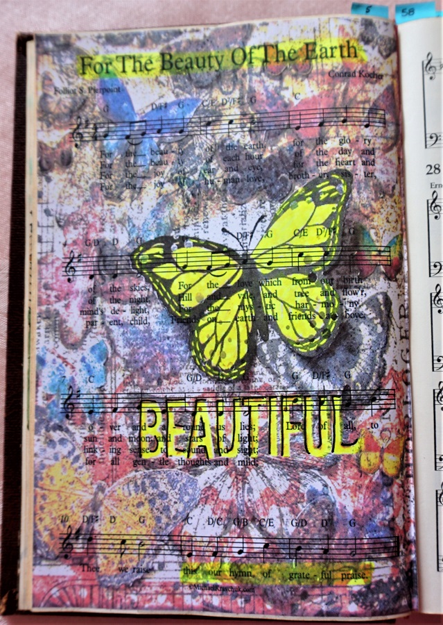
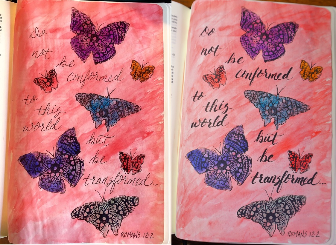
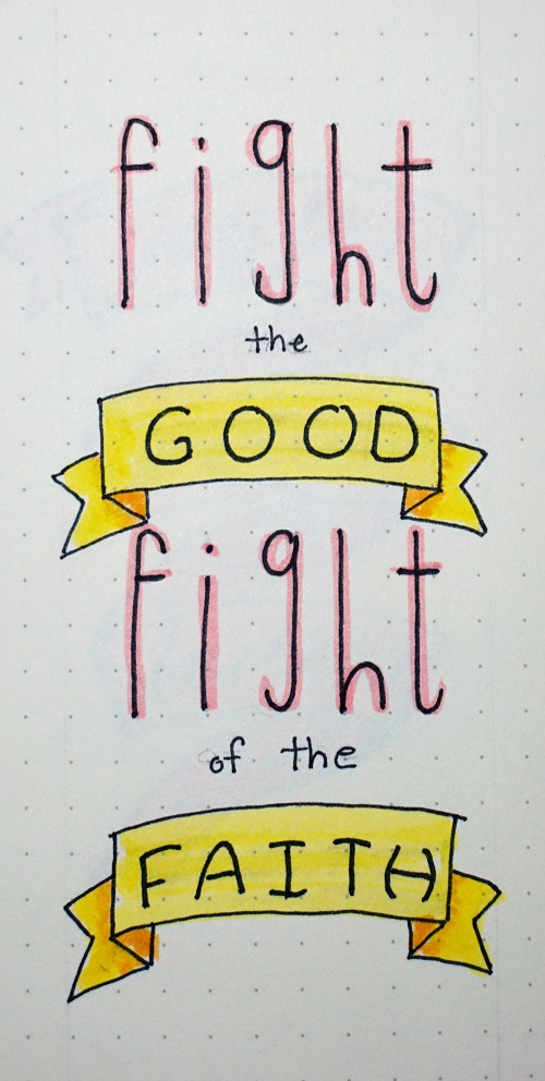
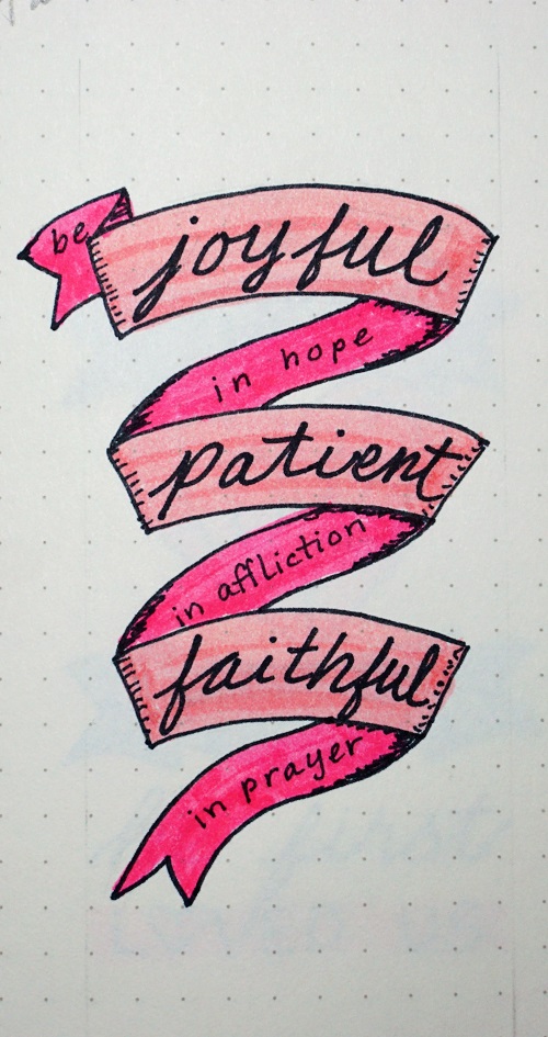
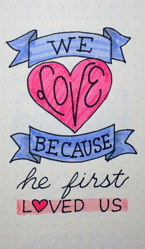
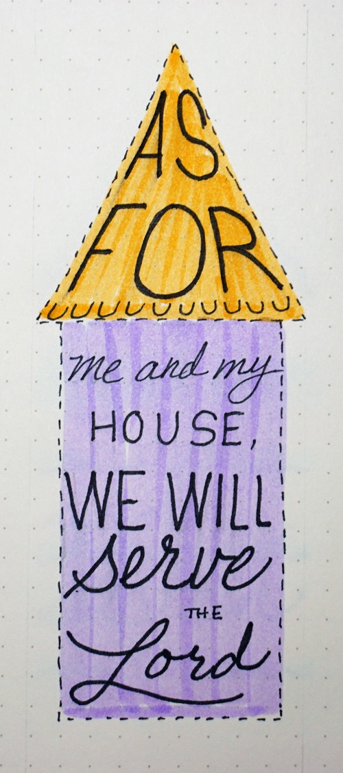
Topic: Bible Journaling
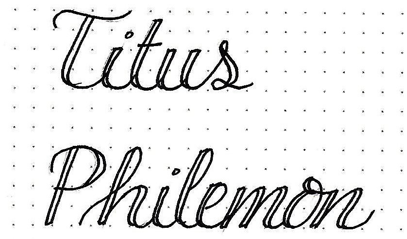
Time for another lettering lesson for use in our Bibles. This time the lessons were in the book of Job. Here are the daily posts:
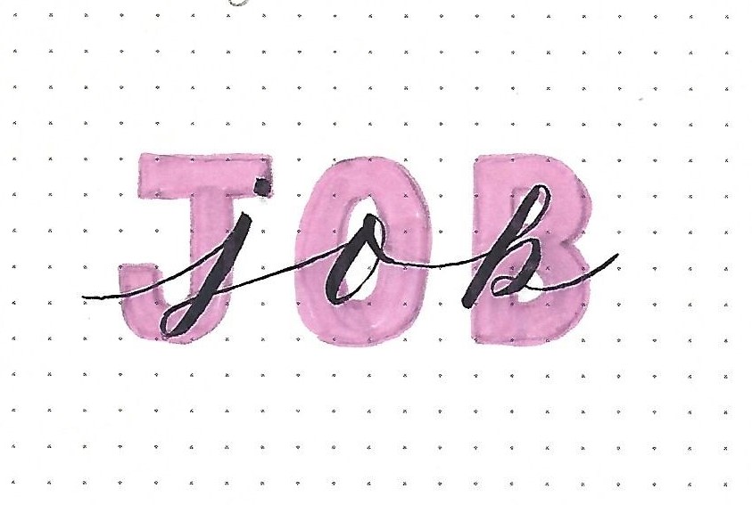
JOB: Day 1 – Stacking Fonts – Intro
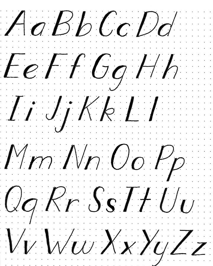
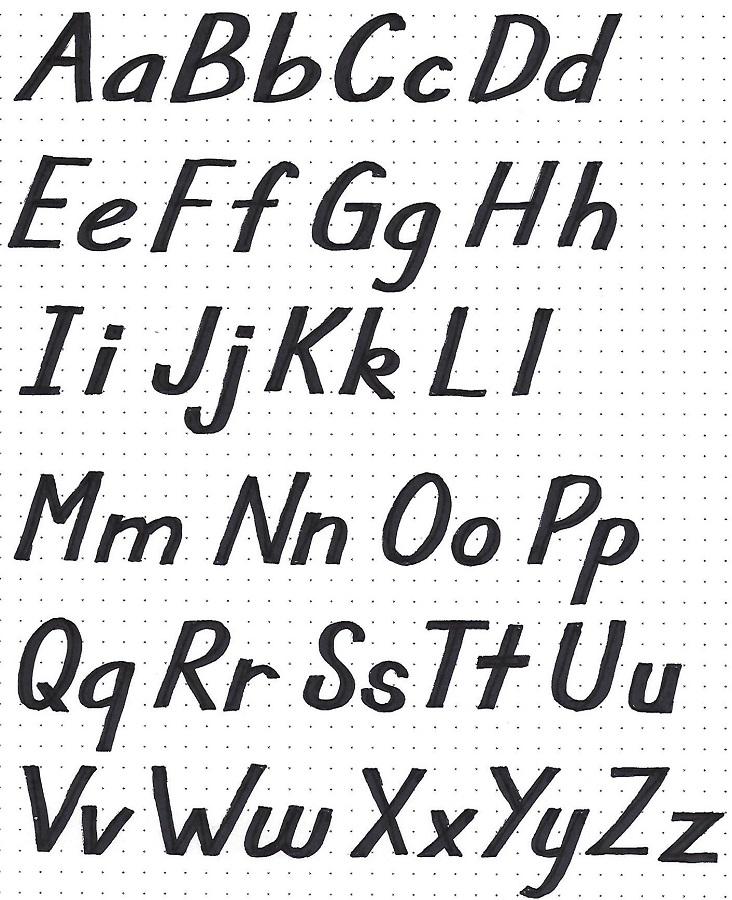
Now that we have advanced through many variations on basic letter structures, we are going to explore combining two styles at a time to create artistic ensembles.
For this introductory piece we will practice with the three letters of the book of Job.
Using pencil, sketch out the three block letters that will become your background. Outline them and color them in a light to medium marker. Erase your pencil.
Now use the pencil again to write one script letter on top of each block letter centering on the vertical. Design smooth connections for the letters. Ink the script letters and add the double lines that change them to faux-brush.
Erase you pencil lines and you have a beautifully designed piece of word art.
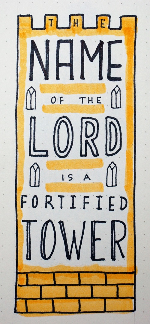
JOB: Day 2 – Stacking Fonts – Two To Try
For this piece, start with block letters but extend the line ends everywhere they cross. This is a design option that we did not study in the progressive series. Ink and erase the pencil. Add faux-brush letters over the corresponding block letter sharing the same base line. Also use faux-brush for the alternating lines.
The serif line works because the serifs mimic the over-strokes on the block letters and because we remain in all-caps.
The final line is also faux-brush but in a smaller scale. The repetition or echoing of similar elements are the means by which we are building continuity.
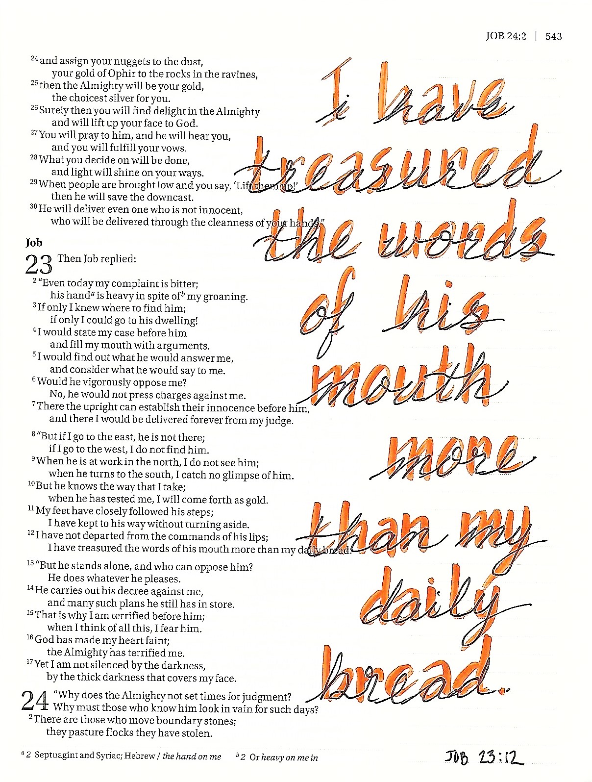
JOB: Day 3 – Stacking Fonts – All Color Combo
For today’s practice piece we are going to switch to a different lettering for the base. We will pencil in some tall basic oval print in sans-serif.
The layered text is no-caps basic script centered in the vertical.
Use a lighter/brighter marker to write the script. Then choose a darker marker to write the print, skipping the lines where they meet the script. This will make them appear to be in the background.
Erase your pencil to see the finished product.
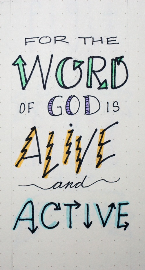
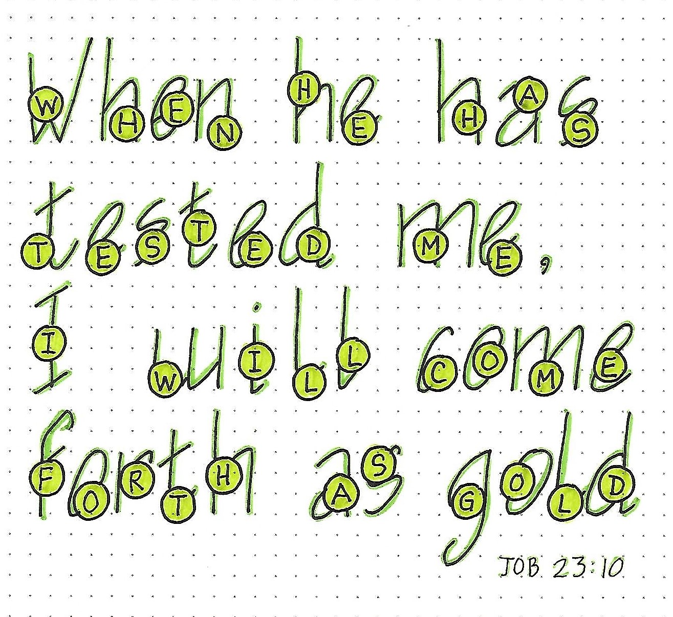
JOB: Day 4 – Stacking Fonts – Novelty Layering
You get a whole different feel by layering ‘architect’ with ‘bubbles’. Pencil in your architect letters in upper and lower case then draw uniform circles in various places on each letter. Inside the bubbles, write the corresponding letter in basic round print in all-caps.
Trace the bubbles and their letters first. Then trace the architect letters only where they appear outside the bubbles.
Erase all the pencil. Color inside the bubbles with a lighter marker and trace the architect letters with a darker value of the same color marker.
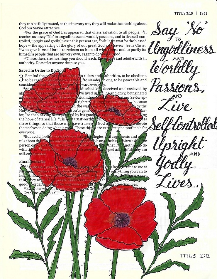
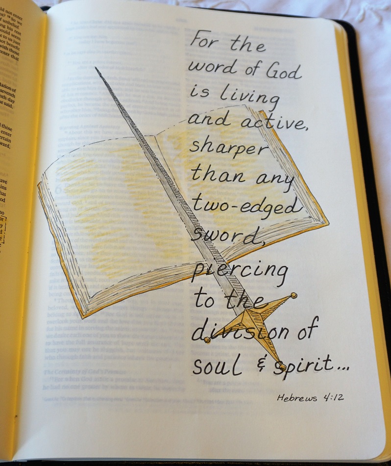
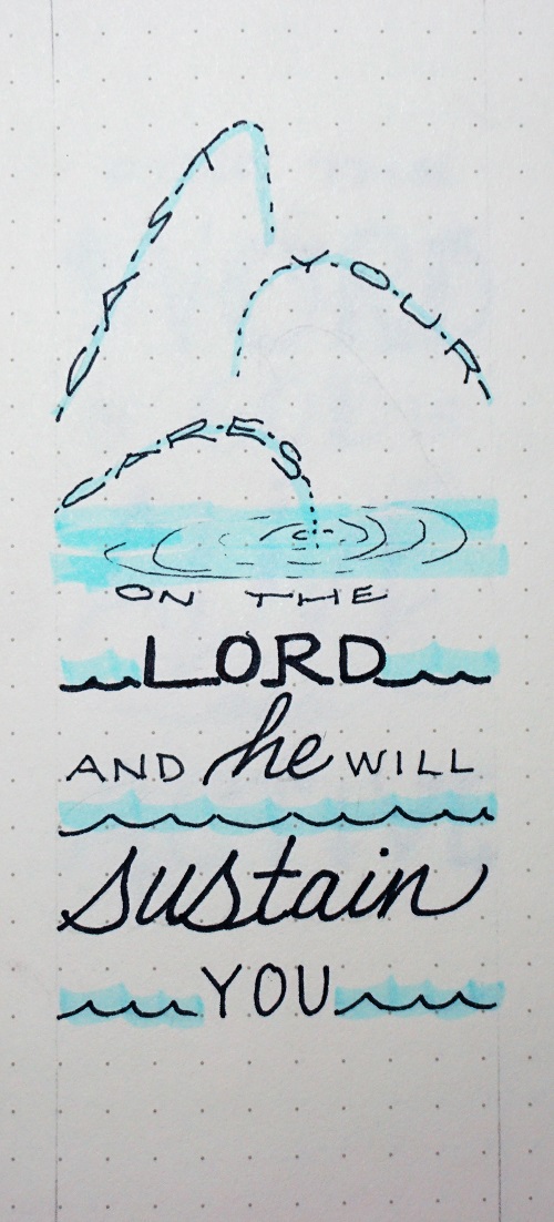
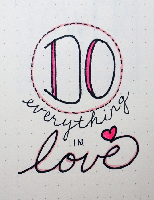
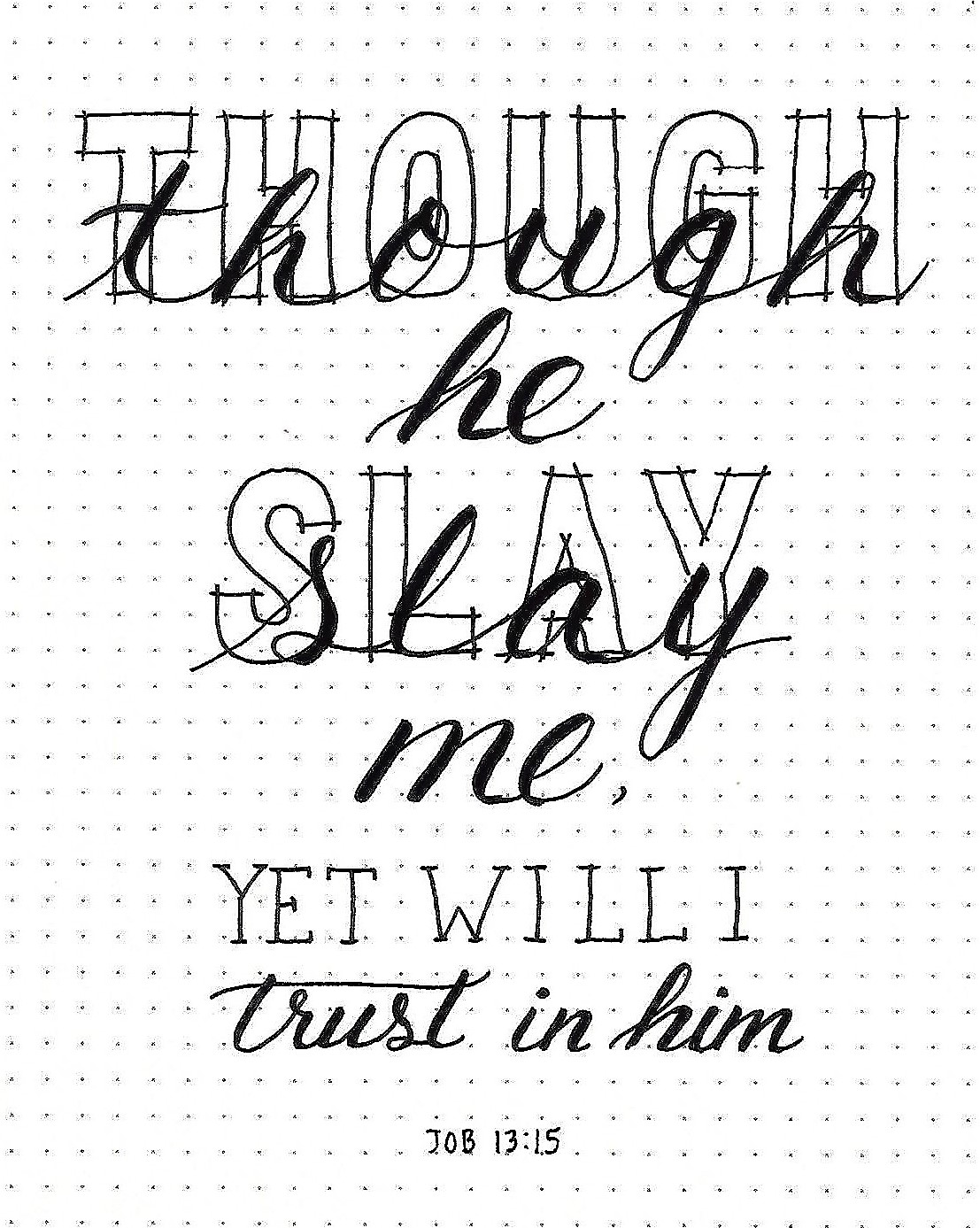
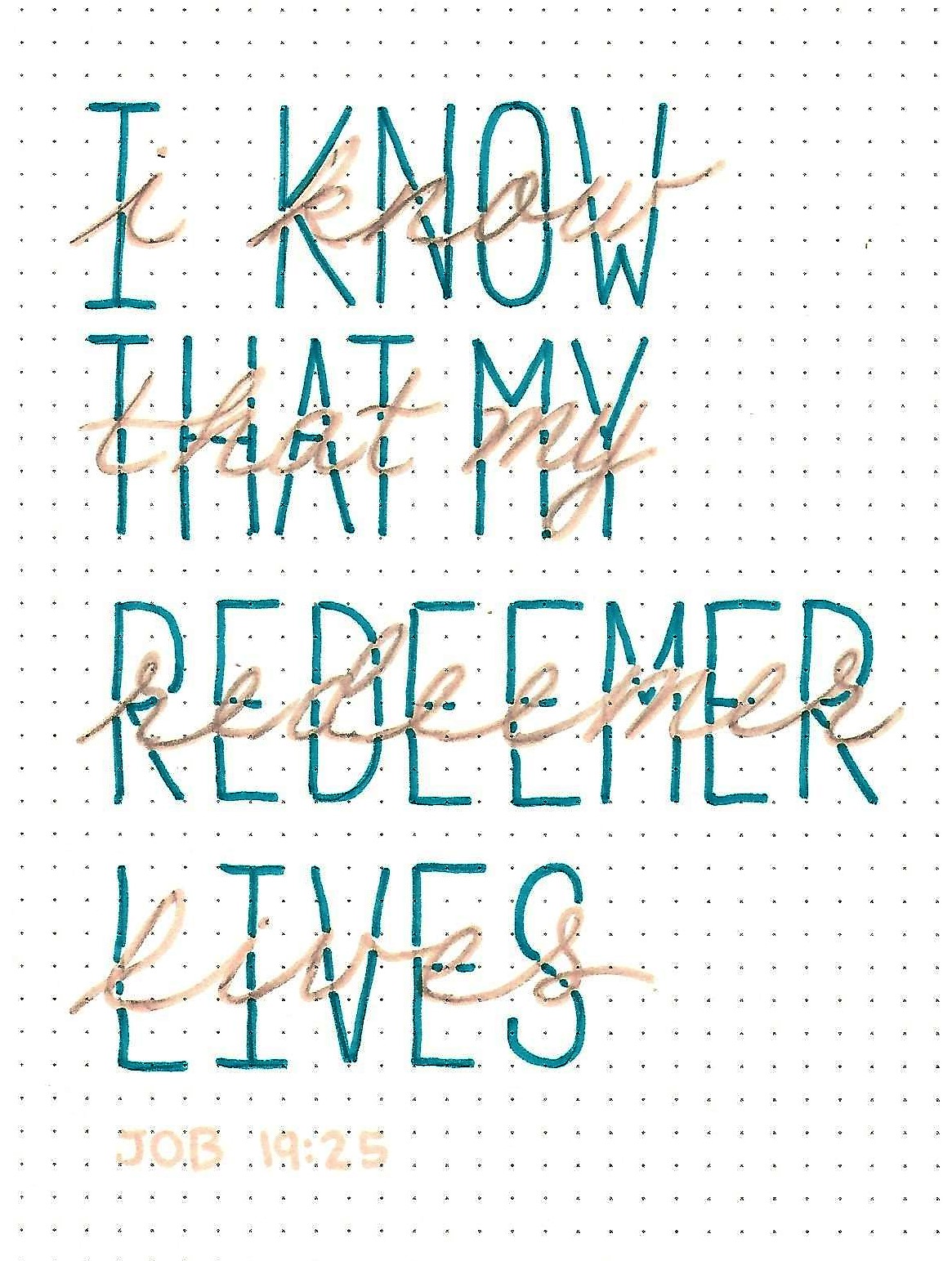
JOB: Day 5 – Stacking Fonts – In Your Bible
For this piece, we will use an architect letter style with thickened downstrokes. This is written in color and the pencil erased.
Over the top we will use a basic script lettering, sharing the baseline with the print.
Notice that in all of the examples this week we combined one print style and one script style so the lettering will not compete.
That was a lot of fun, right?
Ddd