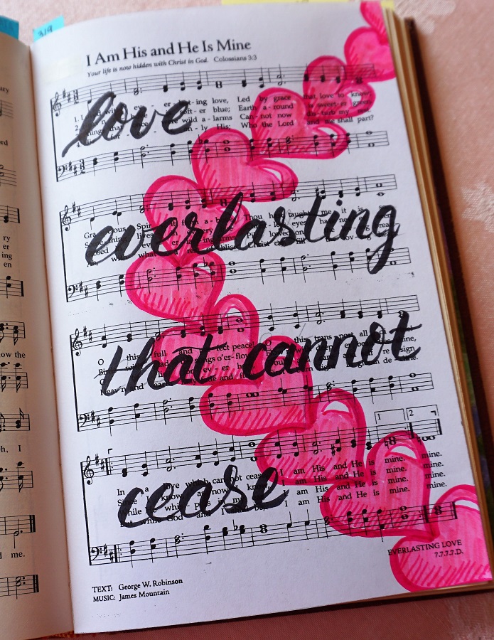
Topic: Bible Journaling
I find it hard to believe that this is week 30 of this progressive learning of lettering series. But, because many weeks (like this one) contain more than one alphabet, I have totally lost track of the total number that have been taught. Here are the daily lessons for this week:
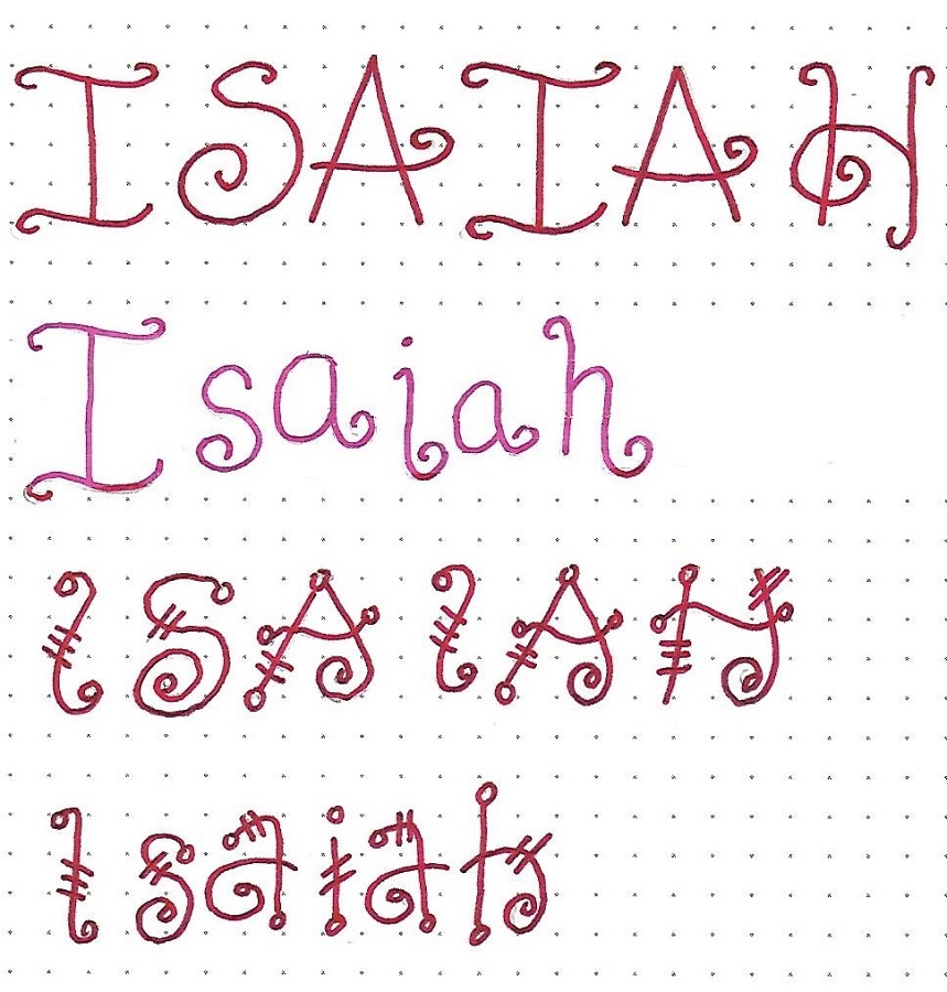
ISAIAH: Day #1 – Quirky Prints – Intro
We are going to work with a couple of quirky print styles this week. In this introductory piece you will find the book of Isaiah written out in each using an all-caps and an upper- and lower-case.
The styles are similar with their curled ends but the letter forms often change up. The first letters are closer to standard print and the second alphabet adds open circles to the line ends and hash marks on the long lines.
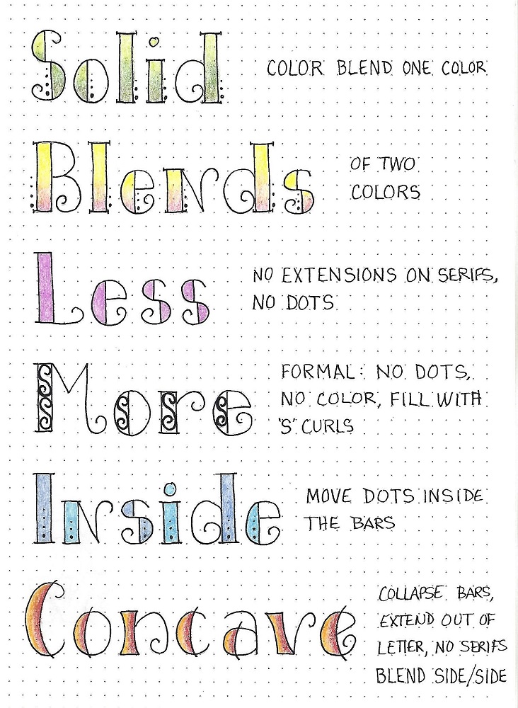
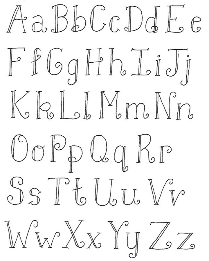
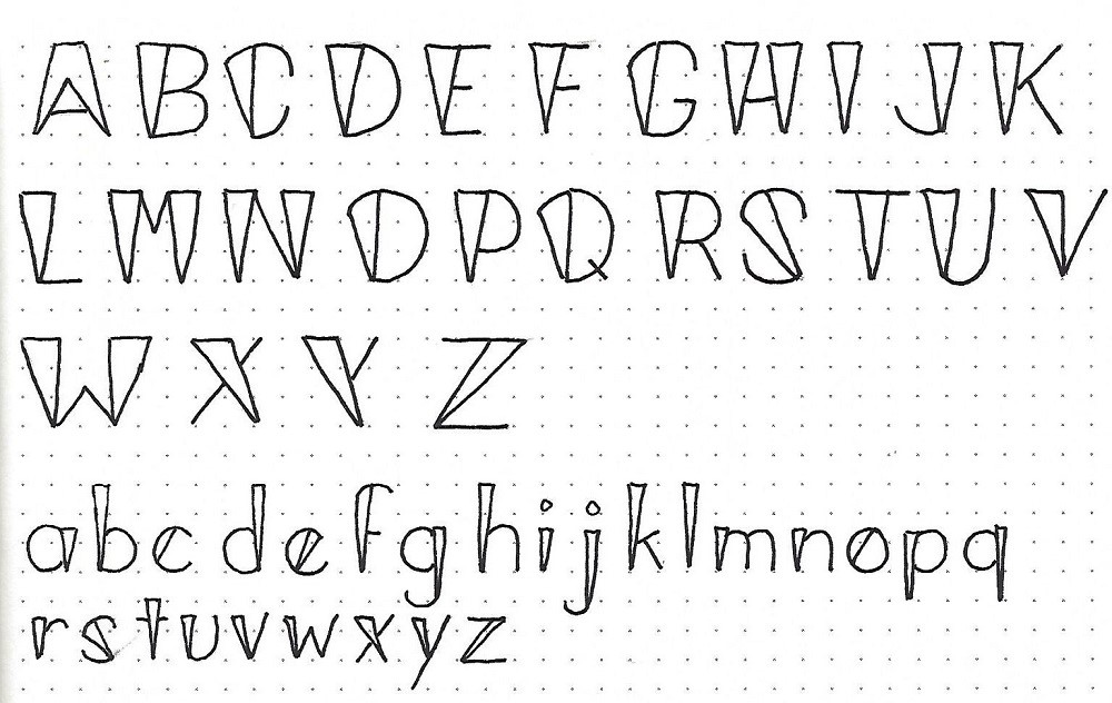
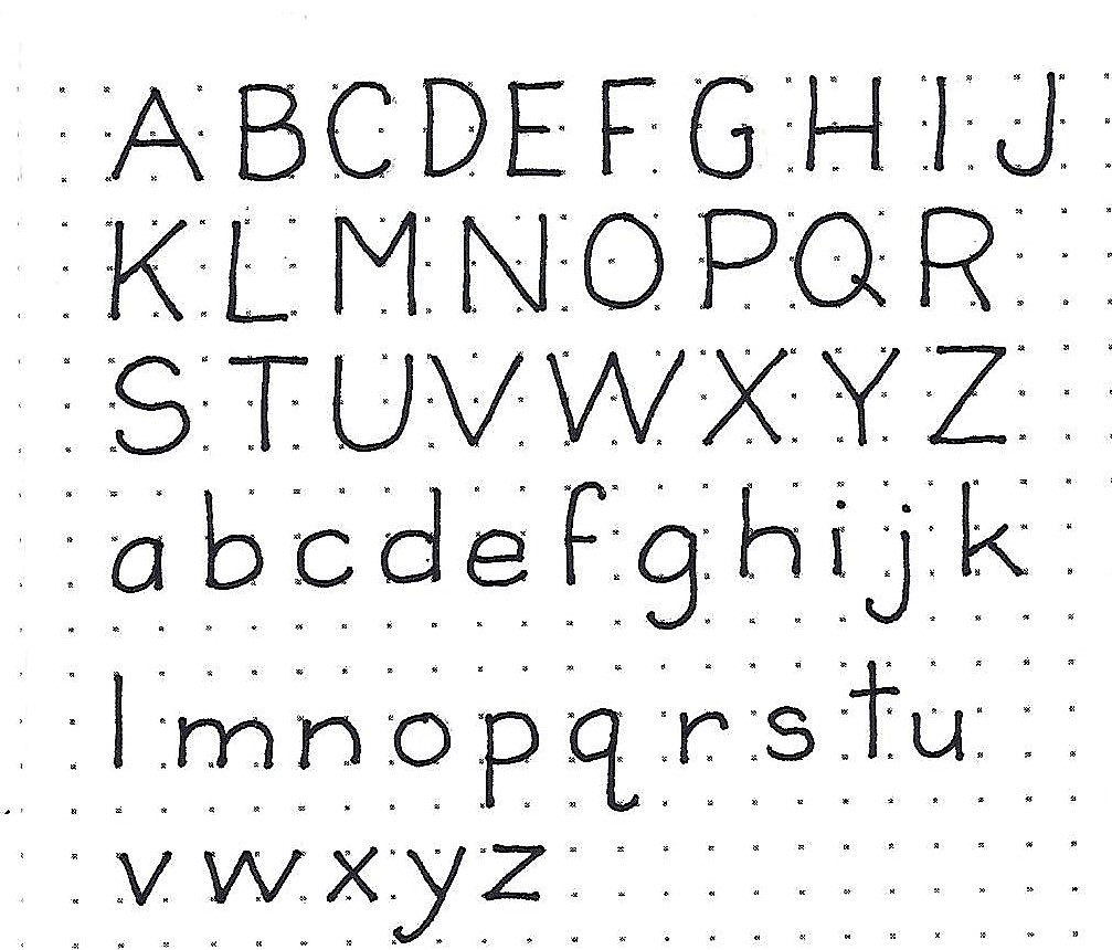
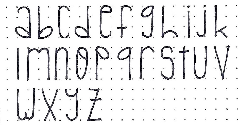
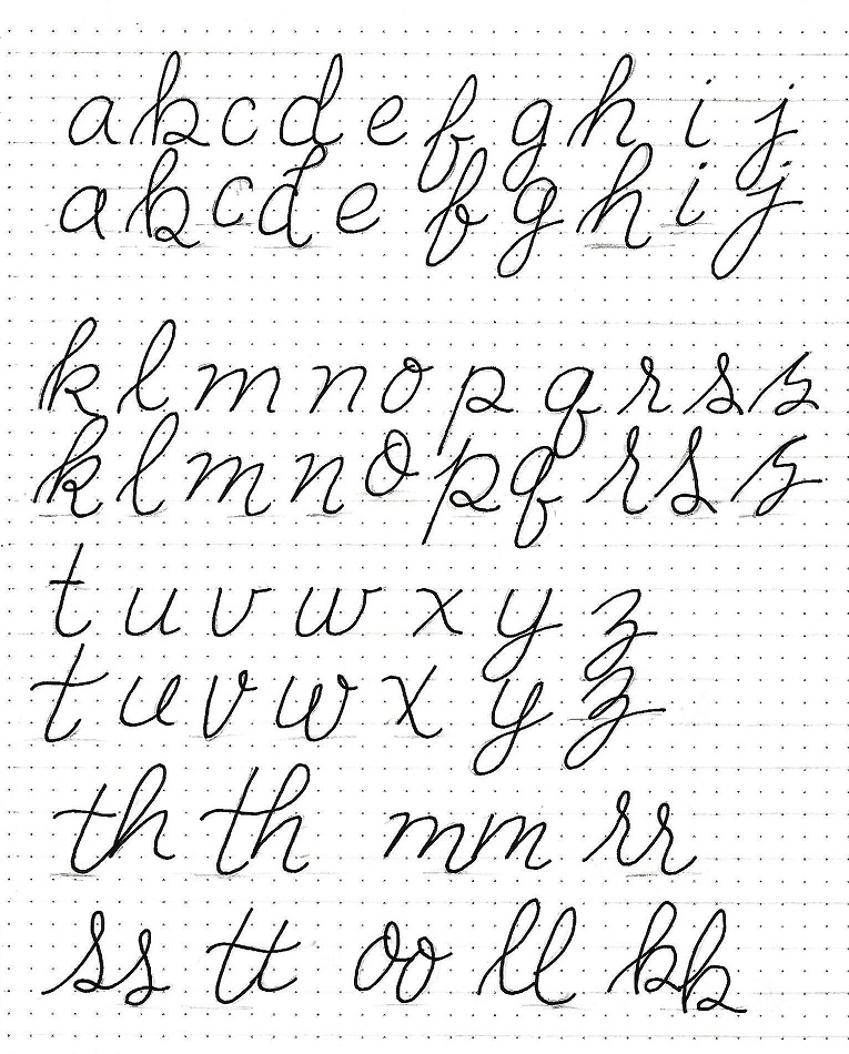
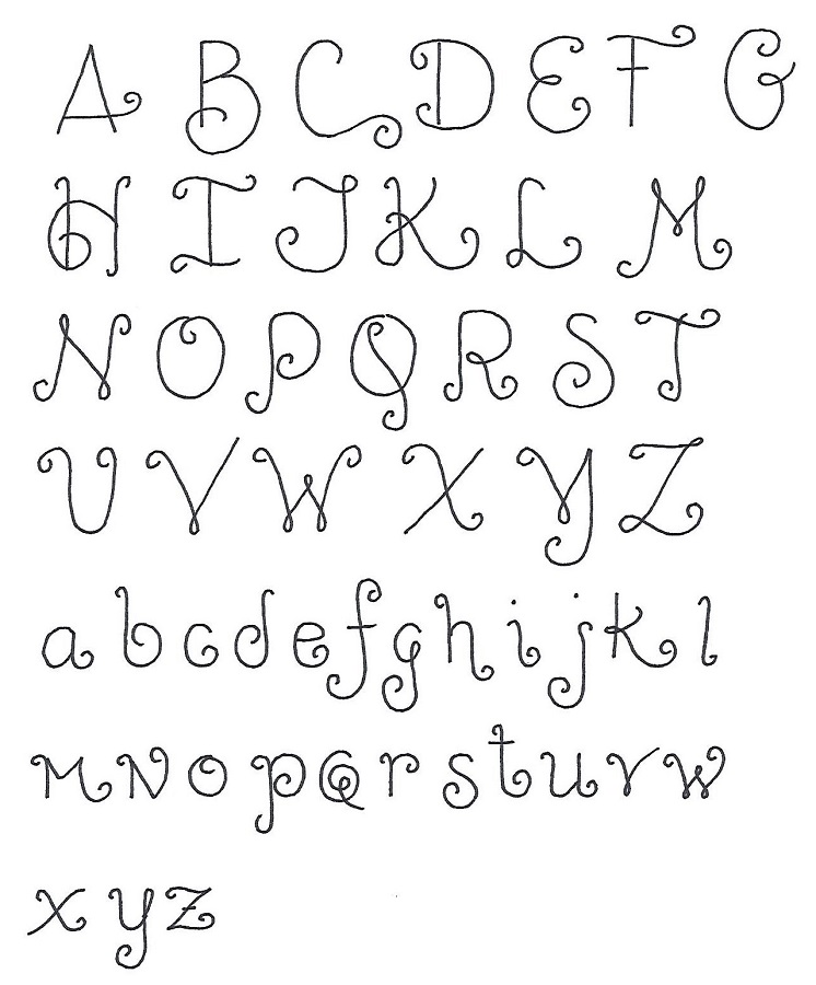
ISAIAH: Day #2 – Quirky Prints – Alphabet 1
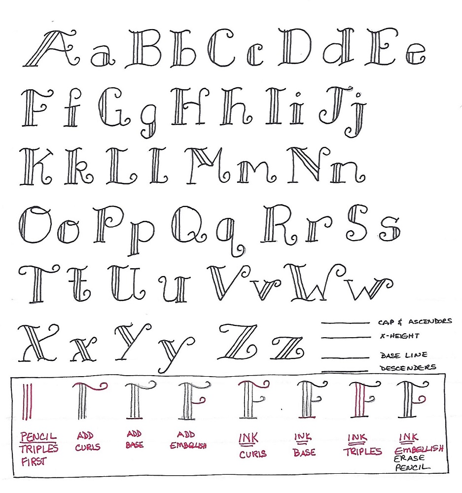
This is the full alphabet for the first of our quirky prints. Get relaxed with those sweeping curls on this casual style.
Although the sample shows the lower-case smaller, the actual size of it is ½ of the full letter height. I made them smaller to conserve space on my paper! Also, note that the letter forms sometimes break out of the confines of their normal baseline and ascender lines. To demonstrate this, draw in a baseline and ascender on the sample.
In use on a project, this is a good alphabet to bounce off the baseline for added interest.
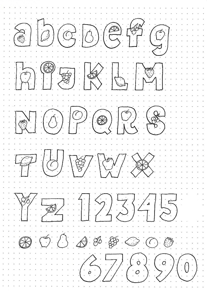
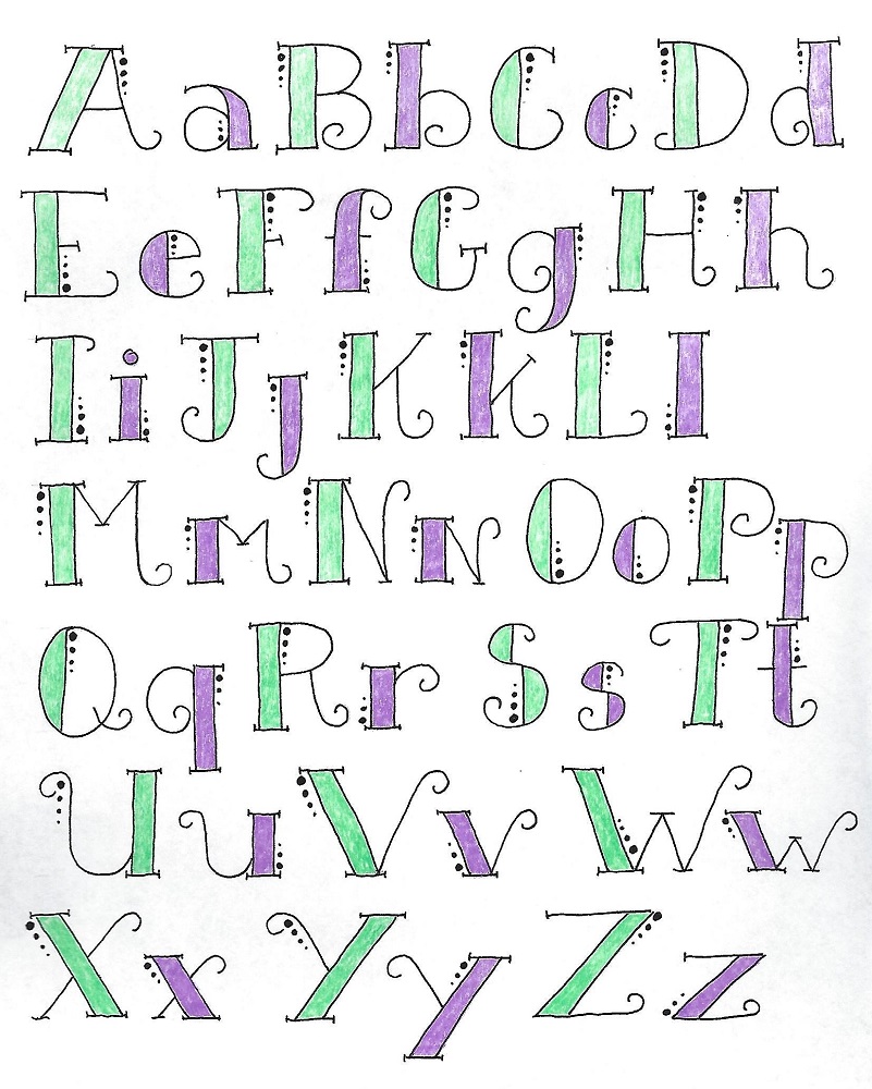
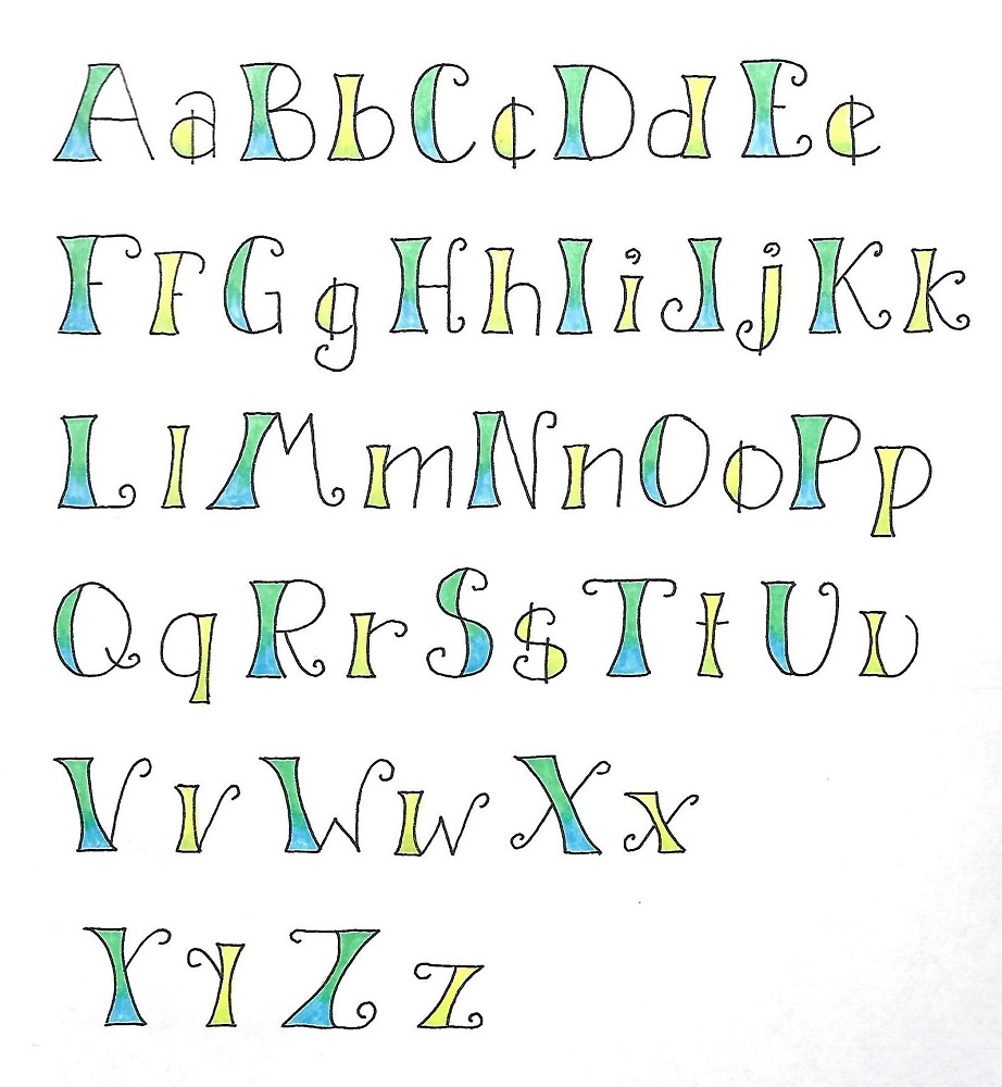
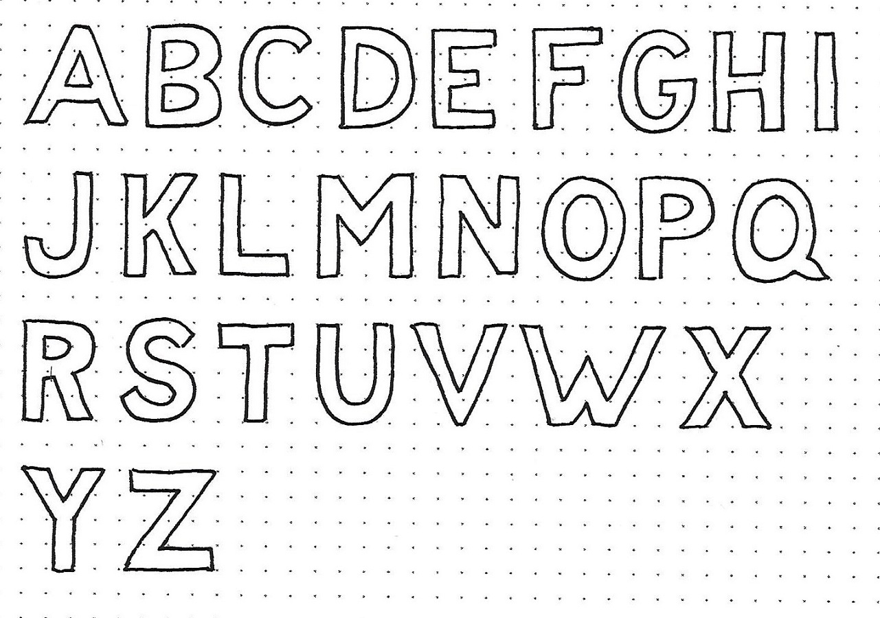
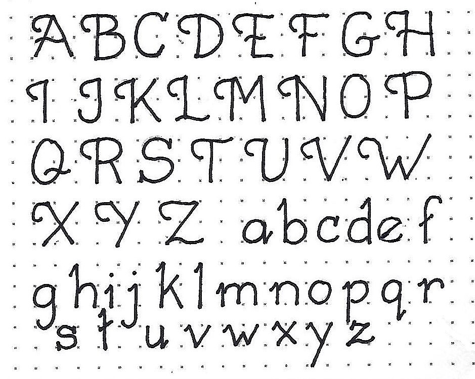
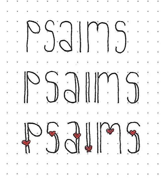
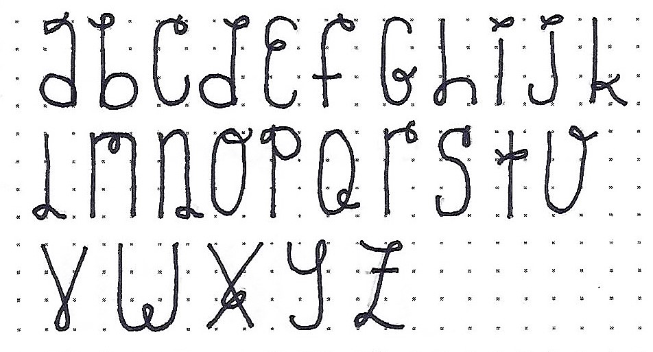
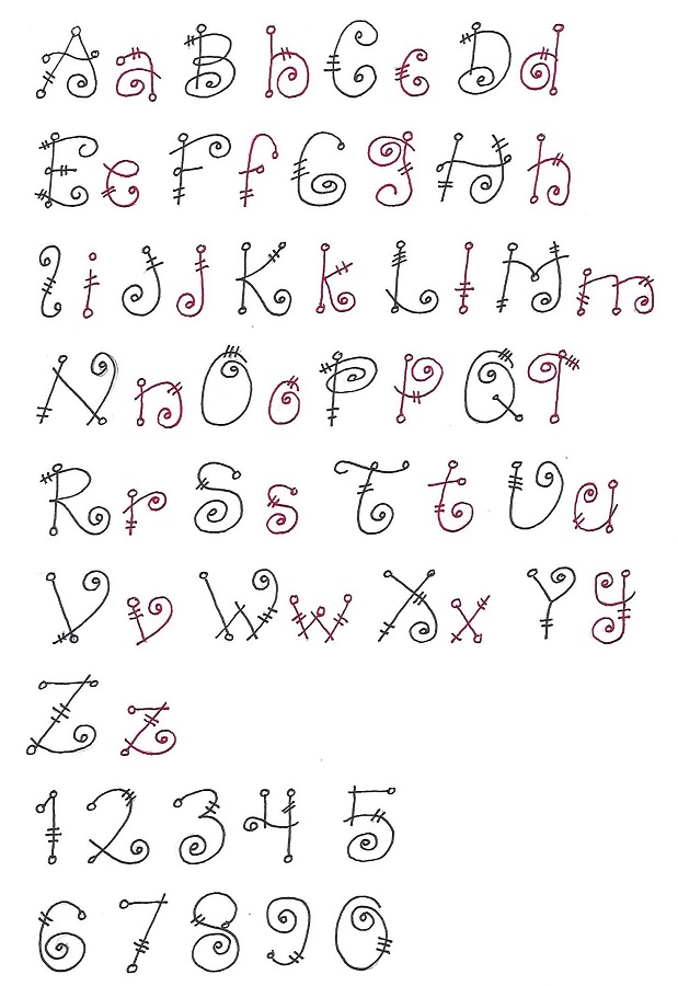
ISAIAH: Day #3 – Quirky Prints – Alphabet 2
The second alphabet is similar to the first but many of the letter forms are changed (see the ‘a’ in both alphabets). In addition, the curls end in little open circles as do many of the other lines. We also add two or three hashmarks on the letters for a little ‘zippiness’.
I used black and red pens to differentiate between the capitals and lower-case letters. AND you get a set of numbers to go with them.
This font also looks great when bounced off the baseline.
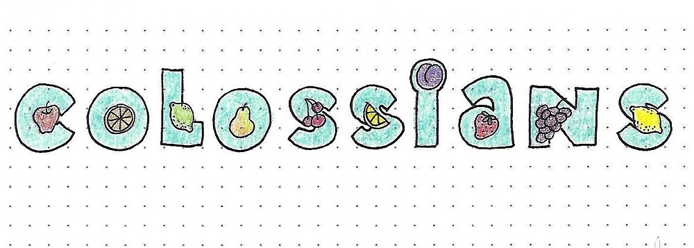
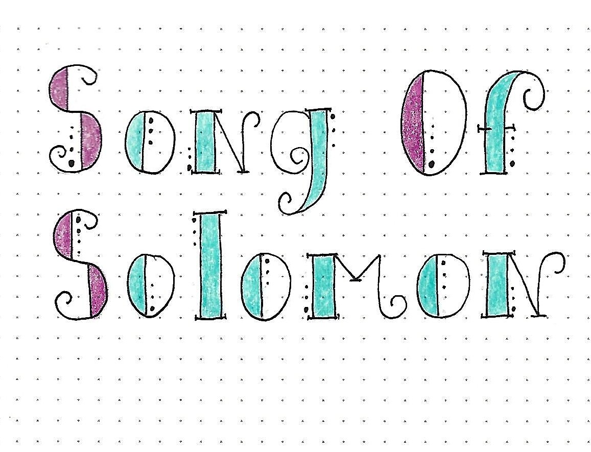
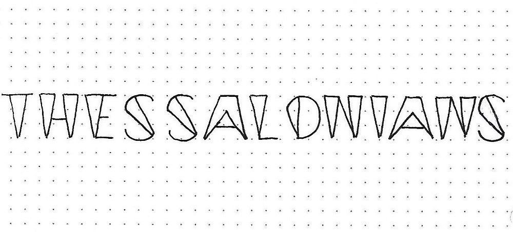
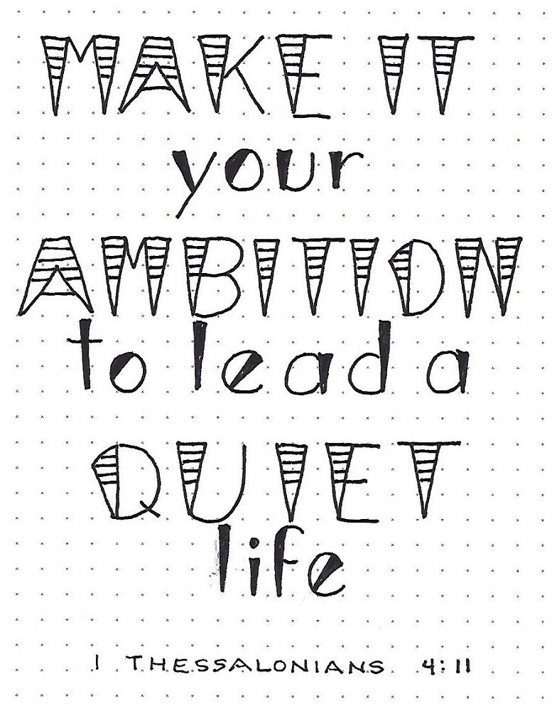
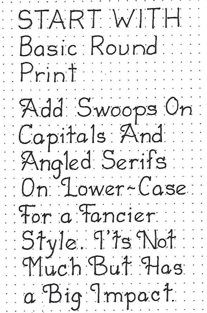
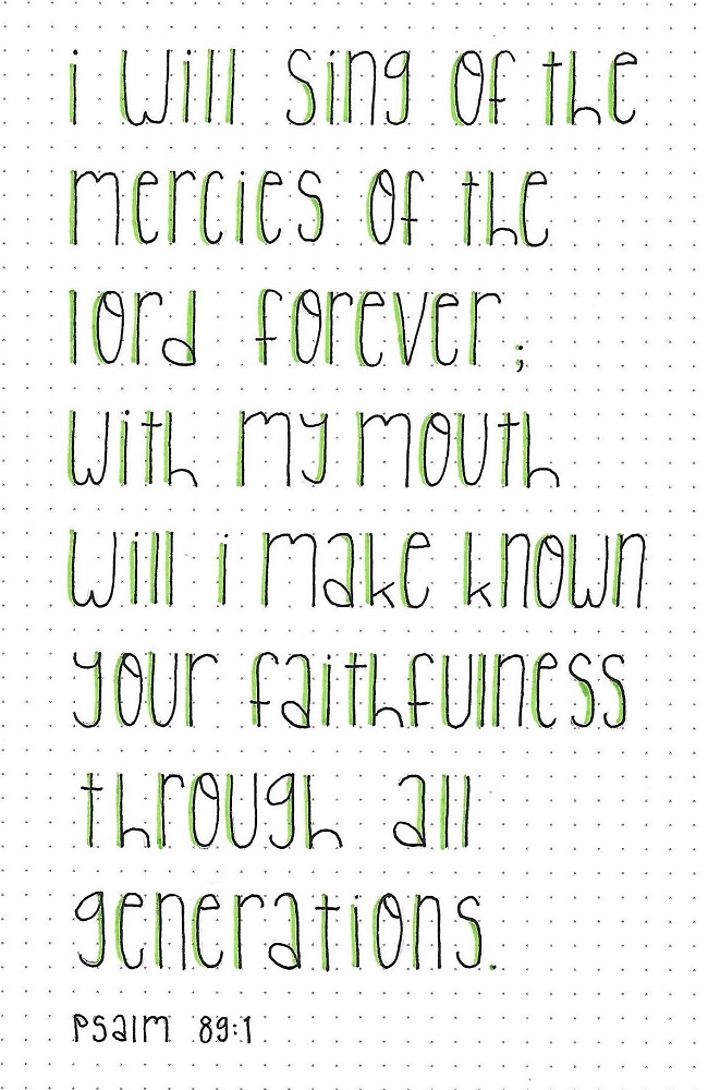
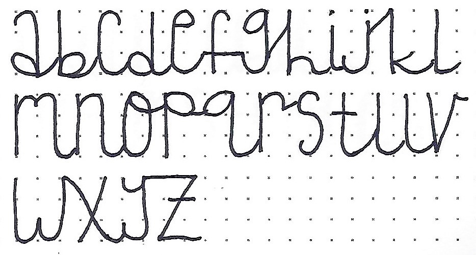
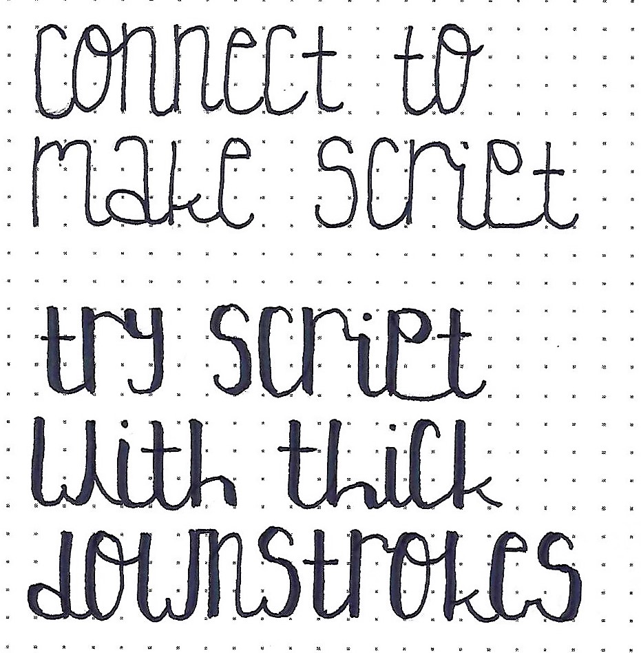
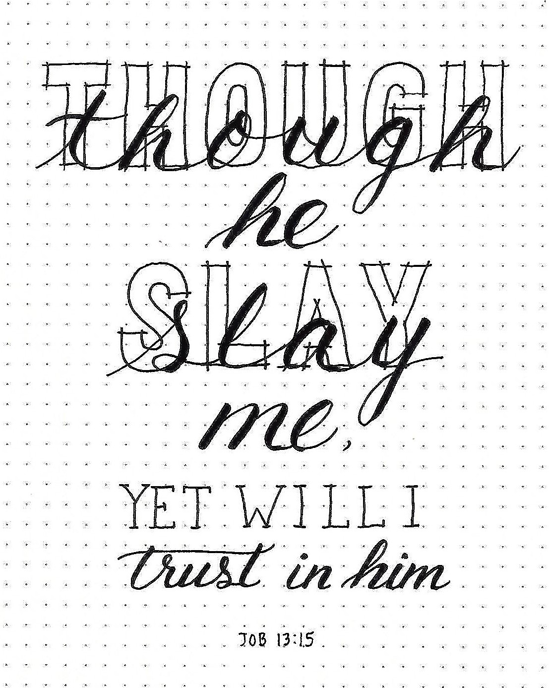
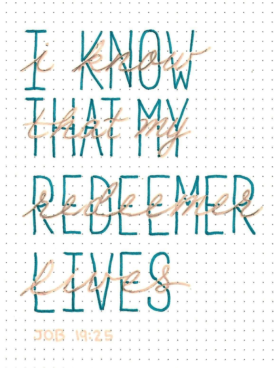
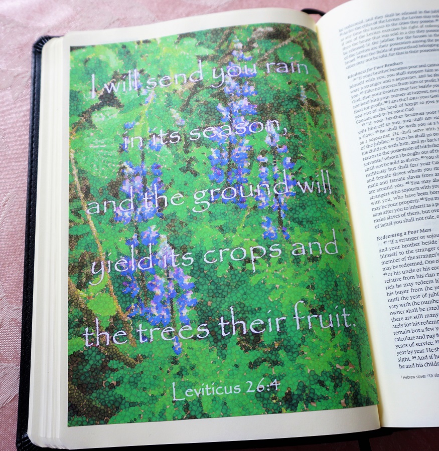
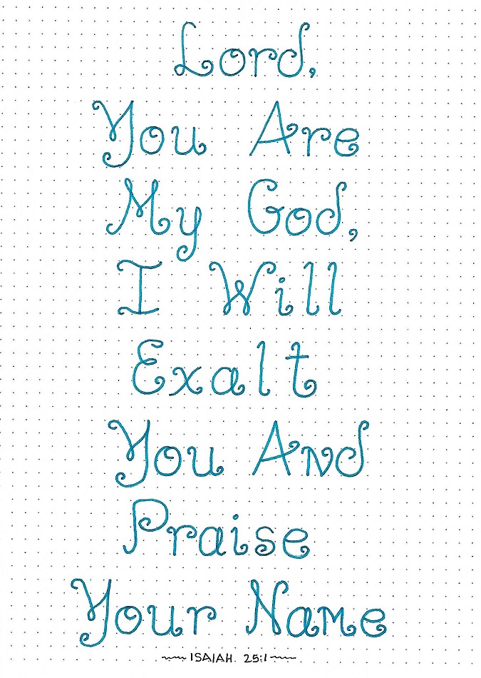
ISAIAH: Day #4 – Quirky Print 1 – Writing Scripture
Today we will practice using one of the new alphabets to write scripture. I used the first form introduced and kept it more formal by maintaining the baseline.
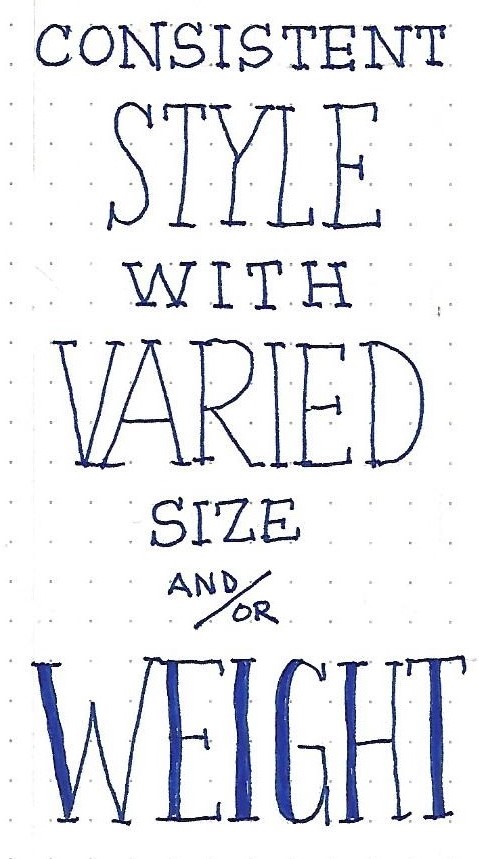
Note the change in the letter ‘Y’ where I shortened the main ‘v’ of it. Remember, you can always make an alphabet your own by editing the letter forms to suit yourself. Just remember to use them consistently throughout your piece.
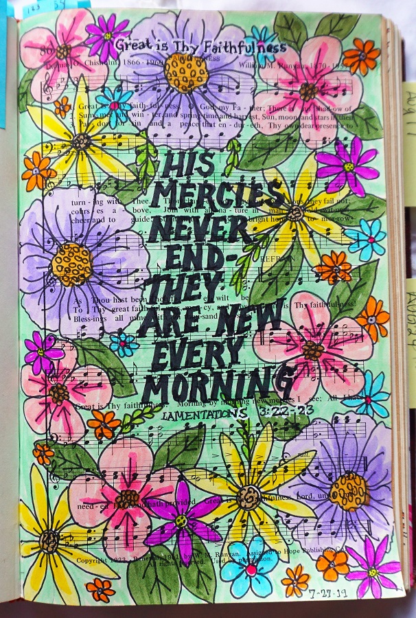
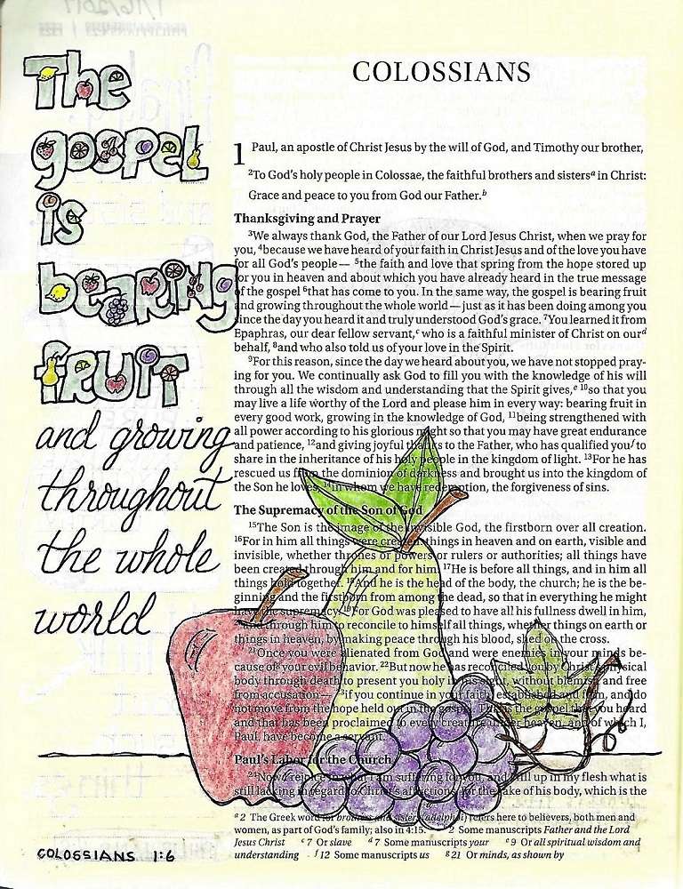
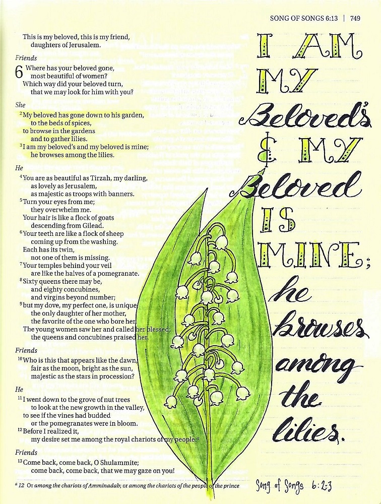
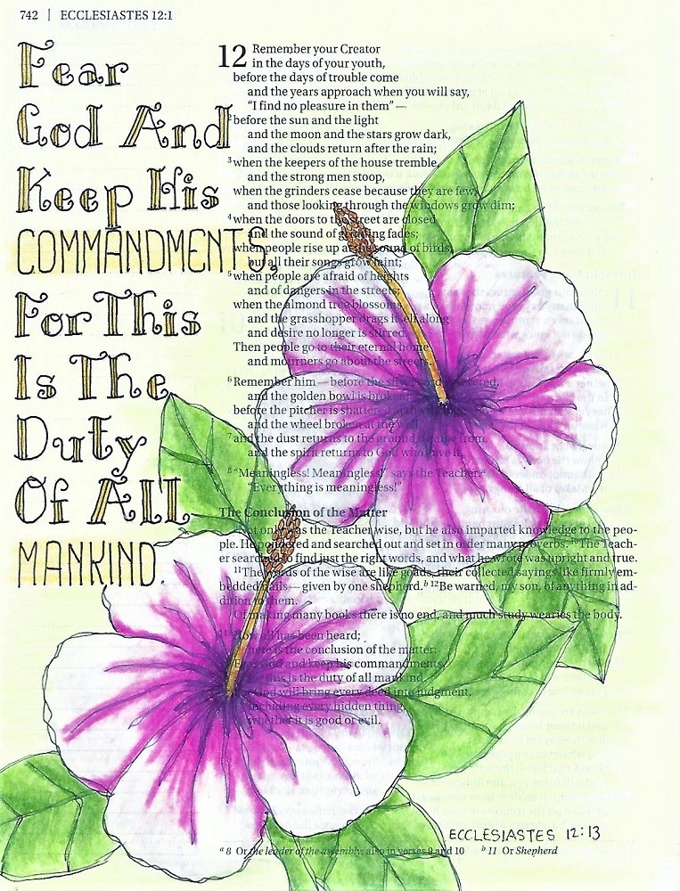
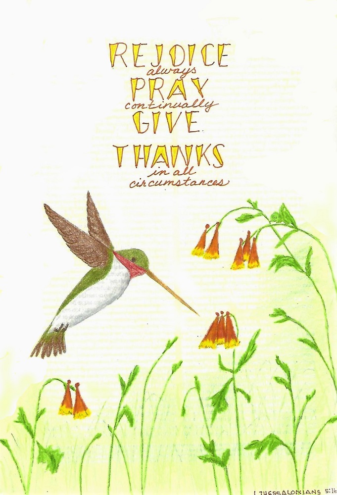
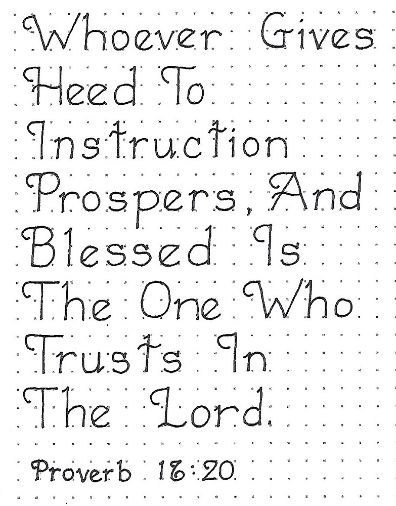
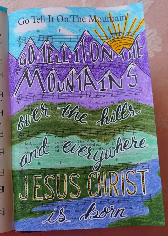
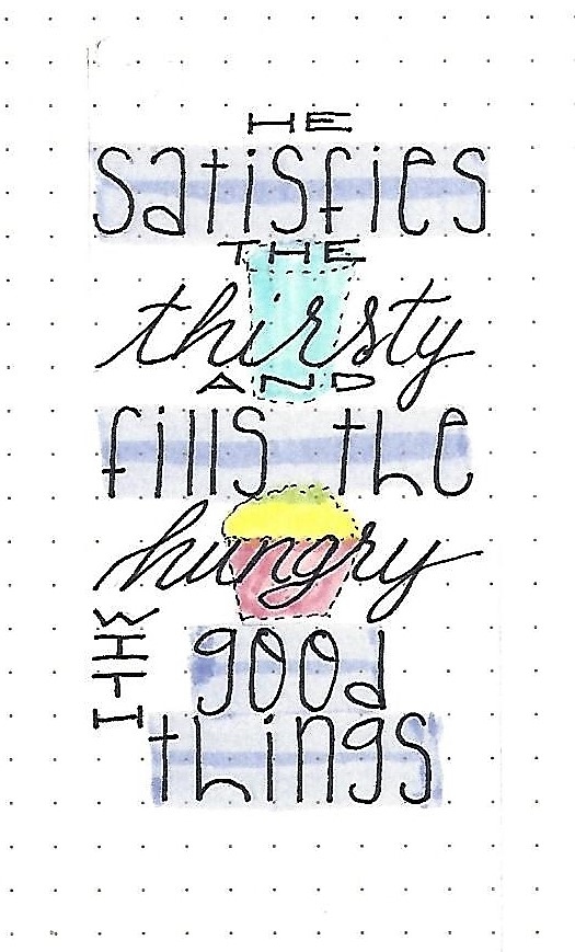
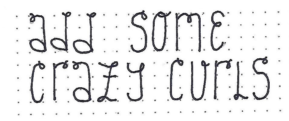
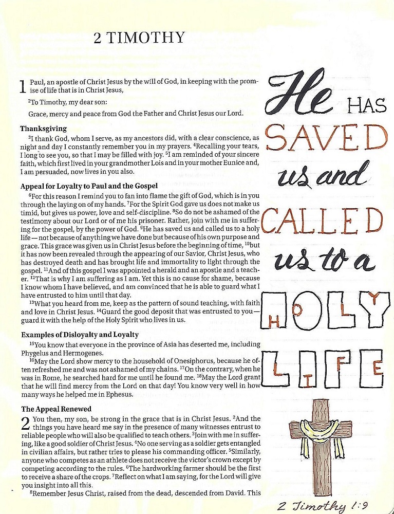
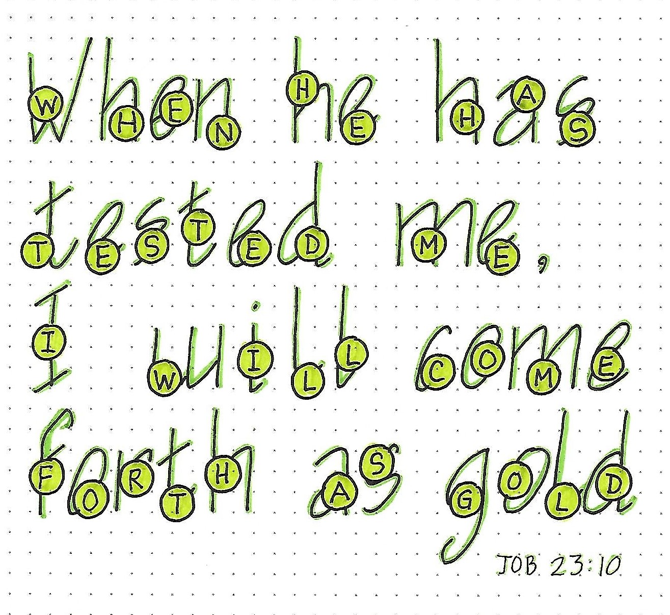
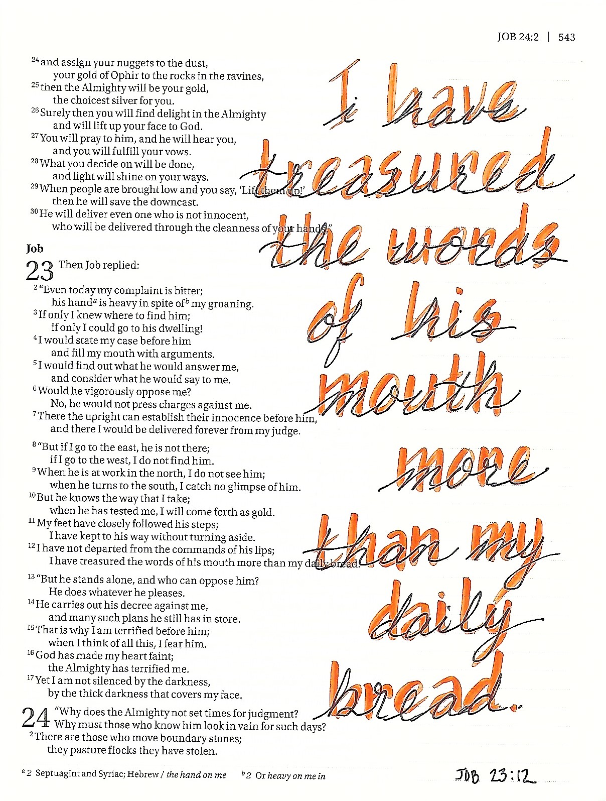
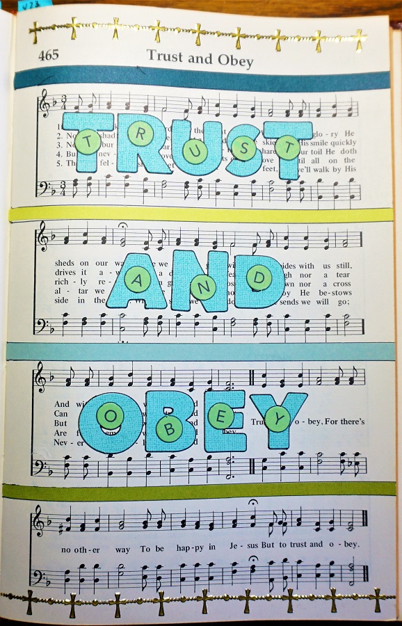
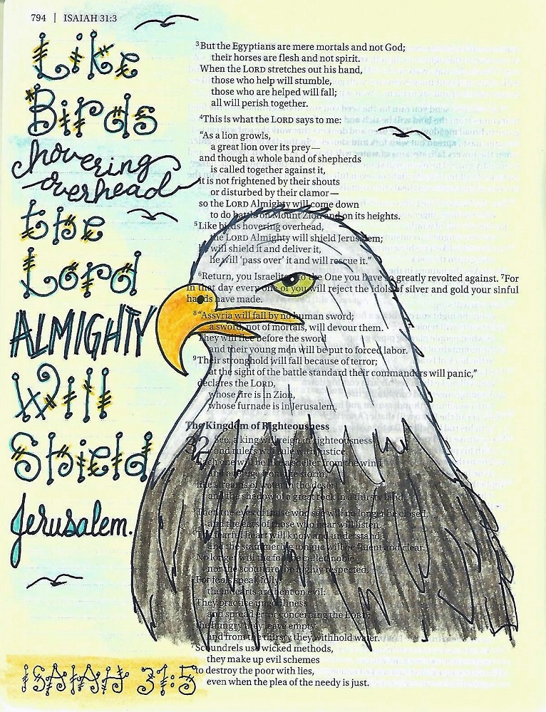
ISAIAH: Day #5 – Quirky Print 2 – In Your Bible
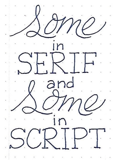
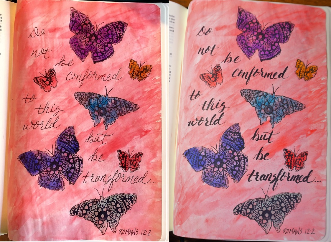
Whichever of this week’s alphabets you did NOT use yesterday will be used today in your Bible. This alphabet 2 combines nicely with a casual script, a sketchy double-lined print and a controlled formal script.
I used different coloring on the various parts of these letters, echoing the colors in the drawing.
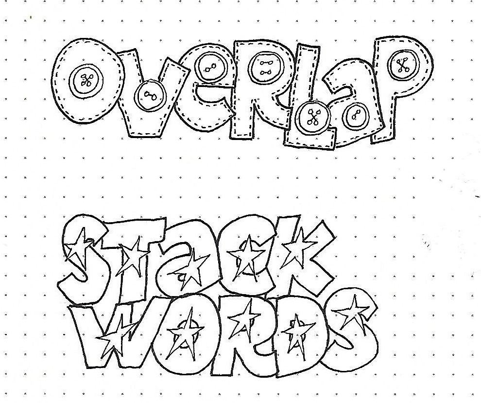
Quirky letters, indeed! Right?
Ddd