« September 2019 »
S M T W T F S
1 2 3 4 5 6 7
8 9 10 11 12 13 14
15 16 17 18 19 20 21
22 23 24 25 26 27 28
29 30
You are not logged in. Log in
Entries by Topic
All topics  «
3D paperwork
A - Z challenge 5
A - Z challenge 7
A - Z challenge round 4
A to Z challenge round 3
A to Z round 2
A to Z round 6
A-Z round 1
Around the House
Art Challenges
Artist Trading Cards
Backgrounds
Beads
Bible Journaling
Books
Boxes
Collage
Color Challenge
Coloring
cookbook
Die Cuts
Digital Projects
Digital Stamps
Drawing
Dry Embossing
Fabric Stuff
Fantastic Folds
Field Trip
Home Decor
How Does Your Garden Grow?
Hymnal Art
In The Kitchen
In the studio
Jewelry
Lettering
Links
Multi-Technique
Music to Work By
Musings
Nail Art
New Work
Online Class
Other Hobbies
Other Projects
Painting
Paper Embroidery
Paper Piecing
Photo
Pretty Paper
Quilting
Random
reading
Scrap Recovery
scrapbooking
Sewing
Sketch Challenge
Some Backlog
Stamping
Stencils
Stickers
Supplies
Teabag Folding
Techniques
Testing
tips and tricks
Tutorial
Web resources
Welcome to my Blog
Work By My Friends
workflow
Writing
Blog Tools
Edit your Blog
Build a Blog
RSS Feed
View Profile
Group One
In & Out of Studio 3D
Thursday, 19 September 2019
Broken Bars
Topic: Quilting

I had a quest: 1) find a pattern for a set of fabric rolls I had acquired 2) find a use for a little scenery panel that came from someone's stash 3) make a quilt as a gift for a guy (no frou-frou!). When I came across this pattern in an old magazine I knew I had the solution.

Unfortunately the fabric rolls were not going to stretch to fit the layout so I set out searching my stash for coordinates and cutting more 2.5 inch strips from them.

The fabric panel was not quite large enough to equal one of the pieced blocks so I used a batik to frame it up to fit.


I used a different pantograph roll (with oak leaves and acorns) to quilt this, carefully working around the panel rather than over top of it. Then I did free-hand quilting on the scene - following along the outlines of hills, houses and fences.


The quilting was completed in dark green as it blended well with all of the colors in the piecing.


This will shortly be on its way to the new owner.

Ddd


Posted by studio3d@ccgmail.net at 12:01 AM PDT
Wednesday, 18 September 2019
And Four More Days...
Topic: Lettering

More lettering today from the 30 Days of Bible Lettering challenge:

September 15 - Proverbs 16:3


September 16 -Matthew 5:44


September 17 -1 Corinthians 10:31


September 18 -Romans 5:8


 Many of these are using lettering styles I have taught here.

Ddd


Posted by studio3d@ccgmail.net at 12:01 AM PDT
Tuesday, 17 September 2019
Asian Dreams
Topic: Quilting

At a yard sale last year I picked up a variety of Asian fabrics. They were from a sample pack so the sizes varied. I set these aside while keeping an eye out for just the right pattern that would have a feel of asian design but would look good with the scrappy look of mixed fabrics.

When I saw this pattern in an advertisement for a fabric line in a magazine, I immediately knew that it was the one.

I cut it so that there are NO DUPLICATE fabrics in the whole thing. There are some with the same design but in a different colorway from the fabric line so they coordinate.

I made the top while on a quilting retreat in June and set it aside to do on the longarm machine. But I wanted to have lots of practice under my belt so I would not ruin it. I found a pantograph roll that was included in the things I got delivered with the longarm. Perfect!


Here is a closer photo of the quilting.


I found great prints to use for the borders, backing and binding - all having some gold pattern overlaying them. This coordinated with the golds featured on the prints.

Ddd


Posted by studio3d@ccgmail.net at 12:01 AM PDT
Monday, 16 September 2019
Does Jesus Care
Topic: Hymnal Art

The assigned hymn to work on this week was 'Does Jesus Care'. Of coourse we KNOW he does and this song confirms it.

I didn't want to have to do a truly photographic version of a face so I found a photo of a sculpture which automatically gave me a gray-scale image. I drew the defined lines with Prismacolor marker and did all the shading with regular graphite pencil.


I may need to spray this with a fixative to keep it from smearing.

Ddd


Posted by studio3d@ccgmail.net at 12:01 AM PDT
Sunday, 15 September 2019
Hooray For Hosea
Topic: Bible Journaling

On we go with lettering lessons every week. This week we are up to Hosea with these lessons:

HOSEA: Day #1 – Overstated Serifs – Introduction

The base shapes for this new lettering style come from the Basic Oval Print. From there, double lines have been added and the serifs are hugely overstated.

This sample uses a letter height of 5 units with an x-height of 3 units. Other options will be explored as we progress through the week.


HOSEA: Day #2 – Overstated Serifs – Alphabet

This page of letters was done without the dot-grid paper. This will help you get a feel for the letter relationships which is much more important than having exact measurements. For example, you may wish to have the double lines wider or thinner, you may want the actual letters wider or thinner, or you may want the x-height to be higher or lower. Make it your own! You can write up the alphabet with any of these options knowing that you can change to a different formula when you use it in a project. Color is optional at this stage.


HOSEA: Day #3 – Overstated Serifs – Options

Today we are going to incorporate some of the changes we discussed yesterday. So write out the words that describe the options being demonstrated.

This is a great font to use with simple pattern doodles, to experiment with color, to toss about off the baseline and to mix cases. You can also experiment here with those size variations. If you think of more options, write them out and give it a try.


HOSEA: Day #4 – Overstated Serifs – Scripture Work

Use one or more of your variations (or the original alphabet) to write up a scripture from Hosea. I am loving those curls on the descenders of the y and g, the tails of the R and the arms of the f and r.

Don’t forget to use capitals on all of the initial letters of the words. It adds continuity and gives you more practice on the upper-case.


HOSEA: Day #5 – Overstated Serifs – In Your Bible

For my bible page I varied the letter sizes slightly, tossed them off the baseline and colored them with a range of teals and blues. I combined the verse in Hosea with the lesson from the Drawing Room (raindrops).


And in the drawing lesson for the week, I taught them how to do the raindrops!

Ddd


Posted by studio3d@ccgmail.net at 12:01 AM PDT
Saturday, 14 September 2019
Four More
Topic: Lettering

Time for four more days of the 30 day bible lettering challenge.

September 11 - Romans 12:12


September 12 -1 Thessalonians 5:15


September 13 -Isaiah 40:29


 September 14 -Romans 8:31


Almost halfway done with the challenge now.

Ddd


Posted by studio3d@ccgmail.net at 12:01 AM PDT
Friday, 13 September 2019
A Chain Of Diamonds
Topic: Quilting

I made this quilt top this summer and got it sandwiched back in June. I was prepared to do the quilting on my domestic machine but set it aside for other stuff. Then I got the longarm machine and figured I would do the quilting on that.

Well, two issues with that: 1) I had spray basted the three layers together so I wouldn't be able to do the standard loading of the machine and 2) I had wanted tonot have a lot of extraneous material beyond the top so I could fit it in my domestinc sewing machine. That left me no fabric to attach to the leaders on the longarm.

So I found some heavier fabric and sewed it on the two edges - about 7 inches of it. This was what I used to load the quilt onto the machine.

Then I just practiced making patterns on the quilt with free-hand stitching - different patterns in different decorative areas.


I had a lot of tension problems and thread breaks on this but I think it was due to the spray baste that was in the sandwich.

Ddd


Posted by studio3d@ccgmail.net at 12:01 AM PDT
Tuesday, 10 September 2019
Lettering By The Day
Topic: Lettering

Days 7 to 10 of the #30DaysOfBibleJournaling challenge (Yeah, I know, hashtags don't work on my blog).

September 7 - Colossians 3:23


September 8 - Numbers 6:24


September 9 - Matthew 19:26


September 10 - 1 John 3:18


You might have recognized that medeival writing above on the 9th. I told you I like it!

Ddd


Posted by studio3d@ccgmail.net at 12:01 AM PDT
Monday, 9 September 2019
Abide With Me
Topic: Hymnal Art

There is such satisfaction in doing artwork in my hymnal. I decided to use some fancy lettering for this hymn and liked it so much that I am going to create a lesson to teach this lettering style.


The black lines are Prismacolor marker and I did the letter fills with gold glittery gel pen (Signo brand).

Ddd


Posted by studio3d@ccgmail.net at 12:01 AM PDT
Sunday, 8 September 2019
Lettering In The Lion's Den
Topic: Bible Journaling

This week, the lettering lessons are from the book of Daniel.

DANIEL: Day #1 – Jubilant Script – Introduction

The lettering this week is a combination of styles, including some invented forms! The lower-case is a fairly straight-forward upright round script (at least in the letters in our sample word.) A few more creative forms will appear in the full alphabet tomorrow.

The upper-case is a very carefree, casual style in which some letters are wide and some narrow. The one thing the all have in common is the little ‘hook’.

The relationship between the cases is extreme. Upper-case is four units while lower-case has an x-height of one unit, an ascender of three units and a descender of one unit.

Somehow it all works!


DANIEL: Day #2 – Jubilant Script – Alphabet

The markings on the left side of the sample graphic are a reminder of the relative letter sizes in this combination of script letters. The letters in the upper-case are so casual that there are very few common elements to watch for, other than the little hook. Some are wide letters and some narrow. You’ll just have to study each letter and get a feel for the shape of it.

In the lower-case, you’ll find mostly standard script formations. The ‘d’ does have a pronounced backhand as does the ‘v’.

When using the lower-case in projects, do as with any other script in designing your own letter connections.


DANIEL: Day #3 – Jubilant Script – Writing Practice

The best way to become comfortable with this lettering style is to just use it. This gives practice with letter formation, letter and word spacing, and letter connections.

Since the casual style of the upper-case is really the feature, when you are writing out blocks of text, use capitals to begin all words.


DANIEL: Day #4 – Jubilant Script – Scripture Writing

This alphabet usually calls for lots of practice before it starts feeling natural. Are you remembering our lettering mantra: Pencil-Ink-Erase? Drawing (sketching) the letters in pencil first lets you make adjustments and corrections in the forms and the spacing until it is just like you want it. Inking over the penciled lines trains your eye and brain to learn the forms and write them more naturally. Erasing the pencil makes your work ready for presentation.

Choose a scripture from Daniel to write using this week’s ‘Jubilant’ script.


DANIEL: Day #5 – Jubilant Script – Bible Page

This lettering style makes a good choice for a quotation because it looks more like personal handwriting. It is that mix between the overstated casualness of the upper-case and the slightly more formal lower-case. It just looks spontaneous!

I used a paraphrase of Daniel’s declaration in my Bible, along with this week’s Drawing Lesson of the ‘lion’.


Another week completed.

Ddd


Posted by studio3d@ccgmail.net at 12:01 AM PDT
Saturday, 7 September 2019
Wall To Wall
Topic: Quilting

I needed something to use for practice on my new longarm quilting machine I found a couple of printed panels in my stash and loaded one backing and batting to put both of them on.

The first is fall-themed illustrations set up in framed areas. I used these to practice echo quilting - steering around the outer edges of the decorative elements using the edge of the round foot as my distance guide. I had a bit of an issue with the tension of the quilt sandwich as some nuts on the collar of the back roller didn't get tightened. This allowed the quilt to sag whenit should have stayed taut resulting in some bubbling.

In any case...


The second panel is much narrower and has three gourds in framed sections. I used the gourgs to try some thread painting, tracing over the top of the decorative swirls on them. 

I then tried tracing along the edges of the frame lines to practice vertical and horizontal control.


I gave both of these hanging sleeves and bound them with the same print as the backing.

Ddd


Posted by studio3d@ccgmail.net at 12:01 AM PDT
Friday, 6 September 2019
Another Four
Topic: Lettering

I have kept up with the daily lettering challenge and have four more to share today.

September 3 - Psalm 116:7


September 4 -Philippians 4:6


September 5 -Romans 8:39


September 6 - Matthew 28:20


Back in a few days with another batch.

Ddd


Posted by studio3d@ccgmail.net at 12:01 AM PDT
Tuesday, 3 September 2019
Another Loss Close To Home
Topic: Multi-Technique

 Quite a while back, I painted this piece in watercolors on a stamped image. I loved it but the way I had created a card around it did not do it justice so I tore it apart and rescued the painting.

For the new card I grabbed some table scraps (diecut ring, dry embossed panel) as well as a new folded card base and some narrow washi tape.

I used a shaped die to cut out the original image which then seated perfectly into the diecut ring! Once the whole thing was layered I added a gold peel-off sentiment.


It's been a sad several months in our neighborhood - three deaths since last fall.

I hope it is a long time before I need to make any more sympathy cards!

Ddd


Posted by studio3d@ccgmail.net at 12:01 AM PDT
Monday, 2 September 2019
30 MORE Days of Bible Lettering - a Challenge
Topic: Lettering

Back in April, I participated in a challenge to letter a bible verse every day of the month. That was fun so I joined in again for September.

I am going to do all of mine as 2-inch wide so I can use the ones I like best as margin art in my bible.

Here is the piece for September 1 -Psalm 96:3


and September 2 - Philippians 4:19


I'm not going to post these every day but will collect a few and post as a group like today.

Ddd


Posted by studio3d@ccgmail.net at 12:01 AM PDT
Sunday, 1 September 2019
New Lettering In Ephesians
Topic: Bible Journaling

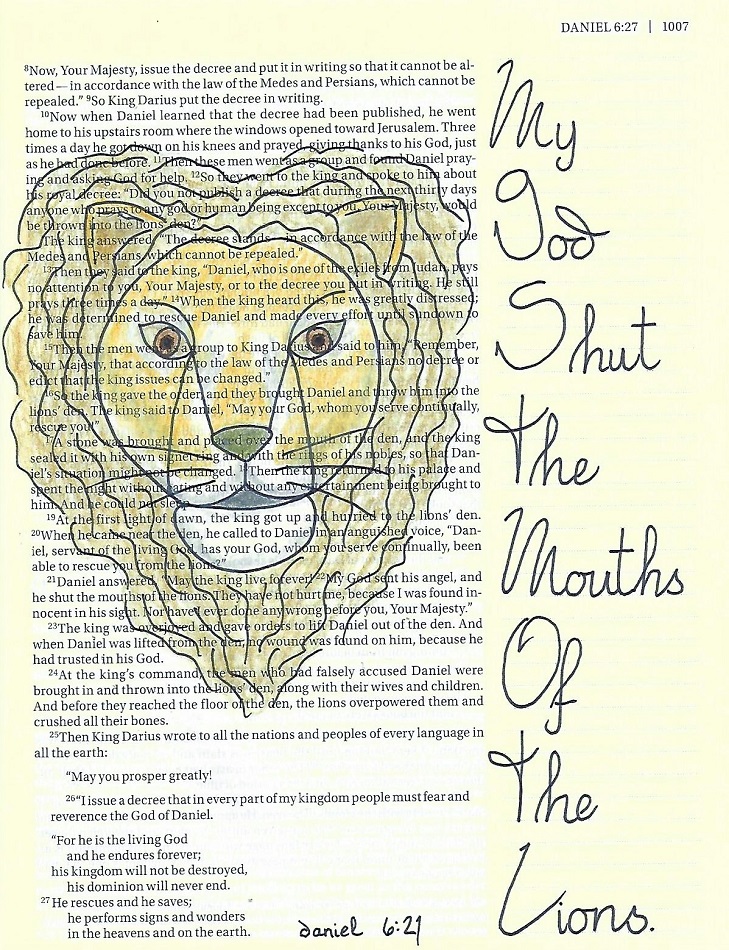
You may wonder why I label all of these lettering lessons as 'Bible Journaling' instead of 'Lettering'. It is simple, really. If it weren't for the bible journaling, I wouldn't be teaching lettering. Also, I use the bible for all of the samples. And further, the final part of the lesson is always a page from my bible that I completed with the lettering lesson.

This time the book featured is Ephesians.

EPHESIANS: Day #1 – Versals – Introduction

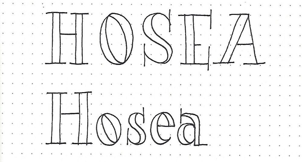
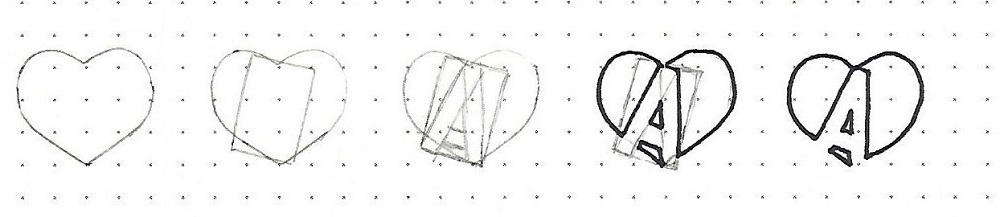
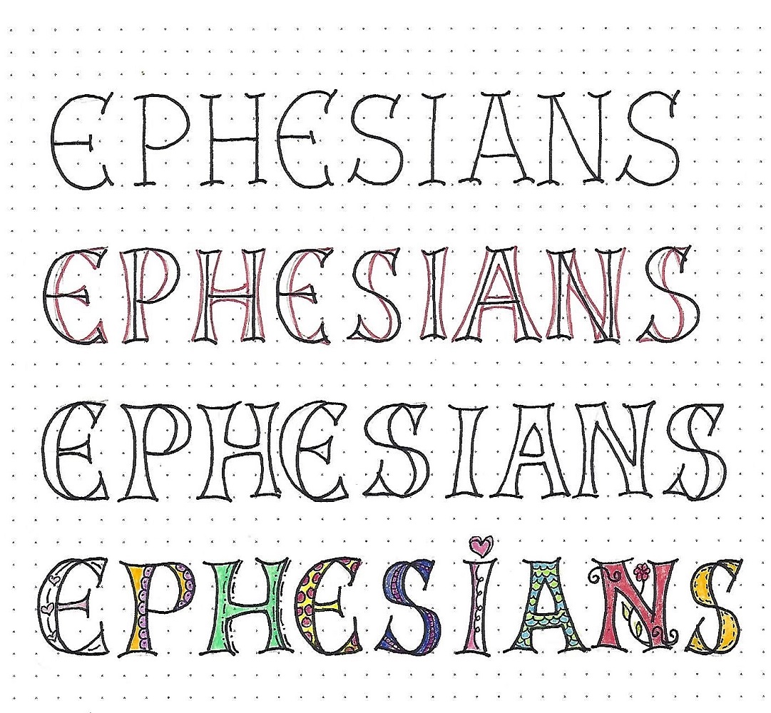
This lettering style is another that requires a step-by-step process for completion. It is called ‘versals’ and was introduced by Joanne Fink in her book Complete Guide to Bible Journaling. The steps are illustrated in the graphic below:

1)      In pencil, write out your word in basic upper-case print with indented wide serifs.

2)      Draw on each side of the lines to create concave shapes that meet with the serifs.

3)      Use ink to trace the outside lines of your newly created letters. Erase pencil.

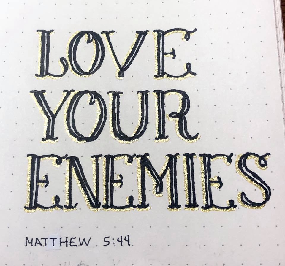
4)      Use fine pen to doodle on the letters however you wish. Color as desired.

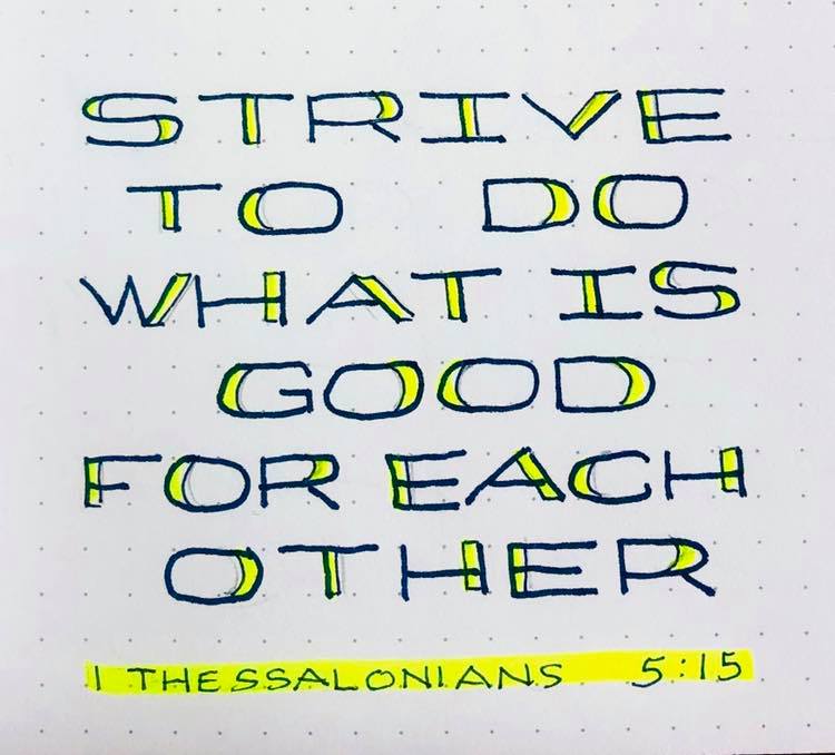
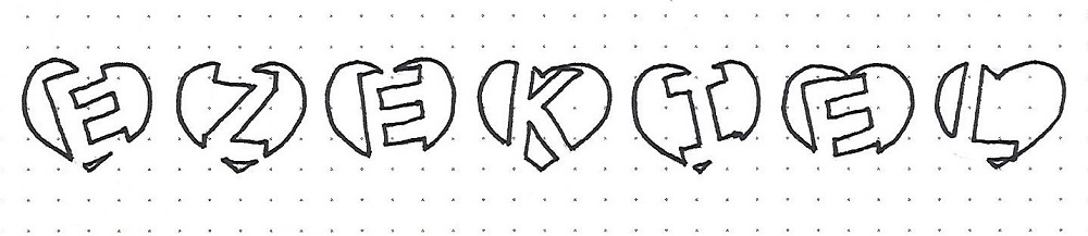
Today, practice writing the word EPHESIANS by following the four steps.


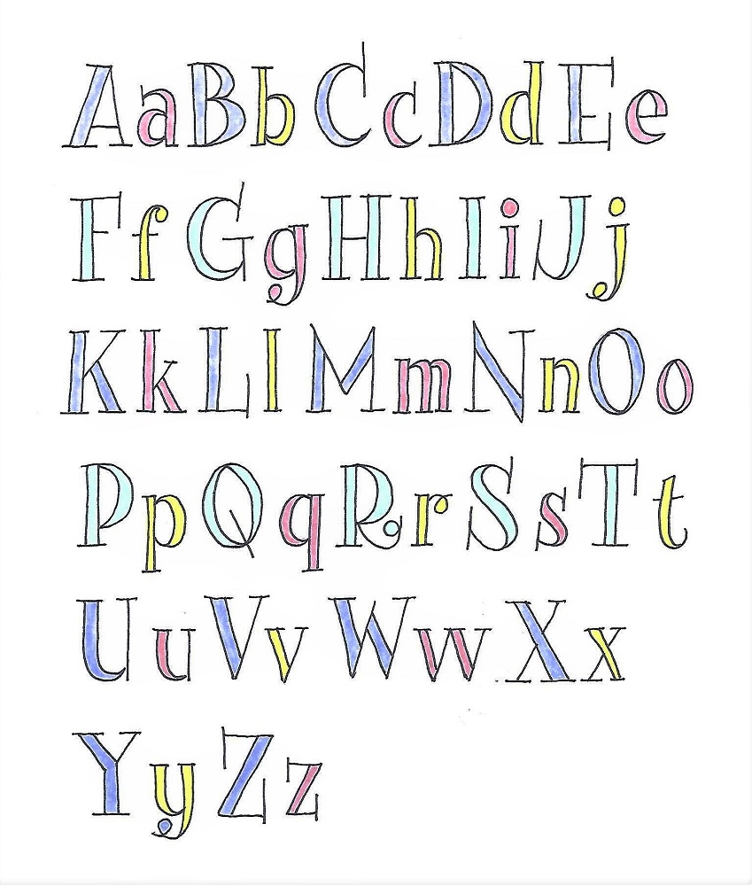
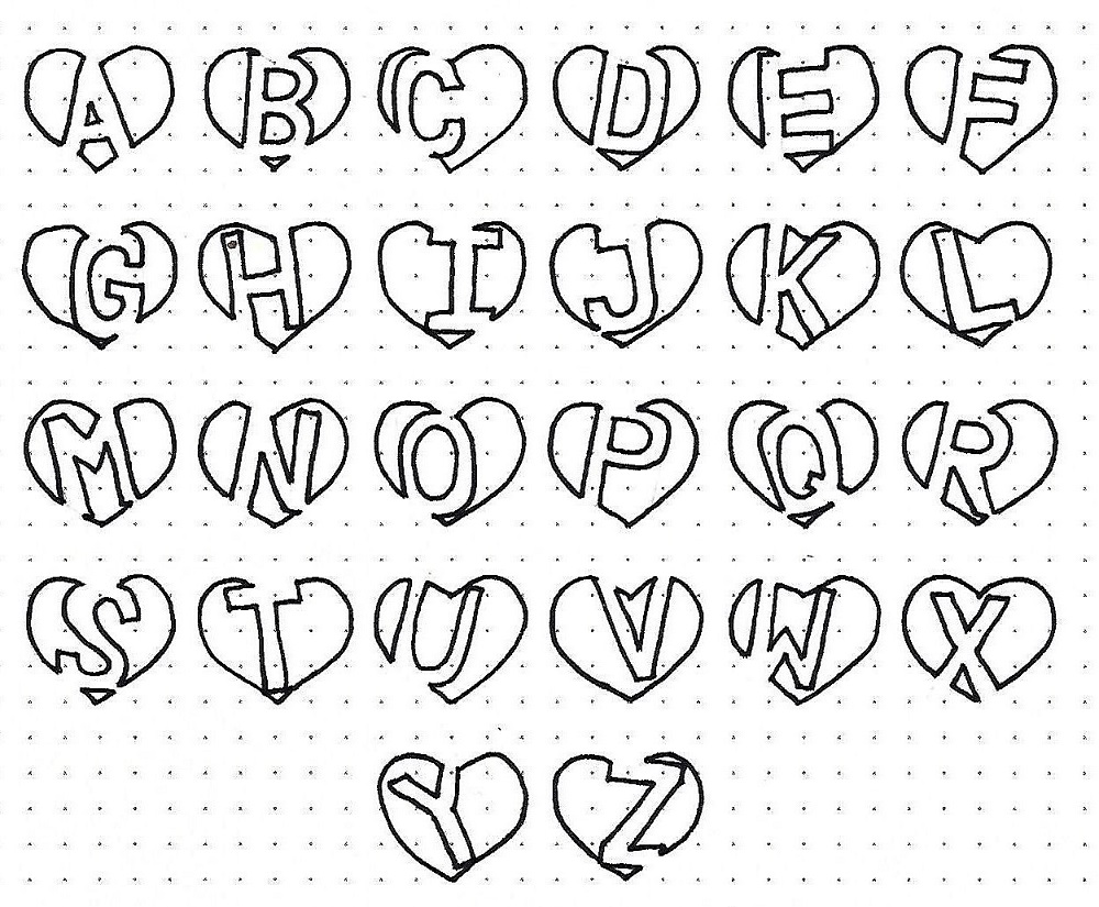
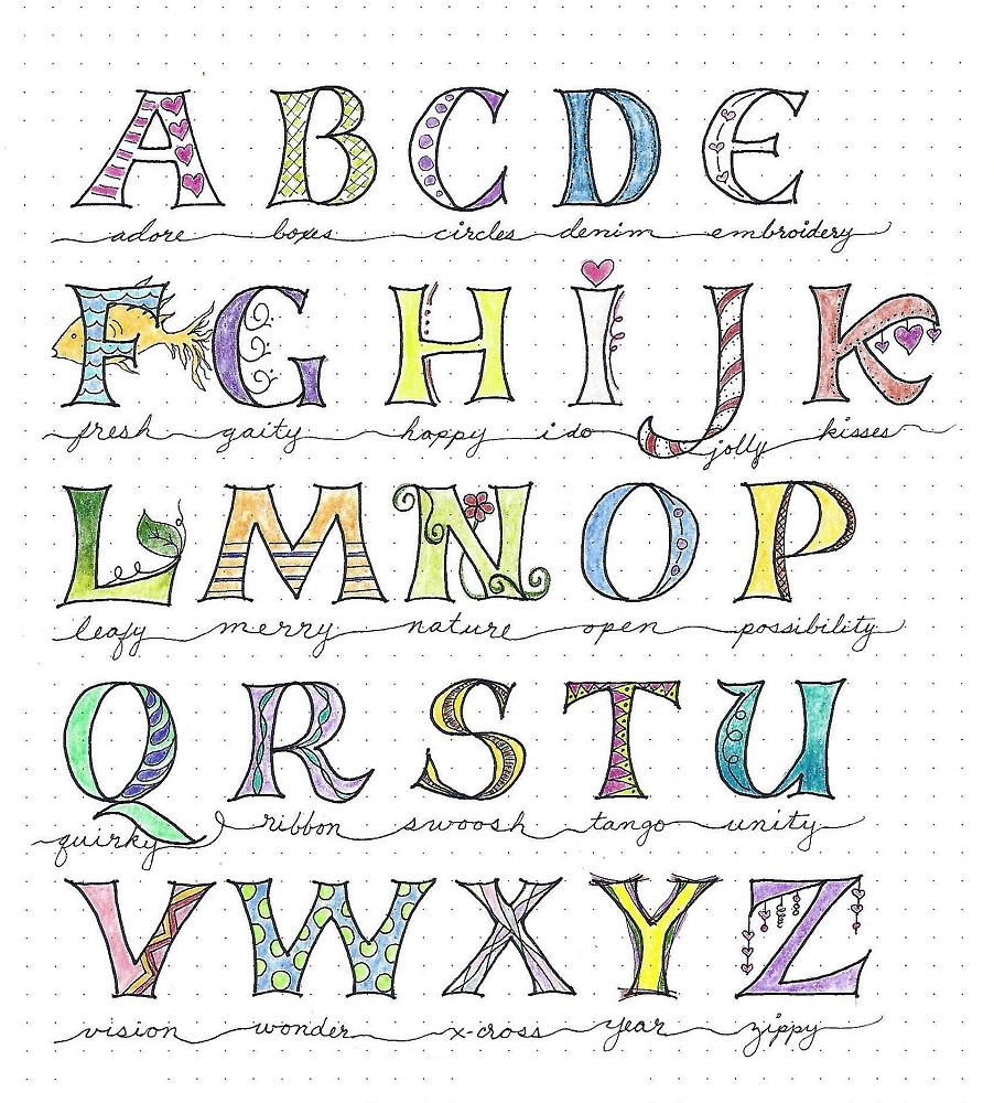
EPHESIANS: Day #2 – Versals – Alphabet

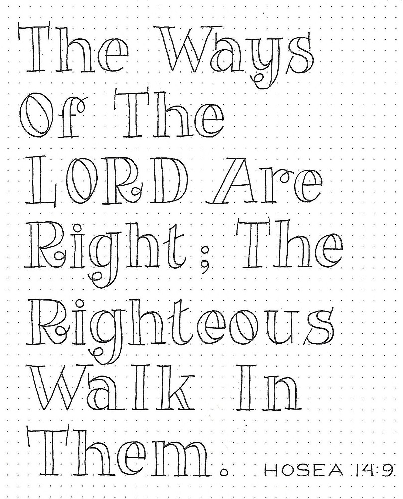
The full alphabet is to be considered an idea guide rather than a pattern this week. Since your own printing in the first step will likely be different than mine, your finished letters will most certainly be different.

When you get to the stage of doodling, try to come up with a variety of ideas. When you are using the letters in a project the doodles can be switched out to fit a theme, replicated throughout to add continuity or just be random.

I added script words underneath my samples to serve as inspiration for the doodles and to make the page more decorative. It is not part of the exercise, though.


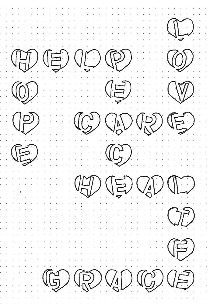
EPHESIANS: Day #3 – Versals – Practice Words

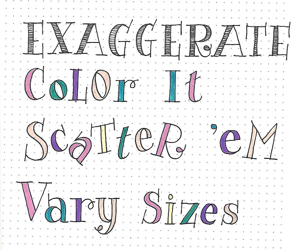
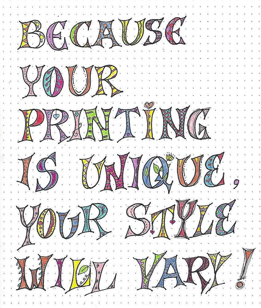
This is a demonstration of how your original printing can affect the outcome of your finished piece. On the first three lines I used a very basic print, first in three units then in four units.

On the last three lines I intentionally varied the size of the printing and exaggerated their shapes. Look how much more relaxed this text becomes. I also practiced creating more doodle styles to build up my catalog of choices.


EPHESIANS: Day #4 – Versals – Creative Application

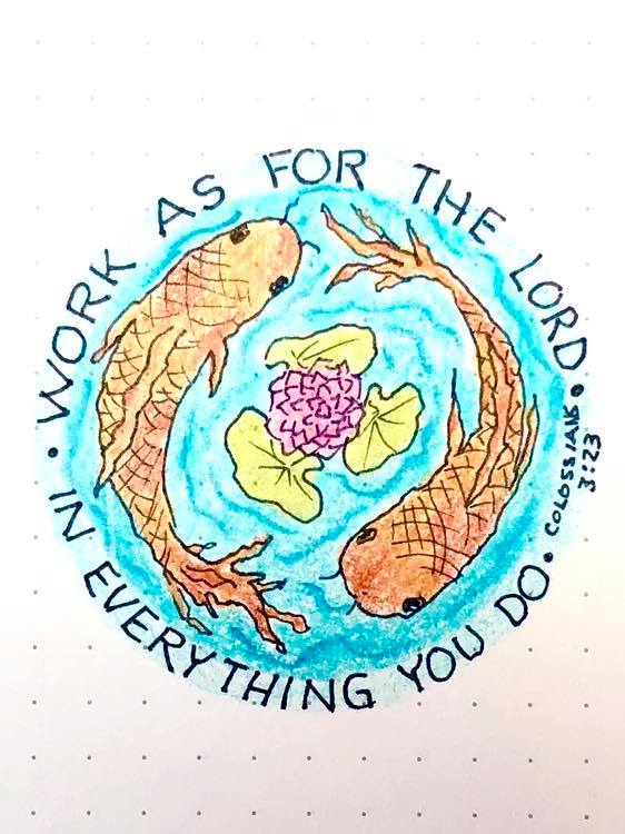
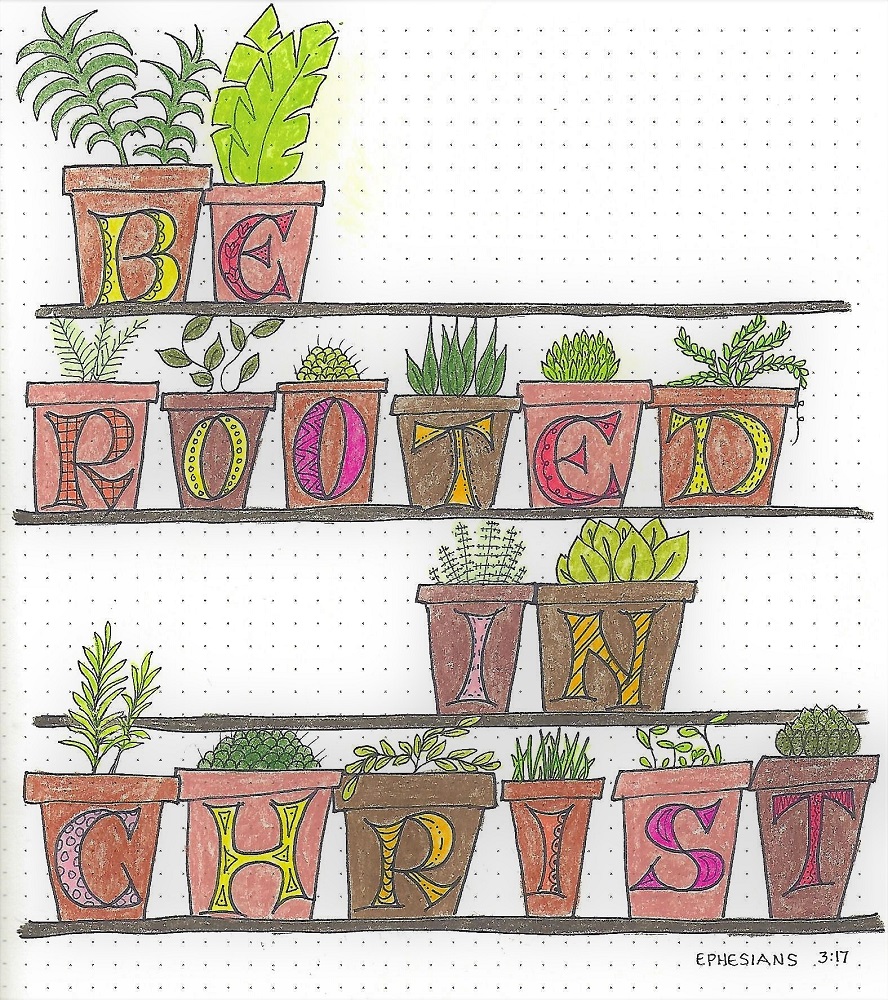
I wanted to explore other ways to use these fun letters, beyond just printing blocks of text. I first laid out lines for the spacing of the shelves and then drew the letters with wider than normal spacing between them. Then I Drew the pots around the letters, varying the heights, and finally, added a variety of plants.

I used four reddish-browns for the pots and colored the letters solid, regardless of their doodle patterns. A variety of greens for the plants brings this scripture into focus.


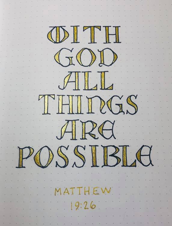
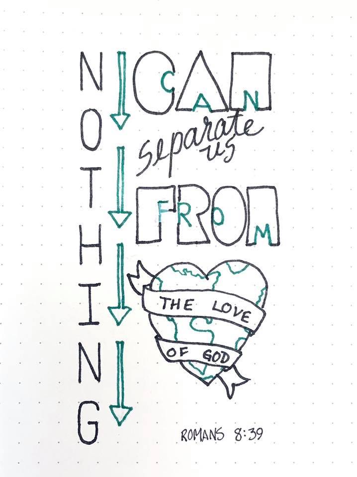
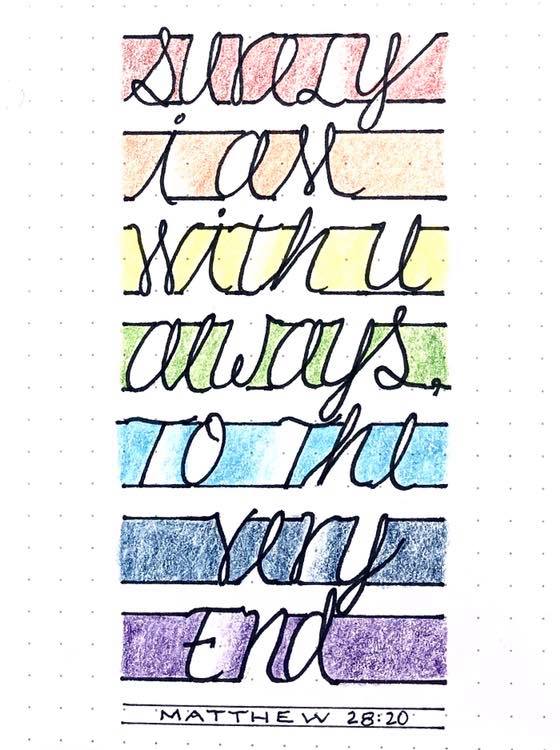
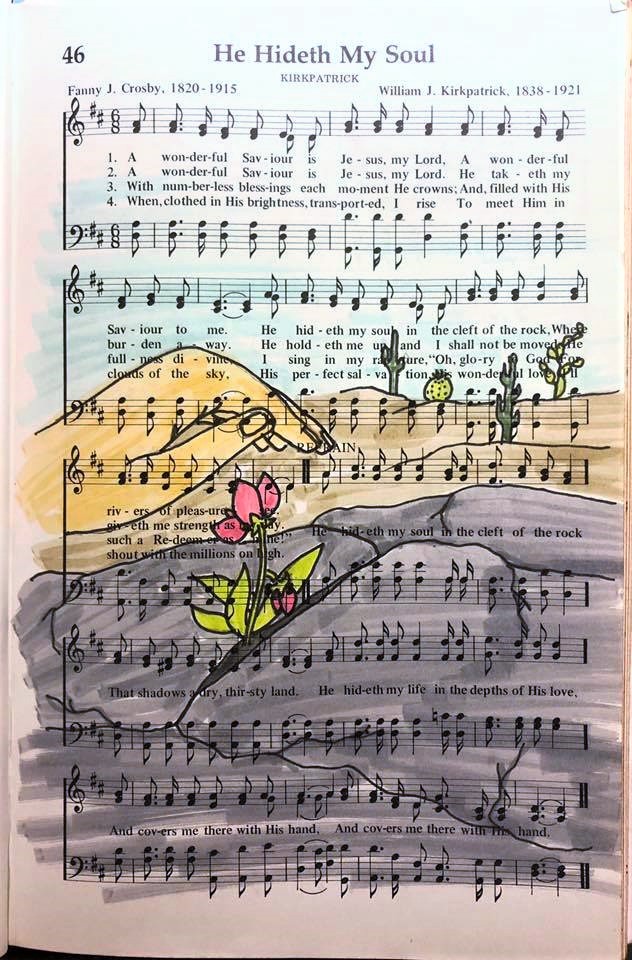
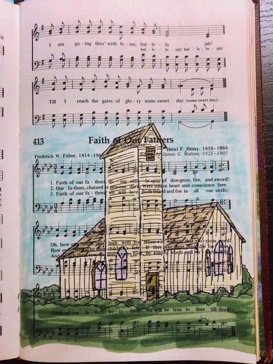
EPHESIANS: Day #5 – Versals – Bible Page

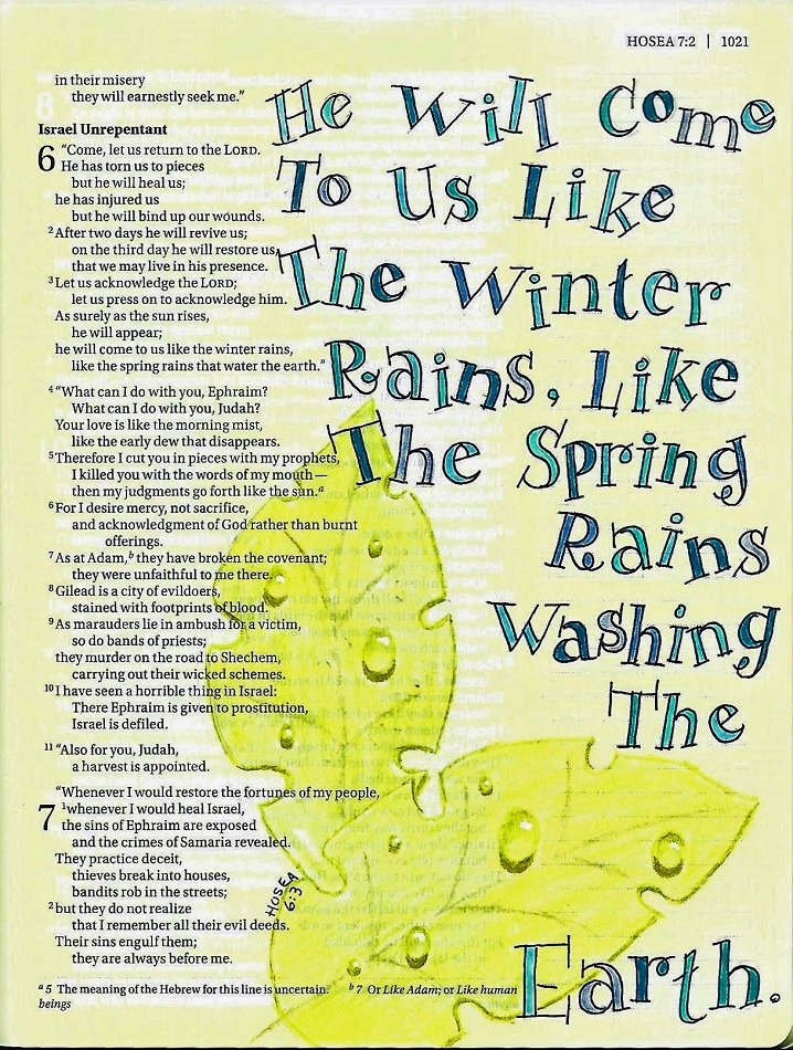
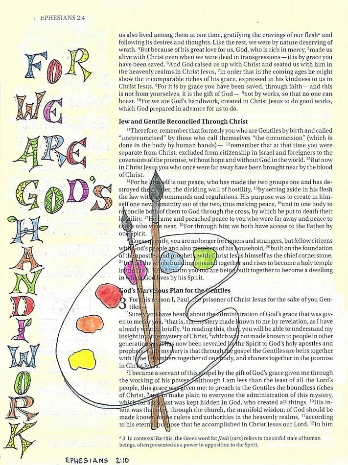
I really think the versals look better in large format lettering as the doodles are more easily seen. Shrinking down to this size can make them appear cluttered. I try to alleviate that by coloring in solidly instead of focusing on the doodling.

This lettering style works well in a vertical format as you can see. The artist palette is from the weekly Drawing Room tutorial.


So there you have it - another week of lessons and a new style of lettering for you to try.

Ddd


Posted by studio3d@ccgmail.net at 12:01 AM PDT
Saturday, 31 August 2019
He Hideth My Soul
Topic: Hymnal Art

Another assigned hymn to illustrate.

I had in my mind exactly what I wanted and had to search for just the right elements for reference material. I needed a hand (I used a photo of my own), a split rock (found photo on Pinterest) and a flower (which I edited so it looks nothing like the reference photo).


I colored this page with markers.

Ddd


Posted by studio3d@ccgmail.net at 12:01 AM PDT
Thursday, 29 August 2019
Neuman Finds a Home
Topic: Around the House

We have had these kind of squirrels at our house for about 25 years - after our god was no longer with us.


This one is enjoying some slivered almond on the deck.


This year, for the first time ever, we have some new guys who have moved in.


We think they are California Gray squirrels. There are a lot of differences between the two, beyond the odd 'paint job' on this guy. He almost looks like he would be bristly like a hedgehog but It sure makes him blend in.

OLD SQUIRRELS:

climb trees easily, eat one nut or seed at a time holding it in their hands and biting off parts,have tufts on their ears, good wire-walkers, live in the trees, run with their tails down, will stand at the back window peering in to beg for nuts.

NEW  SQUIRRELS:

have a harder time getting up trees, scoop up seeds by the mouthful and chew it up hulls and all, have smaller untufted ears, sometimes walk on wires by hanging upside down rather than balancing on top, live in burrow, run with their tails straight up like a chipmunk, will run and hide if they catch a glimpse of you in the window even if they are 20 feet away.

We saw that these were hanging out on top of posts so they could see around the area around the burrows so we make some that stood up higher. They like to get on top and remind you of meercats!


We call these guys 'Neuman' because they are the new men in the neighborhood.

Ddd


Posted by studio3d@ccgmail.net at 12:01 AM PDT
Wednesday, 28 August 2019
XOXOX
Topic: Scrap Recovery

One of the groups I play with is all about creating cards and swapping them. We have been working our way though the alphabet (A is for .... B is for ....) and finally worked our way up to X. Ooooh that is a tough one.

I made a card using the one single wood block stamp I own for the theme X is for xylograph. And, yes, I had to look it up, too.

I used some table scraps to put together a collage card and included some X and O stickers to reinforce the 'X' theme.


Y and Z card Ideas were much easier to come up with. In fact, those were done, shown and filed away when we STARTED the alphabet series!

Ddd


Posted by studio3d@ccgmail.net at 12:01 AM PDT
Monday, 26 August 2019
Faith Of Our Fathers
Topic: Hymnal Art

For this hymn I borrowed from one of the Drawing 101 lessons I took a while back. One of the photos we were given to work from was called Dorothy Church and we drew it in pencil - learning aout multi-point perspective.

I used the same building - drawing from my own original drawing, but this time in ink.


Markers were used for the coloring.

Ddd


Posted by studio3d@ccgmail.net at 12:01 AM PDT
Sunday, 25 August 2019
Lettering in Ezekiel
Topic: Bible Journaling

A new lettering lesson is in the queue for today:


EZEKIEL: Day #1 – Full Hearts – Intro

Here is another font based on the Basic Block Print. We are working in the book of Ezekiel this week so I have written out the book name in the new font.

This looks a little complicated so I’ll show you how easy it is to do (second graphic). There are 5 steps. 1) In pencil, draw a heart that is 5 units wide and 3 ½ units tall. The top point drops down ½ unit. 2) a rectangle that is 3 units tall and 2 units wide is layered over the heart at an angle. 3) Use the rectangle as a size guide to construct your block letter. 4) With ink, trace the outer edge of the heart and the outline of the letter where it rests inside the heart. Leave the overhanging parts of the letter (outside the heart) as unfinished lines. 5) erase the pencil guides.


EZEKIEL: Day #2 – Full Hearts – Alphabet

Here is a repeat of the instructions on constructing these letters. For consistency, I cut a heart hollow out of a piece of paper as well as the correct measurement of the rectangle. Then I could simply trace these ‘stencils’ with my pencil.

There are 5 steps, shown in the first graphic. 1) In pencil, draw a heart that is 5 units wide and 3 ½ units tall. The top point drops down ½ unit. 2) a rectangle that is 3 units tall and 2 units wide is layered over the heart at an angle. 3) Use the rectangle as a size guide to construct your block letter. 4) With ink, trace the outer edge of the heart and the outline of the letter where it rests inside the heart. Leave the overhanging parts of the letter (outside the heart) as unfinished lines. 5) erase the pencil guides.


EZEKIEL: Day #3 – Full Hearts – Crossword

Generally, you would not be writing out whole words with a font as complicated as this – although a title on a page or a keyword might be done. But I wanted you to get lots of practice, so today we will make a crossword.


EZEKIEL: Day #4 – Full Hearts – Scripture Writing

For writing out this scripture, I used the Full Hearts font as the first letter of each word and completed the remainder in 1x2 simple upper-case letters.


EZEKIEL: Day #5 – Full Hearts – Bible Page

The use of the font in my bible page is similar to yesterday’s scripture page. There are, however, three distinctions: 1) the hearts are tilted a bit, this way and that. 2) the hearts are colored as a background to the letters, which makes them easier to read. 3) I finished the words in script instead of print which adds more formality.

The heart from the Drawing Room was done on vellum, cut out and glued down with a dry adhesive.


That is quite a unique lettering style is it not?

Ddd


Posted by studio3d@ccgmail.net at 12:01 AM PDT

Newer | Latest | Older