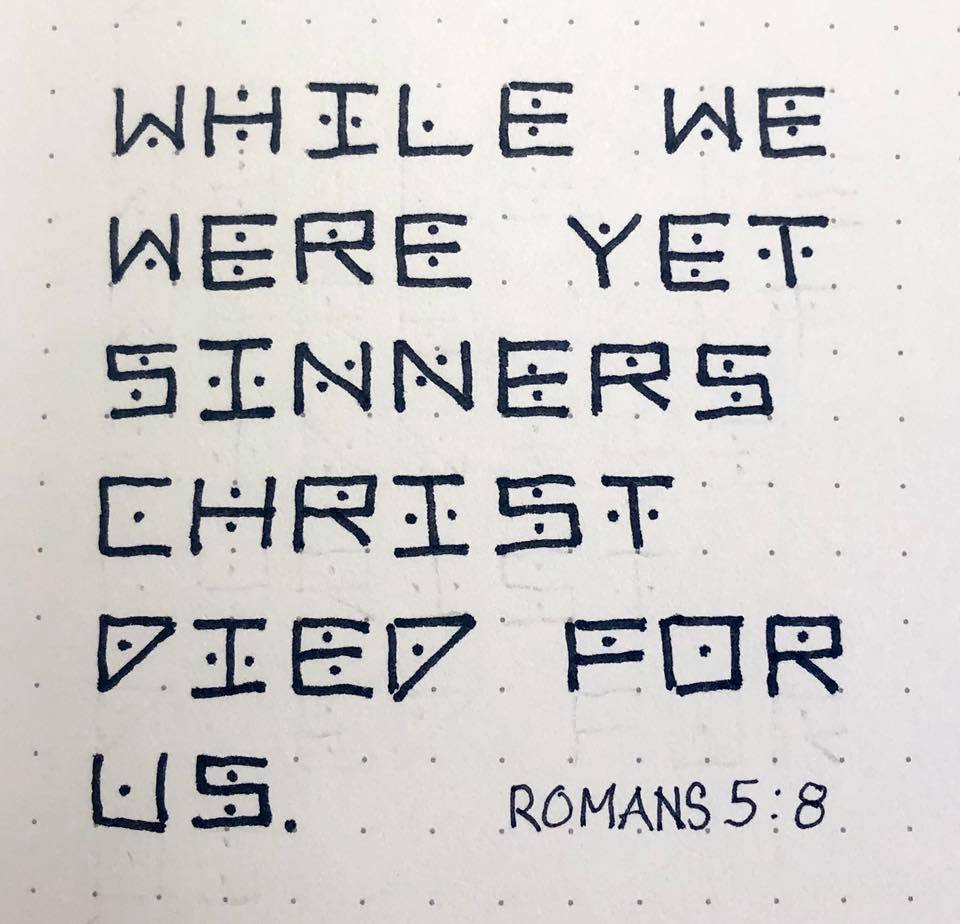
Topic: Bible Journaling
As our group is working on journaling in the bible 'cover to cover' the goal is to have something done in every book by the end of the year. We are alternating between Old Testament front to back and New Testament back to front. Since there are many more Old Testament books, sometimes a set of short ones will be combined into one week. So this week we did various activities in Joel, Amos and Obadiah. (I misspelled Obadiah in several places throughout my samples!)
Here is the lettering lesson for the week:
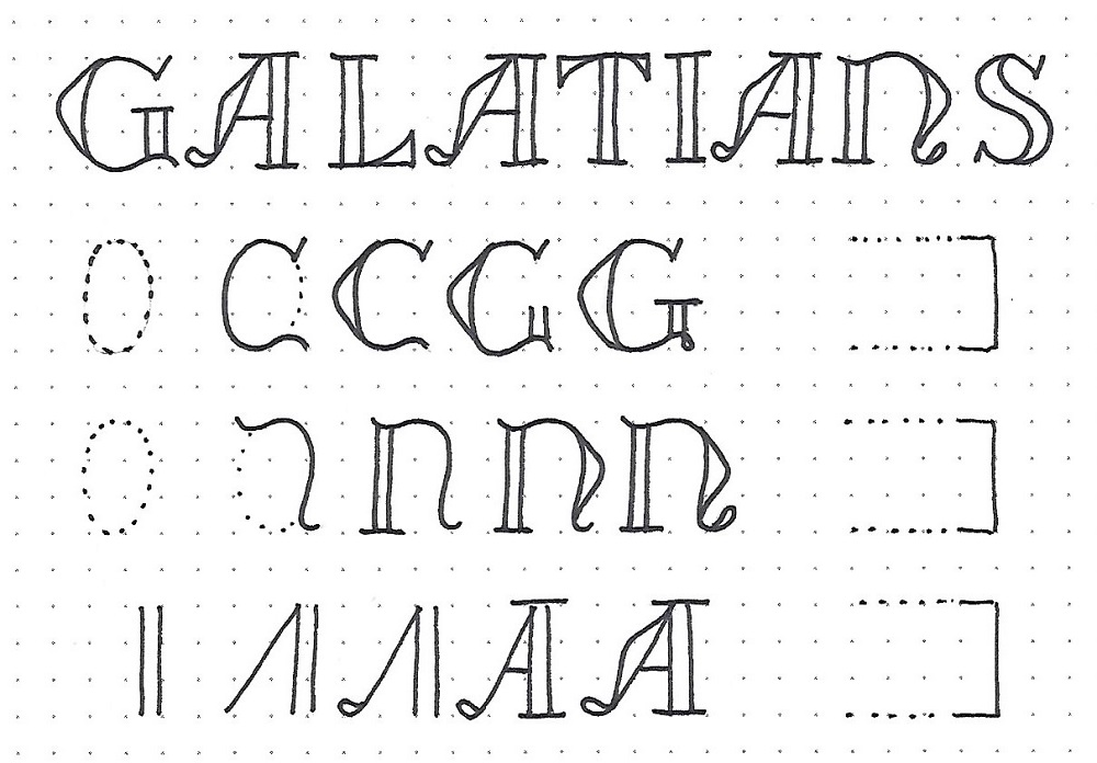
JOEL/AMOS/OBADIAH: Day 1 – Flourish – Introduction
This is probably the fanciest font we have introduced here in the Lettering Lodge. But it, too, is not really as complicated as it looks – just several steps to get you there.
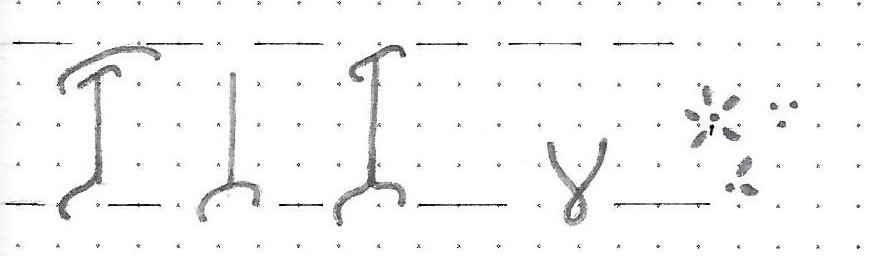
Follow along with the basic building process shown on the letter ‘A’.
1) Sketch out the basic letter skeleton2) Add the flourishes
3) Make teardrop ends where indicated
4) Sketch in flowers and trimmings AND ink them
5) Ink rest of letter without actually touching the flower
6) Thicken midlines but not the ends of lines
Do the same steps on the ‘J’ and the ‘O’ and write in the rest of the words in script. Note relative size and placement of script letters.
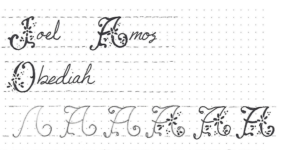
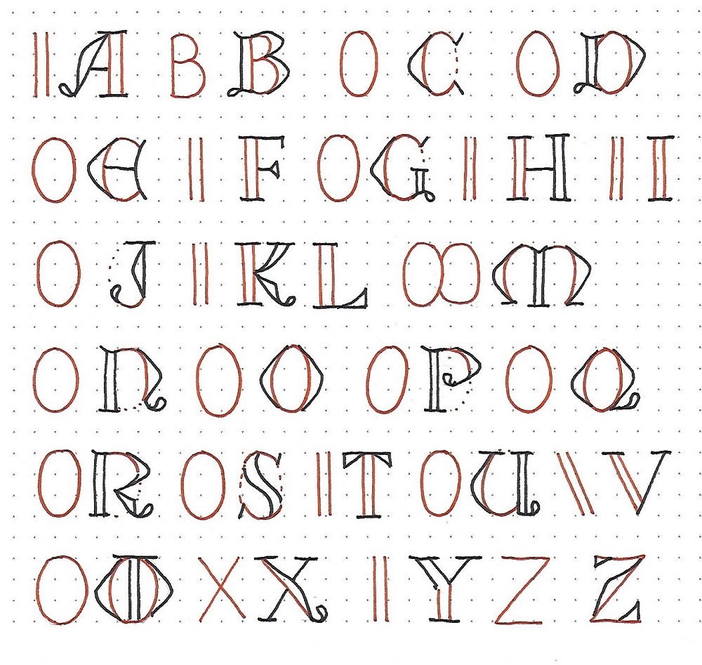
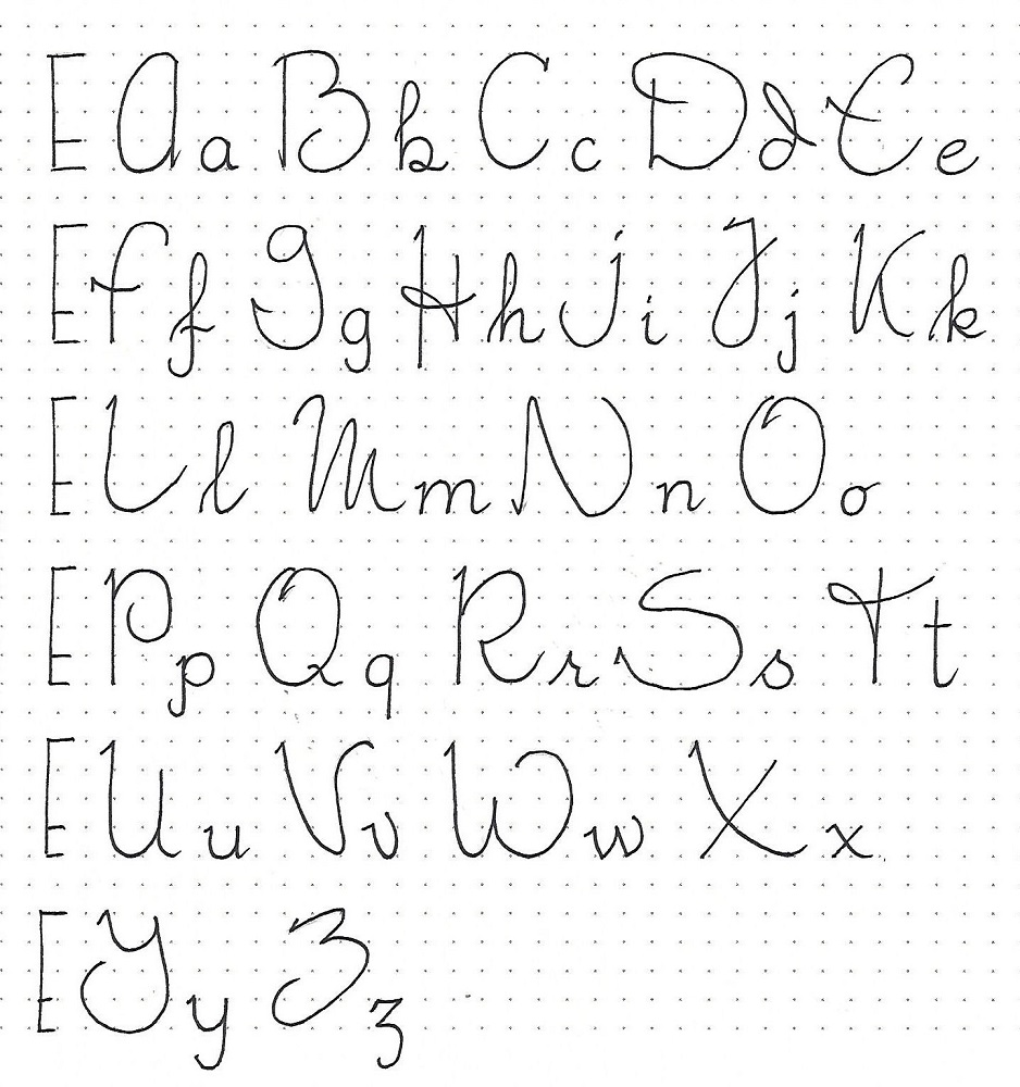
JOEL/AMOS/OBEADIAH: Day #2 – Flourish – Alphabet
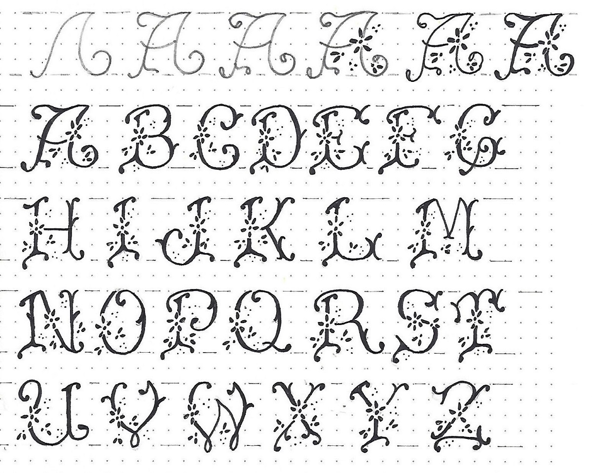
The Flourish alphabet has a few elements that are common across multiple letters. These are the bones that make the alphabet cohesive. First practice these structures – you will recognize them when you are making your letter skeletons. Follow the step-by-step shown for the letter ‘A’ as you draw EVERY letter in the alphabet.
1) Used on B, D, E, F, P, R2) Used on H, M, N, T, Y
3) Used on I, J, K, L
4) Used on V, W
5) Used on ALL LETTERS
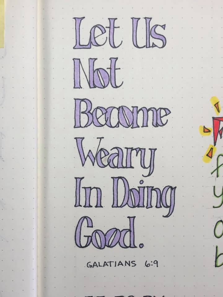
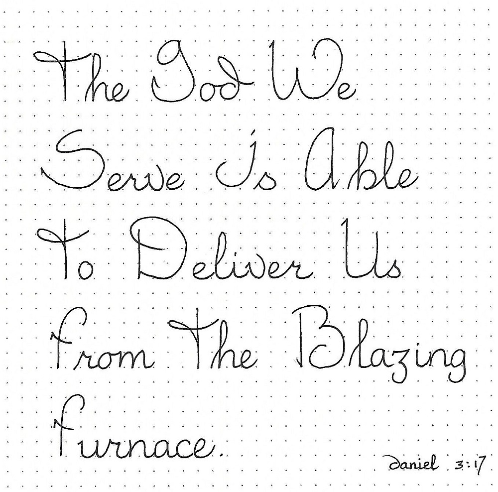
JOEL/AMOS/OBADIAH: Day #3 – Flourish – Lower-Case
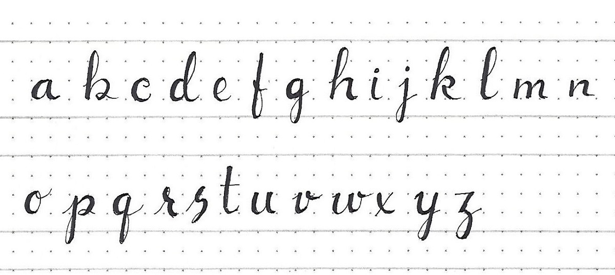
The lower-case alphabet used with the Flourish capitals is a delicate script with faux-brush styling. Note that this is built on the same framework as the upper-case (4 units high) but the baseline is raised one unit and the x-height is at the midline. The ascender is ½ unit lower than the full 4th unit.
Draw base letter with pencil, ink it, then draw a second line along the downstrokes and fill in with pen. Erase pencil.
When this is combined with the Flourish font it creates an elegant word.
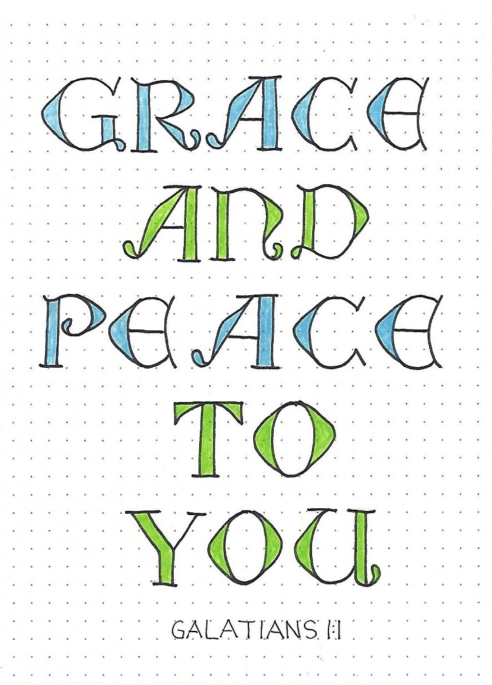
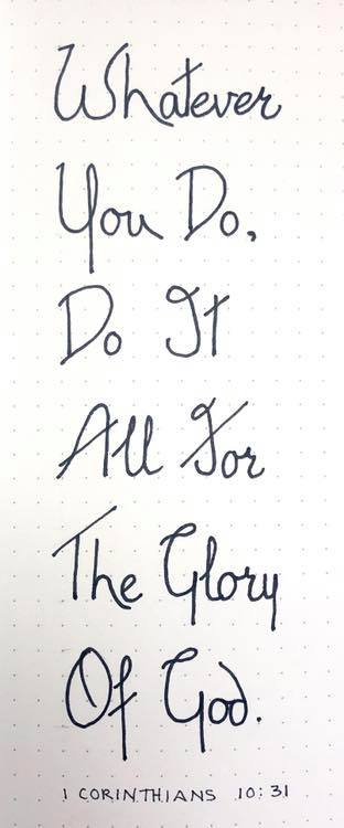
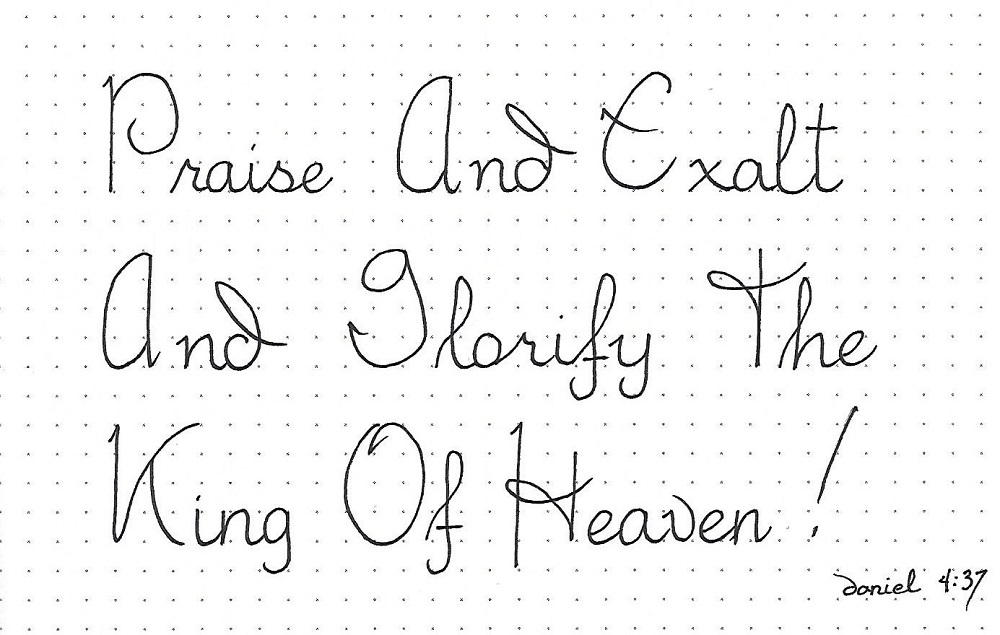
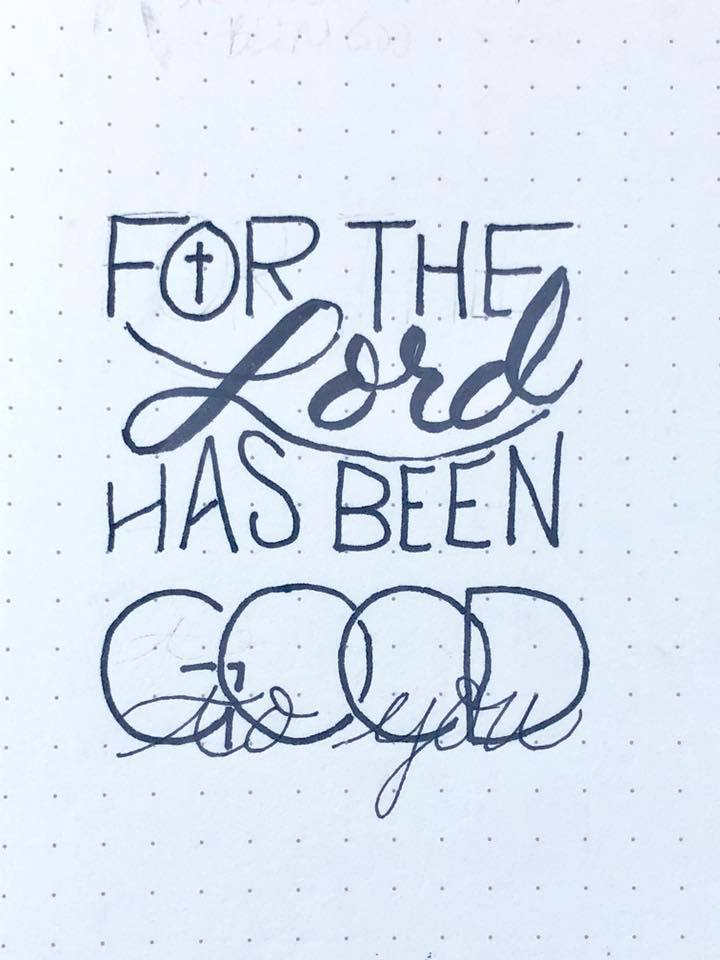
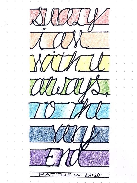
JOEL/AMOS/OBADIAH: Day #4 – Flourish – Practice
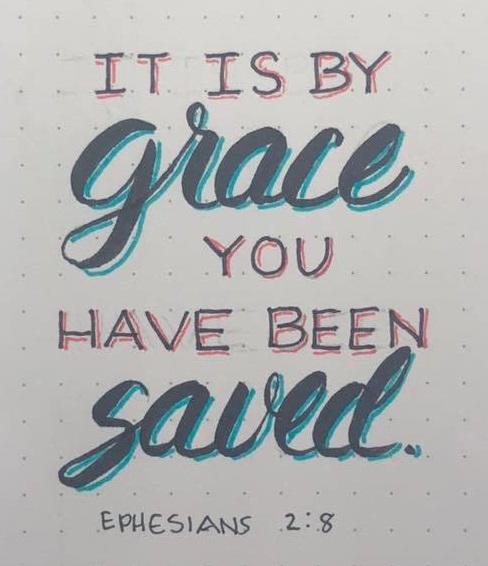
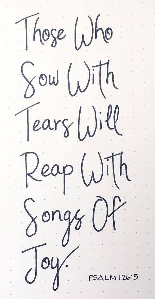
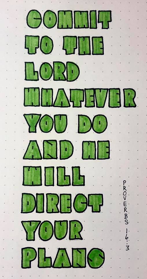
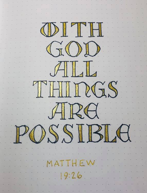
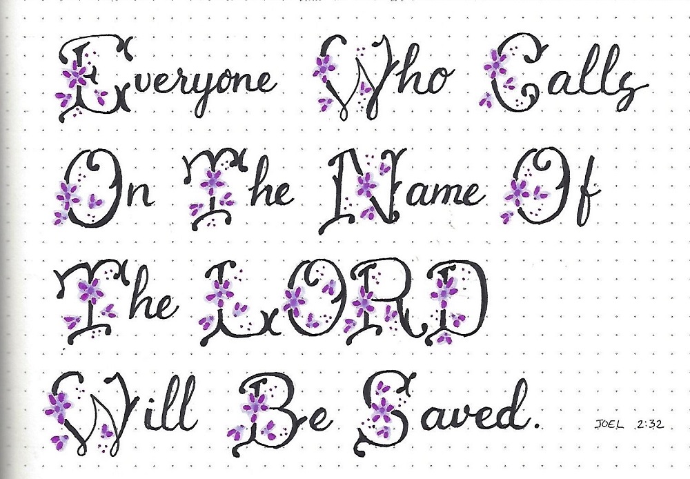
Today, select a verse from one of the three featured books and letter it using the Flourish font. Don’t you love the way this looks?
I made the flowers and trimmings with a dark purple marker and brushed over them with a lighter purple to create a ‘glow’. This was done before inking the letters.
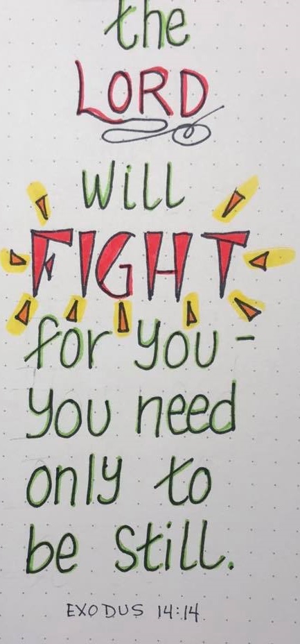
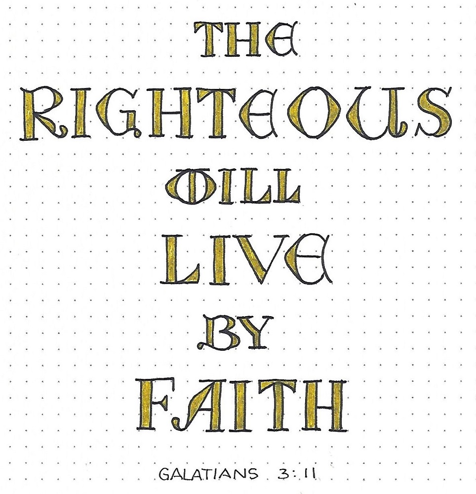
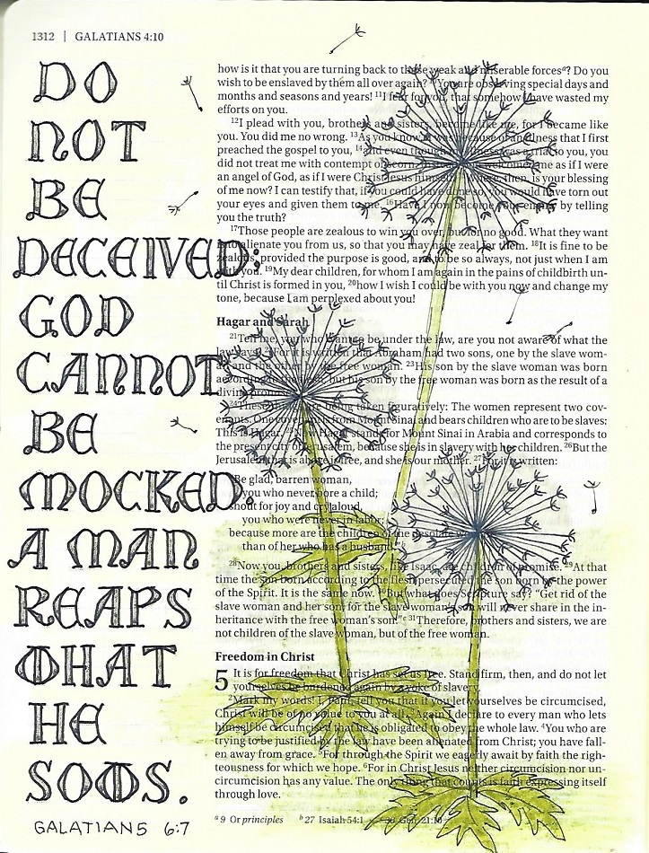
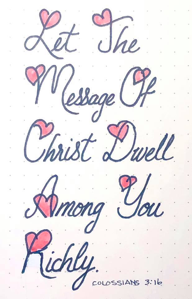
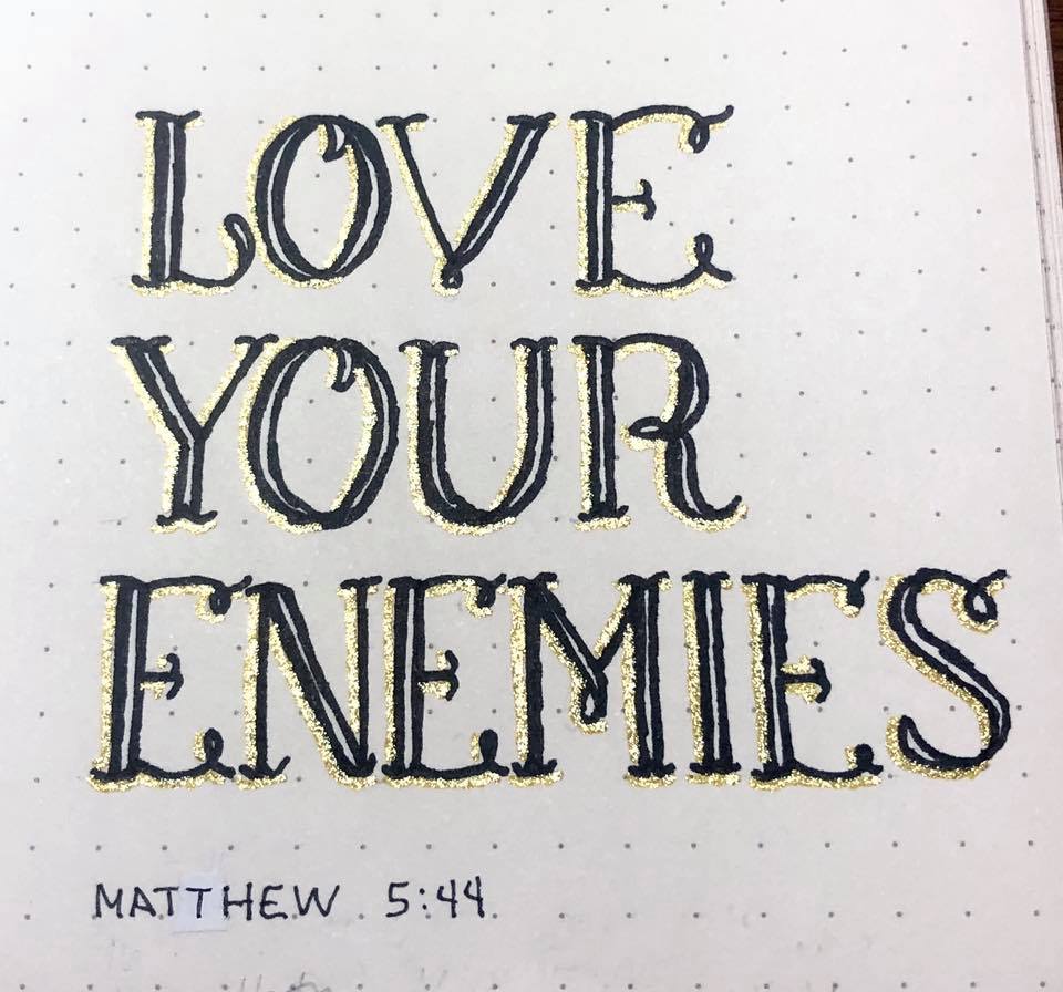
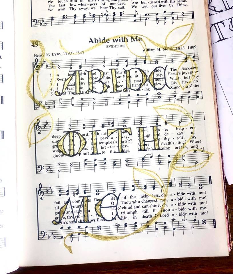
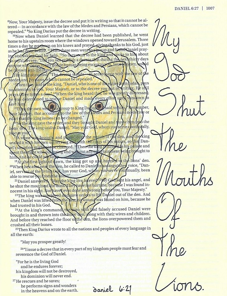
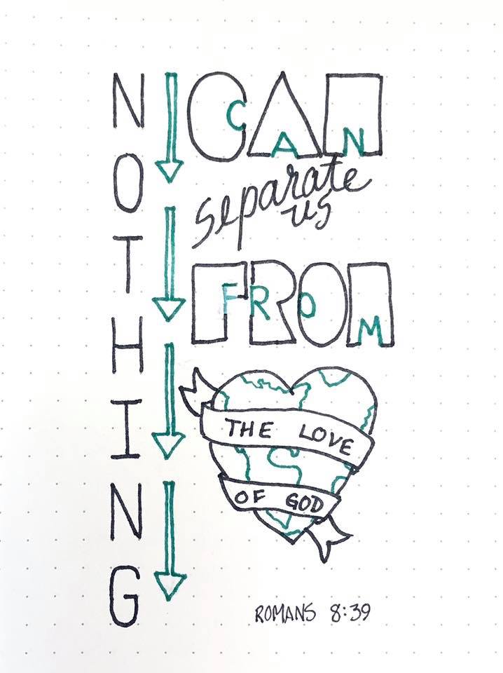
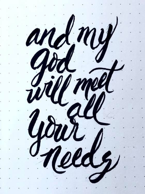
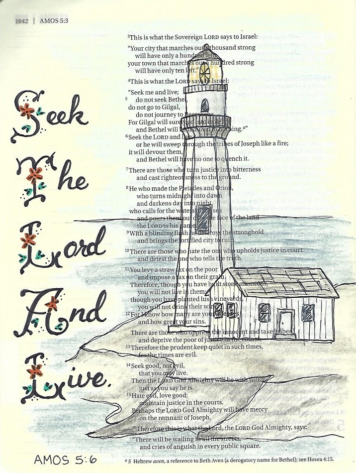
JOEL/AMOS/OBADIAH: Day #5 – Flourish – Bible Page
Create a bible page in one of the featured books using the Flourish font. My words were short so I was able to keep the original scale of 4 units using the lines in my margin.
For the flowers and trimmings, I drew them in using black and then used a bleed-free marker to color over them.
The lighthouse is from this week’s Drawing Room.
Whew! That is some intensive lettering - doable but time consuming. But isn't it awesome when it is done?
Ddd