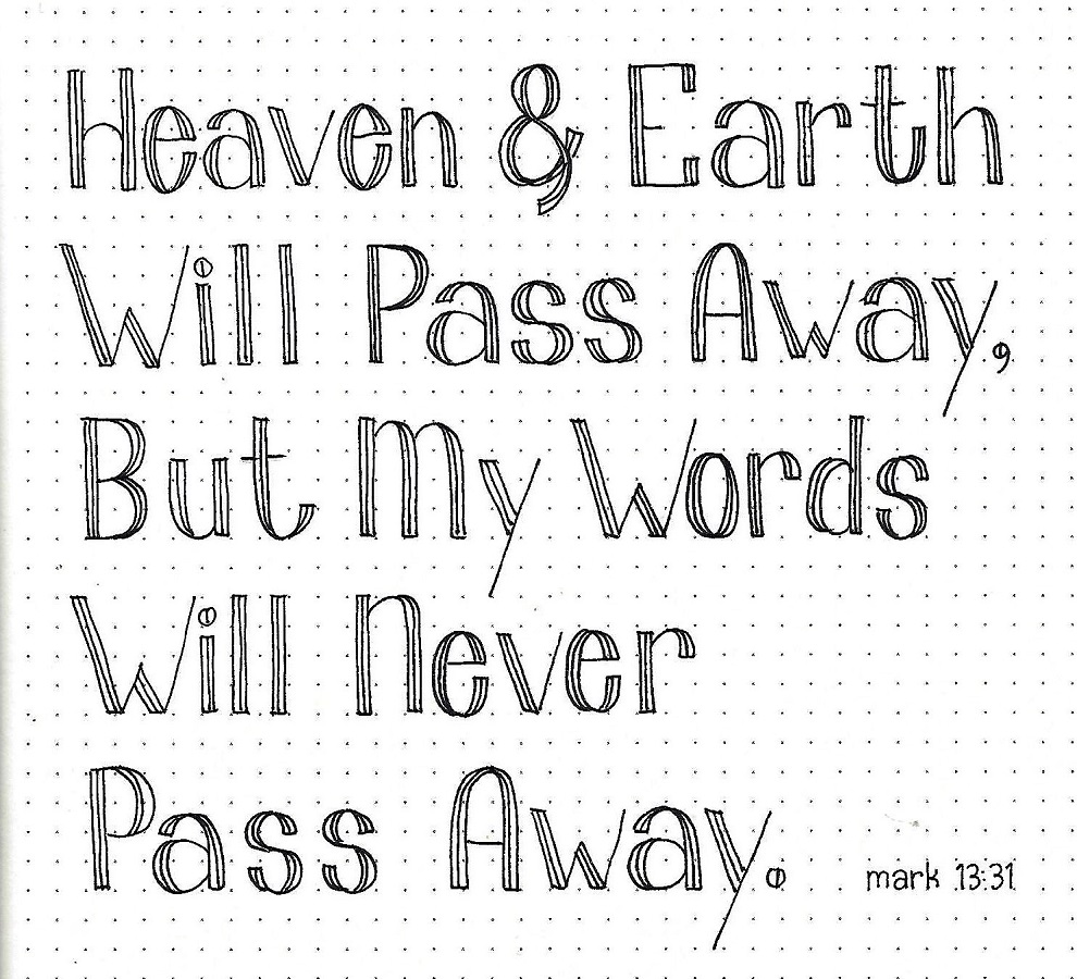
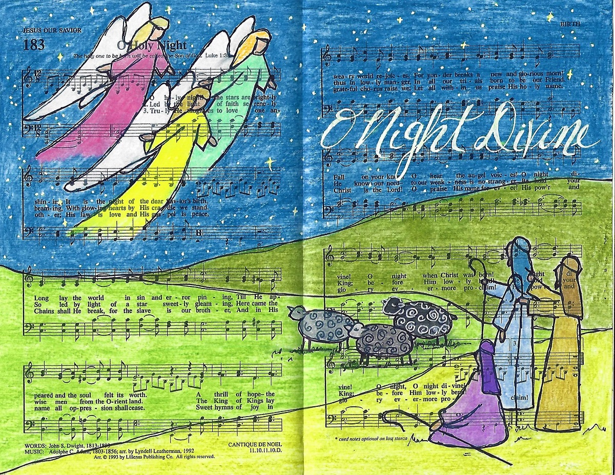
Topic: Bible Journaling
The lettering lessons this week have been centered on the book of Luke. I hope you find them to be as much fun as I did.
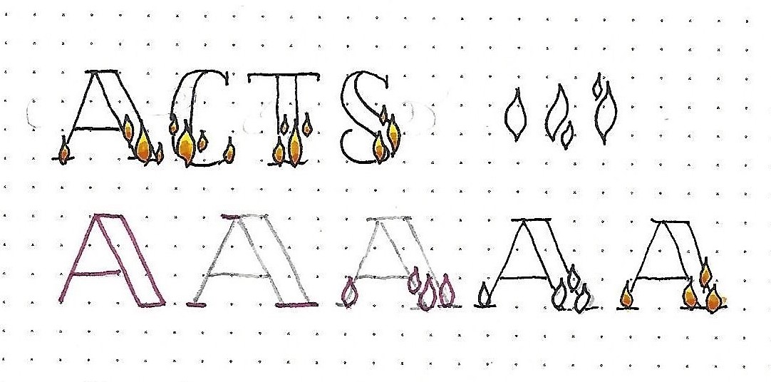
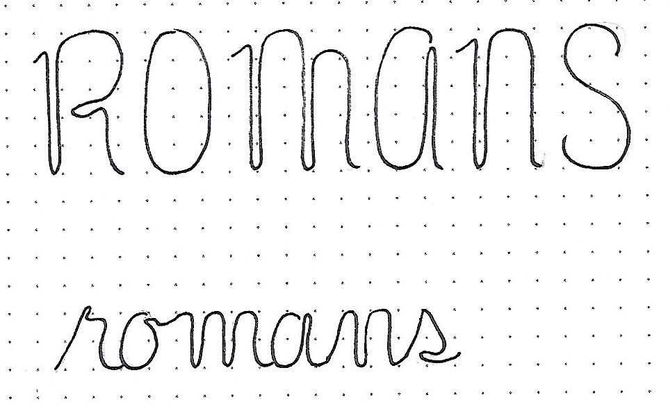
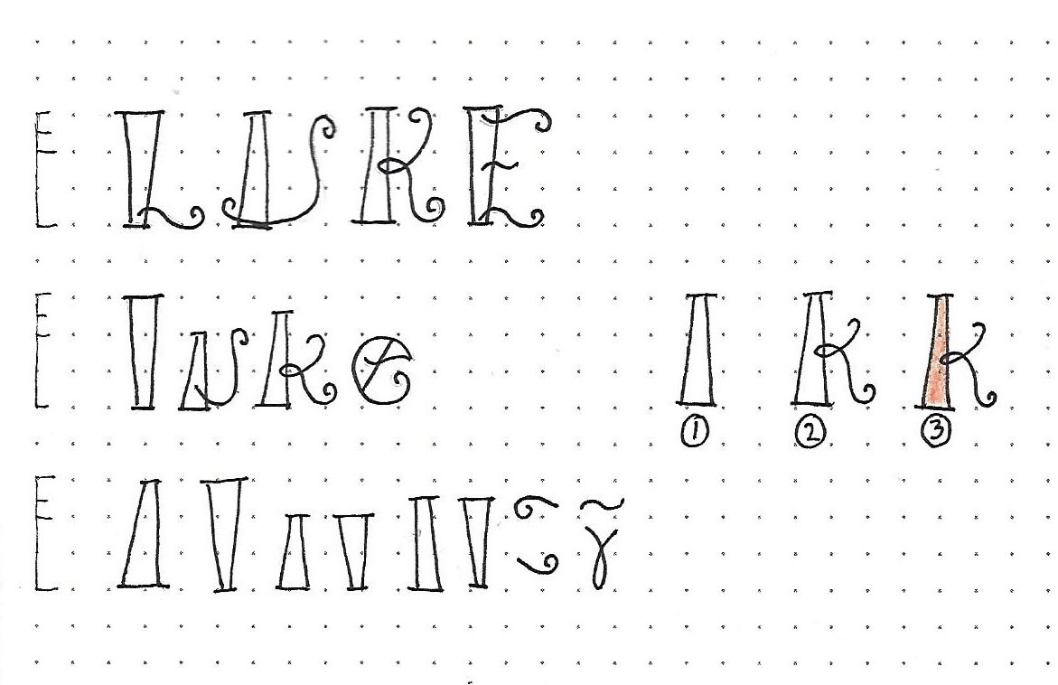
LUKE: Day #1 – Fiddlesticks – Introduction
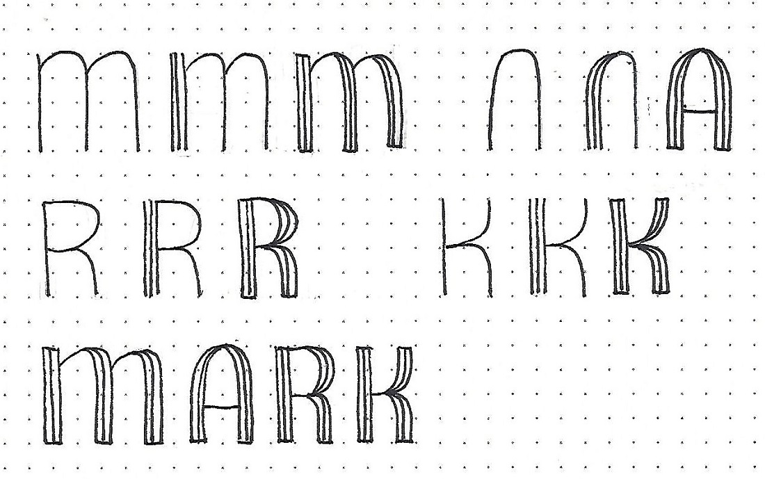
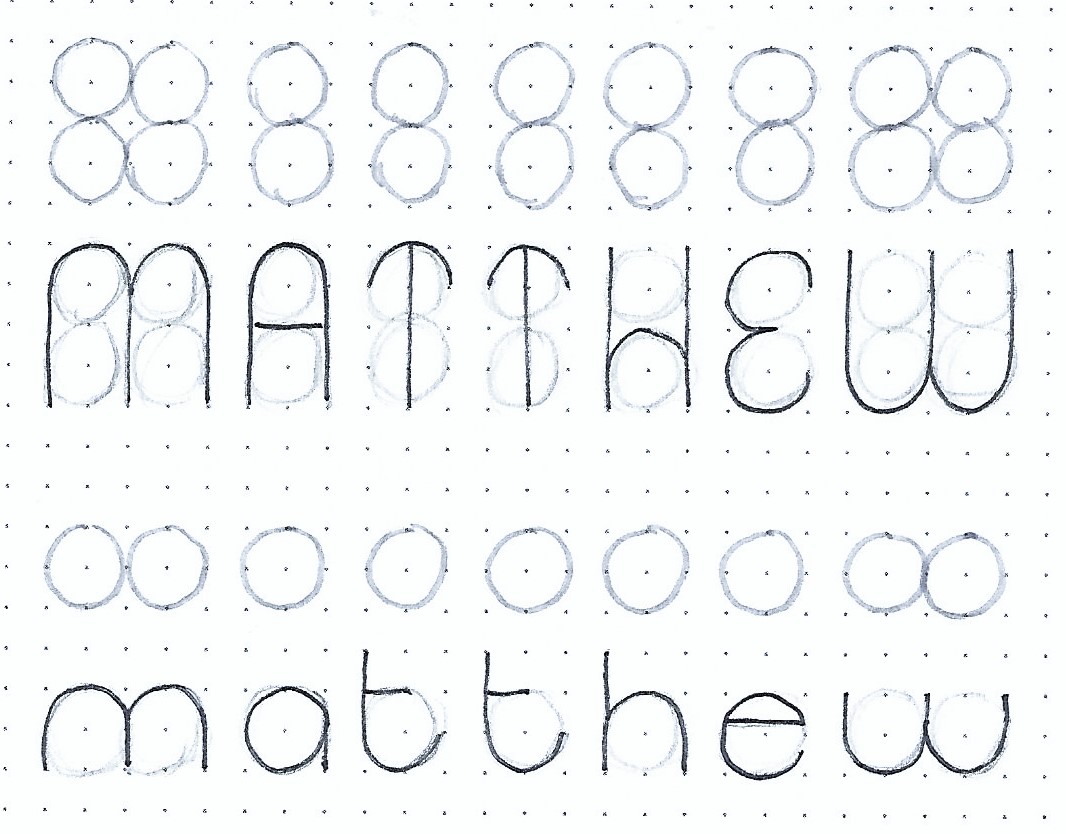
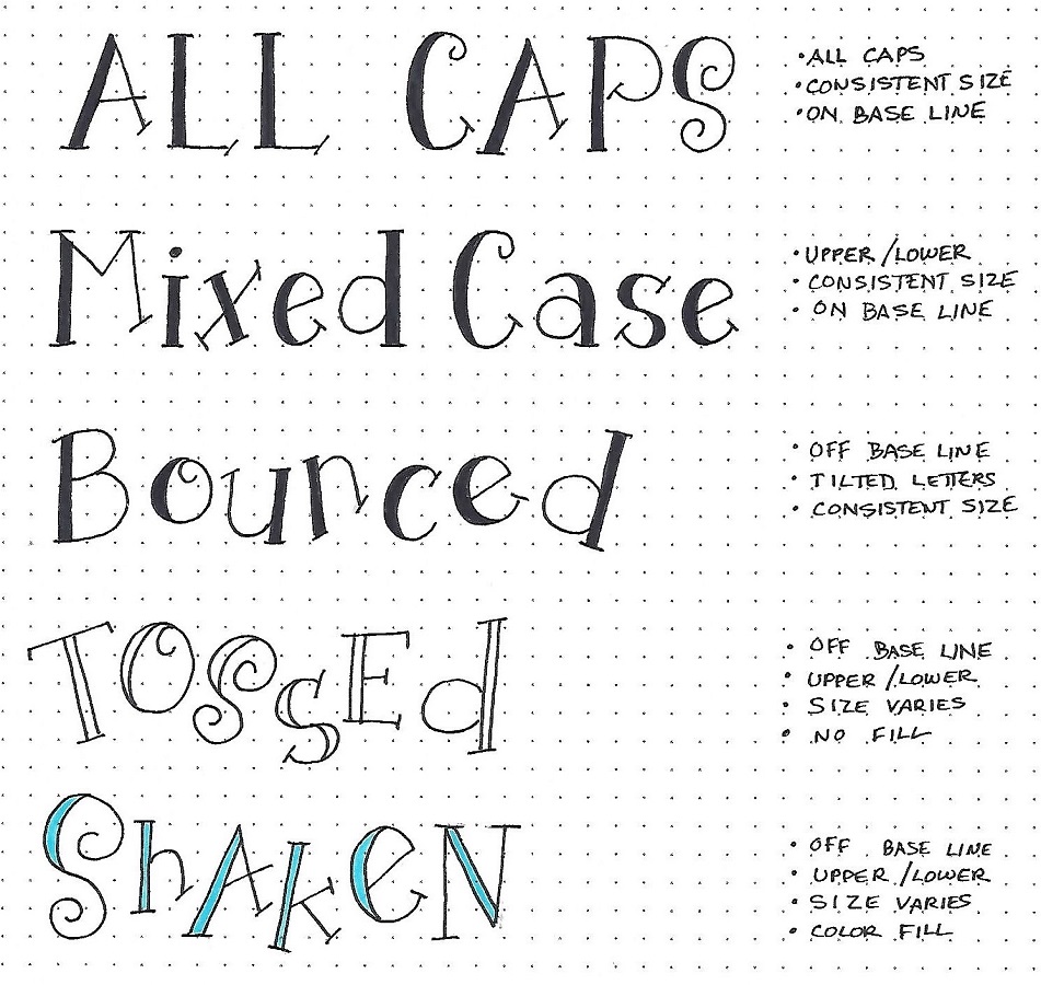
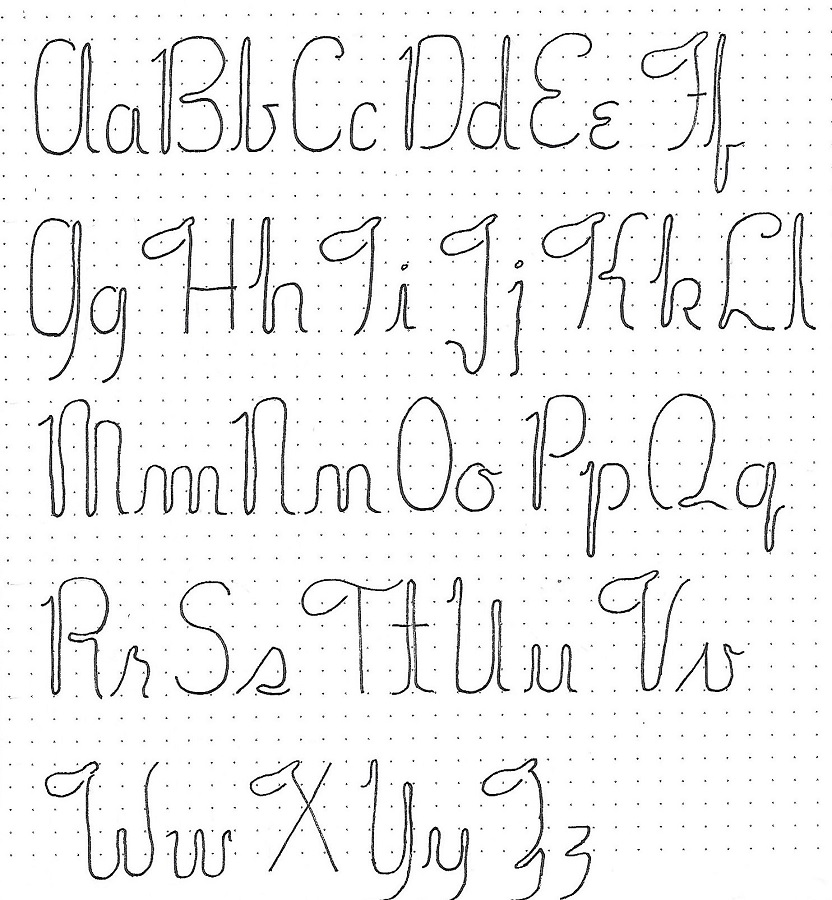
This week we have a fun novelty font that employs one tapered pillar with serifs per letter. The rest of the letter styling is achieved with swirling stringers that have tight curls on the ends.
Overall letter height is 3 units. The x-height is at 2 units while the ascenders are at 2 ½.
Practice the marks at the bottom of the graphic first to get a feel for structure. Then draw out the three steps shown at the right: 1) draw the pillar making sure of whether the wide end is up or down (and the proper height). 2) add the prescribed curly lines. 3) after inking and erasing pencil, fill with color if you wish.
When you’ve become comfortable with the process, ink the upper-case and the lower-case versions of the c2c book of the week.
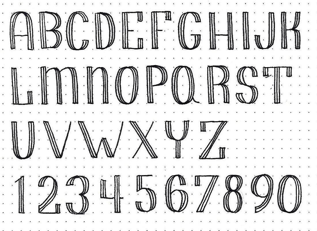
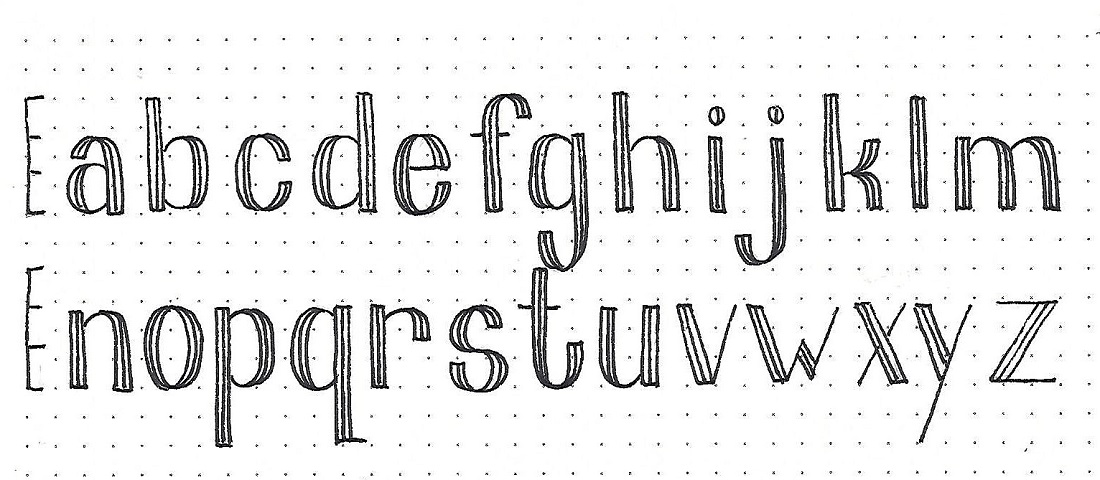
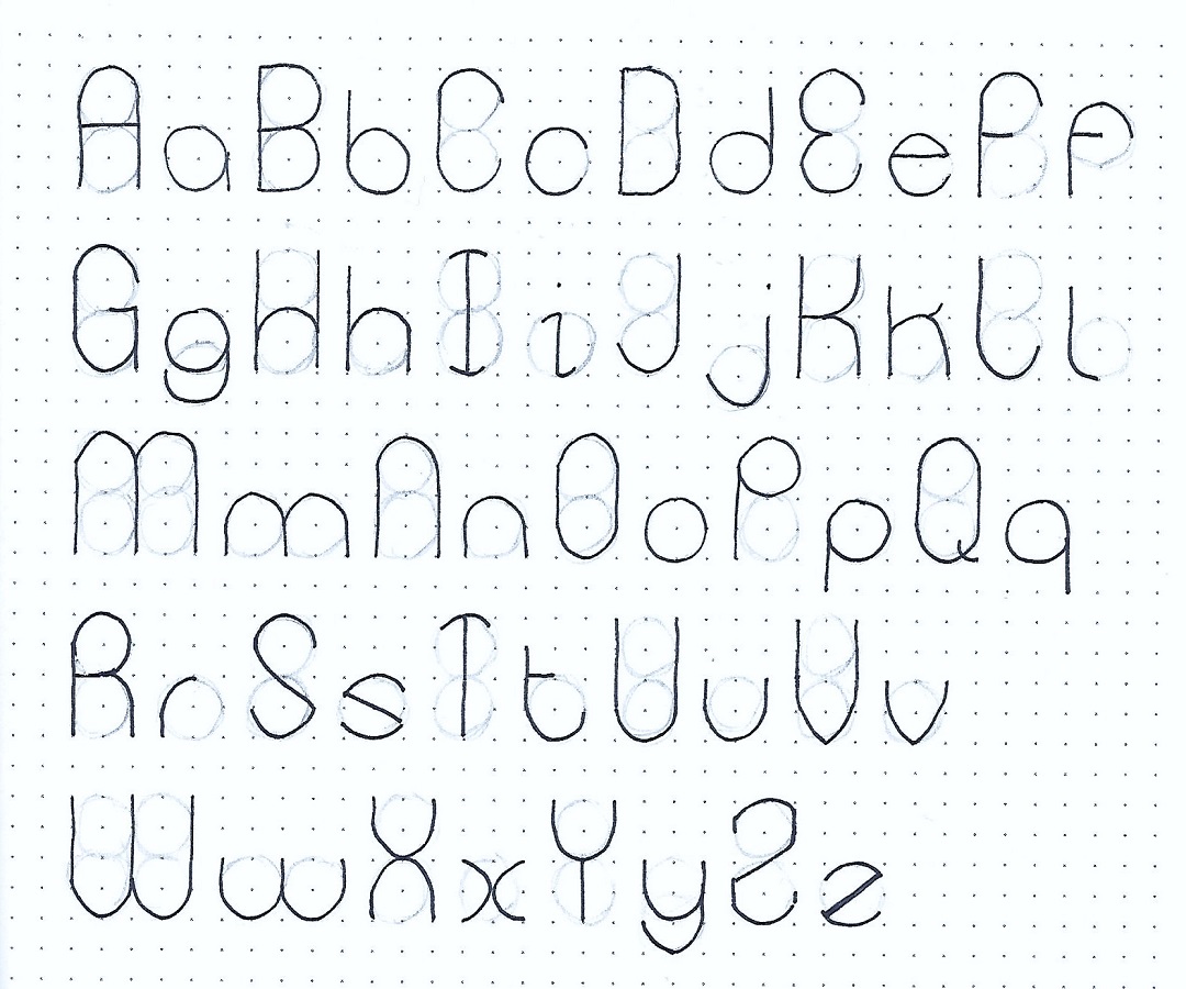
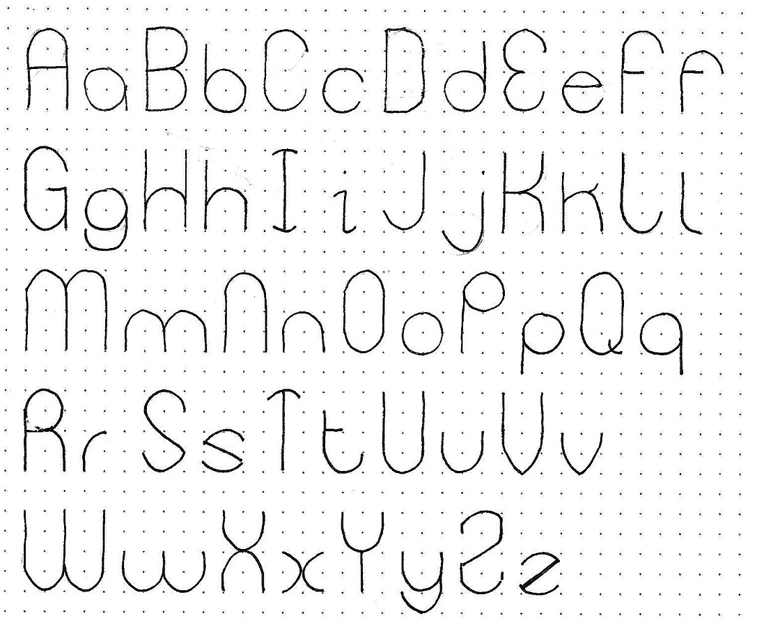
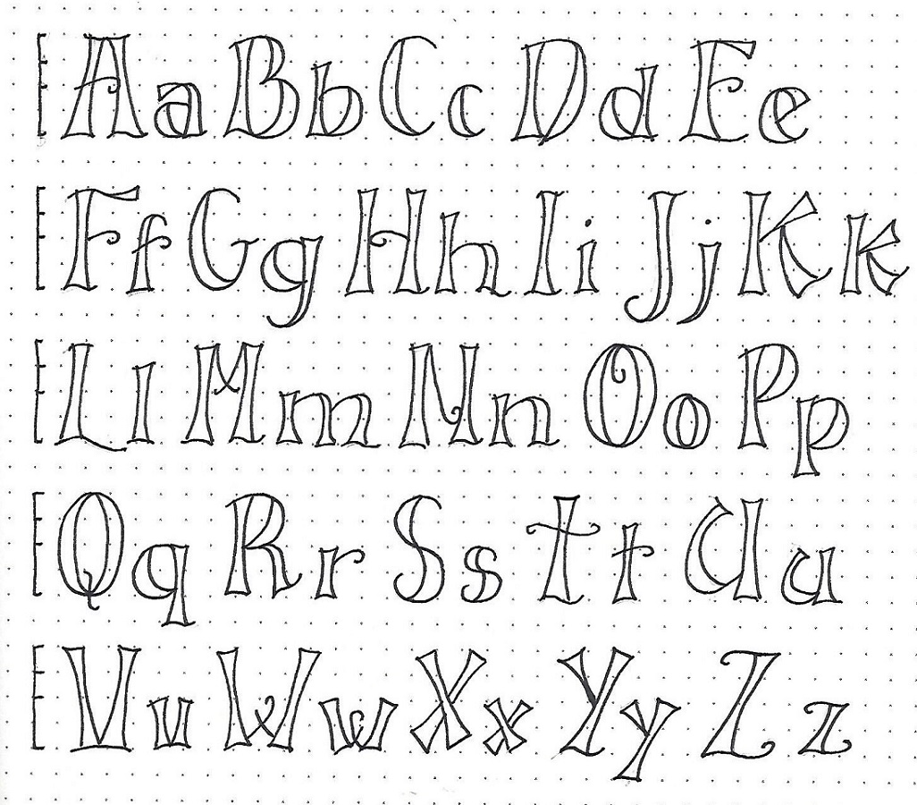
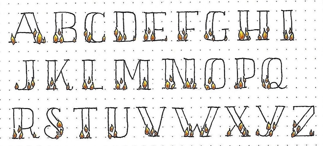
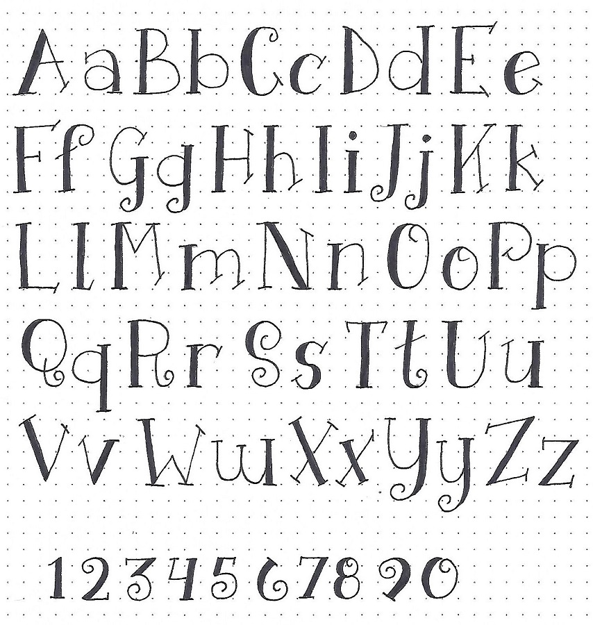
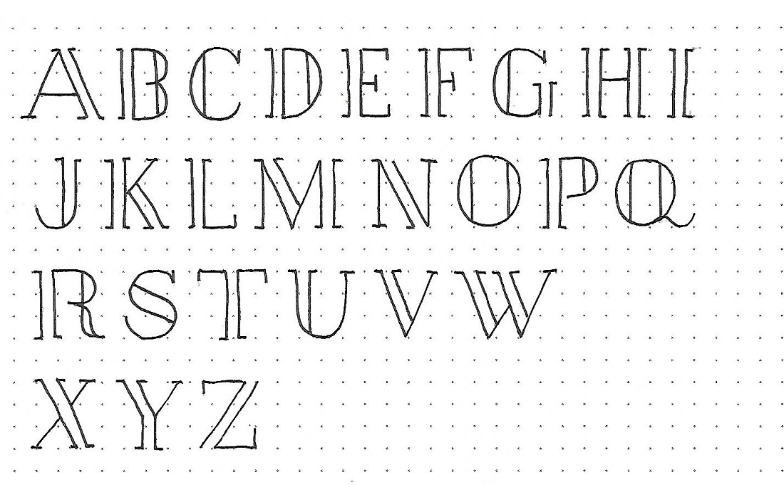
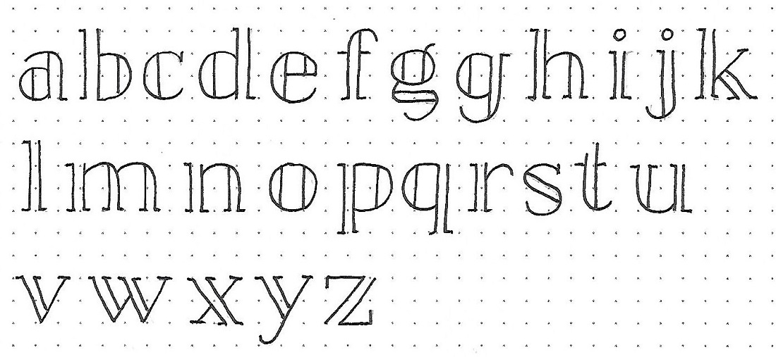
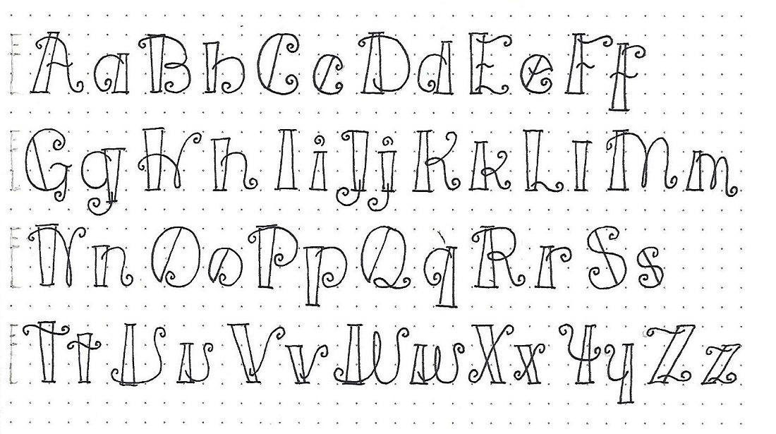
LUKE: Day #2 – Fiddlesticks – Alphabet
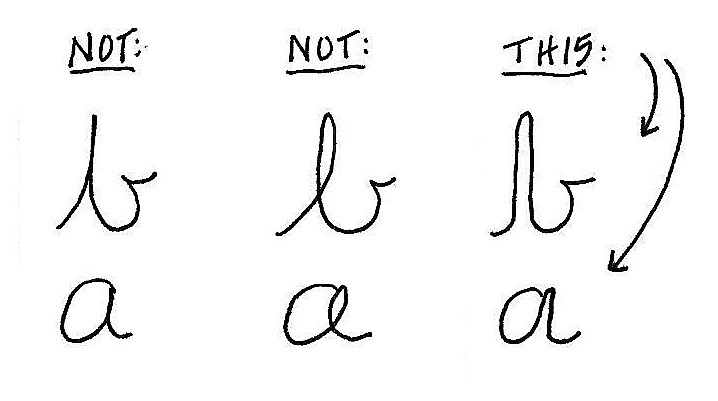
Using the process for construction that we learned yesterday – establishing guidelines, setting the pillars, adding the swirls and curls, inking the letters and erasing the pencil – write out the full upper- and lower-case alphabets for this font I’m calling Fiddlesticks.
Isn’t this fun?
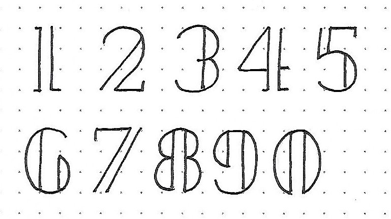
LUKE: Day #3 – Fiddlesticks – Numerals
Yesterday was an intensive day of letter drawing so I am going to go easy on you today. All you have to do is learn the 10 numerals in the Fiddlesticks font.

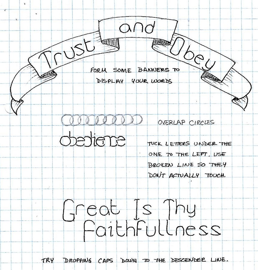
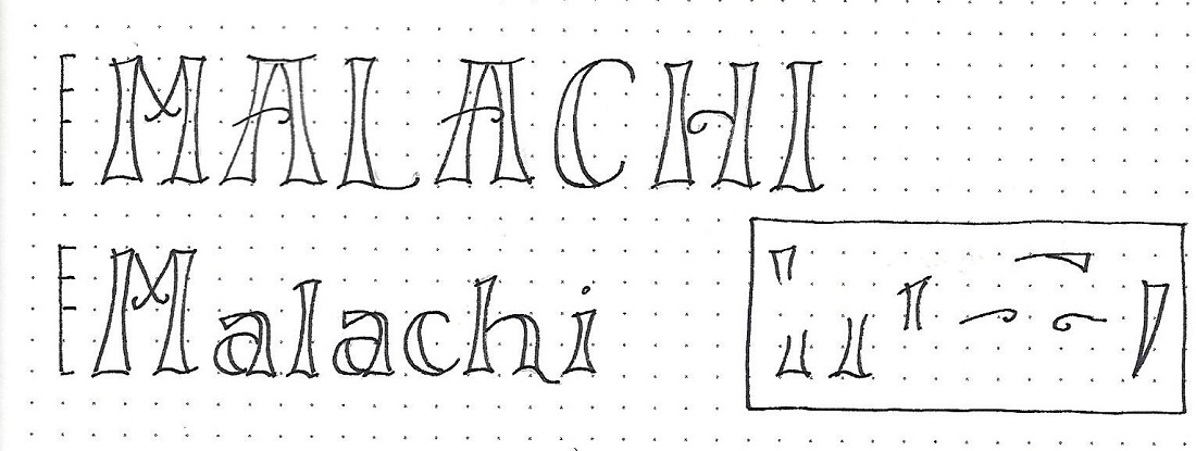
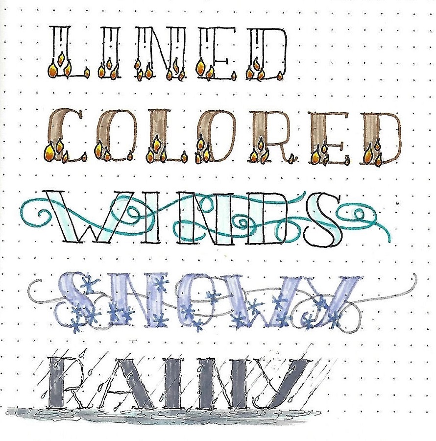
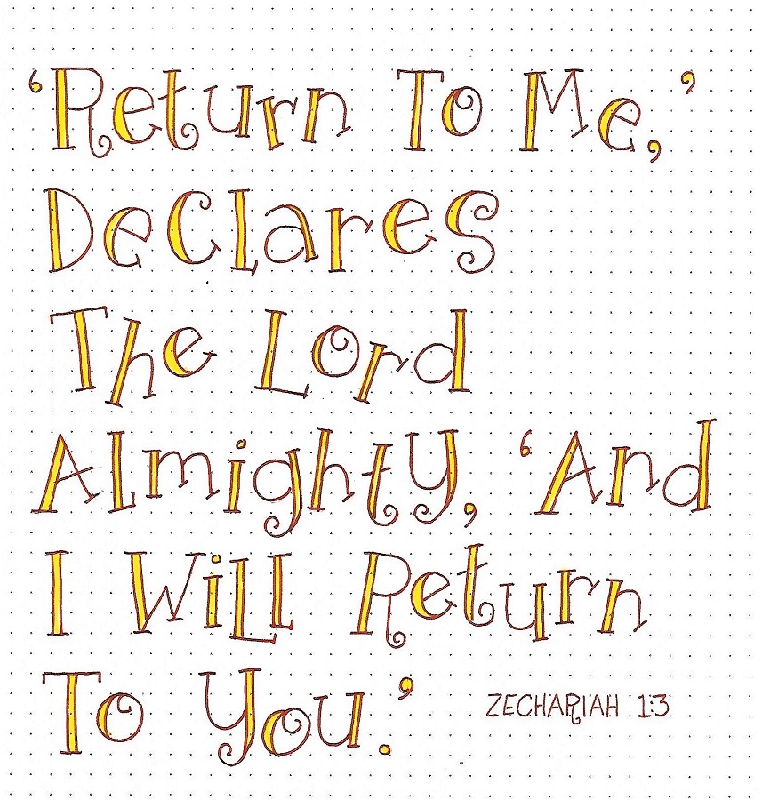
LUKE: Day #4 – Fiddlesticks – Word Play
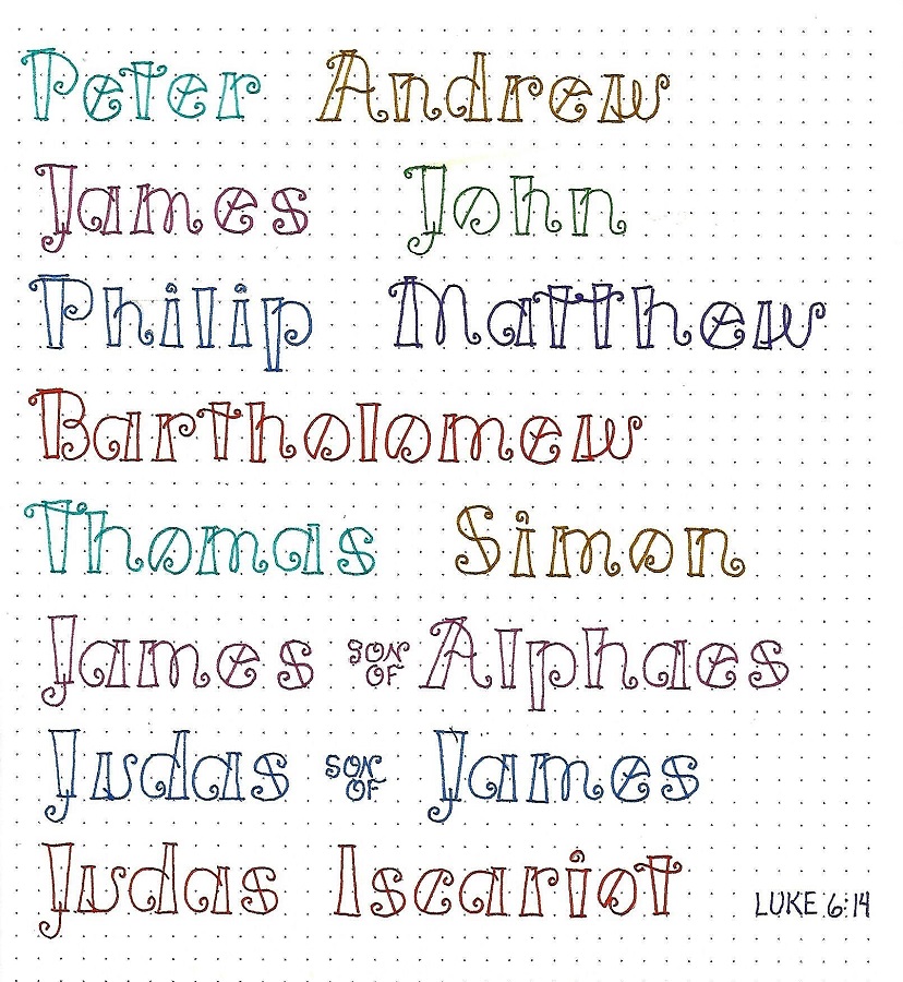
I really liked the look of the name Luke we did on day one so decided to do more names with this font. I found the list of disciples in Luke 6:14 and lettered each one in a different color of marker.
One thing this inspired me to do was make tags for Christmas gifts using this font for the recipients’ names!
Write you own name, too. I think you’ll like it.
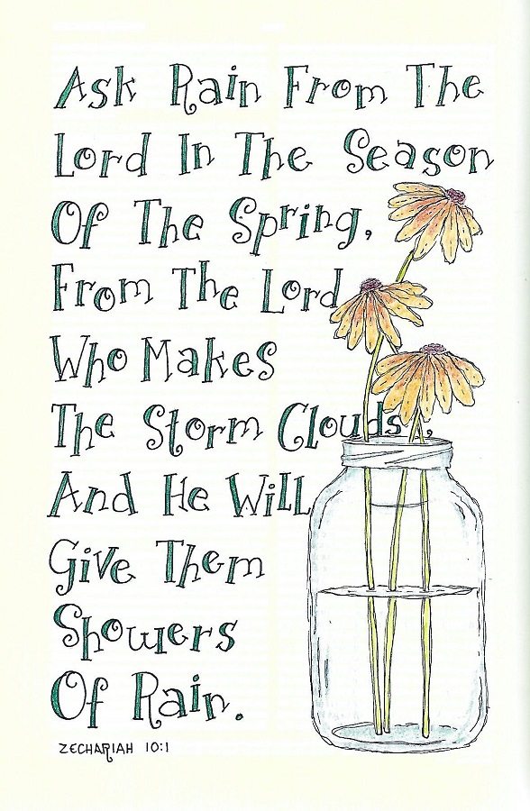
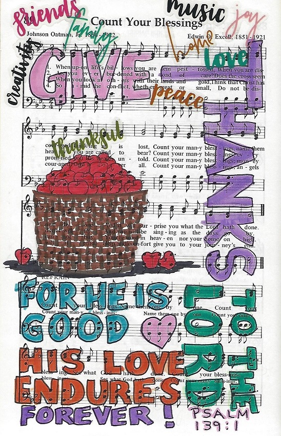
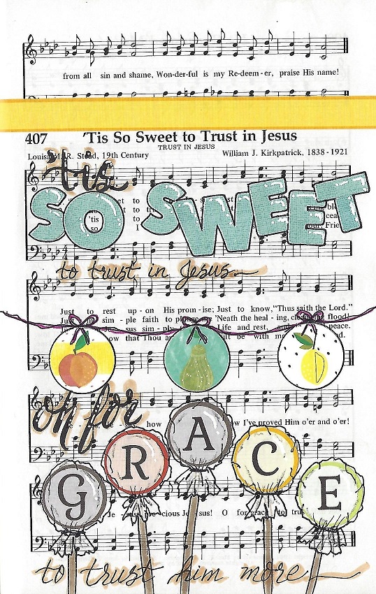
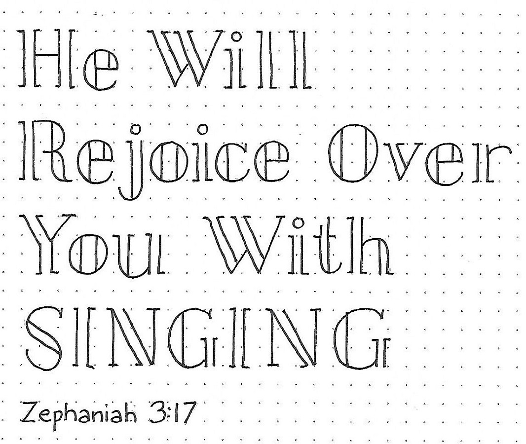
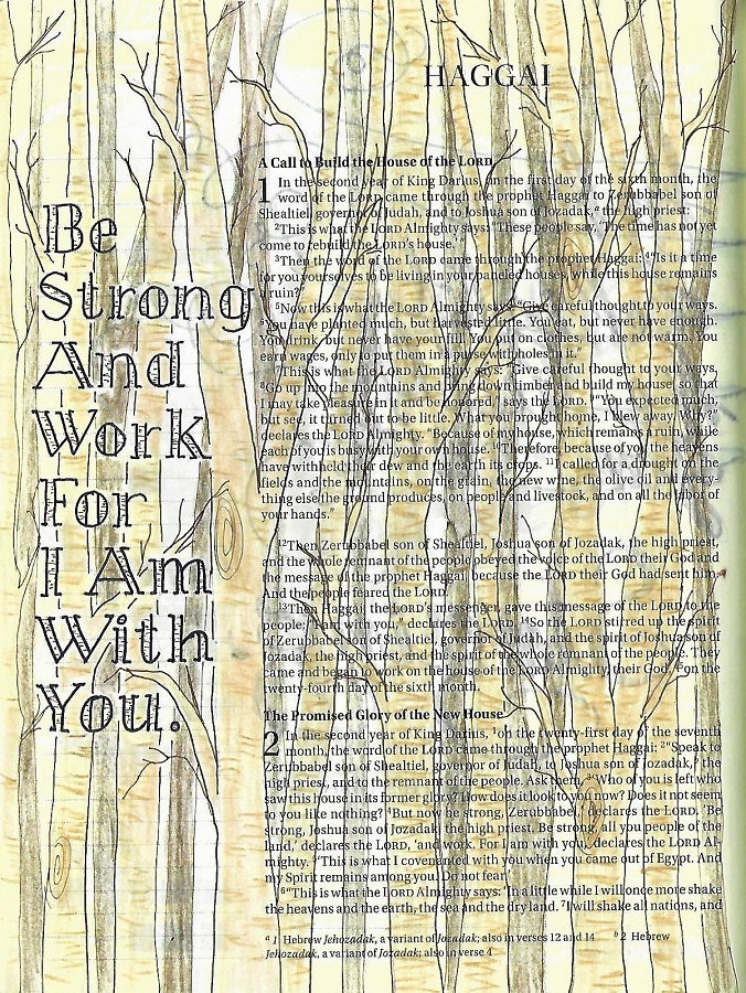
LUKE: Day #5 – Fiddlesticks – Bible Page
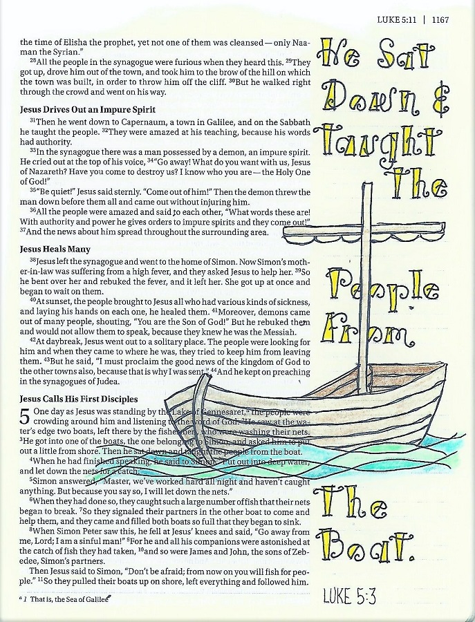
The casual feel of this font is great for writing short phrases. It is most readable when you use one word per line.
I was diligent about drawing penciled guidelines so I could get the relative letter size consistent. This also helps with readability.
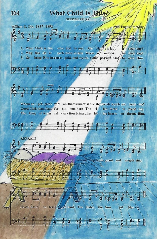
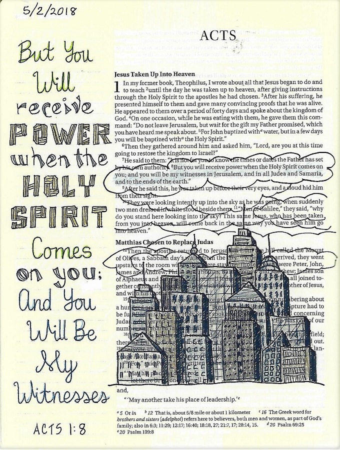
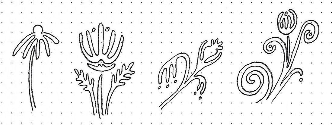
The boat illustration is from the Drawing Room.
Just ONE more lettering to go to close out 2019. Then I will be taking a break from it while the group does review lessons in 2020. There are a few scattered throughout the plan that I have not taught so I may share those as they come up and, as always, I will share new pages in my bible all through the year.
Ddd