« January 2020 »
S M T W T F S
1 2 3 4
5 6 7 8 9 10 11
12 13 14 15 16 17 18
19 20 21 22 23 24 25
26 27 28 29 30 31
You are not logged in. Log in
Entries by Topic
All topics  «
3D paperwork
A - Z challenge 5
A - Z challenge 7
A - Z challenge round 4
A to Z challenge round 3
A to Z round 2
A to Z round 6
A-Z round 1
Around the House
Art Challenges
Artist Trading Cards
Backgrounds
Beads
Bible Journaling
Books
Boxes
Collage
Color Challenge
Coloring
cookbook
Die Cuts
Digital Projects
Digital Stamps
Drawing
Dry Embossing
Fabric Stuff
Fantastic Folds
Field Trip
Home Decor
How Does Your Garden Grow?
Hymnal Art
In The Kitchen
In the studio
Jewelry
Lettering
Links
Multi-Technique
Music to Work By
Musings
Nail Art
New Work
Online Class
Other Hobbies
Other Projects
Painting
Paper Embroidery
Paper Piecing
Photo
Pretty Paper
Quilting
Random
reading
Scrap Recovery
scrapbooking
Sewing
Sketch Challenge
Some Backlog
Stamping
Stencils
Stickers
Supplies
Teabag Folding
Techniques
Testing
tips and tricks
Tutorial
Web resources
Welcome to my Blog
Work By My Friends
workflow
Writing
Blog Tools
Edit your Blog
Build a Blog
RSS Feed
View Profile
Group One
In & Out of Studio 3D
Wednesday, 15 January 2020
Illuminated List
Topic: Bible Journaling

I have used illuminated lettering before in my bible (in Matthew, for the Lord's Prayer). This time it is used in Levitius to list the prescribed Offerings and Observances that were to be adhered to by the Israelites.

By putting these on two facing pages it is nicely balanced. I changed the color scheme from the NT use of these letters to distinguish them.


A lot og gold glitter gel pen decorates these letters which makes it hard for my camera to get good focus.

Ddd


Posted by studio3d@ccgmail.net at 9:41 PM PST
Tuesday, 14 January 2020
Rejoice Before the Lord
Topic: Bible Journaling

When I am going to draw the same thing in my bible that I've already used elsewhere, I try to do it such a way that it is not obvious that it is the same item. That is what I did with these palm fronds that I had previously used in the New Testament with the Palm Sunday text.

I did not realize that the people were told in Leviticus to cut palm branches and wave them in praise to the Lord.

So this time I drew the branches much larger, limited them to just two and used fine pen to draw everything with double wavy lines.


Each branch was colored with a combination of two greens and the colors were blended with Gamsol using a paper stump.

Ddd


Posted by studio3d@ccgmail.net at 9:35 PM PST
Sunday, 12 January 2020
Lampstand For the Tabernacle
Topic: Bible Journaling

One of our group artists drew her interpretation of the lampstand made for the Tabernacle as described in Exodus.

I took her line art and printed it out then used metallic markers to color it all, leaving little bits of white paper as reflections.

I whited out the stem of the stand so my lettering would 'read' over the top of it.


Exodus 25:31 was selected by the artist.

I cut my page to fit my bible page and glued it in only at the spine.

Ddd


Posted by studio3d@ccgmail.net at 9:28 PM PST
Friday, 10 January 2020
Waterfall on Many Levels
Topic: Bible Journaling

I once drew a tutorial on how to draw a waterfall. It was simplistic (to aid in the teaching to non-drawers). When this verse popped up talking about twelve springs I decided to break the waterfall into multiple stages and embellish them a little. I added in some palms to reflect the rest of the verse (Exodus 15:27).

I started at the top and drew a very short fall of water. Then that level of rocks were added. Next came the pool of water followed by the next layer of short falls and rocks. I continued until I got to the bottom and then went back to add the elements above the falls.

After I had inked everything, erased the pencil and colored with colored pencils I blended with Gamsol on a paper stump. More color was added to the water followed by sparkles in the water done with POSCA white paint pen.


I lettered the verse at the top and bottom and colored in the lettering.

Ddd


Posted by studio3d@ccgmail.net at 9:18 PM PST
Thursday, 9 January 2020
On to the Exodus
Topic: Bible Journaling

The next old font I used from 2018 was one called 'still'. I combined it with Exodus 14:14 and rally let that word 'FIGHT' burst right off the page.

I looked up some illustrations and photos of boxing gloves and drew these directly into my bible (no test sketches on paper). These were then colored with Prismacolor brush marker (which does not bleed through bible paper),

I colored in the letters of the big word to match the gloves and pulled back to yellow for the other words.


I quite like this - bold and intriguing.

Ddd


Posted by studio3d@ccgmail.net at 9:12 PM PST
Tuesday, 7 January 2020
What's New in Genesis?
Topic: Bible Journaling

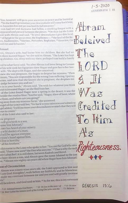
The bible journal page I did today was to feature a font that was taught back in 2018. Since, in Genesis, everything is 'new' that is the name of the font!

The font features wedge letters with a tripple dot embellishment. I changed my dots to diamonds and only used them on the upper-case letters.

Genesis 15:6 was my featured verse.


I liked the lettering well enough to let it stand on its own instead of making it compete with an illustration.

Ddd


Posted by studio3d@ccgmail.net at 9:03 PM PST
Monday, 6 January 2020
Genesis Map
Topic: Bible Journaling

I am still working with a Facebook group doing bible journaling. This year, we are going book by book straight through the bible with activities such as drawing from lessons, lettering styles, some provided artwork, scripture writing, art in our hymnals and verse mapping.


I am doing the scripture writing and the verse mapping in a Happy Planner and adding in three items of gratitude using the book 1000 Gifts as inspiration. I also plan to write in the lyrics of the hymns in addition to decorating the songs in my hymnal. All of these activities will not be shown on the blog but I will share the pages in my bible that grow out of these.

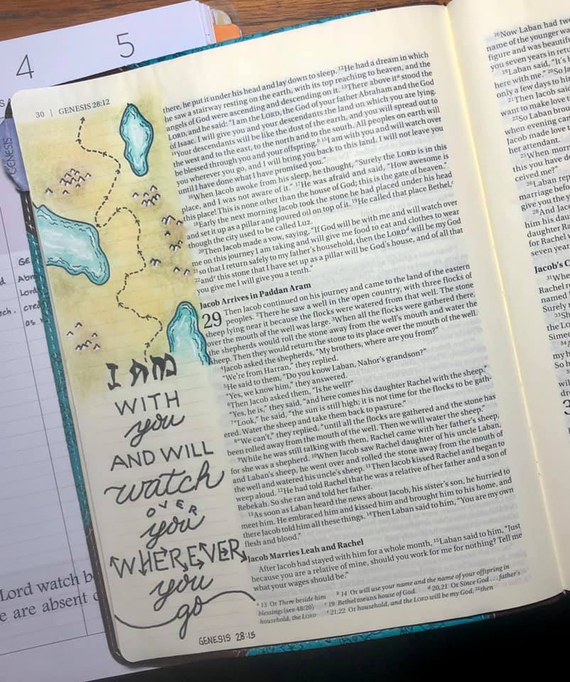
So, first up for the year is a page in Genesis I did using one of the typography lessons I drew up in April and September last year. (I forgot to mention that I want to try to do a page with these as inspiration as their book comes up in the rotation).

Today's scripture is Genesis 28:15. I drew a little map (completely made up) with water, land, mountains and a trail. It is colored with colored pencils and then marks were added in white pen.


This was kinda fun!

Ddd


Posted by studio3d@ccgmail.net at 8:52 PM PST
Quilt Card
Topic: Collage

I was challenged by a friend to create a step-by-step process for creating a quilt block in paper that would be simple for beginners to duplicate. Part of the challenge was encouraging them to 'use what you have' so they would be freed up fron thinking they had to go buy supplies.

I had a rubber stamp of a quilt block that I used as my inspiration and I laid out on my desktop some old salvaged cards, paint chip samples, wrapping paper scraps, white glue and a bit of washi tape.

By cutting standard shapes I was able to layer parts cut out of my scrappy supplies and came up with this quilt block.

After the process was complete I snagged the block to use on this card front, popped up on foam tape.


Background layers are some foiled paper and scrapbook papers over a purple folded A2 card base.

I went back and added very fine dashed lines to represent stitching on the block and gave the card a gold peel-off greeting.

Ddd


Posted by studio3d@ccgmail.net at 12:01 AM PST
Sunday, 5 January 2020
Card Challenge - Graduation
Topic: Art Challenges

I'm going to need THREE graduation cards for grandkids this year so I was glad to see this as one of the challenge themes.

I started this card with a denim printed tissue paper applied as a background on an A2 card base. Then I put together some washi tapes, diecuts, and stickers to create an adventure theme.

The camera was pretty confused by all the gold foil elements so you don't get an awfully clear photo.


CheckONE off the list!

Ddd


Posted by studio3d@ccgmail.net at 12:01 AM PST
Saturday, 4 January 2020
Challenge Card - Unusual Background
Topic: Backgrounds

Our first challenge from the card group was to use an unusual background. I had lots of choices as, when I make backgrounds, I do them in marathon sessions and set them aside for use later. My choice for this card was a shaving cream background where I used reinkers.

I already had black and white line drawing scraps on my desktop from yesterday so I snagged a couple and combined them for a focal image. I covered the seam between them with another of the Tim Holtz text stickers.


I double mounted this on top of black scrapbook paper and parchment cardstock before trimming out the background paper with 1/8 gold foiled washi tape.

Ddd


Posted by studio3d@ccgmail.net at 12:27 PM PST
Friday, 3 January 2020
Card Swap - Black and White
Topic: Pretty Paper

Another thing I want to do this year is get back to participating in card swaps and challenges. I only belong to one card-making group now and they put out monthly: 1 card swap on an assigned theme, 2 card challenges which may be techniques, supplies, themes, etc, and 1 card of the month entry that can be anything goes.

They also do a continuing letter-by-letter swap but, after two rounds of the full alphabet, I am bowing out of that one for the time being.

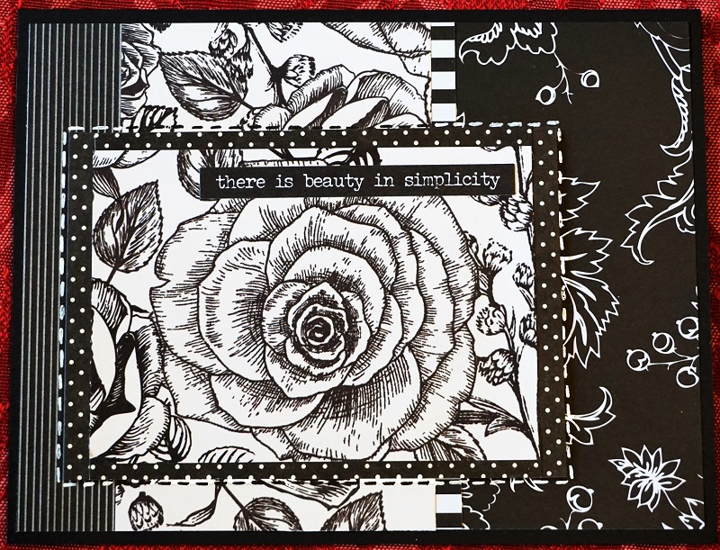
So, today I have a share of my first swap card of the year on the theme Black and White.

I chose to use black and white printed papers in collage with one focal framed out and raised up on foam tape. I used white POSCA paint pen and a black marker to add dashed lines around the focal image (white on the black and black on the white).


This is an A2 sized card with a text sticker from Tim Holtz.

Ddd


Posted by studio3d@ccgmail.net at 12:01 AM PST
Thursday, 2 January 2020
Tower of Babel
Topic: Bible Journaling

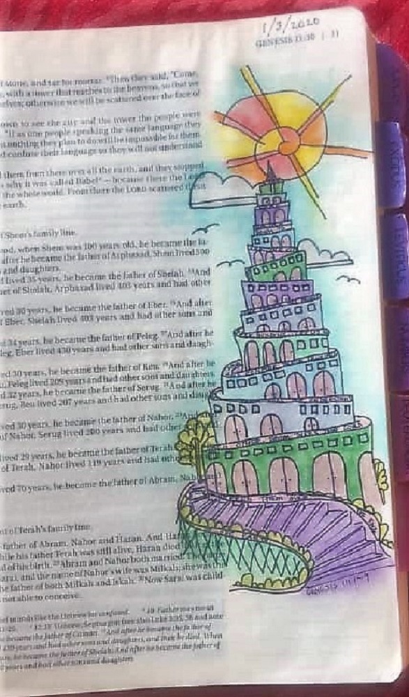
This year I am challenging myself to use more of the artwork provided on Creative-Bible-Journaling.com for inspiration in my bible journaling. Even if I don't use it exactly as presented, I can make my own edits and trace it in, or even just use it as a jumping off point to draw something else.

This week there was a printable of the Tower of Babel from the book of Genesis. I scaled it to fit the margin of my bible and traced with few hanges (I moved the sun and clouds around and changed the lower part to be steps instead of a pathway.

I used colored pencils and then used my new favorite supply, Gamsol, to blend the colors.

The other edit I made was to write a paraphrase of the story in microprint along the tops of the walls.


This is in my Journal the Word NIV bible.

Ddd


Posted by studio3d@ccgmail.net at 12:01 AM PST
Tuesday, 31 December 2019
We Three Kings
Topic: Hymnal Art

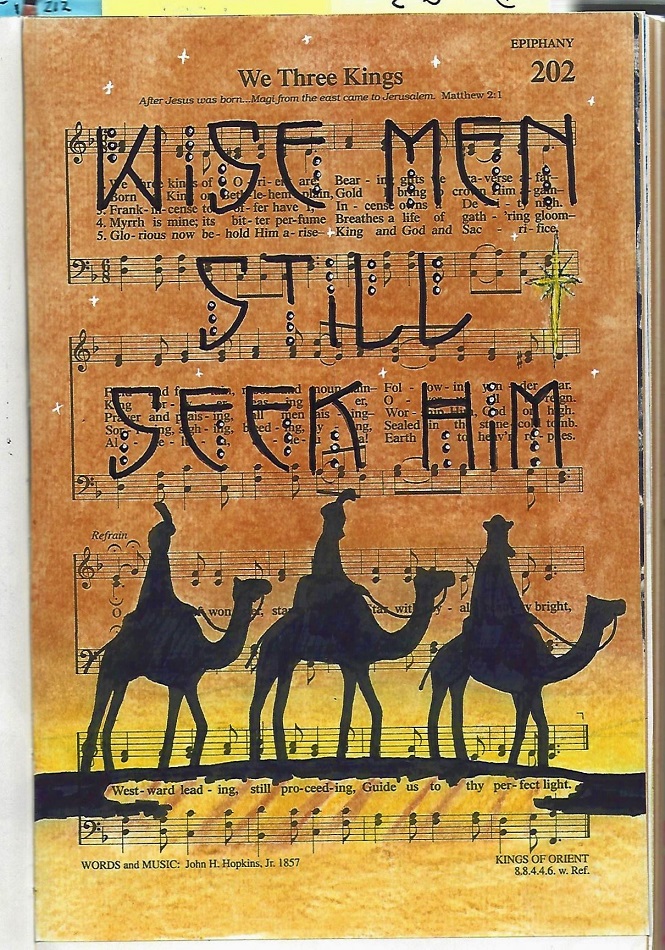
Yes, Christmas is passed and I have another carol for the season. However, it is so appropriate because the three wise men were NOT at the manger but traveled a long distance and visited Jesus later.

We Three Kings was drawn with fine-line marker and colored with Prismacolor colored pencils. The color was blended with Gamsol on a paper stump.

A black brush marker was used for the solid black.

I used a lettering style that I had taught this fall in the Lettering Lodge (and here on the blog) called 'shield'. and added highlights with white POSCA paint pen.

The stars were added with the white POSCA paint pen, as well.

In the new year we will be going back to standard hymns.

Ddd


Posted by studio3d@ccgmail.net at 12:01 AM PST
Monday, 30 December 2019
Quilt of Valor
Topic: Quilting

The Quilts of Valor program has been going on for quite some time but this is the first one I have made. 

According to the Foundation's website The mission of the Quilts of Valor Foundation is to cover service members and veterans touched by war with comforting and healing Quilts of Valor.

It also reports the following quilt counts:

Quilts Awarded This Month:

7575

Quilts Awarded 2019 YTD:

30,967

Total Quilts Awarded:

240,077

Now they can add ONE MORE to each of these totals!

My Quilt of Valor is being awarded to a friend of ours who served in the army during the Vietman era, though he was deployed in a different area.

I used fabrics with dulled colors to give the quilt an overall vintage look. The individual pieces largish (flying geese are 3x6) and blocks are 12x12. 

Here is an overview shot:


And a closeup that shows the quilting. Free-motioned zig-zags in the white chevron areas. The red and white diamond areas are outlined in long scallops as are the yellow and white pinwheels. Then the pinwheels got a star quilted into them.


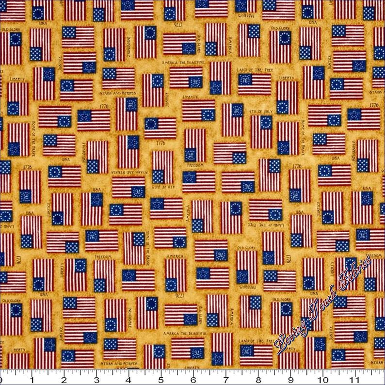
For the backing I found this awesome vintage flag print.


This will be presented on January 1, 2020.

Ddd


Posted by studio3d@ccgmail.net at 4:04 PM PST
Sunday, 29 December 2019
Collaborative Quilting
Topic: Quilting

My sister had started a few quilting projects at the time of her passing. That was a girl with very few unfinished projects!

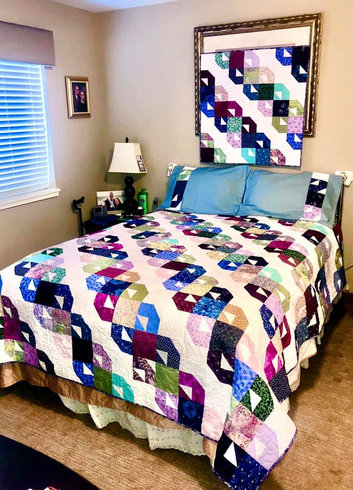
One was a SET that included a queen-sized bed quilt top (completely pieced), a matching wall hanging (laid out on the design wall) and a set of commercial pillowcases with extra blocks to decorate them with.

I took a lot of time practicing on her longarm machine with lap quilts until I was confident that I would not ruin the projects she had begun. The last week I got brave and loaded the two quilts one after the other and quilted both with a feather pattern from one of her pantograph rolls.

I was SO pleased that everything turned out perfectly!

I laid them out at Mom's house to photograph them:


She had designed this set of projects for her daughter's new house. They are boxed up and ready to mail tomorrow.

I hope I did her proud and that they will be used with loving memories!

Ddd


Posted by studio3d@ccgmail.net at 10:30 PM PST
Saturday, 28 December 2019
Lettering in the Book of John
Topic: Bible Journaling

As the year draws to a close so does the Cover to Cover lettering project. And we finished theprocess with the book of John.

These are the lessons:

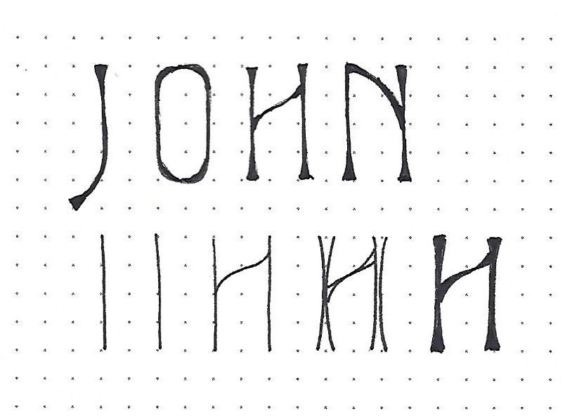
JOHN: Day #1 – Elite – Introduction

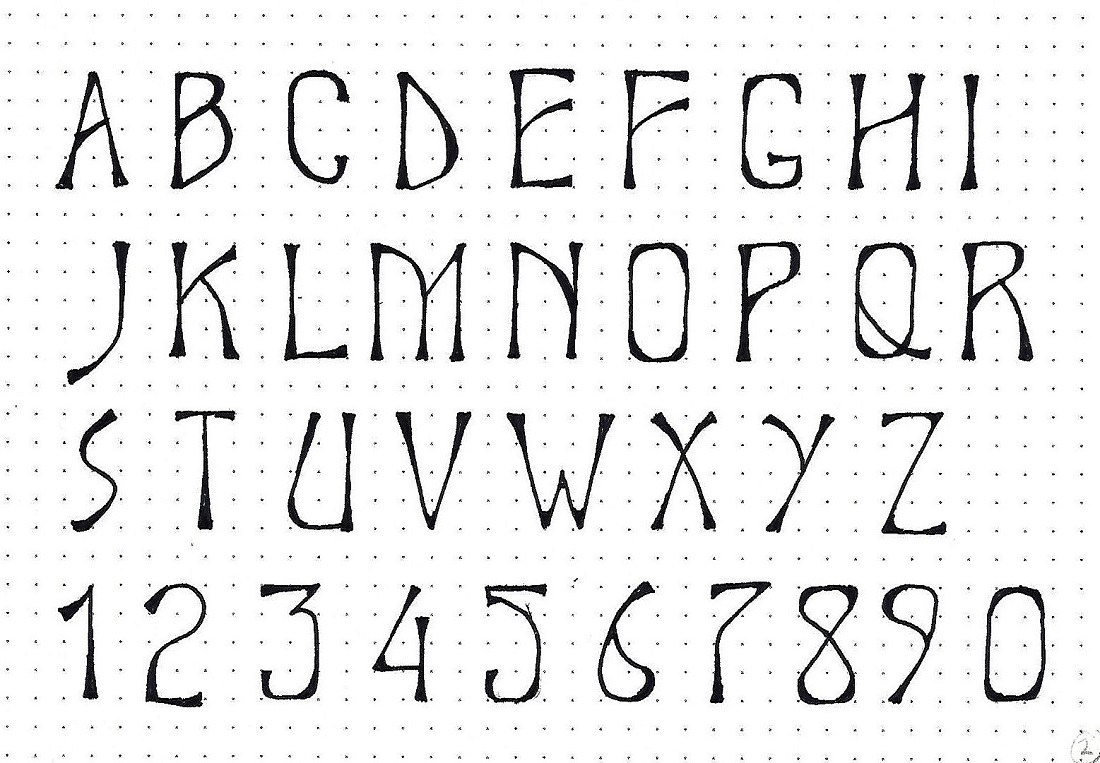
The font this week is all-caps and elegant. The stems on this tall, graceful style are flared at all the ends of lines and thickened at the interior of curves. Crossbars are angled as well as curved.

The lower part of the graphic shows the steps to constructing the letters. First, establish the stems of your 4-unit letters. Add any crosspieces. Flare the ends – the flares are much longer and smoother than a triangle serif. Fill between the lines.

Practice this construction method on the c2c book of the week – JOHN.


JOHN: Day #2 – Elite – Alphabet

Especially note the thickened internal curves on letters like the B C D G O P Q R U. Also note the filled sharp angles on the M V W and Z. These same styling elements are used on some of the numerals.

Make guidelines for a 4-unit letter height and write your alphabet using the same steps to construction that we learned yesterday.


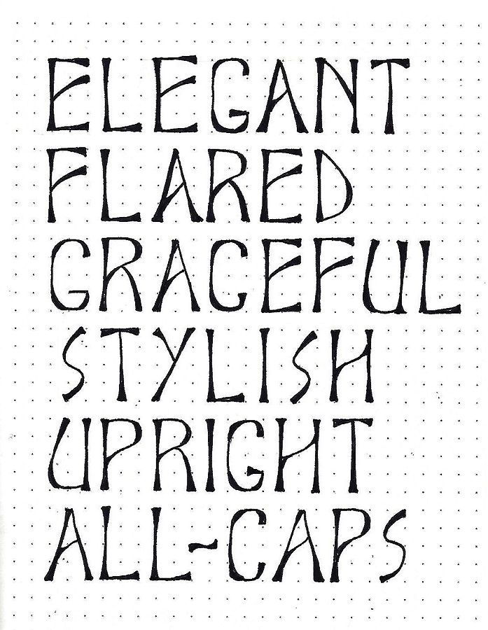
JOHN: Day #3 – Elite – Word Play

Today we will practice using the Elite Font to write some words descriptive of the style. This practice will help you get comfortable with letter spacing.

Use the same construction methods we’ve been employing all week.


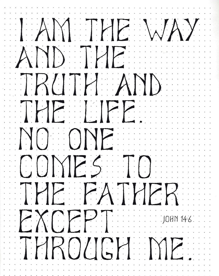
JOHN: Day #4 – Elite – Scripture Writing

Today we are moving on from simple word lists to writing a block of text – a scripture this time. This moves us from letter spacing to word spacing.

Same methods for construction apply. If you want to challenge yourself, try centering each line.


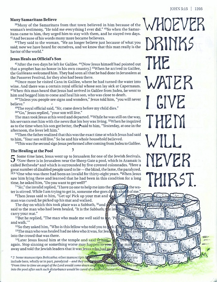
JOHN: Day #5 – Elite – Bible Page

Today we advance to using the Elite Font in our bibles. You’ll want a short scripture or phrase as you can only practically get one word per line.  If you do have a longer scripture, use the Elite font for important words and find a simple script or italic font in a smaller scale for the rest.

Height-wise, this fits nicely in two lines of the margin markings. However, it is advised that you move to a thinner tipped pen. Use the same construction methods and you’ll do just fine.

I combined my text with the Well tutorial from the Drawing Room.


Yes, I will continue lettering in my bible and in my journaling in the new year. Even I don't know what form it will take, though. I will not be teaching online lessons in 2020.

Ddd


Posted by studio3d@ccgmail.net at 12:01 AM PST
Wednesday, 25 December 2019
Joy To The World
Topic: Hymnal Art

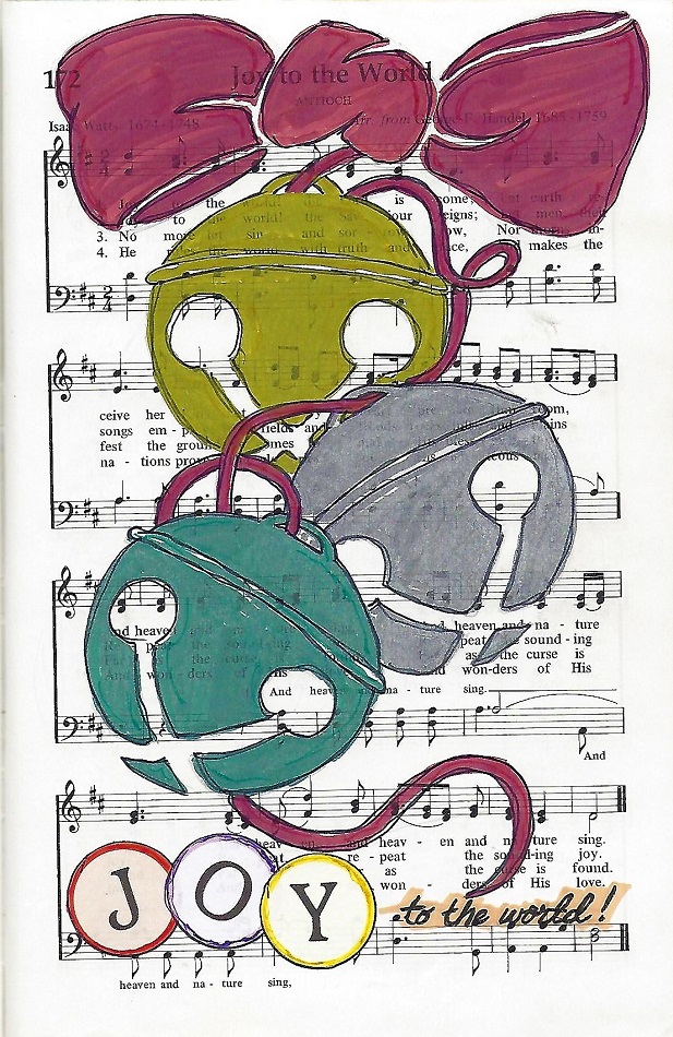
The hymnal art for today is on the Christmas Carol 'Joy to the World'. With all of the Christmas Story art that I have been doing in this hymnal I could not think of something different in that vein so I went with jingle bells.

I started out on scrap paper drawing a bell from memory but it did not look quite right so THEN I looked up a reference photo and made a few corrections from that. I had it 'almost' right but my X cuts were not deep enough on the ball. I bet those original bells would not have even rung!

Once I got the style right, I added three of them to the hymnal page along with some ribbon to hold them all together.

When it got to coloring, I grabbed some metallic paint pens in gold, silver and green for the bells and in red for the ribbons.


You can faintly see where I aded matching glitter gel pen for the highlights.

The JOY is round stickers.

Ddd


Posted by studio3d@ccgmail.net at 12:01 AM PST
Friday, 20 December 2019
Lettering in the Book of Luke
Topic: Bible Journaling

The lettering lessons this week have been centered on the book of Luke. I hope you find them to be as much fun as I did.

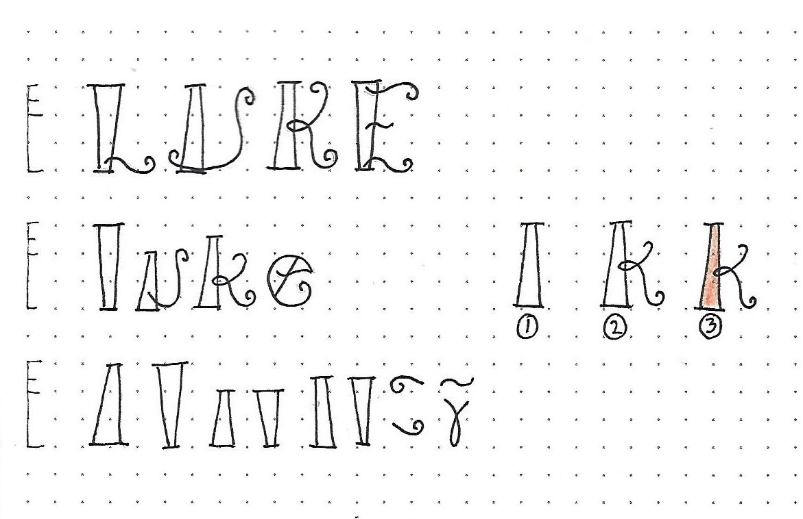
LUKE: Day #1 – Fiddlesticks – Introduction

This week we have a fun novelty font that employs one tapered pillar with serifs per letter. The rest of the letter styling is achieved with swirling stringers that have tight curls on the ends.

Overall letter height is 3 units. The x-height is at 2 units while the ascenders are at 2 ½.

Practice the marks at the bottom of the graphic first to get a feel for structure. Then draw out the three steps shown at the right: 1) draw the pillar making sure of whether the wide end is up or down (and the proper height). 2) add the prescribed curly lines. 3) after inking and erasing pencil, fill with color if you wish.

When you’ve become comfortable with the process, ink the upper-case and the lower-case versions of the c2c book of the week.


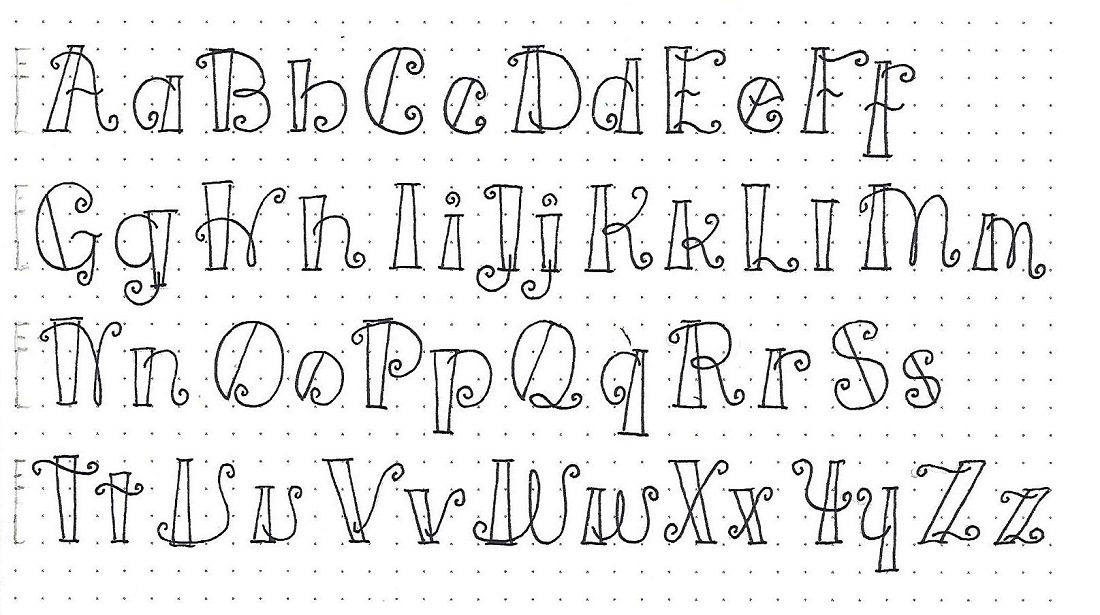
LUKE: Day #2 – Fiddlesticks – Alphabet

Using the process for construction that we learned yesterday – establishing guidelines, setting the pillars, adding the swirls and curls, inking the letters and erasing the pencil – write out the full upper- and lower-case alphabets for this font I’m calling Fiddlesticks.

Isn’t this fun?


LUKE: Day #3 – Fiddlesticks – Numerals

Yesterday was an intensive day of letter drawing so I am going to go easy on you today. All you have to do is learn the 10 numerals in the Fiddlesticks font.


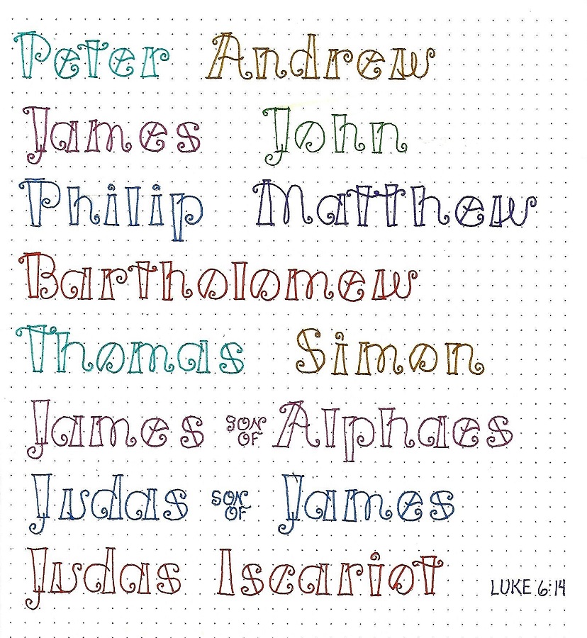
LUKE: Day #4 – Fiddlesticks – Word Play

I really liked the look of the name Luke we did on day one so decided to do more names with this font. I found the list of disciples in Luke 6:14 and lettered each one in a different color of marker.

One thing this inspired me to do was make tags for Christmas gifts using this font for the recipients’ names!

Write you own name, too. I think you’ll like it.


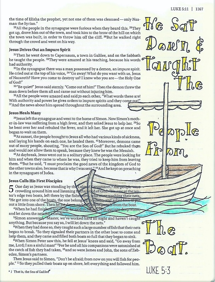
LUKE: Day #5 – Fiddlesticks – Bible Page

The casual feel of this font is great for writing short phrases. It is most readable when you use one word per line.

I was diligent about drawing penciled guidelines so I could get the relative letter size consistent. This also helps with readability.

The boat illustration is from the Drawing Room.


Just ONE more lettering to go to close out 2019. Then I will be taking a break from it while the group does review lessons in 2020. There are a few scattered throughout the plan that I have not taught so I may share those as they come up and, as always, I will share new pages in my bible all through the year.

Ddd


Posted by studio3d@ccgmail.net at 8:36 AM PST
Thursday, 19 December 2019
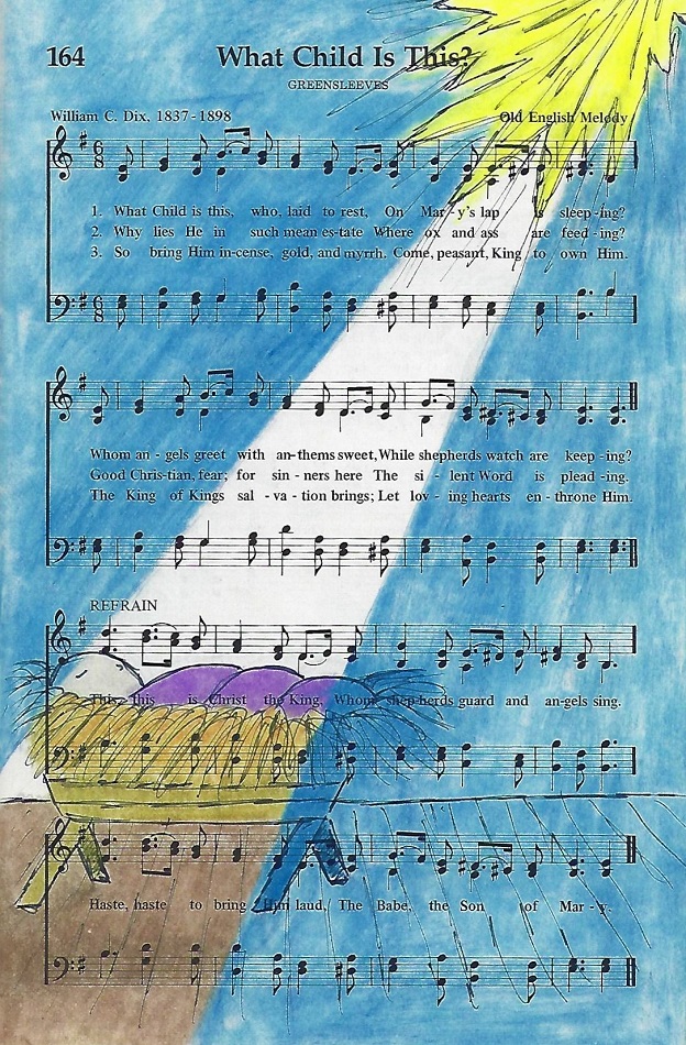
What Child Is This?
Topic: Hymnal Art

All through this month, the assigned hymns to illustrate are Christmas Carols. This is the third of five that we will do.

I did an illustration much like this in my bible in Isaiah for the prophecy of Jesus' birth.

This has been drawn with fine-line markers and colored with colored pencils. The pencil has been blended with Gamsol which also brightens the color.


This highlighting style was one I originally saw applied to a shaft of sunlight on a rubber stamped image - but it works for starlight too!

Ddd


Posted by studio3d@ccgmail.net at 11:01 AM PST
Saturday, 14 December 2019
Lettering in the Book of Mark
Topic: Bible Journaling

Yep, it's more lettering! This is a more formal style so I called it 'Tuxedo'!

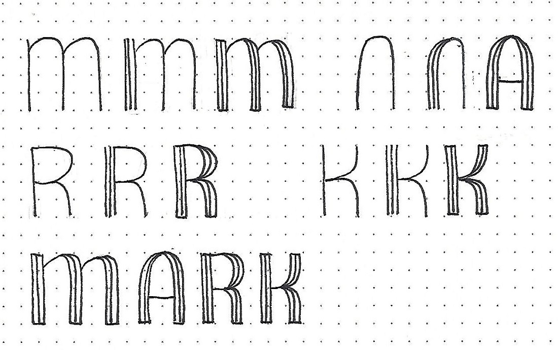
MARK: Day #1 – Tuxedo – Introduction

These letters are based on a 4-unit height and are drawn in three steps, which are demonstrated on each of the 4 letters in the c2c book of the week.

First, draw a basic shape for your letter. Second, draw a close line in both sides of that line on the verticals. Third, complete the rest of the letter in the same manner.

NOTE: The horizontal lines do not get the pinstripes and the curves are merged into a single line.

Practice writing this one word following the steps given. The best way to do this is to pencil in all your base letters for the whole word, phrase or sentence. Then go through with ink and draw the multiple lines on all the letters. Erase your pencil when the ink is dry.


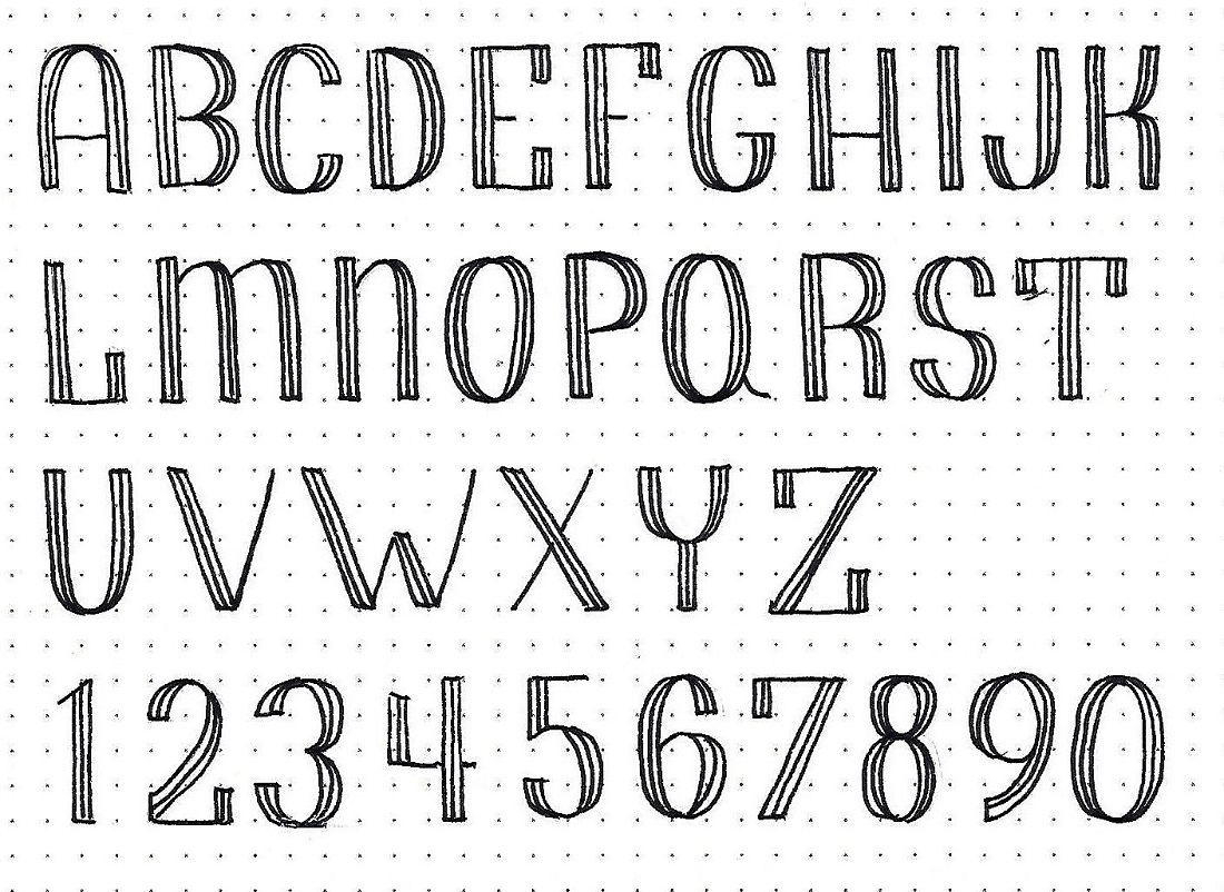
MARK: Day #2 – Tuxedo – Upper-Case Alphabet

You can practice the step by step method for writing out this upper-case alphabet today. I would complete each line separately and then go on to the next one.

I have provided a set of numerals that coordinate with the alphabet, as well.


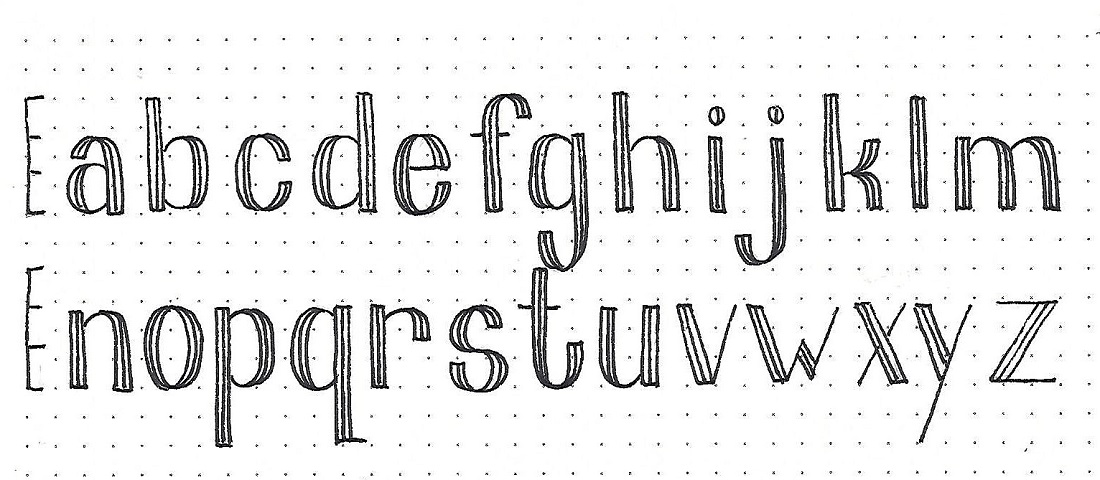
MARK: Day #3 – Tuxedo – Lower-Case Alphabet

Yep, we have a lower-case alphabet for this font, too.  The letter height (4 units) is divided into thirds and the x-height falls at the 2/3 mark. The descender is 2 units.

Make sure you make your tuxedo lines the same distance as you did on the upper-case.

Like the upper-case, the verticals, whether straight or curved, have the lines while the horizontals have only one line. The curves are tapered just like the upper-case letters were.


MARK: Day #4 – Tuxedo – Scripture Writing

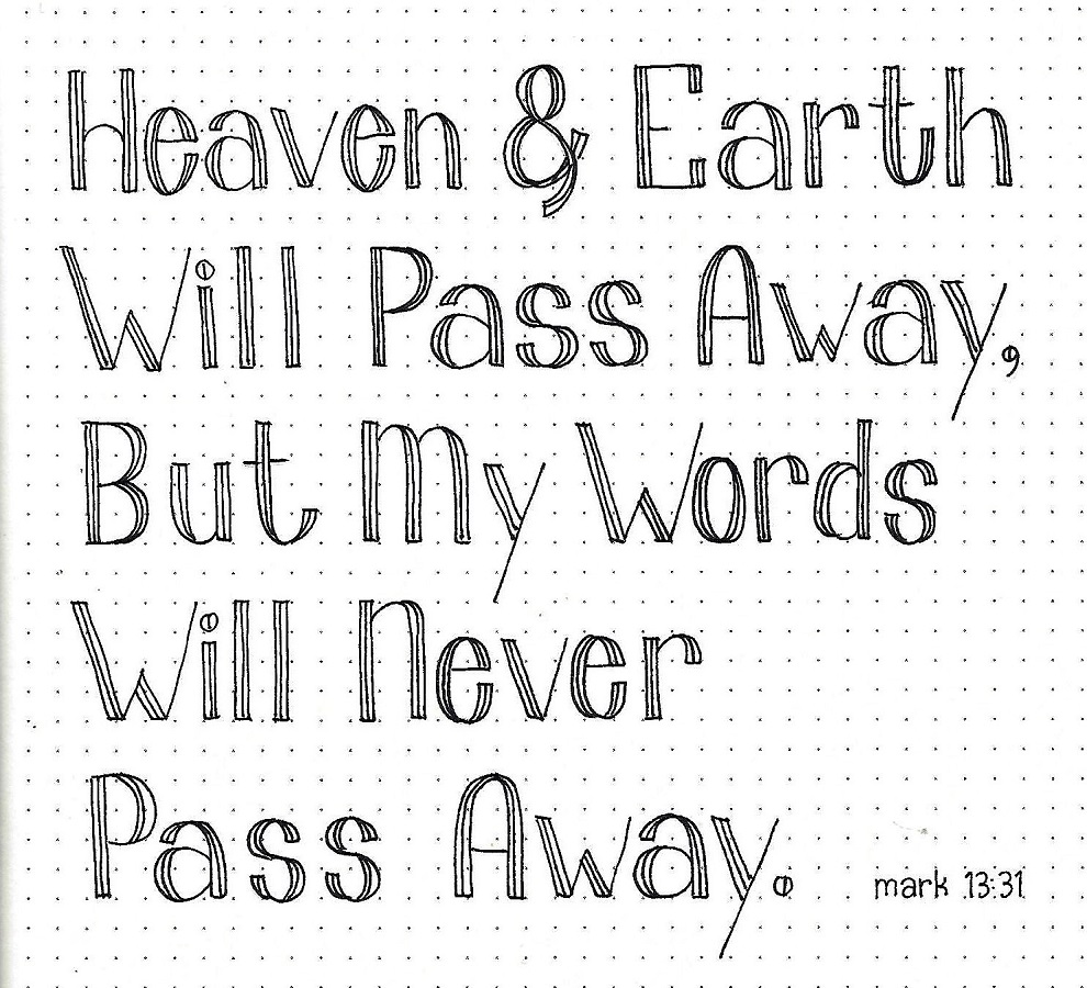
Today, select a verse of scripture to letter using the Tuxedo Font. Use a mix of upper- and lower-case letters.

I am aware that getting the x-height at 2/3 f a 4-unit height will be a challenge. To overcome this, draw in penciled guidelines for the top, baseline and x-height before you begin.

Work on either one line at a time or the whole piece as you proceed through the steps (rather than one letter at a time). This will help you maintain consistency.


MARK: Day #5 – Tuxedo – Bible Page

For my bible page I used a full-letter height of 2 units (the lines marked in my margin). I drew very light guidelines in pencil for the baseline, letter height and x-height (2/3 of letter height).

I worked on the whole phrase at the same time through the steps. After inking and erasing the pencil, I used colored pencils to fill in the letters.


The drawing room tutorial for the week did not fit with my selected verse for lettering so I drew this lily instead, to decorate the page.

Ddd


Posted by studio3d@ccgmail.net at 10:46 AM PST

Newer | Latest | Older