« September 2020 »
S M T W T F S
1 2 3 4 5
6 7 8 9 10 11 12
13 14 15 16 17 18 19
20 21 22 23 24 25 26
27 28 29 30
You are not logged in. Log in
Entries by Topic
All topics  «
3D paperwork
A - Z challenge 5
A - Z challenge 7
A - Z challenge round 4
A to Z challenge round 3
A to Z round 2
A to Z round 6
A-Z round 1
Around the House
Art Challenges
Artist Trading Cards
Backgrounds
Beads
Bible Journaling
Books
Boxes
Collage
Color Challenge
Coloring
cookbook
Die Cuts
Digital Projects
Digital Stamps
Drawing
Dry Embossing
Fabric Stuff
Fantastic Folds
Field Trip
Home Decor
How Does Your Garden Grow?
Hymnal Art
In The Kitchen
In the studio
Jewelry
Lettering
Links
Multi-Technique
Music to Work By
Musings
Nail Art
New Work
Online Class
Other Hobbies
Other Projects
Painting
Paper Embroidery
Paper Piecing
Photo
Pretty Paper
Quilting
Random
reading
Scrap Recovery
scrapbooking
Sewing
Sketch Challenge
Some Backlog
Stamping
Stencils
Stickers
Supplies
Teabag Folding
Techniques
Testing
tips and tricks
Tutorial
Web resources
Welcome to my Blog
Work By My Friends
workflow
Writing
Blog Tools
Edit your Blog
Build a Blog
RSS Feed
View Profile
Group One
In & Out of Studio 3D
Thursday, 24 September 2020
Fruit in Galatians
Topic: Bible Journaling

The obvious choice in using illustrations of fruit in the bible is to place them in Galatians with the scriptures listing the fruits of the spirit. So, yes, I went with the obvious!

In fact, I have a different version of fruit on this scripture in my Journal the Word bible so I switched to the interleaved bible and used a full page illustration.

The coloring is very rudimentary, and is done in colored pencil, with a style reminiscent of a coloring book.  I am torn between leaving it as is and using some odorless mineral spirits to blend.


A simple, tall, skinny print was used for the text lettering.

Ddd


Posted by studio3d@ccgmail.net at 11:00 AM PDT
Wednesday, 23 September 2020
Bid Me Goodnight
Topic: Quilting

Once again, the entry title is the name of my latest quilt - a kind of inside joke because it will be 'bid' on at auction and it is a queen-size bed quilt. This is only the 5th time I have made a queen quilt (also have done 1 king) - not a big percentage out of 202 quilts!

This quilt was made by request, for a fund-raiser auction, but I used mostly fabrics I had on hand.

The initial plan was to use a panel I had with 18 units of paintings of Alaska wildflowers. I had picked this up on a vacation cruise some years ago and was waiting for the right pattern to come along. When I saw a tutorial on Missouri Star Quilt Company for using 2" blocks to surround 6" squares I knew I had the right pattern for me. Only problem was that the floral centers were 6x12, so I had to adjust the pattern. Done.

That tutorial used a 'jelly roll' of 2 1/2" strips to create the surrounding blocks. I happened to have a kit, given to me as a gift, with beautiful batik fabric strips. I never liked the pattern in the kit so these had sat languishing in the stash. Eureka! The colors were perfect with the flower portraits.

Then I got the request that the quilt be queen sized. Hmmm, I had enough for a lap quilt! So I rummaged through my stash and found some florals that I could add in, even if they were not the portrait style - same color ranges, though. I had to add in some other batik fabrics (cut into strips) so there would be enough to surround all the blocks. This gave me the opportunity to weed out some of the original batiks that were red or black or navy blue that really did not suit the pallette.

SO - I laid it all out, sewed together in a 7 across by 4 down grid only to realize I had the mattress dimensions backwards! AAAAAaaaarrrrgggghhhh! Now, what to do? Take off one column from the side, cut and block-border two more of the fabrics and create an addition row at the bottom. Now I had a grid layout of 6 across and 5 down with the exact dimensions of a queen mattress. Whew!

I calculated what borders I would need to create a drop on three sides. From my stash I added a 2 inch border all around, a 4 inch border to the sides and bottom (plus a 2 inch top border) and an 8 inch border to the sides and bottom. At the corners of the 4 and 8 inch borders I put in cornerstones of 2" blocks left over from the block bordering. This gave me a 14" drop.

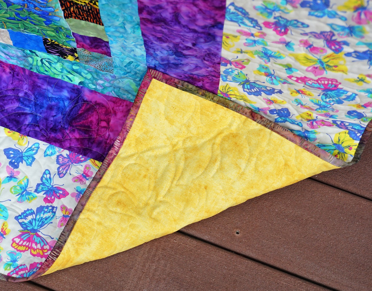
This was quilted with 'bountiful feathers' from Urban Elementz with a 'silver' gray thread, yellow backing and Hobbs Heirloom cotton/polyester blend batting. Binding is one of the batiks that has a color blend from grayed green to red violet.

Throughout this process, with all of its changes, someone commented "You are truly creative." My response, "You mean, 'you really make it up as you go along'!" (More than you know)

When I was truly all done I had big chunks left of the yellow backing fabric, the widest border fabric and another of the border fabrics. So I made a set of matching pillowcases to go with it. By placing these at the top of the bed it will make up for there not being a lot of quilt at the top edge to enclose pillows like you would with a bedspread.

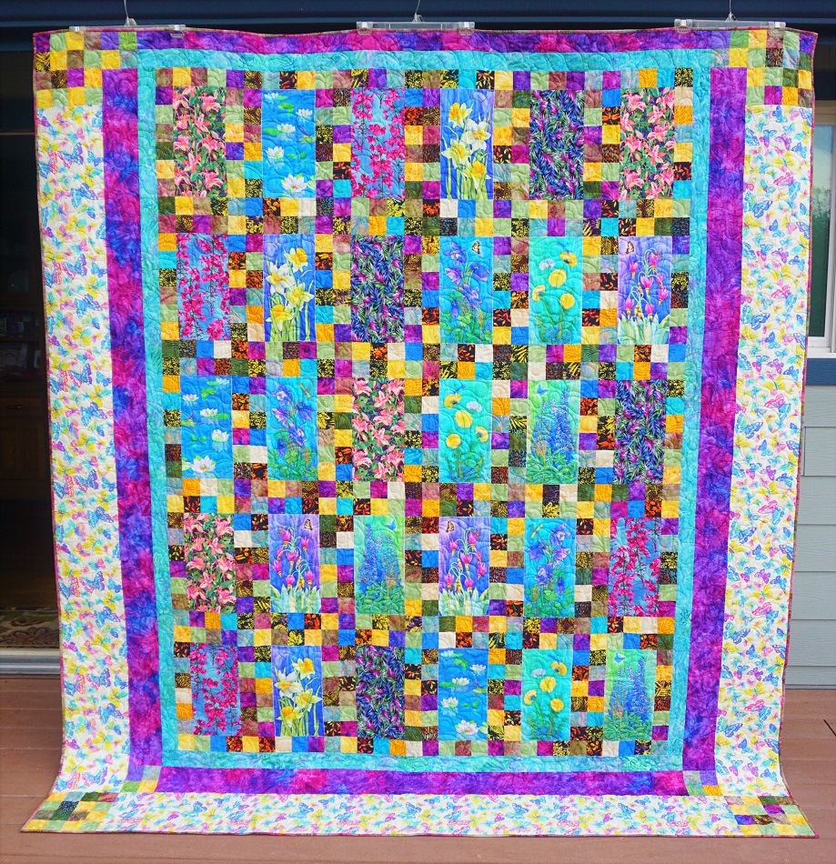
After all that, are you ready for some pictures?

The only place tall enough to display it was on pant hangers hooked to the house gutter. It still drags at the bottom.

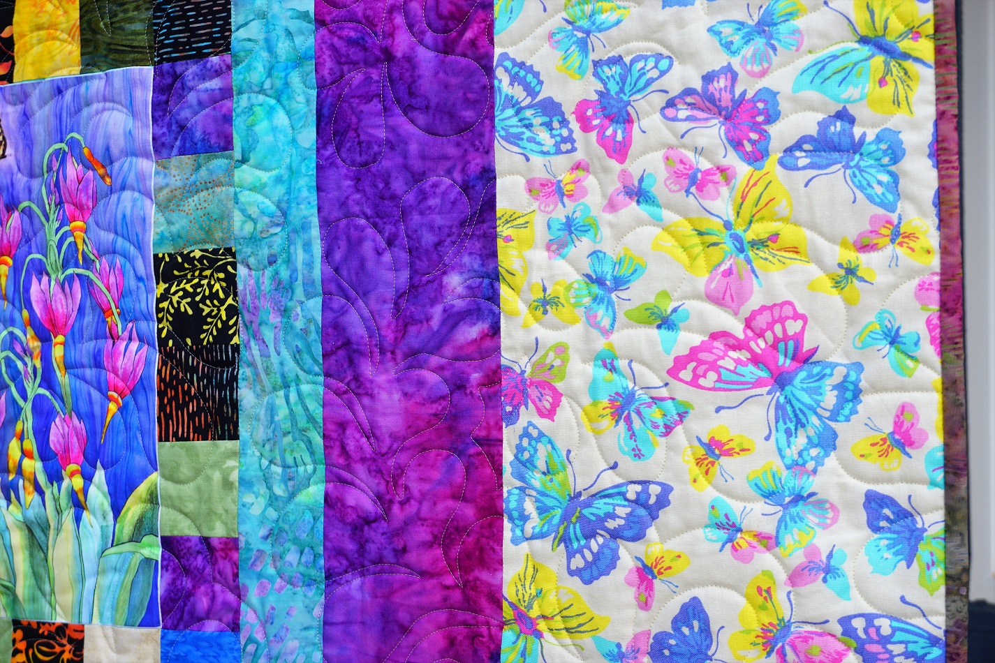
Look how well those batik blocks pull out the colors from the flower panels.

A better view of the floral fabrics:


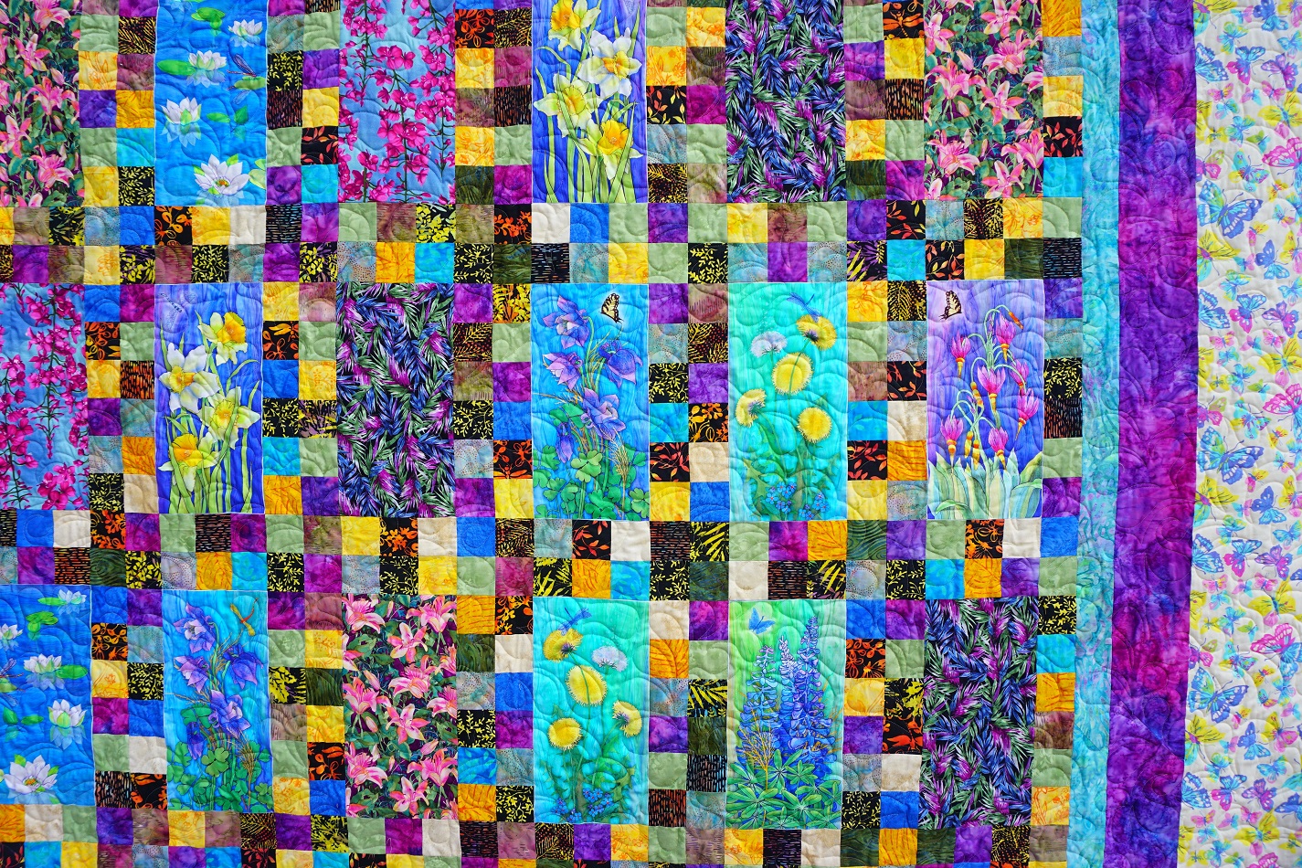
A closeup of one of the wildflower portraits. You can see how this one has a dragonfly. Others have butterflies which will play into the outer border.


Here you can see the quilting pattern as well as the sequence of the three borders (2", 4", 8"). The colors in the butterfly print were a perfect match for the florals and it was already in my stash!


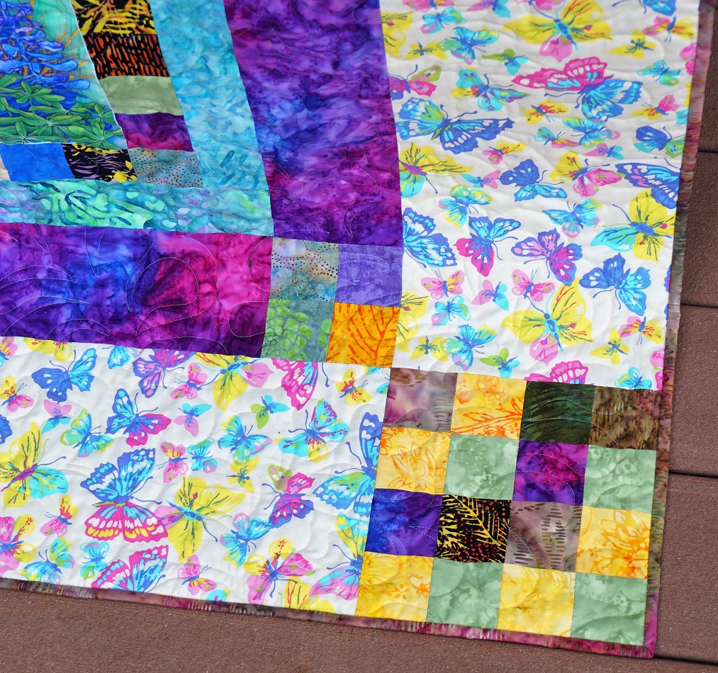
Here is a view of the pieced cornerstones in the borders.


And a peek at the backing and binding.


I didn't get a photo of the pillowcases. They are yellow with a butterfly cuff and a 1" flange of the teal border.

Ddd


Posted by studio3d@ccgmail.net at 12:01 AM PDT
Tuesday, 22 September 2020
Galatians Redeemed
Topic: Bible Journaling

Another week - another book! This week we were working in Galatians. The assigned lettering is a font called 'Redeem' though we could use any form of the word (redeem, redeemed, redeemer).

The oddest thing about this faux-brush script is the way the upper-case is fully vertical while the lower-case is slanted. I'm not entirely sure I like it that way and I often write it all one way or the other or somewhere in between.

Since this was an assignment, I wrote it the way the font was designed.


I used some of the clear floral stickers from Happy Planner to decorate the page.

Ddd


Posted by studio3d@ccgmail.net at 12:01 AM PDT
Thursday, 17 September 2020
Victory in Jesus
Topic: Hymnal Art

I decorated another page in my hymnal - Victory in Jesus.

This is inspired by an illustration I found on Pinterest (the way of the lettering) and I worked with colored pencil shading to create a glow and dimension on the cross.

I found that some of my clear Happy Planner stickers were an exact match to the colors I had used so I added a grouping at the base of the cross.

Ddd


Posted by studio3d@ccgmail.net at 12:01 AM PDT
Wednesday, 16 September 2020
Jars of Clay
Topic: Bible Journaling

When I first did jars of clay in my bible I did a more detailed version. But this time I was following along with a tutorial I had writtten so used the more simplified one.

I also moved to the interleaved bible so I would have a full page to work with.

With the pen and ink sketch lines being rustic, I used a very informal font for the text of 2 Corinthians 4:7, and wrote it with double wavery lines.

Ddd


Posted by studio3d@ccgmail.net at 12:01 AM PDT
Tuesday, 15 September 2020
Bread and Wine
Topic: Bible Journaling

I have used this illustration before but wanted it especially for this scripture. So I used it again, just in a different size on the page.

I also made the cup and the bread more rustic - and with a piece torn off the bread.

I used a tall thin font for the text of 1 Corinthians 11:24

Ddd


Posted by studio3d@ccgmail.net at 12:01 AM PDT
Thursday, 10 September 2020
To God Be the Glory
Topic: Hymnal Art

 A lot of people use washi tape in their bibles or hymnals but I have never been a fan of the low-tack adhesive so I have very little of it.

What I did have was some border strip stickers out of a bible journaling book. They were the perfect size to fit in the spaces of the sheet music.

I used a brush pen to add lyrics over the colored border strips and then added clear flower stickers to finish off the ends.

Ddd


Posted by studio3d@ccgmail.net at 12:01 AM PDT
Wednesday, 9 September 2020
Roman House
Topic: Bible Journaling

The bible journaling book by Joanne Fink teaches a cute little wonky house that I like to draw. In this case I used it in the book of Romans with an open front door to represent hospitality.

I added some light clouds and a front yard with a sidewalk to set the scene.


A little banner added to the lettering and Romans 12:13 is an invitation to get the party started.

Ddd


Posted by studio3d@ccgmail.net at 12:01 AM PDT
Wednesday, 2 September 2020
Put Your Hands Together
Topic: Bible Journaling

 One of the drawing tutorials I did a few years back was for praying hands. I realize they aren't realistic or perfectly formed or artistic.

The point is, they are humble hands, representing everyone.


In this case, I used them in my interleaved bible with some imperfect lettering, which suits them perfectly.

Ddd


Posted by studio3d@ccgmail.net at 10:59 AM PDT
Tuesday, 1 September 2020
A Slice of Bread
Topic: Bible Journaling

 The first lettering assignment for this month was BREAD. This is a fairly standard sans-serif font with an extreme backward lean.

Notice that the Capitals have oversized bulges. I thin of them as topheavy.

Ddd


Posted by studio3d@ccgmail.net at 12:01 AM PDT
Monday, 31 August 2020
August Lettering Alphabets
Topic: Lettering

You may remember that, at the end of every month, I have been sharing the lettering sheets I did that month to use in my bible journaling. These are examples I prepare for the tutorials I wrote a couple of years ago that are being re-presented on the CBJ website.

For Ausust 2020 I did these sheets that I file in my Happy Planner.

For Matthew - COME


For Mark - KINGDOM


For Luke - CHOSEN


For John - LIGHT


Some of the fonts were assigned to be used right where I had done them before. In these cases I did not make new sample pages in my bible and therefore did not reintroduce them on my blog this month.

Ddd


Posted by studio3d@ccgmail.net at 12:01 AM PDT
Wednesday, 26 August 2020
Oh How I Love Jesus
Topic: Hymnal Art

The hymn that was assigned for the book of John was not in my hymnal and I could not find sheet music online. So I just reassigned myself to do this hymn instead!

Ah, artistic license!


I didn't have a specific image come to mind as I read the lyrics so I shose to do flowers and leaves and brush lettering, all with Prismacolor brush markers.

The lettering was not distinct from the background so I used a white paint pen to define the outline.

Ddd


Posted by studio3d@ccgmail.net at 12:01 AM PDT
Tuesday, 25 August 2020
John at the Well
Topic: Bible Journaling

Last year I used this well in my bible in the book of John. I moved over to my interleaved bible so I could use it again!

This is one of the Drawing Room lessons I made for the bible journaling website I participate in.


I love how the shading makes this very dimensional and solid-looking.

Ddd


Posted by studio3d@ccgmail.net at 12:01 AM PDT
Monday, 24 August 2020
The Shirts Off My Back
Topic: Quilting

Armed with a stack of my grandson's t-shirts, collected by his mom, I set out to make my first t-shirt quilt ever!

The first step was to read all about it - advice from other quilters on materials (stabilizers, sashing, batting, backing, threads) and on methods (pressing seams, quilting, special needles). I experimented with various layouts and finally realized I was going to need to put in a couple of extender rows to get the size out of only 15 shirts. I ended up adding the back of one shirt that had gradeschool classmates' names on it so I would have 16 to work with.

I pulled 3 different flannels from my sister's stash - one for sashings and backing, one for the panels and binding, and one for the outer border. After cutting off all the shirt fronts I ironed on the stabilizers and then measured to find the largest size I could get. As it turned out I could cut 13.5 inch squares from all but one shirt and for that I could bring it up to size by adding borders all around (from the back of a black shirt.)

The extending panels ended up being one near the top that ran the full width of the quilt and one near the bottom the width of two shirts. I had a plan for those so they wouldn't be so plain.

So assembly took place, sandwiching and quilting was accomplished and then I put my plan into place for the panels - iron-on lettering! I had my brother and sister-in-law use their Cricut machine to cut 'collegiate' style letters to spell out NEBRASKA in red as well as his last name, HOOPS, in black. I used a combination of the Cricut Press and my iron to apply the letters. I had already quilted at this point so it took some work to get the letters to stick down in the stitched valleys.

Here is the final result (followed by detail shots of the custom quilting in the shirts, by theme)


Details:

This got outlining of the image plus background stippling.


This is the one shirt I had to extend to reach the size of the rest. I filled the background with bubbles.


Archerygot a background of pointy meandering


Rise up was outlined and filled with scallops.


The first banner with iron on lettering. The quilting was varying depths of chevrons to echo the fabric print.


Swirly waves fill this background around the logo which is outlined.


It was perfect that this logo sat up so high. It fit perfectly in the windshield of a stylized Jeep logo.


Never having seen this show I had no idea what was up with the pineapple. But I figured it must be important since it was on a LOT of the pictures I saw. So I just madea large one on the left and meander filled the rest.


Simple echo quilting


Beets, of course!


The basketball net is not obvious on this one but yo can see the 'swoosh' as the ball goes through it!


Hard to see - left half is tire treads, right half is silhouette of Jeep tire with Jeep logo on the hubcap.


The lower panel had blank shirt backs on each end. On this side I made an X-Box controller.


Easy to assume that this is a sports reference, but it is actually his name!


Since this blank block was red, it was begging for the outline of the state.


Our bass player got three lines of music staffs with random notes for the background.

 
Tennis shoes! In a continuous line drawing.


More echo quilting


And the last is allover meandering.

So what do you think of my result?
 
As long as the 'kid' likes it, I'm happy!
 
Ddd

Posted by studio3d@ccgmail.net at 12:01 AM PDT
Thursday, 20 August 2020
Hark! Is That a Christmas Carol I Hear?
Topic: Hymnal Art

When pairing up hymns with books of the bible and working straight through all the books in the course of 52 weeks, there can come some interesting arrivals on the schedule. If this Christmas hymn had appeared in July some might have been on board with the irony of Christmas in July.

But here we are in late August in the book of Mark and the assigned hymn is Hark the Herald Angels Sing!

When I began to plan my page I remembered a pattern I had drawn about 15-20 years ago (at least) for an angel to be worked in parchment craft. I really had to go a-digging in paper files, computer files and old photos to find that pattern.

Then it wasn't exactly what I remembered it to be so I brought it into photo editing software and gave it a bit of an update, a resizing and a color change (it was drawn in pink) and then printed it out.

I had the intention of tracing it onto the page with the lightpad but it was too detailed and the musical notations became too distracting. So I used my glitter gel pens directly on the print and cut it out.


I glued down all of the illustration except the outer 1/2 of the wings as I wanted them to remain free and floating. Note that the lower edge of the clouds is torn rather than cut.

Below, you can see the effect of the glitteriness of the pen when the page is tilted in the light.


I really was pleased with how this came out!

Ddd


Posted by studio3d@ccgmail.net at 10:30 AM PDT
Wednesday, 19 August 2020
A Boat For Luke
Topic: Bible Journaling

The tutorial I did for drawing a boat was in 2019 and appeared in the book of Luke. In order for it to be used in Luke again, I moved over to my interleaved ESV bible and made it a ful page illustration.


Given that the scripture reference involves the quieting of the storm I used the lettering style 'still'. It also fits well with the curls in the waves.

Ddd


Posted by studio3d@ccgmail.net at 12:01 AM PDT
Thursday, 13 August 2020
Where He Leads Me
Topic: Hymnal Art

 I try to use my own hands as a model (photos of them) when I need to draw specific poses. But sometimes it is just impossible to get the right angle and I have to go searching for photos online. Such was the case for these.

I ended up using two different models and drew them on scrap paper. Then they were out of scale with each other so I had to copy them in various percentages till I had a set that matched.

They were not properly aligned so I cut them apart and rotated the drawings until I liked the arrangemet and taped them together.

In the end, I didn't want to try to draw them again so I used my lightpad to trace them into my hymnal.

I used the refrain, written in italics below the verses, and highlighted a portion to tell the story.


I might use a thinner pen nib to do this in the future as it looks a bit clunky. I used markers for the coloring.

Ddd


Posted by studio3d@ccgmail.net at 12:01 AM PDT
Wednesday, 12 August 2020
Net Effect of Mark
Topic: Bible Journaling

I must say that every time I use this technique I am amazed all over again with how easy it is and how nifty it turns out! What am I talking about? Drawing nets.

I had already used the net in the book of Mark before so I switched to my interleaved bible this time. Lo and behold, I had used the blank page next to the scripture I was referencing. So, what to do?

I used the full page of text with the scripture and designed my net as a background treatment. In order to highlight the verse, I left the area free of the net drawing and filled it with some 'water' color with my colored pencils.


Mark 1:16-20 tells of Jesus' calling of Peter and Andrew, out of their lives as fishermen and into his ministry as 'fishers of men'.

Ddd


Posted by studio3d@ccgmail.net at 12:40 PM PDT
Tuesday, 11 August 2020
The Kingdom In Mark
Topic: Bible Journaling

Our group got bogged down in working through journaling in the Old Testament. I kept up with the schedule though which is why you've been seeing the pages right on time. I just haven't been posting them over there.

Now they simply skipped ahead on the schedule to the New Testament so we will be working in sync again.

The lessons we are working on this week are in the book of Mark. The lettering lesson for this book is KINGDOM. Yes, I wrote in all caps on purpose as there are no lowercase letters in this font.

I used Mark 4:11 as my reference. 

This style has diamonds decorating one of the uprights on each letter. For this page I used color in each of them. You can also leave them all blank or color only the first one in each word. Lots of options.


Notice that all the tops and bottoms have triangle feet.

Ddd


Posted by studio3d@ccgmail.net at 1:00 PM PDT
Wednesday, 5 August 2020
Fishing Around With Matthew
Topic: Bible Journaling

I hadn't done any journaling in my ESV Interleaved Bible for a while. So I used the assigned font (come) and drawing lesson (fish) together to do this page.

I used Prismacolor Premier marker for both the lettering and drawing and Prismacolor Premier colored pencils on the fish.


I made a few edits on the fish to change them up from the drawing lesson but they still represent no particular species of fish.

Ddd


Posted by studio3d@ccgmail.net at 12:01 AM PDT

Newer | Latest | Older