Topic: Bible Journaling
I've always liked this novelty front withcolored letters embedded in solid forms. For this piece I combined the novelty print with plain print and script. A few graphic elements were included to help tell the story.
« | November 2020 | » | ||||
S | M | T | W | T | F | S |
1 | 2 | 3 | 4 | 5 | 6 | 7 |
8 | 9 | 10 | 11 | 12 | 13 | 14 |
15 | 16 | 17 | 18 | 19 | 20 | 21 |
22 | 23 | 24 | 25 | 26 | 27 | 28 |
29 | 30 |
I've always liked this novelty front withcolored letters embedded in solid forms. For this piece I combined the novelty print with plain print and script. A few graphic elements were included to help tell the story.
Here's a little typography practice in Romans 8:31. This is a fun little font with a mix of upper and lowercase letters with curls as accents.
There were no sample forms for numerals or punctuation so I made up a question mark.
Ddd
I was practicing a new font a couple of years ago and decided to use it on this scripture for a typography lesson.
When I transfered it to my bible this week I used a blue glitter pen instead of the gold I had used on the sample in my workbook.
A very short scripture that covers a lot of territory.
Ddd
It has been so much fun revisiting these typography samples and transfering them to my bible.
I really like the double writing on the word 'peace' which I first saw as a sample on wtiting headings for bullet journaling pages.
The coloring is all done with colored pencils that matched the markers I used on the original sample in my sketchbook.
Ddd
One.Day.At.A.Time!
That is how we can get through struggles and hard times, because God is faithful to us and gives us new mercies every day. When we rise up in the morning we can know that he is already making a way ahead of us to help us make it through.
It doesn't mean that things will be easy or that the way ahead will be smooth. It means that he will be with us through it all.
This scripture in Lamentations assures us of God's faithfulness and his always-renewing mercy.
I drew the original sketch for this piece in my class on Typography For Bible Journaling. That was some time ago and I am just now getting to put it in my bible.
I like the imagery in this piece and have added colored pencil without shading.
Ddd
Oh my goodness! I absolutely love the way this scripture came together in typography. A little mix of hexigon shaped letters with some standard letters on a hexigon background is so stinkin' cute.
I added a wide band at the top and bottom to stand in for the hive frame and colored using only a honey-hued colored pencil.
Because all the hexigon letters were formed with double lines I used doubles on the other letters as well. They also got serifs to make them more substantial.
This is going to be a favorite page.
Ddd
This is another time when an assigned font ('leads') was used with an assigned drawing lesson ('birdcage') in an assigned book of the bible ('Hebrews').
I chose the scripture Hebrews 13:3 which speaks of praying for the Christian brothers who were in prison. It has nothing to do with the font 'leads' but relates to the bird in the cage.
The font is based on a free font called TallSmall in which the x-height is 1/4 of the ascender height. It also incorporates upright letter forms with serifs.
The drawing is from a lesson I taught in a group in 2018.
Ddd
Today the typography I transfered from my practice notebook to my bibles is Psalm 116:7.
I got to use two print styles and two script styles for this one and I love the way it all came together without feeling cluttered or messy.
Even though this is in the old testament I included a cross as a decorative element to foreshadow the goodness that was still to come when this scripture was written.
Ddd
Quite some time ago I took a class in Typography for Bible Journalers. Several months after that I did a round of scripture writing using special typography for a month.
I started out the year trying to carry over those designs into my bible as I got to each book of the bible in the cover to cover program that was planned by a group I belong to. Somewhere along the line I fell off the wagon on that plan so I have some catching up to do.
What I did first was look in my bible to see what pages were open where the scriptures fell. I marked these and then worked my way through the bible in order, inserting those designs.
This is the first I did for the re-generated plan:
Psalm 107:9
He satisfies the thirsty and fills the hungry with good things.
The original designs were colored with markers. I used the same color schemes as closely as possible but with colored pencils.
Ddd
Sometimes, in working on hymnal art it is difficult to come up with imagery that illustrates what the lyrics are about. But, when the hymn is assigned, you just forge ahead.
In some of these cases, I use florals to 'decorate' the page instead. That was the case for the hymn today.
I used clear floral stickers from Happy Planner to create a floral bush with lots of leaves and branches and buds.
I finished up by using brush lettering to add a single phrase of the lyrics.
I like the colors in this and that you can still read most of the lyrics through the stickers.
Ddd
Today's bible journaling page is another where I combined an assigned font (pray) and an assigned drawing lesson (prayer garden) in an assigned book (Philemon).
This casual font is a pleasure to use because you are invited to vary the size of the letters, bounce the letters off the baseline, and tip the letters to and fro - as long as this is all kept to a minimum wverything works.
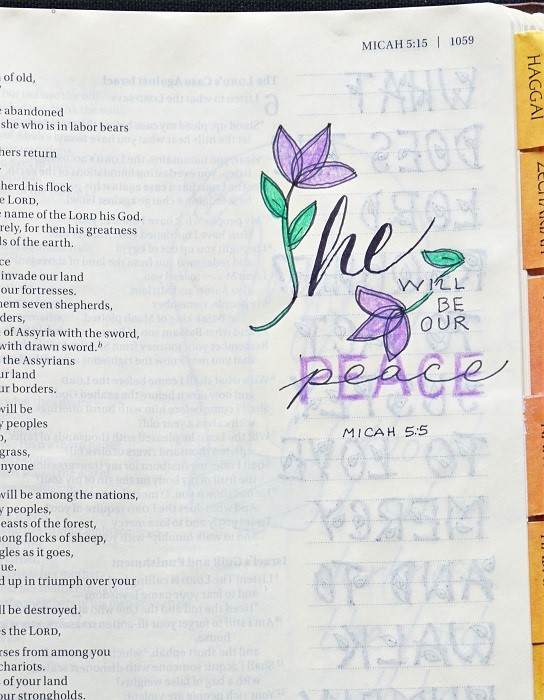
I have used the prayer garden before in my bible (a couple of years ago, in Psalms). As I shared then, this is a technique that I invented back in high school. It allows one to incorporate names and words into art that is not at all obvious to the viewer.
As I was creating this page I thought about who/what I am thankful for and praying for right now and used those as the mirrored stems on my flowers. If you tip your head to the left and read only the top half of the stalk you will see the words: friends, family, country, leaders, church.
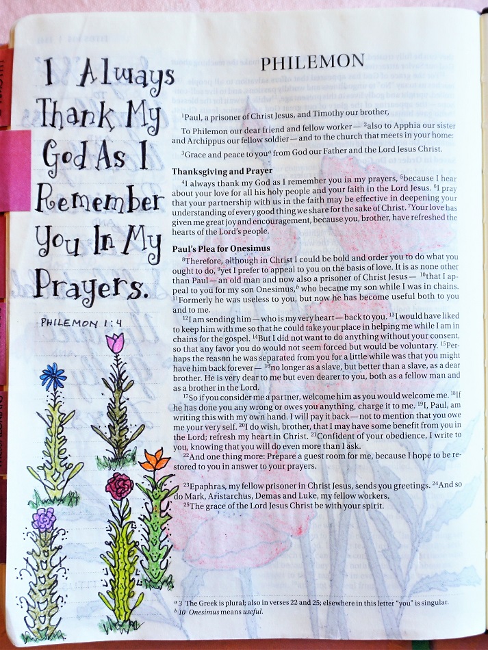
I make up various types of flower heads to put on top so each item is unique. It helps to vary the shades of green in the stems and the colors of the flowers, too.
Ddd
I love when it is time to share another piece of Hymnal Art. Most have been done in response to assignments from a list of hymns matched to every book of the bible. A few that were assigned I had already done and shared here so there are gaps in the timeline.
The hymn that was assigned this time was Blessed Assurance. I love that we are mostly doing hymns that I grew up with.
I got another tablet of stickers from Happy Planner and fell in love with these giant florals. They are on sticker paper instead of being clear so they make more of an impact. I did some fill-in with leaves and branches.
I used flowing bounce brush lettering and stripped the lyrics down to the essentials: Blessed assurance: Jesus is mine!
For today's bible journaling entry I was working in the book of Titus.
The assignment was to use the font called 'promise' which is an upright semi-script. Another assignment was to use the drawing tutorial for the 'mason jar' and the book was also assigned.
Since Titus is a short book there is not a lot of real estate to do artwork so I combined both assignments on the one margin. The jar of flowers really has nothing to do with the scripture but makes for a place to rest the eye while contemplating the verse.
This is one of those fonts that is lovely to read if it is done well. But I find it difficult to render fluidly so it kind of ends up looking forced.
I wrote the scripture in the paraphrased 'The Message' bible.
Ddd
It's time once again for the roundup of lettering styles used for bible journaling in the past month. These are the practice sheets I made of each alphabet to go in my Happy Planner.
First up is 'Rejoice'
Then on to 'Treasure'
Next is 'Called'
And, finally, 'Foundation'
Not that many alphabets to go to wrap up the whole year!
Ddd
I'm back with bible journaling combining old lettering lessons and old drawing lessons.
This lettering style called 'foundation' is one I created while doodling in church (during announcements) a couple of years ago. It got its name because it reminded me of cinder blocks used in building. The 'rules' of this style are 1) every letter fills the exact same space (one square unit) 2) all of the lines forming the letter must followa) the outside of the square b) the diagonals of the square of c) the internal + of the square. 3) all letters have one or two dots.
I changed the top of the pillar image so I would not have two identical pillars in my bible. Of course, it is in an entirely different place this time so it's not like you turn a few pages and come across both of them.
Ddd
Last time I was on a vacation I took along a sketchbook, pencil, eraser and fine line markers. As time permitted I would sketch things around me, things out of my imagination and just doodles.
Over time several of those sketch session pages have found their way into my bible and my hymnal.
On one page I sketched motifs from the fabric that made up my bag of tools. For this hymn I made copies of those motif sketches and cut them apart so I could rearrange them to fit the space created in my shaped lettering design.
This was then traced into my hymnal and color was added with colored pencils and blended with odorless mineral spirits.
I really like the flow of this and that little banner in the center with the single word just makes me happy.
Ddd
This is another case where a lettering style I already used in my bible was assigned to the same book of the bible. In this case, it was a style "called".
It is a semi-script, meaning that it has flowing letters like a script but they to dot connect to one another.
I went to the page I had already done in my bible and simply added a fine-line shadow along the right and bottom of all the letters.
To keep the illustration in a similar style, I used that same fine-line pen to add extra lines along each of the original marks. It gives it a more 'sketched' style. I did not change anything about the coloring.
I like the concept of revisiting old pages and adding or editing the original to get a different effect.
Ddd
Another entry in my hymnal journaling - Higher Ground.
I focused on these lyrics in the middle of the current pandemic: "My heart has no desire to stay where doubts arise and fears dismay. Though some may dwell where these abound, my prayer, my aim is higher ground."
This goes perfectly well with the verse mapping I did last week on 'do not worry', so I gave my illustration a pose of prayer.
Prismacolor pens for the drawing, Prismacolor pencils for the coloring.
(she's wearing the haircut I wish I could get right now!)
Ddd
Long ago a group assignment was to use the Filligree Heart drawing lesson along with the Treasure font together. They landed in Colossians in my Journal the Word Bible.
Two and a half years later those two items were matched up again and also 'assigned' to Colossians. Hmmmm, what to do? I didn't want to add them both to the same book again so I just fancied them up a bit.
The first time around I did the lettering plain. So for this round, I added the stitching that is supposed to be on the letters.
For the filigree heart I added more frills to the filigree along with some other doodles and some dots. Then I added some eyelet lace all around the edge of it.
I like the refreshed look of both of the elements on this page.
Ddd
Oh, this is one of my favorite novelty lettering styles. I used it a couple of times in Psalms a couple of years ago and was glad to see it come up again.
Every one of the letters is represented by a form that is built of musical notations or something that looks like one. Individual letters like the 'L' may be hard to decipher on their own but when presented in context they become apparent.
Makes you want to sing and dance!
Ddd