Topic: Bible Journaling
It was my turn to teach a lettering lesson last week on the Facebook group Creative Bible Journaling. Here's a recap:
DAY 1
This week we’ll be working with an elegant semi-script. That is, it is script formed letters but they are not connected to one another like true cursive.
The lower-cases are unusually small in comparison to the upper-case letters. The upper case may break the plane of the baseline and some descenders may unexpectedly break the plane of the standard descender line (see the t and the l). We’ll look more at the scale issues tomorrow when we see the full alphabet, but for now It’s a matter of keeping the letters/words looking flowing.
The ‘t’ is my favorite letter of this style and reminds me of the cross. It was for this reason that I called this font ‘Eternity’.
You may want to practice with the letters widely spaced like the first line in the sample AND compressed like the third line.

I drew guidelines for my alphabet to get all the letter heights just so since this will be a reference sheet for further use of the font.
This free-flowing semi-script is not very impressive in the mixed case alphabet page, but it really rocks when you start writing out words and phrases with it.
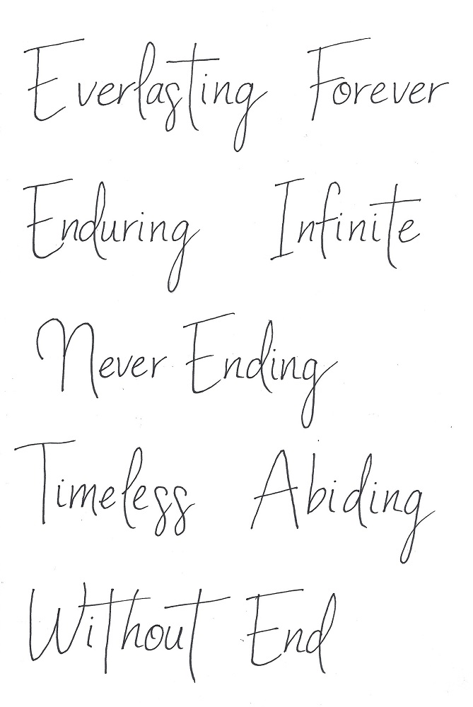
My favorite letters : t, s, Z and E.

I drew guidelines on plain paper to write out synonyms for Eternal and Eternity and erased the guides along with the pencil drafts of the letters after inking the words.
I used capitals on every word to get some practice on their forms as well. I’m not fond of this alphabet when written in all caps so I did not include any of those.
See what I mean about the elegance of writing in this font? Be sure to let those ‘t’s just go wild!
I love finding hymns and choruses that are direct quotes of scripture! We sing this one in church all the time and now I know where to find it in my Bible!
I did this page with the drawn guidelines on plain paper like yesterday and, again, used caps on all the words. I used my previously mentioned method of centering when tracing the text onto a clean sheet of paper.
DAY 5
With the lines alongside the text in my journaling Bible I got away with only drawing one guideline for each line of text. The top, center and bottom were already in place so I just had to mark the guide for the lower-case baseline – a little less than halfway between the two lines of the bottom half.
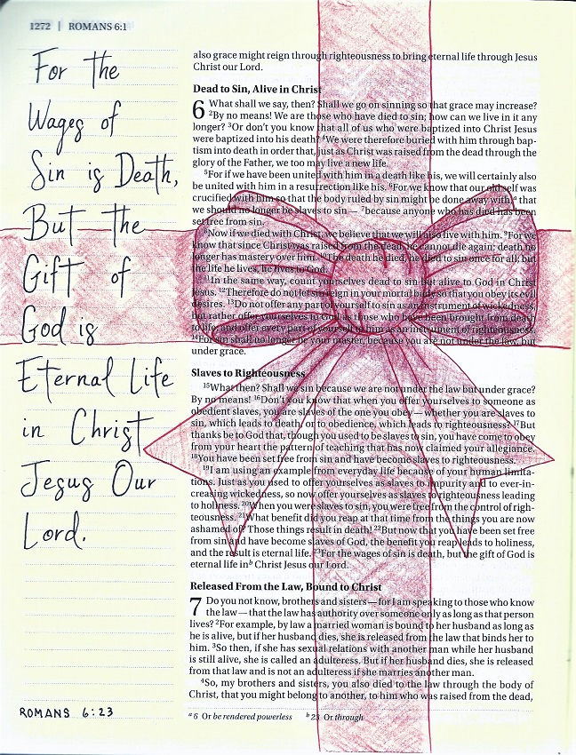
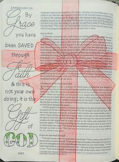
For the illustration I borrowed from this image found on Pinterest. It has been pinned so many times I can’t find the original poster so have no way to attribute it.
This current week I am teaching again so there'll be another set of lessons up for that.
Ddd
