Fall Palette
Topic: Color Challenge
One of the card-making lists issued a challenge to create a card with a specific palette:
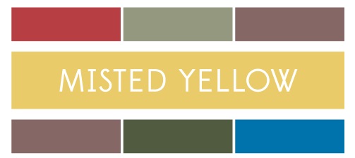
We could use the feature color plus either the top row of colors or the bottom row. I chose the top row.
The way my computer is set up I have to write down the colors with descriptions and then try to find/match those colors when I get down to the studio. It's harder than it sounds!
I started by selecting the Distress inks that I thought were closest (Squeezed Lemonade, Aged Mahogany, Weathered Wood and Dusty Concord). Then I chose cardstock to match those. In the end, I overestimated the intensity of the purple so my card is brighter than the palette supplied.
I selected a piece of sheet music and distressed it with the yellow and grey. Then I used the mahogany and grey as borders with a torn strip of the grape as an accent.
I stamped a vase of flowers on yellow and cut it out. Then the vase and the leaves were colored with Distress markers.
I used two punches to make tiny flowers out of all four colors of the cardstock, shaped them with a ball tool over foam, and stacked contrasting colors together. These were then glued over the whole bouquet.
I then applied Liquid Pearls (Bisque) to the centers of all the flowers.
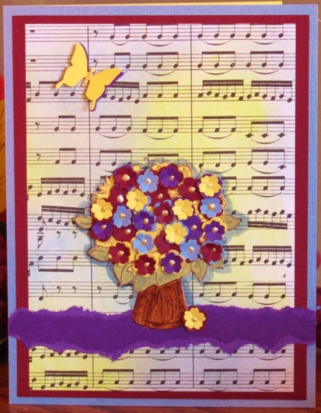
I had used one flower as an accent at the base of the vase and needed something to balance that out. So I punched a butterfly from grape and from yellow and stacked them in the upper left. I added the same Liquid Pearls to the body of the butterfly.
Ddd
Posted by studio3d@ccgmail.net
at 12:01 AM PDT