Topic: A to Z challenge round 3
This is a digital creation using three photos, edited and resized to match. The reference text is obvious.
Has anyone notices how much I like to use puns and plays on words in my artwork? I can't seem to help myself!
« | June 2023 | » | ||||
![]() |
||||||
S | M | T | W | T | F | S |
1 | 2 | 3 | ||||
4 | 5 | 6 | 7 | 8 | 9 | 10 |
11 | 12 | 13 | 14 | 15 | 16 | 17 |
18 | 19 | 20 | 21 | 22 | 23 | 24 |
25 | 26 | 27 | 28 | 29 | 30 |
This is a digital creation using three photos, edited and resized to match. The reference text is obvious.
Has anyone notices how much I like to use puns and plays on words in my artwork? I can't seem to help myself!
This is a digital creation. I made the same card for a friend who is graduating this year but for posting here I changed the name and made the photo of me instead.
I started with a color photo, edited out the background and converted it to B/W. I used an actual yearbook page as a template for size and placement of the photos and text. The names reflect all the titles of the recipient including nicknames, maiden name, etc.
Over the face of the page I used different 'handwriting' fonts to add greeetings from 'school chums.'
This nifty little tool has a variety of tips that can be screwed into it before plugging it in for heating. This tip is a stencil burner which I used to make my own stencil using x-ray film.
After melting the stencil I trimmed the rough edges by scraping with a craft knife. This is the Kanji character for "happiness' or 'fortune'.
I used 'cranberry' and 'espresso' adriondack ink pads and applied their colors to the origami paper through the stencil using brushes.
I punched fancy corners, layered over torn mulberry paper, and layered this onto cardstock. The text is a sticker.
For this card I stamped one of my hand-carved stamps - a window. I cut the panes out and backed it with scrapbook paper to resemble curtains.
I 'built' a windowbox from wood-grained cardstock and then added a bunch of 3D premade flowers.
The text is a sticker.
I chose to stitch this house using verigated threads to see if it gave more dimension to it. I think it does but I would do a couple of things differently in the future: 1) choose threads that are less similar for the various parts - for this I used a rose, pink, and violet. Their light tones are too similar. 2) only use the darker parts of the thread. Where these fade out to white they are almost lost and every one looks the same.
The thread used for the bushes and the stairs are both a duo-twist thread where two colors are wound together. On the bushes it looks speckled and on the stairs the strokes are so short you can't see any color variation!
I DO like the pattern though!
Little drink umbrellas can easily be snipped apart to make fans for oriental cards. for this card I used a mosaic punch to trim out the right side, added a graphic, the fans, and some gold peel-off trim.
This Cuttlebug background was brayered over using a glue pad and then sprinkled with ultrafine glitter. After dry I applied a tag and peel-off greeting.
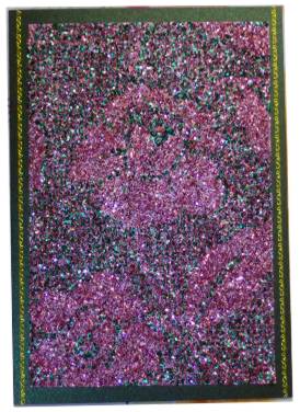
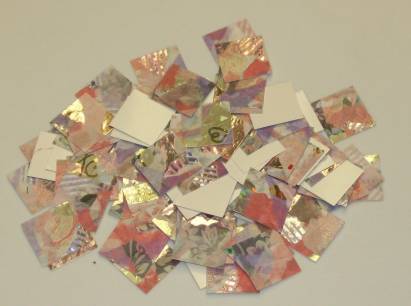
Serendipity squares are tiny bits of collage that are created with leftover scraps from previous projects. I take a sheet of printed cardstock and sort through saved scraps to find ones that coordinate with the background colors.
I tear the scraps into small strips and chunks and then glue them randomly over the background until the original print is almost obscured. Finally, I use my papercutter to turn it into squares of between 2 centimeters up to 1 inch.
This is the pile of squares I ended up with this session:
I select three or four of them that have a similar look to them and use them together on a card front.
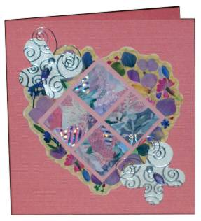
This time I placed them over a heart sticker and added a couple of pre-made butterfly embellishments.
This circle background was made with the Cuttlebug and sanded to expose the white core of the cardstock. Organza ribbon creates some interest and the greeting is a sticker.
I'm sure I have mentioned how much I dislike quilling. But I challenged myself to do it so here it is. These little dresses are from a 'new store' ad that came in the mail last week. They reminded me of Easter so that's where I took the card.
I quilled the flower and the bunny and gave him a little pom-pom tail. The text is a fabric sticker.
The outside is no great shakes - just a large collage text sticker.
The inside, however, is a great multi-level pop-up designed by RobertSabuda.com
I used vanilla scented essential oil to blend colored pencils on the back of this parchment. I initially drew the arrangement free-hand with a mapping pen and white ink.
My 'natural' began with a photo of a field of wildflowers which I mounted to a tag. The cardstock matches the flowers better than this photo would indicate. A text block and punched flowers add a bit of interest.
This mountain photo is from a cruise brochure (Alaska) and I've mounted it on blue cardstock and banded it with border stickers.
The text block is a vellum sticker and the deer is a rub-on.
This dragonfly is made from an old CD. I crackled it and then heated with a heat gun so I could cut the shaped out with scissors. The body is made of a knotted ribbon and I added a crescent shaped rhinestone for the head.
The smaller dragonflies are peel-off stickers, the band of flowers is a border sticker and the text is a fabric sticker.
King Tut is the King in this card. I put together several elements having to do with Egypt and added a fabric text sticker.
This harlequin is a free stained glass pattern that I colored using watercolor markers and cut out. The stickers used for the border came with the little jingle bells so I used those on the cap and cape.
The text is a fabric sticker that I colored with markers.
This is my first try at encaustic. I used regular crayons and my regular iron (covered with aluminum foil) and just winged it.
I call this "Sunset on the Lake".
Here is another all-digital creation using CorelDraw. Nothing is sweeter than honey and a friend!This could be used as a general greeting or as a 'thank you' note.
Glitter tapestry is created by covering cardstock with adhesive and laying a piece of lace down over it. The exposed adhesive then gets glitter poured over it and pressed down. Shake off the glitter and remove the lace. The rest of the adhesive is now exposed and a contrasting glitter is sprinked over it, pressed down and shaken off.
And the result - not my cup of tea. But it meets the criteria of the theme!
Newer | Latest | Older