« July 2024 »
S M T W T F S
1 2 3 4 5 6
7 8 9 10 11 12 13
14 15 16 17 18 19 20
21 22 23 24 25 26 27
28 29 30 31
You are not logged in. Log in
Entries by Topic
All topics
3D paperwork
A - Z challenge 5
A - Z challenge 7
A - Z challenge round 4
A to Z challenge round 3
A to Z round 2
A to Z round 6
A-Z round 1
Around the House
Art Challenges
Artist Trading Cards
Backgrounds
Beads
Bible Journaling
Books
Boxes
Collage
Color Challenge
Coloring
cookbook
Die Cuts
Digital Projects
Digital Stamps
Drawing
Dry Embossing
Fabric Stuff
Fantastic Folds
Field Trip
Home Decor
How Does Your Garden Grow?
Hymnal Art
In The Kitchen
In the studio
Jewelry
Lettering
Links
Multi-Technique
Music to Work By
Musings
Nail Art
New Work
Online Class  «
Other Hobbies
Other Projects
Painting
Paper Embroidery
Paper Piecing
Photo
Pretty Paper
Quilting
Random
reading
Scrap Recovery
scrapbooking
Sewing
Sketch Challenge
Some Backlog
Stamping
Stencils
Stickers
Supplies
Teabag Folding
Techniques
Testing
tips and tricks
Tutorial
Web resources
Welcome to my Blog
Work By My Friends
workflow
Writing
Blog Tools
Edit your Blog
Build a Blog
RSS Feed
View Profile
Group One
In & Out of Studio 3D
Thursday, 18 August 2022
Class - Wash and Ink
Topic: Online Class

The next class I took from Art-Classes.com was a mini-class called Wash and Ink. There were five lessons only and we learned to create loose washes of waterolor and draw over the result to make finished drawings.

In the first lesson the instructor worked on a lilac bloom. I elected to do a hydrangea so I could learn the 'technique' without copying her drawing.

I did two of the 'jellyfish' lesson. I should have stopped with just one as I like the contrast better in the first one I did.


When I got to the tree exercise, I was glad to have taken previous classes (Confident Sketching, Watercolor Jumpstart)

The confident sketching class helped with this one, too.

I refered back to the Watercolor Jumpstart sketchbook in color mixing for this betta fish.

When I was done with the five lessons in the class, I re-watched the demonstration in the advertising and recreated that piece as well.


These are all done on 9 x 12 pieces of Arches watercolor paper so are larger in scale than they appear here. The two jellyfish are side by side on one sheet of the 9 x 12 paper.

Ddd


Posted by studio3d@ccgmail.net at 12:01 AM PDT
Saturday, 6 August 2022
Class - Watercolor Jumpstart
Topic: Online Class

I had bought several online classes from art-classes.com and kept setting them aside to work on 'at a later date'. This one I registered for in 2018!

I finally looked at everything I had pending and arranged them in what I thought would be a logical order where lessons could build upon one another and this one came out as being a top priority for me.

First we had instructions on creating our own sketchbook out of a full sheet of watercolor paper and were provided with a supply list. Yes, I did make the sketchbook and bought the recommended brushes, paints and other items back in 2018.

The sketchbook is created in such a way that it accordian-folds from both directions so one side flips through the color-theory lessons and the other side flips through the technique exercises.

Here are my pages:

Exploring different pigment consistencies

Cool and warm colorwheels. Only the yellow, red and blue are actual pigments, All the other colors are mixed from them.

Colorways - used variety of yellows, reds and blues with all other colors mixed from them

Mixing every color of the cool and the warm primaries with each other

Mixing every red in my palette with every blue for resulting purples. Then doing the same with every yellow and every blue for resulting greens.

Mixing every yellow with every red for the resulting oranges.

Exploring the transition from one pure color to another by varying pigment ratios

Exploring color blending with varying pigment consistencies next to one another

On the technique side of the sketchbook we first created plain flat washes (below) and washes with a glaze (above) The upper ones will be used as background in a later lesson.

A flat wash with wet-into-wet color added. This will be used as a background in a later lesson

Using the 'warm' glazed wash to practice skinny single-stroke leaves

Using the 'cool' glazed background to practice fat leaves with negative painting

Dry-brushing birch trees

Deciduous trees and evergreen trees.

Changing edges with spraying

Negative painting and layering

Wet-into-wet roses

Mixing pigments on the paper for natural colors

Combining techniques for a winter snow scene

Combining techniques for a sunset lake scene


When I wasn't sure enough of the technique to go directly to the sketchbook I bractices a couple of exercises on spare paper. In the end, I did some ink drawing on them and turned them into greeting cards.


The scethbook becomes a useful resource when working on future projects - especially for color mixing.

Ddd


Posted by studio3d@ccgmail.net at 12:01 AM PDT
Saturday, 8 January 2022
Powdered Color
Topic: Online Class

The Colored Pencil Class lesson done today is with powdered color.

In order to get the powdered color the pencil is scribbled over the inside of a fine-weave tea strainer. This scrapes off the color from the lead in very fine colored dust. The color is then spread onto the paper with a cotton ball.

Multiple colors can be blended and the color can be erased away if you have too heavy of application.

My homework piece is a full sheet in my sketchbook - a field of wildflowers. 


On this piece the cloudy sky and the basecoat for the field were done with the powdered color technique.

Direct application of colored pencils was used for the trees, grasses and flowers.

I used the information from the class on using lighter and duller colors in the distance and brighter colors in the foreground.

I wish I had used a duller color for the trees as they seem to stand out too much.

Ddd


Posted by studio3d@ccgmail.net at 5:30 PM PST
Thursday, 6 January 2022
That Old Black Magic
Topic: Online Class

Today I started working again on online classes I have registered for, some started, but had gotten sidetracked on. I decided to jump into the one I was farthest along in.

This class is Colored Pencil Jumpstart from art-classes.com and the lesson (#6) is called Black Magic.

It uses transparent colored pencils applied over white colored pencil on black cardstock. Instead of coloring in darker on the shadows you apply white heavier where you want the brightest highlights and lesser where the shadows would be. Then the colored pencil goes on over top of it using an even pressure.

Magically, you get gradations of color on your black paper.

The first I did was this pear which was first stamped in Studio G white pigment ink.


Then I colored this hummingbird with flowers.


The black cardstock I used kicked back a lot of light reflection so you lose some of the effect. But it turned out nice enough that I used this second one in my devotional book for today.

Ddd


Posted by studio3d@ccgmail.net at 9:34 PM PST
Sunday, 10 January 2021
Blending It Out
Topic: Online Class

While I was in the groove from yesterday's class I jumped right in to Lesson 5... Well, that was my intention anyway. Then I discovered that the lesson did not have any worksheets but were intended to use specific stamps. Oh, poo! I don't have any of those stamps.

So I went on the internet and searched for 'how to draw a cartoon bunny' and combined a couple of those to make my own. The trees were simple shapes so I drew those as well. THEN I got to do the coloring we were shown in the class videos.

This lesson was all about blending. I used three colored pencils for each object and blended with odorless mineral spirits.


The final part of this lesson was to do a bible journaling page with the trees, coloring and blending. Since that is a different topic in my blog, I'll share that tomorrow.

Ddd


Posted by studio3d@ccgmail.net at 10:22 PM PST
Saturday, 9 January 2021
Colored Pencil Class
Topic: Online Class

I finally got back into one of the online classes I registered for. This is Colored Pencil Jumpstart and I am up to Lesson 4 - Shading.

First we tackled spheres and eggs, then on to cubes and cylinders. All of them were to learn how to shade differently to demonstrate where the light source was.


Then we learned to identify various shapes in drawings so we could apply the appropriate shading techniques to them to render them in 3D.


Another exercise had us create a 3D colorwheel using shading and blending.


The last worksheet is set up so you can try out lots of color combinations 'just for fun'.


Ddd


Posted by studio3d@ccgmail.net at 12:01 AM PST
Thursday, 7 May 2020
Three Of a Kind
Topic: Online Class

I took a series of classes online called Spring Card Camp recently but am just now getting around to making samples for the classes. It was a 20 day series so it will take a while to crank all these out.

For the first day we were to stamp and emboss an open image in multiple layers to create a thick outline from the buildup. Then that heavy image is used as an embossing plate to create a raised or indented impression of the image on another piece of cardstock.

I wasn't terribly impressed (ha) with my results but I went ahead and created cards from them in the same style as the class samples.

Problem: the instructor used particular dies and shadow dies, stamps, and other supplies that I did not have. So I used a lot of innovation to get similar results.

Here is the card I created using the actual embossing panel I made.


This started out with white card and was embossed with clear powder. After I used it as an embossing folder I inked the paper with Distress ink and buffed the color back off the embossed areas.

I used a script die to cut 'hello' out of gold metallic paper. The white strip with the shadow of 'hello' was cut by hand with tiny scissors. Then I used a stamp positioning tool to stamp the sentiment. I diecut a shunky leafed branch and a lighter sprig to layer behind the word strip.

This was trimmed down and mounted to a white card base.

This next card is from the cardstock I embossed with the created plate. After making this raised image I used a similar color of distress ink to brush over the whole surface. This enhances the texture of the image. 

With a standard embossed image this is more effective as the image is more prominent and picks up the ink differently. 

In any case, I made this card with the result.


This was finished in the same way as the first.

For the third card, I used a shimmer paper. The impression was not as deep or noticable on this so I turned it to the back to use the debossed side. The inking was done in the same way but it hardly shows.


Also finished in the same manner.

And so ends day one of the Spring Card Camp.

Ddd


Posted by studio3d@ccgmail.net at 9:45 AM PDT
Sunday, 13 August 2017
A Little Sparkle On Your Rainbow
Topic: Online Class

Day Six of the Online Card Class on Rainbows was for three techniques that did not fit into the categories presented on days 1-5.

First up was Kristina with using a rainbow of liquid dots to create flowers around a stamped sentiment on a white card.

I didn't have the materials she used but I had a whole rainbow of Stickles so I set about making flowers with those. I used dots, lines and teardrops to create these sparkly bits of deliciousness.


I liked this so much, I made a second card. Both were cut a little larger and mounted on shimmery yellow card bases.


Then Laura had us stamp (mask and stamp again) a large floral and color it with Copic markers. She showed several ways of arranging the rainbow but I really prefered this version with each flower head as its own rainbow. I colored a white diecut word t match the orange hues.


I went over all the lines with a Sharpie and added dots with a white pen to the stamens.

I skipped the third lesson, although I do plan to do it at some point (using acrylic paints on a gelli plate).

Don't know what is planned for the 'wrap up day'. And then the class will be over.

Ddd


Posted by studio3d@ccgmail.net at 12:00 PM PDT
Saturday, 12 August 2017
Layers of the Rainbow
Topic: Online Class

We're on to day 5 of the Rainbow Maker Online Card Class.

I skipped using the lessons offered by Kristina and Laura, just completing several taught by Jennifer. These took a lot of time to dry (overnight) whitch explains the delay in posting.

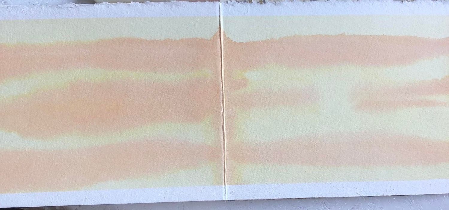
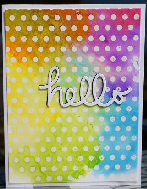
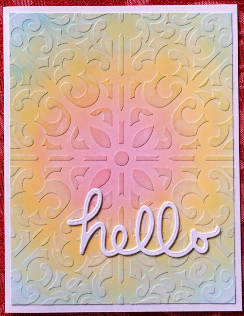
For the first card we were instructed to use watercolor markers in stripes on watercolor paper, spritz with water and let blend to one side. After drying with a heat tool we used a stencil and texture mousse applied with a blending tool. I did not have any mousse so I used a palette knife to apply Heritage Handicrafts Dimensional Paint in Snow White.

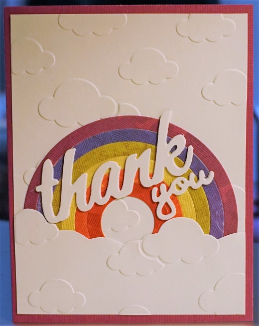
Part of the directions, after completing all the backgrounds were on ways to layer white diecuts for elegant embellishments.


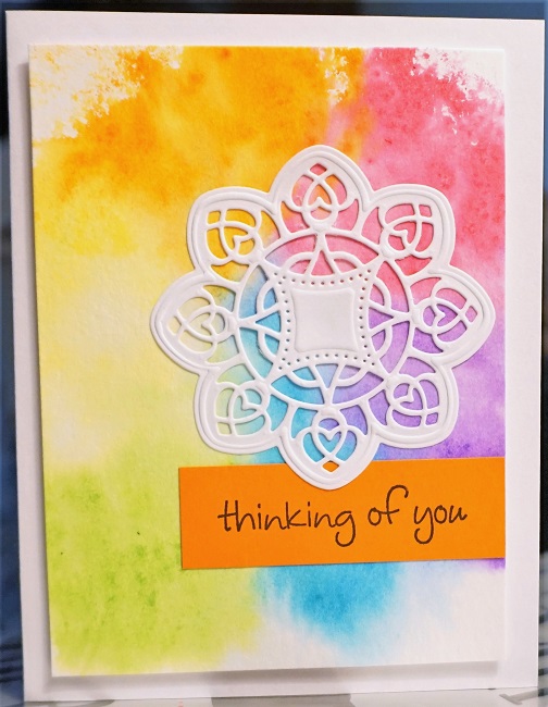
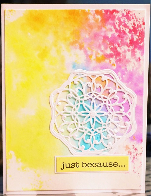
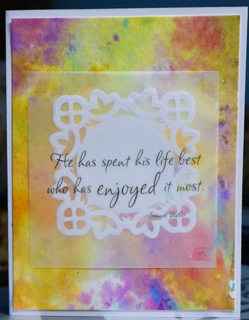
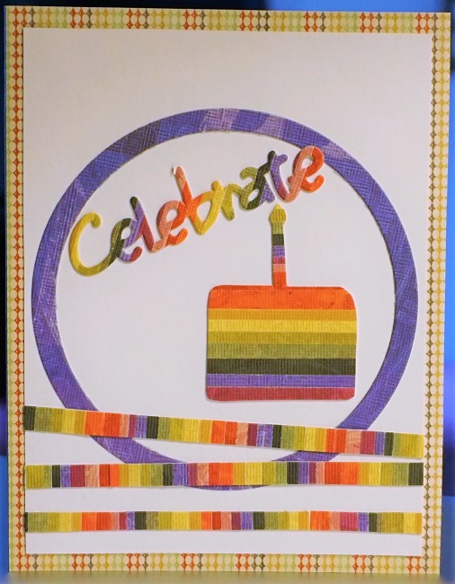
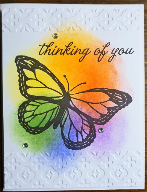
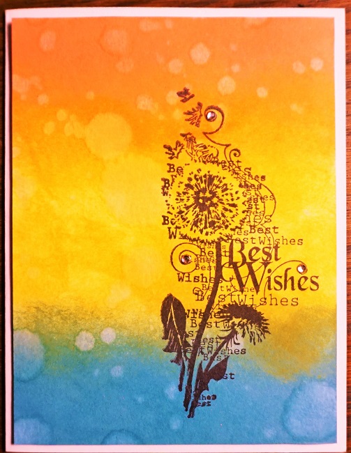
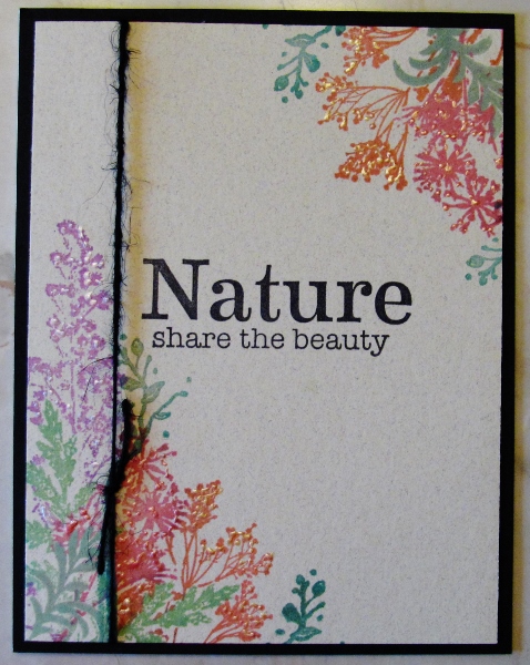
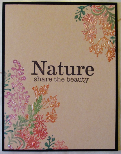
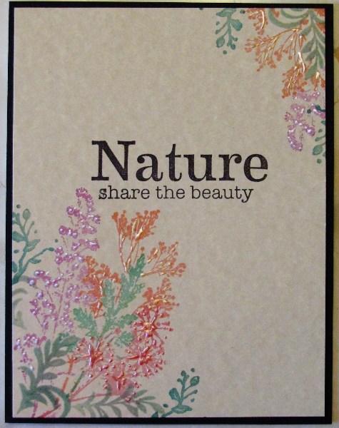
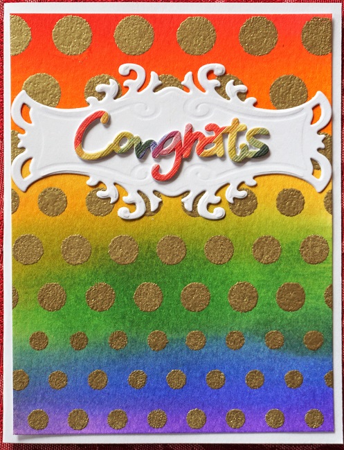
Technique two was to create a radiant blend using only three colors blended in concentric circles. I used a semi-glossy cardstock which made the colors more pastel. Jennifer then used glitter paste through a stencil in a radiating pattern. I had neither a radiating stencil or glitter paste so I used some modeling paste that dries semi-transparent.

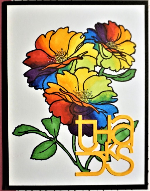
The sentiment is three stacked white diecuts.


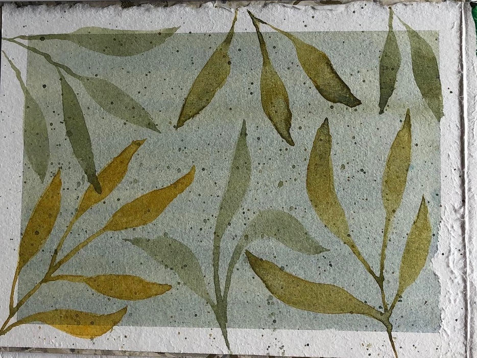
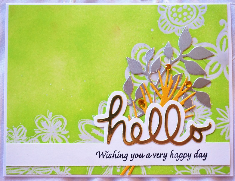
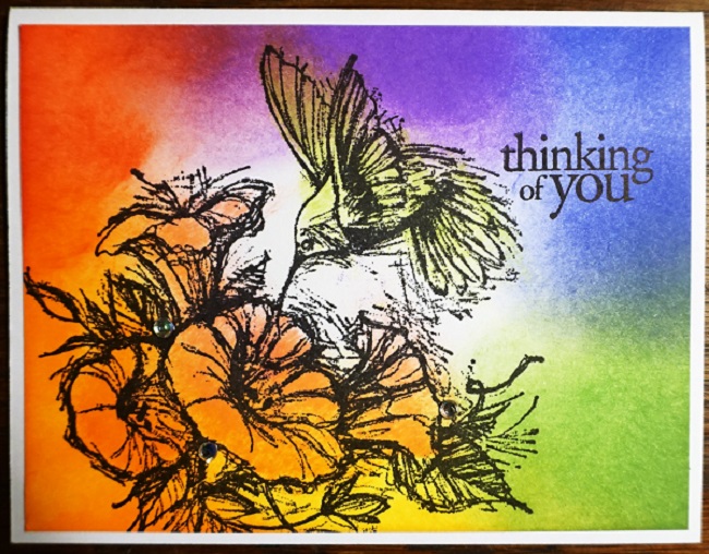
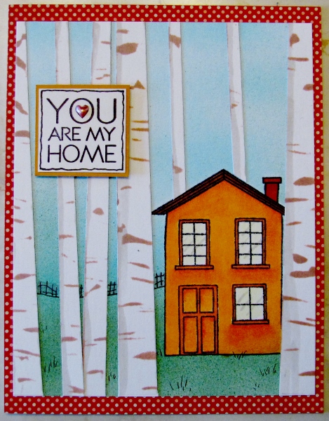
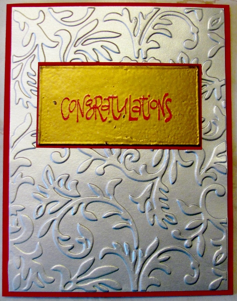
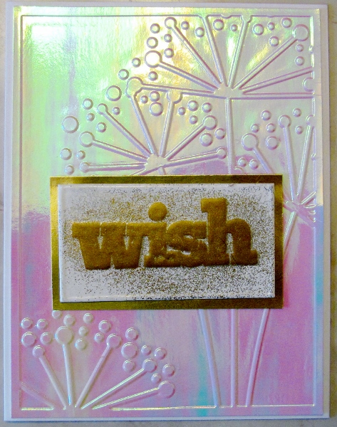
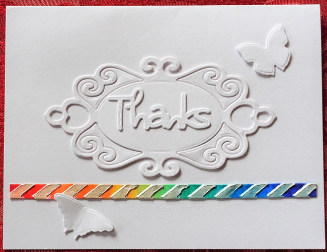
This faux watercolor is applied with Distress Inks and a blending tool then spritzed with water to allow it to blend when held to one side. After drying with a heat tool a stencil was laid on it and Versamark ink pressed through the holes. I did not have irridescent embossing powder like Jennifer used so I went with gold.

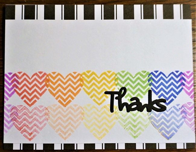
I added a white diecut panel and one of the leftover sentiment diecuts from day two.


Here's a better look at the shine of the gold embossing:

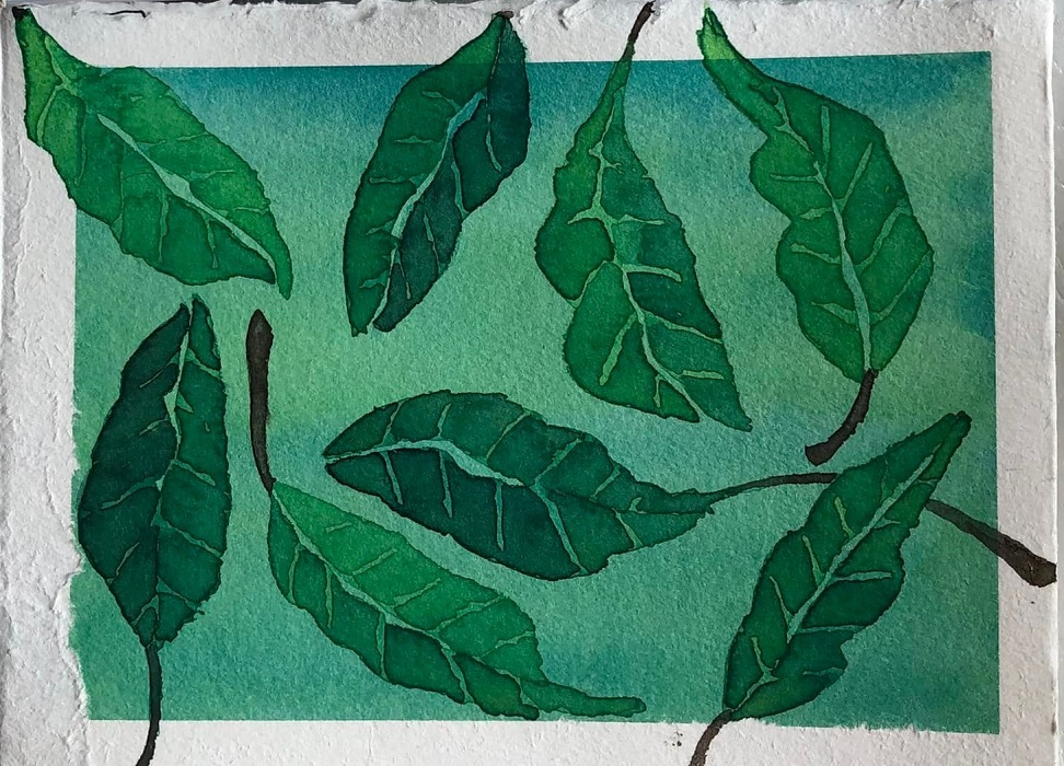
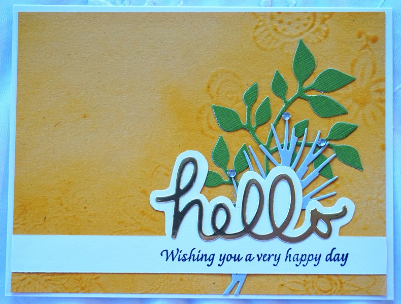
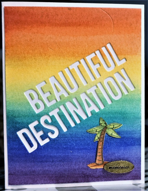
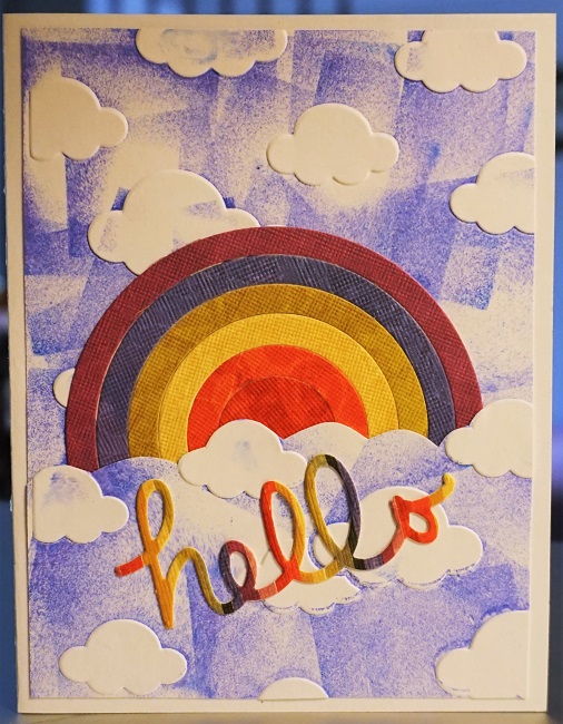
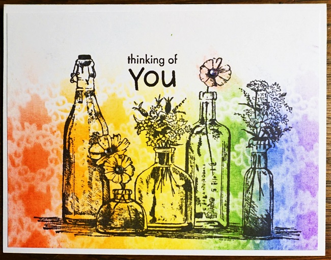
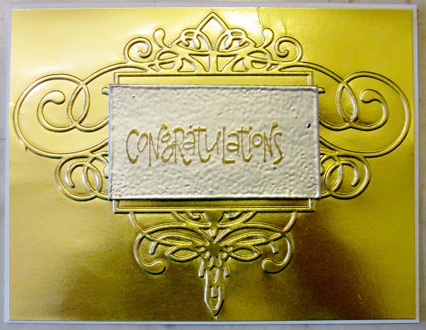
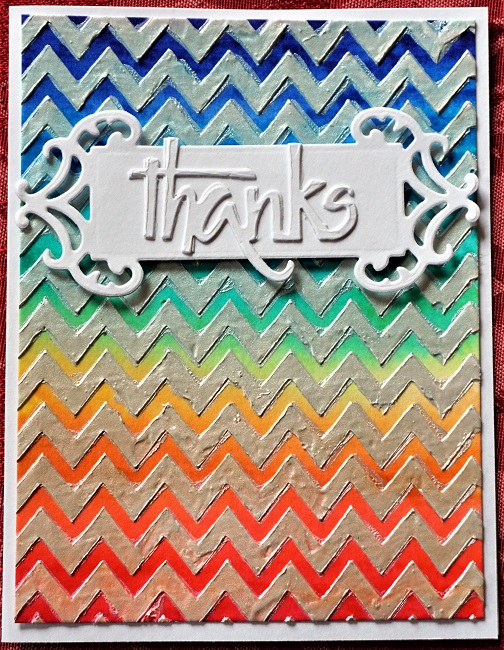
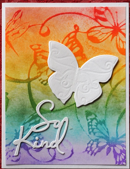
The next card starts out with a soft rainbow applied with blending tools. After thoroughly drying with a heat tool, a stencil is laid on and Versamark applied over the whole exposed surface. Mine was a reverse stencil so the Versamark actually ends up on the background. She embossed with clear sparkle embossing powder but I only had regular clear.

After cooling, another layer of Distress Ink is blended on the rainbow which darkens where the stencil covered.

I did my original rainbow with lighter colors and the ending one with brighter colors to make the distinction even more apparent. I finished off with stacked diecuts.


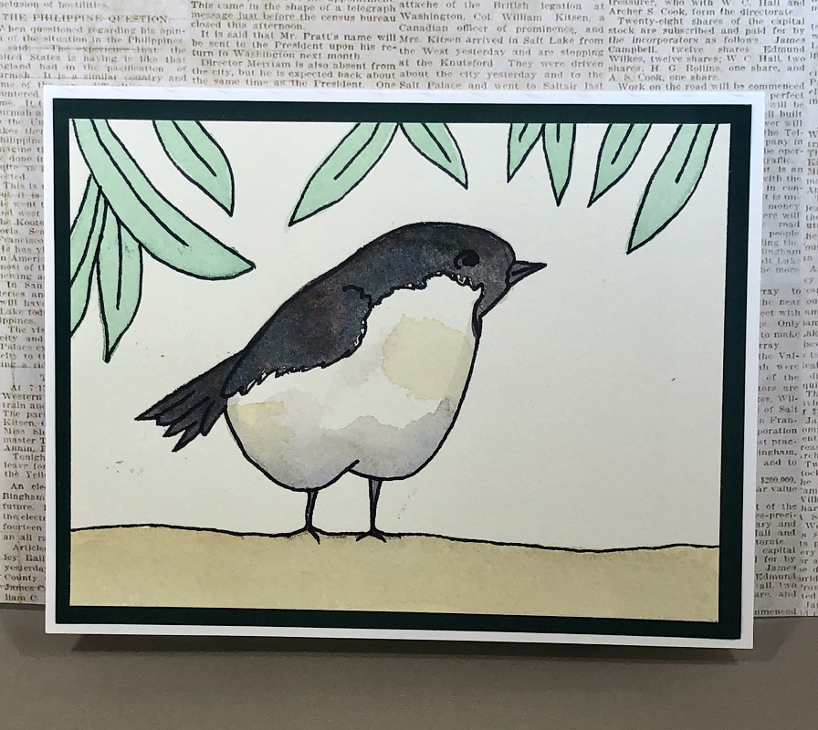
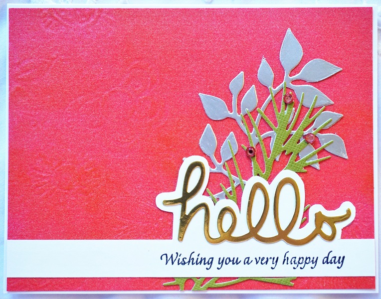
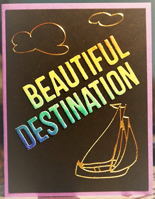
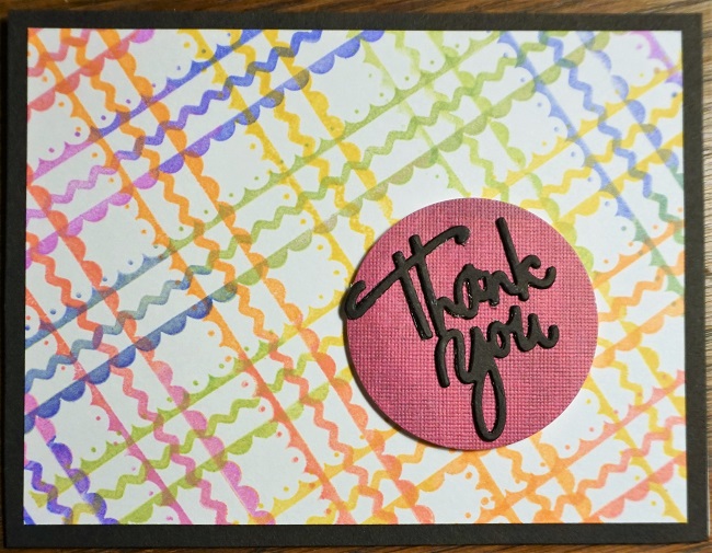
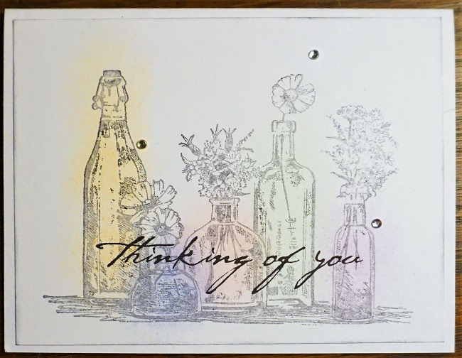
After finishing the lessons I had parts left over so I used them to create a bonus card.


One more day of class - I'd better go get busy.

Ddd


Posted by studio3d@ccgmail.net at 4:49 PM PDT
Thursday, 10 August 2017
You Need Water for a Rainbow
Topic: Online Class

Online Card Class - Day 4 - For these lessons we dug out our watercolors. Actually, we had some choices in what we wanted to use for watercoloring supplies. I used my Windsor Newton watercolor paints for some and Distress Inks for others. All the cards were made with watercolor paper.

Kristina taught watercolor blending skills. We created a background and then diecut words from it and mounted over white cardstock.


The letters that were popped out from card one found a new home on black cardstock along with some gold peel-off stickers.

Laura demonstrated using Distress inks on acrylic blocks to smoosh color bands onto watercolor paper. I added text pre-printed on vellum.

Next, we were invited to apply these same colors in a circle on a sandwich bag, spritz with water and smoosh the card onto it. A white diecut medallion was combined with a pre-stamped sentiment strip.

We then did the same technique using a non-stick craft sheet for inking.

Laura next showed how to create a resist background using Versamark ink and clear embossing powder. The craft sheet smoosh technique was used for the inking. I diecut the sentiment 3 times from black and once from white and glued them in a stack for the card front.


When I was done making these backgrounds, I continued to spritz the craft sheet with water and dab a cardstock into it for a bonus background. This one also got a diecut medallion and a pre-printed vellum.


Debby used watercolors to paint big dots, letting them barely touch to allow the colors to bleed. She shared the concept of turning them into balloons with a figure to hold the strings. I didn't have a figure to stamp so I hand-drew the little cat. I also created this sentiment with three black and one white diecuts stacked up.

Since I didn't stay up till after midnight creating these, I get to actually post them on the day they were made.

Ddd


Posted by studio3d@ccgmail.net at 9:32 PM PDT
Rainbows to Die For
Topic: Online Class

Day 3 of the Online Card Class featured diecutting.

I made just three cards for this lesson. The first combines 1) use of nested circle dies used to cut out rainbow parts along with 2) handfulls of skinny strips mounted vertically to a backing in rainbow order and diecut into a word. Then 3) a cloudy sky background was created with an embossing folder and I cut it apart to layer with the rainbow.


Card number two uses more of the nested circle dies for a rainbow and the cloudy sky folder, but without the blue inking. This also uses a diecut sentiment in white made up of 3 layers of cardstock.


The last card uses scraps from the narrow strips mounted on cardstock. I used some to cut a sentiment on the diagonal to the stripes, some to hand-cut a cake and candle and the rest to cut plain strips. All were combined on a white card along with one of the rings from the nested circle dies.


The biggest lesson I learned was the importance of using waxed paper between the letter dies and the cardstock. The words just fall out instead of having to dig them out of the dies.

Ddd


Posted by studio3d@ccgmail.net at 8:51 PM PDT
Wednesday, 9 August 2017
Stamping Out Rainbows
Topic: Online Class

Day 2 of the Online Card Class I'm taking had it's focus on stamping using rainbow colors.

First up was Jennifer with a first- and second-generation rainbow stamped in a grid. I used a chevron heart where she used a solid. I added three layers of diecut sentiment and a striped background.


This was followed by layered stamping, using overlapping colors to create a more complete rainbow. There are actually only 6 colors used on these crayons. The effect is created entirely by stamping one color on top of another.The crayon stamp is one I hand carved years ago. Again, I used a striped background and triple layered diecut sentiment.


The instructor, Laura, taught how to make ombre plaid rainbows using three border stamps and blending ink on them. I bordered in black, popped up a color circle and added a triple thick diecut sentiment.


Carissa demonstrated several ways of getting a sentiment inked into a rainbow. I didn't use any of her embossing techniques, just straight up inking. I trimmed out the sentiment by hand and mounted it on a black banner strip. Layered over black and white background bordered in coral.

I'm liking this rainbow theme!

Ddd


Posted by studio3d@ccgmail.net at 12:05 AM PDT
Tuesday, 8 August 2017
Blended Rainbows
Topic: Online Class

I started an online class yesterday at the Online Card Classes site. This one has a focus on using rainbow coloring.

The lessons for the first day (three instructors) taught how to do TWELVE different blending styles and then turned several into finished cards.

Mine may use different supplies, a change in style, other finishing and most certainly stamps unlike theirs.

This one uses blending around the edge and is then overstamped with black ink. I finished by blending some spot coloring into the flowers and bird, added a sentiment and tiny rhinestones:


The next is center blending with black overstamping. The front panel has been run through the Cuttlebug with a texture folder at the top and bottom. Finishing includes popped-up mounting and rhinestones:


We switched from blending tools to stencil brushes for the next one. The color is applied from one edge in rainbow bands. Then a stencil was laid on top and more of the same colors were brushed on. I turned mine so the color was at the bottom and stamped the bottles over it.


When stamping the card above I stamped the image again onto a blank card to clean off the stamp. Then I used the image to clean off my stencil brushes and it gave me this soft image. I stamped a black sentiment over the top and finished with rhinestones.


On this, rather than using a whole rainbow of colors, it uses only red yellow and blue. All the secondary colors are from blending these. It has been flecked with water to create the mottled effect.


One of the lessons was creating a stripedy background using the edges of thepads of pigment inks. I, on the other hand, used my Distress Inks. As I added more color it was leaning toward the orange so I finished going in that direction and created a sunset sky instead of a rainbow. The skyline is a stencil that I inked with Archival black.


 Finally, I stamped those bottles again and used the direct-to-paper technique to spot-color them.


...and that was day ONE!

Ddd


Posted by studio3d@ccgmail.net at 8:52 AM PDT
Wednesday, 15 October 2014
Stretch Your Stamps 2 - Day 11 - Play Day - f
Topic: Online Class

For my last card for this class I used a version of the stencils and Copics technique.

On white cardstock I used a birch tree stencil and a foam dauber to ink in the trunks. I used a W3 Copic marker to shade the left side of the trees. Then I cut out trunks to use later.

I stamped a house on white cardstock and colored with Copic markers and shading. 

I created a mask of the house and covered it while I used blue and green Copic markers in an airbrush system to make sky and ground.

I glued the trees in front of the house and added some partial trunks against the roofline. I used a fine marker to add a little fence and a few sprouts of grass.

The panel was trimmed to size and bordered with patterned red cardstock.


I stamped a sentiment block and mounted it with foam tape. At the end I used Liquid Pearls to fill in the heart in the sentiment.

---------------------------------------

So, have you been keeping track of how many cards I made for class? A total of SIXTY THREE! Tomorrow will definitely be something different.

Ddd


Posted by studio3d@ccgmail.net at 12:01 AM PDT
Tuesday, 14 October 2014
Stretch Your Stamps 2 - Day 11 - Play Day - e
Topic: Online Class

The technique used for this card was a focus on stencils and Copic Markers. 

On white cardstock I used a tree stencil and a foam dauber to ink in branches. I slightly offset the stencil and inked with another brown to create some depth. Then I used a fine line marker to sketch in the tree trunks and branches. I used a W3 Copic marker to shade the left and bottom of the branches.

I used blue and green Copic markers in the airbrush system to make the sky and ground then used a dauber with yellow ink to make the sun. I used a black marker to border the panel.

I stamped a house on white cardstock and colored with Copic markers. This was cut out and glued to the stenciled background. I bordered it with patterned dark orange.

I stamped a sentiment strip, inked its edges in yellow and mounted it with foam tape.

Ddd


Posted by studio3d@ccgmail.net at 12:01 AM PDT
Monday, 13 October 2014
Stretch Your Stamps 2 - Day 11 - Play Day - a/b/c
Topic: Online Class

The first technique shared on day 11 of class was called Layered Heat Embossing. I made 4 cards with this technique.

First I cut piece of tagboard and inked the edges with Versamark and dipped them in silver embossing powder. I melted this with a heat gun. Then I covered the face of the chipboard with Versamark. I covered this with and silver embossing powder and heated it. This was repeated to get even coverage.

I used the anti-static bag on the piece. Then I stamped the flag with Versamark and sprinkled on cherry red embossing powder. this was heated carefully to melt only the red.

I bordered with red cardstock and layered it on white cardstock which was dry embossed with a star folder.


I used the same process to creare a gold and red block and layered it on silver cardstock bordered in red.

The next panel was embossed with silver and gold which was layered on a gold cardstock embossed with a frame folder.

Oh, my. The white embossing powder used on the next block stayed slightly sticky so some of the powder stuck to the background. I embossed the stamping in silver first and it wasn't enough contrast to I stamped over that with gold.

I chose an irridescent cardstock to emboss with a dandelion folder for the background.

I can't see using this technique again. Well... maybe.

Ddd


Posted by studio3d@ccgmail.net at 12:01 AM PDT
Sunday, 12 October 2014
Stretch Your Stamps 2 - Day 10 - Silhouette Flowers - c/d
Topic: Online Class

The next technique I tried from the day 10 class was Light Embossing on Dark Cardstock.

This first card was the 'test piece' for the technique. I selected navy cardstock and stamped flowers in white pigment ink and embossed with cherry red. I stamped leaves with white pigment ink and embossed with Christmas green. I stamped berries with white pigment ink and embossed with white.

The colors were not very vivid so I went over them with Copic markers, changing the white berries to yellow. I trimmed the panel and mounted it to pink bordering card and a blue printed layer. I added this to some pink chevron cardstock over a card base.

I was not liking this too much so I used a gold gel marker to add some sketch lines on the navy background. Still not impressed with the look of it so I found a vellum pre-printed quote and trimmed it to the exact size of the flower layer. I ran this through the Xyron machine to coat the back with adhesive. The vellum was adhered to the panel and burnished to allow the flowers to show through.

Salvaged!


OK, back to following the instructions! For the next card I did the stamping in Versamark! Stamped flowers and embossed with cherry red. Stamped leaves and embossed with Christmas green. Stamped the berries and embossed with white. Stamped the flower centers and embossed with gold. MUCH better result.

I trimmed the panel and used a gold Krylon paint pen to band all four edges. I mounted this to a white card base.

I stamped a sentiment block on white and trimmed it. I used a gold gel marker to fill in the dots and lines then mounted it on the card front with foam tape.

Ddd 


Posted by studio3d@ccgmail.net at 12:01 AM PDT
Saturday, 11 October 2014
Stretch Your Stamps 2 - Day 10 - Silhouette Florals - a/b
Topic: Online Class

Day 10 of class started out by using the floral silhouettes as... underwater plants and corals. One of the secrets to success is in the choice of color palette.

I traced a circle on white cardstock then used 2 dye inks and 2 chalk inks to stamp 4 silhouette floral 'sprigs' leaving white space at the top.

I diecut a circle in another white cardstock and a larger circle in green shimmer cardstock.

I embossed a sentiment in gold on white cardstock, trimmed and mounted it as a band on the green layer. 

The diecut layers are glued together and mounted with foam tape over the stamped layer.

Three clown fish from a sticker sheet were placed in the undersea scene.


The second card is similar but has a few changes to note. I used a darker green cardstock, added a gold edging to the sentiment strip using Krylon paint pen, and used holographic fish stickers.

You can see that the colors I chose have a bluish cast and are lighter in the background and gradually get greener and darker as the foliage comes forward.

Ddd


Posted by studio3d@ccgmail.net at 12:01 AM PDT
Friday, 10 October 2014
Stretch Your Stamps 2 - Day 9 - Silhouette Florals - e/f/g
Topic: Online Class

The third technique from day 9 was an experiment fail for me. It needed 'coated' cardstock and a wet dye ink neither of which I had. It also used florals and foliage that actually went together which I also did not have.

The technique was to ink the stamp, press to the coated cardstock and twist it slightly to create a painterly look. My stamps/inks would stick to the paper and not allow me to twist them so the images were clear and not in the least painted looking.

I stamped three daisy style flowers each in different ink. Then I stamped two leaf types.

we were then to use a fine black marker to sketch in some lines to lend a more hand designed look to the stamping - not so regimented. I stamped all three with different sentiments in black.

On the first two I drew a black border on the panel and mounted them to green cardstock.

I like this sentiment style better as it seems to suit the art better:


The third one got a solid sentiment block and a black background.


The black border negated the need for a drawn border on this one.

Ddd


Posted by studio3d@ccgmail.net at 12:01 AM PDT
Thursday, 9 October 2014
Stretch Your Stamps 2 - Day 9 - Silhouette Flowers - b/c/d
Topic: Online Class

For the second technique on day 9 we used a lot of masking. I selected sprigs and grasses (most look like weeds to me) and stamped them on sticky notes. These were cut out and used in series to create bouquets in the lower left and upper right corners. Each stamp was stamped using a different color.

I stamped a large sentiment on the card and mounted to black cardstock for a border. Each card got three colors of Liquid Pearls decorating the flowers.

On the first card I boo-booed on one of the stems so I covered it by tying black twine over it.


Each of the three cards was made with a slightly different shade of Kraft cardstock.


This background actually has a bit of a parchment look to it.


These masks were very fiddly to cut and the result was not so awesome that I'd use them again. I decided to use them up by making all three cards at once and just be done with it.

Ddd


Posted by studio3d@ccgmail.net at 12:01 AM PDT

Newer | Latest | Older