Tutorial - Portfolio Book
Topic: Techniques
Today is going to be a LONG entry as I have a 23-step tutorial for making a portfolio book.
Here is the supply list:
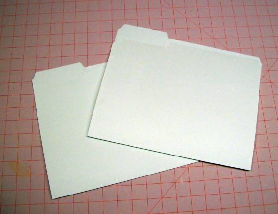
**2 manila file folders with 1/3-cut tabs. Both must be the same with the first station tab.
**2 sheets of 12 x 12 inch scrapbook paper. From one cut 8 squares measuring 3 3/4 inches. From the other cut 2 pieces measuring 4 x 7 1/2 inches. Set aside the scraps for optional use.
**1 piece of cardstock measuring 3 x 7 3/4 inches.
**8 pieces of cardstock measuring 3 X 7 inches.
**1/8 to 1/4 inch wide ribbon. One piece 24 inches. 8 pieces of 5 inches.
**Ruler
**Scissors
**Pencil
**Bone Folder
**Hole punch
**Adhesive
Ready? Let's Go! We'll start with the two file folders:
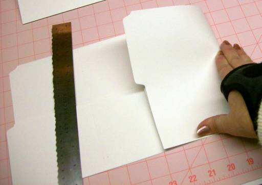
Open both and turn one over so they are exact opposites of one another:
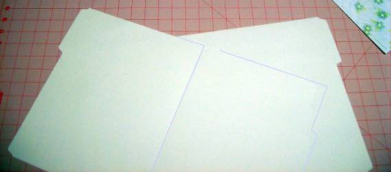
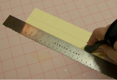
You will do all the following steps to BOTH of the folders. Measure and score 4 inches from the bottom.

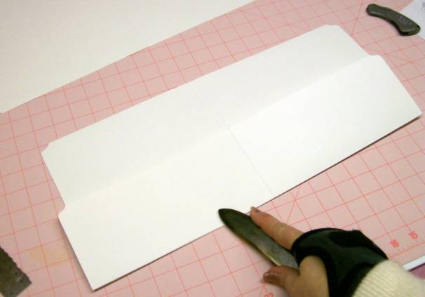
Fold up on score and burnish to a sharp crease:
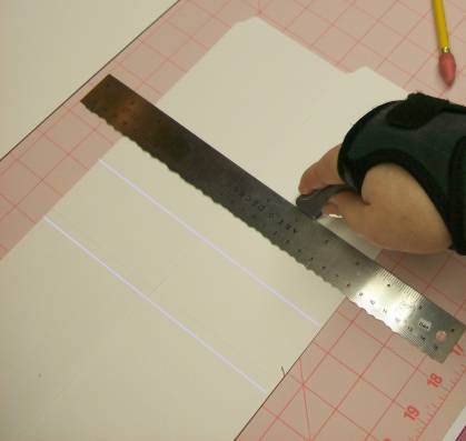
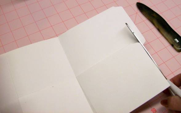
With bottom folded up, score top to bottom 4 inches on each side of the center fold:
Fold in one side being careful to align bottom edges. Use bone folder to burnish a sharp crease. Repeat on other side:
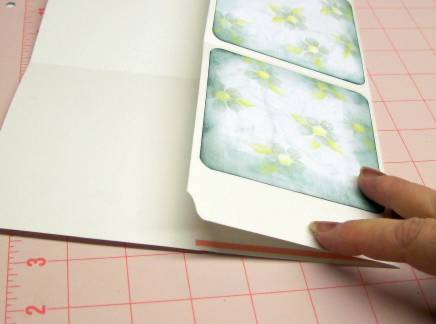
Trim off widest flap to align with folder edge:
Set aside folders.
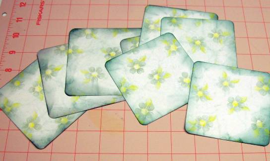
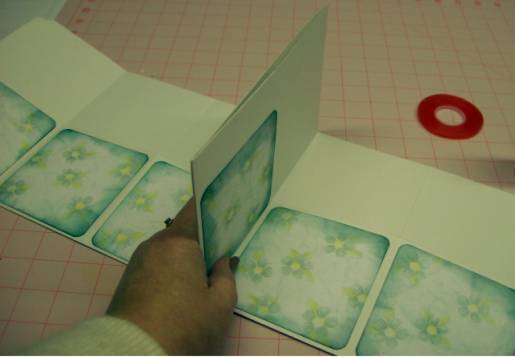
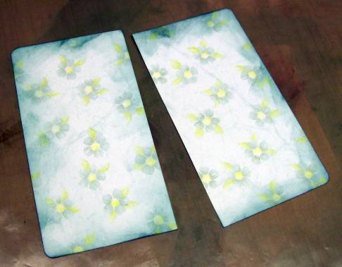
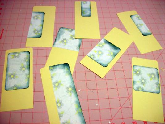
Decorate, distress, shape corners as desired on 8 squares of scrapbook paper. For my piece I used a corner rounder and the used Ranger Distress inks in 'Bottle':
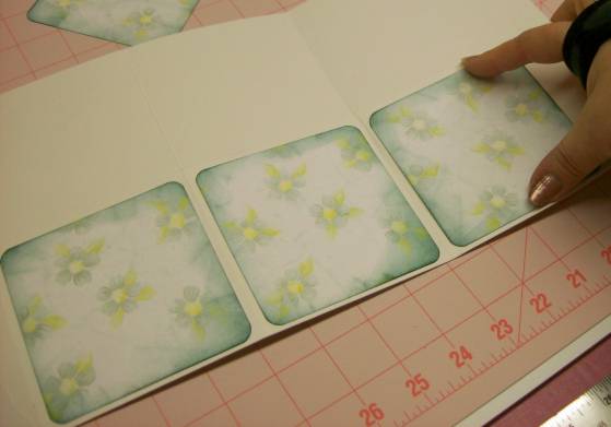
Center one square on each side of the center fold flaps and adhere:

Use these as a guide to spacing the two outer squares on their flaps and adhere:
Glue the fore-edge of the flaps where they overlap. I used redline tape for it's strength:
Apply adhesive (I used redlinge tape again) and adhere the folders back to back. This will be on the panels where you trimmed off the tab:
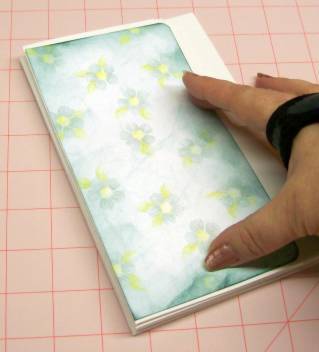
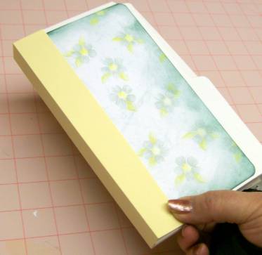
Set aside folder. Decorate, distress, shape corners of the two pieces of scrapbook paper that measures 7.5 x 4 inches. I used the corner rounder and distress inks as before:
Glue these panels to front and back of folder, aligning with spine:
Set aside folder. Take up your piece of cardstock measuring 7 3/4 x 3. Measure and score 1 1/8 inches from each side (leaves a 3/4 inch strip in the center:
Apply glue to the side flaps only and apply to spine of folder:
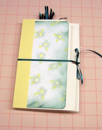
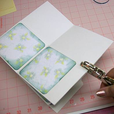
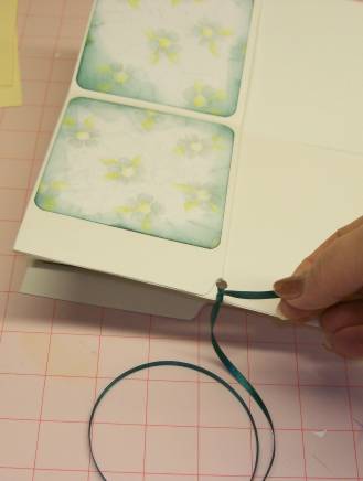
Punch a hole in the center of the center panel (this is where you glued the two folders together:
Thread your 24 inch ribbon through this hole and tie it leaving 8 inches on the FRONT of the folders:
Use your 8 cardstock pieces measuring 7 x 3 inches to make tags. You can shape the tops if you wish (I used my corner rounder again) and use the spare pieces of scrapbook paper to decorate them as you desire:
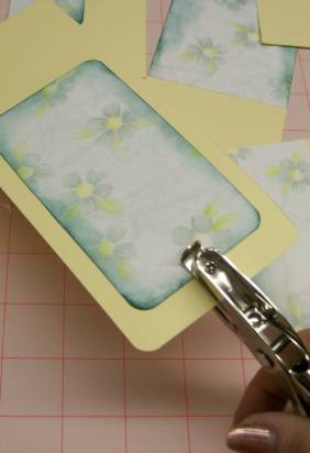
Punch holes at the top of your tags:
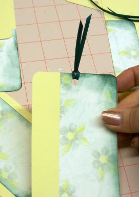
Use the 5 inch pieces of ribbon to make pulls on your tags:
Insert tags in pockets of your folder:
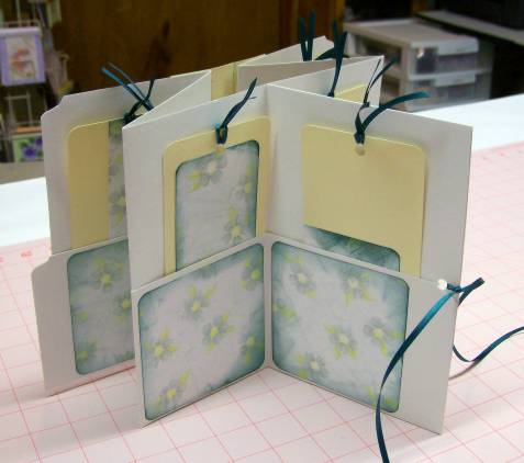
Pass long end of ribbon across back of folder, around spine and across the front. Tie a bow over the knot and your portfolio book is DONE:
Posted by studio3d@ccgmail.net
at 6:00 AM PST