« July 2015 »
S M T W T F S
1 2 3 4
5 6 7 8 9 10 11
12 13 14 15 16 17 18
19 20 21 22 23 24 25
26 27 28 29 30 31
You are not logged in. Log in
Entries by Topic
All topics  «
3D paperwork
A - Z challenge 5
A - Z challenge 7
A - Z challenge round 4
A to Z challenge round 3
A to Z round 2
A to Z round 6
A-Z round 1
Around the House
Art Challenges
Artist Trading Cards
Backgrounds
Beads
Bible Journaling
Books
Boxes
Collage
Color Challenge
Coloring
cookbook
Die Cuts
Digital Projects
Digital Stamps
Drawing
Dry Embossing
Fabric Stuff
Fantastic Folds
Field Trip
Home Decor
How Does Your Garden Grow?
Hymnal Art
In The Kitchen
In the studio
Jewelry
Lettering
Links
Multi-Technique
Music to Work By
Musings
Nail Art
New Work
Online Class
Other Hobbies
Other Projects
Painting
Paper Embroidery
Paper Piecing
Photo
Pretty Paper
Quilting
Random
reading
Scrap Recovery
scrapbooking
Sewing
Sketch Challenge
Some Backlog
Stamping
Stencils
Stickers
Supplies
Teabag Folding
Techniques
Testing
tips and tricks
Tutorial
Web resources
Welcome to my Blog
Work By My Friends
workflow
Writing
Blog Tools
Edit your Blog
Build a Blog
RSS Feed
View Profile
Group One
In & Out of Studio 3D
Sunday, 5 July 2015
Operation Write Home - sketch 256 version 2
Topic: Sketch Challenge

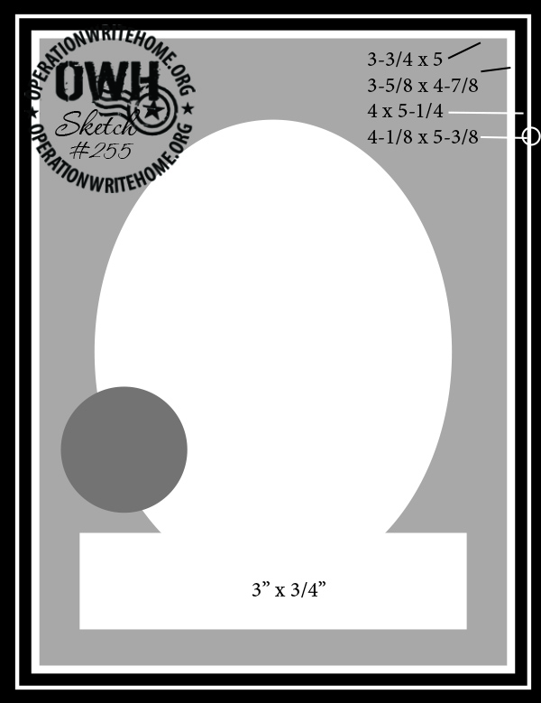
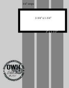
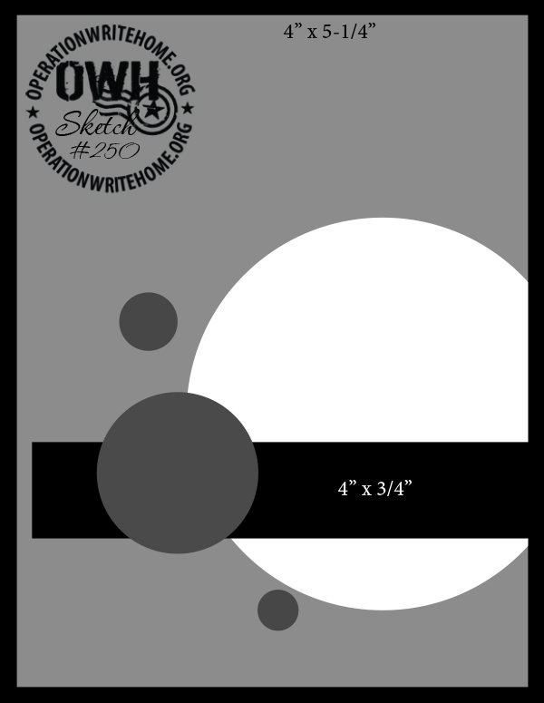
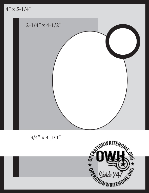
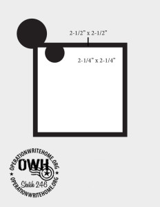
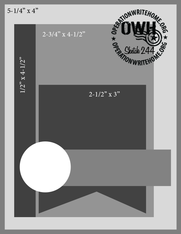
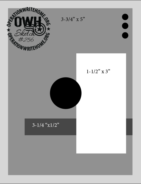
Ready for a little deja vu? Here again is OWH sketch 256


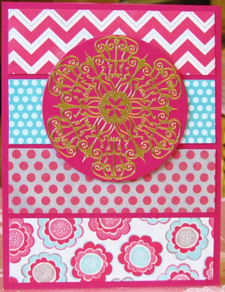
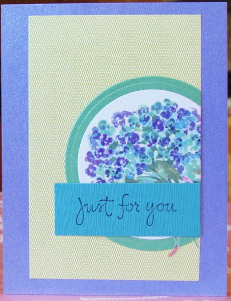
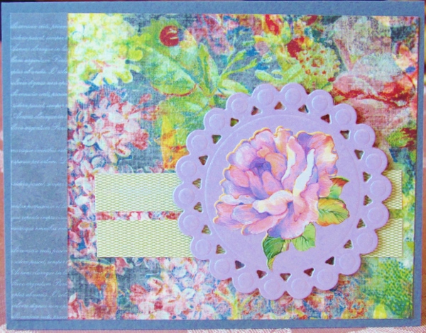
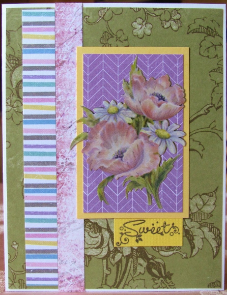
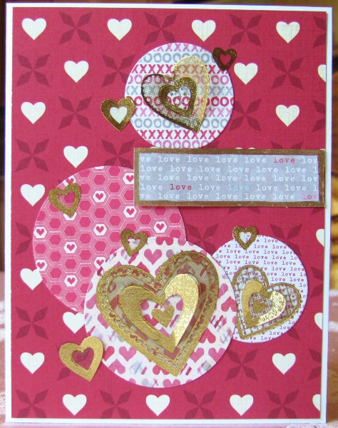
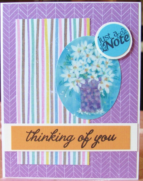
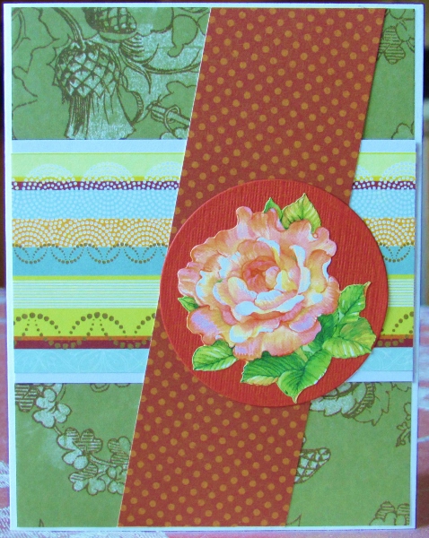
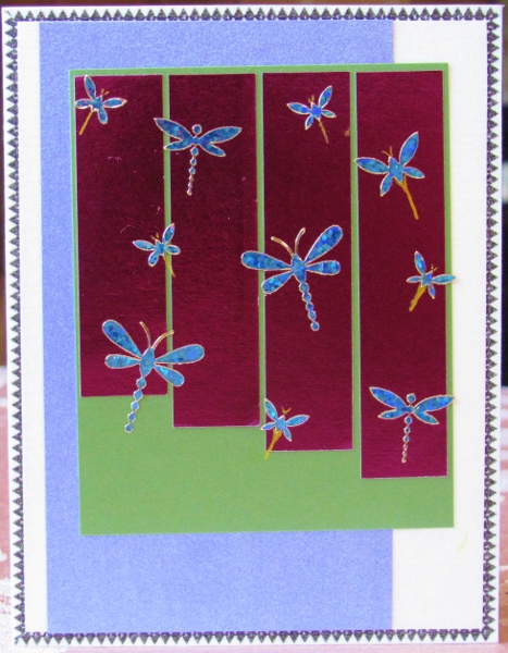
For version 2 of this sketch I leaned heavily on the 'circle' theme. The sticker I started with had a big round center surrounded by round petals. I carried this over into the background covered with big dots and then used a punch to create the purple round element and added a floral to it. This got popped up on foam tape.

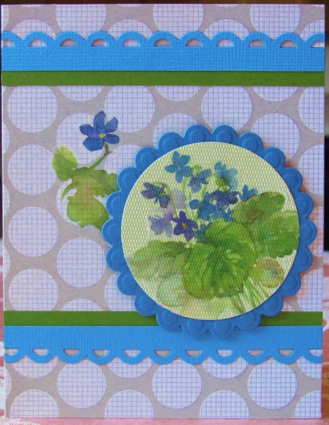
The main panel needed to be wider to accomodate the sticker and I also bordered it with lavender to separate it from the background.

I used low profile lavender pearls for the upper right dots in the sketch.


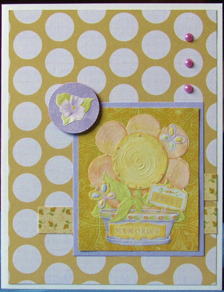
I turned the horizontal strip into two (one of which only shows at the right) and used a floral that kind of mimics the rim of the bowl in the illustration.

The white base card creates a border on the card.

Ddd


Posted by studio3d@ccgmail.net at 12:10 AM PDT
Saturday, 4 July 2015
Operation Write Home - sketch 256 version 1
Topic: Sketch Challenge

A new sketch was posted by Operation Write Home and then a challenge came out to use it in several ways. I took up the challenge and created seven cards with OWH 256:


I'm not thrilled with the first card I made, even though it meets all the design guidelines on the sketch.

I had a sheet of cardstock stickers and pulled the tall tabbed panel and the round text circle to start with. I gave the panel a dotted background and cut it larger than the sketch so it would show around the edges. The dots pull color from the round element.

Some of the other cardstock stickers were text as well, so I used those and then added outline stickers to illustrate them. This is where I got disappointed. I wish I had used something else on the tall panel.


Fortunately, this was only version one and I had lots more opportunities to improve on the style.

Ddd


Posted by studio3d@ccgmail.net at 12:01 AM PDT
Friday, 3 July 2015
Operation Write Home - a bonus sketch
Topic: Sketch Challenge

A few of the bonus sketches from OWH are not numbered and I have no idea when they were first produced. So they get generic names like 'a bonus sketch'. You'll probably also see 'another bonus sketch' and unnumbered bonus sketch'.

This is one of those:


I went searching first for a great round element and found this gold filigree medallion peel-off sticker in my stash. It exactly fit in the prescribed circle which I diecut from a coral-red.

In the paper stash I found this great coral and aqua with simple flowers. They look so good with the gold medallion!

I selected other papers that complemented it - the zig-zag mimics the layout of the flowers, the dots both pick up colors from the floral as well as having the same look as the scallops on the flower edges.

Sometimes you just 'know' when papers look good together and then have to do some analysis on the back end to figure out what it is that 'works'. In the case of this collection, they also all share the muted background (cream instead of white). The aqua dot is brighter so it is used as the background to the medallion to draw the attention there.


The medallion element is popped up on foam tape for emphasis.

Ddd


Posted by studio3d@ccgmail.net at 12:01 AM PDT
Thursday, 2 July 2015
Operation Write Home - sketch 255
Topic: Sketch Challenge

With this sketch I have officially 'caught up' with the regular series of sketches produced by Operation Write Home on their blog. After this, I will be working on the 30-some bonus sketches in their collection while sorting in the new sketches as they are released.

So now it is time for OWH sketch 255:


Somewhere along the line OWH changed from somebody 'creating' a sketch every week to selecting a donated card that they particularly liked and 'reverse engineering' a sketch from it. This way we know that somebody already made a great card using that design.

I have resisted the temptation to look at the work others have produced with the sketches and/or the work the sketches are derived from. I want my work to be 'mine' and not copied from someone else.

I first decided that I wanted to use some rub-on flowers and selected a lavender to diecut an oval from. I already had the sentiment stamped on the right color but it was too small. So I chose a block for it to sit upon what has two greens and a design that complements the leaves in the floral.

I kept the backing very neutral so it would not compete with the focal piece but I used a tone-on-tone dot so it would have some movement. It also echoes the little dots that are the flower centers.


For the round element I punched adot of green and then built a layered paper flower which I had colored with alcohol markers. I assembled these with a little flower brad.

The round did not suit where the sketch placed it so mine was moved to a new location.

Ddd


Posted by studio3d@ccgmail.net at 12:01 AM PDT
Wednesday, 1 July 2015
Operation Write Home - sketch 254
Topic: Sketch Challenge

Somebody must have hit the 'EASY' button! It sure came in handy with OWH sketch 254:


What's so easy about it? I already had the white circle cut, I already had the green circle cut, they matched the colors in the vellum sticker I wanted to use, I already had the sentiment stamped on the right size and color for the sketch!

The 'hard' parts were cutting the card front and the large rectangle.


I also had to change the alignment a little as my circles were larger and I wanted more of the floral sticker to show.

Ddd


Posted by studio3d@ccgmail.net at 12:01 AM PDT
Tuesday, 30 June 2015
Nailed It!
Topic: Nail Art

It's been quite a while since I did any art on my nails. Having my nails grown out to an attractive length is my preference for nail art and in the growing-out time span I just paint them without any art on them.

My nails have reached a great length for designing AND there's a holiday coming that makes me want to have a little celebration at the end of my fingers.


I went with a stars and stripes theme. The thumbs got blue with tiny white dots and the fingers got red with double white stripes.


This is before the cleanup of color from the cuticles. Actually, there is very little to clean up AND the stripes are remarkably neat.

Remarkable in that they were done start to finish while a three-year-old was continually trying to convince me to change my color scheme to purple, silver glitter and gold glitter, asking a lot of questions about the purpose of the supplies, and bounced against my knees as he tried to get a closer look.


Hooray for LEGOs that I managed to get out of a cupboard to entertain my little friend WITHOUT smearing any of my manicure!

Bring on the holiday, I'm ready!

Ddd


Posted by studio3d@ccgmail.net at 8:35 AM PDT
Operation Write Home - sketch 253
Topic: Sketch Challenge

I think I'm in LOVE! Yeah, with OWH sketch 253:


I shifted, simplified and shined up this sketch for use!

I decided that more of the layers would be the same so I would have more unity in the pattern. Then I decided to not have the center panels with all that space around them. This was the simplify part of the changes.

I had another of those vellum heart stickers with gold on it. I decided to cut a backing circle of shiny gold cardstock to meet the design of the sketch.

The color of the heart was used to select the papers for the card front, keeping the heart motif for the main piece. For more unity in design I kept two of the strips on the right the same.

When the front was assembled, I wanted to bring back some gold and needed to mimic the layering around the edges. So I selected some very fine gold line peel-off stickers and added them snug up against the colored papers of the front panel.


The gold circle with the heart is popped up on foam tape to separate it from the background.

Ddd


Posted by studio3d@ccgmail.net at 12:01 AM PDT
Monday, 29 June 2015
Operation Write Home - sketch 252
Topic: Sketch Challenge

For so many cards I work entirely out of the scrap bin. Sometimes I think that all the cards are starting to look alike. I wonder what would happen if I threw out all the scraps and only worked from newly cut paper? HA, where did all the scraps come from? From those same pads of newly cut paper! Yeah, I'd have to toss all the 6x6 papers and truly start from brand new paper pads. UM, not going to happen! I'll add in papers here and there, weed the pile for stuff I truly don't like at all and can't imagine ever using, and donate or trade instead of tossing them. I might even reopen those files of 12x12 papers and cut some down to 6x6 for a new mix.

Something has to change, though. Or maybe it's just time to make some Christmas cards - that would get me playing with new papers.

Anyway, what started this rant was a card I made for OWH sketch 252:


Sticker from the files (check), Leftover diecut circle (check), Strips of paper from recently used scraps (check), Border strip of text from recently used scraps (check), Floral to pull all the colors together (check).

Yep, the same old same old.

Oh, wait! I used gray for the base card! That's new!


It may be the same 'formula' as I've used all along, but I still like how it all comes together. And, yes, I popped the focal up on foam tape "just like always."

Ddd


Posted by studio3d@ccgmail.net at 12:01 AM PDT
Sunday, 28 June 2015
Operation Write Home - sketch 251
Topic: Sketch Challenge

This is a sketch that told me right away what IT wanted and I just jumped on the bus and followed along. Here is OWH sketch 251:


I had a cardstock stitcker from a recenty used sheet laying in the scrap pile and agreed that it could be the focal piece. It requested all the stripes to be an ombre of browns and I complied, making the 'behind' pieces a part of the blend.

Then the sticker said "look at my little strip of decorative trim. Let's add some gold like this to the stripes". Who am I to argue with a good design idea? Gold filligree trim coming right up!

The sticker wanted rounded corners which I supplied with the corner chomper and I gave the same to the right side of the card.


The focal sticker got popped up on foam tape - my version of a 'stage' and became the star of the show.

Ddd


Posted by studio3d@ccgmail.net at 12:10 AM PDT
Saturday, 27 June 2015
Mountain Wildflowers
Topic: Quilting

QUILT # 70 ! Can you believe it? I hardly can, myself.

Since starting quilting in September 2010 I have made:

5 full-size quilts

1 twin-size quilt

3 queen-size quilts

1 king-size quilt

10 banners

50 lap quilts (37 for charity)

Total - 70 quilts!

I just finished this one using a block pattern called delectable mountains and arranged it in a manner I think resembles an Aztec blanket.

I found the bright floral in the 'managers special' section of my favorite fabric store for 40% off. SO BRIGHT!

Right across the aisle were these yummy tone-on-tone brights that picked up the yellow-green, coral and teal from the print and they were 35% off. Gotta take the hint.

Then, gotta hang on to them for a year or so waiting for design inspiration. I got it when I watched a Craftsy quilting series and saw the ease of constructing the delectable mountains block. I cut up ALL the floral and then enough of each of the three brights to match up with them (1/3 of the blocks with each color).

When I tried to lay them out I realized that I needed something to separate the bright blocks. I pulled purple out of the stash for some sashing and bordering - it was another color in the floral.


The floral has black lines in it so I did the quilting with loops through only the floral areas. Then I stitched in the ditch all the purple bands.

This will be going off to the hospital for Passages.

Ddd


Posted by studio3d@ccgmail.net at 12:01 AM PDT
Friday, 26 June 2015
Operation Write Home - sketch 250
Topic: Sketch Challenge

Let's go back to 'simple' with OWH sketch 250:


I had another of those large vellum heart stickers that I wanted to use in place of the large circle. So as to not be too bold with the background I chose a grey with script.

The gold in the heart sticker led to gold vellum hearts and the black circle backing on the largest led to a black border all around the card.


I chose a pre-stamped sentiment for the crosspiece to reflect one of the colors in the large heart sticker.

Ddd


Posted by studio3d@ccgmail.net at 12:01 AM PDT
Thursday, 25 June 2015
Operation Write Home - sketch 249
Topic: Sketch Challenge

"But, I dont WANT to do it that way!" is my response to OWH sketch 249:


I was not impressed with those 'flags, tabs, strips, blocks' or whatever down the left side. So I turned them into a strip of striped paper.

I chose a purble paper for the main block and found I had a floral sticker to go with it.

A yellow border to pull color from the flower centers and a green background to reflect the leaves got me on the way. I added a strip of pink for the blossom color and mounted it all on a white card base with a border.


Another wierd little square at the bottom of the main block was replaced by a tab made of a pre-stamped sentiment.

Ddd


Posted by studio3d@ccgmail.net at 12:01 AM PDT
Wednesday, 24 June 2015
Operation Write Home - sketch 248
Topic: Sketch Challenge

WOW, that looks complicated! That was my first response to OWH sketch 248:


I thought I could relieve some of the clutter by using papers that are similar in color and pattern. This helps them to blend together.

I wanted to use 3D gold heart stickers so chose larger ones for the larger circles and then used small ones scattered about as shown on the sketch.

By careful placement of the smaller hearts I was able to integrate them with the background, lessening their impact.

I had one paper more than what I needed for the circles so I used that to cut the horizontal strip. In tied it into the rest of the layout by bordering it with gold metallic pen.


When mounting the sentiment strip I popped one end up on foam tape for dimension. This echoes the raised layers of the heart stickers.


Ddd


Posted by studio3d@ccgmail.net at 12:01 AM PDT
Tuesday, 23 June 2015
Operation Write Home - sketch 247
Topic: Sketch Challenge

In comparison to yesterday's card this sketch is a real mind-twister. On its own, though, it is very straightforward. Here is OWH sketch 247:


I started this one out with a floral sticker I had that was already an oval shape. The colors in the striped paper were perfect with the illustration and tied it in to the background purple.

I wanted the orange flower centers to be picked up elsewhere wo I used orange as the lower crosspiece. The pre-stamped sentiment was not long enough so I allowed for bordering.


I used a round punch on a pre-stamped sentiment for the upper right element. It needed a bit of emphasis so I bordered it in white and popped it up on foam tape.

Ddd


Posted by studio3d@ccgmail.net at 12:01 AM PDT
Monday, 22 June 2015
Operation Write Home - sketch 246
Topic: Sketch Challenge

S-I-M-P-L-E

That is the most that can be said for OWH sketch 246:


I can honestly say this is the simplest card I have ever made, short of those grade school things where we just folded a piece of paper in half and wrote 'MOM' on the outside in crayon!

Because the sketch was so clean I did not want to use busy papers and illustrations with it. I chose a rub-on for the artwork and mounted it on shimmery cream paper. This was trimmed to size and bordered with dark green to match the leaves.

This was mounted to a low-key green mesh background with no border.


Two small rub-ons from the same sheet stand in for the two round elements on the sketch.

Ddd


Posted by studio3d@ccgmail.net at 12:01 AM PDT
Sunday, 21 June 2015
Operation Write Home - sketch 245
Topic: Sketch Challenge

I'm closing in on the end of the tunnel! After this sketch I will only have 10 more to catch up wth the end of the regular sketches. There are still 27 bonus sketches left as well, but I really AM near the end!

Here is OWH sketch 245:


Yeah, that's an odd one.

First off, that diagonal piece looked rather haphazard so I chose to extend it all the way to the top and bottom. That helped right off the bat. 

I chose a rose sticker for the circle area and then realized that the round needed to be larger. No problem.

I chose a floral and a stripe for the background to reinforce the colors in the sticker. This gave me the colors to use for the round and diagonal bar.


I left a white border around the card and also at the top and bottom of the striped paper. This keeps the palette from being too dark.

No sentiment to make it more versitile.

Ddd


Posted by studio3d@ccgmail.net at 12:01 AM PDT
Saturday, 20 June 2015
Operation Write Home - sketch 244
Topic: Sketch Challenge

Ooooh, this is a cute little sketch! I was very happy to catch up to OWH sketch 244.


I was especially glad when I found the bird sticker in my stash. It is a clear vinyl sticker so would not separate from a background well. I chose to apply the bird sticker to white cardstock and then fussy-cut it with a fine white border.

As usual, I keyed the card parts to colors found in the illustration. The best was coming across the block of multicolored patterned stripes. It played well with a strip of dark green on the left and a big banner of orange.

I kept up with the 'theme' of diagonal patterns by using a neutral gray background with white diamonds.


I found a stamped sentiment in my binthat was in just the right color.

Ddd


Posted by studio3d@ccgmail.net at 12:01 AM PDT
Friday, 19 June 2015
Operation Write Home - sketch 243
Topic: Sketch Challenge

I think sketches like OWH 243 are really 'back to basics'. The centered elements kind of hold everything together while the off center ones add interest.


The key for me was noting where the bordering elements were, setting the stage for the coordination of layers within them.

My starting point, as usual, was the two rose stickers. I chose a coordinating color for their background and an accent strip that mimicked the shapes and color in that background paper.

For the next layer down I chose a lighter version of the orange, in a solid, and a green printed stripe - low key but still pulling color from the stickers.

The final layer, the background, echoes the color and, a little bit, the shape in the most forward layer. This paper has roses in it as well, like the stickers.


I used blaks as the bordering throughout and reinforced this with the stamped sentiment across the blank space of the center layer.

Ddd


Posted by studio3d@ccgmail.net at 12:01 AM PDT
Thursday, 18 June 2015
Operation Write Home - sketch 242
Topic: Sketch Challenge

Here's another sketch from OWH, number 242. This one is a bit more original than many which do seem to get repetitive.


With those interesting stripes I kept thinking of a sticker sheet of holographic dragonflies in my stash. Once I pulled those out I decided to go with ALL shiny papers in all the layers.

I started by putting a thin washi tape around the 4 sides of the card base which is the zig-zag border shown.

Then I simply cut all the pieces and put the whole thing together as shown in the sketch.

I added all the dragonflies that I had and needed more. I had some little butterflies on the sheet so I added some of those and used a gold gel pen to add antennae and tails to them.


This was enough to bring it all together. No sentiment makes this versitile enough to use for any occasion.

Ddd


Posted by studio3d@ccgmail.net at 12:01 AM PDT
Wednesday, 17 June 2015
Operation Write Home - sketch 241
Topic: Sketch Challenge

A few simple changes actually makes this sketch look more complicated. Here is OWH sketch 241:


I started the changes by deciding to use the same background over the whole card and eliminating the border all around. Then, instead of the three stripes at the top and bottom I chose to do a wide and a skinny where the wide one was border punched with a scallop.

The sticker circle (vellum over a printed background) was backed by a diecut scalloped circle. The colors tie all of the scallops and circles together.

I decided to mount the illustration off center rather than like the sketch and then added a coordinating sticker to the background.


The main illustration is mounted on foam tape.

Ddd


Posted by studio3d@ccgmail.net at 12:01 AM PDT

Newer | Latest | Older