Topic: Bible Journaling
With a bit of a busy week (again) I did the lettering lessons hit and miss. The font this time was named 'beautiful'.
The first lesson I worked on was skipping right to the full alphabet. I found it extremely challenging to make this cursive alphabet 'stand up' so it looks more italics that it is supposed to.
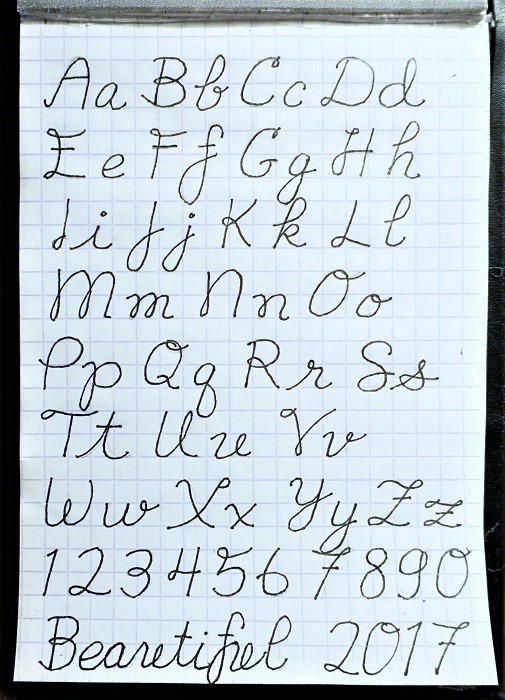
I am not overly fond of the lowercase U when it connects with some letters. Just looks strange. You'll notice below that some letters that have a trailing loop do strange things when juxtaposed with the leading loop on the R.
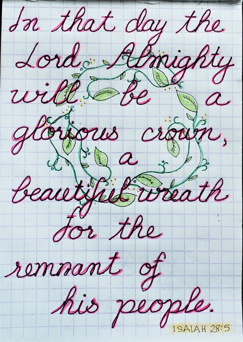
We also worked on designing wreaths this week.
For my 'in the Bible' journaling I chose Isaiah 52:7 because I have been wanting to this one for some time.
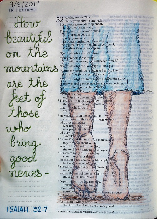
Idea for the feet was found on Pinterest.
Ddd
Posted by studio3d@ccgmail.net
at 12:57 PM PDT
