Topic: Bible Journaling
And with a big sigh, I end several weeks in a row of being on duty for lettering tutorials. The other leader will take over this week.
Last week, I taught a series on the word 'Purity'.
MONDAY LESSON
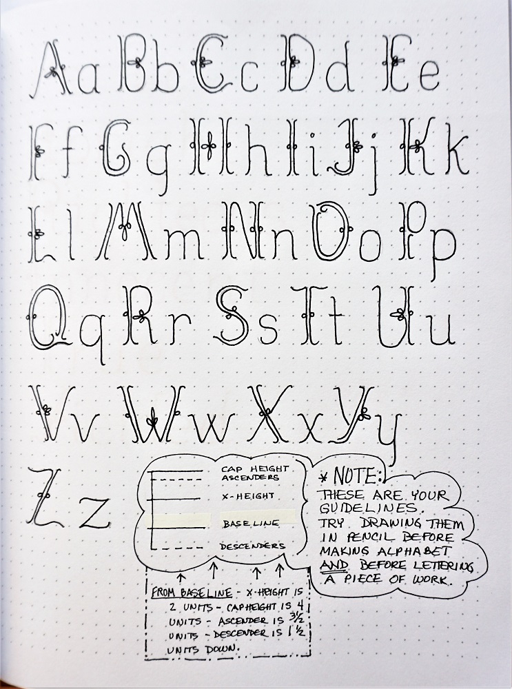
The lettering lessons this week will demonstrate and teach an elegant print font I’ve titled ‘Purity’.
The upper case is prettied up with some double lines and single and double loops. The lower case does not have any of these elements but echo the bent ends of the lines at top and bottom.
The inset box has some step-by-step directions on forming your capitals so you get the best results for your efforts:
1) In pencil, create your basic forms
2) In pencil, add features such as the double lines, bent ends and single and double loops
3) Ink the whole letter
4) Erase the pencil
AIM FOR CONSISTENCY in the size and angles of your features and in the spacing between your double strokes.
Practice with different forms of the words: pure and purity and do some with all caps and some with mixed-case.

TUESDAY LESSON
Before you start drawing your alphabet, make yourself sets of guidelines in pencil. See the ‘clouds and box’ at the bottom of the page.
The only letter I think could use some tweaking is the upper-case Y. If you have a form you like better, draw it in and share it with us.
Don’t let all those loops intimidate you! Over all, this alphabet looks complicated and hard to draw but it is really very simple – just take it one step at a time. It will look very elegant when you are using it.
WEDNESDAY LESSON
Today, use your new font to write up a word list that reflects one of the forms of ’Purity’. I made mine into an anagram but you could build a crossword or a quote.
Just play! The goal is to get some practice using the font and getting a feel for letter spacing.

THURSDAY LESSON
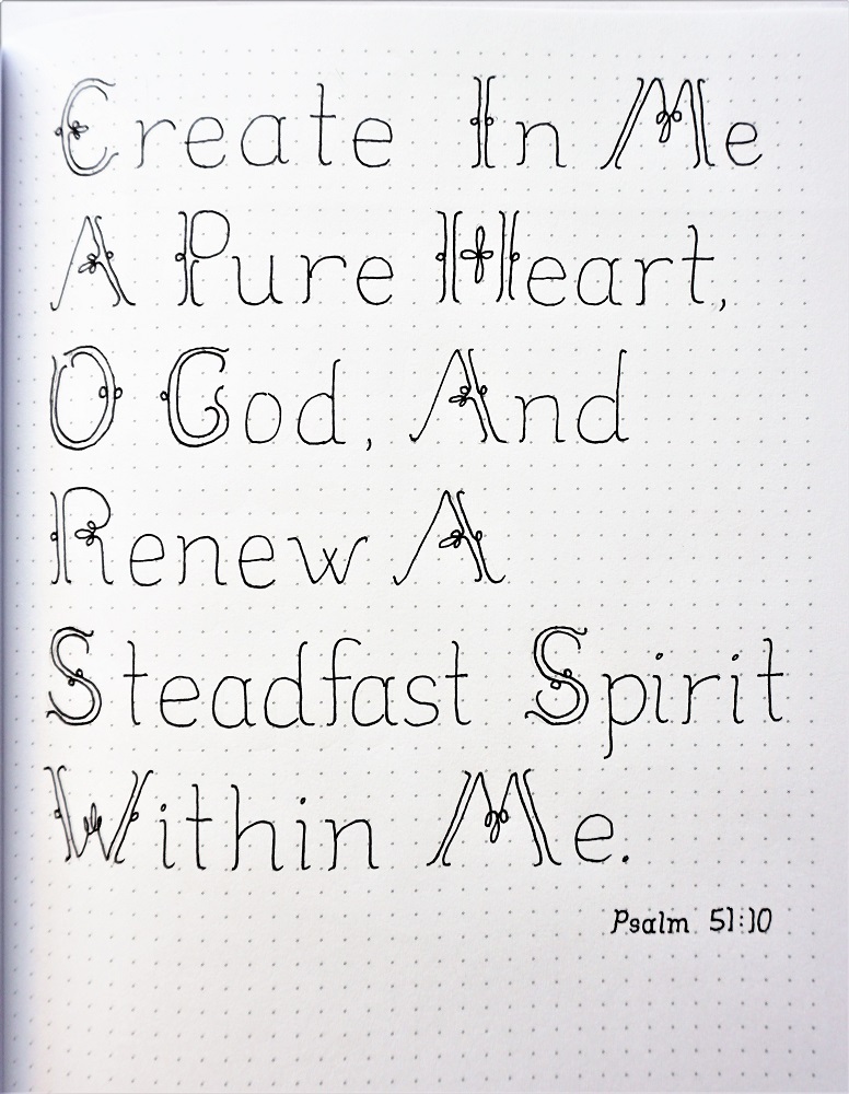
Let’s write scriptures!
As I’ve mentioned before, I think a phrase or verse looks best when every word is capitalized. This is especially true when the lower case is so plain. You want those caps to say, “This is what it’s all about.”
Although it would be a LOT of work, an alternative would be to use ALL caps.
FRIDAY LESSON
It’s Friday already! Time to use the new font in our Bibles.
I did part of my verse with the featured lettering and supported it with an elegant script. Except for that last word… no way did I want that to be either elegant or represented by the ‘purity’ font. It just got ugly writing.
I used a bright color burst from the feature word.
Did you notice the heart is formed from the word ‘Pure’?

Another tutorial in the books.
Ddd
