Topic: Bible Journaling
This week we covered three books of the old testament with one lettering style. Here are the lessons:
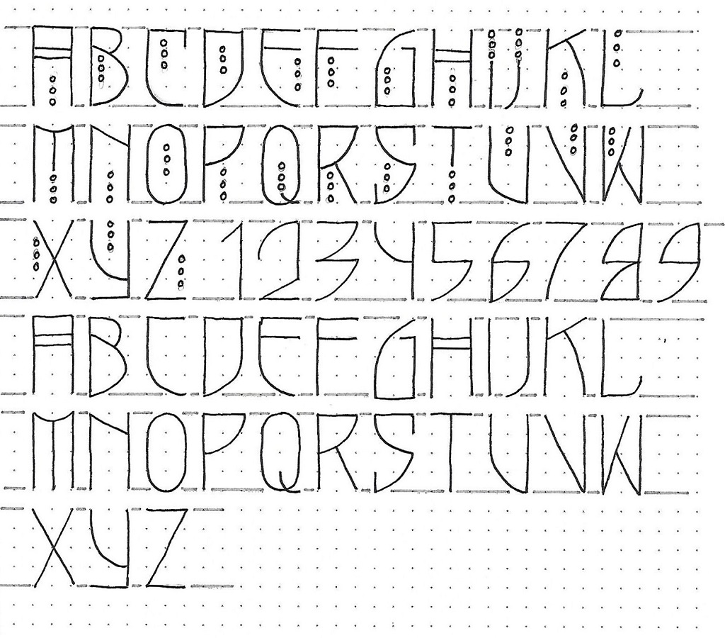
3 O.T. BOOKS: Day #1 – Shield Font – Alphabet
We usually start our lessons with practicing just the name of the book but there are so many of the letters contained in these (9 of the 26) that I decided to go straight to the alphabet today and have you use the book names as practice tomorrow.
This alphabet is 4 units high and 2 units wide. The exceptions are the I and J, as usual. There are a few tight curves (B, O, Q) but most of them are large sweeping curves. The A and H feature double crossbars.
The upper case is distinguished by three small circles. These mostly sit inside the letter but in a few cases replace a portion of a line (I, J, M, T). Numbers have similar characteristics and the lower case has no small circles.
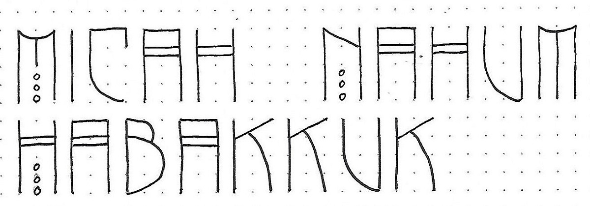
3 O.T. BOOKS: Day #2 – Shield Font – Word Practice
Here are the three books of the Old Testament that are covered this week. This practice page will give you a feel for using the ‘upper-case’ only as the leading letter in each word.
I think the C, U, E are all good examples of why I named this font ‘shield’.
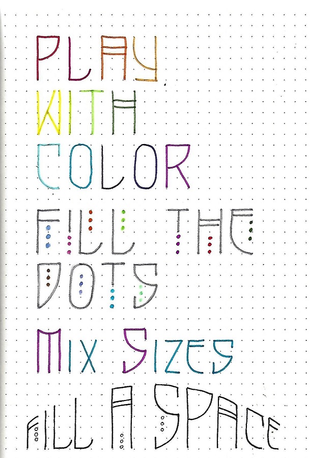
3 O.T. BOOKS: Day #3 – Shield Font – Play Time
Today I want you to practice your letters while adding some variety.
1) - Use colored markers to write the letters in a variety of hues. I used a rainbow order for mine.
2) - Use a standard plain color (black or gray) for the letters and colors for the dots.
3) - Use the full-size letters for capitals and shrink by one unit for the lower-case.
4) - Draw an arched top and a straight baseline then stretch your letters vertically to fill the space.
Your lettering never has to be boring!
3 O.T. BOOKS: Day #4 – Shield Font – Scripture
For more practice, choose a scripture in one of the featured books to write out in the Shield Font. Use any form of the alphabet that we practiced this week. I used all-caps and filled my circles and crossbars with color

3 O.T. BOOKS: Day #5 – Shield Font – Bible Page
This is the day we take the new font to our Bibles. I got quite a bit of text fitted in by using two lines in my margin guides. For longer words you may have to change the scale slightly, making the letters skinnier than the norm. If you do that, be consistent throughout.
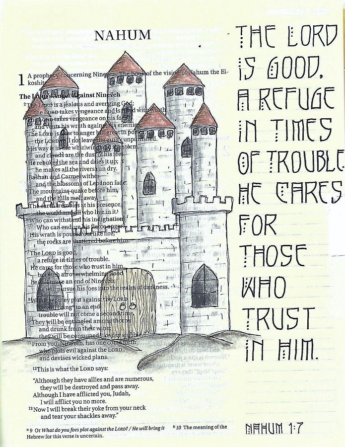
I used the same lettering for the scripture reference on this page, too.
Ddd
