Topic: Bible Journaling
This is the last in the series of progressive lessons from basic round print to bounce lettering. I will still be teaching lettering lessons but they will be built on one or more of the lessons from this series.
This week's lessons are built around the book of Esther.
Bounce Lettering – Introduction
| This week is the culmination of all our study in the progressive series on lettering – from basic print to elegant script. We have visited the faux-brush script (last week) and now will enter the realm of bounce lettering. This style is sometimes referred to as ‘modern calligraphy’ and is most often executed with a brush-tipped marker. However, we will continue to use our method of penciling the letters, making adjustments, inking our best effort, erasing the pencil and thickening and filling the downstrokes.
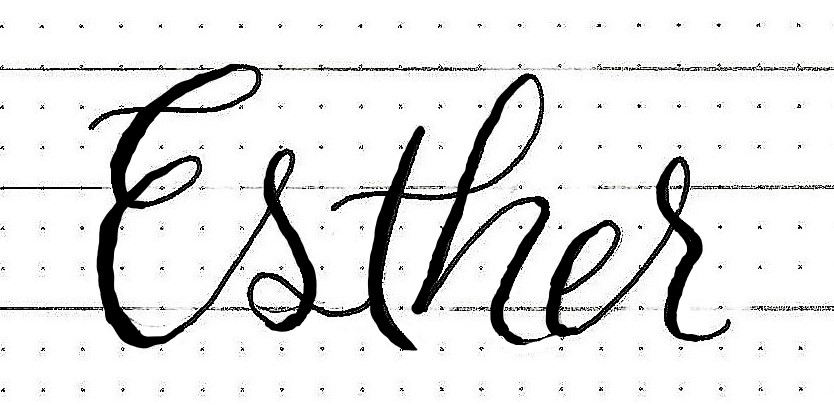
This week we will be using samples from the book of Esther so our introductory word is just that.
First, use your regular script to write out the word, using the baseline and x-height and ascender line as guides. Then lightly sketch a pencil line just below and just above the baseline. Edit your letters so some drop below the line and some ride above it. Exaggerate the loops and heights as you wish and connect some letters as I have with the th.
Trace over your final lines in ink and thicken the downstrokes before erasing your pencil.
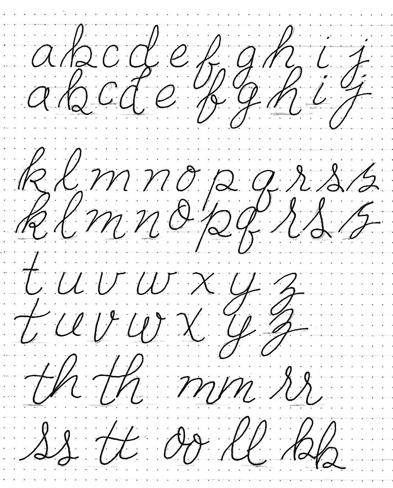
Bounce Lettering – Alphabet
|
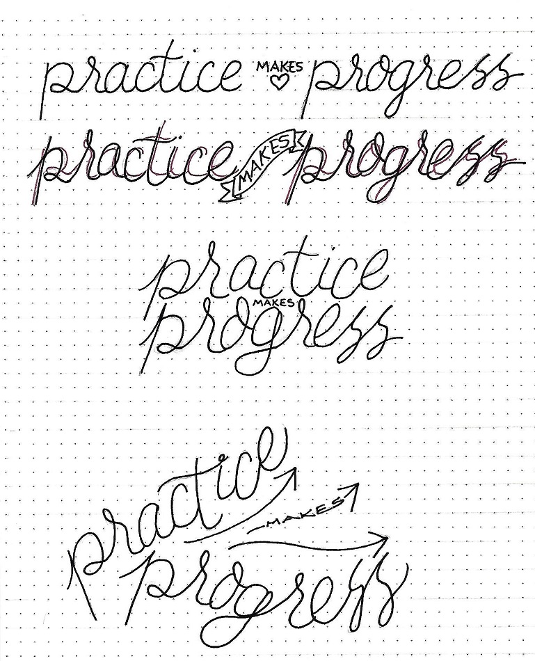
Bounce Lettering – Practice
| Just as we did yesterday, we are drawing those guidelines and writing our phrase in normal script. Make a second set of guidelines and repeat this step (shown in pink lines here). Then use pencil to exaggerate those letters and make them bounce.
Now try it again, working over and under. This time let the exaggerated forms fill in spaces where the words come together.
Then draw some baselines that are not square to the page OR one another. Use these to write in bounce letters. |
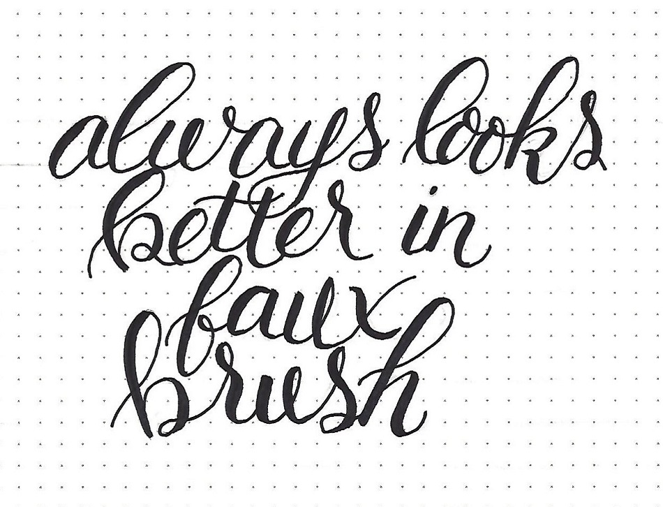
Bounce Lettering – Faux Brush Bounce
| Today, I want you to draw some ‘rising and falling’ curved baselines and use them to write a block of text.
Make the exaggerations fill the open spaces. Don’t forget to work in pencil and edit over and over and over to get just the look you want.
Ink when you are finished and then use the double-line technique to turn your letters to faux-brush lettering.
It does not have to be perfect! This is a sharp learning curve that most are practicing for a LONG time before it comes naturally. The goal is beautiful, artistic lettering – not looking like it was produced on a computer. Your own variations and designs will make it unique to you. |
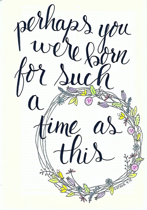
Bounce Lettering – Bible Page
| Use a piece of paper to do all the design and layout work for a scripture in bounce lettering. Edit until you have it just the way you want and then ink the letter forms. This will make them easier to see for tracing.
Trace into your bible (I used my interleaved ESV in Esther 4:14) using pencil, then ink the letters, then make them faux-brush with thickened downstrokes. Erase all the pencil and decorate the page as you wish. |
As further evidence of what a difference the thickened downstrokes make, take a look at this side-by-side comparison of before and after adding them.
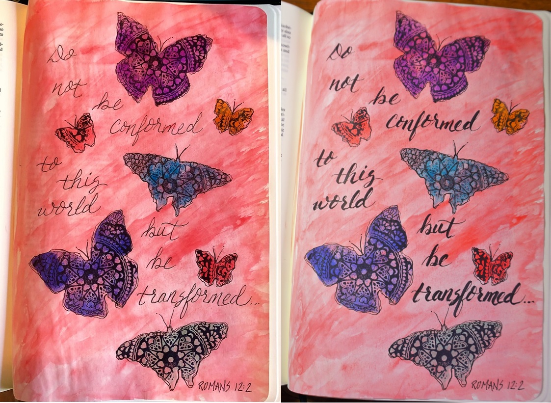
Seriously? Why would you NOT add them?
Ddd
