Topic: Bible Journaling
A few weeks back someone suggested we develop a lettering style that used double lines. So I did an upper-case only and prepared the 5 days of lessons for it.
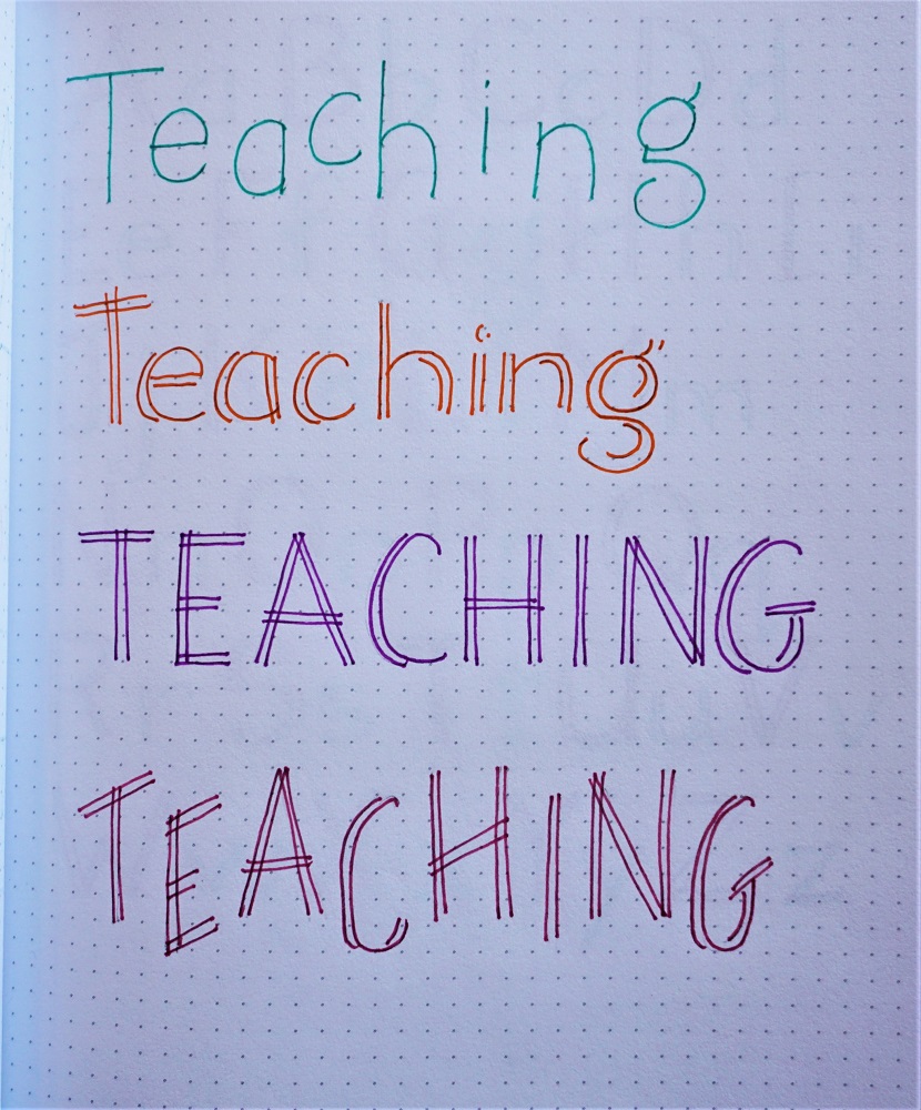
At the end of last month my co-leader was having some family health issues and needed some time off. I offered to pick up this last week for her. But when I got ready for the first post, she had forgotten about that offer and had prepped the 'teaching' font we just completed.
I had to laugh because we had both planned on the double-line fonts for the same week. Don't you love God's sense of humor?
So I did mine as a 5-hour class instead of a 5-day class and posted it in the lobby of our site instead of the Lettering Lodge thread. I posted one lesson each hour on Friday night and got lots of attention from people who don't seem to dig down into the threads for lessons.
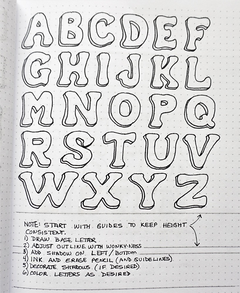
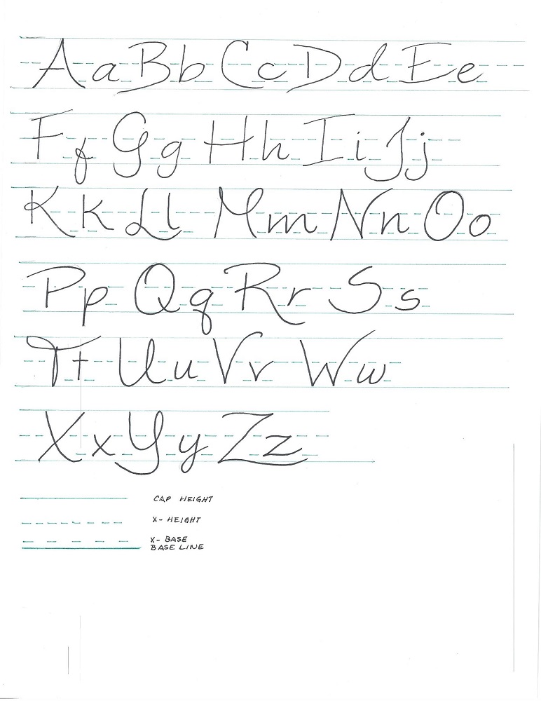
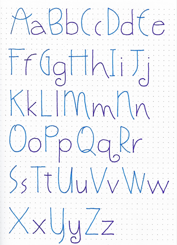
So, here is the font I developed. Again, I did only an upper case. Mine is all straight lines where Ann's has lots of curves because it is based on a standard print.
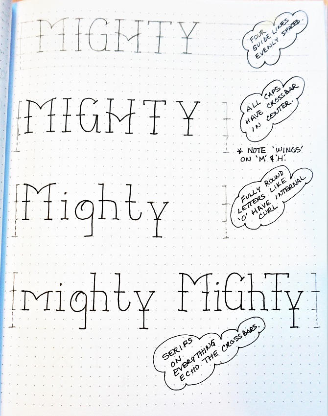
LESSON ONE
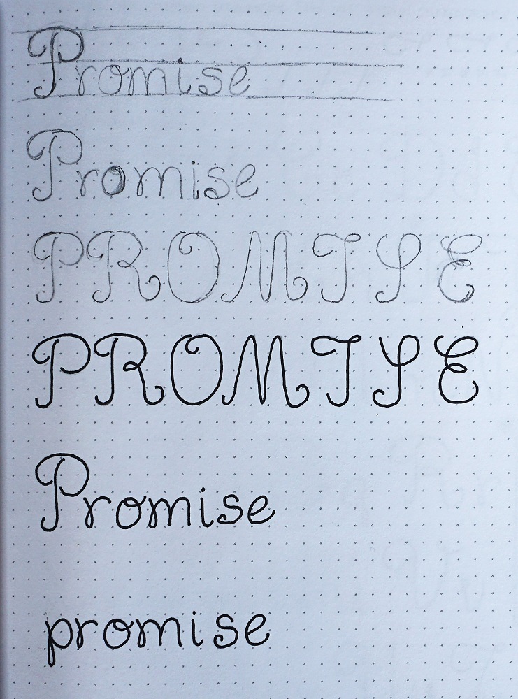
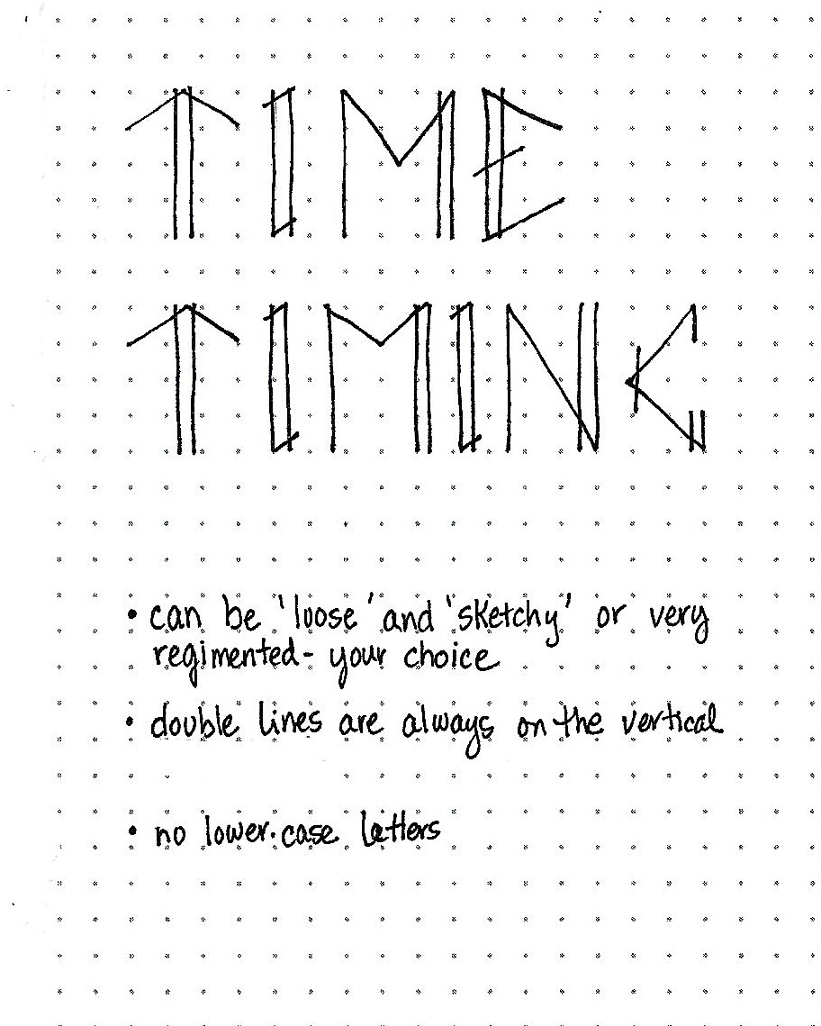
Hello everyone it is TIME for new lettering! (The first lesson is always an introduction of the style using a focus word - the same focus word will be used for the whole lesson plan)
I had such fun developing this print style. This print style has no lower-case.
All those angles and double lines can be treated very loosely or very structured and precise. It’s your choice.
All of the double lines are on the vertical – never on an angle or horizontal. This gives a tall linear vibe. Every letter gets just one double.
LESSON TWO
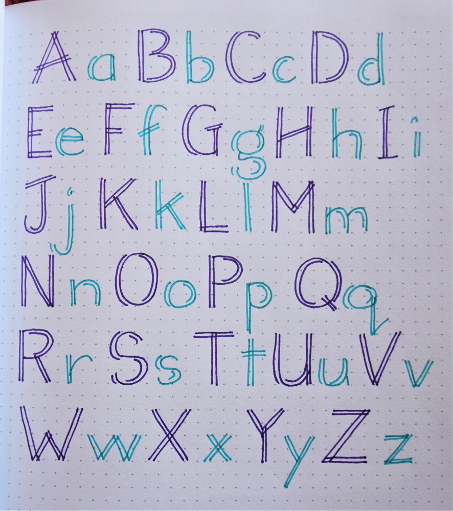
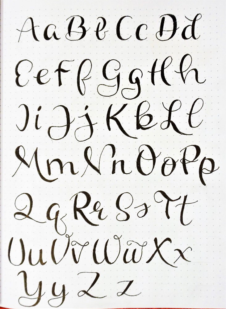
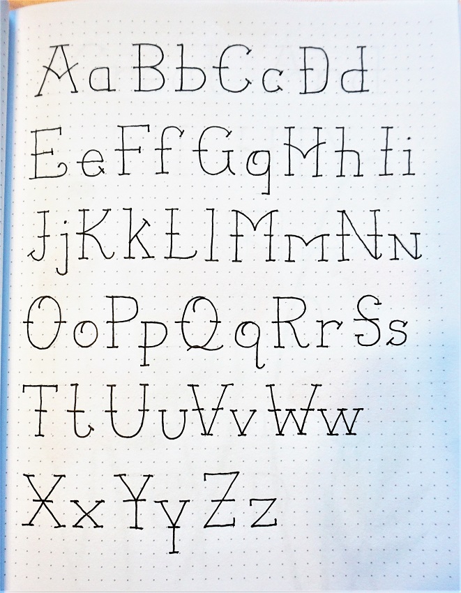
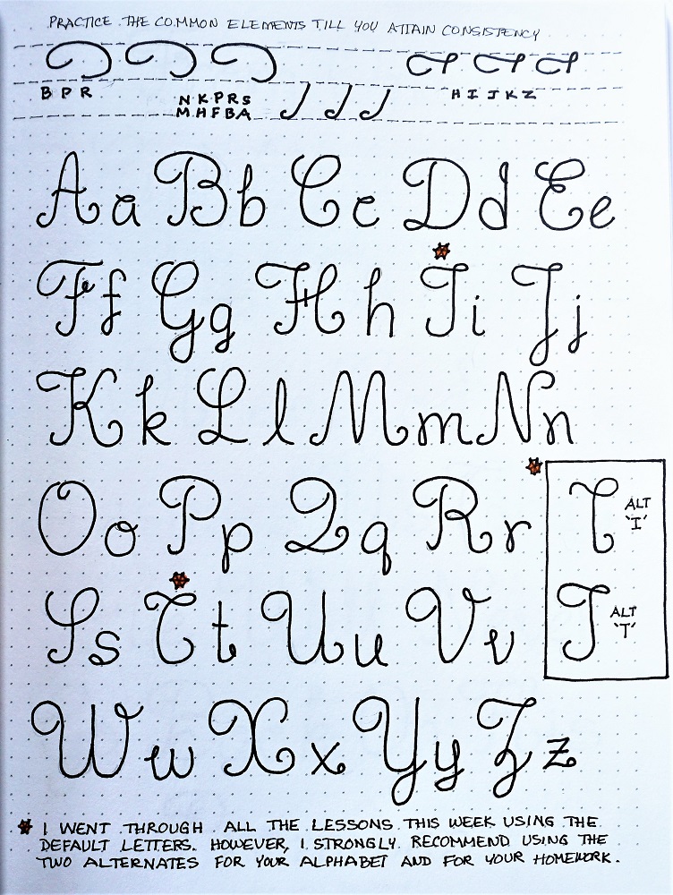
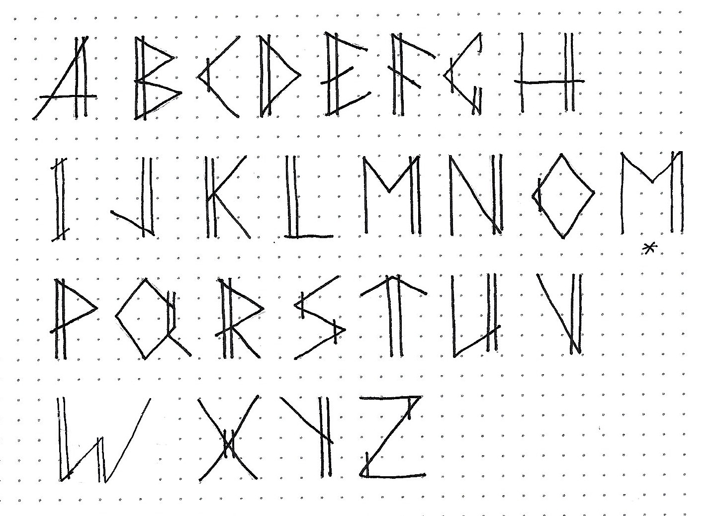
Our second lesson is always the introduction of the full alphabet in the new lettering style.
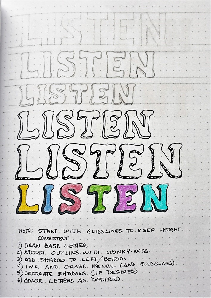
We always use the same process for lettering, whether for this initial introduction or the projects we design later. We call that process P-I-E. This stands for PENCIL (use pencil to draw your letters rather than writing them which helps you break out of your natural handwriting) INK (go over the new letter forms in pencil as many times as you need to get them just how you like. Then trace over them in ink) ERASE (when the ink is dry, erase your pencil)
Note how there are no curves at all in this style. Those angular lines remind me of the hands on a clock which is what led to the focus word ‘time’.
There is an alternate letter M as I wasn’t sure if I wanted a deep or a shallow V on the top of it, use whichever one you like best.
My favorite letters are the G and Q.
LESSON THREE
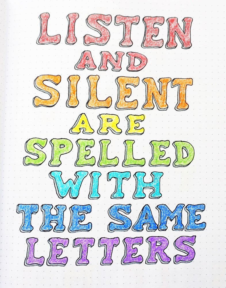
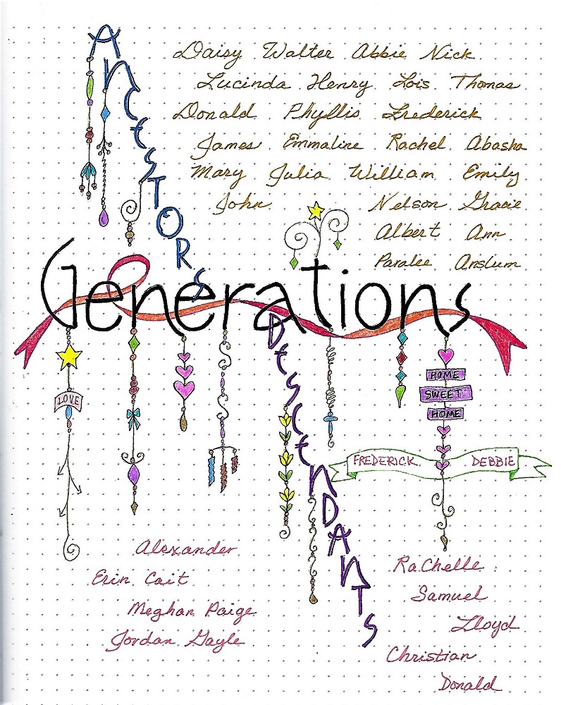
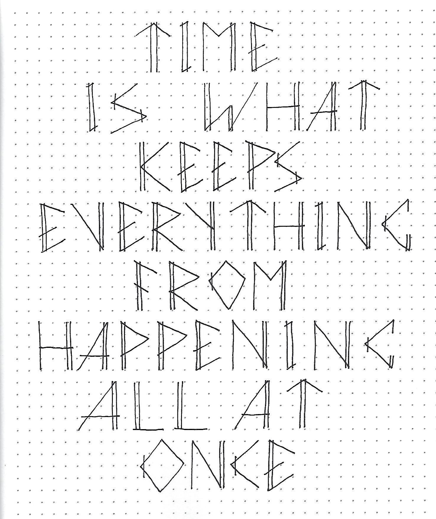
For our third less we give an assignment to do something creative with the new lettering style. Sometimes it is writing lyrics from a hymn or chorus, sometimes we do an anagram or crossword, other times it will be a quote. These will all use the focus word or be related to it.
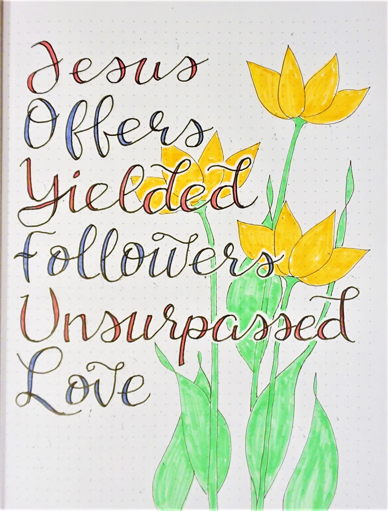
The intention is to give ample opportunity for practicing using the letters in words and phrases to get familiar with spacing, joining letters and just seeing how the style looks when it is in common use. Some people choose to decorate their pages. This is optional.
I’ve always found this quote about time to be quite humorous. It has been attributed in various iterations to Einstein but most believe it not to have come from him at all.
Choose your own quote about TIME to write up for lettering practice. You know why we do all these activities throughout the week, don’t you? It is to train our minds and hands in the proper formation of the letters for the style. It also gives more opportunity for you to develop the stylistic elements that will make it your own. So, it is to your OWN benefit to write longer blocks of text rather than trying to get by with as little as possible.
LESSON FOUR
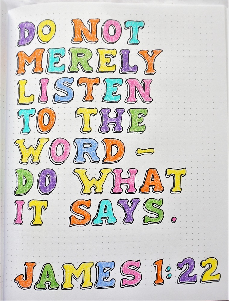
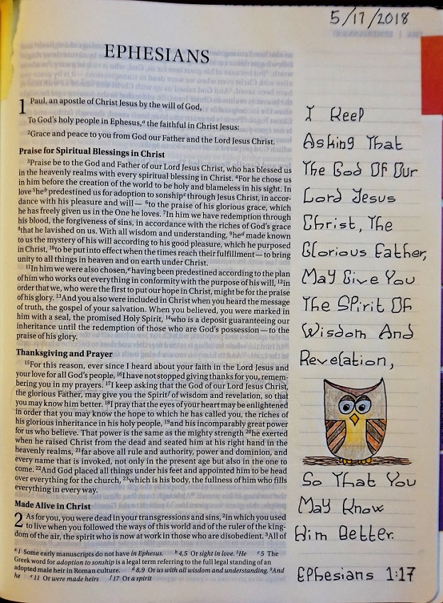
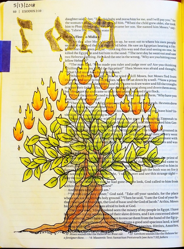
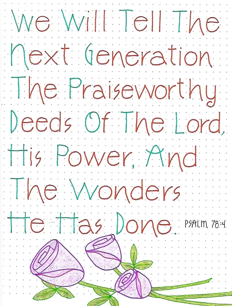
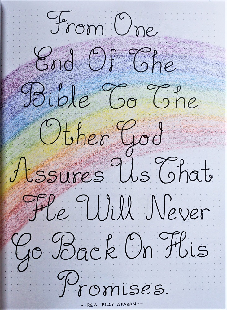
This lesson is always the day we use the new style to write a scripture with the focus word in our notebook, on plain paper or in a journal. These can also be decorated or combined with artwork if you wish
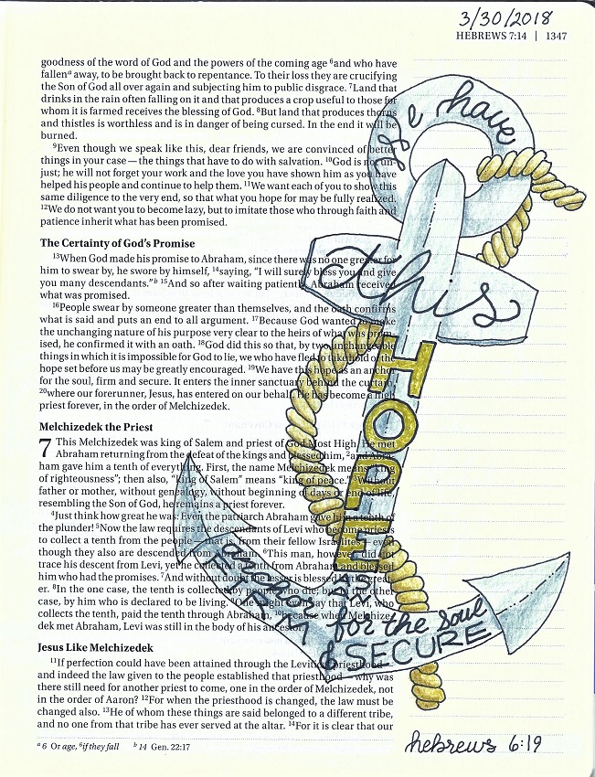
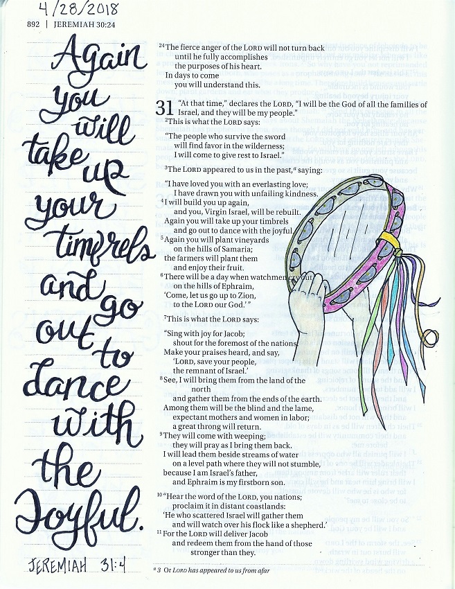
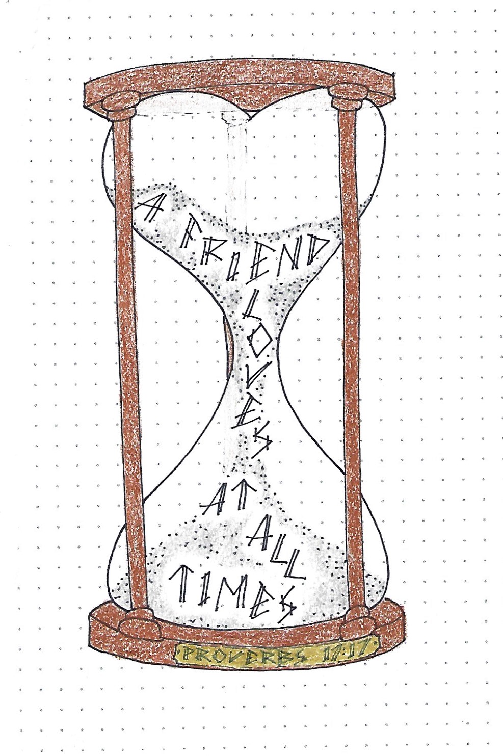
When using this letter style in a looser manner it takes on a casual feel. I used mine to write out a scripture inside an hourglass. This is a variation on the one presented in the Drawing Room this week. The scripture reference is on the brass plaque.
Have you discovered whether you like to use this as a casual style or more regimented? It helps on the casual usage to toss and turn the letters a bit to dial down the formality.
LESSON FIVE
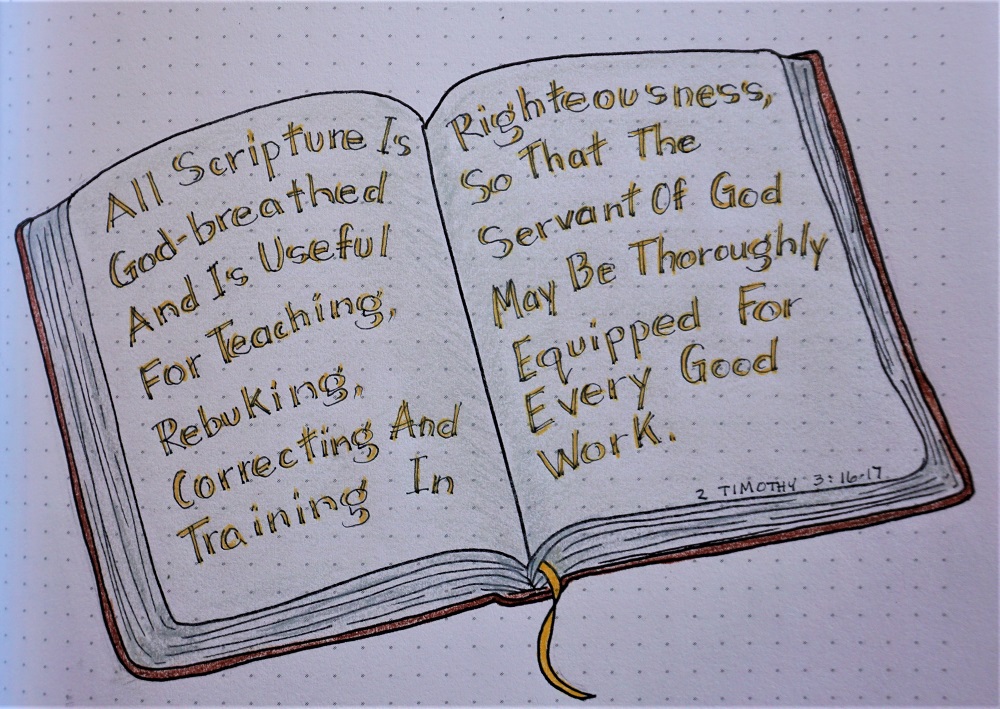
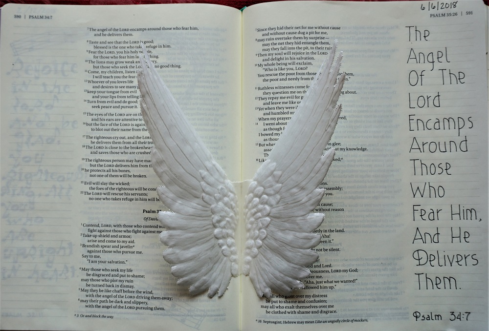
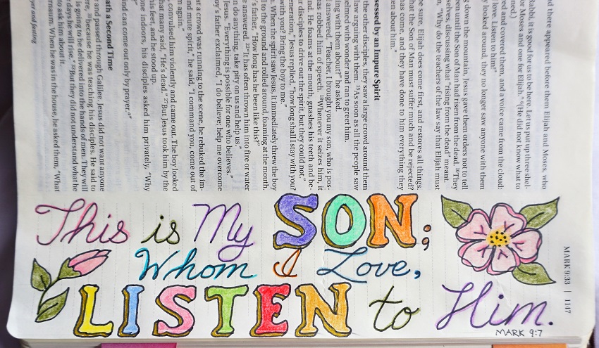
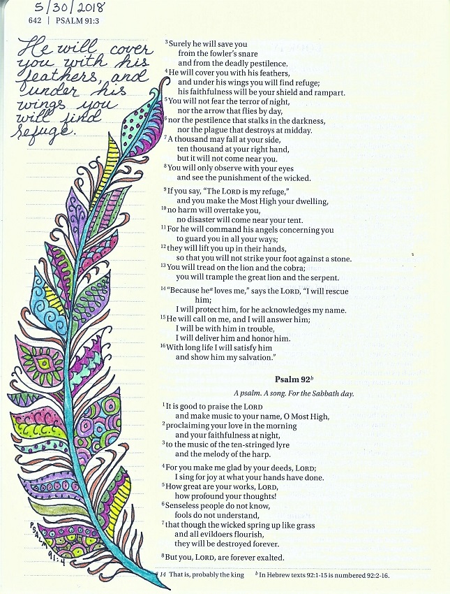
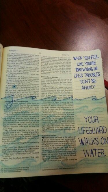
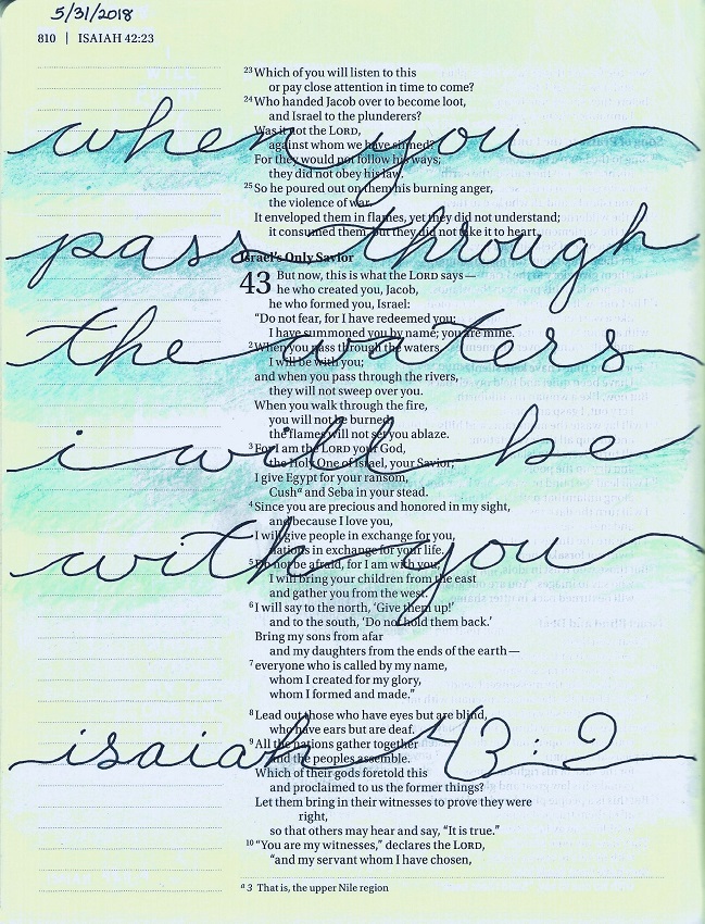
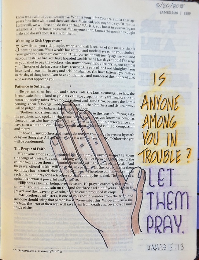
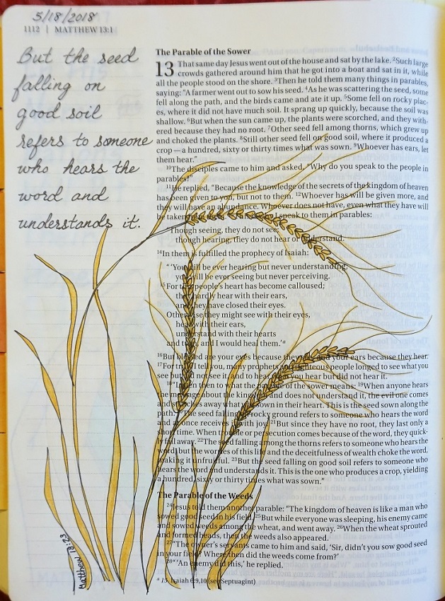
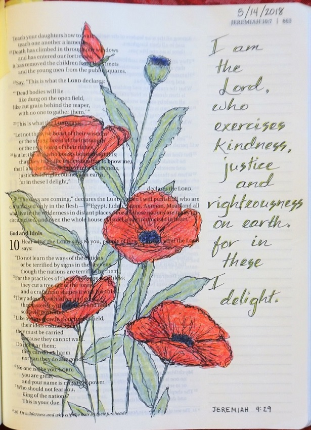
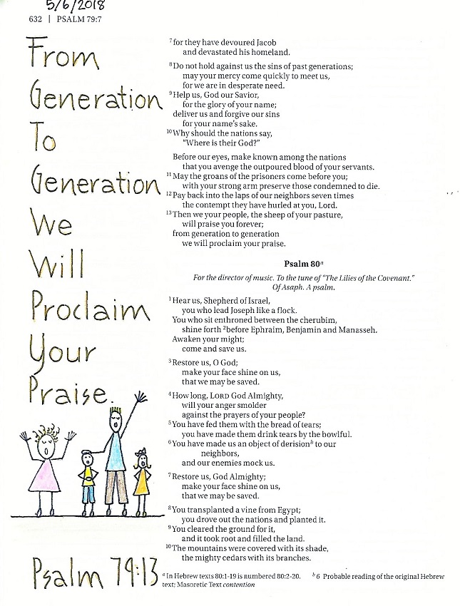
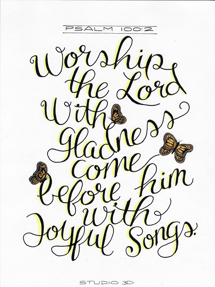
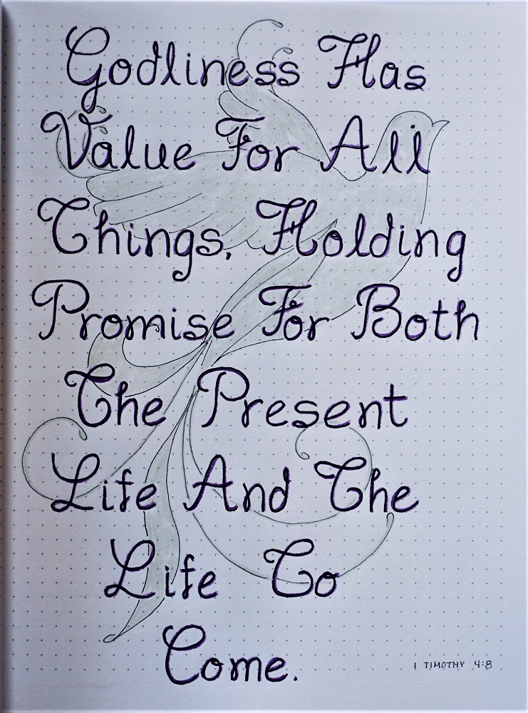
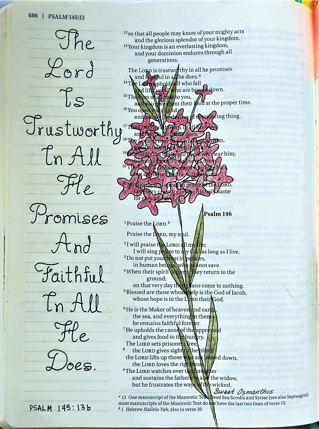
The fifth lesson is when we get to use the lettering in our Bibles.
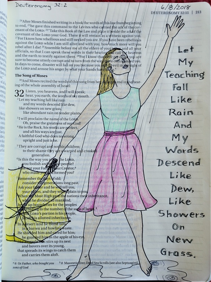
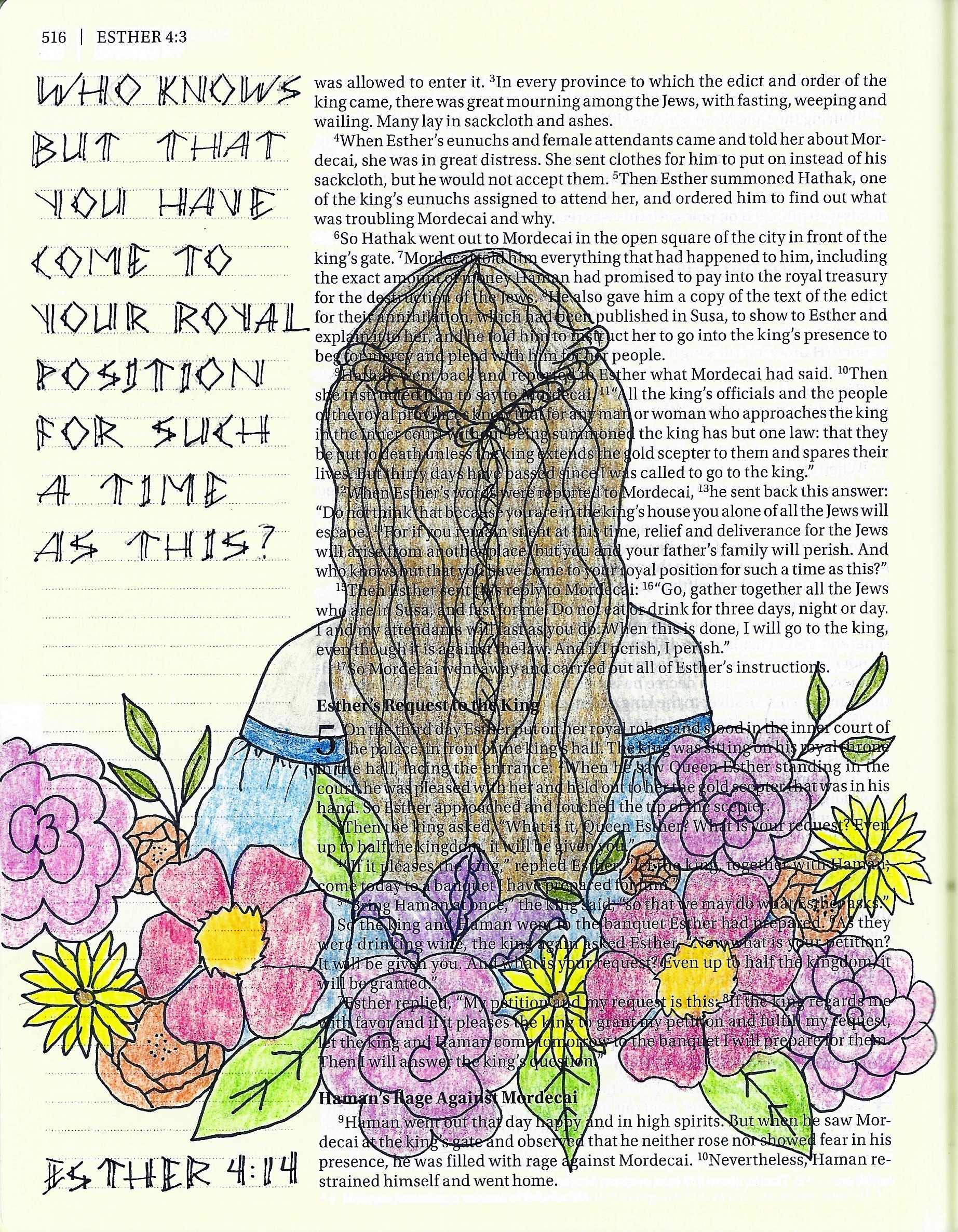
I found a coloring book illustration that I liked for inspiration. I used the same hair style and sleeves but all the flowers are mine.
For this scripture I went back to a more regimented usage of the lettering style as it references royalty so needed that formal touch.
Don’t forget, we are still using the P-I-E method – Pencil-Ink-Erase.
Let us see what scripture you choose to use with the TIME font.
So, that's how you teach 5 days of lessons in 5 hours!
Ddd