Topic: Bible Journaling
Another week - another font!
I am much happier working with fonts that are precise than those that are loose and interpretive, but this week the assigned font was the latter. He were working with the word 'heart' throughout the lessons.
Monday --
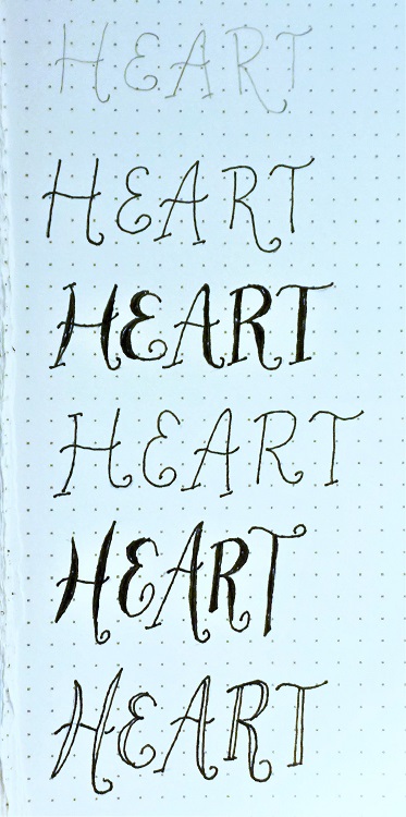
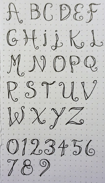
We learned the basic letters needed for the focus word and wrote them out with slight variations (some of that interpretive stuff).
Tuesday --
I was less than thrilled with the whole alphabet.
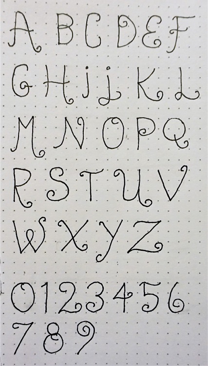
So I added thickening lines with a ribbon twist. I left them open so I could review the line structure when I used them on a project and then select whether to leave them open, fill with the base color or fill with an accent color.
Wednesday --
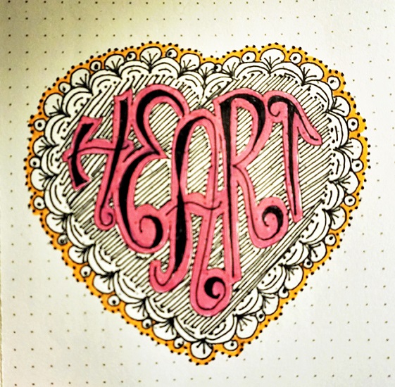
We worked on loosening up the letter forms by shaping the word to fit inside a heart. One has to adjust the length of legs, the tilt of a letter cap and make some letters smaller then others to nestle them.
We practiced making border frames as well to create a finished piece.
I colored mine with highlighters. (Sorry about the photo quality. It was taken at night by lamp light)
Thursday --
When writing out a scripture on a journal page, I really worked on making the words flow across the area and adjusting some letter heights for interest.
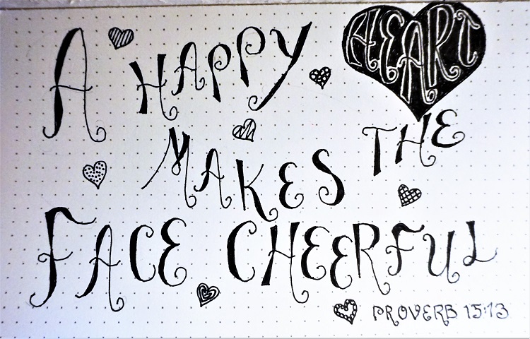
I used that 'word in a heart' motif again but did a solid blackfill instead of color.
Friday --
I kept selecting verses to journal that had the word 'heart' in them but found that the page I needed was already journaled on or the adjacent page was done. I suppose that will be happening more and more.
I finally settled on Psalm 119:11.
I drew a padlock and key from imagination and colored them with metallic colored pencils in silver and gold.
I managed to get my lettering to look loose and carefree without being sloppy and filled the ribbon portion of the letters with gold gel pen.
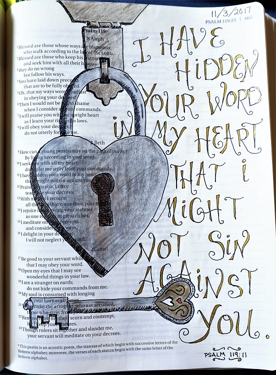
Here you can get a better look at the effect of the metallic pencils and gel pen.
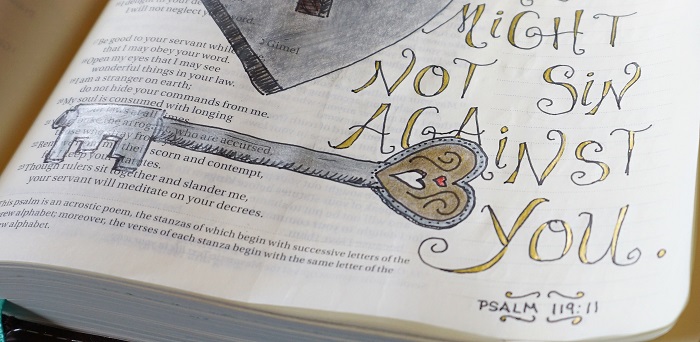
I am liking that gold gel pen!
Ddd
