« November 2017 »
S M T W T F S
1 2 3 4
5 6 7 8 9 10 11
12 13 14 15 16 17 18
19 20 21 22 23 24 25
26 27 28 29 30
You are not logged in. Log in
Entries by Topic
All topics  «
3D paperwork
A - Z challenge 5
A - Z challenge 7
A - Z challenge round 4
A to Z challenge round 3
A to Z round 2
A to Z round 6
A-Z round 1
Around the House
Art Challenges
Artist Trading Cards
Backgrounds
Beads
Bible Journaling
Books
Boxes
Collage
Color Challenge
Coloring
cookbook
Die Cuts
Digital Projects
Digital Stamps
Drawing
Dry Embossing
Fabric Stuff
Fantastic Folds
Field Trip
Home Decor
How Does Your Garden Grow?
Hymnal Art
In The Kitchen
In the studio
Jewelry
Lettering
Links
Multi-Technique
Music to Work By
Musings
Nail Art
New Work
Online Class
Other Hobbies
Other Projects
Painting
Paper Embroidery
Paper Piecing
Photo
Pretty Paper
Quilting
Random
reading
Scrap Recovery
scrapbooking
Sewing
Sketch Challenge
Some Backlog
Stamping
Stencils
Stickers
Supplies
Teabag Folding
Techniques
Testing
tips and tricks
Tutorial
Web resources
Welcome to my Blog
Work By My Friends
workflow
Writing
Blog Tools
Edit your Blog
Build a Blog
RSS Feed
View Profile
Group One
In & Out of Studio 3D
Friday, 10 November 2017
Bible Journaling - Psalm 139:1
Topic: Bible Journaling

The lettering word for this week was 'give' and we learned another cursive font, this time with lots of swoops on the uppercase letters.

Day 1 - Draw out the word 'give' and practice thickening the downstrokes.


Day 2 - Practice writing out the whole alphabet in uppercase and lowercase.


Then we also practiced the alphabet with thickened downstrokes.


Day 3 - practice the new font by writing out words you associate with 'give'. Use some decorative elements.


For the thickened downstrokes I only filled them with hashmarks.

Day 4 - Use the new font to write out a 'give' scripture in a notebook or journal or on paper. I used Matthew 11:28.


Day 5 - Use the new font to journal a 'give' scripture in your Bible. I went with Psalm 139:1.


I used the assigned font mixed with some others. As you can see, I gave up on the 'backwards' letter 'o' and substituted a more conventional one.

I decorated my page with fall elements (leaves, nuts and berries) based on a journaling page that came up on Pinterest when I put in the scripture reference.

Next week I will be the one teaching the lettering lesson.

Ddd


Posted by studio3d@ccgmail.net at 9:52 PM PST
Thursday, 9 November 2017
Quilt Stats
Topic: Quilting

I have had a spreadsheet detailing my quilt finishes since near the beginning. Today I made a second sheet for it that gathers statistics and sumarizes several categories (sizes, disposition and pattern source). This is the current tabulation:


Start date for first quilt 9/2010    
Total Quilts completed to date 146    
Average per month 1.6437    
DISPOSITION     PERCENTAGE
Mine 18   12%
Family 17   12%
Friends 15   10%
Charity (itemized below) 96   66%
Will. Falls Hospital   66  
Warm Springs Indian Res.   25  
Hope 360 Pregnancy Clinic   4  
Project Linus   1  
SIZES     PERCENTAGE
Wall 13   9%
Baby 29   1%
Lap 92   63%
Twin 1   1%
Full 5   3%
Queen 3   2%
King 1   1%
Other 2   14%
DESIGNS      
Missouri Star Quilt Co. 19    
Quilt in a Day 5    
Fons & Porter - TV or mag 6    
Magazine 16    
Web 20    
Original 25    
Sewing With Nancy 3    
Mystery Quilt - various sources 7    
Purchased Pattern 1    
Traditonal 29    
Can't remember 2    
Live Class 2    
Shop Hop materials 2    
Craftsy 4    
Book 5    


It's kind of fun to see them categorized these different ways.

Ddd


Posted by studio3d@ccgmail.net at 3:42 PM PST
Tuesday, 7 November 2017
Bible Journaling Tutorial With Lettering and Drawing Lessons
Topic: Bible Journaling

I taught another Lettering Lesson series October 23-27 and in the process I totally forgot to post about it here! Very belatedly.....

MONDAY LESSON:

The font we will be working with this week is single case, meaning there is no uppercase or lowercase. It is all mixed together. This makes it a very casual font.

It is easiest to see the letter height roughly divided in thirds. Nothing happens on the midline at all. All the shaping takes place inside the top third or bottom third.

Also, note how the letter bubbles (b and d) are kind of egg-shaped. I think they look like deflated party balloons!

Remember to ‘draw’ your letters rather than ‘writing’ them. This helps us break away from our natural handwriting. Draw the word in pencil several times. Leave the first one in pencil and trace all the rest in ink. Play with the last two, adding shadow lines and shading as noted (in pencil first). Erase pencil lines from the third one on down.


TUESDAY LESSON:

In writing out this alphabet you’ll note that all letters are the same height. There are no ascenders or descenders.

Draw three alphabets in pencil. Add shadow lines to one long side of each letter in the second alphabet and thickened lines to the third alphabet. You’ll note the numerals (at the bottom) follow the same shaping rules as the alphabet.

In practical use, if you wanted to have ‘capital letters’ you could 1) make the caps taller than the rest of the text or 2) use shadow lines or thickened lines just on the capitals or 3) do both!


WEDNESDAY LESSON:

Here are some ideas for embellishing your letters with big hearts (A, B, D, G, P, Q) – Little hearts on the double-lined letters – Musical notes (B, D, P, Q) – Botanicals (A, B, D, E, G, I, J, O, P, Q). These will only be useful if the lettering you aree doing includes the letters that are embellished (except for the tiny hearts).


BONUS:

On a page in your journal or notebook, using any style of the font and embellishments (if you choose), write out a list of your blessings. Use these to practice some of yesterday’s suggestions for making faux capital letters in some text.

****As a bonus, I have a fun and easy drawing lesson for you! Just follow along with the notes on the drawings below (two postings because we only get to put one photo per post)

As with the lettering, practice in pencil first, trace in ink, erase the pencil.


THURSDAY LESSON:

Today, in your notebook or journal, write out a verse about being blessed, using any one of the styles in the lettering. Don’t forget to write out in pencil first, ink the letters, erase the pencil. I used the shadow-line letters for mine and did not worry about using anything to denote capital letters.

Again, working in pencil, add some roses and trace using colored ink (I used Sigma Micron). As you trace the roses in ink, stop just shy of the letters so the flowers recede to the background.

Here is Proverb 8:32 (NIV) – “Blessed are those who keep my ways.”


FRIDAY LESSON:

For Friday’s work, combine the ‘blessing’ font in any style with the roses in colored ink, working in your Bible on a verse about blessings. The Sigma Micron pens I used do not bleed through the Bible pages.

TIP: When I want my lettering to line up along the right-hand margin, I actually pencil in the letters right to left to get the correct spacing. I still ink it left to right, though, so I don’t smear it with my hand as I go.

I used colored pencils to color in three shades of pink/red in the various open spaces of the flower drawings. Then I used a dark burgundy and added shading at the inner edge of each section to give dimension to the ‘petals’. I added dark yellow to my shadow lines in the letters.

This is Psalm 128:1 (NIV) – “Blessed are all who fear the Lord, who walk in obedience to him.”


Sorry about the delay in posting.

Ddd 


Posted by studio3d@ccgmail.net at 2:12 PM PST
Sunday, 5 November 2017
Wall Tree
Topic: Quilting

I wanted to ‘build a snowman’ and I did it!

I started in March with a paper piecing pattern that I had won as a door prize several years ago and had not stitched up. It included three snowmen and a pair of mittens. They were arranged in the pattern to be a horizontal banner.


So I stitched up these 5 blocks and laid them out as instructed –


Then I yawned because, not only is this boring but I don’t have a place to display a horizontal banner.

I tried some other arrangements:


Then I brainstormed with the hubby and finally decided to make MORE motifs and create a row-by-row Christmas tree wall hanging.


The angel was from an outline of a pattern found on Pinterest. I added a halo of sequins.


Then came the pair of mittens from the original design. I added fluffy yarn to the cuffs.


I drew my own paper piecing pattern for the wreaths. They have a fabric bow and red seed beads as decoration.


I also drew my own paper piecing pattern for the candle. It is decorated with a single gold tube bead in the flame.


I used the outline of a paper pieced pattern found on Pinterest for the poinsettias. They have yellow seed beads stitched into a cluster for the center.


The snowflake is the one motif I am most disappointed with. The pattern I found online was very small. I had to enlarge it a LOT to get the size I wanted. Unfortunately, any inconsistencies in the seam matching on those small pattern pieces were magnified in my version so there are some snaggly edges toward the center. I used scrappy whites throughout this block and I chose not to use any embellishments.


The snowmen were part of the original pattern. I left off pom-poms on their hats but added fabric scarves and small tube beads for eyes and buttons.


I drew my own paper piecing pattern for the trees. They got star buttons (that I had on hand!) sewn on for decorations.


I set in green half-rectangles for the overall tree shape. I obviously had some problems with the math on these!

After stitching in the ditch around all the blue background blocks I did free-motion ‘snow’ and ‘icicles’ around the tree branches.


I also did a stitch in the ditch across the rows where they connect and used a 1 ½ inch vertical line to quilt the background.


Finally, I added a hanging sleeve the same fabric as the binding.


So – 9 months to birth this baby! I can’t wait for it to be time to put up the Christmas decorations. This will be front and center at my house.

Ddd


Posted by studio3d@ccgmail.net at 12:37 PM PDT
Friday, 3 November 2017
Bible Journaling - Psalm 119:11
Topic: Bible Journaling

Another week - another font!

I am much happier working with fonts that are precise than those that are loose and interpretive, but this week the assigned font was the latter. He were working with the word 'heart' throughout the lessons.

Monday --

We learned the basic letters needed for the focus word and wrote them out with slight variations (some of that interpretive stuff).


Tuesday --

I was less than thrilled with the whole alphabet.


So I added thickening lines with a ribbon twist. I left them open so I could review the line structure when I used them on a project and then select whether to leave them open, fill with the base color or fill with an accent color.


Wednesday --

We worked on loosening up the letter forms by shaping the word to fit inside a heart. One has to adjust the length of legs, the tilt of a letter cap and make some letters smaller then others to nestle them.

We practiced making border frames as well to create a finished piece.

I colored mine with highlighters. (Sorry about the photo quality. It was taken at night by lamp light)


Thursday --

When writing out a scripture on a journal page, I really worked on making the words flow across the area and adjusting some letter heights for interest.


I used that 'word in a heart' motif again but did a solid blackfill instead of color.

Friday --

I kept selecting verses to journal that had the word 'heart' in them but found that the page I needed was already journaled on or the adjacent page was done. I suppose that will be happening more and more.

I finally settled on Psalm 119:11.

I drew a padlock and key from imagination and colored them with metallic colored pencils in silver and gold.

I managed to get my lettering to look loose and carefree without being sloppy and filled the ribbon portion of the letters with gold gel pen.


Here you can get a better look at the effect of the metallic pencils and gel pen.


I am liking that gold gel pen!

Ddd


Posted by studio3d@ccgmail.net at 12:55 PM PDT
Sunday, 29 October 2017
Bible Journaling - Lord's Prayer
Topic: Bible Journaling

When we toured the Getty Museum in L.A. recently I was inspired by the illuminated manuscripts and the hand-written codexes and prayer books. I took photos of many of them. SO beautiful.

Then I ran across a font that intrigued me and I set out to develop my own set of letters based on this. Here is the font I found:


I liked that the letter forms are informal so not difficult to draw. I wrote notes to myself outlining what would become my process.


Here are those steps along the way:


As you can see, I developed my alphabet with different flowers in the background. As they are used for a project the flowers from one can be substituted into another.

So, then I went looking for a font that could be used for the text and settled on this one. I simplified some of the lines so it could be written smaller and remain readable.

The result is this page in Matthew:

I used a thicker pen for the text as it suits the style in the illuminated manuscripts I looked at.

For the framed letters I colored the flowers red, leaves and stems green, checked background in blue/brown/purple, and used gold gel pen on the letter, the frames and the fleur-de-lis.

On those larger letters that match with the illuminated letters, I drew a thin shadow line on the right and filled with red pen.

Ddd


Posted by studio3d@ccgmail.net at 5:24 PM PDT
Thursday, 26 October 2017
Another Finely Dressed Tree
Topic: Quilting

When my daughter saw the tree skirt I made for myself last Christmas she requested one 'just like it'. I had to move some of the colors around because of the amount of fabric I had on hand, but it is essentially the same.

I used a pattern from the November/December 2015 issue of Fons and Porter's Love of Quilting magazine that uses the LeMoyne Star. I don't have their special tool so I made the directions fit my own method. That makes the outer diamonds into trapezoids but I like them anyway.

This is the new one:

Compared to the one last year:


On last year's skirt I used a pieced back but for this new one I found a neat metallic 'brush painting' fabric for the backing.

Now it's off to arrive as a birthday gift and dress up the upcoming Christmas festivities.

Ddd


Posted by studio3d@ccgmail.net at 8:21 PM PDT
Tuesday, 24 October 2017
Farm Life
Topic: Quilting

Progress! I got back to work on a quilt that I started at retreat in June and just finished it.

This started with a panel of prints. There are six views of country life with repeats in reverse that total 18 units.

I made patch units with six fall-colored prints bordered in black.


Those patch units appear in twos fours and sixes to intersperse with the picture panels.

The result is a small lap quilt bordered in plaid and a leaf print for binding.


Ddd


Posted by studio3d@ccgmail.net at 11:14 AM PDT
Sunday, 22 October 2017
Bible Journaling - Luke 10:2
Topic: Bible Journaling

Our lettering lessons this week were focused on the work 'harvest'. The font was more casual in nature and we were encouraged to add little loops and stems in keeping with the theme. I even made the lies wiggly and doubled them to look more like vines.

Since I liked the look of vine lettering, I kept at it as I wrote out the alphabet on day two.


On day three we wrote words we associated with harvest and did a little pumpkin illustration. I used my colored pencils on my page.


When we wrote out a scripture on day four, I chose Matthew 9:37. I also switched from pumpkins to wheat for the illustration and colored the lettering with a rainbow of hues.

My day five was going to be the same scripture reference but when I opened my Bible I had already done work on that page - although with a different scripture. So I skipped over to Luke 10:2 which is essentially the same thoughts.


The colors ended up being duller than I had wanted but I did manage a whole cornucopia, including both the pumpkin and wheat plus acorns, Indian corn, grapes, apples and a gourd.

Ddd


Posted by studio3d@ccgmail.net at 5:12 PM PDT
Friday, 20 October 2017
The Drawing Room
Topic: Drawing

When we were in Los Angeles last year we spent a couple of hours at The Getty Center and wished we had much more time there. So, earlier this week, we made time for it and flew down to spend two days viewing all the artwork on display.

What a treat! There is something magical in standing in front of a painting of irises by Van Gogh, a sculpture by Degas, a landscape by Monet... To see the brushstrokes, fingerprints in the paint, chisel marks of a master - it is almost overwhelming.

One small section of the museum is an area called The Drawing Room in which a small-scale statue, a couple of marble busts and several paintings are displayed. There are benches with built-in easels around the room and you are provided with paper, a large clipboard and a packet of drawing materials.

With these supplies you can sit and draw - with the sculptures and paintings as inspiration. What Fun!

I selected one of the busts and drew in sepia conte crayon. Here is my model:


And here is my finished work - about 1/2 hour of time invested:


For anyone who desires, they will put your work up on the bulletin board. Thus one can say they have work hanging in The Getty!

Ddd


Posted by studio3d@ccgmail.net at 1:50 PM PDT
Friday, 13 October 2017
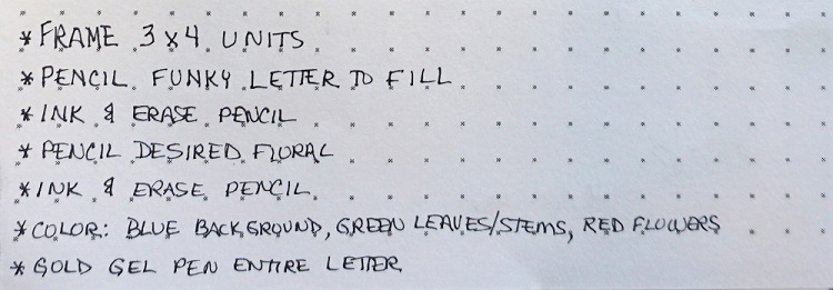
Lettering Tutorial and Bible Journaling
Topic: Bible Journaling

It really frustrates me that I can only apply ONE topic to blog entries. If I had my way, I would tag this one 'Bible Journaling', 'Lettering' and 'Tutorials' because it is really all three. I had to choose what I might want people to search for in order to find it.

This week I have been the Guest Host on the Creative Bible Journaling Facebook group in their Lettering Lodge. This is the same place I have been getting my Bible lettering inspiration from lately.

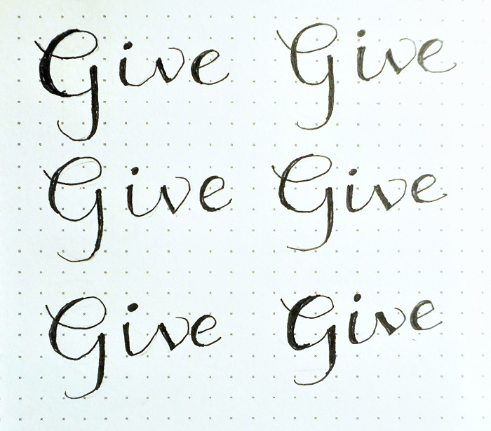
The font I am teaching is the new one I designed a few weeks ago. As soon as this is posted, I will go back and delete the original entry as the samples for it were poorly executed and the photography was bad, as well.

So here goes:

------------------------------------------------------------

DAY 1 - Good Morning! I'm your Guest Host in the Lettering Lodge this week.

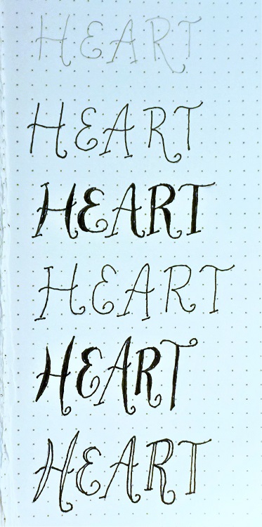
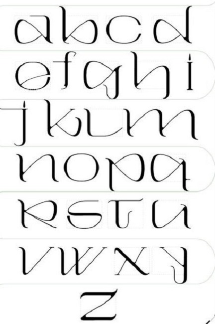
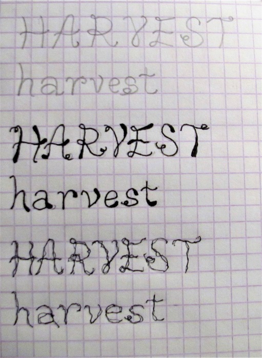
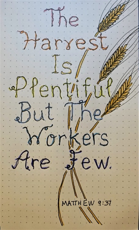
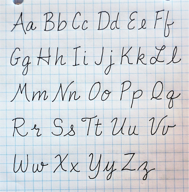
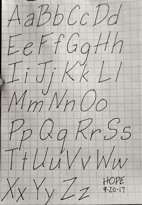
We're going to be working on a new font I named 'Gather Round' because it is ALL about the circles! And the word we will focus on this week is 'Trust'.

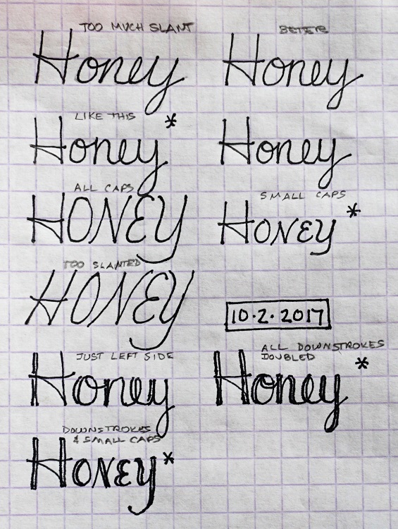
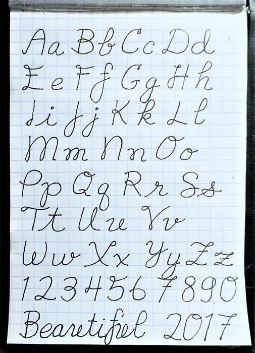
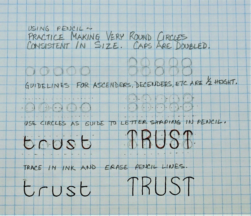
This font takes some prep work to make sure the letter shapes are correct and consistent.

First, you will establish your letter height with penciled lines – one for the base and one for the top. Then add a dashed ascender line half a letter space above the top, a dashed descender line half a space below the base and a midline in the center. You will have a total of five lines.

Practice making perfectly round circles in pencil between the base and top lines. For this step, draw lightly and circle loosely, round and round until the shape takes form. Make whole rows of them. This is a crucial step because EVERY LETTER in this alphabet is traced in-part on the outline of that circle.

When you’ve got a good row of 5 circles, go back with pencil and trace the parts of the circle that form the lowercase letters. Add extension lines as needed to complete the form.

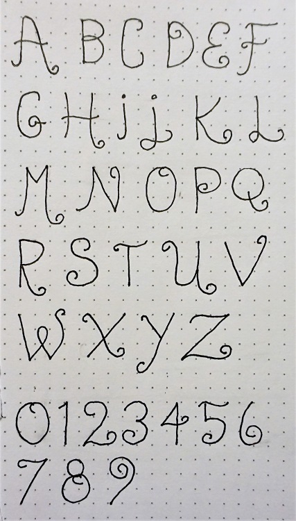
NOTE: the uppercase letters are all based on two circles stacked on top of one another.

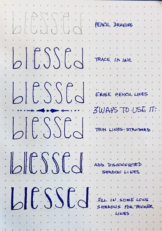
Trace your formed letters in ink and then erase all your guidelines, circles and penciled letters.

Here is a step-by-step sample sheet:

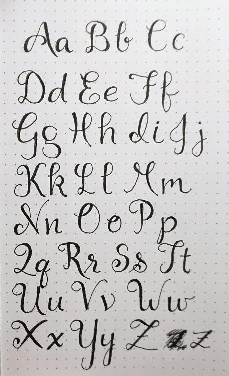
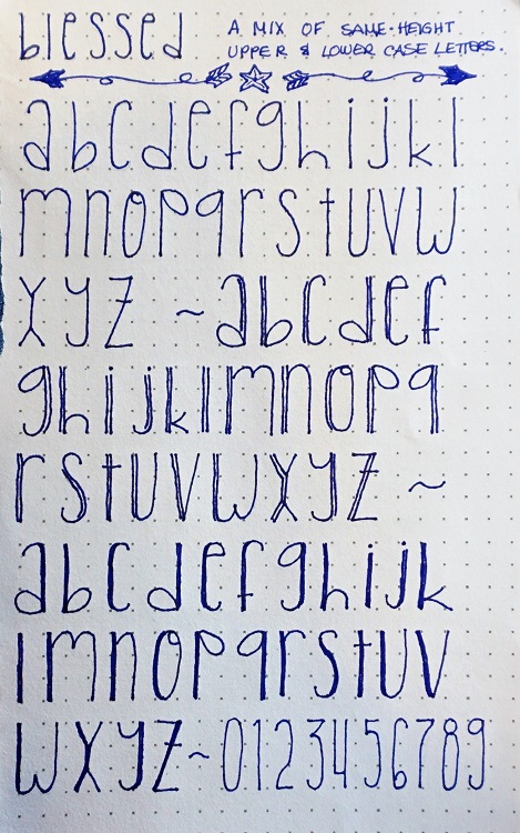
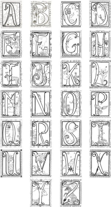
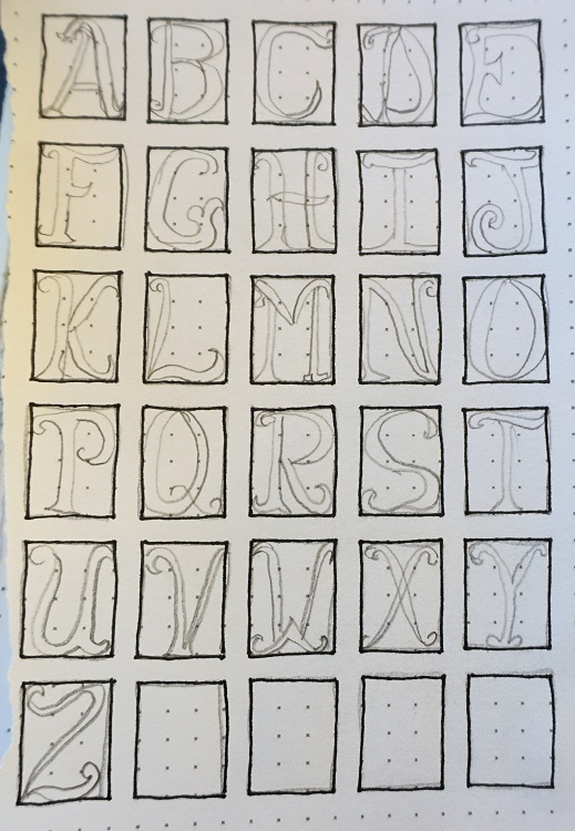
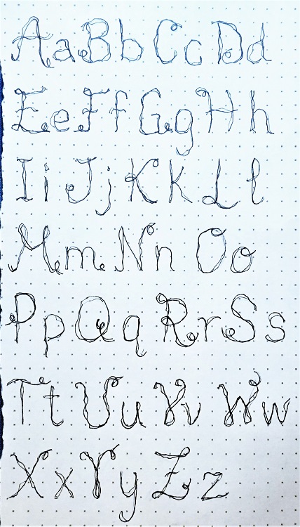
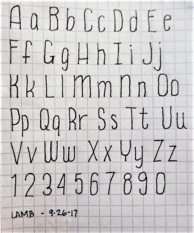
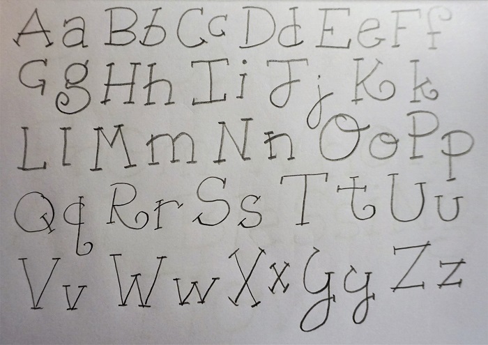
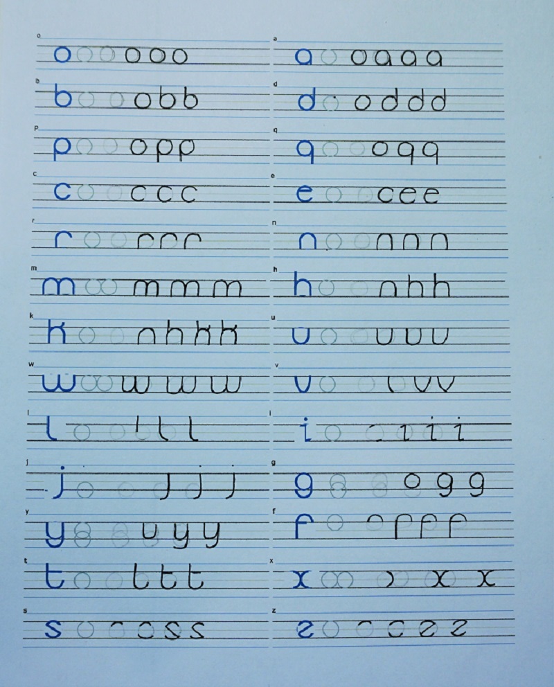
DAY 2 - Today we are going to learn the letter shapes for both the lowercase and uppercase alphabets in the font we started yesterday. The guide pages attached show the step-by-step with letters that share the same characteristics grouped together (o through q, c and e, r though m, etc)

Note that some letters use TWO circles. These may be side by side or they may be stacked and overlapped.

When you have completed the sheet, erase all the pencil lines FOR THE LAST, FULLY FORMED LETTER ONLY.

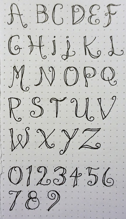
This first picture is the instruction sheet for lowercase.

If you want to print practice sheets they are available in PDF form at http://mystudio3d.com/practicesheets.pdf


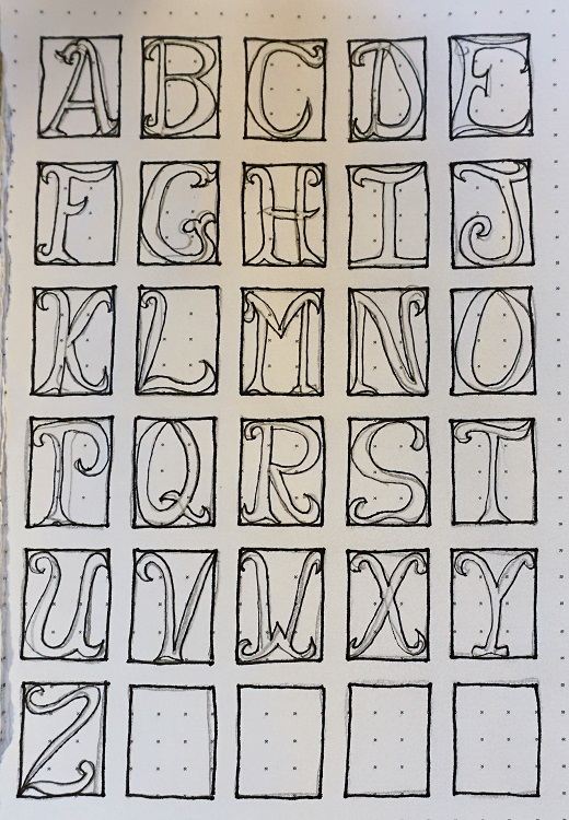
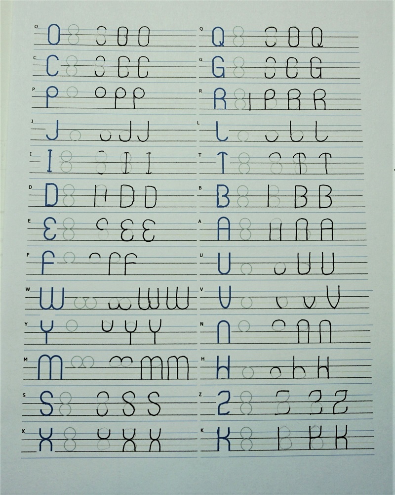
Now you can go on to the uppercase letters. Note that every letter is based on TWO stacked circles. Again, some letters will be double-wide as well.

The guide page attached shows the step-by-step, grouping the letters that share the same characteristics. Since these are different in the uppercase than in the lowercase the letter order is different here than on the last sheet.

When you have completed the sheet, erase all the pencil lines FOR THE LAST, FULLY FORMED LETTER ONLY.

Again, if you want to print practice sheets they are available in PDF form at http://mystudio3d.com/practicesheets.pdf (all the sheets are combined there so printing one set will give you all the pages you need)


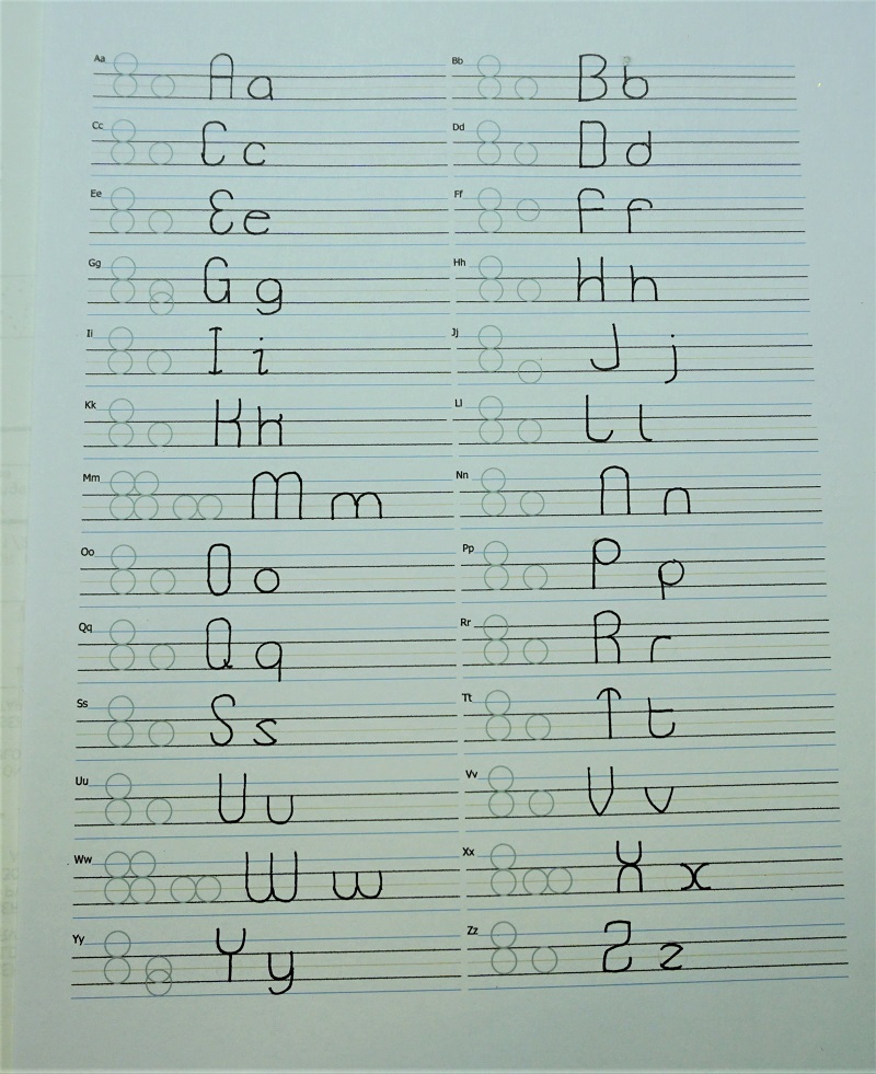
Now you should prepare a new practice sheet and draw all your alphabet in the correct order by referring to your instruction pages for correct letter forms.

Leave the first set of guide circles in place for reference but, when you have completed the sheet, erase all the pencil lines FOR THE LAST, FULLY FORMED SET OF LETTERS ONLY.

There is a sheet for this in the practice pages as well at http://mystudio3d.com/practicesheets.pdf


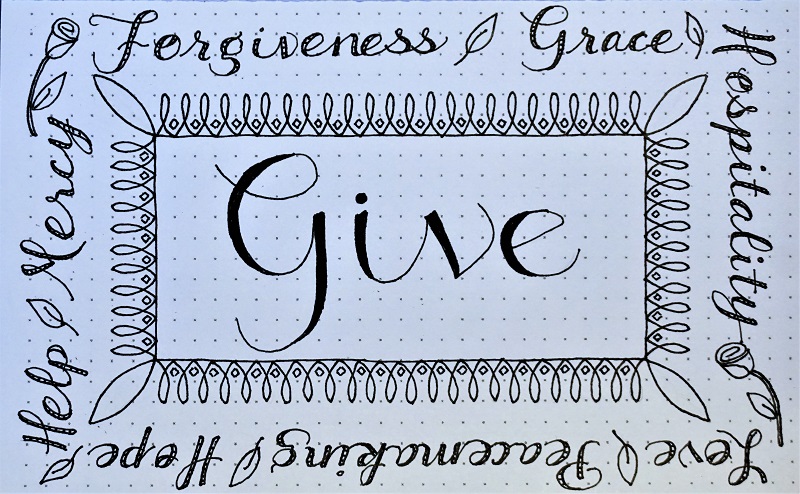
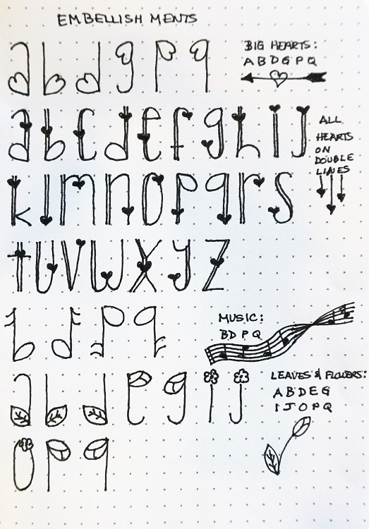
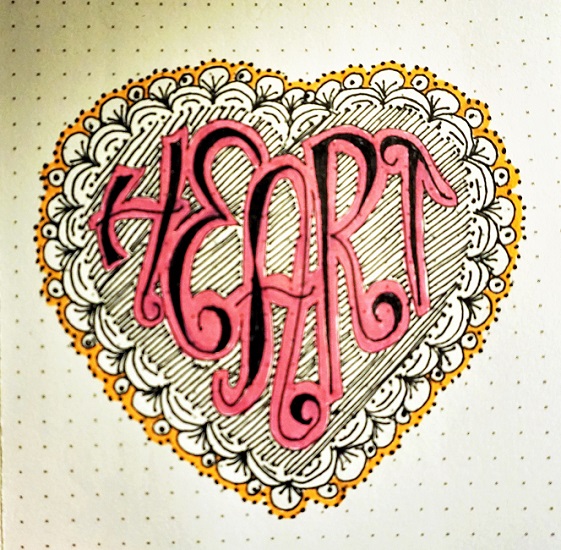
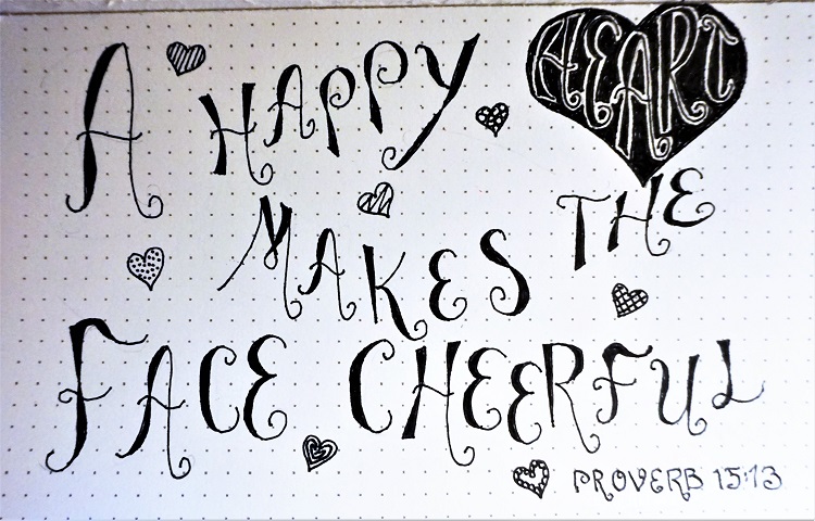
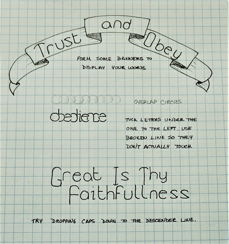
DAY 3 - Lettering lessons so far have been kind of regimented so now we are going to play!

First, let’s practice making banners to contain words or phrases. There is a great set of banner lessons at https://www.thepigeonletters.com/single-post/2016/08/11/6-Step-by-Step-Banners

Then we’ll practice overlapping your letters slightly. This comes in handy when a l-o-n-g word must fit in a smaller space. There are hints for this in the notes on the page.

Finally, play with Drop Caps. In our case, the letter height of the capitol letter stays the same but the descender line becomes the base for it.


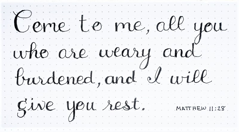
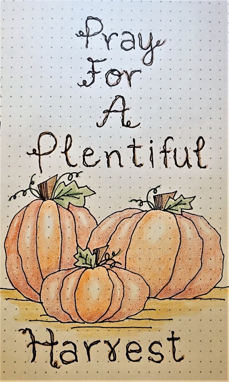
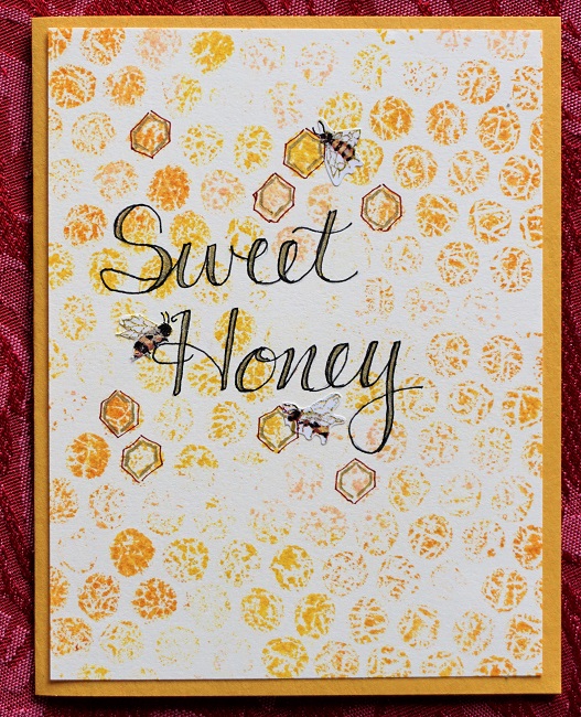
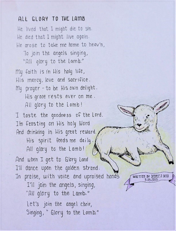
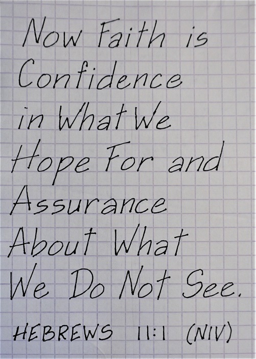
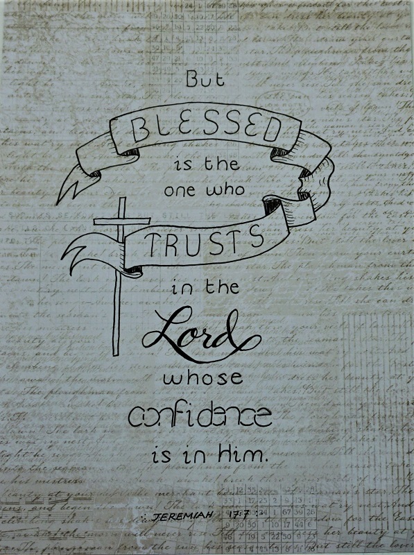
DAY 4 - Next, your assignment is to write a scripture with the word ‘trust’ using the new font and some play-day features. We’re using paper or a journal page for this exercise. We’ll be in the Bible tomorrow.

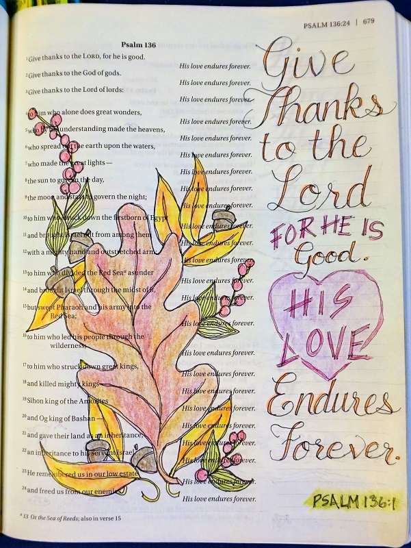
I worked on scrapbook paper with Jeremiah 17:7 (NIV) – “But blessed is the one who trusts in the Lord, whose confidence is in Him.”

(Do you know, this font was a gift of God just a few weeks ago. As I sat listening to the choir one Sunday, some of the forms came to me and I turned to the back of my notebook and just wrote out the whole lowercase alphabet. Then I actually took my sermon notes with it – not as fast as my usual scribbled notes but I got down all the key phrases!)


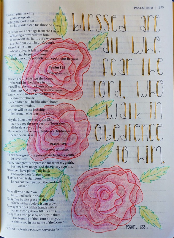
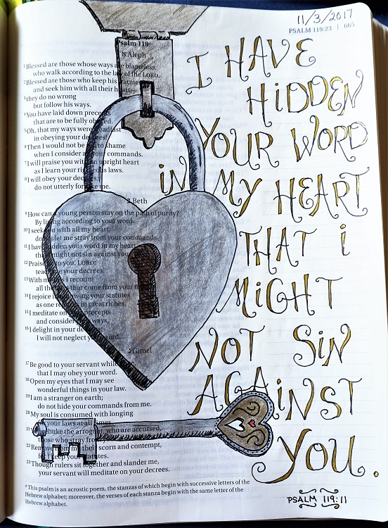
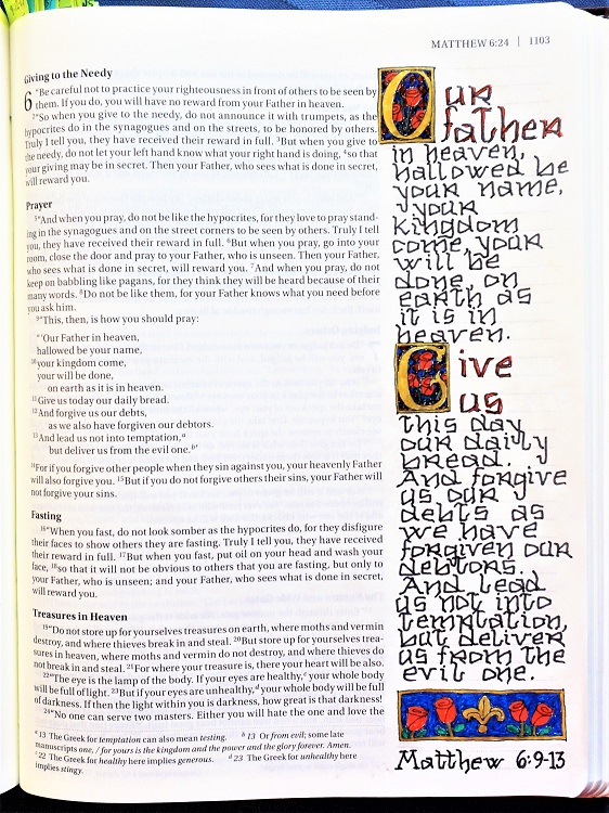
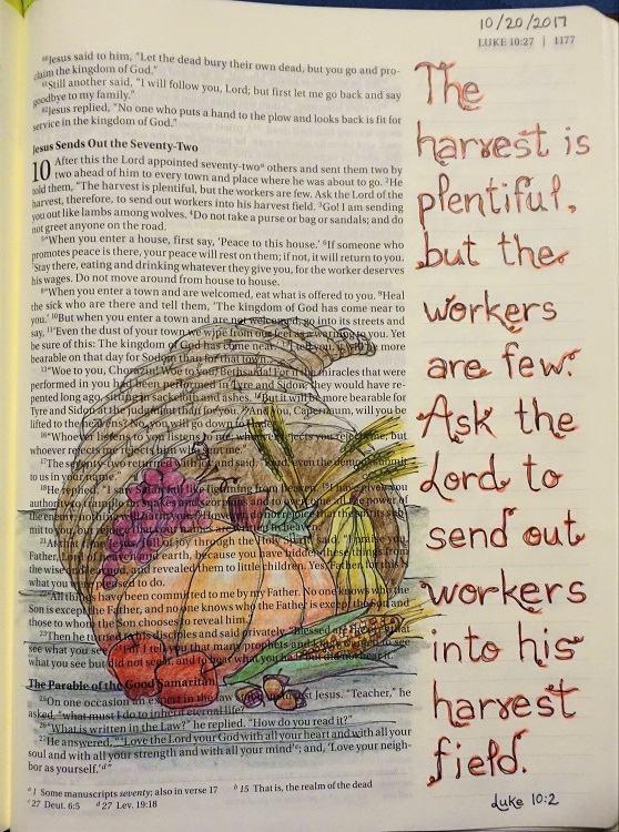
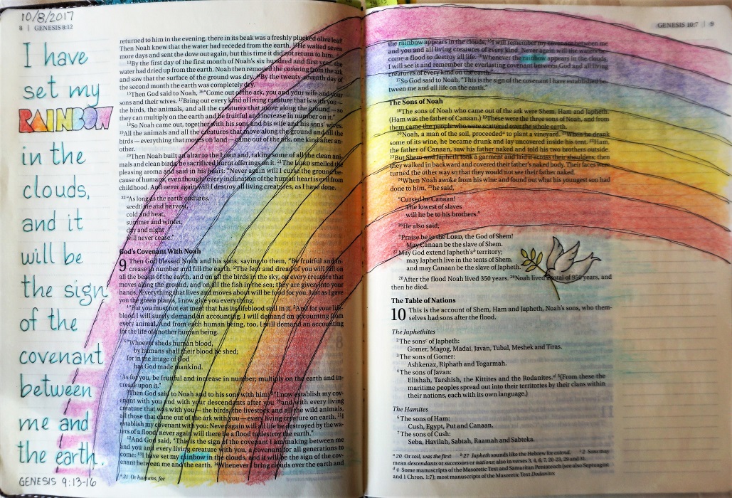
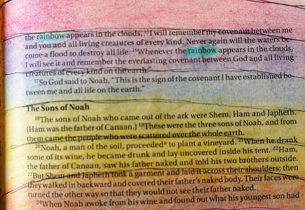
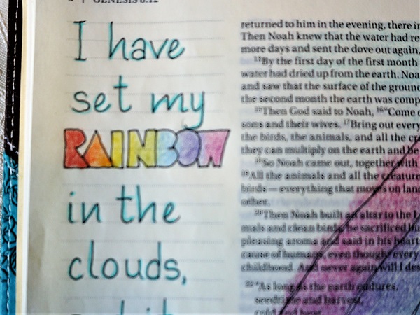
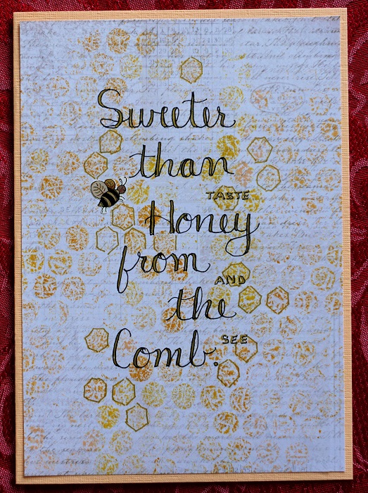
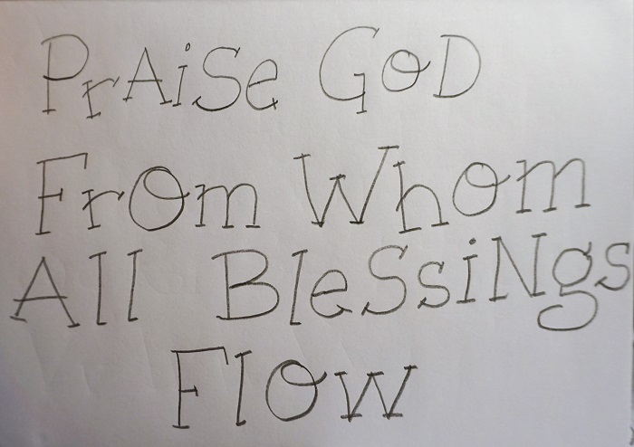
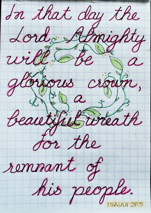
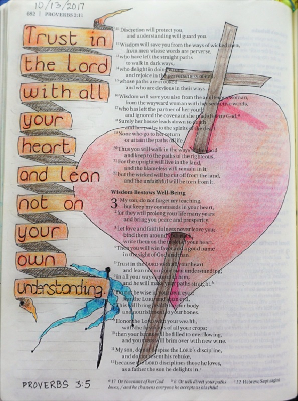
DAY 5 - The final homework is to work in your Bible on a ‘trust’ scripture using the new font.

The reference I used is Proverbs 3:5 (NIV) – “Trust in the Lord with all your heart and lean not on your own understanding.”

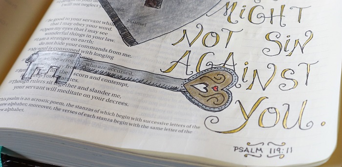
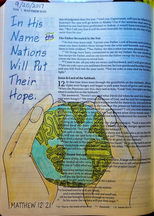
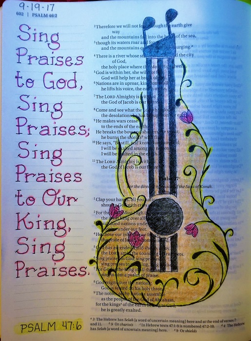
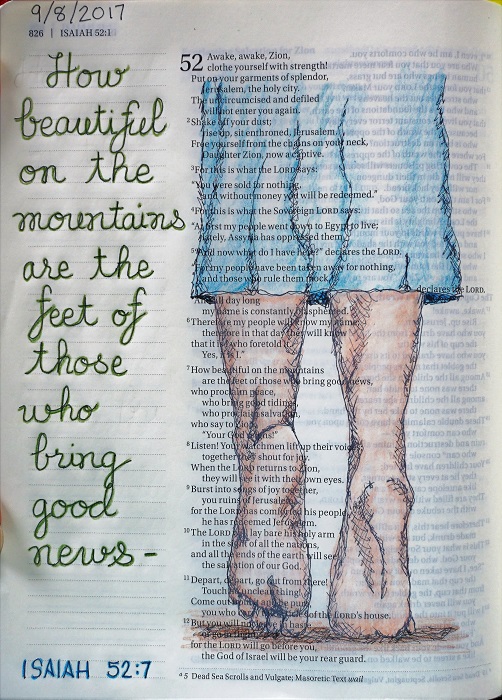
From the ‘play day’ lesson, I used the space-saving overlapping letters as well as banners. I also practiced colored pencil blending. I have been using the cross in my illustrations in the Old Testament a lot lately. After all, the whole of scripture is pointing toward Christ so that really makes me want to tie it all together in my ‘word pictures’.


***It was a privilege to prepare lessons for the Lettering Lodge this week. All those who played along did a wonderful job. God bless you all!***

Ddd


Posted by studio3d@ccgmail.net at 7:26 AM PDT
Sunday, 8 October 2017
Bible Journaling - Psalm 27:1
Topic: Bible Journaling

On assignment to journal the scripture Psalm 27:1, I wanted to focus on salvation as the theme. Even though the scripture was written before Jesus walked the earth and died on the cross, the gospel is really just ONE STORY that all points to Him.

I went looking on Pinterest for 'stained glass window cross' and found two that were free line drawings. I combined the two drawings and added some elements like the 3D lines on the cross.

Then I used several colored images for reference in making the window come to life.


I used a much thicker pen on this one so it would look more like the leading on stained glass.

Ddd


Posted by studio3d@ccgmail.net at 6:31 PM PDT
Bible Journaling - Genesis 9:13-16
Topic: Bible Journaling

We had a challenge on the Bible journaling group I belong to, to use colored pencil blending and highlighting on a Bible page. My mind immedaitely skipped to rainbows so I turned to Genesis 9.

I think the thing that struck e in meditating on these verses as I was doing the artwork was that God did not put the rainbow in the sky to remind US of his covenant (to never flood the entire earth again) but he says: When I bring clouds over the earth and  the rainbow appears in the clouds, I will remember my covenant between me and you.

Even though the rainbow obviously does not have dividing lines between the various colors, I drew them in with my pen to keep the illustration in the same style as my other work in this Bible.

I did color and blend across the lines, though, then I followed up by blending the colors even more with a Prismacolor colorless blender pencil.


I left uncolored the word 'rainbow' the three times it appeared in these verses and then went back to fill them in with a contrasting color.


In the lettering, I only wroteout verse 13. I gave special attention to the word 'rainbow' and colored it with blended pencils in the same colors as the main illustration.


I added a little drawing of the dove coming back to the ark with an olive branch.

Ddd


Posted by studio3d@ccgmail.net at 6:22 PM PDT
Friday, 6 October 2017
Bible Journaling - Psalm 19:9-10
Topic: Bible Journaling

Sweeter than honey - that perfectly describes the font we used this week for journaling.

We started out on Monday with the assigned word:


You can see that I,once again, struggled to keep this as an upright font. We were asked to note that on a letter like the lowercase N the upstroke separates and leans away from the leading downstroke. The caps have a bit of curve.

On Tuesday we learned the full alphabet:


Again with the leaning letters! I did do better with the upstokes pulling away.

Wednesdays lesson got us to playing with applying color with bubble wrap! I used three colors of Distress Inks and applied my color to three different backgrounds. After lettering on them, I added bee stickers and made them into card fronts.


On the last background I changed to a honeycomb lettering style I found on Pinterest. I then drew a little beehive. All three cards have accents added with gold gel pen.

On Thursday used the new font to write a scripture. I had some hexagon embossed cardstock a friend had sent in a swap and I used a Distress Ink pad to sweep over it to add color. I then used a brown Sigma Micron pen to do my lettering and added thickened lines with a Prismacolor brush marker.

I went back and traced the thin lines and both sides of the thick lines in black before adding a peel-off bee sticker in brown. I made this one into a card as well.


As usual, our Friday assignment was to use the new font in our Bible. I chose excerpts from Psalm 19:9-10.

I used the font in a very straightforward manner  and even made it stand upright as it was designed to do! I found pictires of honey dippers on Pinterest and drew mine onto the page with Sigma Micron 01 black pen. I used double lines on most of it to camoflage wobbles in the long lines. 

Coloring was done with Prisacolor pencils with accents of white gel pen.


When I was writing in the reference, I accidentally wrote 'Proverbs' instead of 'Psalms'. To fix this I used the Sigma Micron pen to color over the whole reference in a solid block. Then I wrote in the correct one using white gel pen. When it was dry, I used colored pencil to make the white pen cream colored to match the page. Crisis averted.

Next week I am teaching the font we will use (online). The lessons will get posted here on Friday.

Ddd


Posted by studio3d@ccgmail.net at 10:42 AM PDT
Saturday, 30 September 2017
Tulips Are Better Than One
Topic: Quilting

I am amazed by the tutorials that come out of Missouri Star Quilt Company week after week. Every one is easy, innovative and attractive.

But there are some that I just can't wait to dive right in on.

I rarely print out the accompanying materials with materials, measurements and instructions. Instead, I have my little tablet of graph paper and I make sketches of the blocks, the step-by-step and layouts. I pencil in measurements as I go.

Usually, they work out just fine even though I don't often make them in the size they are designed. This is because they are mostly using pre-cuts in full packets (or multiples of them) and I just work out what size I want the finish to be and cut the number of pieces needed to do up the pattern.

The tutorial for this quilt is called Totally Tulips and starts with 10" precuts and makes a quilt measuring 89" x 90". That's huge.

I am generally making lap quilts so I only needed 12 tulips. That used 24 10" squares from my stash - half colors and half greens. I used muslin I had on hand for the background.


I did overall large stippling over all the white. Then I did three wavy vees on all the flowers and stitch in the ditch up both sides of each stem.


The backing is a modern print with little blocks of color on point. It has all the colors used on the front. It looked so nice I used it for the binding as well.


This will go to the hospital Passages program.

Ddd


Posted by studio3d@ccgmail.net at 7:59 PM PDT
Friday, 29 September 2017
Bible Journaling - Revelation 5:12
Topic: Bible Journaling

Combining a couple of favorite things (lettering and drawing) into the artform called Bible journaling makes me happy. Digging into the Bible to find just the right scripture to suit a theme is time well spent and I always find something good to meditate on.

This past week, the online group was working on a tall font based on ovals. It makes a space-saving font that can be made to look casual or elegant, depending on how it's used.

I started on Monday with the assigned word in the font:

Note how the lowercase shoulders come half a space above the midline?

Tuesday we tackled the whole alphabet:


Here, you can see, I narrowed the width of the letters to make them more oval.

Wednesday, we were challenged to write out a verse of a hymn with the work 'lamb' in it and to draw an image of a lamb. I decided to write out the entire song I wrote in 2009 and drew a lamb from a photograph I found on the internet.

I had to make my own lined paper in Word to get the size and spacing right for the number of lines I had. I then wrote out the whole thing in pencil on that lined paper and then used the lightpad to trace it onto a clean sheet of paper using a fine-line marker.

I traced my sketched lamb on the page in fine-line marker and used colored pencils to finish it.

On Thursday, we did our usual activity of writing a scripture on paper using the font. I wrote mine up and then did some pen-work to give it the look of an invitation.


Today (Friday) we took the new font to our Bible, selecting a scripture that used the work 'lamb'.

I liked the lamb I had drawn on Wednesday so decided to include that on my page. When I was originally looking for pictures of lambs I saw several that showed the wounded lamb and included a cross. I decided to add these as well as a crown and banner (purple for royalty).


All coloring with Prismacolor pencils.

Ddd


Posted by studio3d@ccgmail.net at 2:53 PM PDT
Friday, 22 September 2017
Bible Journaling - Matthew 12:21
Topic: Bible Journaling

New font practice included writing out the alphabet:


...then I went directly to a scripture:


This wa a 'natural' font for me to draw - a lot like my natural printing style.

I designed a pair of hands (drawn from my own) holding a globe on which I filled in the continent shapes with the name of Jesus.

Colored with Prismacolor pencils after inking with Prismacolor Premier fine line marker in my Bible.


Matthew 12:21 was perfect for the word font 'hope'.

Ddd


Posted by studio3d@ccgmail.net at 9:44 AM PDT
Wednesday, 20 September 2017
Recommended Reading
Topic: Books

Last month I recommended a new book I had picked up called "Hand Lettering For Relaxation" by Amy Latta. I am about 6-7 lessos into this workbook and still enjoying it very much.


Today, I picked up another book - one that I have had checked out from the library. It is called "You Can Draw It In Just 30 Minutes : See It and Sketch It in a Half-Hour Or Less" by Mark Kistler.


The techniques he teaches are simple, easy to follow, and very effective.

Here are my sketch sheets from the first two lessons:


Are they great works of art? No! But my intent is to be able to learn to di sketches from photos (or life) for my Bible Journaling, instead of often relying on someone else's sketch.

I tried it out on the Bible page that will be posted on Friday and I am very pleased with the results.

I recommend this book very highly.

Ddd


Posted by studio3d@ccgmail.net at 10:41 PM PDT
Tuesday, 19 September 2017
Bible Journaling - Psalm 47:6
Topic: Bible Journaling

I had a short out-of-town getaway last week so did not stay on task with the new font in the lettering lessons I follow. I ended up finishing this week.

The font was titled 'Praise'. One of the 'goals' of the instructor was to have these letters 'bounce' instead of sitting on the same baseline. I tried -really I did.


The second day was, as usual, the whole alphabet. You'll note that I did not go back and trace any of these in ink and erase the pencil lines:


And the third day lesson was to write familiar words. I wrotesome hymn lyrics and called that the homework for day 3 and day 4.


I'm still not enamoured with the bouncing letters so, when I took this font to my Bible, I made those letters line up like little soldiers. I am very happy to have them standing in nice little rows. :)

I found that Psalm 47:6 had plenty of opportunities to use the word 'Praise' in the assigned font.


The guitar illustration is a re-drawing of one I founf in my Pinterest feed the other day. What great timing!

Ddd


Posted by studio3d@ccgmail.net at 10:14 AM PDT
Friday, 8 September 2017
Bible Journaling - Isaiah 52:7
Topic: Bible Journaling

With a bit of a busy week (again) I did the lettering lessons hit and miss. The font this time was named 'beautiful'.

The first lesson I worked on was skipping right to the full alphabet. I found it extremely challenging to make this cursive alphabet 'stand up' so it looks more italics that it is supposed to.


I am not overly fond of the lowercase U when it connects with some letters. Just looks strange. You'll notice below that some letters that have a trailing loop do strange things when juxtaposed with the leading loop on the R.

We also worked on designing wreaths this week.

For my 'in the Bible' journaling I chose Isaiah 52:7 because I have been wanting to this one for some time.


Idea for the feet was found on Pinterest.

Ddd


Posted by studio3d@ccgmail.net at 12:57 PM PDT

Newer | Latest | Older