Topic: Bible Journaling
For my turn at lettering this week I developed an original font to teach. It reminded me of cinderblocks so I called it 'Foundation'.
Here is the lesson plan:
MONDAY
I’m going to have another run at showing what I think will be a very easy print style. I’ve been wrong before, but I do think you will all find this one easy to do.
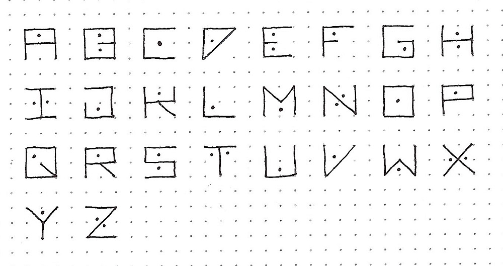
There are only a few rules: All the letters fit inside a perfect square and all are exactly the same size. You can use only the outside lines of the square as well as the vertical half-line, the horizontal half-line and both diagonals.
There are no lower-case letters and every letter will have one or two dots to decorate it. These were inspired by cinderblocks.
Letter spacing will be ½ the letter width.

TUESDAY
Today we have the full alphabet. Remember, there are no lower-case letters in this style.
Note how all the letters fit the rules that we established yesterday – all letters the same size and all lines must be on the + axis, the x axis or the perimeter of the square.
Because of the regimented structure of this style it is very easy to remember them when writing. I usually write all the letters and then go back and add the dots. It helps in maintaining the flow of writing which helps to avoid misspellings.
WEDNESDAY
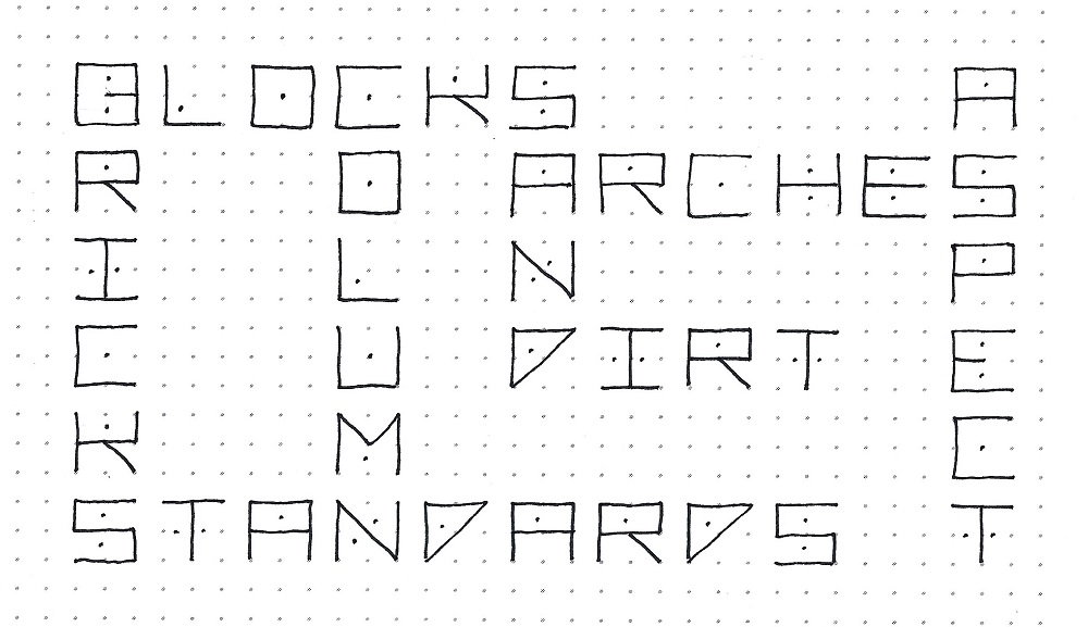
This style of block lettering serves as a good one for constructing a crossword. I did mine with terms and materials used in construction.
THURSDAY
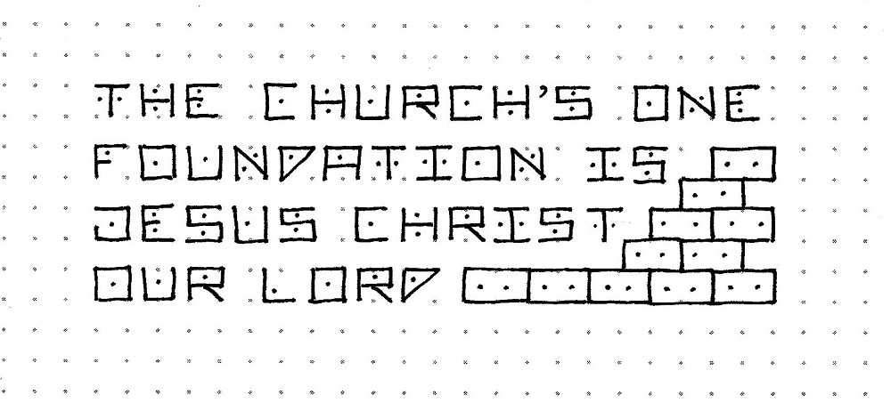
Today you can write either a hymn or a scripture on plain paper. Fill in empty areas with some drawn cinderblocks the same height as the letters but twice as wide. The blocks each get two dots.
FRIDAY
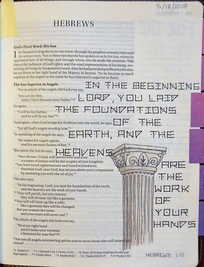
Today we will use the FOUNDATION lettering style in our Bibles.
All that practice keeping things square when we had the dots on our papers should have trained your mind to create square letters when you only have top and bottom lines.
I decorated my page with a column which I realize is not really a ‘foundation’ but it is a part of a construction and I liked the way it looked with the lettering style. If you want to use a column as well, check out the Drawing Room lesson for the week. It is not this same one but will work just as nicely.
It's a novelty print, to be sure, but occasionally you might need a little structured block print with dots. Who knows?
Ddd
