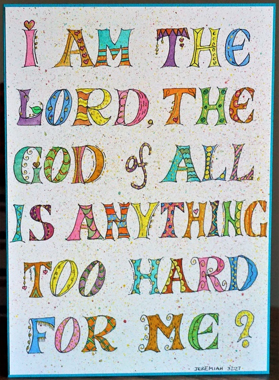
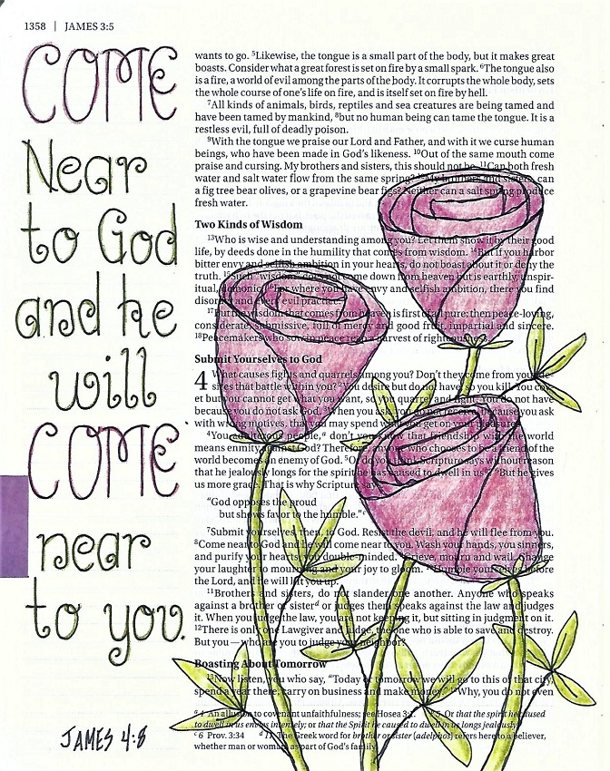
Lettering Is Good For The Soul
Topic: Bible Journaling
Another week of lettering tutorials is in the books. The font I taught has the appearance of being very simple but it does have a few tricks up the sleeve.
SOUL FONT – DAY 1 – FONT INTRO
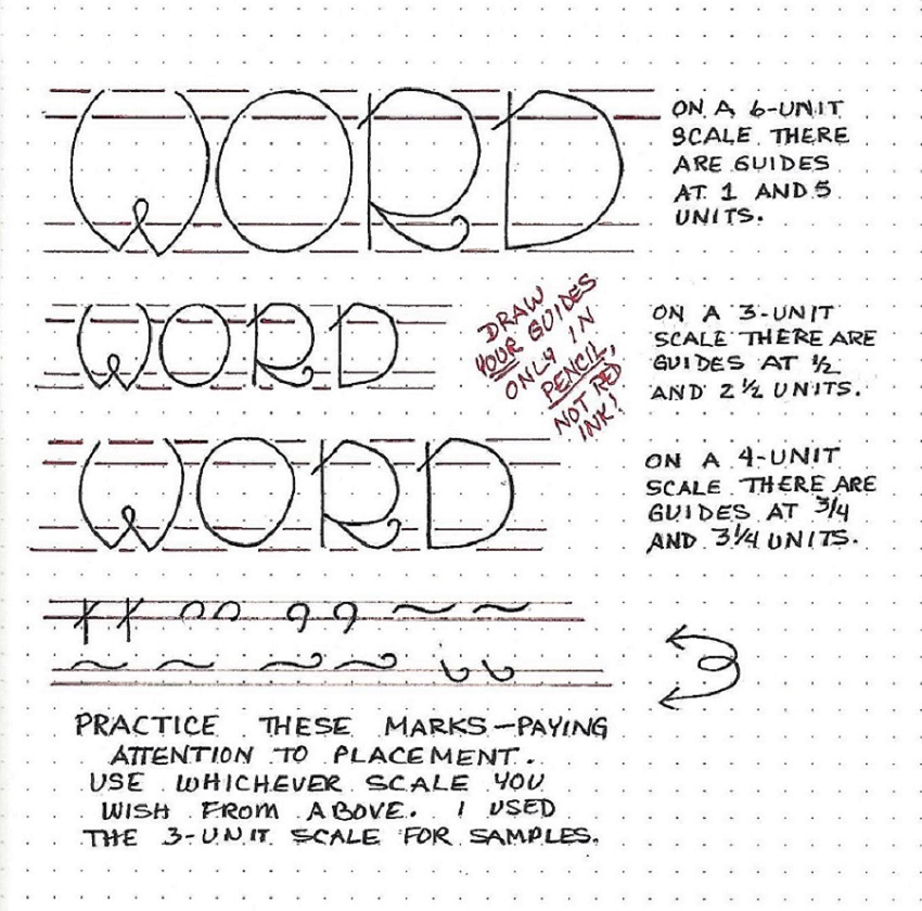
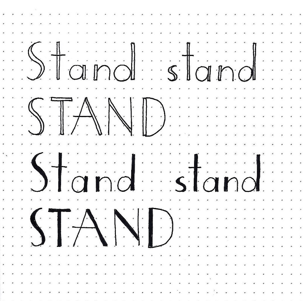
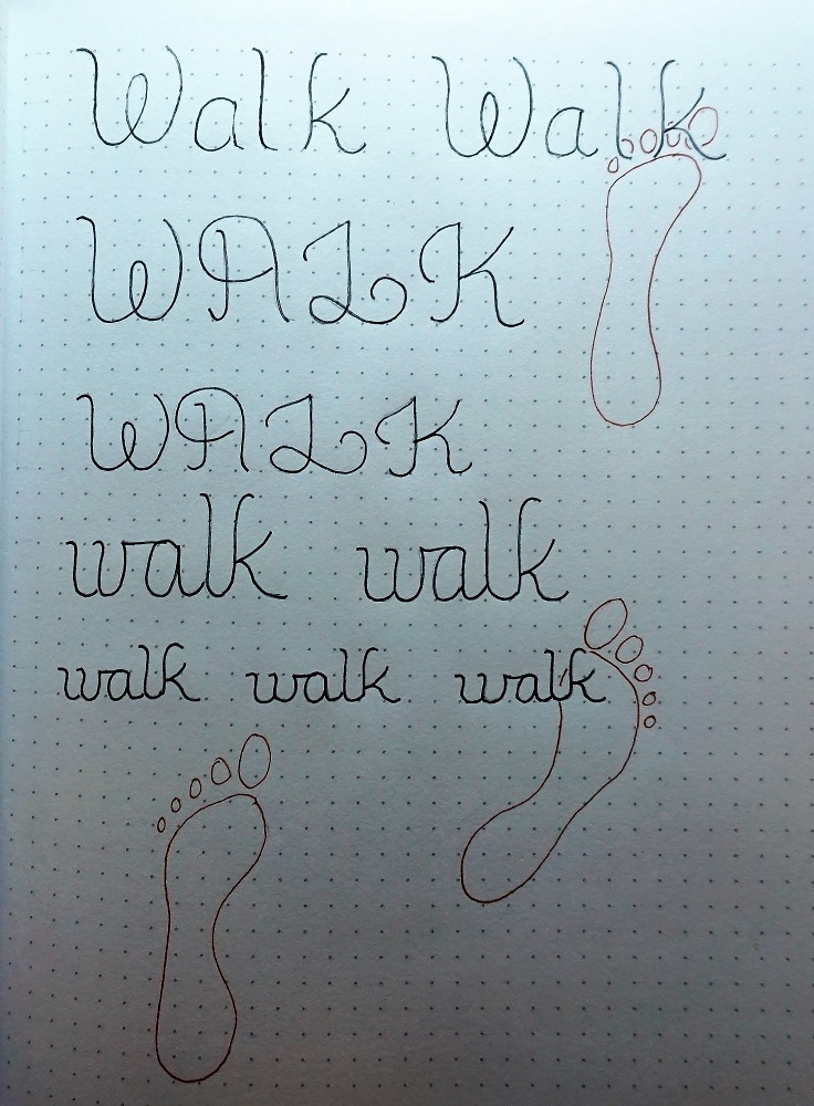
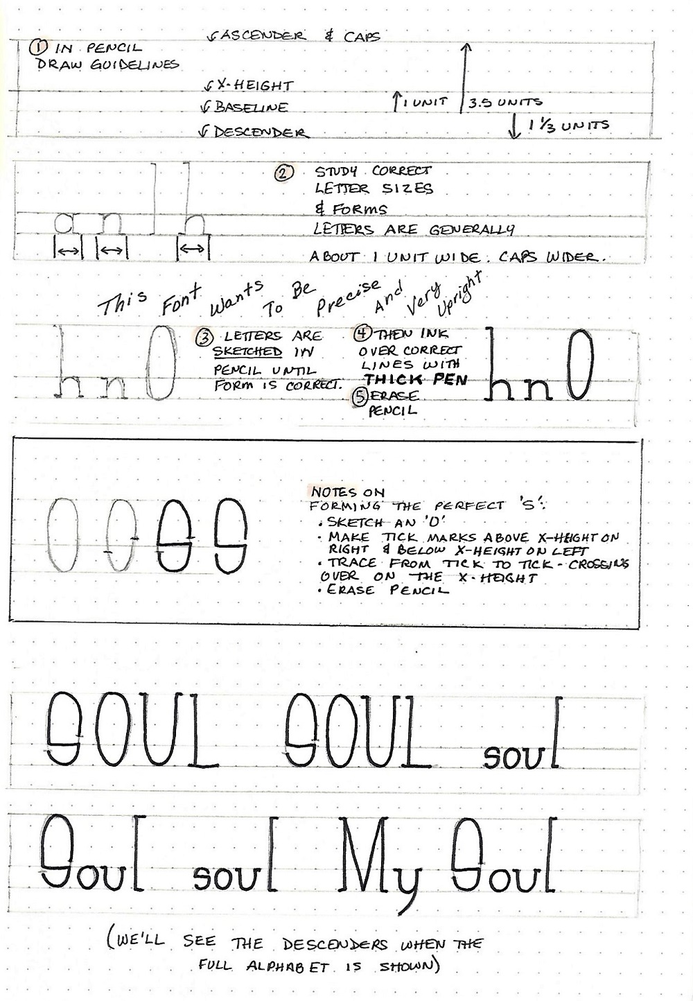
The font we are learning this week is all about the rules – or maybe ‘about the ruler’. Since it is such a precise font and the spirit of the lettering is dependent on sharp, consistent form we are going to start out there instead of just jumping into writing a word.
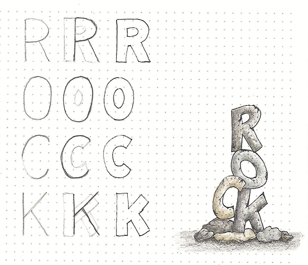
First, the guidelines. You’re going to want paper that has some kind of unit for you to follow. I used dot grid but you would do as well with graph paper or a narrow-rule lined paper. First line to pencil is your baseline. The x-height is one unit above this. The ascender/caps line is an additional 2.5 units above this (3.5 units above the base line). The descender line is 1 1/3 units below the base line. SEE THE FIRST LINE ON THE ILLUSTRATION FOR REFERENCE.
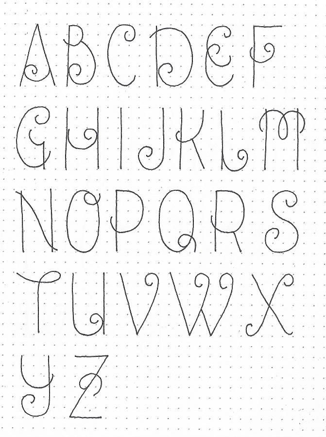
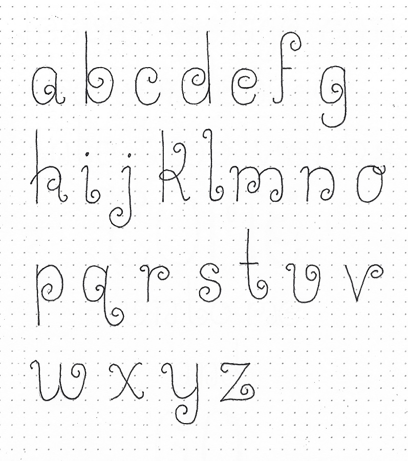
Next, we address the letter widths. With some exceptions which will become apparent when we see the full alphabet, letter width of lower-case letters are about 1 unit wide and upper-case about 1.5 wide. THIS IS SHOWN ON THE SECOND LINE IN THE ILLUSTRATION.
Now, for working methods. Note on LINE THREE IN THE ILLUSTRATION it is important to sketch each letter in pencil. Don’t go with your first marks necessarily but make little corrections to the form until it is just right. Ink over the final lines and then erase your pencil. You end up with perfect lettering!
And, finally, there is one special letter that takes a few extra steps to get just right. So, IN THE BOXED AREA ON THE ILLUSTRATION take note of the correct formation of the letter S. Sketch an O, make tick marks as indicated, trace from tick to tick and cross over on the x-height guideline, and erase the pencil.
READY FOR SOME LETTERING NOW?
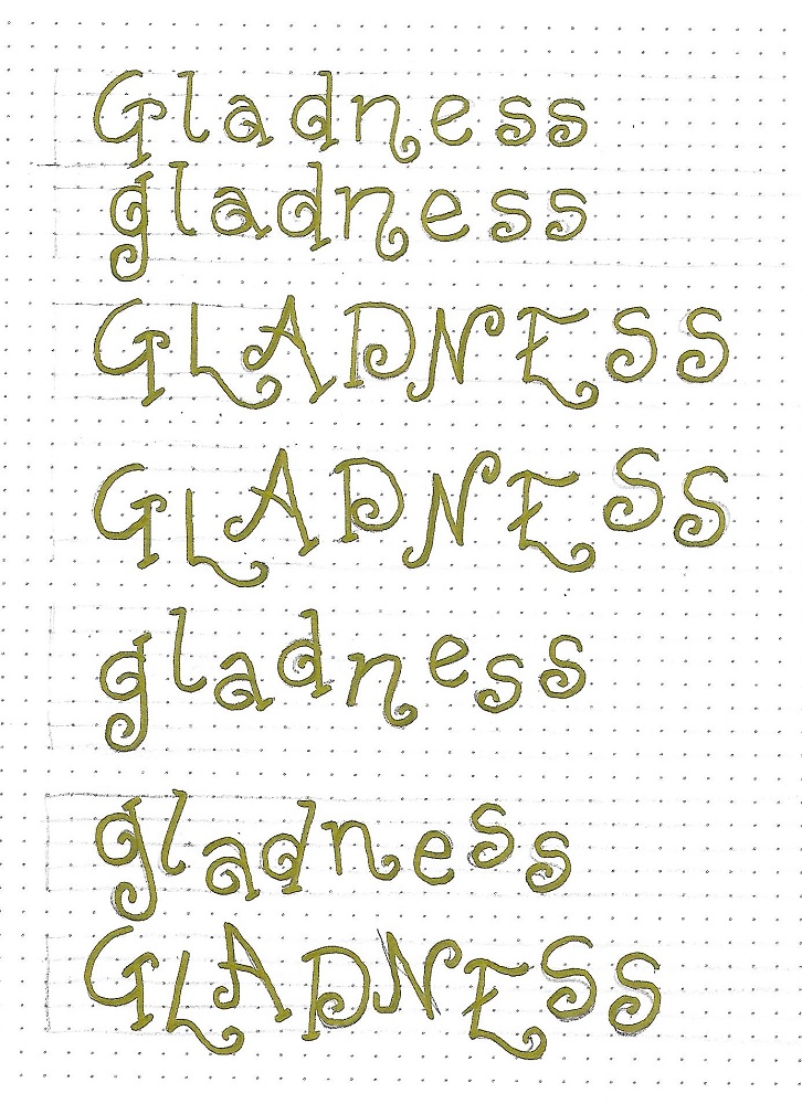
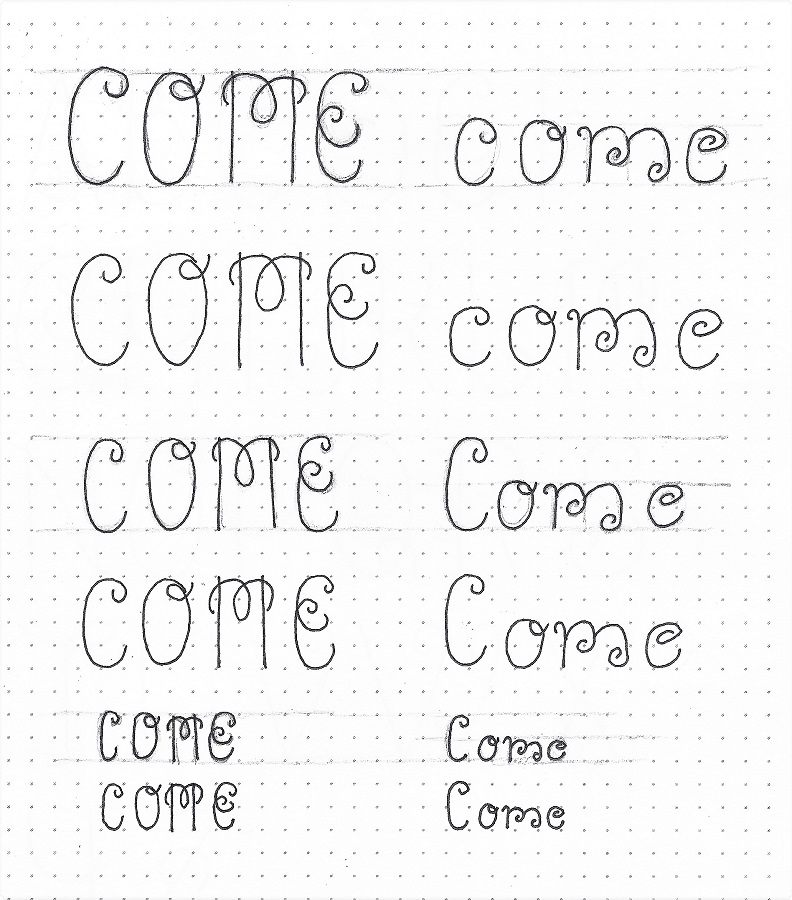
The focus word this week is SOUL. Write it out in various upper/lower-case versions. You can also practice some of the letters used in the instructional portion since this word only has four letters to play with. None of the letters on today’s page have descenders, so we’ll see those in the full alphabet lesson tomorrow.
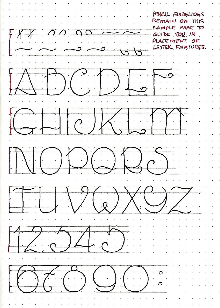
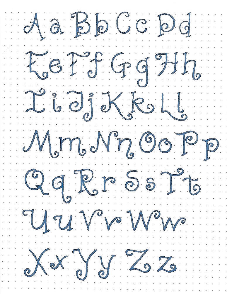
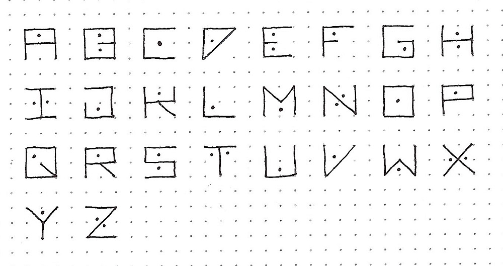
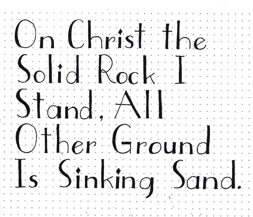
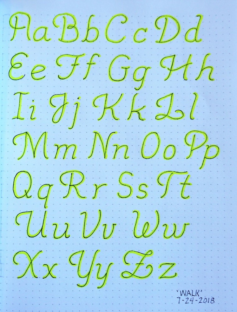
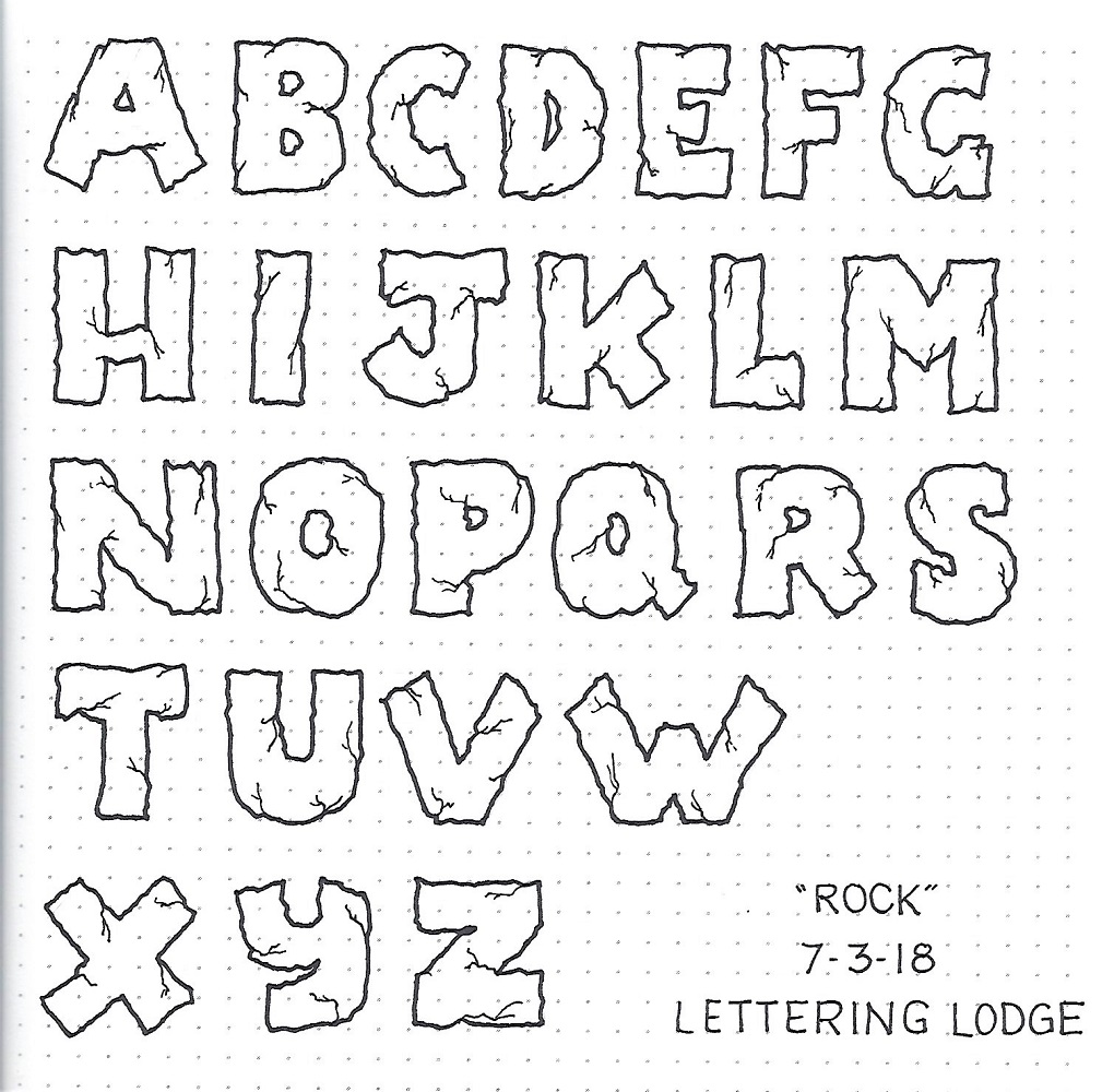
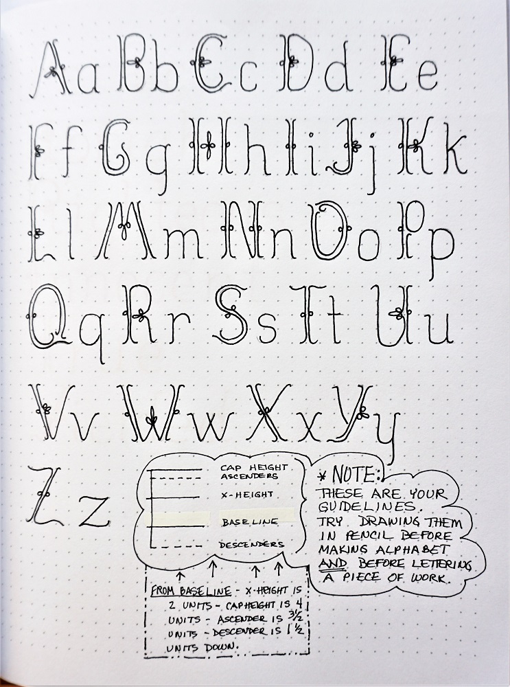
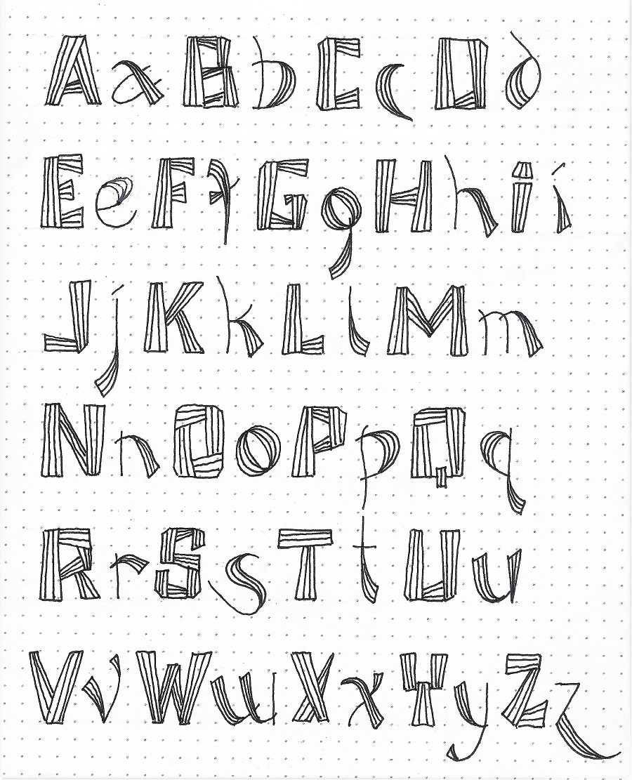
SOUL FONT – DAY 2 – ALPHABET
This alphabet is based on a free font called SmallTall. I added a set of numbers without referencing the original font so those are mine entirely.
Note that straight letters have a set of half-serifs to define the top and/or bottom. Exceptions are the capital ‘I’ with full serifs, the capital ‘T’ with none and the ‘Z’ with none. Curved letters do not have serifs for the most part. Exceptions on the foot of the ‘h, m, n’ and the top of the ‘g, j, u, y’. there are few descenders. Two are extensions of the straight line with a half-serif like the ‘p, q’ and the remaining three are matching gentle curves with no serif. These are ‘g, j, y’. So only 5 descenders in total.
I threw in a reminder on forming the ‘S’ so you wouldn’t have to keep referring back to page one. Note that the lower-case ‘s’ can be formed the same way. Its internal crossbar is straight across rather than a curve or slant like one would normally write.
Now, go forth and letter. It’s good for your SOUL!

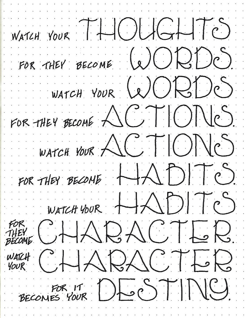
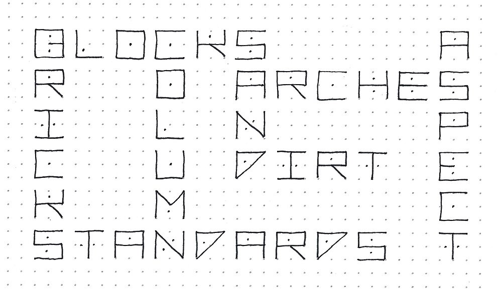
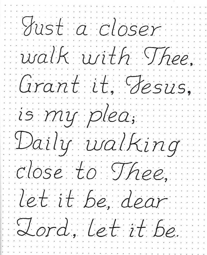
SOUL FONT – DAY 3 – QUOTE OR LYRICS
I used lyrics from the song ‘Anchor’ by Hillsong for a practice sheet today. When you write out a long block of text it looks better to capitalize every word. I use all caps for key words.
You can see I used a version of this font for my reference though I condensed the height of the upper-case letters. This makes it blend in but not compete with the main text.
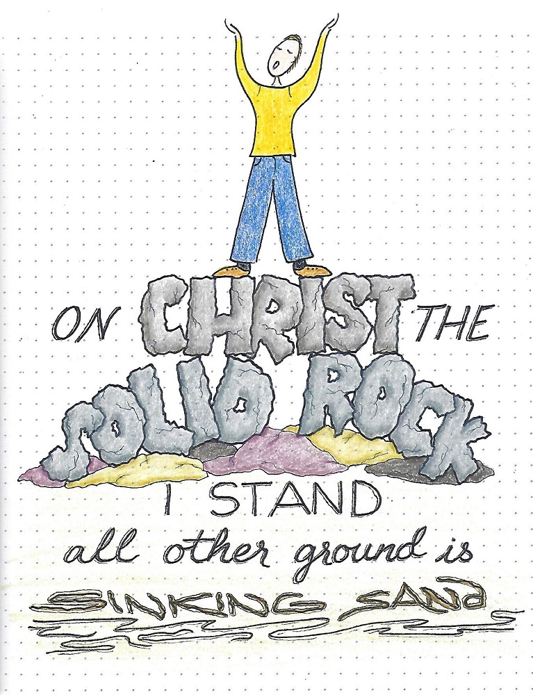
Practice your lettering with a quote, song lyrics or poem relating to the SOUL and share your work in the Photo Album.

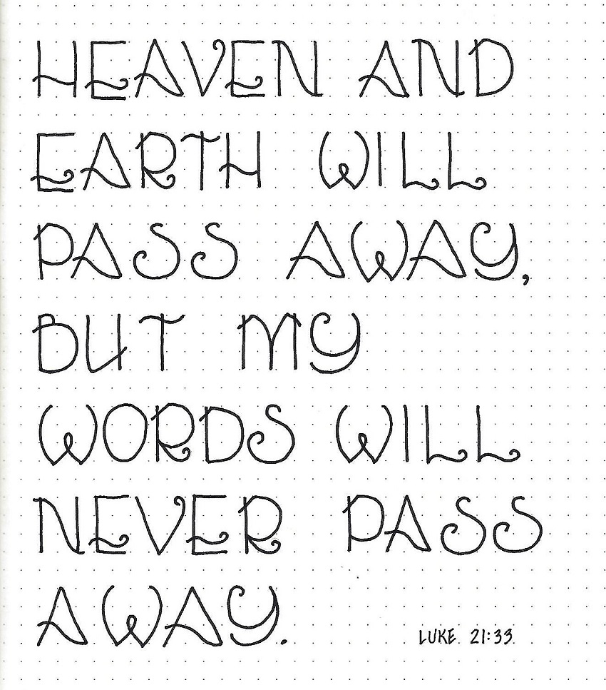
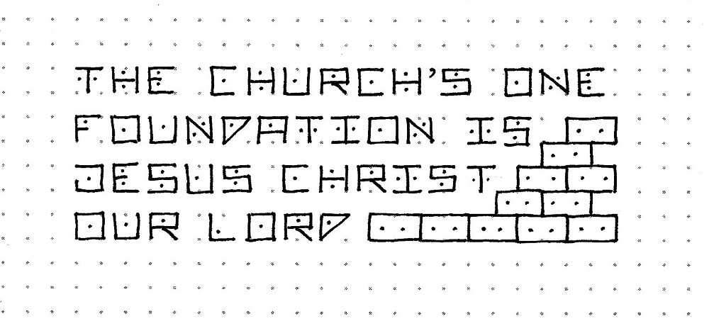
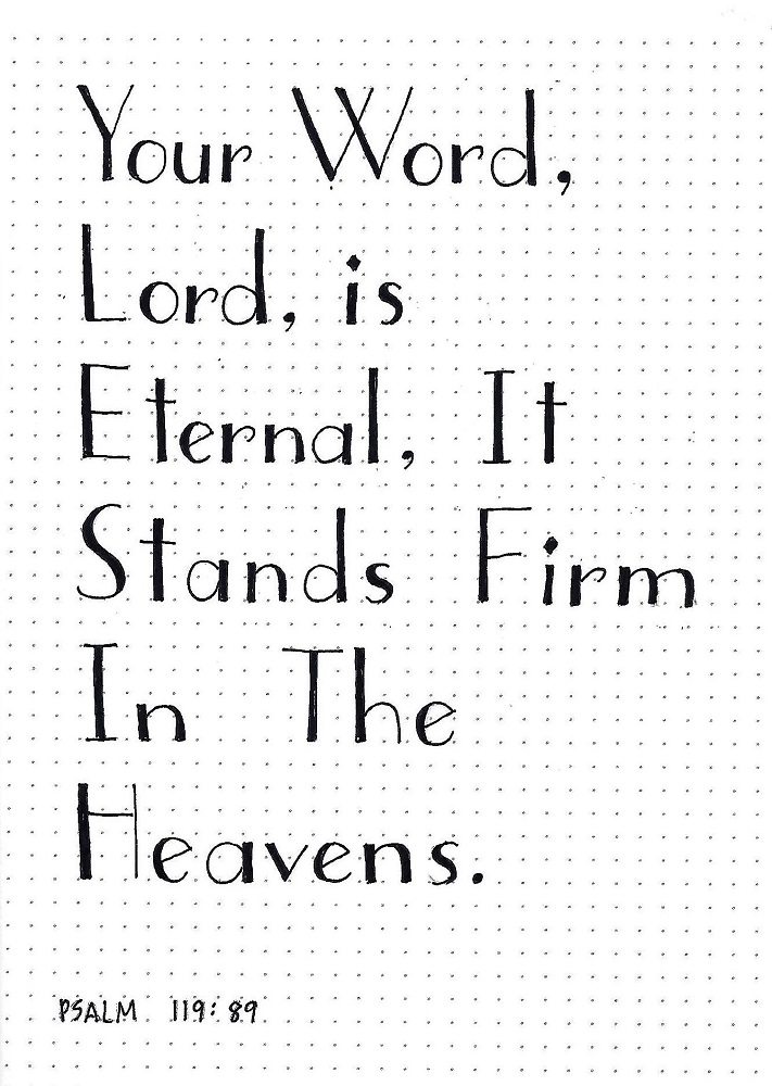
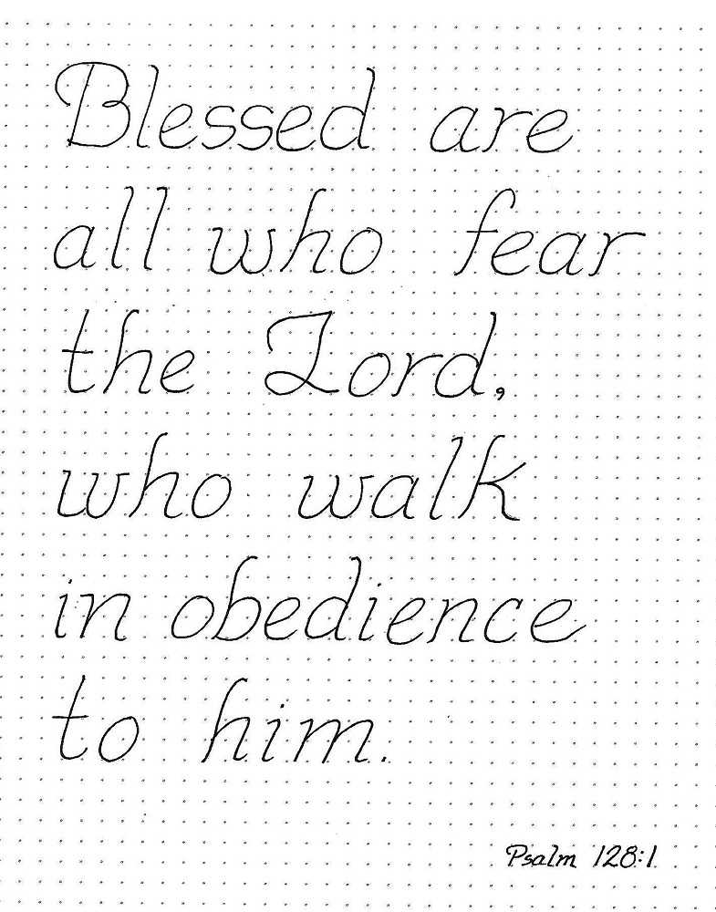
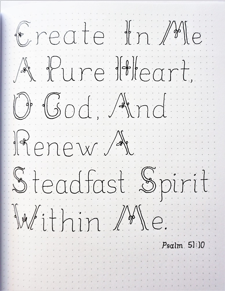
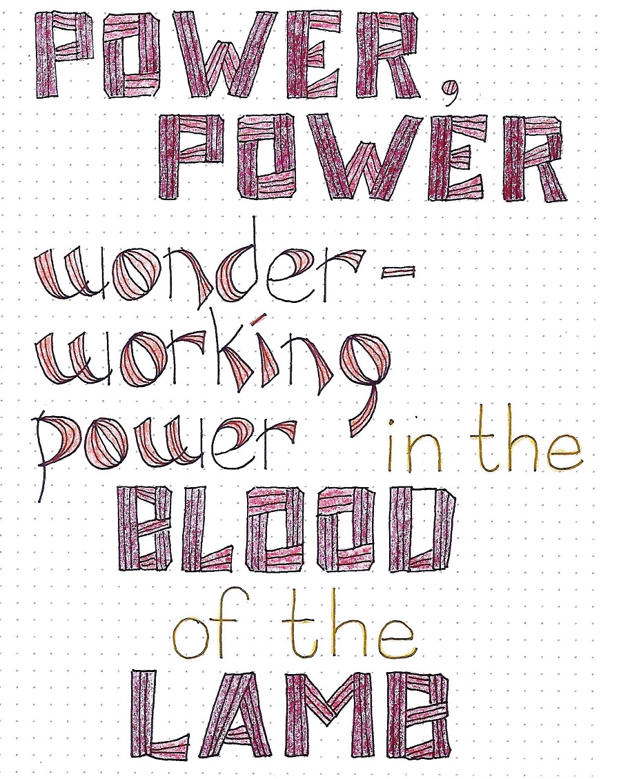
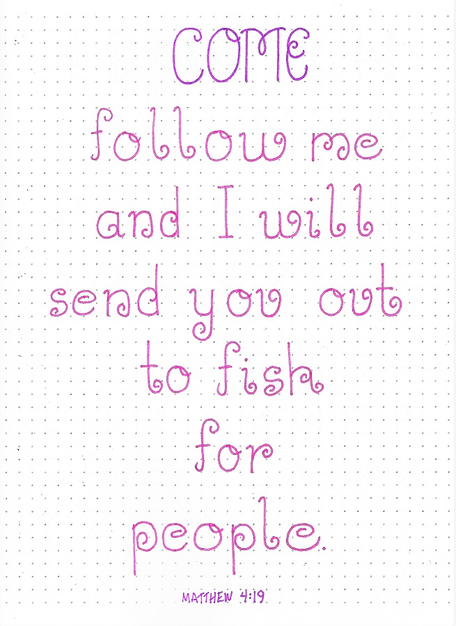
SOUL FONT – DAY 4 – SCRIPTURE WRITING
Today we move into using our font for a scripture on practice paper.
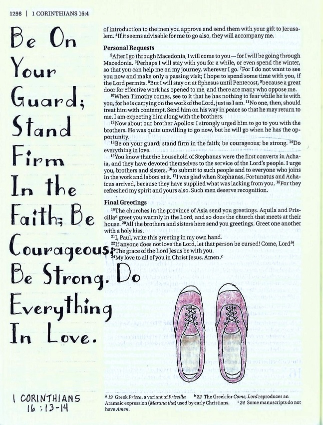
I spread out the lettering on my page and used a winding rope to provide a flowing guide for the reader.
***Want to make your own rope? In pencil, sketch a looping curvy line. Add a second line beside it, making the lines equidistant all the way down. Skip the areas where the rope crosses letters. Use a very fine-line pen to make broken, dotted and dashed lines down each side (stop when you come to a cross-over and pick up on the other side of it then after the loop when you come to the cross-over continue on through it – now the rope crosses itself). With the same fine-line pen, make angled hashmarks along the length, again skipping around the letters and the back side of the crossovers. Keep the angle consistent, turning your paper as necessary to do so. Erase your pencil and color lightly with brown.***
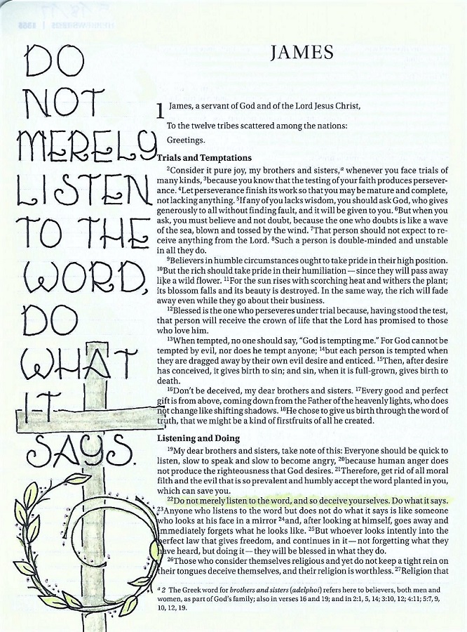
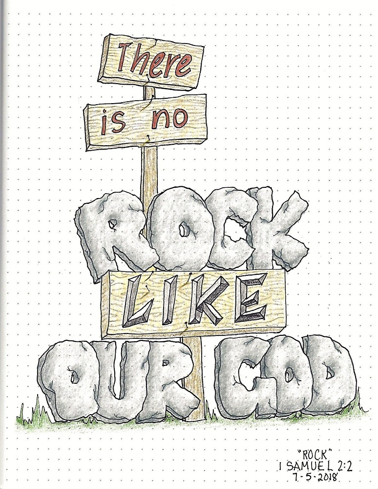
Whether you add rope or not, letter a scripture on practice paper and share your work with us in the photo album for Lettering Lodge.

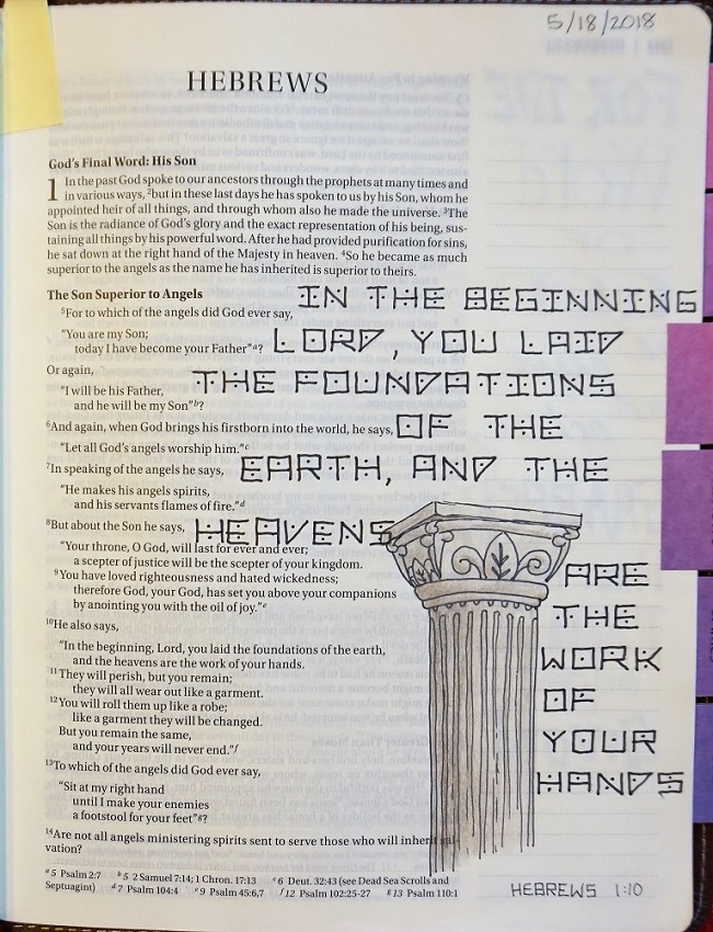
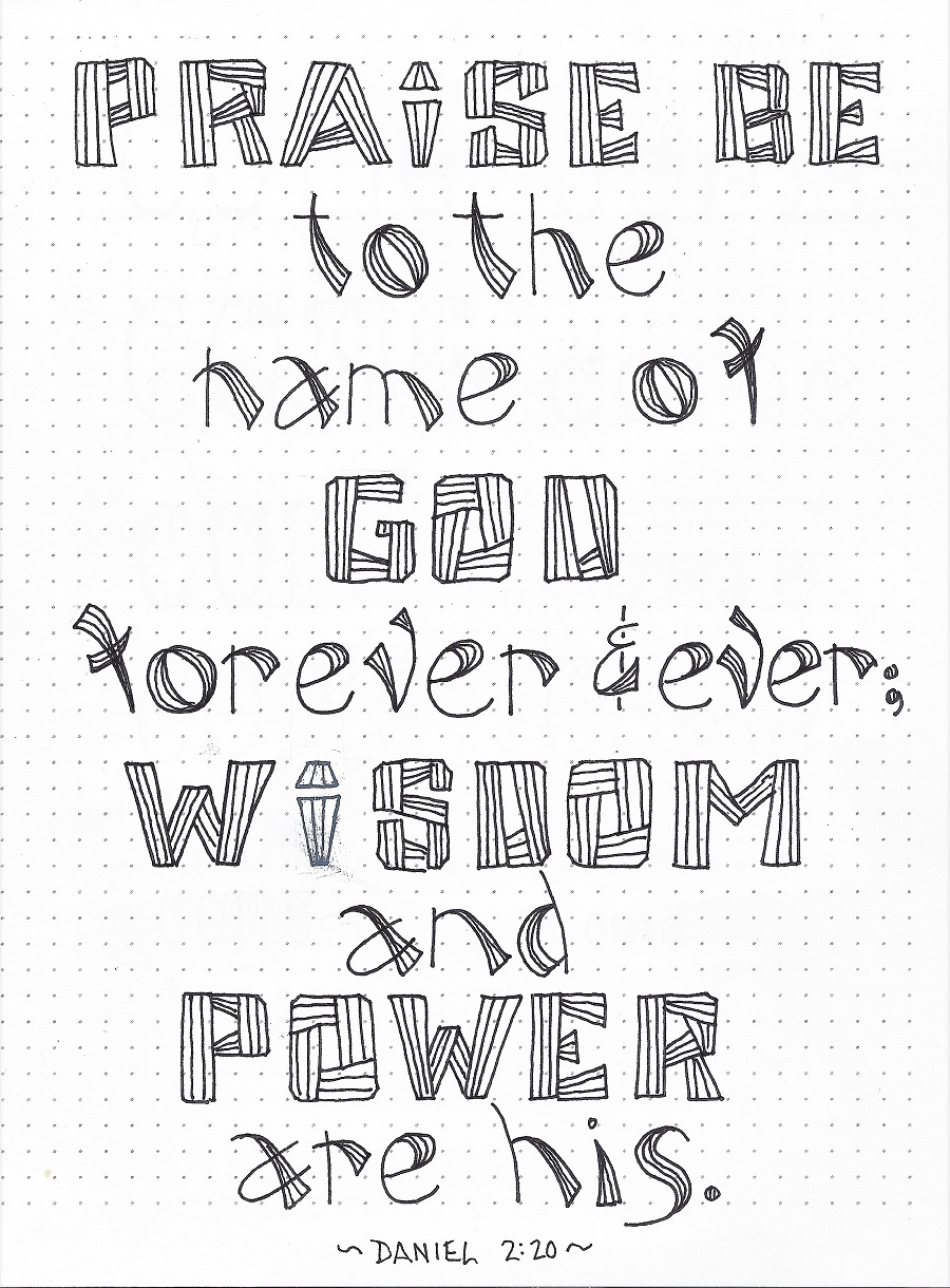
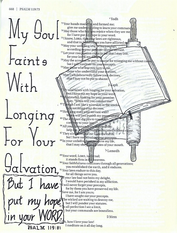
SOUL FONT – DAY 5 – IN YOUR BIBLE
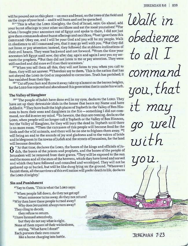
This is the day we use our newly-learned font in our Bibles. I really wanted to use the same verse as yesterday with a drawing of an anchor but I already had done that in my Bible. So, I switched up for Psalm 119:81 and illustrated with an open book (Bible today) and a scroll (Bible in David’s time).
This font eats up a lot of vertical space so you might have to mix in a more compact font to supplement it. I did that at the bottom.
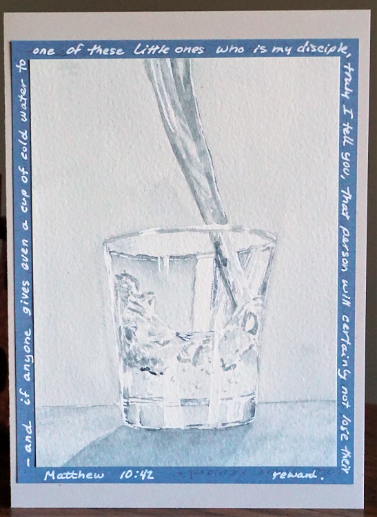
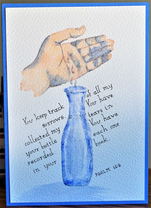
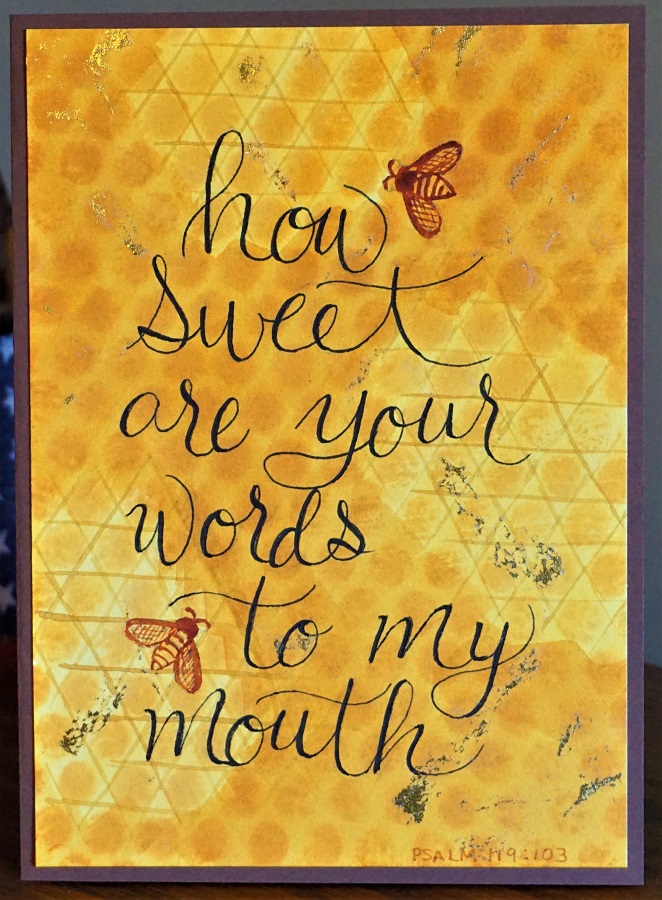
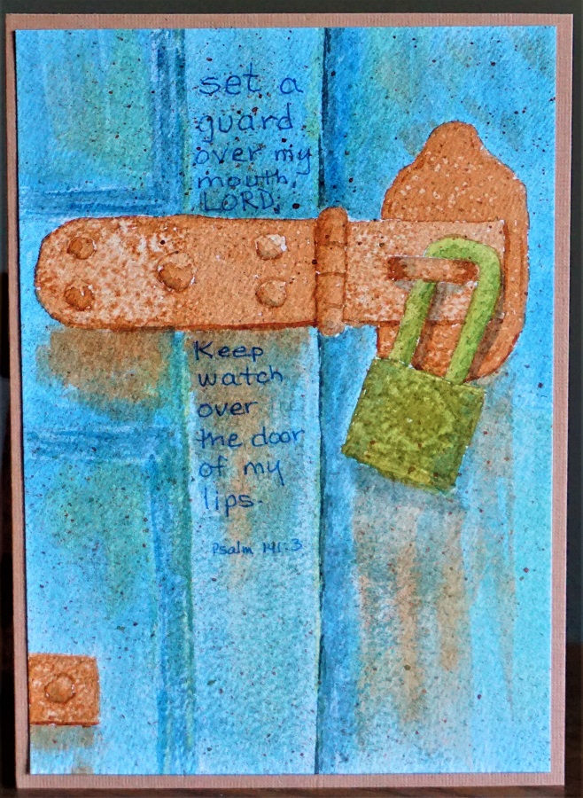
I think I will use this font a lot as it is a style with versatility. In face, I already used it on one of the watercolors I did this week (blue bottle).
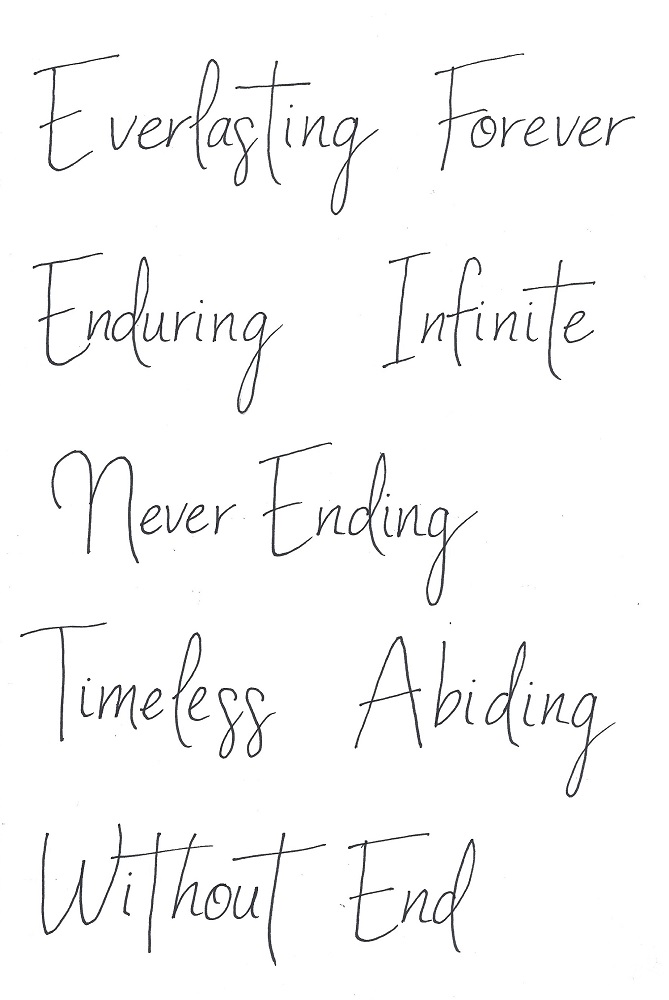
When I was writing this lesson I started out to do the focus word 'anchor'. Then I discovered there were not very many scriptures with that word that were something that I would want to journal. That's when I changed it to Soul based on some of the samples I had already done.
Here is the original introduction:

Off to do more artwork. What shall I work on next????
Ddd
Posted by studio3d@ccgmail.net
at 8:09 PM PDT