Topic: Bible Journaling
Another week of lettering lessons - this time with a 'signage' style. What a lot of fun I had with this one. Here are the daily lessons:
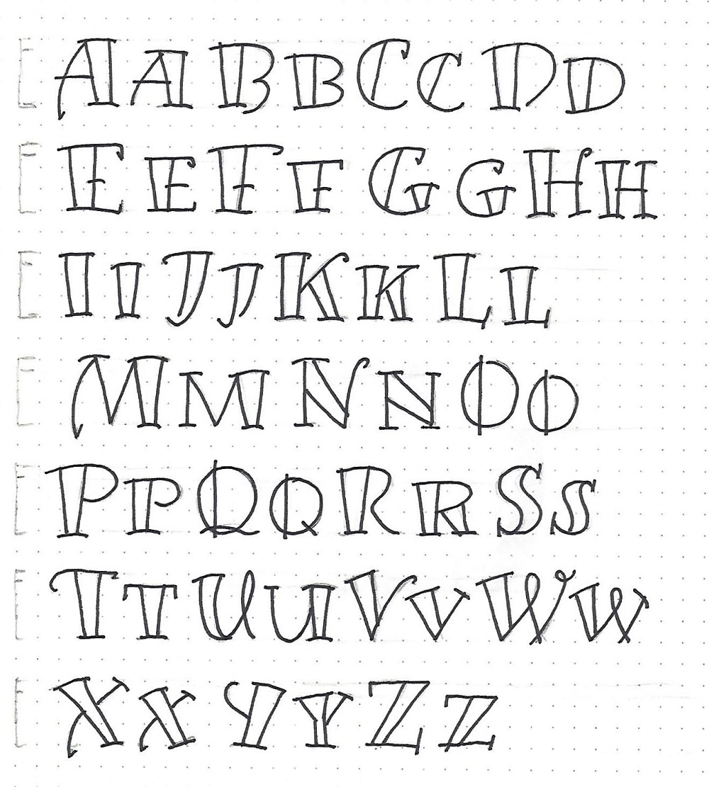
FOLLOW FONT - DAY 1 – INTRODUCTION
The font we are learning this week is of a style that might look good in signage.
The letters feature open spaces that can be colored in for more impact. We’ll get to do that later in the week after becoming familiar with the letter forms.
Remember P-I-E? That’s Pencil-Ink-Erase which we use to work toward our best letter forms.
I hope you have a go at this.
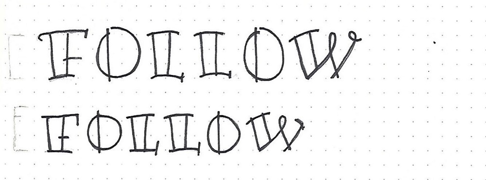
The nod to lower-case in this font is mostly to make smaller versions of the upper-case. There are a FEW cases where there is a difference. However, you can treat these as ‘alternative’ forms for the letters and switch them around.
The ‘A’, ‘M’ and ‘X’ have a variation on the length of the tail. The ‘H’ varies in the serif form as does the ‘K’ the ‘N’, the ‘T’, the ‘V’ and the ‘W’. The ‘Q’ varies in the way the tail is designed. The ‘R’ has a different style for the leg. The ‘U’ has two distinct forms as does the ‘Y’.
You can either decide which one you like of each of these or use them as designed for a distinction between upper- and lower-case. But, for this exercise, I recommend writing them ALL out and then you can make your style choices later.
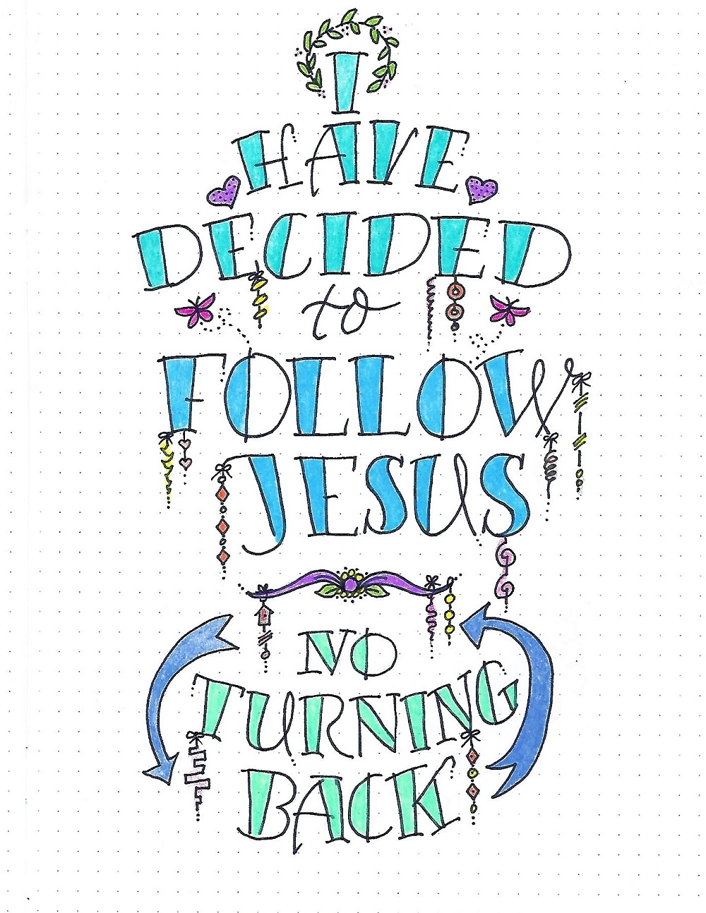
FOLLOW FONT - DAY 3 – SONG LYRICS
Today let’s use our new alphabet to create a display piece and decorate it.
First, draw some slightly curved lines to follow and write your letters along them. You will definitely want to use pencil to sketch in your letters to center the words. Use a mix of sizes for more interest.
Don’t ink until you’ve got everything lined up just as you want. Add dangles, embellishments and color to decorate your piece.
This should be a fun project to complete.
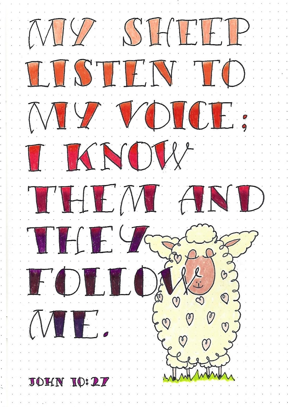
FOLLOW FONT - DAY 4 – SCRIPTURE WRITING
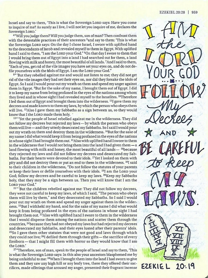
Today we’ll practice the new font by writing a scripture with the word ‘Follow’. For my sample of scripture writing I kept the letter size consistent throughout.
I colored my letters in a gradation of color using colored pencils.
I had fun adding a ‘Baaa-Sheep’ from our Drawing Room lesson from this spring.
Isn’t this a great font for ‘sign-making’?
Since the font we are using this week has a lot of ‘presence’ it can stand up to combining with a mix of other fonts. It’s ‘sign-like’ characteristics makes it a natural to make lovely display-pieces.
On this page, I used the curved baselines again, combined with two different print styles and my own handwriting as the script.
I used colored pencils to add a rainbow of color from yellow at the top to purple at the bottom.
I hope you will be inspired to use the FOLLOW font in your own Bible, either by itself or combine with other fonts.
So, that’s it for another week. I hope you find good uses for this font.
Ddd
