Progression of Lettering Styles
Topic: Lettering
We are, this week, tackling week 7 of building on lettering styles.
DEUTERONOMY: Day 1 – Enhanced Blocks – Intro
| This week we will learn three ways to adapt the basic block lettering to create other creative styles for our Bible journaling. The sample word below is a taste of day three – making stencil letters. Start with all of the word written out in pencil using the basic block letters we learned last week. Then draw in a little break where the letter parts change direction. Ink in the letter and erase your pencil outlines. You may choose to leave the letters open as they show here or fill them in solidly with ink or color. 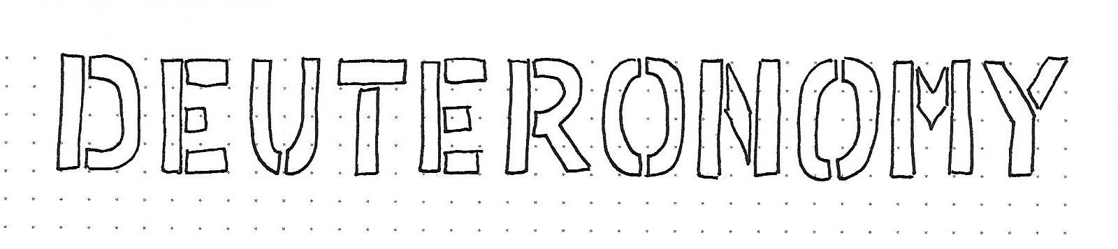
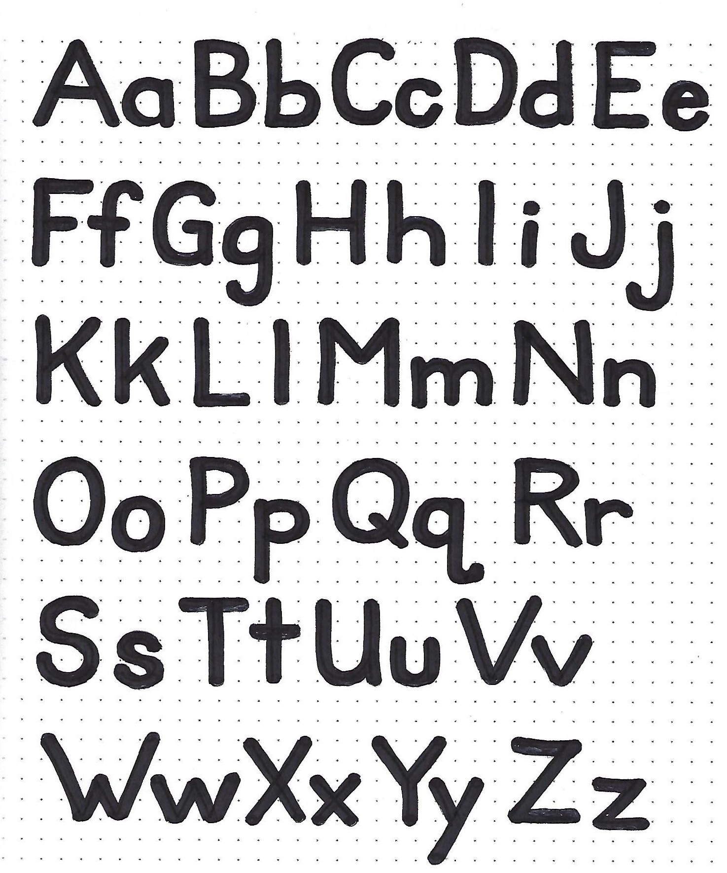
DEUTERONOMY: Day 2 – Rounded Blocks – Alphabet | The first full alphabet we will cover this week is the rounded block. Use pencil to write out basic block letters in both upper- and lower-case letters. I have done the sample with narrower elements that the alphabet we learned on last week. Work still for a consistent line width. The next step is to draw a circle at the end of every line ending. Keep the circle contained inside the line so it does not make the letter taller than the original pencil marks. Then trace around the letter, in ink, using the rounded ends instead of the squared off ones. Erase pencil and fill in solid. 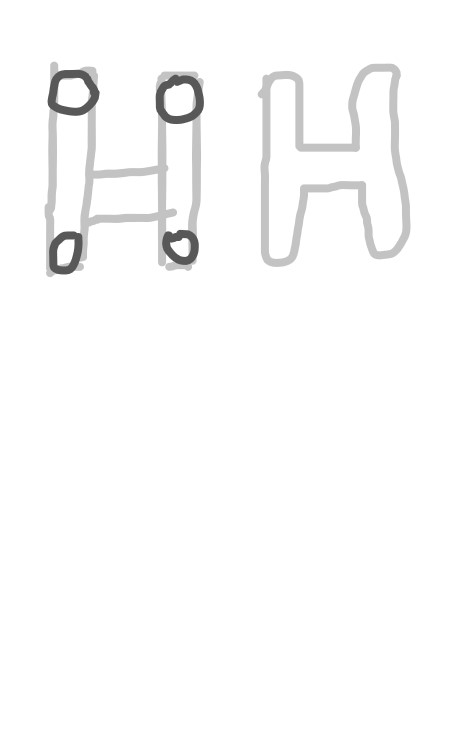
| 
DEUTERONOMY: Day 3 – Stencils – Alphabet | The stencil alphabet goes back to being an all-caps lettering style. We got a taste of this on day one. Start with all of the alphabet written out in pencil using the basic block letters we learned in week 6. Then draw in a little break where the letter parts change direction. Note that the H only has one break in my sample. You can choose to add a second break on the right side. Also note that the Q does not break at the tail, even though it is a direction change. Ink the outline of the letters and erase your pencil outlines. You may choose to leave the letters open or fill them in solidly with ink or color as shown. | 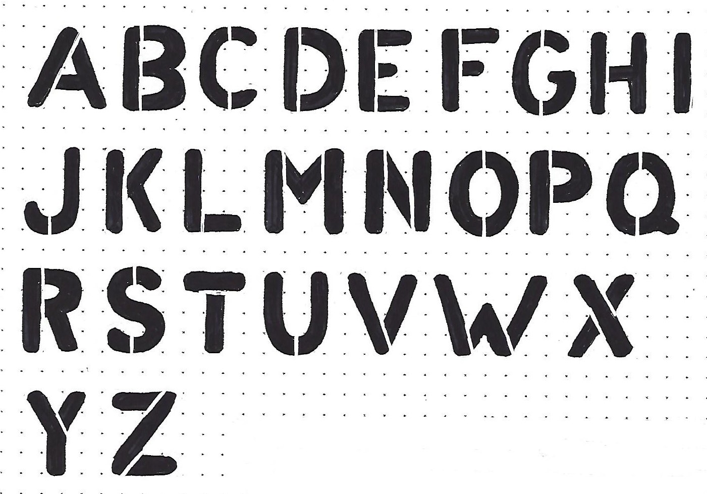
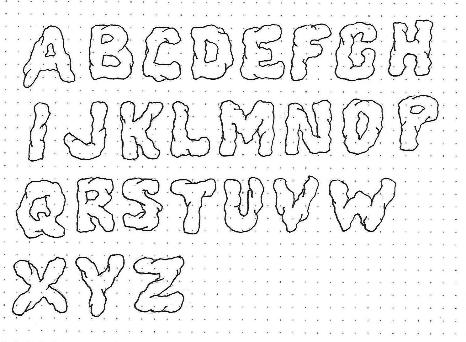
DEUTERONOMY: Day 4 – Solid Rock – Alphabet | This is similar to a novelty style that was taught here in July 2018. Begin by drawing out your basic block lettering alphabet in pencil. Convert your smooth outlines to lumpy, bumpy ones and draw in a few ‘cracks’ extending inward from a few of the dips. It is okay if your letters look a bit misshapen. Trace the outlines and cracks in ink and erase your pencil marks. · These make great letters to write stacked words by starting your text at the bottom and making sure all the words above rest directly on the letters below · Shading these darker along the bottom of each element and a little in the cracks give a great look of dimension · You can also draw a lumpy shadow under and to one side of all the elements to make them look more solid · Drawing the letters so they touch each other, and even overlapping a bit, will seal them together as words better | |
DEUTERONOMY: Day 5 – Fancy Blocks – In Your Bible
| The ‘Solid Rock’ version of the block letters was used sparingly on this page in Deuteronomy. Your assignment is to use one of the enhanced block styles learned this week on a scripture in your Bible in Deuteronomy. 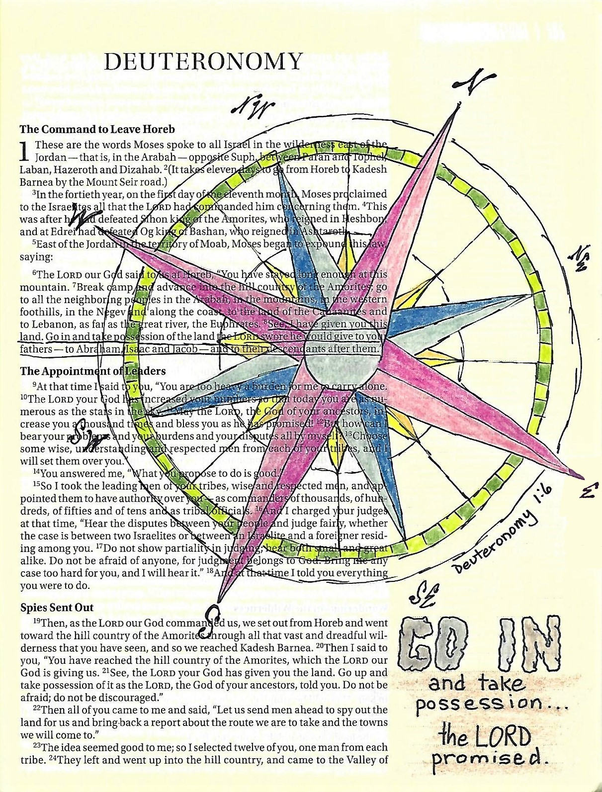
That's it for another week Ddd |
Posted by studio3d@ccgmail.net
at 12:06 PM PST
