Topic: Bible Journaling
Ready for the next lesson in the series? Let's dive in to beginning script.
| This week we will convert our semi-script into full script. It is much easier than you might expect, thanks to the way we have studied incremental changes.
|
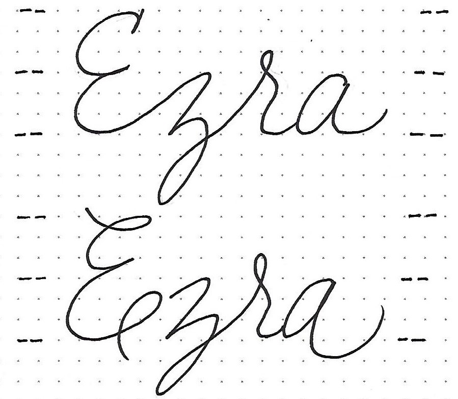
Today, make some practice areas on your paper, marked with even amounts of space above and below the x-height. I have written out two slightly different versions of script that you can practice. As you go, try to identify the things that make this font different from our semi-script and what makes it different from your handwriting?
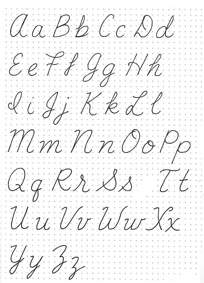
| This is the full alphabet for a basic script style. Note that I said ‘A’ basic script. Because there are many alternative forms for many of the letters. We will look at a few of the more common ones tomorrow.
This alphabet uses an x-height that is one-half of the total letter height. The bowls are oval and the letters have an italic slant.
|
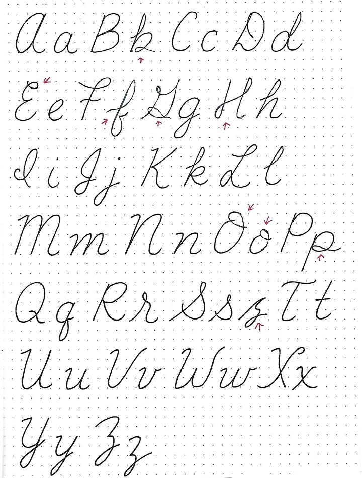
| As was mentioned a few days ago, there are alternative forms to many script letters. A few have been included here to give you some choice in your personal style going forward.
|
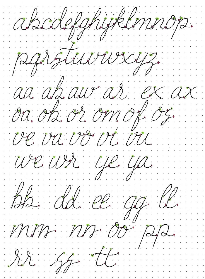
| Once you’ve practiced and selected the form you want to use for each lower-case letter you will move on to learning how to connect them to form words. Again, this is NOT the same as cursive handwriting. Unlike penmanship, hand lettering is meant to be drawn rather than written; decorative rather than utilitarian. One of the hardest things for many is forming the habit of pausing and lifting the pen in the middle of words. This allows for connecting letters in a more artistic way than the cursive we learned in childhood.
Use this method to write out your lower-case alphabet as long words, using the letter forms you have chosen. When you get to the end of a line, move down and continue with the next letter series (beginning with the last letter used). I have marked the end-point (where I lifted the pen) with a red dot. I have marked the start points (where the letter began) with a green dot. [green=go, red=stop]
You will likely want to do different letter connections when going from a short letter into one with a loop and stem than when connecting a series of small letters. Also, you can elect to pencil the letters as stand-alones and then go back and add the connections where they seem natural to you. Do NOT leave letters unconnected within words at this point. Later, when you are confident with styling, this may be an artistic choice you make.
Letter pairs (bb, dd, ee, gg, ll, mm, nn, oo, pp, rr, ss, tt) often get a different styling than a single letter of the same. It is hard to get both letters to match, so you may intentionally change one slightly so it looks planned.
|
Another one in the books!
Ddd
