Topic: Stamping
As proof that I had learned my lesson, here are three more cards using the same embossed image from two days ago. That one I had colored using alcohol markers and found that they melted the embossing powder. It also removes the shine from the embossing so the image does not have a finished look.
I had stamped and embossed three other times - once on regular cardstock and twice on watercolor paper - when I created the original card. So I colored them up with watercolor markers this time. In each case I used three values on the petals, two on the leaves, and one on the stems.
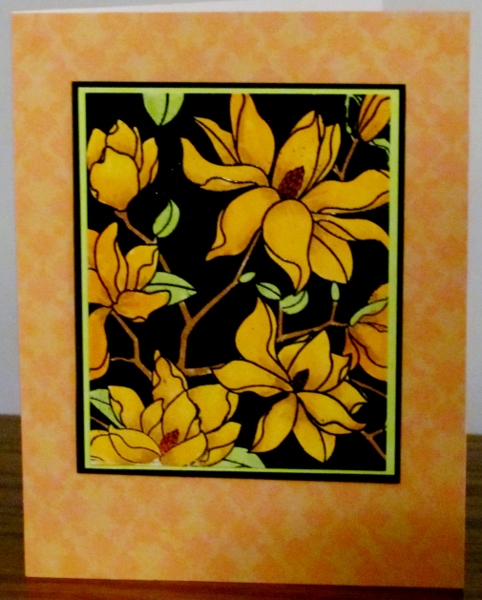
This first one uses oranges for the blooms. This is the closest to the one I did with alcohol markers and it is on regular cardstock like that one, too. I used an aqua-brush to blend the colors. I bordered with neon green and black before popping up on foam tape over a patterned paper.
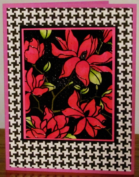
The next one is on watercolor paper and I used three bright pinks on the flowers. This got borders of hot pink and black and is popped up on foam tape over a houndstooth paper. I used a bright red-violet for the card base. Love the graphic look of this.
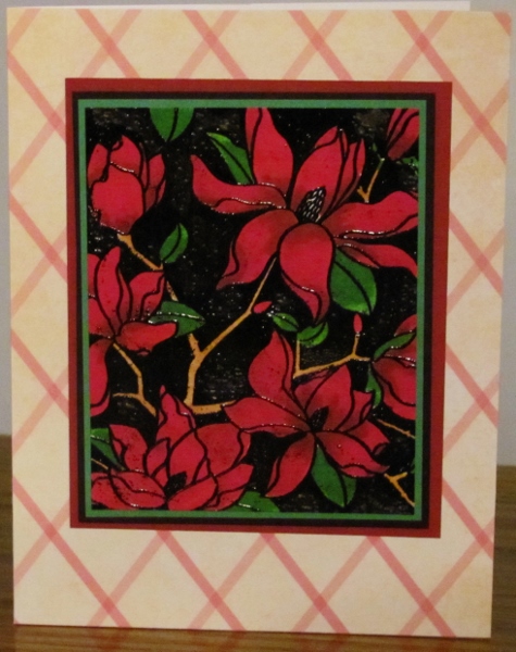
The last one is also on watercolor paper. I used dark pinks and burgundy for this image and darker greens for the leaves. A green and a black border were applied and popped up on foam tape over a third border of burgundy. I placed this all on a latice background so ithad a more formal feel than the others.
I left these all without sentiments to let the illustration remain the center of attention.
Ddd
